Lilac & Fern
Posted: May 12, 2021 Filed under: fresh ferns, Karin brushmarkers, lovely lilacs, Penny Black | Tags: Fabriano Watercolour Paper, Karin brushmarkers, Penny Black stamps, Ranger Distress inks 10 Comments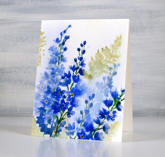
I don’t think I am alone in calling this stamp set a favourite. The two lilac stalks are pretty alone but with a sprig or two of fern they are delightful. I stamped this panel a while ago so the exact process is no longer firm in my memory but I do remember a crucial step which I will share with you.
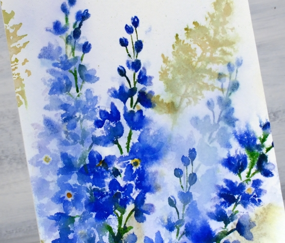
I inked then stamped the lilacs with a mix of distress inks and Karin markers and the ferns with peeled paint distress ink. It looked ok but not the soft blended bunch I was after. I did like the combo of lilacs and ferns though so I thought I would dilute it all and see what happened. I didn’t spritz it; I drowned it. I dipped the whole panel in a bucket of water (the laundry is right beside my workroom) and watched a lot but not all of the colour drain away. The brightness of the peeled paint ink washed out but the olive stain remained. The lilacs washed out to a paler version of themselves and it was rather nice.
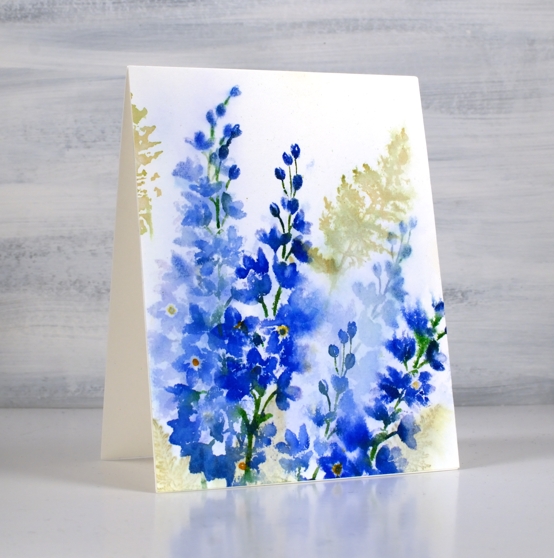
I re-inked the lilac stamps with the royal blue, lush green, henna and gold markers and stamped darker more distinct lilacs over the top. I have a friend who has had many successes with what she calls the ‘drowning’ method. It’s worth a try if your panel is not going in quite the direction you wanted; what have you got to lose? It’s only paper!
Although it is not quite ready yet my new online class, Floral Faves, is getting closer every day and I will be teaching techniques using your floral stamps to create card sized art works like the one above. I can’t wait to open the class and of course I will let you know as soon as it happens. Stay tuned!
Supplies
(Compensated affiliate links used when possible)
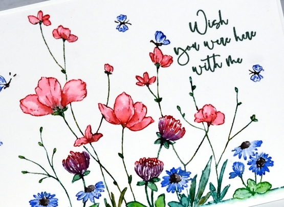
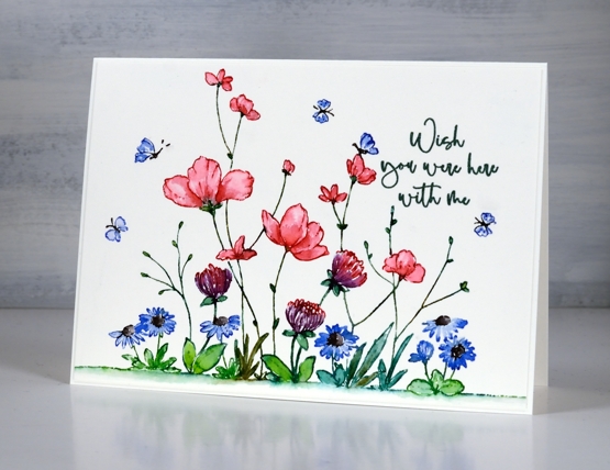
Pathway
Posted: May 7, 2021 Filed under: Karin brushmarkers, pathway, trailing | Tags: Karin brushmarkers, Penny Black stamps, Ranger Distress inks, Tsukineko Versafine inks 6 Comments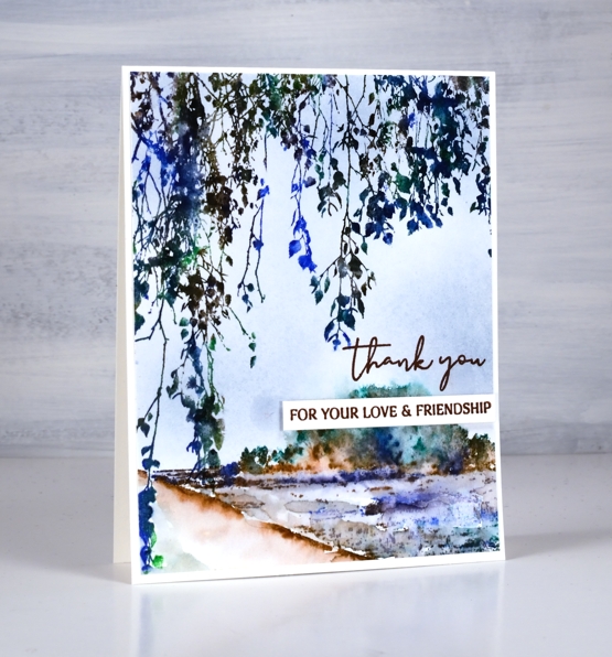
I’ve taken a moody path for today’s card using the new PB ‘trailing’ stamp for some overhead foliage and the scenic PB stamp ‘pathway’ for the background image.
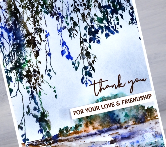
I inked both stamps with Karin brushmarkers, a brown, a green and a blue. I added a spritz of water before stamping both images and then did more blending with a brush of the pathway image on the panel. To add some background colour I blended stormy sky distress ink with a blending brush.
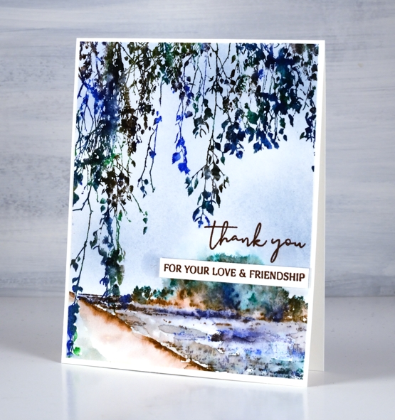
To complete the card I stamped the scripty thank you from PB ‘million thanks’ and a separate phrase from the PB ‘ever thanks’ both in versafine acorn ink.
Supplies
(Compensated affiliate links used when possible)
Simple Delight
Posted: May 5, 2021 Filed under: delight, Karin brushmarkers, Penny Black | Tags: Fabriano Watercolour Paper, Karin brushmarkers, Penny Black stamps 7 Comments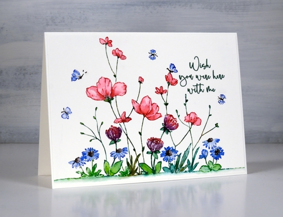
The colour scheme you see above is one of my favourites; I love pinks and blues and combinations of pink and blue. I also like green way more than I used to especially when paired with blue. I am talking about more than art and cardmaking; the clothes in my closet are blue, pink, burgandy, navy, white and combinations of the above!
I used Karin brushmarkers to both stamp and colour this panel featuring the PB ‘delight’ stamp; it’s a technique I often use and one that I teach in my new online class, Floral Faves. At the risk of boring you I am going to keep talking about my new class because I am very excited about it and very busy getting ready to launch it.
I used the following markers; magenta, lush green, henna, lilac, black, royal blue varying the greens with the help of the ‘henna’ marker to add more yellow tone. The stamp is a large one but I extended the edge of the ground even more with a few dots and dashes of green marker blended underneath with water. I kept this card design very clean with plenty of white space, the only added texture being the subtle border of the painted panel over a slightly larger card base in the same colour. I just felt the pretty colours were enough. To see a different look with the same stamp check out this card.
Supplies
(Compensated affiliate links used when possible)
Bird’s eye view
Posted: April 23, 2021 Filed under: bird's eye view, Dies, Flower Frolic, gift card pocket, Karin brushmarkers, Penny Black, Script | Tags: distress markers, Karin brushmarkers, Penny Black creative dies, Penny Black stamps, Ranger Distress inks 7 Comments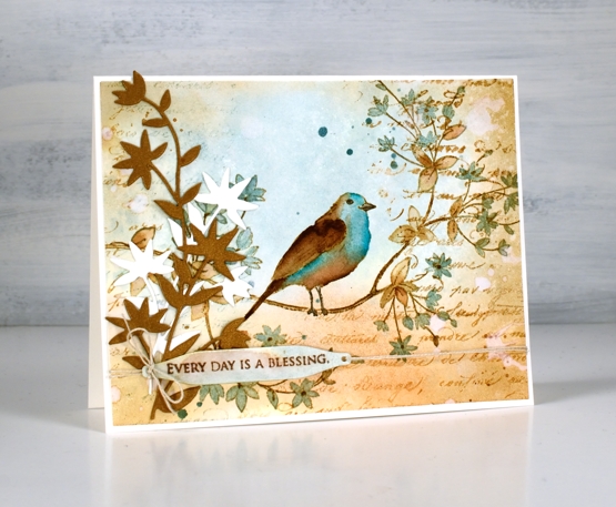
This cute bird on a branch stamp is new from Penny Black and is called ‘bird’s eye view’. We recently installed a new bird feeder in our backyard. It is on a shepherd’s hook metal pole to discourage the squirrels. The feeder itself has the anti-squirrel spring mechanism which closes access to the seed when something as heavy as a squirrel lands on it. You can probably guess what I’m going to say next; squirrels are wily creatures as are chipmunks! I can say that no adult squirrels have successfully fed directly from the feeder, they hang around underneath and eat what falls to the ground. We have seen a smaller squirrel climb the pole and lean over to take seed from the feeder without putting weight on it and a chipmunk that is light enough to sit on the feeder and stuff it’s face happily!
I know from experience you win some and lose some with feeders and I am enjoying the cardinal couple, the chickadees and the sparrows that are popping in. I think we’ve seen a finch or two but not certain.
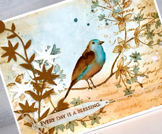
To create this vintage themed card I limited myself to a brown and blue colour scheme. The browns are tea dye, antique linen and vintage photo distress inks; the blues are speckled egg distress ink plus the arctic blue and cyan Karin brushmarkers. First I smooshed tea dye and speckled egg inks on a glass mat, diluted them with water then swiped a piece of hot pressed watercolour paper through the inks. Once the background was dry I stamped the ‘bird’s eye view’ image on the panel with antique linen and kept the panel in the stamp positioner while I added darker ink by applying distress marker to the stamp where I needed darker browns and black.
I painted the leaves in both tea dye and speckled egg inks and did the same with the bird before adding vintage photo ink to the wing, tail and legs. Once the bird was finished I felt the speckled egg blue was not deep enough so I used the blue Karin markers to add ink directly to the paper then blended with a paintbrush.
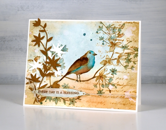
To add to the vintage look I blended around the edge of the panel with vintage photo ink then dropped splats of water here and there to create watermarks. I also stamped the PB script stamp which never fails to add some vintage charm. I hunted through my dies to find a pretty foliage die that mimics the shape of leaves and cut both bronze and cream pieces to attach to the left of the panel. Continuing the vintage theme I stamped a partial sentiment on a little tag and tied it to the panel with twine. Yes, of course there is also some ink splatter.
Let me know if you have successfully deterred squirrels from you backyard bird feeders; I’d love to hear your techniques.
Supplies
(Compensated affiliate links used when possible)
Florescence
Posted: April 16, 2021 Filed under: florescence, Karin brushmarkers, Penny Black | Tags: Fabriano Watercolour Paper, Karin brushmarkers, Papertrey ink, Penny Black stamps, Tsukineko Versafine inks 11 Comments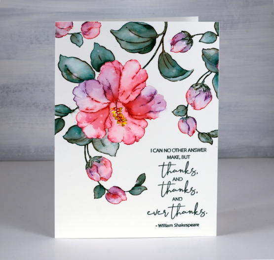
I hope you have already seen some of the gorgeous new stamps from the Penny Black ‘Delight’ release. I am thoroughly enjoying the large floral stamps and will be sharing projects here on the blog over the coming weeks. This beautiful hibiscus stamp is called ‘florescence’ and it is a joy to work with.
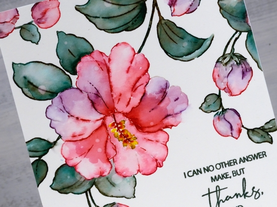
To create this large 4½”x 6¼” card I used Karin brush markers to both stamp and paint the image. With the hot pressed watercolour panel in a stamp positioner I stamped first in Papertrey soft stone ink so I could see the outline image then inked the flower and buds with the magenta and magenta red markers. When I am inking a stamp with a marker I always turn the marker tip on its side to protect the point. I inked the leaves and stems with both lush green and henna markers to create more of a muted green. When painting the leaves and flowers I drew ink from the stamped lines as well as adding it to the panel directly with the brush markers. I also dabbed ink away to create water marks and gradation in the petals and leaves. I stamped and painted the anther and filament (yes I looked that up) in magenta and canary markers. To finish the flower painting I strategically placed some large and small water droplets on the leaves and petals. After letting them sit for 30 seconds or so I dabbed them up with a paper towel to reveal pale dots here and there.

To fill the top of the panel I stamped and painted the buds a couple more times leaving a blank space bottom right for the large thank you sentiment from the new ‘ever thanks’ set. I stamped in versafine olympia green; I’ve heard the original versafine inks are being phased out so I will keep stamping with them while I have them but buy the versafine clair inks from now on.
Both the Foiled Fox and Penny Black are hosting giveaways right now so click on the links I created for a chance to win.
Supplies
(Compensated affiliate links used when possible)
Lemon Lush
Posted: March 15, 2021 Filed under: floral notes, Karin brushmarkers, lemon lush, Peerless watercolours, Pink Fresh studio | Tags: Brutus Monroe, brutus monroe embossing powder, Karin brushmarkers, Peerless Transparent Watercolors, Pink Fresh studio, Tsukineko Memento inks, Tsukineko Versafine inks 3 Comments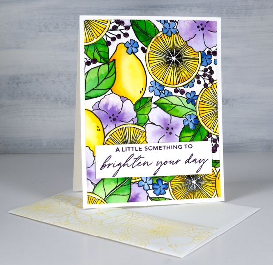
It’s a collaboration day with The Foiled Fox, so I am over on their blog and sharing here at home too. Make sure you pop over there to learn more about today’s card process and products.
Isn’t this a bright happy image? I know it’s partly the colours I chose but I think it is also the mix of lemons, leaves and flowers. It’s a glimpse of summer and that is definitely welcome! The stamp is called ‘lemon lush’ and it is a large 6″x6″ from Pinkfresh Studio. I’ve used two thirds of it for this rectangle card but I’ll be showing you the whole square image on another card soon.
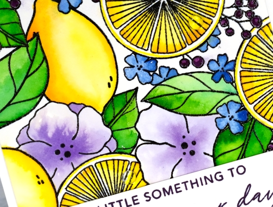
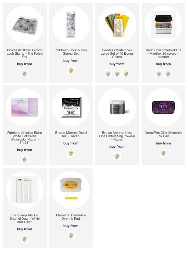
I stamped the rubber stamp on hot pressed watercolour paper in raven black ink and embossed in raven powder (both from Brutus Monroe). For the watercolouring I used Peerless watercolours. I watercolour with quite a few different products so sometimes the Peerless paints sit on the shelf feeling forgotten. Once I bring them out however, I remember just how beautifully they blend and what gorgeous colours are available. If you haven’t heard of Peerless watercolours paints they are an old, old company and the paint is in pieces of thick paper. I use a wet brush to pick up paint to use on my project.
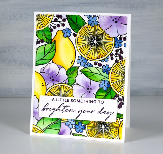
When painting the cut lemons I used a yellow and a light orange paint, for the whole lemons I used the same plus darker orange tones to get depth and shadow. I used two greens for the leaves, a blue for the tiny flowers and violet for the large flowers. To fill in the berries I switched to a purple Karin brushmarker. The sentiment is from Pinkfresh Studio’s ‘floral notes’ set stamped in monarch versafine clair. I stamped the flap of my envelope too with memento dandelion ink. If you take a close look at the second photo you will see some clear dots glued to the lemon halves, those droplets of juice might just be my favourite part of the card! Thanks for joining me today and thank you Foiled Fox for sending me this stunning stamp to create with.
Supplies
(Compensated affiliate links used when possible)
Floral notes slim
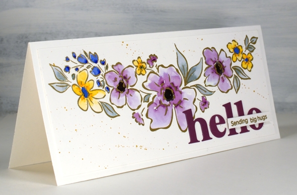
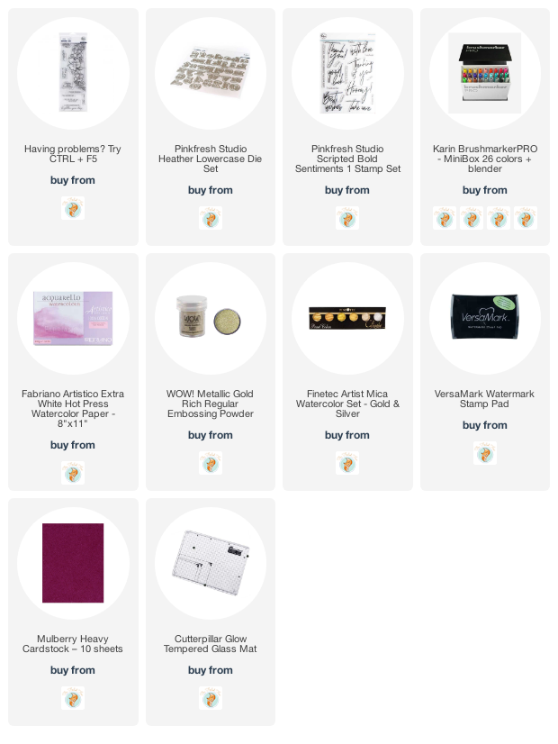
Posted: March 3, 2021 Filed under: floral notes, Heather lowercase die set, Karin brushmarkers, Pink Fresh studio | Tags: Fabriano Watercolour Paper, Karin brushmarkers, Pink Fresh studio, WOW embossing powders 5 Comments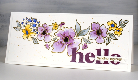
I’ve teamed up with the Foiled Fox again to share this lovely slimline Pinkfresh Studio stamp. The stamp is called ‘floral notes’ and it’s just over 8″ long! The set also includes some sentiments which I will feature another day.
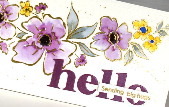
I embossed the floral stamp in gold powder then added colour with dabs of ink from the Karin brushmarkers (I only used royal blue, lilac, gold and black). I say dabs because that is really all it takes to watercolour with the Karin markers. I dab a few dots of ink where I want the colour to be strongest then blend from that point with water to fill the petals or leaves. I was wanting variation in the petals and was happy to achieve it particularly in the large flowers coloured in lilac.
After the colouring was complete I splattered ‘pearl gold’ pearlescent paint from Finetec; it was a close match to the WOW metallic gold embossing powder. For a sentiment I cut ‘hello’ with the Pinkfresh ‘Heather lowercase alphabet dies’ and left the border off so the letters would not be too big then added a blended sentiment using dies from the Pinkfresh ‘scripted bold sentiments’ set.
Previous to making this card I lost the letter ‘t’ die from the alphabet set. It was after cutting the word ‘star’ for another card. As you can imagine this caused me great dismay. Without the ‘t’ there would be only birhdays, bes wishes and merry Chrismasses! I searched high and low and went my workroom garbage and recycling multiple times. Yesterday, after eleven days without it, the ‘t’ was returned to the alphabet. It had fallen into the MFT box in the filing cabinet right between ‘YAY for you’ and ‘painted prints’!
I’ll be using this pretty floral stamp again and not necessarily just on slimline cards. The sentiments from the set are also lovely so keep an eye out for them. Don’t forget to visit the Foiled Fox blog today for more details including measurements.
Supplies
(Compensated affiliate links used when possible)
Daydream Watercoloured Flowers -Video
Posted: February 18, 2021 Filed under: daydream, Karin brushmarkers, Penny Black, Tutorial | Tags: Karin brushmarkers, Penny Black creative dies, Penny Black stamps, Tutorial 7 Comments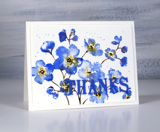
Penny Black has a new release called ‘Daydream’ and it’s filled with spring goodness. I guess many of us start daydreaming about spring in February. The stamp featured in my card today is called ‘daydream’ and I’ve paired it up with a new die, ‘thanks & hello’.
I’m enjoying working with the Karin brushmarkers both for watercolouring line images and for inking stamps. In today’s video I ink the stamp with four markers but my technique is slightly different to my usual method and involves some ‘water stamping’
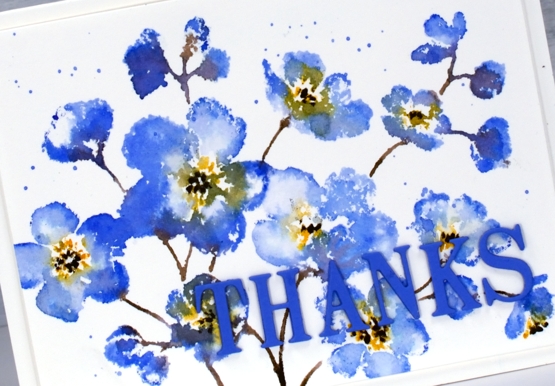
In the video below you can see why the juicy Karin markers are perfect for this technique. As I’ve mentioned in previous posts, a little ink goes a long way. I’m looking forward to trying this technique again on a different stamp with even less ink for a paler more subtle look.
I chose to keep the panel simple on a white background but you could add a pale wash before starting or do some second generation stamping for background flowers. Maybe I’ll try that next.

This blue which has a hint of purple is my favourite blue. It reminds me of cornflowers which featured in my bridal bouquet and was the colour of my bridesmaid’s skirts.
Supplies
(Compensated affiliate links used when possible)
Big & Bold thank you cards
Posted: January 25, 2021 Filed under: Brutus Monroe, Colorado Craft Company, Concord & 9th, Daisy & Dahlia, Karin brushmarkers, phrase builder you, Pink Fresh studio, simple serif alphabet dies | Tags: brutus monroe embossing powder, Colorado Craft Company, Concord & 9th, Karin brushmarkers, Pink Fresh studio 9 Comments
I’ve teamed up with the Foiled Fox again, as I love to do and I’m sharing two cards featuring the Colorado Stamp Company’s ‘daisy & dahlia’ stamp. I made a couple of cards last year with this stamp using a very different colour scheme.
On the card above I wanted to show you how much depth and variation you can get from single Karin brushmarkers. I was so happy to see the light and shadow I could achieve on each petal with one or two dabs of ink from the marker then blending with water. The blue flower on the right which is barely showing was coloured with a bold dark blue but as you can see it was possible to dilute it to a pale blue. I used the following Karin brushmarkers on the panel: black, henna, cool grey , rose wood, cyan, turquoise, royal blue.
It’s not easy to see but you might notice a white on white embossed image on the card base; it’s the same stamp providing a bit of texture. You can learn more about my process by visiting the Foiled Fox blog today
I kept some of the colours but went for a bolder look on my second card embossing the same large stamp in white on black cardstock. As you can see this stamp works as a coloured image and and a black and white image. White on red, red on white, blue on white, there are many colour combos which I’m sure would also look bright and beautiful.
Make sure you check out all the details on the Foiled Fox blog and take the time to check out Shauna’s stunning floral card from last Friday; it is a beauty.
Supplies
(Compensated affiliate links used when possible)
Woolly Wishes
Posted: January 18, 2021 Filed under: A2 layers, Additional A2 layers, Darkroom Door, Karin brushmarkers, knitting, Penny Black, Waffle Flower | Tags: Darkroom Door stamps, Karin brushmarkers, Penny Black creative dies, Tsukineko Memento inks, WOW embossing powders 6 Comments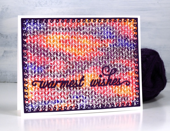
This is the first knitting project I have done in years! I keep meaning to pull out some needles and wool to see if it hurts my hands to knit. I have a little stash of wool and plenty of different sized needles and I used to knit while watching tv. My last project was never finished then my hands became quite sore so I haven’t tried again.
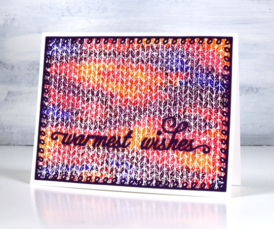
When I first saw this Darkroom Door knitting stamp I couldn’t believe how realistic it looked when stamped and coloured. I stamped with versamark and embossed in clear powder on hot pressed watercolour paper for both cards. On the panel above I used Karin brushmarkers (amber, lilac, violet blue, magenta) to colour random shapes over the panel just like you get when you knit multicoloured yarn. I spritzed lighlly over the panel with water to get the colours to blend just a little.
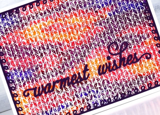
I knew just the dies to use to complete the card. Penny Black has a set of looped frame dies which look a little like knitting stitches and the PB warmest wishes die is made of small curly letters that look like loops of wool. I cut both from purple cardstock with double sided adhesive on the back.
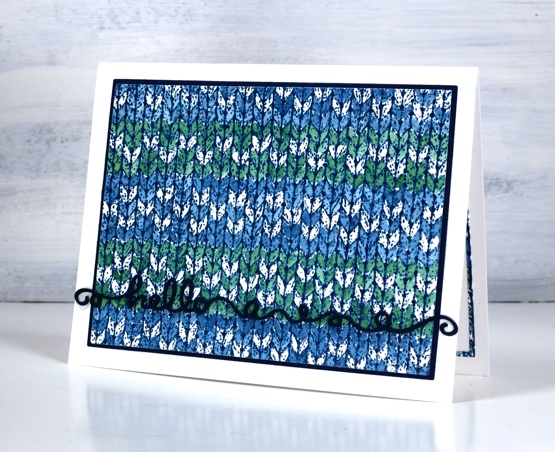
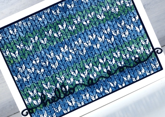
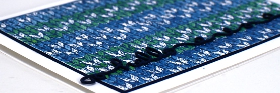
The second card features a simple pattern painted over the embossing with nautical blue and cottage ivy memento inks smooshed on my glass mat. I wanted to do a fancy snowflake pattern but decided I should start with something simple. Just as well as I missed a whole line of the pattern I was trying to do. This time I matted the panel with dark blue cardstock and stacked three layers of the ‘hello’ from the Penny Black ‘doodles’ die set which also looks a bit like yarn.
I had to make the knitting panel smaller to fit on the matching piece of blue cardstock so I re-cut it with the WaffleFlower A2 layer dies and saved the slim outline to glue inside the card. I will definitely be playing with the DD knitting stamp again because I want to colour a fancy fairisle type pattern. It will also show up in a small role on a card coming up later in the month.
I am happy to be back blogging again after my short break; I’ve missed chatting with you. I wish I could say I achieved all my planning and preparation goals but that is far from the truth. I think maybe my expectations were set a bit too high! Today’s cards feature the knitting stamp that had been sitting waiting patiently for some ink for months. I could have continued to stamp and play this image for days but I limited myself to one day so I could move onto other things. Is your year off to a good start, have you had some creative time already?
Supplies
(Compensated affiliate links used when possible)