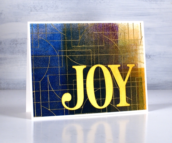
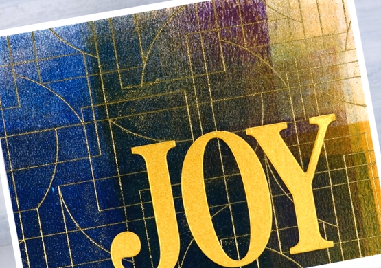
The Magic of Brusho
Posted: November 4, 2025 Filed under: Background Stamps, Brusho, contemporary, cricut, Penny Black | Tags: Brusho, brutus monroe embossing powder, cricut, Fabriano Watercolour Paper, Penny Black stamps 5 Comments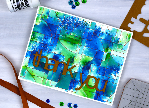
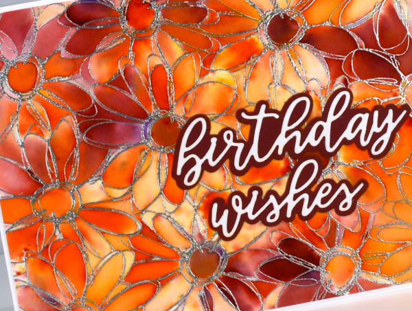
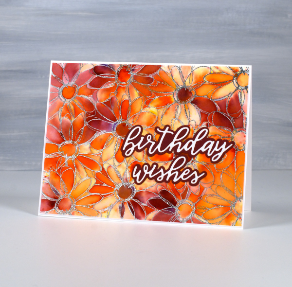
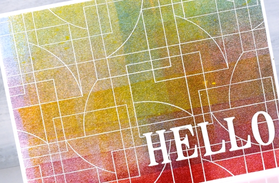
I’ve said it before but here is more evidence, Brusho watercolour paint powders make magic! I embossed the ‘contemporary‘ background stamp from Penny Black in a copper colour (I think it was ‘Penny‘ from Brutus Monroe) on hot pressed watercolour paper.
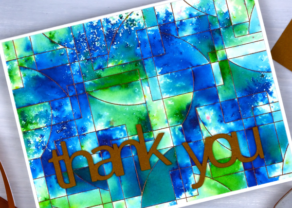
You can see the pattern in the background stamp is made up of curved and straight edged shapes. The embossing creates enclosed spaces on the panel and the the brusho powders get trapped in the spaces.
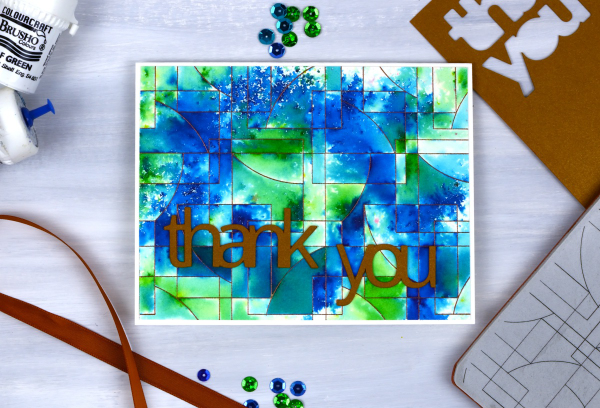
There are a couple of ways to trap brusho in an embossed design, you can spritz the embossed panel with water then sprinkle some brusho over the top, or you can sprinkle the brusho first then spritz. I often end up doing a bit of both. For this panel I think I spritzed some water first then sprinkled both blue and green brusho over the wet areas. My aim was to keep some sections blue, some green and others a mix of the two colours. I also wanted some areas to look speckled and other sections to look softly blended. Less water keeps things speckled; more water gives the paint more time to dissolve and blend.
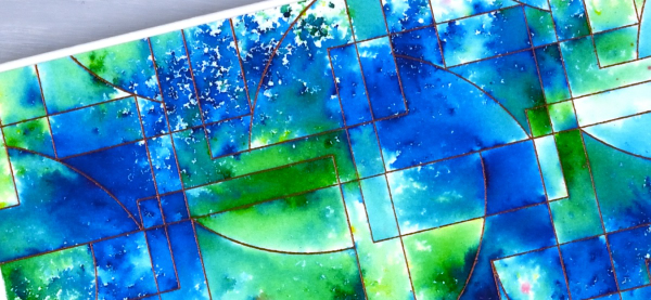
I had some bronze shimmery cardstock which matched the embossing powder so I cut the ‘thank’ and ‘you’ on the cricut. I stacked two layers so the words would stand out from the busy background.
Feathered Edges
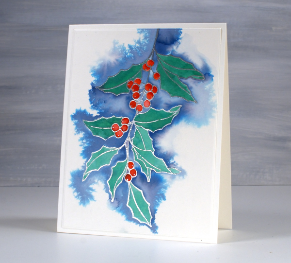
Posted: December 23, 2024 Filed under: holly berry branch, Penny Black, poinsettia poem | Tags: brutus monroe embossing powder, Penny Black stamps, Ranger Distress inks, Staedtler watercolour brush pens 2 Comments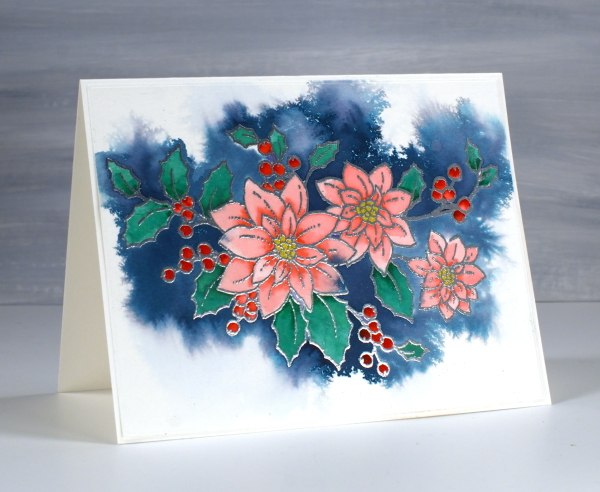
I had fun recently experimenting with a feathering technique to add background to embossed line images. This pretty stamp from Penny Black is poinsettia poem embossed in silver powder on Fabriano hot pressed watercolour paper.
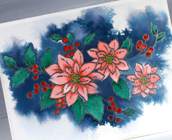
Before adding any colour I spritzed the embossed panel with water. I then picked up chipped sapphire distress ink from a mat where I had smooshed the ink pad. Carefully I touched the tip of the inky brush to the area outside the embossing; the ink spread wherever there was water around the image.

I let the whole panel dry before moving on to painting the flowers, berries and leaves using watersoluble brush tip markers.
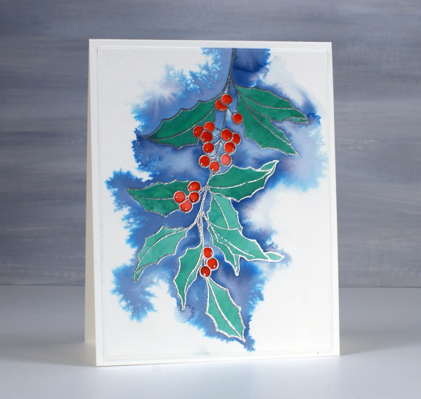
Above and below is another image that worked well with this technique; it’s holly berry branch from Penny Black. This time I used faded jeans ink for the background which is a lighter, less purply blue resulting in paler blues overall.
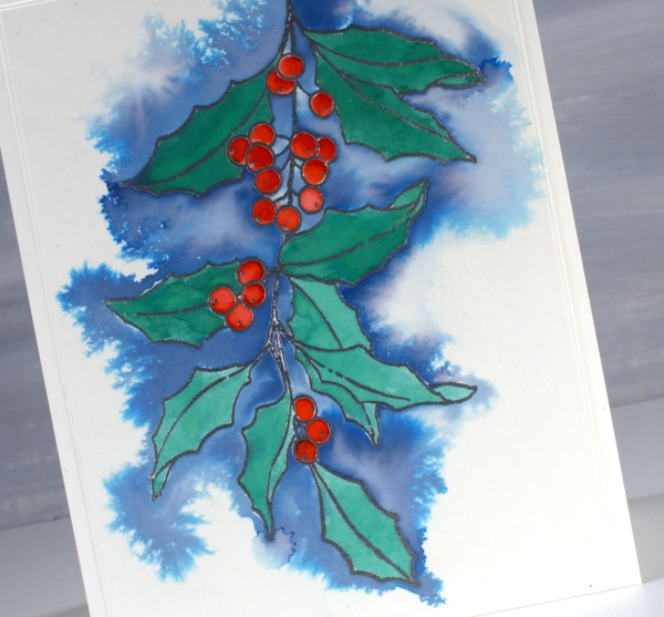
This is definitely a technique I will continue to experiment with; the feathery patterns that appear when ink flows across the wet paper are my kind of watercolour!
This post includes affiliate links from Foiled Fox and Scrap’n’Stamp . If you buy through these links I receive a small commission at no extra cost to you.
Brusho Daisies
Posted: July 19, 2024 Filed under: Brusho, daisy delight, Darkroom Door, Spellbinders | Tags: Brusho, brutus monroe embossing powder, Darkroom Door stamps, Spellbinders 7 Comments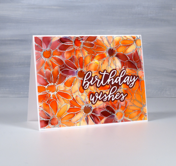
Yesterday I did some embossing with a friend and, as I was introducing her to brusho paints, I remembered how much I like the emboss resist technique with brushos. I don’t do too much heat embossing these days because of the gritty mess of embossing powder that ends up on my desk even when I am careful. But the results with brusho…
I embossed the Darkroom Door ‘daisy delight’ stamp on hot pressed watercolour paper with sterling embossing powder. I spritzed the panel with water then sprinkled orange and crimson brusho powders over the top. The trapped colour is just what I hoped for.
I added a Spellbinders sentiment from the die set, ‘Serenade Sentiments‘ to complete the card. So maybe it is worth getting gritty occasionally. This post includes affiliate links from Foiled Fox. If you buy through these links I receive a small commission at no extra cost to you.
Birthday butterflies
Posted: March 31, 2023 Filed under: Brusho, Butterflies, Darkroom Door, this way | Tags: Brusho, brutus monroe embossing powder, Darkroom Door stamps 8 Comments
Darkroom Door has just released an amazing new collection of stamps so I will be showing off a few of them in the coming weeks. The narrow arrow stamp named ‘this way’ motivated me to pull out the brusho powders. Brusho is wonderful when used with embossed patterned stamps where the paint crystals can get trapped. I used both ultramarine and emerald green brusho on this card.

I embossed the ‘this way’ stamp in white powder on hot presssed watercolour paper then sprinkled brusho on top and spritzed water from above to get the colours activated. I also painted the black embossed butterflies with brusho but was a bit more strategic in my paint blending.

I popped some gold cord behind the butterflies and tucked a tiny DD birthday sentiment in as well. This slim border stamp is very versatile and in future posts I will be sharing how I used it with cars, motorbikes and a lighthouse!
(Compensated affiliate links from Foiled Fox, Scrap n Stamp)
Ransom Alphabet cards
Posted: December 14, 2022 Filed under: Brushed Christmas vol 1&2, Brutus Monroe, Darkroom Door, ransom alphabet | Tags: brutus monroe embossing powder, Darkroom Door stamps, WOW embossing powders 6 Comments
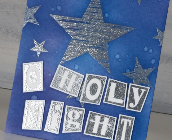
Darkroom Door recently released the ‘ransom alphabet’; it looks like letters cut from random newspapers or magazines. I decided not to cut my stamp into separate letters yet, so stamped it as one large stamp containing both alphabet, a few symbols and numbers 1-10. I embossed one sheet in gold powder and another in silver. I also stamped again on some small strips of cardstock to get the extra letters I needed to complete the greetings.
Both cards and alphabets are neenah solar white cardstock. I stamped a tree and star from the Darkroom Door ‘Brushed Christmas vol 1’ set then blended three greens over the card front using blending brushes. I spritzed water over the panel then blotted it with a paper towel to get a twinkly effect. A pearlized spray would have been even better but my workroom is upside down and inside out at present so locating the shimmer spray was asking too much!

I used the same process to create the ‘O Holy Night’ card but used a blue and a purple ink for the blended background. I wondered if the ransom alphabet was perhaps a bit too funsy for such a theme but then I remembered Mark 10:45, ‘the Son of Man came not to be served but to serve, and to give his life as a ransom for many.”
I’m looking forward to putting this set to use in my art journal. I think it might be necessary to cut the rubber stamp into separate letters eventually but for now it is still one large stamp.
Darkroom Door has so much inspiration on their blog. They are currently featuring all the products from their new release one product at a time. So many styles, colour schemes and projects.
(Compensated affiliate links from Foiled Fox, Scrap n Stamp & Ecstasy Crafts)
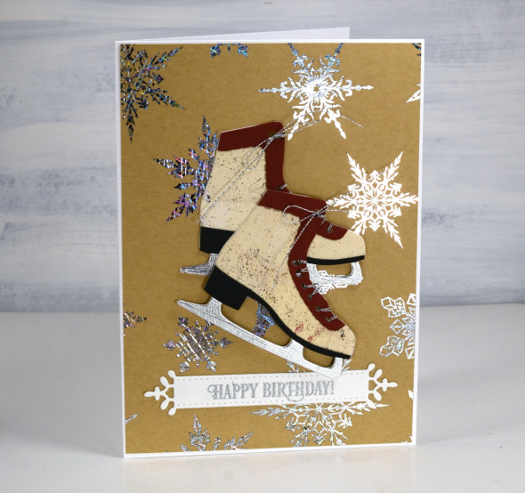
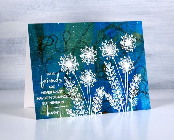
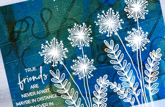
Let’s Skate
Posted: November 22, 2022 Filed under: birds and banners, Brutus Monroe, Dies, Echidna Studios, Foiling, layered Xmas wreath die set, let's skate, Penny Black, silver sketch deco foil, snowflake digital stamp set, stocking stuffers | Tags: Brutus Monroe, brutus monroe embossing powder, digital stamps, Echidna Studios, Foiling, Penny Black creative dies, Penny Black stamps 4 Comments
Don’t let that blog post title trick you. I won’t ever be the one saying, “Let’s Skate”! I will happily say, “Let’s make cute cards with skates on them.” My less than stellar skating experience ended when my children became proficient and I realised I didn’t have to get out on the ice and wobble around any more.

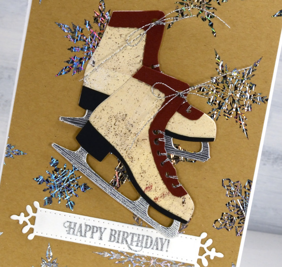
These lovely skate dies are from Penny Black and I was thrilled when I saw them. I have been using them in the Christmas card class I’ve been teaching but decided to make a few vintage looking pairs with various pieced layers. Quite unusual for me to piece layers but I do like how they turned out. On card above I filled them with die-cut foliage.
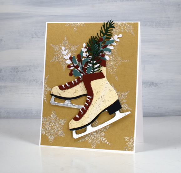
Both pairs of skates are popped up on snowflake backgrounds printed then foiled from my daughter’s snowflake designs available in her Etsy store. I printed the file on kraft paper on my laser printer then foiled in white on the piece above and Brutus Monroe silver foil on the design below.

The vintage style cream colour I used for the boot is a gel print, black cardstock for the heel, silver for the blade and some burgandy for the trim. Fiddly but worth it in the end.
These skates look really cute cut from patterned or collaged paper too. Not cute enough to make me want to skate though!
(Compensated affiliate links from Foiled Fox, Scrap n Stamp & Ecstasy Crafts)
Watercolour Whale
Posted: December 6, 2021 Filed under: Pink Ink Designs, whale | Tags: brutus monroe embossing powder, Pink Ink Designs, sennelier watercolours 7 Comments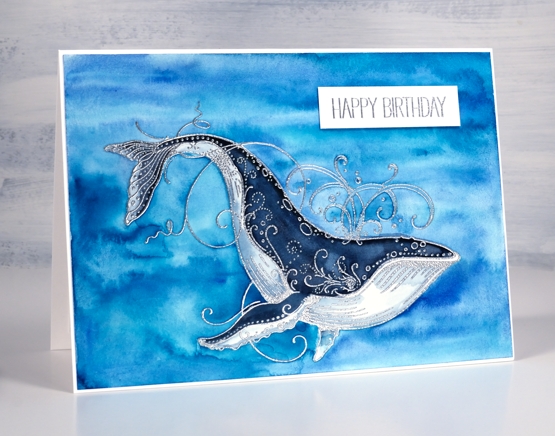
I don’t make many cards for children so I’m sometimes at a loss for the right theme. The whimsical and beautiful animal stamps from Pink Ink Designs have helped me out several times, and not just for children. This one, simply titled ‘whale’ from their nautical series is lovely to paint or colour. Last time I used it I coloured with Faber-Castell polychromos pencils on kraft cardstock.
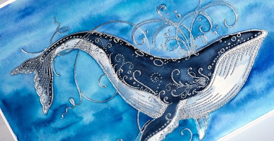
For this card I embossed with Brutus Monroe sterling embossing powder on hot pressed watercolour paper then painted with Sennelier watercolour paints. I painted the water first with a mix of blues, then the whale with my darkest blue mixed with some Paynes grey to darken it even further.

I’ve only seen whales up close once and that was not very close. My family went on a whale watching boat off the coast of Grand Manan Island and saw only a few whales but a beautiful sunset. My brother and sister-in-law see them regularly from their balcony!
Supplies
(Compensated affiliate links used when possible)
Floral Focus in pencil
Posted: July 5, 2021 Filed under: Brutus Monroe, floral focus, Heather lowercase die set, Inktense pencils, Pink Fresh studio | Tags: brutus monroe embossing powder, Inktense, Pink Fresh studio 7 Comments
Last week I shared a card featuring the Pinkfresh Studio background stamp, ‘floral focus‘ watercoloured with Karin Markers. Today I have another card with the same stamp but pencil coloured this time using Derwent inktense pencils. At some point I should do pencil colouring on white or cream cardstock again but I am still in love with the look of pencil on kraft. Inktense pencils are watersoluble but you can also use them as traditional pencils with no water added, that’s what I did here.
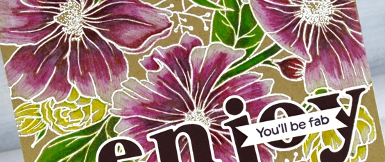
I embossed the background stamp in white powder, another technique that looks great on kraft cardstock then used the inktense pencils to fill the flowers and leaves. The flowers are coloured with red violet, fuchsia and antique white. The leaves and stems I did with felt green and apple green and the small flowers are coloured with sun yellow and antique white.
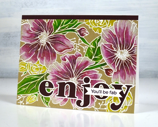
To finish the card I added a strip of violet cardstock and cut letters from the same cardstock with the Pinkfresh ‘Heather lowercase letter’ dies. The little sentiment is from PF set ‘scripted bold sentiments. You might think this is an odd pairing of sentiments; I was thinking it would suit someone starting something new, some encouragement along with a reminder to enjoy the experience.
Supplies
(Compensated affiliate links used when possible)
Gel print backgrounds
Posted: June 14, 2021 Filed under: Brutus Monroe, contemporary, gel press, perfumed | Tags: brutus monroe embossing powder, gel press, gel printing, Penny Black creative dies, Penny Black stamps, WOW embossing powders 8 Comments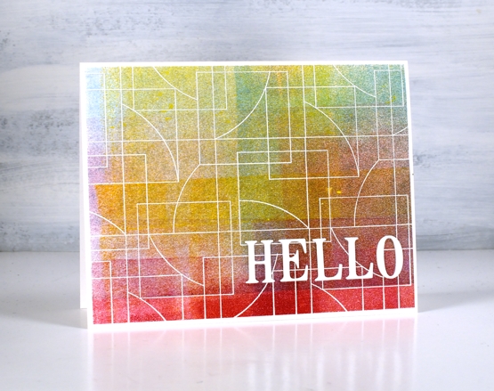
I have had my gel plate out recently and I am addicted. It is what happens when I get it out. Gel printing can be frustrating because some of the prints are a whole lot of nothing much while others are full of pattern, texture and colour. I never know whether the next print will be the former or the latter so I keep on printing. I have a stack of prints sitting around and I decided it was time to cut a few up to make cards. I added some stamping and die-cuts.
This first card is my favourite but I must be honest with you, it isn’t a gel print. It is the scrap paper I cleaned the brayer on! I love how pretty the colours and blends are but I’m a bit miffed that my clean up page was prettier than many of my prints!
To turn it into a card I stamped and embossed the PB ‘contemporary’ stamp in white and added the hello, cut with the PB ‘thanks & hello’
Same deal with this background but embossed with gold and adorned with the PB ‘jumbo joy’ die.
I’m glad to add another card to my very small Christmas card stack. My resolution to add to it every month seems to be a bit off and on.
This background is a recent print and includes a fun thread printing technique I saw on Birgit Koopsen’s instagram. She recently completed a challenge gel printing every day in May. She generously shared all the techniques she tried.
I added flowers from the PB ‘perfumed’ set and a sentiment in white embossing powder.
I guess the title of this post was a bit inaccurate as only one of these cards features a gel print background! Watching beauty emerge when gel printing is so much fun. To glance over at my brayer clean up sheet and realise I have to save it because it looks like a pastel check table cloth is a bonus. To see the pale ghosts of stencils turn up on third or fourth prints also amazes me.
I did not participate in Birgit’s recent challenge as I was busy busy launching the new online Floral Faves class but now the gel plate is out I am challenging myself to post something gel-print related every day this week. See you tomorrow.
Supplies
(Compensated affiliate links used when possible)
Tropical florescence
Posted: May 3, 2021 Filed under: Brutus Monroe, florescence, Penny Black | Tags: brutus monroe embossing powder, Fabriano Watercolour Paper, Penny Black stamps, Ranger Distress inks 8 Comments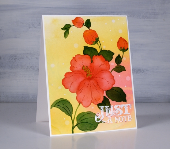
This is the second appearance of the beautiful hibiscus stamp from Penny Black (it’s called Florescence and it’s a stunner) and I’ve been working with it behind the scenes as I complete my next online class. To create this tropical look I smooshed worn lipstick and wild honey inks on my glass mat and spritzed water over them until they ran together then took a piece of hot pressed watercolor paper and swiped it through the diluted inks. To get good coverage and blends I tilted and spritzed more water on the panel then left it to dry.
With the panel in a stamp positioner I inked the large hibiscus and buds with worn lipstick ink stamped then inked the rest of the stamp with antique linen so I could see the whole image for some no-line watercolour. I painted one petal at a time with worn lipstick ink adding more towards the center of the flower. For the buds I used a mix of worn lipstick and wild honey.

For the leaves I stamped and painted with rustic wilderness distress and sometimes added worn lipstick to the blend so I’d have variation in the leaf colours.
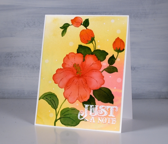
That little sentiment seemed to lend itself to the tropical, surf shop vibe so I stamped once in worn lipstick, then moved the panel ever so slightly down so I could stamp again in white to create a drop shadow look. I definitely dried it and used an anti static tool before sprinkling the white embossing powder over the words otherwise it could have all ended up white.
I’m so excited to have another online class in the works; the projects are all filmed so it’s editing time, supply list creating time and intro filming time. I’ll have more details, dates and sneak peaks for you soon!
Supplies
(Compensated affiliate links used when possible)