Gel print backgrounds – stripes and grid
Posted: July 20, 2021 Filed under: companions, Finetec paints, gel press, mountain magic, Penny Black | Tags: gel press, gel printing, Penny Black stamps 9 Comments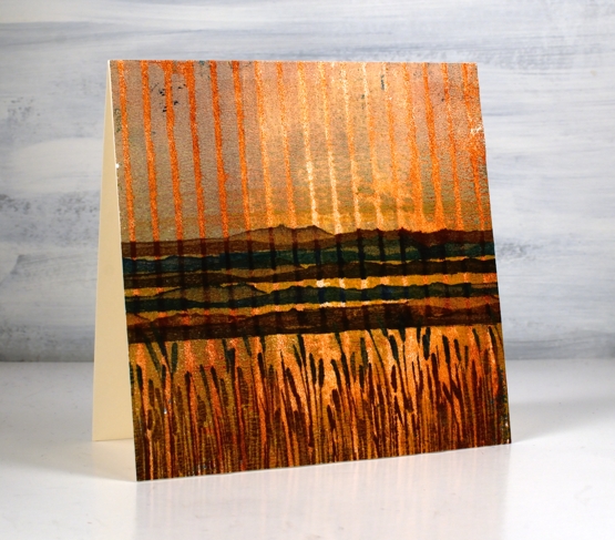
Yesterday I posted a gel printing video where I used both an egg carton and a piece of corrugated cardboard to add texture to my prints. I used a couple of the corrugated cardboard prints to make today’s cards.
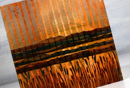
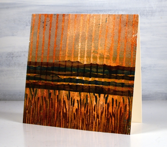
You can see how I printed this panel in the video. To turn it into a card I used a couple of new stamps from Penny Black. I stamped the mountain stamp five times in browns and blue then inked the rushes with a brown and a blue ink. I love the way it looks like a sunset or sunrise because of the background print. It wasn’t something I tried to create but a possibility I saw when looking at the prints.
The print below was made with the same piece of corrugated cardboard pressed down on the gel press twice to create a grid pattern. You can see the process in yesterday’s video. I decided to stamp flowers on it as an experiment. I knew it might be too much pattern but I wanted to try. I stamped and embossed the Penny Black ‘companions’ stamp in versafine clair nocturne ink and it looked bold just as an outline.
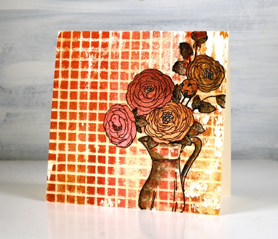
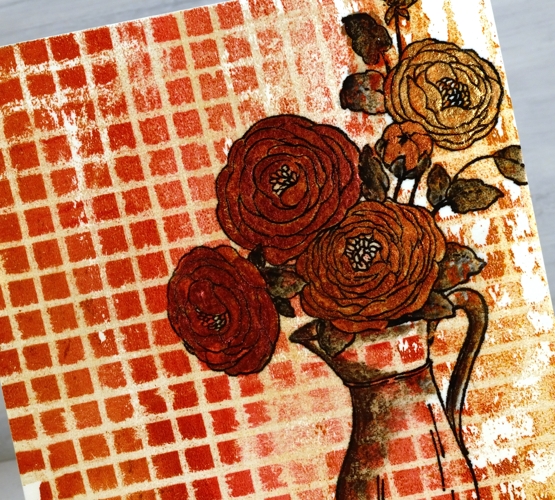
By painting inside the flowers I was able to separate them from the background enough to make them a feature not a competitor with the very busy grid pattern. I used a couple of layers of pearlescent paint on the flowers but quite diluted pearlescent black on the leaves and jug.
Tell me what ‘recycled’ items you have used for gel printing. I am keen to print with ‘all the things’! To be honest gel printing is top of my list of techniques right now. I hope you enjoyed the two recent gel printing videos. I will definitely make more. Tomorrow I have a couple of cards made from the piece of cardstock I used to clean my brayer. I showed a glimpse of it at the end of the video.
See you soon.
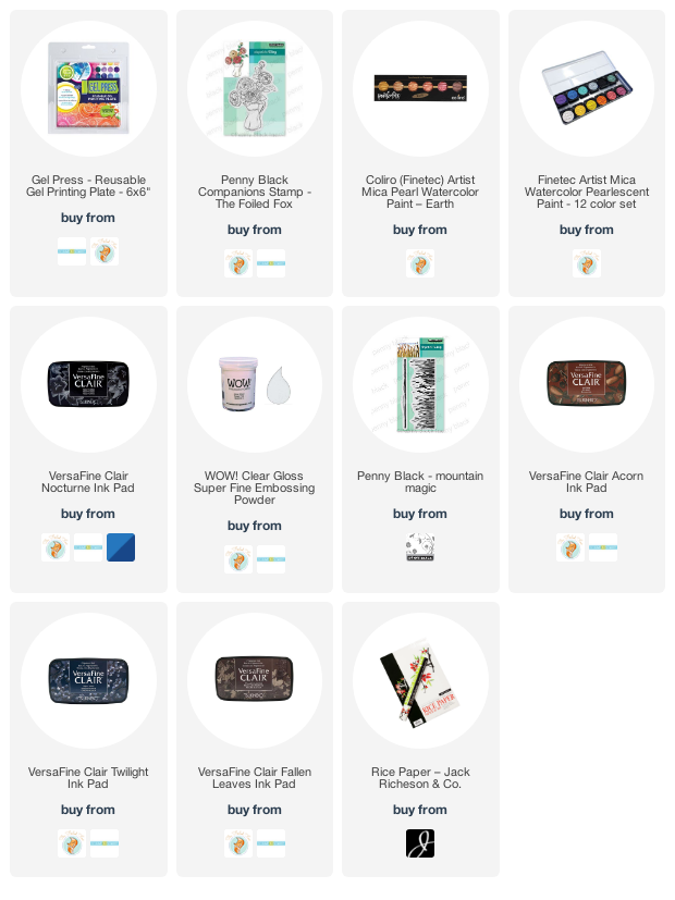
Supplies
(Compensated affiliate links used when possible)
Gel Printing with recycled cardboard
Posted: July 19, 2021 Filed under: carved leaves, Darkroom Door, gel press, layered Xmas wreath die set, Penny Black, sleigh, Tutorial | Tags: Darkroom Door stamps, gel press, gel printing, Penny Black creative dies, Penny Black stamps, video 8 Comments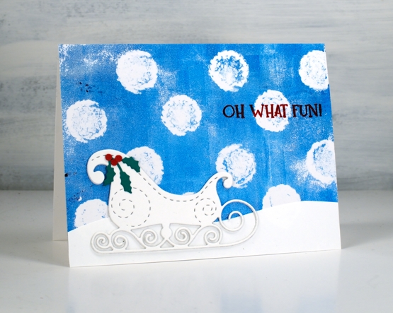
I posted a video last week featuring gel prints with stencils. In today’s technique video I use cardboard found at home. One piece was the packaging for eggs and the other a piece of corrugated cardboard.
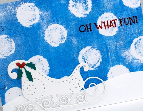
The huge snowballs falling in the card above were printed using the large circles on the egg carton. I could have done more on the gel plate with extra colour or texture but I kept it simple which works well behind the more intricate sleigh. You can see my process in the video below.
The card below also features a gel print background made with an egg carton but I pulled two prints on the one panel both with green and white paint and egg carton circles.
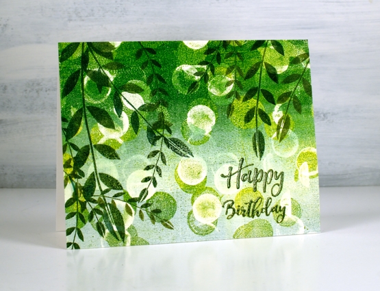
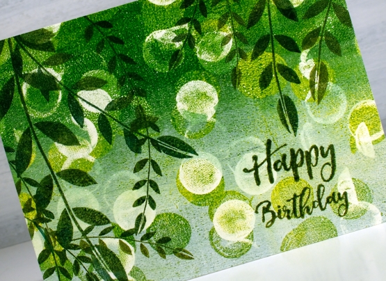
The card below also features a gel print background made with an egg carton but I pulled two prints on the one panel both with green and white paint and egg carton circles. I stamped leaves from the Darkroom Door stamp set, ‘carved leaves vol 1’ over the bokeh-like circle background. To get the right tones of green in the stamping I used both shady lane and rain forest versafine clair inks one over the top of the other. The sentiment is from the ‘happy birthday’ sentiment strip.
In the video I also made prints with a piece of corrugated cardboard pressing it down on the gel press once for a striped pattern and twice for a grid pattern. I’ve turned a couple of those prints into cards which will be on the blog tomorrow. I hope you try gel printing with some recycling you find at your place. See you soon.
Supplies
(Compensated affiliate links used when possible)
Captivating Blue
Posted: June 30, 2021 Filed under: captivating, Catherine Pooler inks, Penny Black | Tags: Catherine Pooler inks, Penny Black stamps, Ranger Distress inks 8 Comments
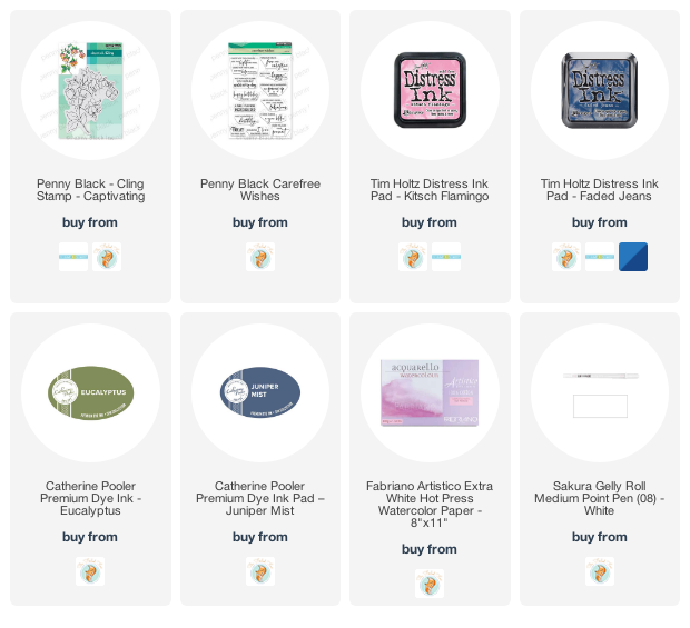
I’ve been creating backgrounds for landscape stamping lately often by smooshing a few inks on my glass mat, diluting the ink then swiping the watercolour paper through it. The background for this floral card was done the same way and features faded jeans and kitsch flamingo distress inks plus some scattered salt for subtle patterns.
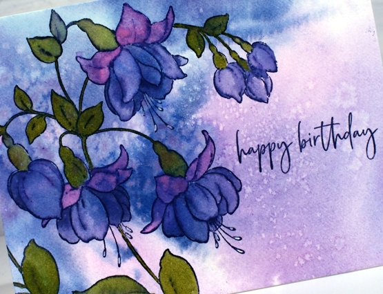
I stamped the Penny Black ‘captivating’ stamp in Catherine Pooler ‘juniper mist’ ink then blended the stamped ink to fill all the lower petals of the fuchsias. I painted the upper petals with kitsch flamingo and the leaves with CP eucalyptus ink. For the tips of the little stamen I used a white gel pen.
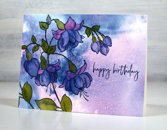
With all the pattern in the background I kept the sentiment simple with part of a stamp from the PB ‘carefree wishes’ set in CP juniper mist.
This stamp features in one of the lessons included in my Floral Faves online class where I teach a range of techniques for use with floral stamps. It’s a self paced class where you can access the video content at your own convenience.
Supplies
(Compensated affiliate links used when possible)
Country scene
Posted: June 25, 2021 Filed under: arbors, Penny Black, snow fence, Stamped Landscapes | Tags: Fabriano Watercolour Paper, Penny Black stamps, Ranger Distress inks 7 Comments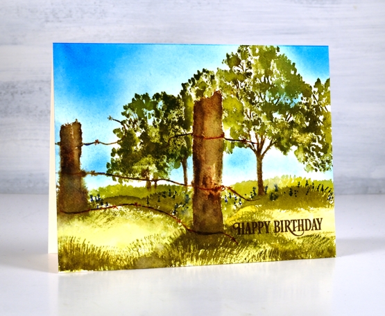
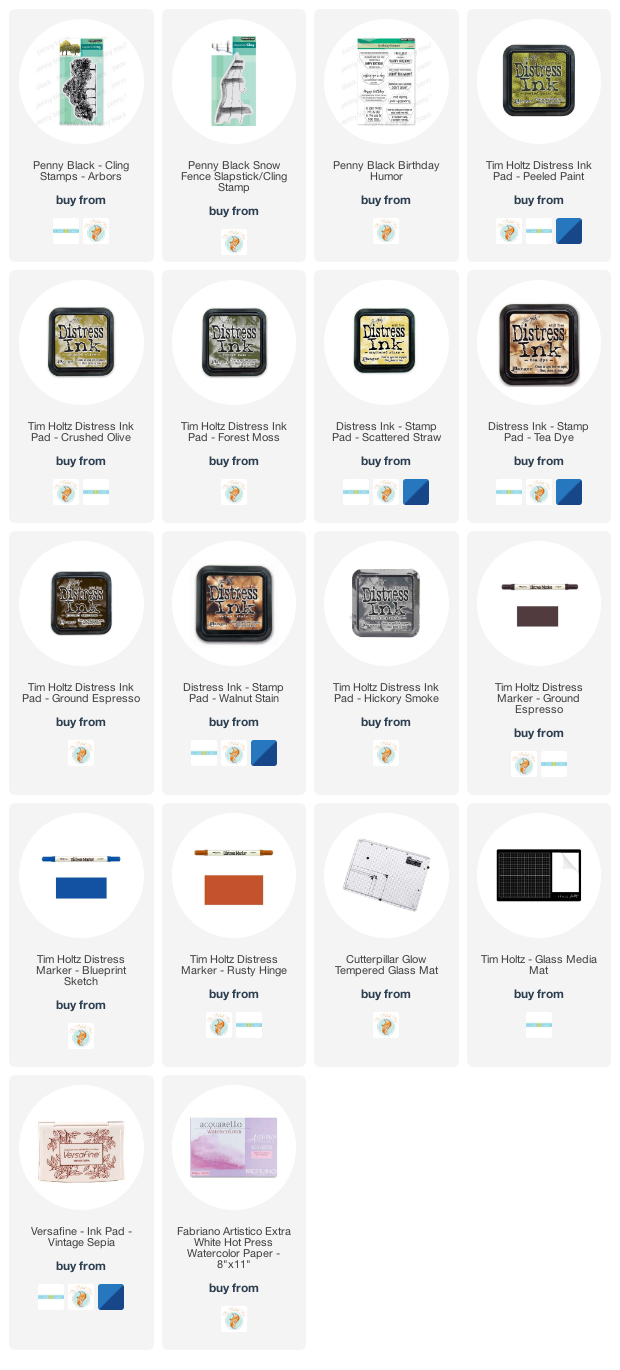
Another stamped scene, this one a little closer to home than the desert in the previous post. I paired the PB ‘arbor’ and ‘snow fence’ stamps to create a pastoral scene. I worked on hot pressed watercolour paper using distress inkpads and markers as my ‘watercolour paints’.
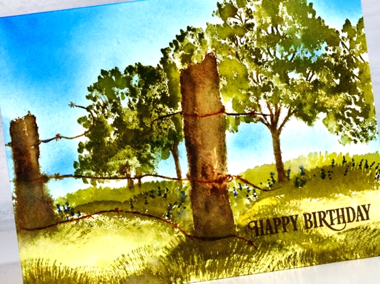
As the fence posts are in the foreground I stamped them first in a mix of browns, black and grey then blended on paper with water. Once the posts were dry I inked the trees in a few greens and brown avoiding the area behind the fence post. I should have masked the posts but I was feeling a bit lazy so I just inked and stamped several times getting closer each time to the post without stamping over it.
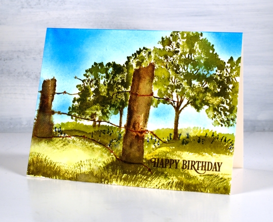
Once the trees were completed I painted a light wash of crushed olive and peeled paint inks over the ground area then used a fan brush which I’ve left untouched for years to paint grass in both forest moss and peeled paint. For a bit of interest I added blue dots to look like flowers under the trees. My stash of birthday cards is looking low so I added a partial sentiment from the birthday humor set. Are you a scenic stamper? What are your favourite techniques for bringing scenes to life.
Supplies
(Compensated affiliate links used when possible)
Desert Sky
Posted: June 23, 2021 Filed under: desert dream, Stamped Landscapes | Tags: distress markers, Fabriano Watercolour Paper, Penny Black stamps, Ranger Distress inks 7 Comments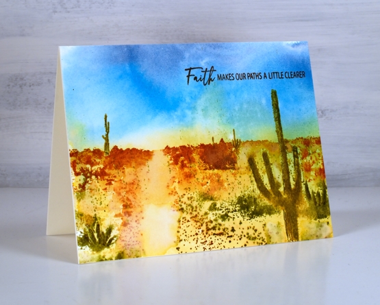
After creating some gel printed landscapes I was inspired to return to another technique I enjoy: creating landscapes with scenic stamps. Sometimes I combine scenes to create a new landscape or stamp additional elements, other times I stamp a single complete landscape as shown in this ‘desert dreams’ stamp. It was released a few years back but this is the first time I’ve inked it. Before getting to the stamping I created the painted background which included a two tone blue sky and two toned desert floor. I smooshed distress inks on my glass mat, spritzed water over the ink and swiped the watercolour panel through to pick up colour.
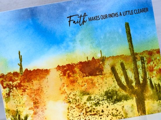
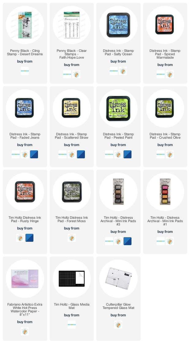
Once the panel dried I did the stamping in a stamp positioner so I could build up the colour and picture bit by bit. I started by inking the cacti with crushed olive and peeled paint markers, the distant foliage with rusty hinge and the foreground foliage with peeled paint and forest moss. I spritzed the stamp but also used a paint brush and occasional spritz on the panel.
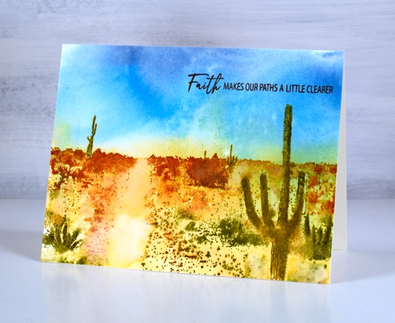
You can see my finished design doesn’t contain fine details but the overall feeling is a hot day in the desert day among some bold contrasting scenery. I finished the card with a sentiment from the PB ‘Faith.Hope.Love’ set.
To see more scenic stamping take a look at these posts: Arbors, Pumpkins, Fields of gold and Beloved view.
Supplies
(Compensated affiliate links used when possible)
Craft Roulette
Posted: June 21, 2021 Filed under: garden variety, Penny Black | Tags: craft roulette, distress markers, Penny Black stamps, Ranger Distress inks 10 Comments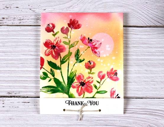
I had the opportunity to participate in Craft Roulette on Friday night. If Craft Roulette is new to you (as it was to me until a month ago) it is a live crafting improv game show hosted by Mary Gunn every Friday night on Youtube. She has a different guest each week, sometimes more than one, and they craft together. Every week the parameters for the card are different as the wheel is spun four times, once for type of card, then colour choices, a theme and finally a random element.
I was delighted to see familiar names from this blog pop up in the live chat; thank you so much for joining in. Although I could not respond to all the chat I went back and read through it yesterday and was so encouraged by your kind words. I know some of you stayed up very late to watch!
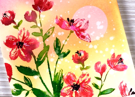
The wheel was pretty kind on Friday night and none of the parameters took me too far out of my comfort zone. The card style was MATCHBOOK ( I needed a refresher on that), colours were RED +2, theme was MORNING and the random element was SPLATTERS! You know I love splatters.
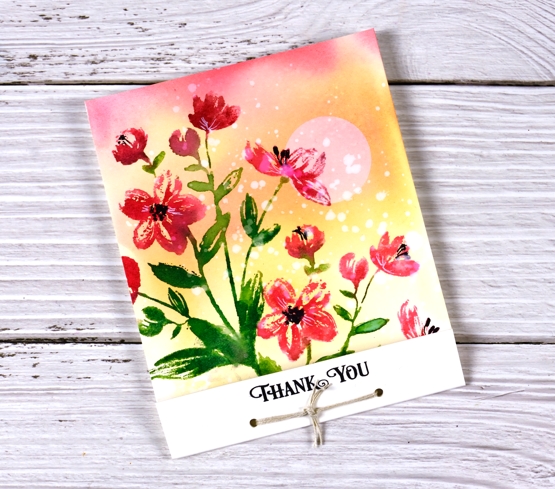
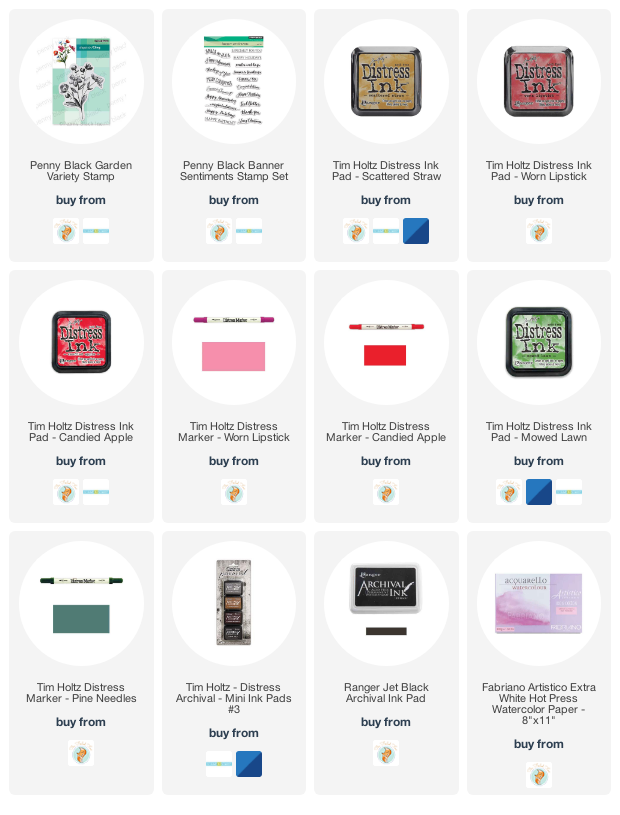
I chose to create a background sunrise, add some red and green flowers (PB garden variety) then add splatters with water at the end. My three colours were red + green and yellow. The evening was very enjoyable; Mary is a hoot, the viewers on live chat were the loveliest and being live on the interwebs was not as daunting as expected. I might just attempt my own live creating on youtube from time to time.
As the challenge unfolds, viewers are encouraged to make a card following the same parameters. Some viewers watch and create as the show progresses but most make and post their cards after watching the show. Everyone has until Sunday evening to submit their creations. The cards are all shared during the show the following week. Contributors are entered into a few prize draws at the end of the show. So you see, Craft Roulette is a happening place, full of fun and inspiration and worth checking out on a Friday night. To see how I created this card you can watch the replay here.
Supplies
(Compensated affiliate links used when possible)
Gel print backgrounds
Posted: June 14, 2021 Filed under: Brutus Monroe, contemporary, gel press, perfumed | Tags: brutus monroe embossing powder, gel press, gel printing, Penny Black creative dies, Penny Black stamps, WOW embossing powders 8 Comments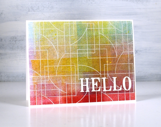
I have had my gel plate out recently and I am addicted. It is what happens when I get it out. Gel printing can be frustrating because some of the prints are a whole lot of nothing much while others are full of pattern, texture and colour. I never know whether the next print will be the former or the latter so I keep on printing. I have a stack of prints sitting around and I decided it was time to cut a few up to make cards. I added some stamping and die-cuts.
This first card is my favourite but I must be honest with you, it isn’t a gel print. It is the scrap paper I cleaned the brayer on! I love how pretty the colours and blends are but I’m a bit miffed that my clean up page was prettier than many of my prints!
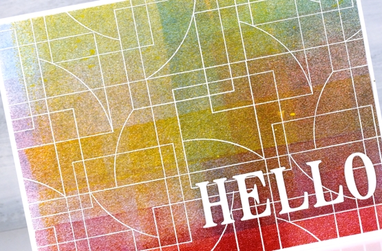
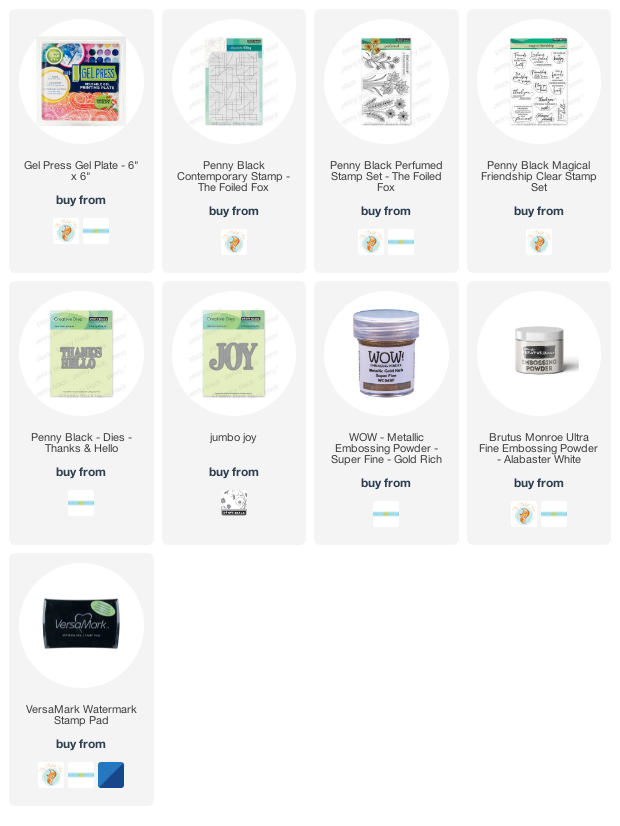
To turn it into a card I stamped and embossed the PB ‘contemporary’ stamp in white and added the hello, cut with the PB ‘thanks & hello’
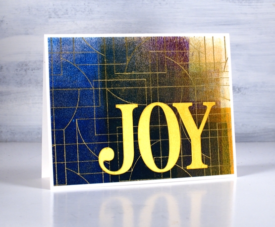
Same deal with this background but embossed with gold and adorned with the PB ‘jumbo joy’ die.
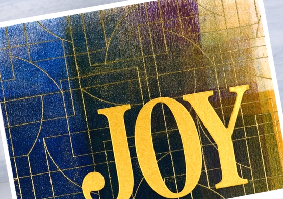
I’m glad to add another card to my very small Christmas card stack. My resolution to add to it every month seems to be a bit off and on.
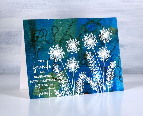
This background is a recent print and includes a fun thread printing technique I saw on Birgit Koopsen’s instagram. She recently completed a challenge gel printing every day in May. She generously shared all the techniques she tried.
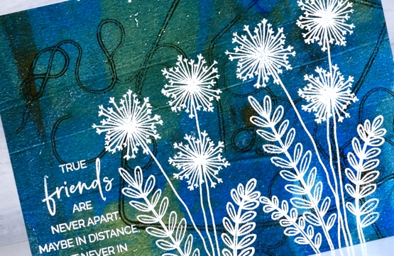
I added flowers from the PB ‘perfumed’ set and a sentiment in white embossing powder.
I guess the title of this post was a bit inaccurate as only one of these cards features a gel print background! Watching beauty emerge when gel printing is so much fun. To glance over at my brayer clean up sheet and realise I have to save it because it looks like a pastel check table cloth is a bonus. To see the pale ghosts of stencils turn up on third or fourth prints also amazes me.
I did not participate in Birgit’s recent challenge as I was busy busy launching the new online Floral Faves class but now the gel plate is out I am challenging myself to post something gel-print related every day this week. See you tomorrow.
Supplies
(Compensated affiliate links used when possible)
2021 BuJo – June theme
Posted: June 4, 2021 Filed under: Bullet Journal, delight, Dingbat notebooks, Penny Black | Tags: Bullet Journal, Dingbats notebook, Gina K inks, Penny Black stamps, Staedtler watercolour brush pens 3 Comments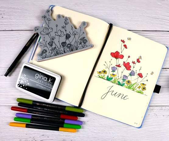
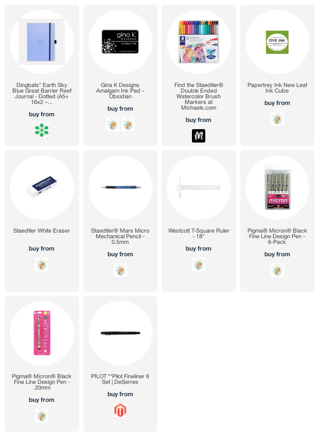
New month, new bullet journal theme. I chose the PB delight stamp because it is just that, delightful. I also tried colouring with markers, just colouring no water blending! The journal pages are very smooth and a decent weight but nothing like watercolour paper so I’ve been hesitant to do much blending with water. I used Staedtler brush pens which are water-based ink and coloured the flowers and leaves as minimally as possible.
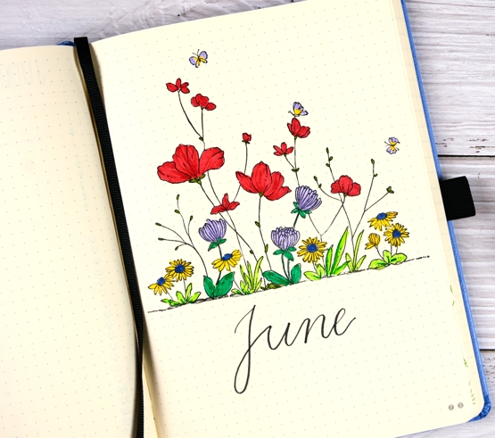
The red tended to go through the paper a bit but only where I had layered ink over ink. I stamped the image first in Gina K obsidian amalgam ink which doesn’t bleed when water based ink touches it. Stamping without a stamp positioner is not something I do very often any more, it was a bit nerve wracking but it worked ok. I didn’t put the stamp on an acrylic block, I just pressed it down with my hand, that way I could apply pressure to the whole stamp bit by bit.
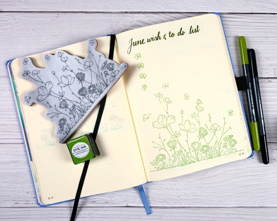
For the wish & to do list I just stamped in Papertrey ‘new leaf’ ink and repeated the butterflies for list items. By the way for the first time this year I completed all items my wish & to do list in May! Of course the big item was launching the new online course but there were birthday cards made and sent on time which is rather surprising for me!
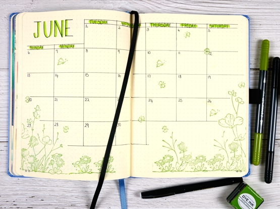
I used ‘new leaf’ ink again on the calendar page along with a pilot fineliner for the grid, a micron pen for the days of the week and staedtler brush pens for the shadows over the letters.
Supplies
(Compensated affiliate links used when possible)
Daisy Sunshine
Posted: May 28, 2021 Filed under: dancing daisies, Penny Black | Tags: distress markers, Fabriano Watercolour Paper, Papertrey ink, Penny Black stamps, Tsukineko Versafine inks 11 Comments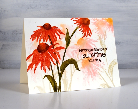
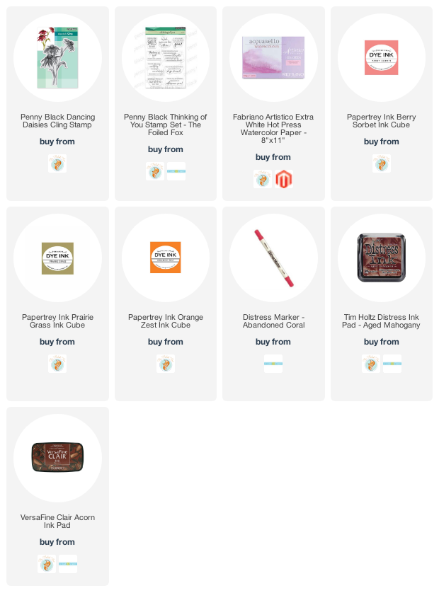
Last week I asked what your favourite floral stamp was and several people mentioned PB ‘dancing daisies‘. That was all the motivation I needed to get it inked up. I used the same technique for today’s card as I did for a recent lilac card. I inked the stamp with three ink colours (listed below), spritzed and stamped on hot pressed watercolour paper. Without re-inking I spritzed the stamp again and stamped another print then another spritz, another pale watery print. I dried the panel a little then dipped it in a bucket of water. The result was the background you see in pale colours.
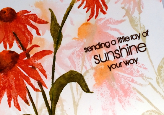
I made sure the panel was totally dry before putting it in a stamp positioner to do a bold focal print. I used the same colours berry sorbet for petals, orange zest for centre and prairie grass for leaves and stems. I stamped a second time adding aged mahogany shadows on the flower centre and abandoned coral definition on the petals. I did some blending with a paint brush but not on all the stamping.
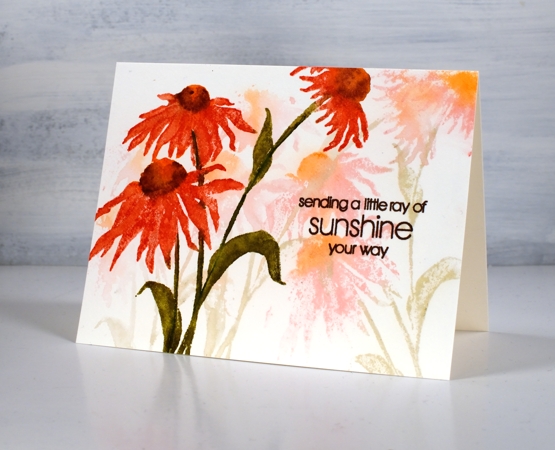
I finished the panel with a sentiment from PB ‘thinking of you’ in acorn versafine clair ink. I’m glad to have been reminded about dancing daisies; it’s a lovely stamp which I’ve used a few times over the years.
Supplies
(Compensated affiliate links used when possible)
One colour floral
Posted: May 26, 2021 Filed under: Catherine Pooler inks, Penny Black, thriving | Tags: Catherine Pooler inks, Penny Black stamps 5 Comments
I know I’ve been talking a lot about FLORAL FAVES, my new online class, but today’s post is not all about a favourite stamp or a favourite technique. Today the star is my favourite colour. I am team blue all the way! Some might consider this particular blue a bit sneaky because it dilutes to pink and purple tones but I just consider it clever. The way this design turned out with overlapping flowers in shades of blue reminds me of a piece of clothing my mother had when I was very young, perhaps a skirt. My mother was definitely team blue as well!
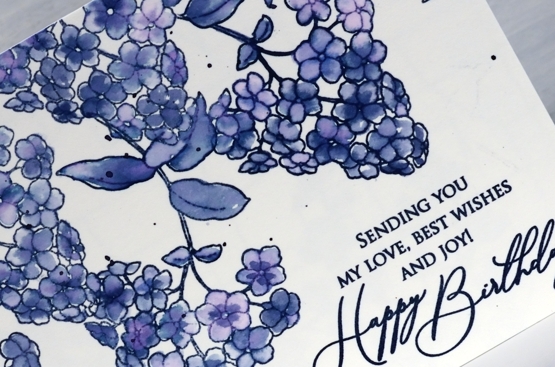
Juniper Mist ink from Catherine Pooler is one of those magical inks that separates into several different colours. It might not be quite as magical as Memento northern pine, but it’s definitely up there.
Using a stamp from the transparent PB set ‘thriving’, I stamped what might be a lilac several times on hot pressed watercolour paper with juniper mist and painted each flower and leaf with water. I didn’t spend long on the painting so it’s a little messy but that’s the style for this one. As I painted I varied the amount of water I blended with, added extra ink for some flowers and dabbed other ones. Dabbing away wet ink when using juniper mist leaves a pink print.
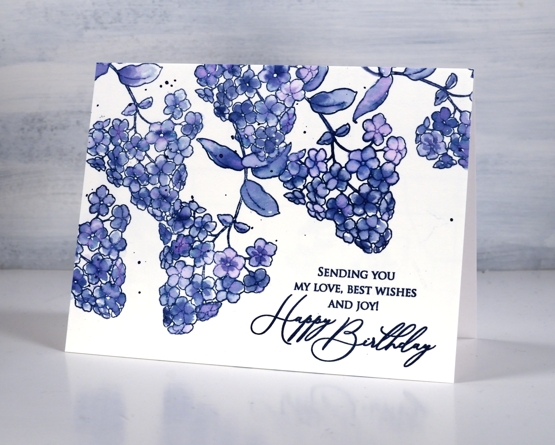
I’m keeping it floral here on the blog for a while longer to celebrate the launch of my new online class FLORAL FAVES. Thank you to everyone who has joined already. The lesson content is all available now so dive in!
Supplies
(Compensated affiliate links used when possible)