At Ease
Posted: August 11, 2021 Filed under: at ease, Penny Black | Tags: Penny Black stamps, Ranger Distress inks 21 Comments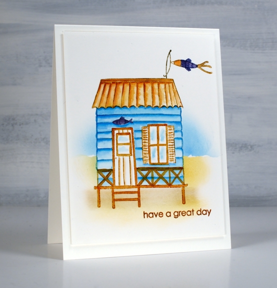
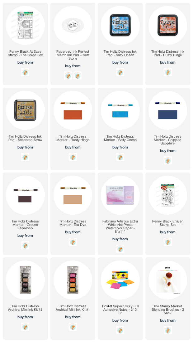
Wouldn’t you love to have a sweet beach hut like this one? To be honest I would love to be at the beach, hut or not! Instead I am enjoying a great summer with just the perfect mix of hot and warm days. The garden is growing and it is great to be outdoors. To celebrate the joys of summer I have teamed up with the Foiled Fox to host a Summer Giveaway.

If you like this beachy theme make sure you pop over to the Foiled Fox blog. I am blogging there today but you can also catch the cute starfish card Shauna posted recently.
I kept things clean and simple for this beach hut card, it wasn’t my first go with the PB ‘at ease’ set; I completed a couple of other panels using more colours and elements in the scene. I think this simple approach is my favourite.
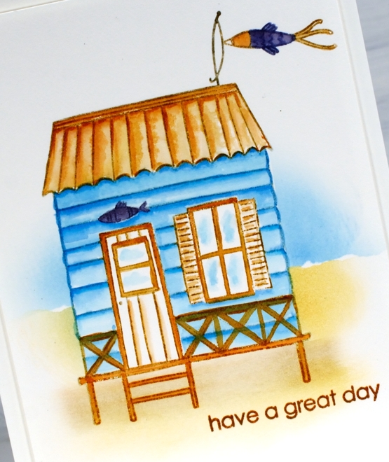
I stamped the hut in soft stone ink and did further stamping with distress inks. I used the salty ocean, rusty hinge and chipped sapphire distress inks to paint the hut, roof and railings as well as the fish decorations.
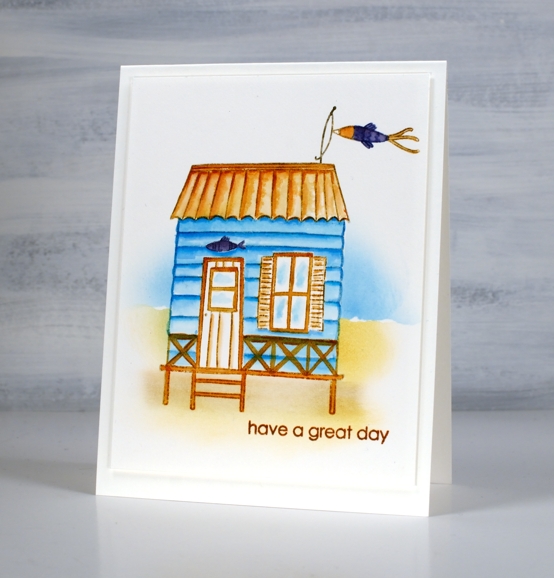
To add a background I placed some post-its over the hut so I could blend some ink for the sand and water. I used the torn edge of a post it to mask while blending. As I often do I popped up the panel on the same colour cardstock for a subtle ‘shadow’ frame. I added the sentiment from PB ‘enliven’ set because nothing says ‘great day’ to me like a beach themed card!
Make sure to leave a comment below telling me your favourite summer activity. I’ll put you in the draw to win a little spending spree at The Foiled Fox store!
Supplies
(Compensated affiliate links used when possible)
Sunset Over Wetlands Video
Posted: August 9, 2021 Filed under: mountain magic, Penny Black, Stamped Landscapes | Tags: Penny Black stamps, Ranger Distress inks 9 Comments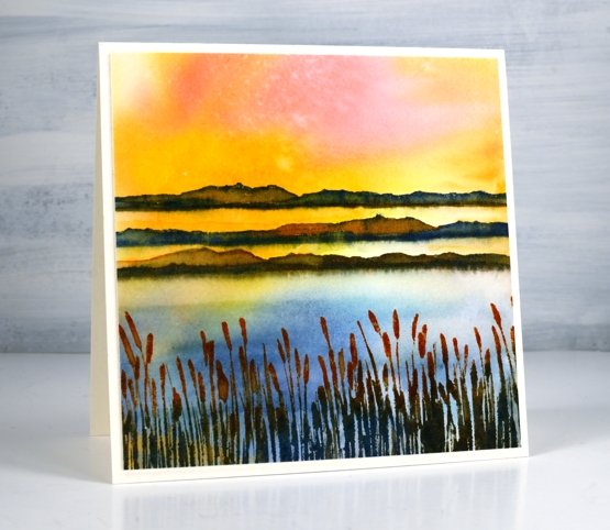
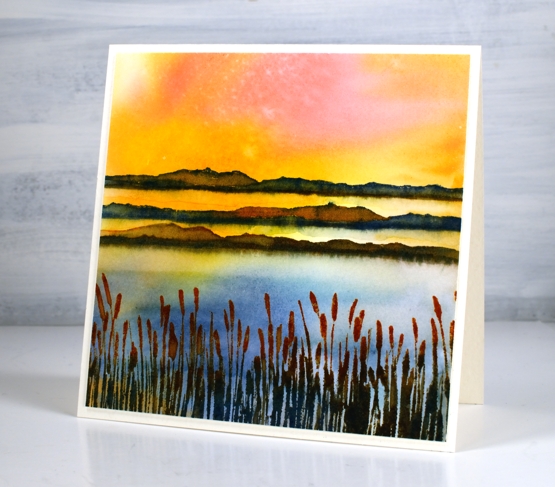
Scenic stamping can be so much fun and working with the new ‘mountain magic’ set from Penny Black is proving to be delightful. Even though the set mentions mountains, in this card I am using the wide hilly stamp to represent island strips in a wetlands environment when the sun is setting and hitting both water and land.
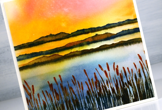
Once again I did the sunset sky first by swiping the watercolour paper through diluted ink. It is not possible to control the result with this method but it is possible to create stunning skies. Take a look at the video below to see the whole process.
I really enjoy working with scenic stamps, especially switching the time of day or time of year with colour choices and arrangement. I also like to look through my scenic and nature stamps in order to add more elements to the scene. I will be doing that with these two simple stamps from the ‘mountain magic’ set.
Hope today’s video inspires to you to swipe a pretty sky and stamp some scenery over the top!
Supplies
(Compensated affiliate links used when possible)
Lakeside Wander
Posted: August 6, 2021 Filed under: Stamped Landscapes, wander | Tags: Fabriano Watercolour Paper, Penny Black stamps, Ranger Distress inks 10 Comments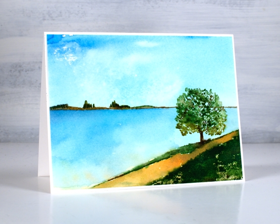
When I receive new scenic stamps from Penny Black I love creating a variety of scenes. I like to change mood and location first with colour and later with the addition of other scenic stamps. Both scenes in today’s post feature only one stamp, the new ‘wander’ cling stamp.
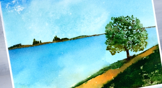
The stamp includes both the distant hills and the foreground with a tree. The space in between can be interpreted by the stamper to include whatever they wish. I have chosen to make it water in both my cards perhaps a river, a lake or ocean inlet.
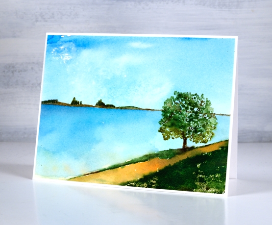
To make both scenes I created a smooshed ink sky first. For the sunny sky and water above I smooshed salty ocean, scattered straw and mowed lawn on my glass mat then swiped the watercolour panel through the diluted ink. For the moodier panel below I smooshed faded jeans, mowed lawn and tea dye to create my background.
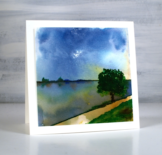
Once the sky dried I stamped the scenic stamp inking it with a mix of distress inkpads and markers. I add colours a bit at a time to build up dimension sometimes spritzing the stamp to move the inks and other times blending the stamped inks with a paint brush
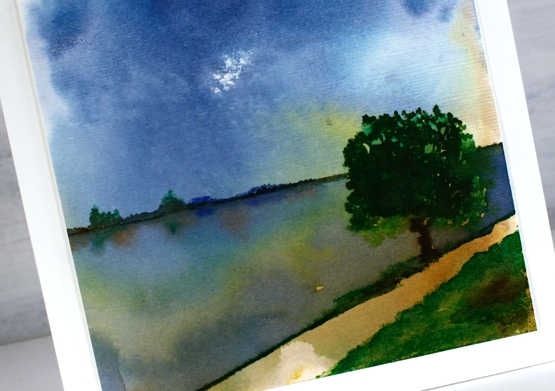
To add reflections to the second scene I painted over the water with hmmm, water so I could drop ink into the wet area below the land and trees.
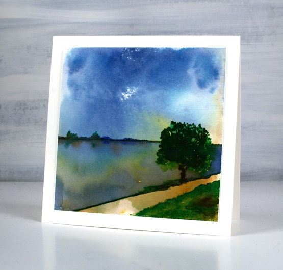
When I had finished the panel above I gave it some texture with the ‘subtle’ embossing folder so it looks like it has a canvas finish. The two cards definitely show different moods, the first being bright and sunny, the second darker but with drama in the water and sky. Which do you prefer?
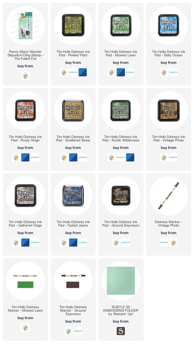
Supplies
(Compensated affiliate links used when possible)
Seashells
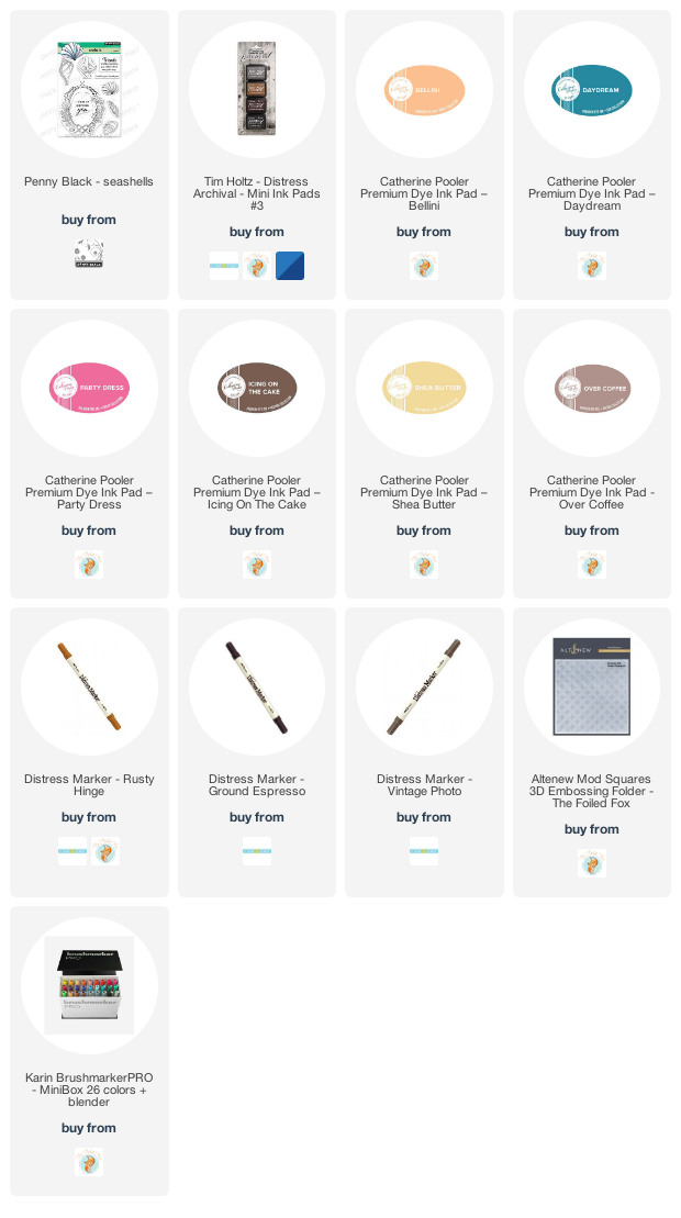
Posted: August 4, 2021 Filed under: Catherine Pooler inks, seashells | Tags: Catherine Pooler inks, distress markers, Penny Black stamps 8 Comments
Penny Black recently came out with new stamps that had me daydreaming of the beach. I was a shell collector as a child and still love wandering the shore looking for seashell beauty when I get the chance.
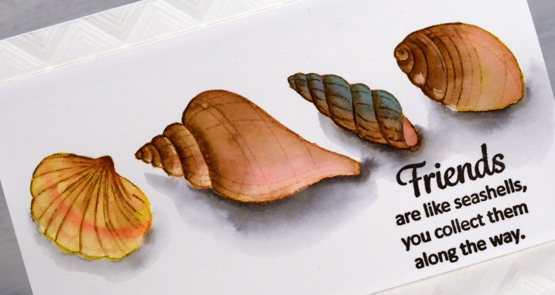
To bring these clear stamps to life I stamped initially in various colours of Catherine Pooler ink then blended out the colours to fill the shells. I smooshed the inks on my glass mat so I could use it as a palette and featured brown inks in all four shells but added different colours to make each one stand out a little. After blending colours for a while some of the initial detail was lost so I used a few distress markers to add some lines back in.
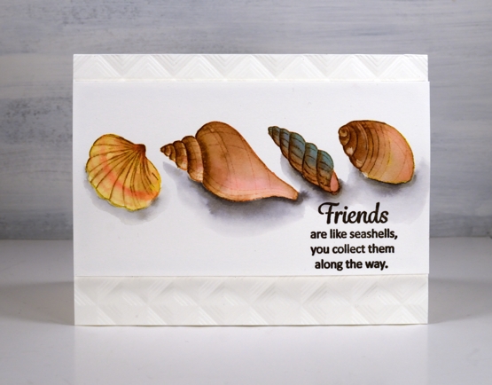
Once the shells dried I used a warm grey Karin brush marker to add shadows below the shells. I drew around the base of each shell in grey then blended it out with water before adding extra grey right beside the shell for depth.
I popped the panel up up an embossed background made with the ‘mod squares’ folder from Altenew.
Oh I would like to be beside the seaside!
Supplies
(Compensated affiliate links used when possible)
Gouache skies
Posted: August 2, 2021 Filed under: Gouache, Penny Black, snowy village, soulful silhouettes | Tags: Gouache paints, Penny Black stamps, Tsukineko Versafine inks 9 Comments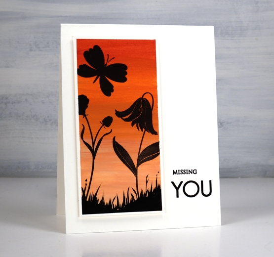
Some of you may remember me mentioning a while back an interest in trying gouache paint. The Foiled Fox kindly sent me some to try and I have been learning and practicing the techniques over the last couple of months. I am sharing over on their blog today so make sure you visit to read more about my process. Gouache is an opaque acrylic paint with some similarities to watercolour paint. It is possible to dilute with water until it becomes somewhat transparent but it is more common to see it used in its opaque form. I watched several videos to learn what to do (and what not to do!) and will continue to experiment.
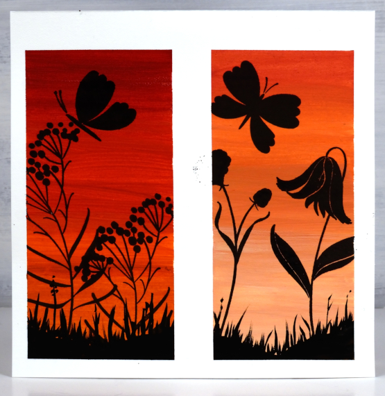
One key fact I learnt after trying to paint with several colours right out of the tube is the need to mix with a little water to get a creamy consistency. Another important thing to note is that unlike watercolour, where I add water to get a lighter shade, with gouache I add white paint. In the photo above you can see two panels side by side. I taped the watercolour paper with washi tape and painted the one on the left without adding white paint to the red and orange paints used. For the one on the right I added white to both the red and the orange increasing the amount of white to get the lighter colour at the bottom.
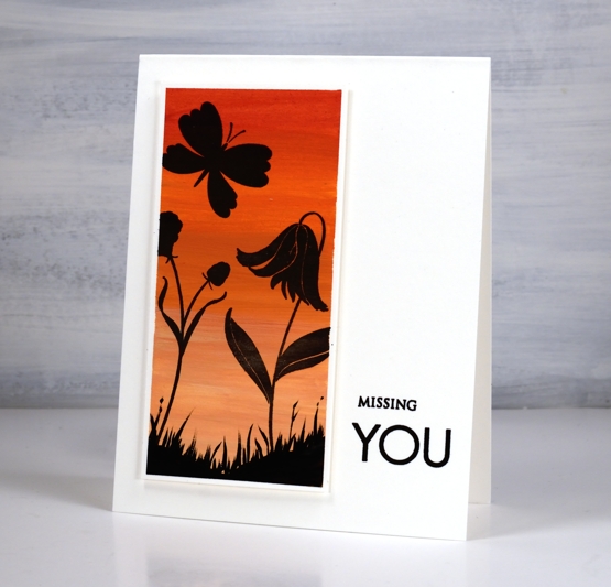
I also included the photo of the uncut panel so you could see how well the washi tape masked against the paint but was not thick enough to keep out all the versafine clair nocturne ink.
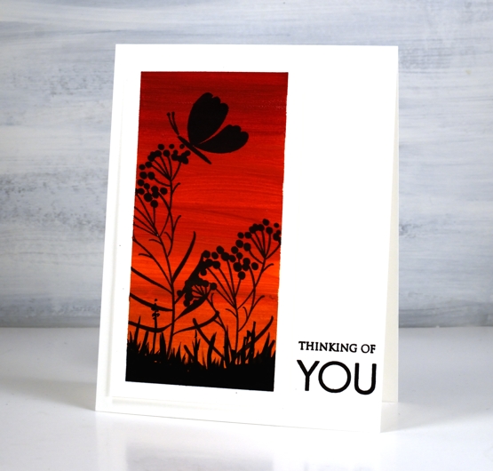
To turn the painted panels into scenes I used PB ‘soulful silhouettes’ stamped in nocturne versafine clair ink. It stamped really well on the gouache.
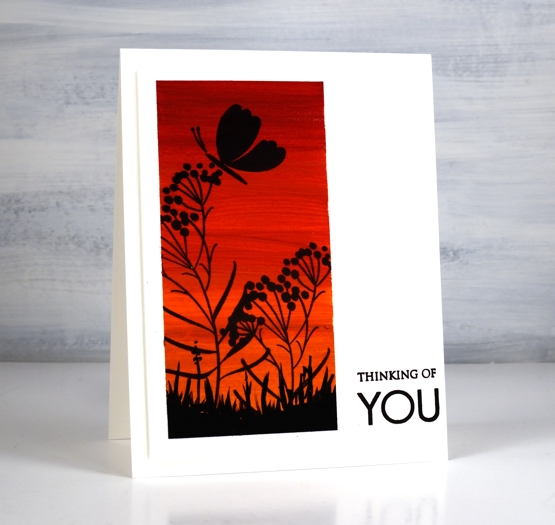
I popped up the panels and added sentiments using the PB ‘only you’ sentiment set.
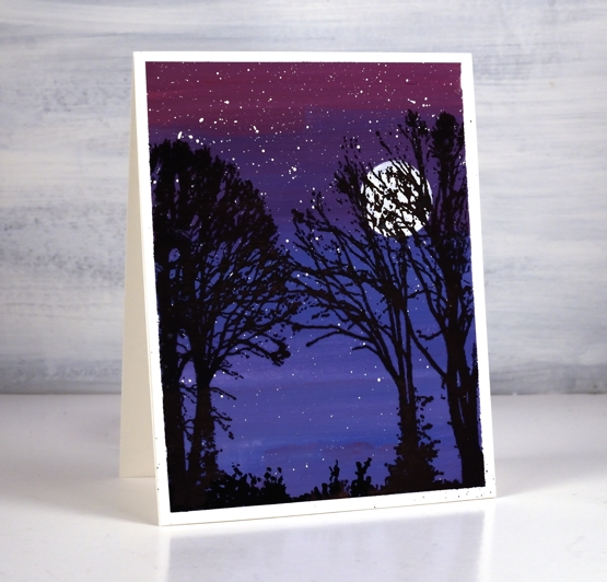
After some success with the warm toned panels I taped off a larger one and used blues and red to create a gradated purple sky. Although it is quite dark I did mix white paint with each of the colours used. ( I listed the paint colours used on the Foiled Fox post)
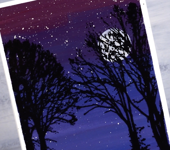
Once the background sky paint dried I splattered white gouache for stars then painted a circle for the moon. Once again the nocturne ink worked beautifully over the painting as I stamped trees from the PB ‘snowy village’ set.
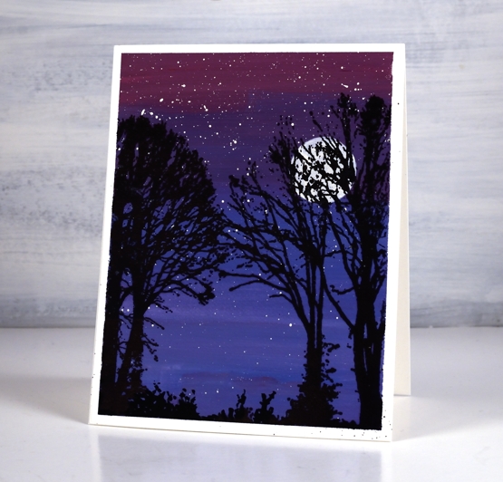
I finished all three panels by painting some black foliage along the base to look like grass and plants.
Let me know if you use gouache either for cards or other purposes. I have a few projects I hope to try as I continue to learn more about the medium. Thanks for dropping by.
Supplies
(Compensated affiliate links used when possible)
2021 BuJo – August theme
Posted: July 31, 2021 Filed under: Bullet Journal, Dingbat notebooks, Hand lettered, perfect pairing | Tags: Bullet Journal, Dingbats notebook, Papertrey ink, Staedtler watercolour brush pens, Tsukineko Memento inks 5 Comments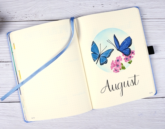
This might be a first, having my month theme set up and ready to share before the month has even started! I wanted to include butterflies as the garden has been attracting quite a few. I’ve been enjoying both blooms and wings.
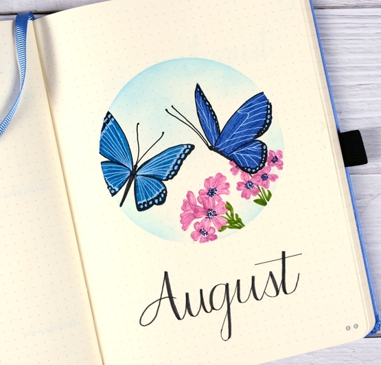
I masked the circle with an ‘express-it mask it sheet then stamped butterflies and flowers from the PB ‘perfect pairings’ set with soft stone ink. Before colouring I added memento summer sky ink with a blending brush.
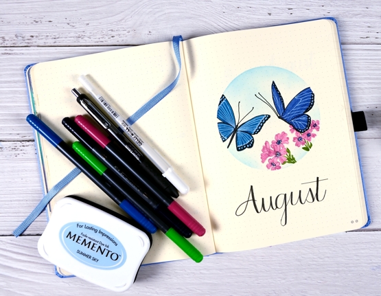
As I did the last two months I used markers to colour the flowers and butterflies; I am still new to (non-blended) colouring with markers. Usually when I use markers for colouring I add a little ink then blend it with water to fill a space. As the bullet journal pages do not handle water in the same way as watercolour paper I’ve avoided water blending.
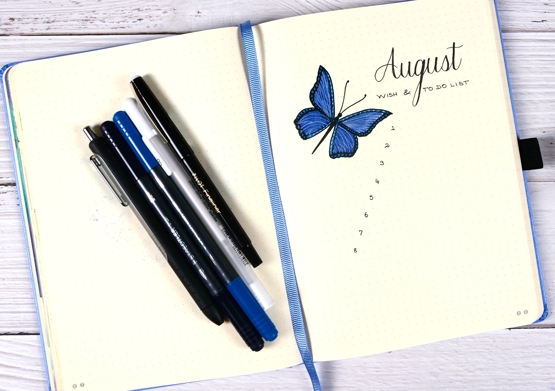
On both the title page and list page I filled the wings with blue first then added all the details over the top with black and white gel pens. I switched to a pilot fineliner to do the numbers and lettering.
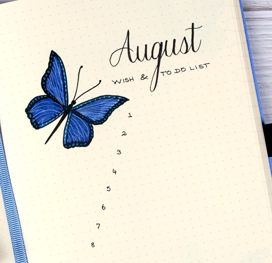
After prepping my August pages with flowers and butterflies it is time I headed out to my garden and did some real life tidying up. Thanks for dropping by.
Supplies
(Compensated affiliate links used when possible)

Work & Relax
Posted: July 30, 2021 Filed under: paws and relax, Peerless watercolours, zooming by | Tags: distress markers, Papertrey ink, Peerless Transparent Watercolors, Penny Black stamps 2 Comments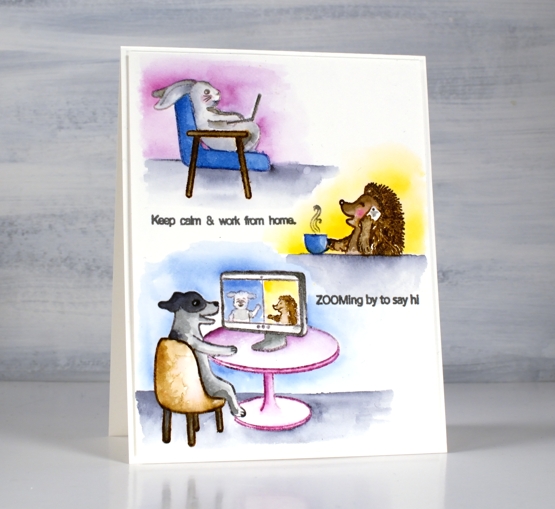
Are you surprised to see another critter post? Regular programming will resume I promise but first let’s enjoy Scooter and her friends working from home and pampering themselves!
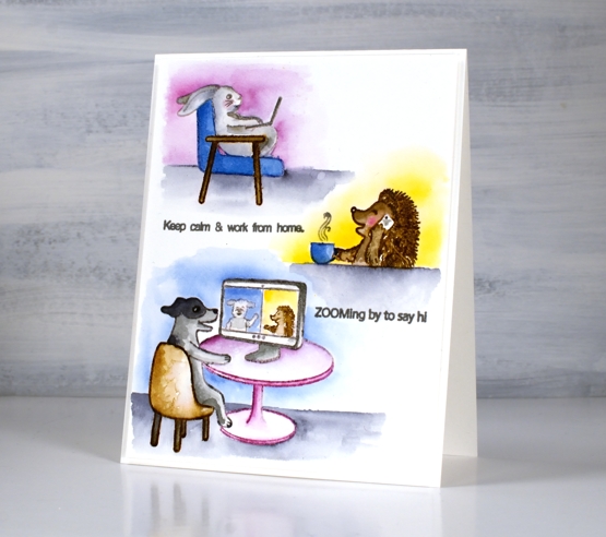
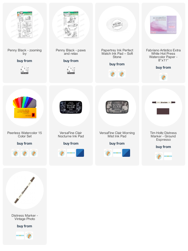
Once again I stamped the images with Papertrey ink’s soft stone. It is great for no-line watercolour. I used Peerless watercolours to paint the little scenes concentrating on a few main colours for each card. For the hedgehog I switched to brown distress markers, easier for getting all those spikes!
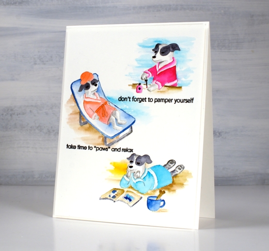
If you didn’t read it in my earlier post, Penny Black is donating some of the proceeds from the Scooter release to Muttville a rescue program for senior dogs.
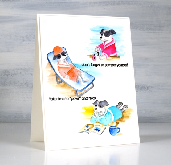
Hope you get to ‘paws & relax’ this weekend. It’s a long weekend here in Ontario!
Supplies
(Compensated affiliate links used when possible)
Hot Diggity
Posted: July 29, 2021 Filed under: doggone great, hot diggity dog, Peerless watercolours, Penny Black | Tags: distress markers, Peerless Transparent Watercolors, Penny Black stamps, Ranger Distress inks 4 Comments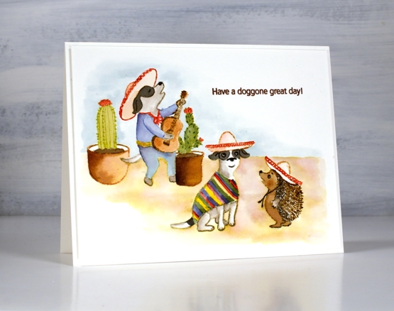
I have another cute Scooter card for you today. Once again I watercoloured, this time with distress inks. I think this is my favourite set from the release; what’s not to like about a canine mariachi band?
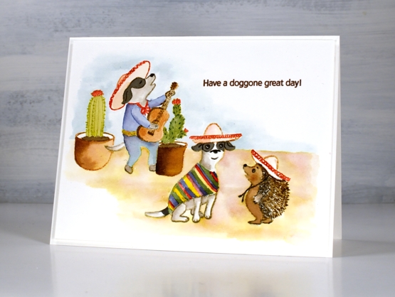
I stamped some images with soft stone ink then painted with distress inks. Other images, including the hedgehog I stamped in brown distress inks and blended them to fill the image. I painted the background with distress inks smooshed and diluted on my glass mat.
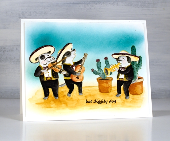
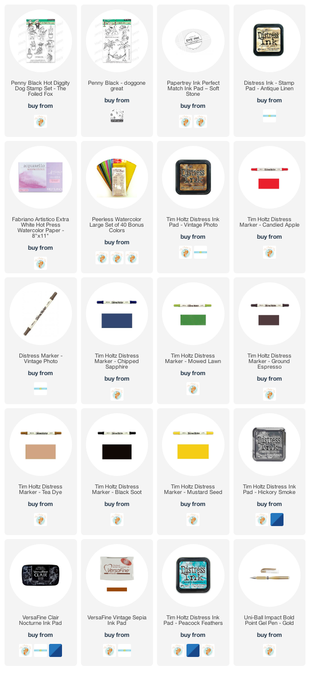
The second card I stamped in antique linen distress inks and stamped on masking paper also so I could create the scene with cacti in the background and one musician behind another.

I painted with peerless watercolour paints and added gold details with a gel pen. I used the masks a second time so I could blend ink over the background.
These Scooter scenes were definitely a departure from my nature (and book) themed projects but as a friend said to my yesterday, ‘always good to step out of your comfort zone!’
Supplies
(Compensated affiliate links used when possible)
Scooter
Posted: July 28, 2021 Filed under: Dies, gift card pocket, Karin brushmarkers, Penny Black, puptastic | Tags: Karin brushmarkers, Penny Black creative dies, Penny Black stamps 4 Comments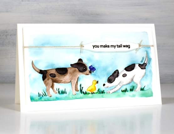
If you have visited the Penny Black blog lately you will have met Scooter; that’s her on the right. The Scooter release features a pup and her friends. The real life Scooter was part of the Penny Black family and now there is a range of stamps featuring her real and imagined activities. Penny Black is donating a portion of the proceeds from Scooter stamp set sales to Muttville a senior dog rescue program.
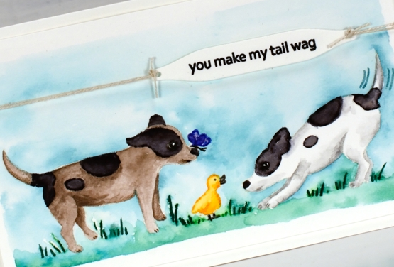
Unaccustomed to painting cute critters like Scooter it took me a while to get in the groove. For this little scene featuring stamps from the Puptastic set I stamped the outline images in papertrey soft stone ink then watercoloured with Karin brushmarkers. The sky and grass is also diluted ink from the Karin markers.
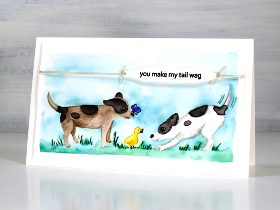
To complete the card I stamped the sentiment from the same set on a label cut with a tag from the PB ‘gift card pocket’ die set, tied it with twine and popped it up on dimensional tape.
Thank you for all your kind words about my garden pics. It really has become a relaxing pastime for me. I think because it is finally under control I can enjoy working on a patch for a short time or strolling around trimming off deadheads. It is no longer just about weeding!
Supplies
(Compensated affiliate links used when possible)
Landscapes from leftovers
Posted: July 21, 2021 Filed under: Dies, gel press, into the woods, Penny Black, tall trees | Tags: gel press, gel printing, Penny Black creative dies 7 Comments
In my recent gel printing video I kept a piece of heavy weight paper off to the side for cleaning my brayer. I turned it around half way through the printing session so it ended up browns on one side and blue/grey/yellow on the other.

The colour and texture was too yummy to waste so I cut two rectangles which both spanned the centre or ‘horizon’ line of the large sheet. Because the panel above has a dark sky I punched a circle moon from another area and made it a night scene with the addition of black silhouette trees die-cut with the PB ‘into the woods’ die.
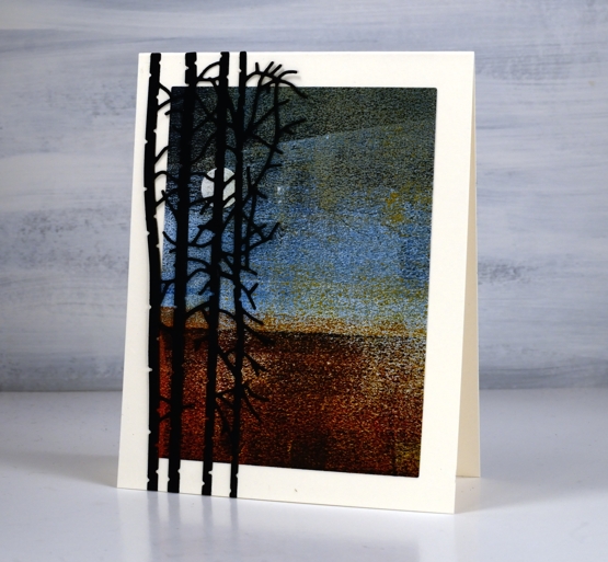
Not only is there plenty of visual texture in these panels the brayered paper is also very rough to touch. There is no trick to making these papers; I definitely don’t keep the clean up sheets every time but I find if I work with the same colours for a while and flip the sheet around when it has plenty of paint on it the combination of colour and texture can be beautiful.
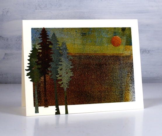
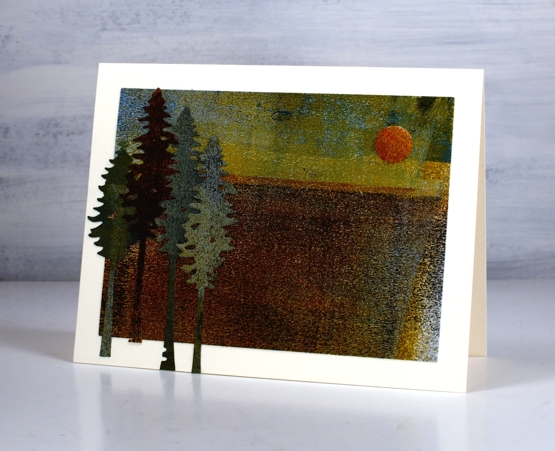
The second card is more of a late afternoon scene. The colour of the sun is similar to what we saw two days ago when the sky was hazy due to bushfires in northwestern Ontario.

The trees blend into the landscape somewhat as there is not a lot of contrast between the die cuts and the base. I used the PB ‘tall trees’ dies and cut them from the left over edges of the panel.
This is not the first time I’ve used scraps and scratch paper for cards and journal pages. This cityscape is made from gel printing masks and two of these cards are from a clean up sheet. Today I glued a large ‘clean up’ sheet into my art journal as a background for a future page. I don’t know what to do with it yet but I liked it too much to toss it away.
Supplies
(Compensated affiliate links used when possible)