
Lakeside Wander
Posted: August 6, 2021 Filed under: Stamped Landscapes, wander | Tags: Fabriano Watercolour Paper, Penny Black stamps, Ranger Distress inks 10 Comments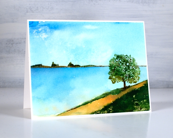
When I receive new scenic stamps from Penny Black I love creating a variety of scenes. I like to change mood and location first with colour and later with the addition of other scenic stamps. Both scenes in today’s post feature only one stamp, the new ‘wander’ cling stamp.
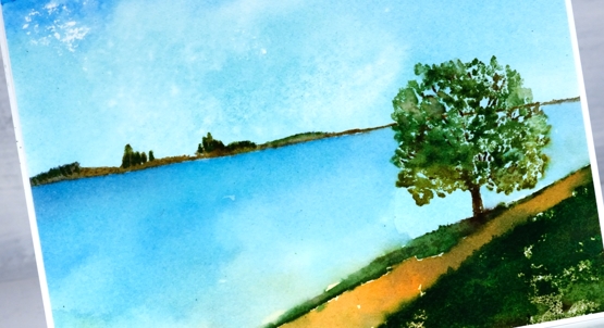
The stamp includes both the distant hills and the foreground with a tree. The space in between can be interpreted by the stamper to include whatever they wish. I have chosen to make it water in both my cards perhaps a river, a lake or ocean inlet.
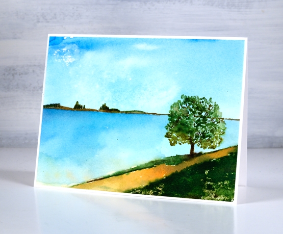
To make both scenes I created a smooshed ink sky first. For the sunny sky and water above I smooshed salty ocean, scattered straw and mowed lawn on my glass mat then swiped the watercolour panel through the diluted ink. For the moodier panel below I smooshed faded jeans, mowed lawn and tea dye to create my background.
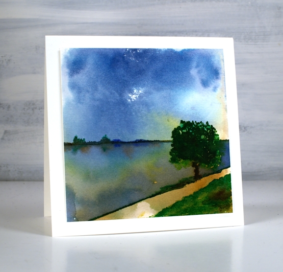
Once the sky dried I stamped the scenic stamp inking it with a mix of distress inkpads and markers. I add colours a bit at a time to build up dimension sometimes spritzing the stamp to move the inks and other times blending the stamped inks with a paint brush
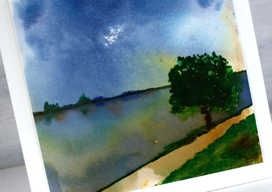
To add reflections to the second scene I painted over the water with hmmm, water so I could drop ink into the wet area below the land and trees.
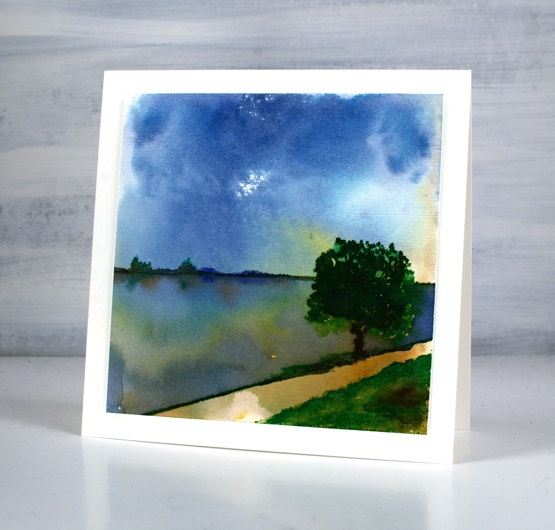
When I had finished the panel above I gave it some texture with the ‘subtle’ embossing folder so it looks like it has a canvas finish. The two cards definitely show different moods, the first being bright and sunny, the second darker but with drama in the water and sky. Which do you prefer?
Supplies
(Compensated affiliate links used when possible)


Amazingly beautiful, Heather. I love, love water and trees. You have painted a totally mesmerizing scene. When it does get dark around the lake here, the sky is just like you captured.
Thank you for all your inspiration.
Tish Rowe
Excellent night time colours. To me the perspective of the stamped image is a little weird but you can overlook it with vibrant colour. All best, Heather
Thank you, I know what you mean about the perspective. When I first saw the stamp I had to work out where the tree was standing in relation to the water. I decided it was at the top of a little rise which dipped down behind out of sight!
Two wonderful examples of scenic cards Heather and show just how different a scene can look using different colours to set the mood. The first in the light bright colours is very tranquil and pretty whilst the second in darker tones really adds atmosphere to the scene, especially with the added shading, and I love them both. x
both are gorgeous, but I like the bright, sunny one best. Thanks for sharing
they are both wonderful, I do like the brighter first one over the look of a storm coming in one on the second.
Incredible work on this stamp! Love the sunny one but the drama in the dark sky of the second one just grabbed me. It reminds me of the storms here over Lake Erie. Fabulous colors on that!
Two very different looks with this stamp, Heather! I love both!
Two amazing scenes with this great image, Heather. I love how the mood changes so much by just altering the colours. 🙂 xx
Such depth in both! There is something in the second one that keeps whispering to me. Gosh they are both gorgeous!! Well done and thanks for bringing us into your process!!