
Beloved View – 2 ways
Posted: March 2, 2020 Filed under: beloved view, Penny Black, Stamped Landscapes | Tags: Fabriano Watercolour Paper, Penny Black stamps, Ranger Distress inks, Ranger Distress stains 8 Comments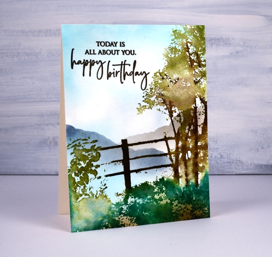
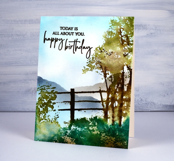
I haven’t done scenic stamping for a while so ‘beloved view’ from Penny Black called out to me. I decided to stamp it two ways, that way you can see the versatility and I will have two more birthday cards. To begin I smooshed some mermaid lagoon and weathered wood distress inks on a glass mat, diluted the ink with water then swiped the watercolour paper through the inks to create the look of a cloudy sky. I dried the panel then put it in a stamp positioner so I could build up the scene a colour at a time. First I inked the fence in gathered twigs and ground espresso distress inks then, after stamping, blended the browns with a brush and water. Next I inked the foliage of the tree in peeled paint and forest moss inks, spritzed and stamped. I let that dry a little then used a brown marker to ink some of the branches before stamping again. For the foreground foliage I used a mix of pine needles distress ink along with peeled paint. I did a bit more blending with a paint brush then dried the whole panel.
I switched to blending brushes to add the rest of the detail including brown ink along the lower edge and mermaid lagoon around the edge of the sky. I added two hills by blending over the edge of a torn post it note first in weathered wood ink then on the right with hickory smoke ink.
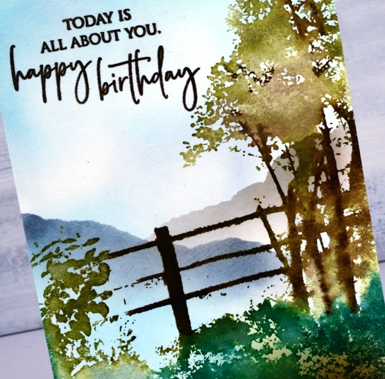
The sentiment is from PB ‘special sentiments’ and is stamped in versafine vintage sepia ink. Now I’m sure this never happens to you but as I was stamping the sentiment a second time I got it slightly off set. Several unappealing fixes popped into my head but I decided to keep stamping the sentiment so with extra ink the two ‘prints’ would join together. This would not have been totally successful if I had left them only stamped but once I embossed with clear powder the text no longer appeared to be a double image! Phew, crisis averted.
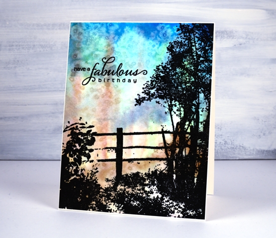
On my second card I created an abstract background first then, once dry, I stamped ‘beloved view’ over the top in versafine clair nocturne ink to create a silhouette,
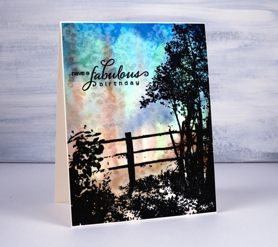
The ‘impressionistic’ background was painted with distress stains, salty ocean, chipped sapphire, vintage photo and peeled paint. I spritzed water and painted them without trying to create a scene other than keeping the brown stain in vertical strips a bit like trees. Once I had the background covered I sprinkled salt over the wet panel to add some texture.
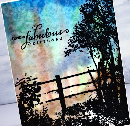
Once the salt dried I rubbed it off and did the silhouette stamping. The paper is hot pressed watercolour so it has a little texture; to get a solid image of the foreground scene I had to stamp several times in black and the stamp positioner made that possible. The sentiment from PB ‘heartfelt’ is also stamped in nocturne ink. I trimmed the panel so the card base would create a very narrow frame all around.
My stash is always a little short on masculine cards so these two are sure to come in handy. And by the way, my cards are now for sale in two Ottawa locations, A Curated Nest on Wellington Street and Crop A While on St Joseph Boulevard. Thanks for dropping by today
Supplies


These are stunningly beautiful!
Thank you very much; it was great to do some scenic stamping again.
both are gorgeous, especially love the coloring on the first!
Both are Gorgeous I especially love the salt background technique card!
Thank you, the salt worked well here; I have to remember to use it more often.
I adore the two different looks you have achieved Heather and love that this stamp comes with the heart shaped balloons as well so lots of versatility. Two great masculine cards here though, and the salt gives a wonderful added dimension to the background. x
Both of these are beautiful!
[…] To see more scenic stamping take a look at these posts: Arbors, Pumpkins, Fields of gold and Beloved view. […]