Winter Wonder art journal page
Posted: February 1, 2021 Filed under: A blizzard, Art Journal, Brusho, Classes, Dies, fir tree, Heather lowercase die set, online class, Penny Black, Pink Fresh studio, Skis 'n' sled, Snow time, winter trees, winter wardrobe | Tags: Brusho, online class, Penny Black creative dies, Pink Fresh studio 6 Comments
After my son and I finished filming the stop animation intro for my Winter Wonder online class I didn’t know what to do with the painted background and all the die cuts we’d used. They lay on a tray still in their snowy formation for a few months gathering dust until I realised I could keep the scene if I transferred it to my art journal.
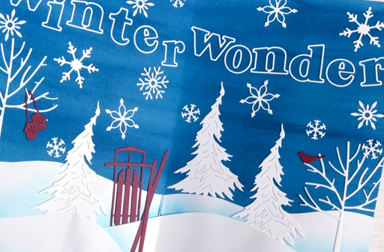
The initial spread was bigger than art journal page so I cut down the watercoloured background panel, cut new snowdrifts out of lighter weight cardstock and added ink blending to help them stand out. I saved the trees, sled, skis, mitts, snowflakes and bird all cut using the Penny Black dies listed below and glued them on. Yes the gluing almost finished me but I persevered and even glued the outline letters from Pink Fresh studio. I found that I do have a glue pen that works if you are patient and take note that enough glue if coming out.
If you haven’t scene the stop motion animation it is part of the promo for my WINTER WONDER class which teaches my methods for making cards with a northern winter theme. I’ll include the promo below just for fun and in case you’re new around here.
The scene shown in the journal page is mirrored outside right now; we have plenty of snow, we’ve been skiing and enjoying winter wonder all around us. Back in October-November when we filmed the class there was little to no snow!
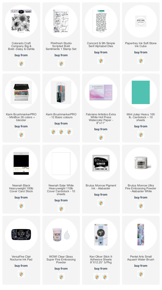
Supplies
(Compensated affiliate links used when possible)
Big & Bold thank you cards
Posted: January 25, 2021 Filed under: Brutus Monroe, Colorado Craft Company, Concord & 9th, Daisy & Dahlia, Karin brushmarkers, phrase builder you, Pink Fresh studio, simple serif alphabet dies | Tags: brutus monroe embossing powder, Colorado Craft Company, Concord & 9th, Karin brushmarkers, Pink Fresh studio 9 Comments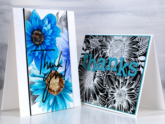
I’ve teamed up with the Foiled Fox again, as I love to do and I’m sharing two cards featuring the Colorado Stamp Company’s ‘daisy & dahlia’ stamp. I made a couple of cards last year with this stamp using a very different colour scheme.
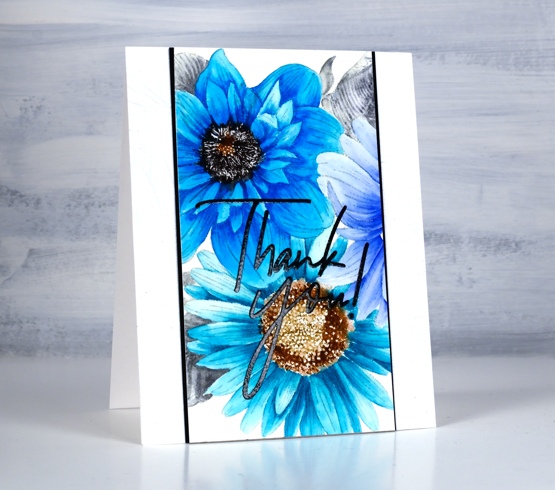
On the card above I wanted to show you how much depth and variation you can get from single Karin brushmarkers. I was so happy to see the light and shadow I could achieve on each petal with one or two dabs of ink from the marker then blending with water. The blue flower on the right which is barely showing was coloured with a bold dark blue but as you can see it was possible to dilute it to a pale blue. I used the following Karin brushmarkers on the panel: black, henna, cool grey , rose wood, cyan, turquoise, royal blue.
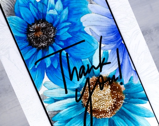
It’s not easy to see but you might notice a white on white embossed image on the card base; it’s the same stamp providing a bit of texture. You can learn more about my process by visiting the Foiled Fox blog today
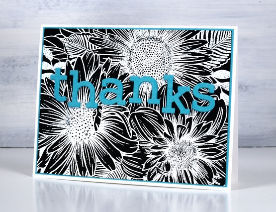
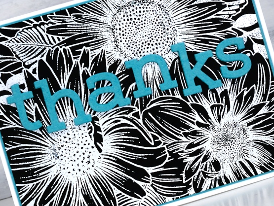
I kept some of the colours but went for a bolder look on my second card embossing the same large stamp in white on black cardstock. As you can see this stamp works as a coloured image and and a black and white image. White on red, red on white, blue on white, there are many colour combos which I’m sure would also look bright and beautiful.
Make sure you check out all the details on the Foiled Fox blog and take the time to check out Shauna’s stunning floral card from last Friday; it is a beauty.
Supplies
(Compensated affiliate links used when possible)
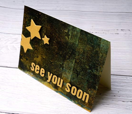
See you soon
Posted: January 5, 2021 Filed under: Darkroom Door, gel press, My Favorite Things, Pink Fresh studio, starry night, Stencils | Tags: Darkroom Door stencils, gel press, gel printing, Pink Fresh studio 11 Comments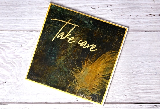
Just popping in with a couple of cards carrying a couple of messages for you. I hope your new year is off to a good start; I am still enjoying the beauty of an array of Christmas cards sent from around the world, thank you my creative friends for brightening up the midwinter days.
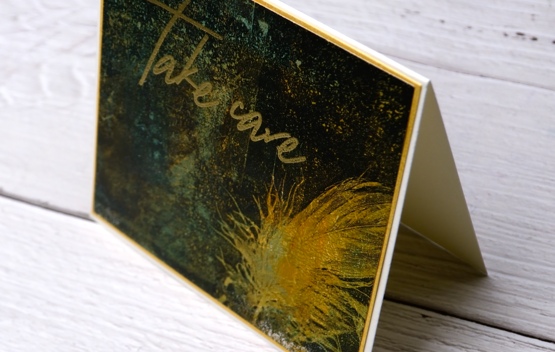
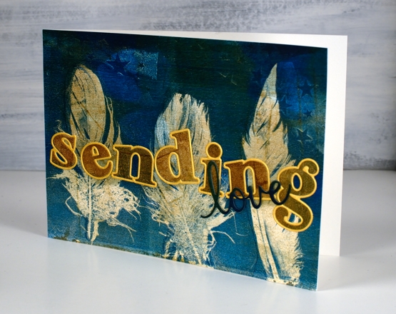
I made today’s cards from a gel printed panel done several months ago. I can’t remember the paints but you can see there was definitely orange, aqua and black. The panel I cut up is shown below, most of it included distinct or faint stars made with the Darkroom Door small starry night stencil. Along one edge there were two very distinct feather prints made with real feathers.
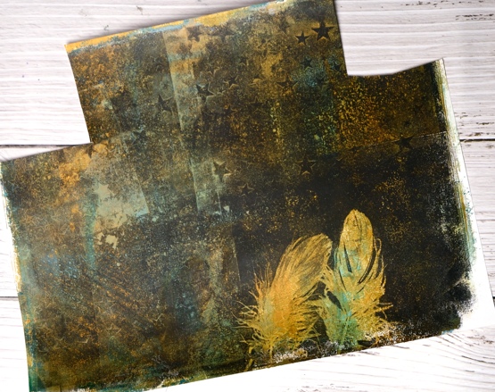
I ended up cutting a square which included one feather, leaving me one for another project. I also cut a rectangle covered in colour and texture which became the base for die cut letters and stars. I chose gold cardstock and gold embossing powder to add some brightness and shimmer on top of the dark background featuring a ‘scripted bold sentiments’ stamp from Pinkfresh Studio, alphabet dies from MFT and nesting star dies from We R Memory Keepers. I popped up the letters and the stars on black foam which kind of makes them appear to be floating.

I wanted to let you know I am taking a short blogging break so I can devote some time to planning and prep. I will be working on projects to share with you over the coming months. Ideally I would have done this before I stopped for Christmas but that didn’t happen so I’m doing it over the next week or so. I have lovely ideas and projects floating round in my head, I have a little stash of stencils and stamps that haven’t been out of their packets and some new release products from Penny Black on the way.
It has been a while since I devoted time to gel printing, alcohol inks, stenciling and lettering so that’s on the list along with some more hand painting. I will be making some videos to share here on my blog and youtube channel. I have a new online class in the works also. So you see while it’s quiet on the blog it will be busy behind the scenes.
As always I am happy to answer questions and I’m open to requests or suggestions for new projects and videos. If you feel like diving into one of my online classes just click on COLOUR CLUES or WINTER WONDER to learn more. (Here is a discount code for COLOUR CLUES which will take 20% of the price until January 15, 2021 HTNY21 )

So take care everyone, I’m looking forward to sharing techniques and experiments, cards, journal pages, paintings and more here on the blog during 2021. See you soon…
Supplies
(Compensated affiliate links used when possible)
Gel printed feathers again
Posted: October 21, 2020 Filed under: gel press, Heather lowercase die set, phrase builder you, Pink Fresh studio | Tags: gel press, gel printing, Pink Fresh studio 10 Comments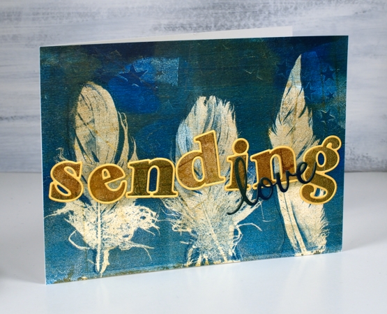
Last year I did my first gel prints with feathers and I was thrilled with the detail in the prints. When I was gel printing with leaves a few months ago I did a few feather prints at the same time. It’s the same process.
The letters and word added to this feather print were cut from the same panel. I was working on my large gel plate and lifting the prints on A4 pieces of cardstock. The mustard/gold paint was over the whole print before I added dark turquoise paint to one end as I printed feathers.
I cut the letters for the word ‘sending’ with the ‘Heather lowercase’ dies from Pinkfresh studio. There are capital letter dies in the same style and co-ordinating stamps for both lower and upper case but I just bought the lowercase dies. Buying alphabet dies or stamps is quite the investment so I worked out what I would get the most use from and it was these pretty letter dies. I am way more likely to make words with all lowercase than with all caps. After I had ordered the dies I realised they were all double dies in that they cut a very narrow border around every letter which gives you a bonus delicate die cut letter which can be used as a border for the solid letter. Maybe you know all this but I was pretty happy to get double the letter fun.
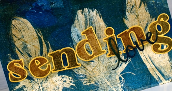
I cut all the letters for the word ‘sending’ and arranged them on top of the feather panel but they did not stand out enough until I cut the same letters from shimmer gold cardstock so I could give each one the narrow border. I added double sided adhesive to the back before cutting the letters so it would be easy to attach them to the panel. I cut the word love from a teal section of the printed panel twice and layered them to make them stand out a bit more, the die is from the Pinkfresh phrase builder ‘sending’ set.
I’m very keen to get out my gel plates again but my to do list has other things on it right now. It’s fun to have a stack of prints to put to use in the interim.
Supplies
Poppy birthdays
Posted: February 25, 2020 Filed under: little lowercase letters, My Favorite Things, phrase builder you, Pink Fresh studio, poppy background, YAY for you | Tags: Fabriano Watercolour Paper, grafix, My Favorite Things, Pink Fresh studio, Ranger Distress inks, WOW embossing powders 5 Comments
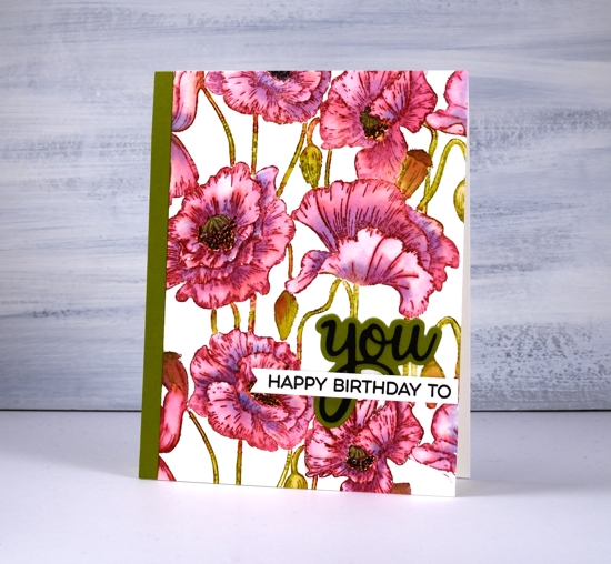
When I pulled out the MFT ‘poppies background’ stamp my intention was to do some loose watercolour with splashes and dabs here and there. As you can see I didn’t manage that; I stayed inside the lines. It was not a fiddly job though, painting this panel. I was surprised at how quickly I was able to get it done. I put the stamp in the stamp positioner along with a piece of cold pressed watercolour paper. Using the papertrey ink cubes I was able to ink the flowers in ‘scarlet jewel’ and the buds, stems and pods in ‘ripe avocado’. If the inks ended up on the wrong section I either wiped it off or let it be because a little green in the flowers or red in the stems doesn’t matter.
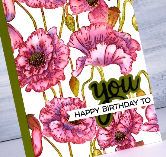
I blended one petal at a time which sounds time consuming but they are large petals so it wasn’t bad. As I finished blending the ink into one petal I picked up a little bit of ‘blueberry sky’ ink and dropped it into the wet petal at the inner edge. When I came to the poppy centres I got mixed up and did the centres black and the surrounding dots in yellow so to fix it I went over the yellow with little black dots then went over the black center with a gold gel pen to turn it yellowish! Adding a sentiment took me an age, not because it was too fiddly but because I couldn’t decide how to arrange it and my embossing game was definitely off. I ended up with ‘you’ from Pink Fresh ‘phrase builder: you’ set overlaid with a sentiment from MFT ‘YAY for you’ set.
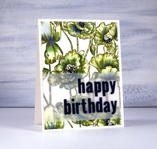
The second panel definitely involved more slap dash watercolouring but I still managed to stay inside the lines. I stamped the whole image in distress peeled paint which blends very easily with water. As I wanted some depth of colour in the centres of the flowers I smooshed faded jeans and chipped sapphire distress inks on my glass mat and picked up ink to paint shadows on the petals. I inked up the centres of the poppies with a chipped sapphire marker then chose a dark blue (not black) cardstock to die-cut the letters for the sentiment.
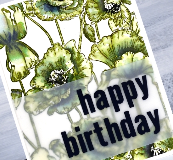
The die-cut letters got a little lost when placed straight on the busy background panel so I attached them to a piece of vellum first. To line them up I perfectly magnets held the vellum in place on my Wendy Vecchi magnetic board and, because it was vellum I was able to see a whole grid of lines to get them straight vertically and horizontally. I was pretty happy with this arrangement and might just have to do all my sentiments on vellum to experience the same satisfaction! I put ‘stick it’ adhesive on the back of the dark blue cardstock before I cut the letters so I would not have to deal with glue or tiny bits of tape for each letter. That would not have given me any satisfaction at all!
Even though green poppies are a bit of an oddity I think that one ended up being my favourite.
In other news make sure you pop over to the Penny Black blog to enter their giveaway; you have until March 1. I will be sharing plenty of new PB product in the weeks to come.
Supplies