Wonderful
Posted: January 30, 2020 Filed under: Anything but basic friendship, My Favorite Things, Roses all over | Tags: My Favorite Things, Penny Black creative dies, Ranger Distress inks 5 Comments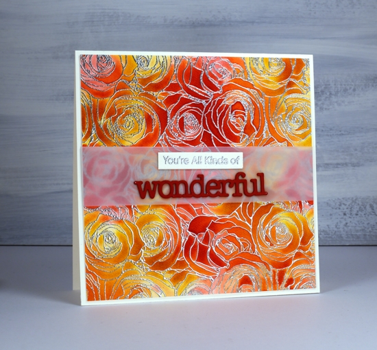
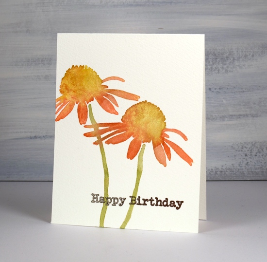
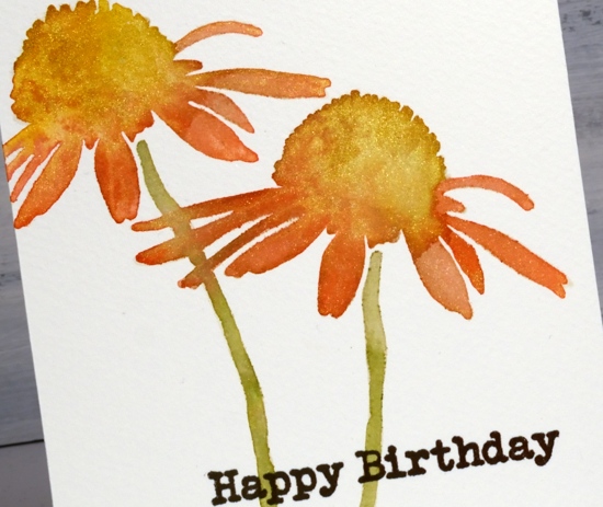
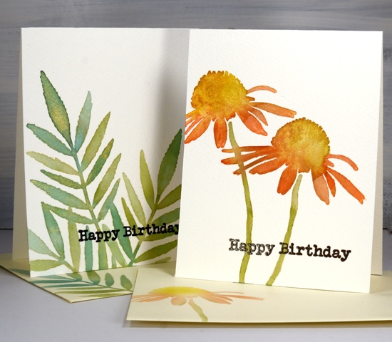
This lovely background stamp from MFT is brilliant for trapping colour. My first choice would be to colour it with paint powder like brusho or colourburst but a quicker and less messy technique is to rub distress ink cubes across the embossed panel randomly. I embossed ‘roses all over’ on hot pressed watercolour paper with silver embossing powder then randomly rubbed fossilized amber and candied apple distress inks over the panel. Because of the embossing the ink didn’t saturate the whole panel but it did leave some colour in all the sections.
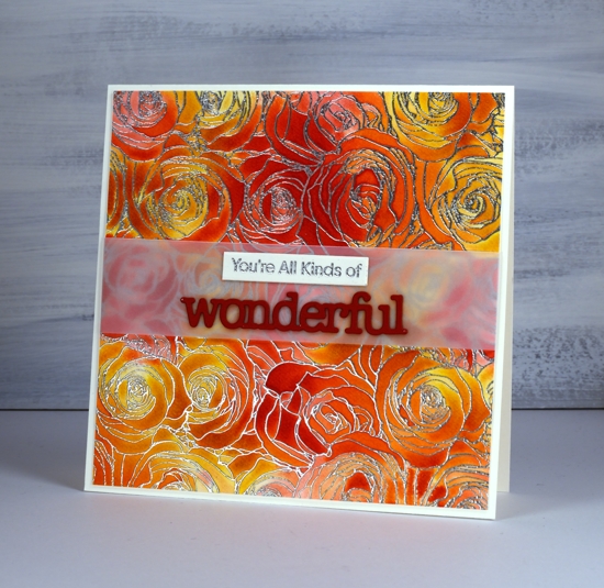
Next I liberally spritzed the panel so the inks would dilute, blend and fill the petals. This technique is one a friend of mine affectionately calls ‘drowning’. The ink mixed pretty well by itself but I did use a paintbrush here and there to make sure the whole panel was coloured. I dried it, trimmed it and added a band of vellum so my sentiment strip and die-cut would not have to fight with the busy background.

I stamped part of a MFT ‘anything but basic’ sentiment on an Avery Elle simple sentiment strip. I use those sentiment strips all the time; I have a stash cut and ready on my desk for every third card! I cut the PB ‘wonderful’ twice from red cardstock (with ‘stick it double sided adhesive’ on the back) and stacked them on the vellum.
I enjoyed reading your comments about the black watercolour paper and I’m happy some of you are inspired to pull out your own to do a little experimenting. You’ll definitely be seeing it again here.
Supplies
Roses on black
Posted: January 28, 2020 Filed under: Finetec paints, key to kindness, Penny Black, rose romance, winsome wreath | Tags: Finetec artist mica watercolour paint, Penny Black stamps, WOW embossing powders 15 Comments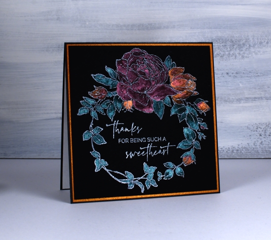
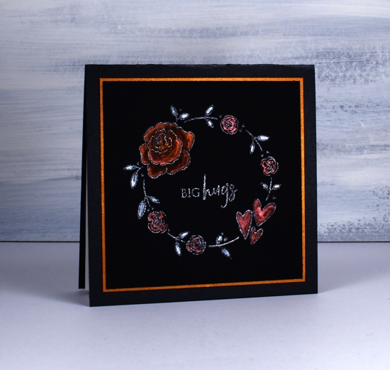
Today’s cards are my first experiment with black watercolour paper. I have already learnt a few things I will take into consideration on my next projects. I could have waited until I had played with the paper more but I decided to jump right in with these rather unusual valentine/friendship cards. The card with purple flowers does have a valentine sentiment but the other two could be used anytime to send a friendly message. Unfortunately the photos don’t convey how shimmery the paint is and the colours are brighter in real life.
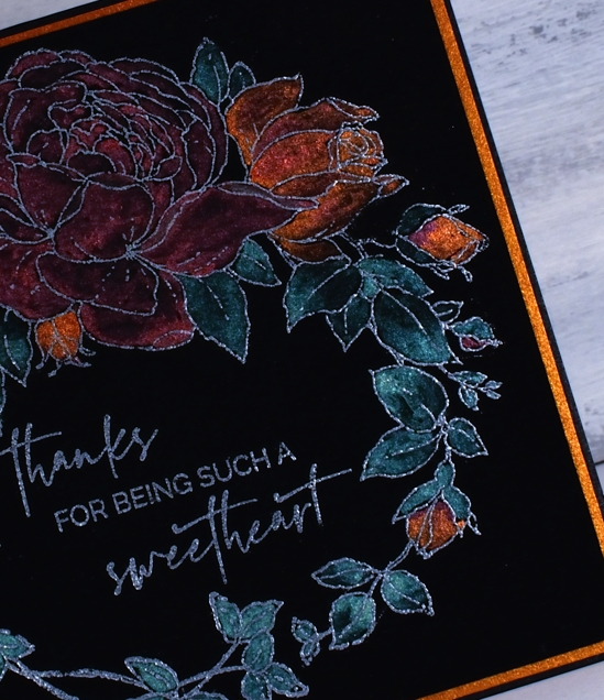
I’ve seen a few people on the interwebs using this new Stonehenge black cold press watercolour paper so I had to give it a try. As you can probably see I’ve paired it with pearlescent paints this time. I plan to try oxides next time. Because it is new to me I tried three different embossing powders wondering how much they would show up on black. On the card above I embossed PB ‘winsome wreath’with WOW silver pearl; it looks a bit silvery. On the card below I used WOW white pearl on PB ‘rose romance’: it also looks a bit silvery. On the final card I used Ranger gun metal with a wreath from PB ‘key to kindness’ set, it is a bit darker but still looks a bit silvery.
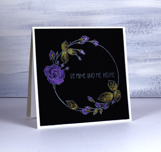
To paint the flowers I used both my Finetec pearlescent paints and pearl paints. I don’t find the two sets all that different but I think there might be a bit more shimmer in the pearlescent ones. I also have some Ken Oliver liquid metals so I used the verdi gris for the leaves above. I carried through the shimmer theme by cutting mats from copper shimmer cardstock and I made card bases from black shimmer and quartz shimmer.
What do you think about predominantly black cards? I know some would find them too dark and sombre, some may be reminded of the painted velvet pictures from the 70’s but maybe you like the added drama. Will you try the black watercolour paper if you get a chance?
Supplies
https://linkdeli.com/widget.js?1559654439292
Flower heart
Posted: January 23, 2020 Filed under: passionate blooms | Tags: Penny Black creative dies, Penny Black stamps, Ranger Distress inks 6 Comments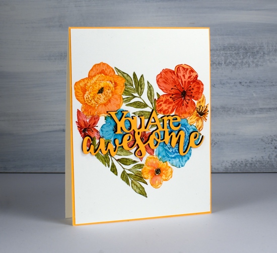
I have seen this stamp on quite a few cards lately, just pop over to the Penny Black blog if you want to see some other colour schemes and techniques. I have surprised myself with this colour scheme and also by choosing a large heart motif in the first place. I don’t usually make Valentine’s day cards so when I decided to ink this stamp it was always going to be for a versatile friendship card.
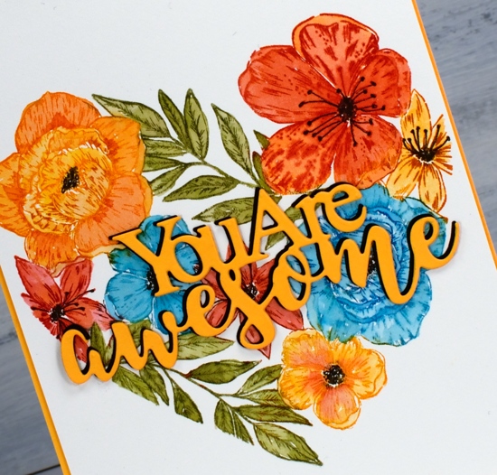
I worked on hot pressed watercolour paper in the stamp positioner and inked one flower at a time. It is easier to ink a single flower with a marker but when I don’t have the colour marker I need I use an inkpad and just wipe excess ink off the stamp. Each time I stamped a flower or leafy section I blended the ink with a paintbrush and added extra ink if necessary by picking it up off my glass mat. On some of the flowers blending the colour resulted in loss of definition so I restamped after all the colouring was done. That’s the beauty of keeping it in the stamp positioner.
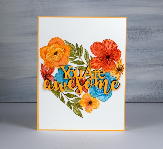
The distress inks I used were carved pumpkin, barn door, mermaid lagoon and peeled paint; I’m pretty sure I’ve never used that combo before. I added centres to the flowers with a black marker.
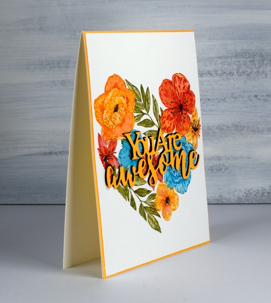
I chose a die-cut sentiment that spans the heart and chose orange cardstock to stand out against the background. Even though the sentiment was over the top of mainly red and turquoise flowers it got a little lost so I cut a black layer as well and stacked two orange over a slightly offset black.
On my last post ‘Creating in Colors’ commented, ‘...I love it when you design cards for which I have the stamps and/or stencils! I’m inspired to try these.‘ I was so pleased to read that. It makes me happy when that happens; its always good to get a fresh idea for supplies we already have.
Supplies
Stencils & watercolour
Posted: January 20, 2020 Filed under: boxes, carved flowers, carved flowers, Darkroom Door, ferns, Stencils, Wildflowers Vol 1 | Tags: Darkroom Door stamps, liquid metals, Ranger Distress inks 7 Comments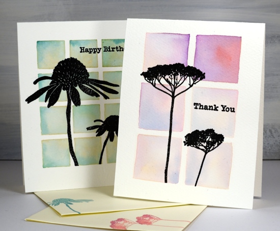
Some recent art from Kathy Racoosin inspired me to use my stencils a little differently. I used four stencils from Darkroom Door and my ever useful distress inks.
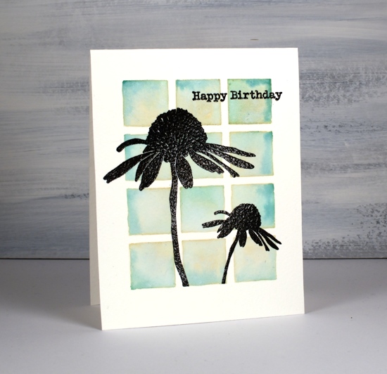
All these cards are one layer; I often attach a one layer panel to a card base and keep the layers minimal that way but this time I cut card bases from cold pressed watercolour paper and did all the stenciling and painting on directly on the card base. I taped the stencil to the card base using the grid on my glass mat to make sure the stencil sides and card sides were parallel. I used a large blending brush to transfer antique linen to the watercolour paper. Whatever ink you use through your stencil will lend some colour to the final images as it will mix with the ink painted on later.
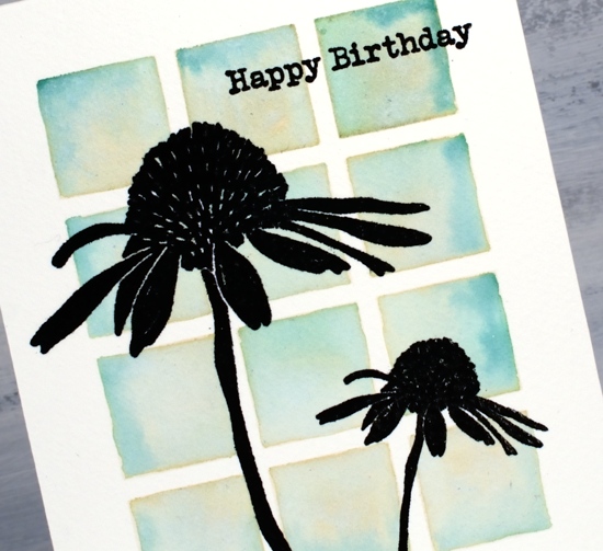
On the twelve square background I painted peeled paint and pine needles ink using the blended antique linen as my guide. On the card below I used wilted violet, abandoned coral and blueprint sketch inks to fill the six blended squares.
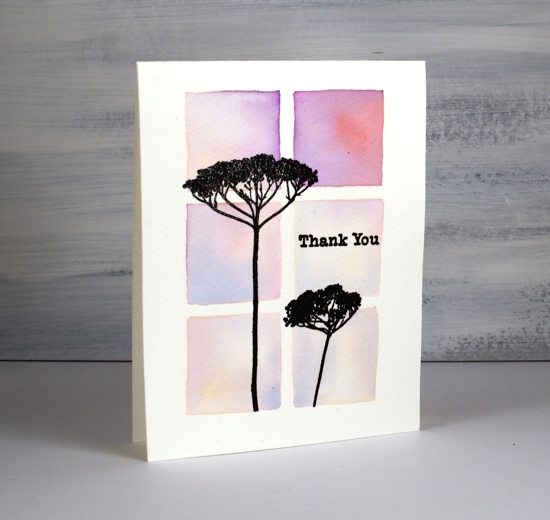
After both cards had dried I used a stamp positioner to stamp the flowers in versafine clair nocturne ink. There is texture in the cold pressed watercolour bases so I stamped and restamped a few times. After stamping a couple of sentiments also from Darkroom Door I embossed all the stamping with clear powder. (I’ve listed and linked all the stamp sets and stencils at the end of this post.) I used one or two of the same distress inks to stamp matching envelopes.
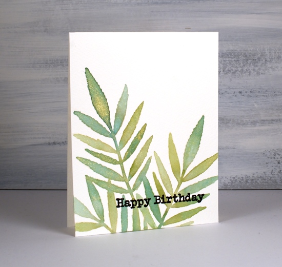
For the next two cards I used the same ‘blend then paint’ method. Once again I blended antique linen ink through the stencil then for the ferns painted a section at a time switching between cracked pistachio, peeled paint and pine needles inks.
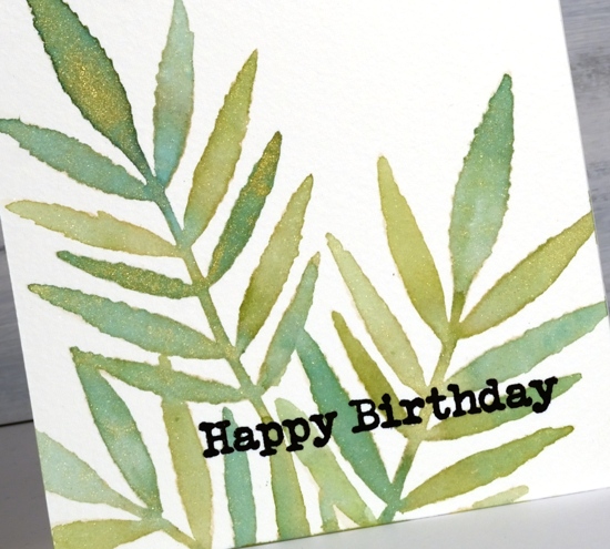
I smooshed the ink pads on my glass mat and added a little gold shimmer with a few drops of Ken Oliver’s ‘yellow gold’ liquid metals. The shimmer isn’t very obvious in the photos but in real life it adds a little pizazz!
On the cone flowers I also added shimmer and used peeled paint for the stem, and fossilized amber with abandoned coral for the flower and petals.
Techniques like this make me take a second look at my stencils. I want to try it with a different base colour next time. Take a look at Kathy’s video to see her step by step technique.
Supplies
Wintertide
Posted: January 17, 2020 Filed under: Penny Black, wintertide | Tags: Fabriano Watercolour Paper, Penny Black stamps, Ranger Distress inks 11 Comments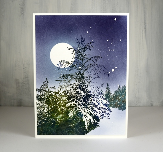
As you can imagine, I was thrilled when I saw this stamp. Yes it is one stamp with all these beautiful trees in a snowy clearing! It’s called wintertide and it definitely portrays what I am seeing outside these days.
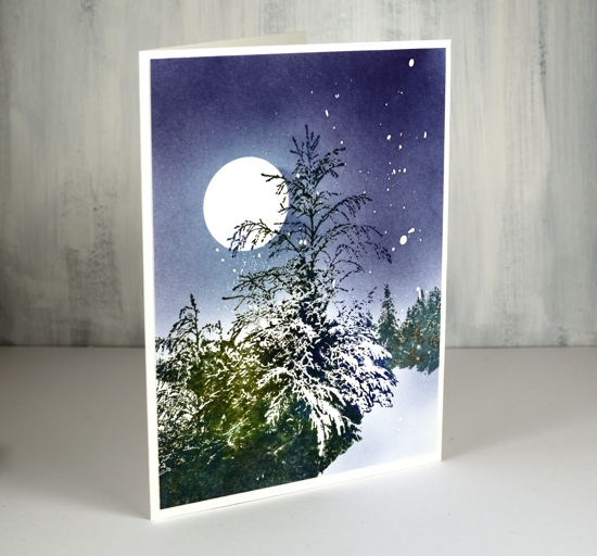
I worked on hot press watercolour paper because I did plan to add a little water as I worked but the stamp is very detailed so I didn’t want added water to blur the detail and lose all the snowy white areas. There are some white splatters in the sky made by splots of masking fluid splattered on the panel before I started stamping.
I kept the stamp in a stamp positioner so I could stamp one colour at a time starting with pine needles distress ink. I added other distress greens and blues bit by bit to give definition to the trees on the right and the bushy area in the foreground. I spritzed the stamp lightly with water after inking the area left of the big tree so the greens blended with each other. Once I had built up enough colour variation I dried the panel and added a frisket film circle mask before colouring the sky. I used blending brushes to apply tumbled glass and chipped sapphire distress inks to the sky and the snowy path.
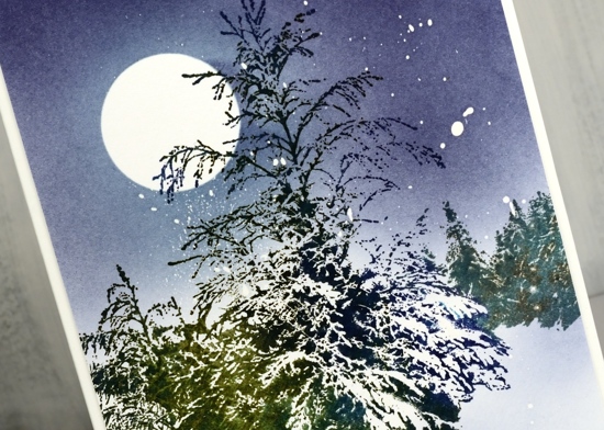
This stamp is very detailed but that does not have to mean it is difficult to use. By stamping the whole image first in a light colour you are able to see where to change colours when adding ink with markers or ink pads. When I don’t use markers I add ink to a large area with an ink pad(often a cube) then wipe it off the areas I don’t want stamped. Jill Foster has a fabulous video tutorial for this stamp so check that out if you want some ideas.
Supplies
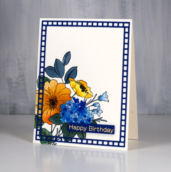
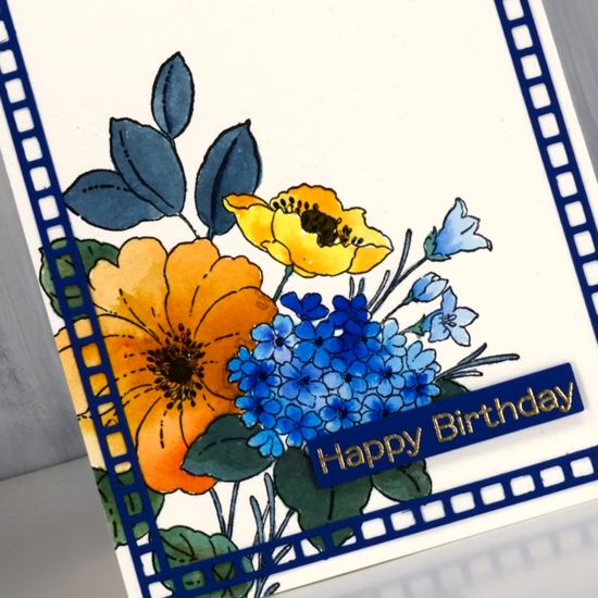
Three colours – Poppy time
Posted: January 15, 2020 Filed under: Avery Elle, Brusho, fluttering friends, My Favorite Things, Penny Black, Poppy Time, simple sentiments | Tags: Brusho, My Favorite Things, Penny Black creative dies, Penny Black stamps 8 Comments
This is the last of the three colour panels I did with sandstone, lemon and ost blue brusho. I think this one might be my favourite because of the sky behind the poppy. Of course I was not really responsible for that pretty sky, it was the magic of brusho! I embossed the PB ‘poppy time’ stamp in gold powder on hot pressed watercolour paper first. Next I sprinkled the three colours of brusho on craft mat and spritzed it with water. I didn’t sprinkle too much powder; it is easier to add more colour than to take it away. I swiped the panel through the wet activated brusho and set it flat to dry. I can’t remember if I dabbed colour away or moved some with a paintbrush (I made this card a while ago)

With the background taken care of I mixed some green from the sandstone & ost blue and painted the bud, stems and seed pod. I the petals with sandstone and lemon from a palette then sprinkled salt on top to get some texture.

Once again I used a sentiment from MFT ‘fluttering friends’; I really like the clean lines of the font and the size too. The sentiments fit perfectly in strips cut with the Avery Elle simple sentiment strips.
Thanks for joining me in this mini series on using a limited palette. I have enjoyed reading your comments and hope you are trying it yourself. Please let me know if you do. If you just joined me today here are the other two cards made with this simple colour scheme.


Supplies
Three colours – Bouquet Ballet
Posted: January 13, 2020 Filed under: bouquet ballet, Brusho, fluttering friends, My Favorite Things, Penny Black, square frames | Tags: Brusho, Fabriano Watercolour Paper, My Favorite Things, Penny Black creative dies, Penny Black stamps 12 Comments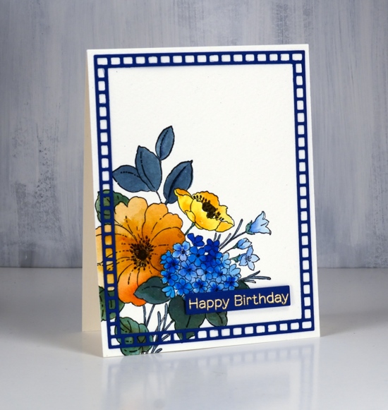
Above is the second of my three colour cards painted with only ost blue, sandstone and lemon brusho. The first card displayed some of the texture and blending which is easily achieved with brusho, in this card it is easier to see the three basic colours plus a couple of the colours I mixed myself. As with the first card I mixed the brusho powders with water in a palette but for this card didn’t sprinkle any brusho directly on the watercolour panel.
The PB bouquet ballet stamp is stamped in black ink on cold pressed watercolour paper; I used a stamp positioner as cold pressed watercolour paper has texture which prevents me from getting a perfect impression first go. The small poppy is painted in lemon brusho, the large flower with sandstone and the multi-headed flower in ost blue. On each one I dropped in more colour for extra depth. The small trumpet shaped flowers to the right are also painted in ost blue but a diluted coat. The stems and leaves are painted in a mix of blue and lemon. The centre of the flowers I painted in brown which was a mix of blue and sandstone brusho. I did use a black marker to colour the little flower centre thingies, but we are not going to count black as a fourth colour!
Happily I found a blue cardstock in my stash to create a sentiment strip and a frame. I embossed the sentiment from MFT fluttering friends in gold powder and popped it up over the panel. The frame is cut using PB square frames and glued on using on point glue because of the tiny tip on the glue bottle. I have one more card to show you in this miniseries and I think it might be my favourite. Check back soon.
Supplies

Three colours – Sweet Perfume
Posted: January 8, 2020 Filed under: Brusho, Penny Black, Sweet Perfume | Tags: Brusho, Penny Black stamps, WOW embossing powders 10 Comments
I’ve talked about limited palettes on the blog before; today’s card is a good example of why I like to work with a limited palette of colours. I used only three brusho colours to paint this card, ost blue, sandstone, lemon brusho. The panel began with the PB sweet perfume stamp embossed in gold on hot pressed watercolour paper.

I sprinkled each of the three brusho colours into wells of a palette leaving empty wells between the colours where I could mix new colours. I used mainly sandstone for the large flower, lemon for the smaller flowers and added depth by adding more sandstone for tan shadows or orange shadows. I was able to create a few different greens by mixing blue with sandstone and blue with lemon. As sandstone is a brownish orange it was perfect for darkening the centres of the flowers. I love the texture in the centre of the large flower which I achieved by sprinkling some brusho directly on the panel then blending it with water.
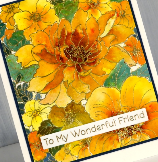
To mat the panel I chose a dark blue cardstock that co-ordinated with the dark bluey green paint. To finish the card I added an MFT sentiment also embossed in gold.
I have another couple of cards made with the same limited palette, so check back soon.
Supplies
New Year florals
Posted: January 6, 2020 Filed under: filled in florals, fine line florals | Tags: Concord & 9th, Ranger Distress inks 9 Comments
Happy New Year everyone. After a busy but wonderful December full of family visiting from Australia I am getting back into the work groove. I have some lovely products to try out and tell you about in the coming months so thank you for dropping in today to see what I have been doing.
I have used this Fine Line florals stamp from Concord & 9th several times, it is fun to colour loosely, carefully or with co-ordinating stamps that fill the outline images. On this card I used mainly distress markers. I don’t often use my distress markers for colouring directly on the paper, usually I ink stamps with them and then blend the ink with a paintbrush once stamped.
To create this panel I stamped the large image with ranger archival ink on watercolour paper then added colour to the petals with distress markers. On each flower I coloured close to the centre with the marker and blended the colour out to the edges with water and a paintbrush. The first layer on each flower was the palest colour which I let dry before adding a darker colour again from the centre.
I don’t have all the distress markers so I did some colour with markers and some with distress ink smooshed on my glass mat; both techniques work but using the ink gives intense colour more quickly and depending on the colour can be easier to blend. For quick and accurate application the markers are handy. As I use distress markers, inks and stains fairly regularly I have sometimes wondered about doing a comparision of techniques with the different distress products. Is that something you would be interested in seeing?
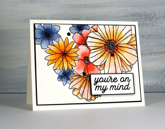
I chose black as an accent colour to team up with the black outline stamping. I cut slim mats and coloured enamel dots with a black sharpie as I didn’t have any black dots on hand. The sentiment is from another C&9 set, ‘filled in florals , and is matted and popped up with black dimensional tape.
Enjoy your day!
Supplies
On the seventh day of Christmas
Posted: December 31, 2019 Filed under: Before the Snow, Penny Black, winter woodland | Tags: CAS, Koh-I-Noor, Penny Black stamps, Tsukineko Memento inks, Tsukineko Versafine inks 6 Comments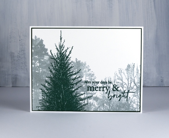
That’s right I have a Christmas card for you. I totally subscribe to the twelve days of Christmas deal; I am in no hurry to take down decorations or make resolutions. When I look at this card though, I realize it could definitely work for the new year. We woke up to a very merry & bright scene as the world is once again covered in white! Both these stamps are favourites of mine as they will be useful year round and of course, they feature trees!

No watercolour paints or techniques were used in this card, I know, it’s a bit of a departure but I love the crisp images I was able to get stamping on bristol cardstock. I stamped the winter woodland stamp with memento London fog ink on bristol then switched to versafine clair rainforest ink to stamp the ‘before the snow’ tree and the sentiment in the foreground. I matted with a co-ordinating green cardstock then a white cardbase.
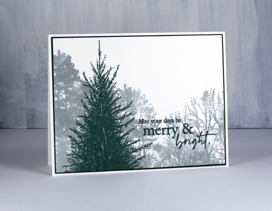
I made a couple of these cards but might make a few more in preparation for next Christmas or even change the foreground image to make them suitable for year round. It’s a quick but effective design inspired by the beautiful work of Julia of Derkleineklecks blog.
Happy New Year! Thank you for spending time here on the blog with me this year; I look forward to sharing more projects in 2020. How about the neatness of that 2020; I like it!
Supplies