
Three colours – Sweet Perfume
Posted: January 8, 2020 Filed under: Brusho, Penny Black, Sweet Perfume | Tags: Brusho, Penny Black stamps, WOW embossing powders 10 Comments
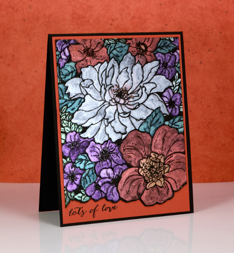
I’ve talked about limited palettes on the blog before; today’s card is a good example of why I like to work with a limited palette of colours. I used only three brusho colours to paint this card, ost blue, sandstone, lemon brusho. The panel began with the PB sweet perfume stamp embossed in gold on hot pressed watercolour paper.

I sprinkled each of the three brusho colours into wells of a palette leaving empty wells between the colours where I could mix new colours. I used mainly sandstone for the large flower, lemon for the smaller flowers and added depth by adding more sandstone for tan shadows or orange shadows. I was able to create a few different greens by mixing blue with sandstone and blue with lemon. As sandstone is a brownish orange it was perfect for darkening the centres of the flowers. I love the texture in the centre of the large flower which I achieved by sprinkling some brusho directly on the panel then blending it with water.
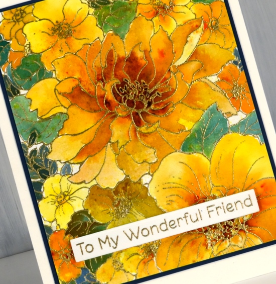
To mat the panel I chose a dark blue cardstock that co-ordinated with the dark bluey green paint. To finish the card I added an MFT sentiment also embossed in gold.
I have another couple of cards made with the same limited palette, so check back soon.
Supplies
Distress Oxide background
Posted: August 8, 2017 Filed under: Butterfly trio, Sweet Perfume | Tags: distress oxide inks, Penny Black creative dies, Penny Black stamps, WOW embossing powders 8 Comments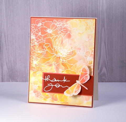
I’ve been playing with distress oxide inks again and its all because of the wonderful folk at the Foiled Fox. I loved the first 12 colours released but when I saw salty ocean, peacock feathers and seedless preserves in the second release I was pretty happy. I am guest blogging over on the Foiled Fox blog today with all the details about this card.
Our family has been enjoying a visit from my sister-in-law, Dale for a few weeks. She came from Australia via Alaska and we have had the chance to do a few little trips around Ontario and Quebec while she’s been here. One afternoon while we were home I was downstairs in my workroom trying to nail this card. I loved the soft blends in the background but deciding on features for the foreground was not happening. Dale came down to see what I was doing and we ended up collaborating to complete the card.

Supplies
Stamps:Sweet Perfume, Butterfly Trio (PB)
Die: Many Thanks (PB)
Inks: spiced marmalade, abandoned coral, wild honey distress oxide inks (Ranger) versamark (Tsukineko)
Papers: hot pressed watercolour paper, Neenah natural white cardstock, brick red cardstock
Also: clear embossing powder (WOW)
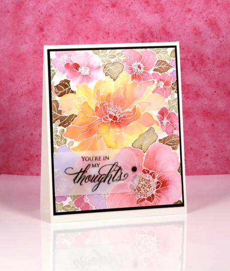
Sweet perfume
Posted: May 2, 2017 Filed under: Sweet Perfume | Tags: Faber-Castell Albrecht Durer Watercolour pencils, Penny Black stamps, WOW embossing powders 19 Comments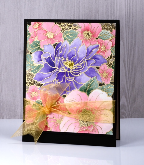
This panel is another I coloured while away in Toronto. I took my watercolour pencils, some brushes and several stamped panels, some embossed others just stamped in light colours to paint over. I did a ton of walking and exploring while there but also met up with my daughter in coffee shops during the day as she was working on a thesis most of the time. She sat at her laptop, I painted for a while, drunk some tea then headed out exploring again.
I have already posted a card featuring this image stamped on black cardstock. This one was not stamped on black; it was embossed on hot pressed watercolour paper. I did all the painting with my watercolour pencils filling the flowers with pinks and purples and the leaves with a few shades of green. When I had finished there were a few spaces between flowers with no colour at all. I decided to paint them black. It really did not look very good but I packed it away and moved onto something else. When I came home and took some time to turn my panels into cards I trimmed this one back so the flowers were cropped on all sides then tried several coloured mats to frame it. The black card base ended up being the best option. Those few little black sections on the coloured panel tied in with the card base nicely. I also tried a few sentiments but ended up going without. On the inside I have glued a pale pink panel to write on.

Thanks for dropping by; I’ll be back with my next distress oxide trial tomorrow, I think it is my favourite so far.
Supplies:
Stamps: Sweet Perfume (PB)
Pencils: Albrecht Durer watercolour pencils (Faber Castell)
Ink: Versamark ink
Paper: hot pressed watercolour paper, Neenah Epic black cardstock
Also: gold embossing powders, gold organza ribbon
Shimmer and shine
Posted: August 24, 2016 Filed under: Sweet Perfume | Tags: Finetec artist mica watercolour paint, Penny Black stamps, Tsukineko Versafine inks 9 Comments
I’m excited to be guest posting on the Foiled Fox blog today. To find out how I got the pretty shimmer on this card check out the post here.
Stamps: Sweet Perfume, Happy Snippets(PB)
Let the colouring begin
Posted: July 5, 2016 Filed under: Brusho, Sweet Perfume | Tags: Brusho, Canson Moulin du Roy watercolour paper, Penny Black stamps 32 Comments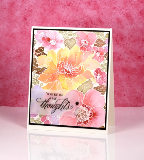
Today is day 1 of Kathy Racoosin’s latest ‘30 Day Coloring Challenge‘. If you haven’t heard about it click on the link and read the details. It is a no pressure, loads of inspiration, tutorials and prizes type of challenge. Kathy is a colouring wizard and she shares her tips and tricks on her blog and in her very friendly conversational videos.
I had fun colouring this large scale floral design with brushos. I embossed the image on watercolour paper with silver pearl powder. I limited myself to four colours from the brusho range and I created different shades and values by mixing and diluting. The pink flowers are a mix of crimson and cobalt blue; some have little or no blue mixed in. The central flower is a mix of yellow and crimson. To make sure my greens blended in with the colours of the flowers I mixed some crimson with leaf green and created muted green-browns. In order not to loose too much of the panel behind a sentiment strip I embossed on vellum and added a half pearl over the adhesive. I didn’t have any black half pearls but a sharpie did the trick.

I have something quite new to share tomorrow. See you then.
Supplies
Stamps: Sweet Perfume, Special Thoughts (PB)
Paints: leaf green, cobalt blue, crimson, yellow brusho
Ink: Versamark ink
Paper: hot pressed Canson Moulin du Roy watercolour paper, Neenah Epic black cardstock, vellum
Also: black & silver pearl embossing powders, half pearl


