Captivating Blue
Posted: June 30, 2021 Filed under: captivating, Catherine Pooler inks, Penny Black | Tags: Catherine Pooler inks, Penny Black stamps, Ranger Distress inks 8 Comments
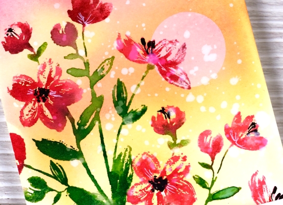
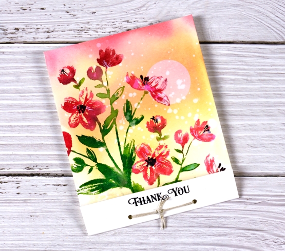
I’ve been creating backgrounds for landscape stamping lately often by smooshing a few inks on my glass mat, diluting the ink then swiping the watercolour paper through it. The background for this floral card was done the same way and features faded jeans and kitsch flamingo distress inks plus some scattered salt for subtle patterns.
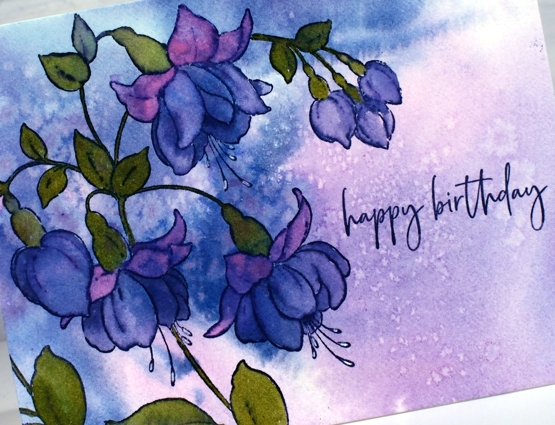
I stamped the Penny Black ‘captivating’ stamp in Catherine Pooler ‘juniper mist’ ink then blended the stamped ink to fill all the lower petals of the fuchsias. I painted the upper petals with kitsch flamingo and the leaves with CP eucalyptus ink. For the tips of the little stamen I used a white gel pen.
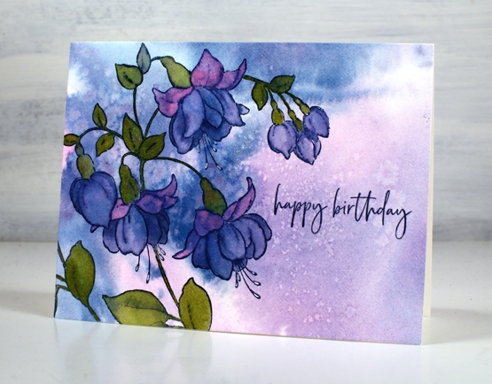
With all the pattern in the background I kept the sentiment simple with part of a stamp from the PB ‘carefree wishes’ set in CP juniper mist.
This stamp features in one of the lessons included in my Floral Faves online class where I teach a range of techniques for use with floral stamps. It’s a self paced class where you can access the video content at your own convenience.
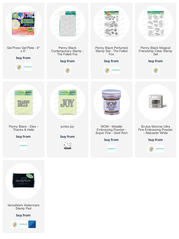
Supplies
(Compensated affiliate links used when possible)
Floral Focus
Posted: June 28, 2021 Filed under: floral focus, Heather lowercase stamp set, Karin brushmarkers, Lea ornate uppercase stamp set, Pink Fresh studio | Tags: Karin brushmarkers, Pink Fresh studio 7 Comments
Hello! I am excited to be sharing this post here and on the Foiled Fox blog today. All this floral beauty is on one stamp from Pink Fresh Studio and it’s called ‘floral focus’. Since it arrived on my work table I’ve tried it with pencil colouring, emboss resist and this Karin brushmarker watercolour technique. I love how bright and summery it looks with these colours.
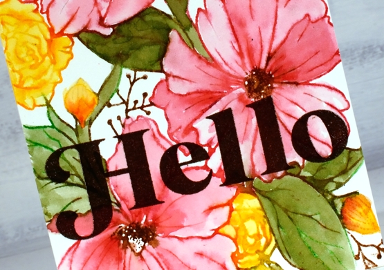
Floral Focus is a large rubber background stamp and rubber stamps are my favourite to work with. I know transparent stamps are great for placement but rubber stamps seem to hold onto their ink better. I will always have both in my collection but I get a little bit excited when I ink the rubber stamps. I used a stamp positioner for this panel and inked the large pink flowers first with magenta red and henna markers. If I get ink on adjacent areas I just wipe it off before stamping. Once stamped I blended the pink ink to fill the petals and restamped the centres in brown to make them a bit bolder. Next I inked the small flowers and buds with the gold brushmarker, then blended with water. For the leaves and stems I inked with both henna and grass markers to get a muted green rather than a bright green. Finallly I did the twiggy bits with the henna marker.
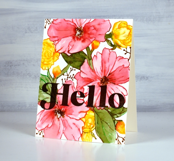
The large letters are from two Pink Fresh studio alphabet sets, the ‘H’ is from Lea’s Ornate uppercase set and the rest of the word from the Heather lowercase set. I stamped several times in versafine vintage sepia then embossed in clear powder for a glossy finish.
Thanks for dropping by today, make sure you visit the Foiled Fox blog for more information and inspiration!
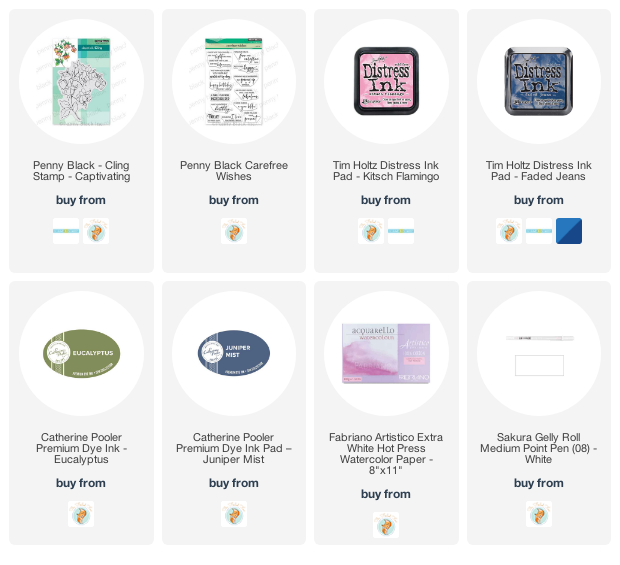
Supplies
(Compensated affiliate links used when possible)
Country scene
Posted: June 25, 2021 Filed under: arbors, Penny Black, snow fence, Stamped Landscapes | Tags: Fabriano Watercolour Paper, Penny Black stamps, Ranger Distress inks 7 Comments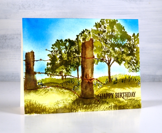
Another stamped scene, this one a little closer to home than the desert in the previous post. I paired the PB ‘arbor’ and ‘snow fence’ stamps to create a pastoral scene. I worked on hot pressed watercolour paper using distress inkpads and markers as my ‘watercolour paints’.
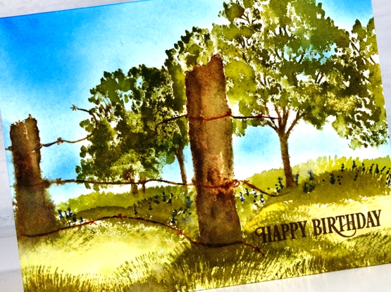
As the fence posts are in the foreground I stamped them first in a mix of browns, black and grey then blended on paper with water. Once the posts were dry I inked the trees in a few greens and brown avoiding the area behind the fence post. I should have masked the posts but I was feeling a bit lazy so I just inked and stamped several times getting closer each time to the post without stamping over it.
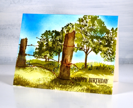
Once the trees were completed I painted a light wash of crushed olive and peeled paint inks over the ground area then used a fan brush which I’ve left untouched for years to paint grass in both forest moss and peeled paint. For a bit of interest I added blue dots to look like flowers under the trees. My stash of birthday cards is looking low so I added a partial sentiment from the birthday humor set. Are you a scenic stamper? What are your favourite techniques for bringing scenes to life.
Supplies
(Compensated affiliate links used when possible)
Desert Sky
Posted: June 23, 2021 Filed under: desert dream, Stamped Landscapes | Tags: distress markers, Fabriano Watercolour Paper, Penny Black stamps, Ranger Distress inks 7 Comments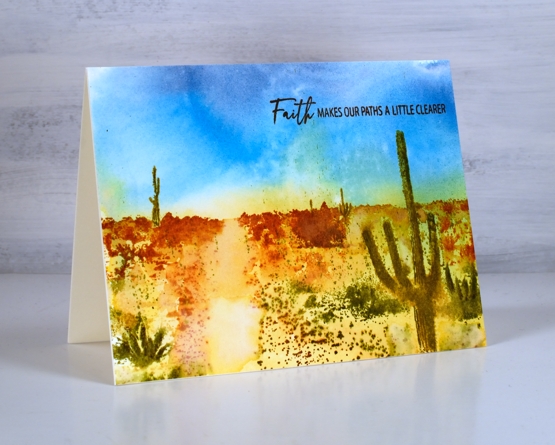
After creating some gel printed landscapes I was inspired to return to another technique I enjoy: creating landscapes with scenic stamps. Sometimes I combine scenes to create a new landscape or stamp additional elements, other times I stamp a single complete landscape as shown in this ‘desert dreams’ stamp. It was released a few years back but this is the first time I’ve inked it. Before getting to the stamping I created the painted background which included a two tone blue sky and two toned desert floor. I smooshed distress inks on my glass mat, spritzed water over the ink and swiped the watercolour panel through to pick up colour.
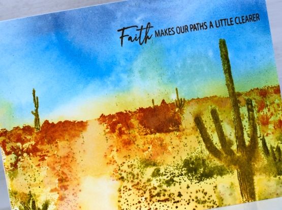
Once the panel dried I did the stamping in a stamp positioner so I could build up the colour and picture bit by bit. I started by inking the cacti with crushed olive and peeled paint markers, the distant foliage with rusty hinge and the foreground foliage with peeled paint and forest moss. I spritzed the stamp but also used a paint brush and occasional spritz on the panel.
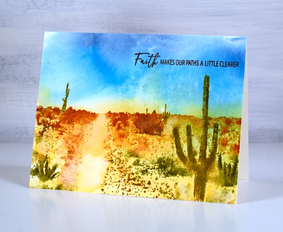
You can see my finished design doesn’t contain fine details but the overall feeling is a hot day in the desert day among some bold contrasting scenery. I finished the card with a sentiment from the PB ‘Faith.Hope.Love’ set.
To see more scenic stamping take a look at these posts: Arbors, Pumpkins, Fields of gold and Beloved view.
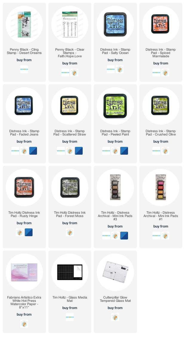
Supplies
(Compensated affiliate links used when possible)
Craft Roulette
Posted: June 21, 2021 Filed under: garden variety, Penny Black | Tags: craft roulette, distress markers, Penny Black stamps, Ranger Distress inks 10 Comments
I had the opportunity to participate in Craft Roulette on Friday night. If Craft Roulette is new to you (as it was to me until a month ago) it is a live crafting improv game show hosted by Mary Gunn every Friday night on Youtube. She has a different guest each week, sometimes more than one, and they craft together. Every week the parameters for the card are different as the wheel is spun four times, once for type of card, then colour choices, a theme and finally a random element.
I was delighted to see familiar names from this blog pop up in the live chat; thank you so much for joining in. Although I could not respond to all the chat I went back and read through it yesterday and was so encouraged by your kind words. I know some of you stayed up very late to watch!
The wheel was pretty kind on Friday night and none of the parameters took me too far out of my comfort zone. The card style was MATCHBOOK ( I needed a refresher on that), colours were RED +2, theme was MORNING and the random element was SPLATTERS! You know I love splatters.
I chose to create a background sunrise, add some red and green flowers (PB garden variety) then add splatters with water at the end. My three colours were red + green and yellow. The evening was very enjoyable; Mary is a hoot, the viewers on live chat were the loveliest and being live on the interwebs was not as daunting as expected. I might just attempt my own live creating on youtube from time to time.
As the challenge unfolds, viewers are encouraged to make a card following the same parameters. Some viewers watch and create as the show progresses but most make and post their cards after watching the show. Everyone has until Sunday evening to submit their creations. The cards are all shared during the show the following week. Contributors are entered into a few prize draws at the end of the show. So you see, Craft Roulette is a happening place, full of fun and inspiration and worth checking out on a Friday night. To see how I created this card you can watch the replay here.
Supplies
(Compensated affiliate links used when possible)
Fern gel print journal page
Posted: June 18, 2021 Filed under: Art Journal, gel press | Tags: Art Journal, gel press, gel printing, youtube 7 Comments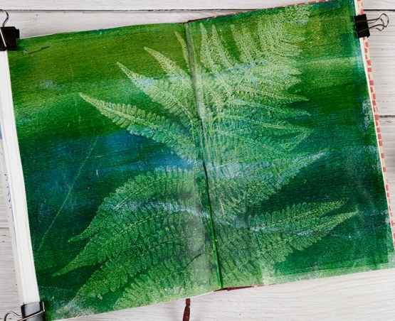
Another art journal page today which is unusual for me. After noticing there was a fern growing beside one of the drainpipes off my roof I had to try gel printing with one of the intricate fronds. I made a card with a fern gel print too but carelessly I let it leave the house before being photographed!
To gel print a leaf or feather I use a two step process. I apply paint to the gel plate; I used blues and greens and the large 12″x14″ gel plate. I lay the fern frond as flat as I could on the plate and then took a print; once again I used rice paper. The first pull picks up all the surrounding ink leaving a white empty frond shaped space in the middle. I carefully removed the fern which reveals the print of the frond still on the gel plate. I took a second pull, laying the paper down in the same place so it picked up all the detail of the fern. You can see a video of the same process in an earlier post.
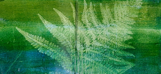
To attach the large print to my art journal pages was a little tricky. I cut it in half and worked one side at a time applying the matte medium to the page not the print. I will do the opposite next time. Rice paper is thin which makes it less bulky but I had to be careful not to use too much glue. When I made the card (which is gone!) I applied a thin coat of matte medium to the gel print and immediately pressed a piece of cardstock down on the rice paper and put something heavy on top. It worked well.
Thanks for joining me this week as I went off in card-less directions. I have enjoyed your encouragement and thoughts in the comments. If you are free tonight at 7:30 EDT and want to see me creating live online for the first time I would be thrilled. I have no idea what I’ll make; it all depends on what the wheel spins for me!
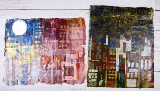
Gel print city journal page
Posted: June 17, 2021 Filed under: Art Journal, gel press, Waffle Flower | Tags: Fabriano art journal, gel press, gel printing, gelli plate, Waffle Flower dies 5 Comments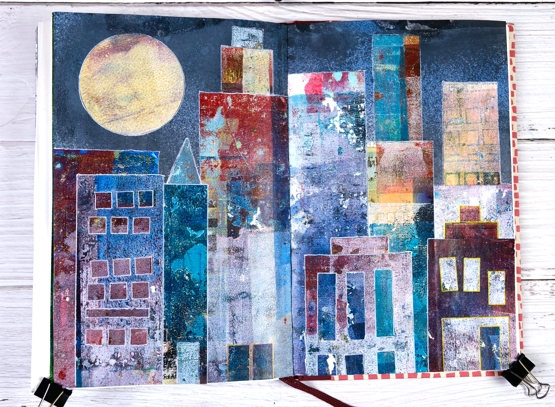
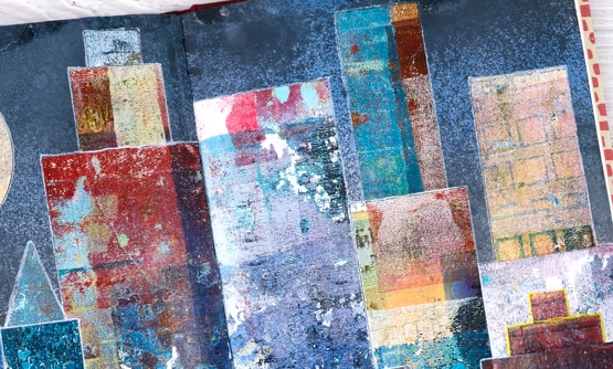
Continuing my week of gel prints you might see a resemblance between yesterday’s projects and todays. I posted large cityscape projects yesterday made by masking areas of the gel plate with paper rectangles cut from stiff magazine paper. Some of the masks had little shapes cut from them with dies. I used the magazine masks over and over on several prints and experiments so by the end they were covered in paint and way more interesting than they started out.
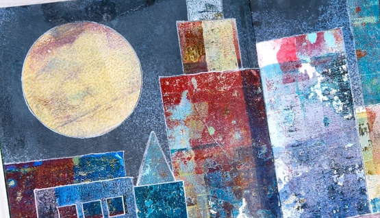
Rather than save the masks or throw them away I turned them into a city scape art journal page. Once again my scraps are prettier than some of my prints! Every time I brayered a new colour onto the gel plate I lay the rectangle masks paint side down so they ended up picking up paint, pattern and texture while occasionally letting a bit of text or photo show through.
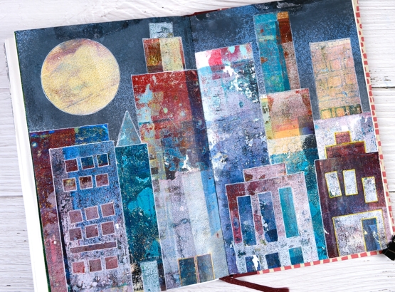
The background sky was done with distress sprays, a few blues and a black (listed below) spritzed over the open spread to cover the top half of both pages.
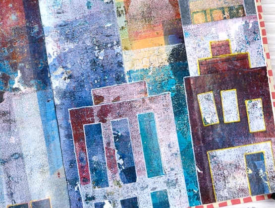
Once the sky was dry I arranged and rearranged the ‘buildings’ so I would have contrasting heights and colours across the scene. Some of the tiny shapes die cut from the masks also had paint on them so I used a few as doors on this scene. The windows are all cut outs revealing some of the prints underneath. I used matte medium and a Tim Holtz collage brush to glue everything down then decided to outline the shapes with gel pens to separate them a little more.
This art journal design was one of those rare ones that turned out as I imagined it might. Doesn’t always go that way!
I mentioned a couple of days ago I am appearing on Craft Roulette Live Improv show on Friday night. I’d love to see you there if you are free. You can hop on the chat and say hello. The details are here and here
Supplies
(Compensated affiliate links used when possible)
Gel print cityscapes
Posted: June 16, 2021 Filed under: Darkroom Door, gel press, large stars, Stencils | Tags: gel printing 11 Comments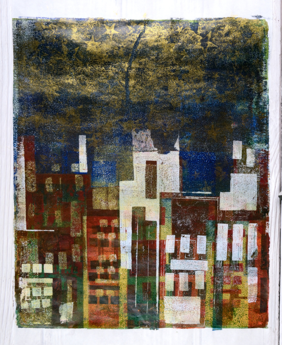
Yesterday was coast line, today we are back to the city. I hesitated before sharing these as I am still experimenting with the technique but I think these two panels are good representations of what I am aiming for.
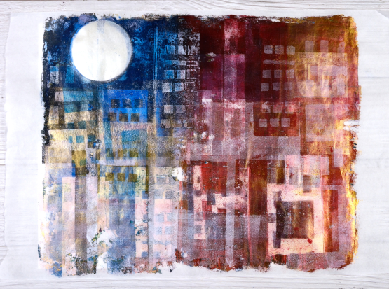
These panels are quite large; they are printed on rice paper from a 12″x18″ pad. My gel plate for these is 12″ x 14″ so it was tight on the edges and sometimes I didn’t get it lined up exactly. With gel printing not getting things lined up exactly is part of the charm in my opinion. I initially bought the rice paper for painting but it was the perfect size for large gel prints so I tried it and liked it.
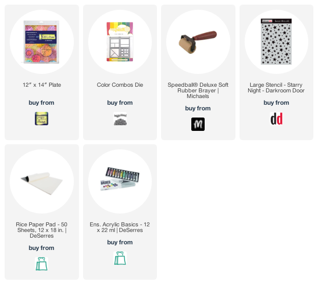
My technique for both these panels was the same. I began with a two or three colour base layer then every time I printed over the top I lay rectangular pieces of thick magazine paper over sections of the panel to mask ‘buildings’. Some of the rectangles had little squares and rectangles cut out; I used the Waffle Flower ‘color combos’ dies for that.
The tall panel has gold stars in the sky created using the Darkroom Door large ‘stars’ stencil but other than that I didn’t add texture to the layers. I plan to do more of that as I keep experimenting.
My plan wasn’t to make one rather dark and the other light but that is what happened. Both feature gold paint but in the lighter one it has showed up as a sheen in the photograph and distracts a bit from the ‘buildings’.
The process is enjoyable but takes some planning and thinking because any surface that I want to preserve has to be masked on the next and subsequent layers. Sometimes I get it right, sometimes not, but I’m still happy with these abstract cityscapes.
Supplies
From the ocean or the shore?
Posted: June 15, 2021 Filed under: gel press | Tags: gel press, gel printing 11 Comments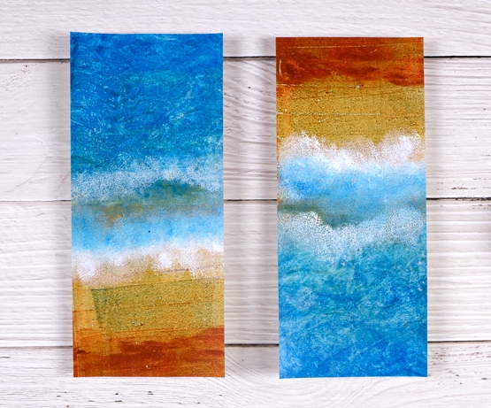
Today’s gel prints are inspired by aerial views of parts of the West Australian coast. I haven’t been there but the views I’ve seen on youtube show these colours. These panels are roughly slimline card size but they are not made into cards yet because I’m not sure if I want to send them or display them. I think a very slim black strip with a sentiment could look good but I can’t commit to it yet. I’ve already started worked on a larger similar print so I might be able to part with these ones.
I also have a bit of exciting/terrifying news about Craft Roulette; if you want to hear more about that make sure you read to the end of this post.
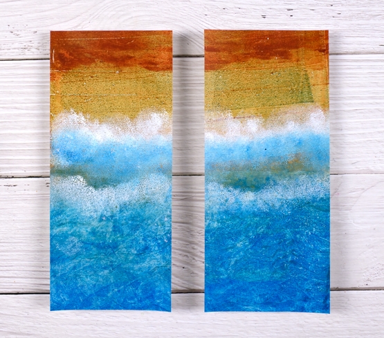
I also wonder which way you think they should be oriented. The view above appears to be looking from the ocean back to the beach. The view below is from land out to the ocean. What’s your preference? There is no right or wrong of course.
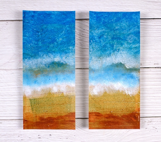
I created these on a large gel plate in a few layers, not too many as I didn’t want to muddy the sandy end. I started with blue acrylic paint in two tones covering half the plate then mustard covering the other. The next print once again had blue but I put some texture marks in it with a homemade ‘wide comb’ edge and added a rusty colour at the other end.
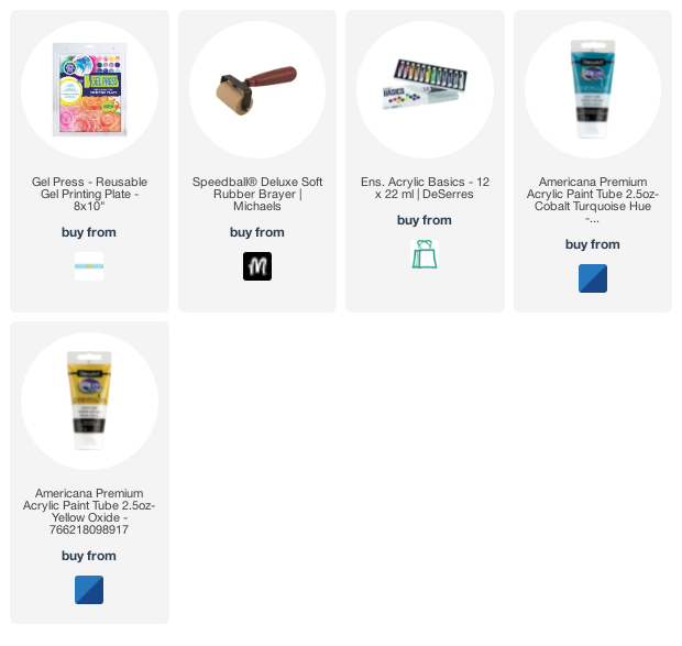
The final prints were to add the white foam and extra blue so I sponged the blue and white acrylic paint onto the gel plate in roughly the middle, took another print and then repeated the sponging. I used a mixture of acrylic paints, some liquitex basics, some decoarts Americana, but in the midst of a gel printing session I don’t always take note of what colours I use and by the end of the session all the colours are out on the table! The cardstock is a lightweight white card, about 60lb weight, not the usual 110lb I use for card bases.
In other news, on Friday evening I will be a guest on Craft Roulette, a live improv crafting game show on youtube hosted by Mary Gunn. I have never created live before and it is improv so I don’t even know what I will be making until they spin the wheel. Pop over to the Craft Roulette youtube channel; you can find out what it is all about, check out old episodes and get ready to watch on Friday night. It is 6:30 MT so that’s 7:30 EST and beyond that you will have to do the math!
Supplies
(Compensated affiliate links used when possible)
Gel print backgrounds
Posted: June 14, 2021 Filed under: Brutus Monroe, contemporary, gel press, perfumed | Tags: brutus monroe embossing powder, gel press, gel printing, Penny Black creative dies, Penny Black stamps, WOW embossing powders 8 Comments
I have had my gel plate out recently and I am addicted. It is what happens when I get it out. Gel printing can be frustrating because some of the prints are a whole lot of nothing much while others are full of pattern, texture and colour. I never know whether the next print will be the former or the latter so I keep on printing. I have a stack of prints sitting around and I decided it was time to cut a few up to make cards. I added some stamping and die-cuts.
This first card is my favourite but I must be honest with you, it isn’t a gel print. It is the scrap paper I cleaned the brayer on! I love how pretty the colours and blends are but I’m a bit miffed that my clean up page was prettier than many of my prints!
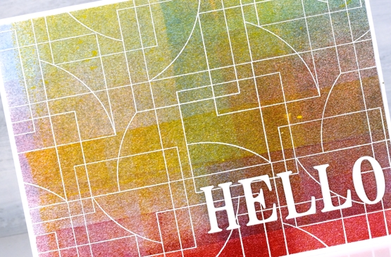
To turn it into a card I stamped and embossed the PB ‘contemporary’ stamp in white and added the hello, cut with the PB ‘thanks & hello’
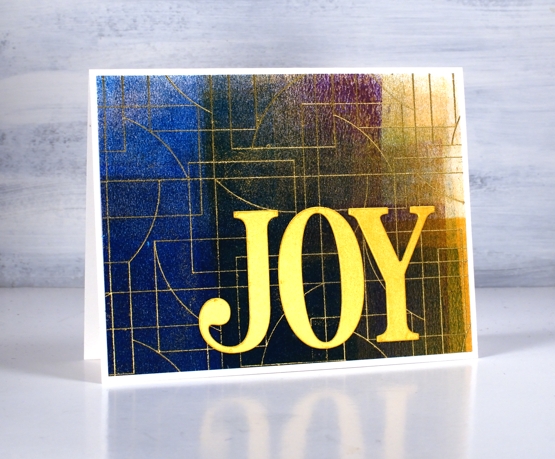
Same deal with this background but embossed with gold and adorned with the PB ‘jumbo joy’ die.
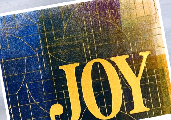
I’m glad to add another card to my very small Christmas card stack. My resolution to add to it every month seems to be a bit off and on.
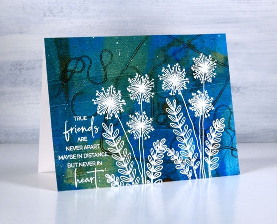
This background is a recent print and includes a fun thread printing technique I saw on Birgit Koopsen’s instagram. She recently completed a challenge gel printing every day in May. She generously shared all the techniques she tried.
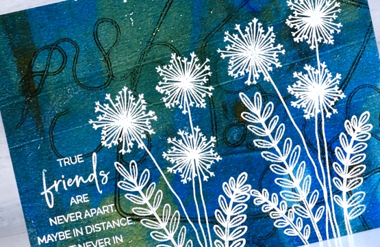
I added flowers from the PB ‘perfumed’ set and a sentiment in white embossing powder.
I guess the title of this post was a bit inaccurate as only one of these cards features a gel print background! Watching beauty emerge when gel printing is so much fun. To glance over at my brayer clean up sheet and realise I have to save it because it looks like a pastel check table cloth is a bonus. To see the pale ghosts of stencils turn up on third or fourth prints also amazes me.
I did not participate in Birgit’s recent challenge as I was busy busy launching the new online Floral Faves class but now the gel plate is out I am challenging myself to post something gel-print related every day this week. See you tomorrow.
Supplies
(Compensated affiliate links used when possible)