Wreath & Wings
Posted: November 4, 2020 Filed under: Coliro paints, Hand lettered, mirthful, wreath & wings | Tags: Coliro paints, distress markers, Hand lettering, Penny Black creative dies, Penny Black stamps, Ranger Distress inks, Staedtler watercolour brush pens 6 Comments
I’ve combined a new PB stamp, ‘wreath & wings’ with a new PB die, ‘mirthful’ for simple elegant style Christmas card.
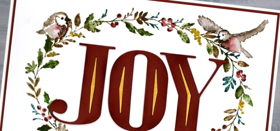
I used distress inks and markers to ink the wreath elements and birds, keeping the stamp in the positioner so I could work a bit at a time. I inked the stamp, stamped the image then did a bit of blending with a paintbrush to fill the leaves, berries and birds.

I used a gold gel pen to colour some of the berries then continued the gold highlights in the die cut word. The die has decorative diamond cut outs so I cut gold ones to add to the burgandy letters and framed the panel in the same burgandy cardstock.
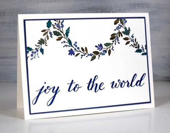
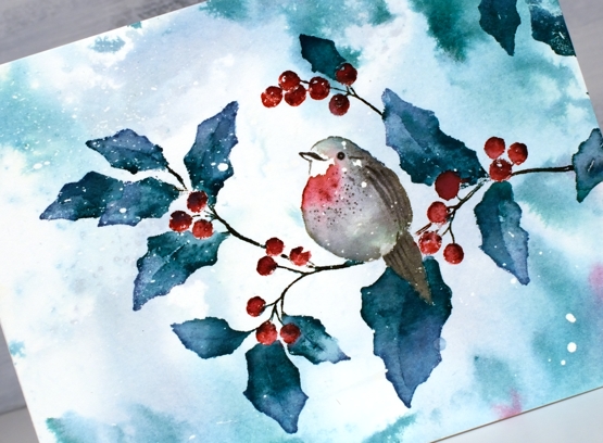
For the second card I decided to use the curve of the wreath as a hanging garland. Using a centering ruler to help me with positioning I stamped half the wreath on the centre top edge of the watercolour panel, then stamped another part loop either side.
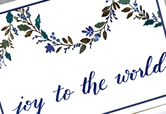
Once again I worked on hot pressed watercolour paper so I could blend the ink on the leaves. I used ocean coliro pearlescent paint on some of the leaves and berries for a little shimmer.
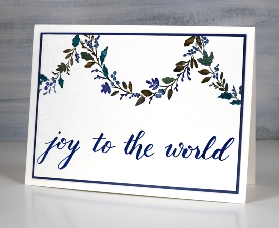
I wrote the sentiment for this one using the darkest blue marker from the Staedtler watercolour 36 brush pen set and matted the panel in a dark blue cardstock.
Even though I don’t like to over do my designs I’m wondering if the blue card is a bit sparsely decorated. What do you think?
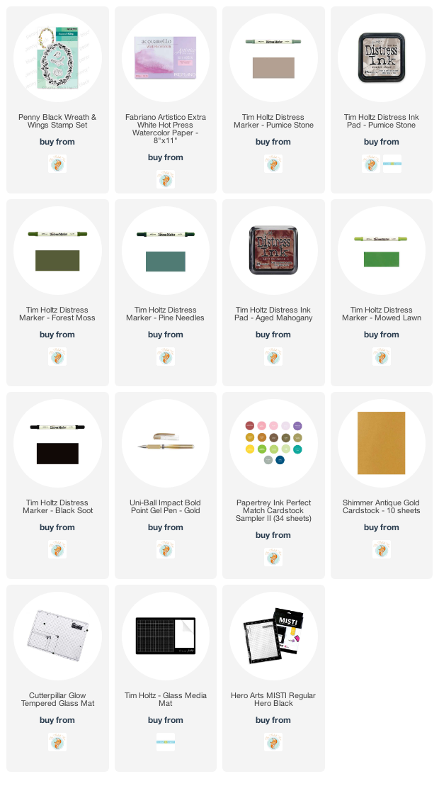
Burgandy Card Supplies
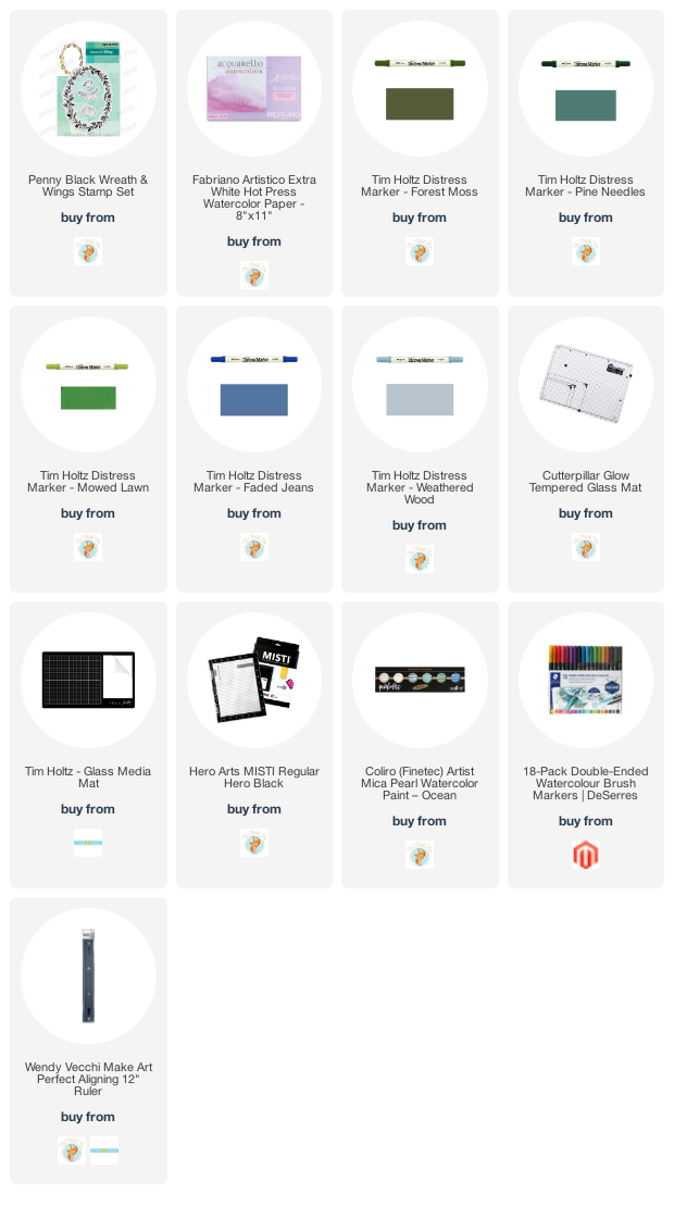
Blue Card Supplies
 <
<
Season’s Tweetings video
Posted: November 3, 2020 Filed under: season's tweetings | Tags: distress markers, Penny Black stamps, Ranger Distress inks, Tutorial, video 9 Comments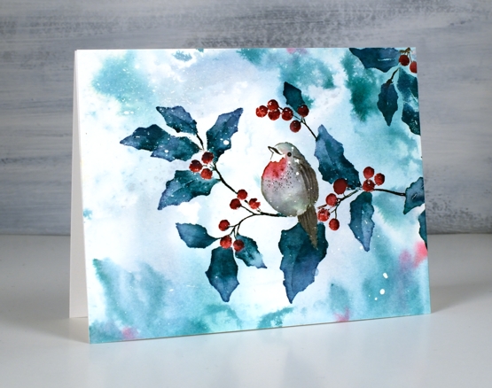
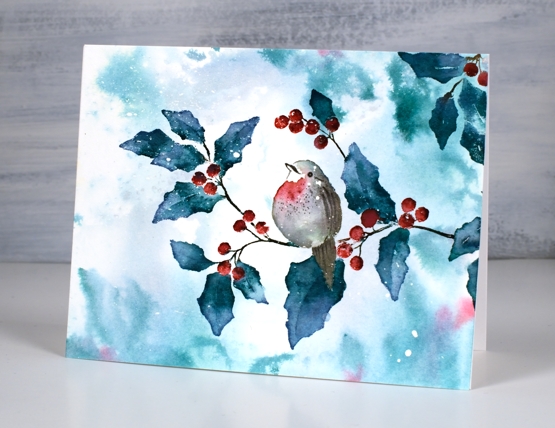
This sweet bird on a branch is a single stamp from the new Penny Black release ‘Season of Hope’. The stamp is called ‘season’s tweetings’ and I used it here to create both the bokeh background and the foreground watercoloured image. I filmed my process so you’ll see how I use the same blending technique to build up colour on the leaves and just a few tones to paint the little bird. (the video might look familiar to you if you have a membership with Penny Black)
We have a few centimetres of snow on the ground this morning so this sort of scene is becoming way more likely!
Thanks for dropping by today, I will be back with more of the PB new release over the coming weeks.
Supplies
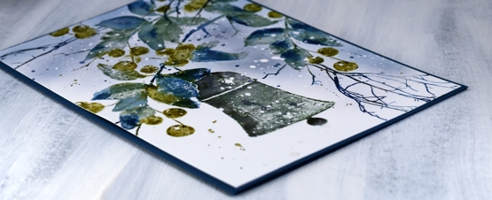
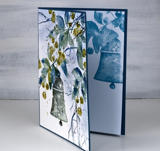
Bell & Berries
Posted: October 28, 2020 Filed under: bell & berries, Coliro paints, Finetec paints, fragile branches, Penny Black | Tags: Coliro paints, Fabriano Watercolour Paper, Papertrey ink, Penny Black stamps, Tsukineko Memento inks 13 Comments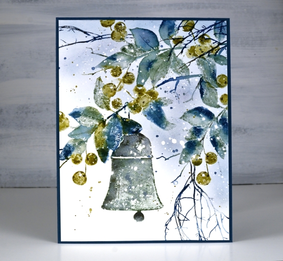
Over the summer I kept reaching for the blues and greens; they were refreshing in the hot weather. It appears that my fascination with them is continuing into the winter! I created this wintry panel with the Penny Black ‘bell & berries stamp and the versatile PB ‘fragile beauty’ set.
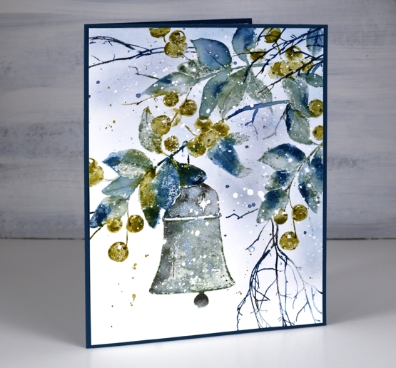
When I started this panel by stamping only the branch section of the stamp at the very top I chose only blue, grey and green inks. Choosing green over red for the berries helped to create a fresh frosty look. After stamping only the top branch I repositioned the stamp and stamped the whole image then finally a bit more branch on the right hand side. The extra twigs were added in dark blue.
I inked the leaves with papertrey ‘enchanted evening’, a dark blue and ‘stormy sea’, a grey blue. I used the olive toned ‘prairie grass’ for the berries. When I spritzed the stamp before stamping on the hot pressed watercolour paper the inks began to blend. I did further blending on the paper with a paint brush and water but didn’t blend every part of the image, some leaves and berries I kept unblended to show the texture of the paper and stamp.
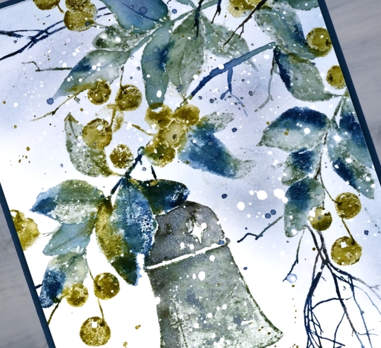
The paper had spots of masking fluid splattered over it before I began which caused the white dots you see in the finished panel.
I stamped the bell in a mix of stormy sea and true black ink and also added ‘blue silver’ pearlescent paint from the Coliro ‘ocean’ set so there is a shimmer to it in real life.
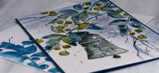
I used a piece of dark blue cardstock for a card base then stamped the ‘bell & berries’ on both an insert panel and the envelope.
I woke up to the frosty look of fresh snow on autumn leaves this morning; it’s pretty but it can go now!
Supplies

Autumn lanterns
Posted: October 14, 2020 Filed under: Flower lanterns, fragile branches, Penny Black, Script | Tags: Fabriano Watercolour Paper, Penny Black stamps, Tsukineko Memento inks, Wendy Vecchi 5 Comments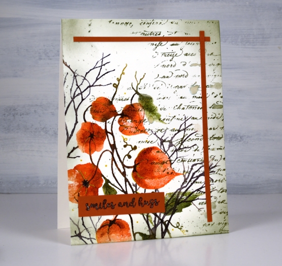
I have some dried Chinese lanterns in the corner of my workroom. They are lasting well, I’ve had them at least seven years, probably longer. A few have broken or fallen off the stems and the colour has faded so they are not the deep orange you see in the image on my card. I used Penny Black’s ‘flower lanterns’, ‘fragile beauty’ and ‘script background’ stamps to create this panel.
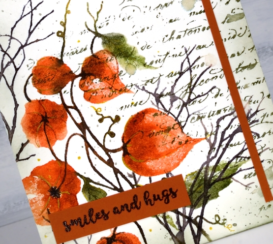
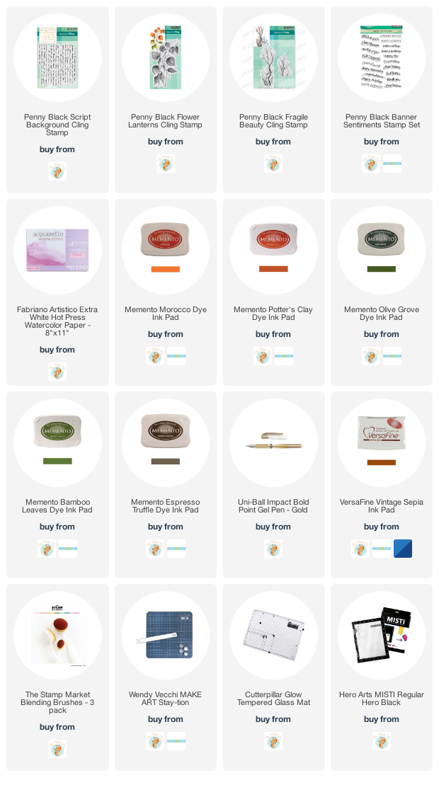
Just to mix things up a bit I pulled out memento inks for this project. There was a time when I used memento inks on every project and they are still within reach of my work table. The ‘Morocco’ browny orange is a beautiful colour so I started with that and used potter’s clay, olive grove, bamboo leaf and espresso truffle, some inkpads, some markers. I was very happy to see the ink pads are juicy as ever.
Memento inks don’t always blend once on the watercolour paper so I blend with a spritz of water to the stamp before stamping. I also smoosh some ink on my mat and pick it up with a brush if I want to add depth to a very specific area. I added some details with a gold gel pen after I had built up the lanterns and leaves with ink.
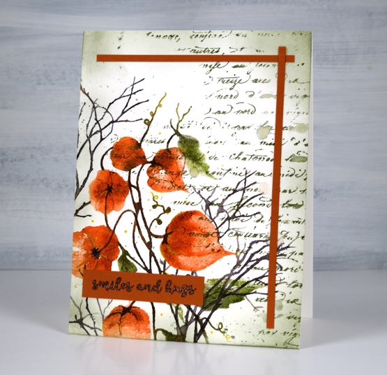
You can see some of my favourite ‘finishing touches’ on this panel: a script stamp, splatter and ink blended edges. I added two strips of co-ordinating cardstock as a half frame then balanced them with the sentiment from PB ‘banner sentiments’.
Supplies
Autumn Grove
Posted: October 5, 2020 Filed under: birches, Chat Bubbles, Penny Black, winter's forest | Tags: Fabriano Watercolour Paper, Papertrey ink, Penny Black creative dies, Penny Black stamps, Tsukineko Versafine inks 7 Comments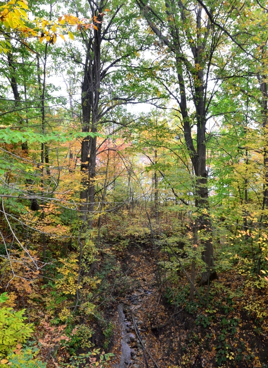
As I mentioned last week; I’m a seasonal stamper which shows in today’s card. I’ve included some inspiration pics taken on a walk last weekend not far from where I live.
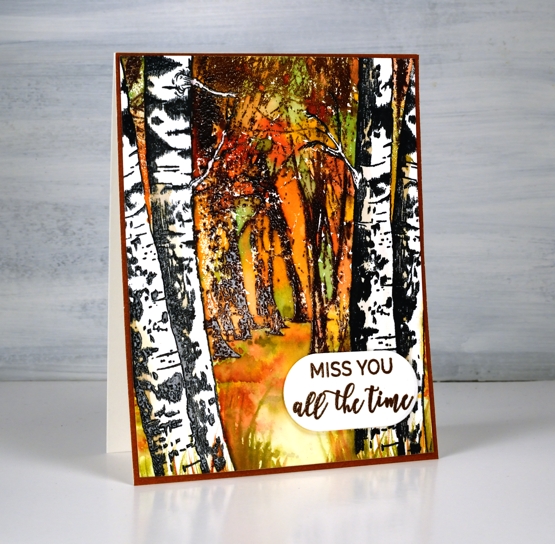
I stamped the PB ‘birches’ first in nocturne ink on hot pressed watercolour paper then embossed them in clear. I masked them with tape then, stamped PB ‘winter’s forest’ in Papertrey ‘cocoa bean’ and ‘dark chocolate’ ink then, while still in the stamp positioner stamped again with versamark ink so I could emboss in clear powder.
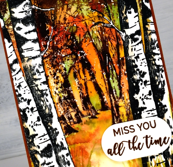
With all the trees embossed I started painting dabs of autumn toned inks around the trees and on the forest floor. The inks are listed below. Once I had the look of autumn leaves around the branches and scattered on the ground I used a white gel pen to draw back in the little birch branches I had accidentally painted over.
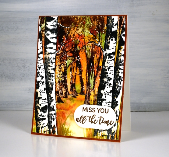
I stamped words from PB ‘family sentiments’ and cut them out with a speech balloon die which was exactly the right size. I matted the whole panel in brown then popped up the sentiment on a couple of pieces of cardstock.
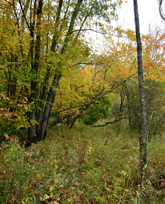
The colours are lovely around here right now and there are still plenty of leaves on the trees. We had an enormous tree removed from our yard earlier in spring so it will be interesting to see if the leaf collecting is a little easier this year. We still have four big trees plus others over the fence daring to drop their leaves in our yard too!
Supplies

Oxide Leaves Video
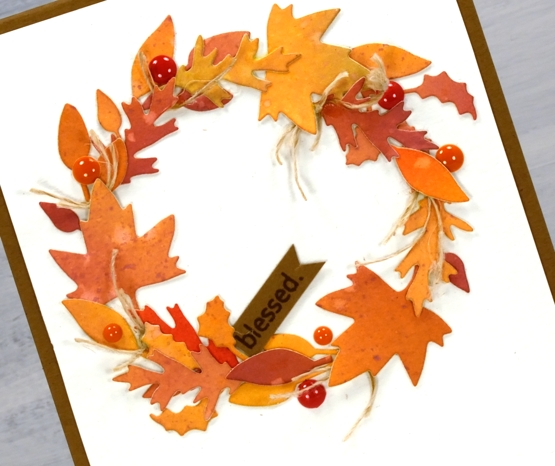
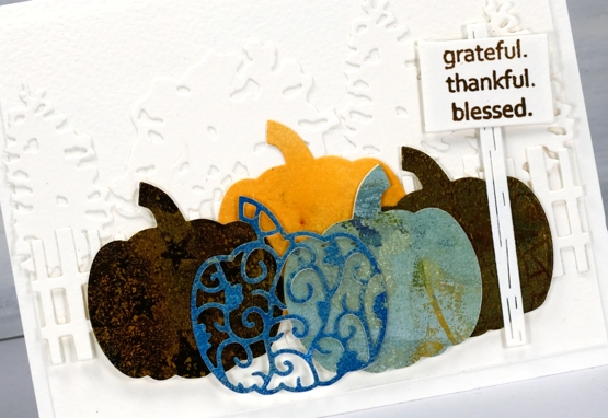
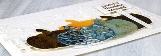
Posted: September 25, 2020 Filed under: Dies, fall foliage, golden delight, Penny Black, pumpkin & leaves, Tutorial | Tags: distress oxide inks, Fabriano Watercolour Paper, Penny Black creative dies, Penny Black stamps, video 5 Comments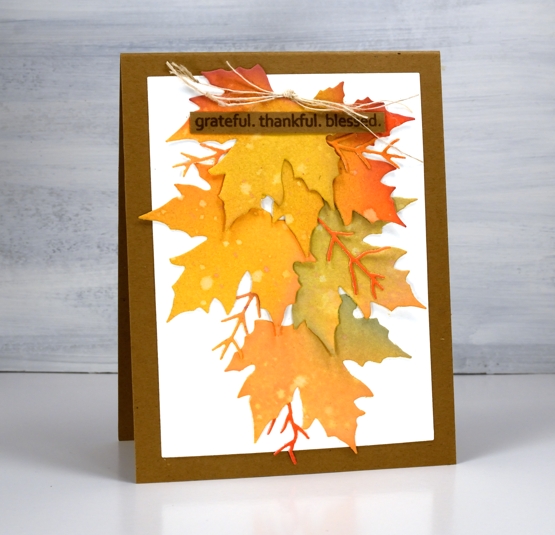
There is no denying it anymore, autumn is in the air and on the trees and definitely in the cards. This week the weather has been lovely, the sun has shone and the frost warnings have gone. Can’t complain.

I really am a seasonal stamper; I’m inspired by what is going on outside in the world. With a few exceptions, like Christmas card prep, I like to stamp what I see in the garden and surrounds. The leaves on my trees are beginning to turn, nothing spectacular yet and nothing to rake (yay) but the signs are there. I chose oxide inks to blend several three coloured panels which I then cut up into leaves. The process and chit chat is all in the video below.
After the video was completed I looked at the wreath and decided it needed some brighter pops of colour and luckily I had some enamel dots which matched exactly. I added them before taking the photos below.
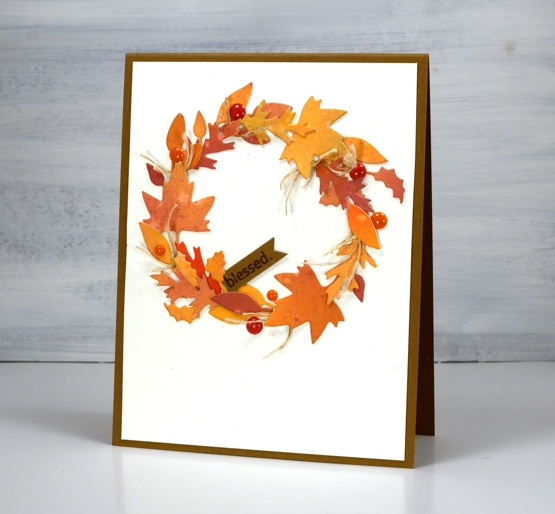
I really enjoy arranging all the elements on die cut cards like the two I’ve shared today but the gluing drives me a little crazy. Sometimes I use double sided adhesive but if the die cuts are not going to be sitting flat that doesn’t really work. If you have any suggestions for attaching fiddly little die cuts please leave them in the comments; I’d love to know. You might notice I try not to include much gluing in the video because it doesn’t make for very entertaining viewing.
I hope you are surrounded by some fall beauty where you are or perhaps enjoying some spring sunshine in the southern hemisphere.
Supplies
Gel print pumpkins
Posted: September 21, 2020 Filed under: gel press, leaf pattern, Penny Black, pretty picket, pumpkin & leaves, sign, trio of trees | Tags: gel press, gel printing, Penny Black creative dies, Penny Black stamps 4 Comments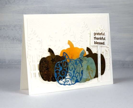
Despite what the title suggests this post isn’t about gel printing, it’s about using more dies on one card than I’ve ever done before. I tend to use dies sparingly, not because I don’t like them, but because they are usually called in to highlight or frame some watercolouring. This time the dies are the feature and I used some leftover pieces of gel printed paper for the pumpkins.
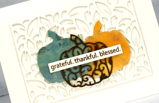
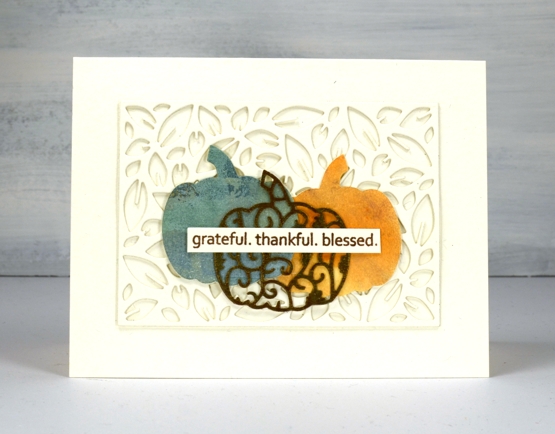
On the first card I built up a background for the gel print pumpkins with a row of die cut trees and then a die cut picket fence. Each pumpkin is two layer as the original cardstock used for printing was light weight. I tried to find prints in pumpkin colours and found a couple of blue/greens, some goldy browns and a pale orange; I didn’t have a strong orange in the pile. The fact that one of the prints had stars on it was definitely a bonus.
On the second card I stacked two leaf pattern die cut panels to create a textured background then layered the pumpkins on top of that. All the background die cutting and card bases are either luxe textured white cardstock or a cheap cold pressed watercolour paper that I thought was luxe textured white until I placed them side by side and had to rearrange things a bit.
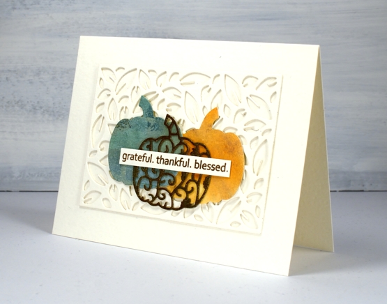
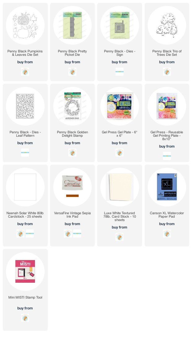
All the dies are listed and linked below and I made two messages with the same ‘golden delight’ sentiment stamp. I know I have other sentiments for thanksgiving but I can’t go past this one. For the cute little sign by the pumpkin patch I stamped one word, masked, then next word, masked and then the last one and wonder of wonders, it worked first go!
The layering and adhering of dies was a labour of love because I am just not great at the whole fiddly nature of gluing die cuts. When I imagined the card in my head it was way more intricate than either of these but it’s important to know your own limits and sometimes quit while you’re ahead!
Supplies
Falling Leaves
Posted: September 17, 2020 Filed under: Brusho, falling leaves, Penny Black | Tags: Fabriano Watercolour Paper, Penny Black creative dies, Penny Black stamps 5 Comments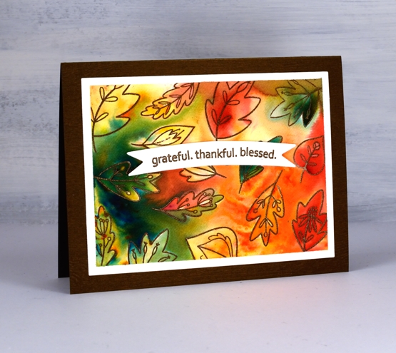
Falling Leaves is a new transparent set from Penny Black, part of the ‘Autumn Extraordinaire’ release. I made a random pattern with most of the little leaf stamps by embossing them on a piece of hot pressed watercolour paper. I taped the edges of my panel before I started and was able to keep a clean frame around the patterned area.
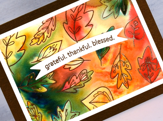
I arranged the leaves on the panel and embossed with versamark and potting soil powder. To add colour I started with just two brusho powders, gamboge and olive green sprinkled sparingly here and there over the leaves. After spritzing with water the colours started to move and fill the leaves and surrounding area but the gamboge diluted to pale orange and yellow so I added some brilliant red brusho to create a few more pops of colour. Most of the colour placement was random but I did move some around with a paintbrush.
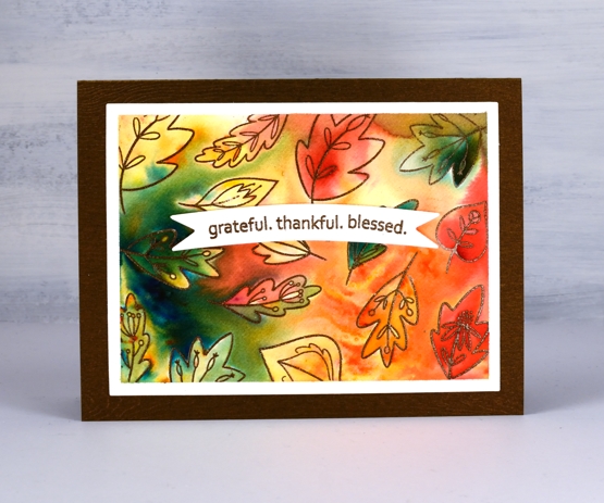
Once the design was complete I dried it, removed the tape and cut the panel with a rectangle die. I stamped the lovely sentiment from ‘golden wreath on a banner die cut then looked at my cardstocks to choose a base colour. I ended up with a lovely metallic brown wood textured piece which worked exactly how I thought it would. Then I wondered, did I make a very similar autumn card with this cardstock last year? Yes, yes I did.
Supplies
Pumpkin Season
Posted: September 15, 2020 Filed under: homeward, pumpkin season, Stamped Landscapes | Tags: distress markers, Faber-Castell Albrecht Durer Watercolour pencils, Fabriano Watercolour Paper, Penny Black stamps, Ranger archival inks, Ranger Distress inks 2 Comments
This lovely blue wheelbarrow filled with pumpkins is one of the new autumn products from Penny Black. It’s called ‘pumpkin season’ and I paired it with an older PB scenic stamp, ‘homeward’.
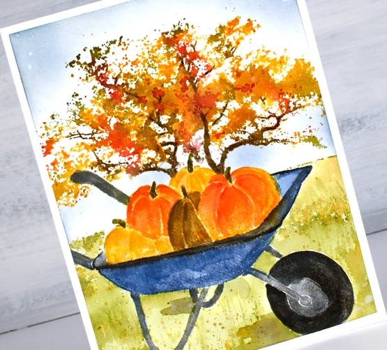
I worked on the wheelbarrow first while keeping it in my stamp positioner. I stamped the barrow in faded jeans archival ink, the base in hickory smoke archival and the pumpkins in fossilized amber archival. That gave me a base print to add to with distress inks which I could blend with water and a paintbrush. Still with the stamp in the positioner I inked different section with distress ink cubes and markers to build up the colours bit by bit. Once I was sure I didn’t have to stamp any more on the barrow I removed the panel, stamped the barrow on masking paper and masked the barrow in order to finish my scene.

With the panel back in the positioner and the barrow masked I stamped the ‘homeward’ scenic stamp over the top with ground espresso, spiced marmalade, barn door , peeled paint and wild honey inks. I blended the grass area immediately after stamping so I could extend the ground with peeled paint ink to fill the space around the wheel and base of the barrow.
I built up the colour of the tree with repeat stampings spritzed with water. Once the stamping and blending was complete I painted some shadows under the barrow with peeled paint ink and added some extra definition to the pumpkins with watercolour pencils. I blended the sky around the tree with stormy sky ink and a blending brush.
We harvested most of our tomatoes yesterday even though they are still green so now I am looking up green tomatoes recipes. The fried ones sound appealing (just like in the Fanny Flagg book) and a zucchini and green tomato relish could be good too.
Supplies
The Good Life with pumpkins
Posted: September 11, 2020 Filed under: Penny Black, Pumpkin Patch, Stamped Landscapes, the good life | Tags: Penny Black stamps, Ranger Distress inks 7 Comments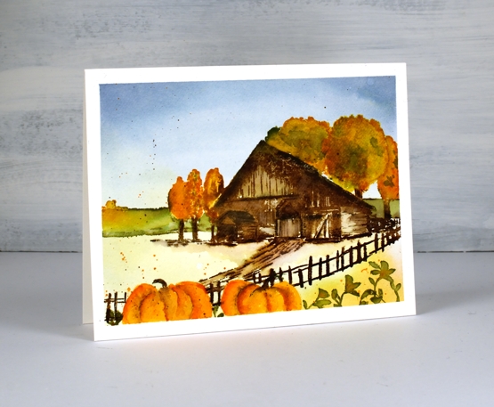
Even though I am in denial about summer ending my card making would disagree. I have seen leaves changing colour and there is a nip in the air. I’m not against autumn; I know everyone loves it, I just don’t like to see summer go! This little autumn scene combines the Penny Black stamps, ‘the good life’ and ‘pumpkin patch’.
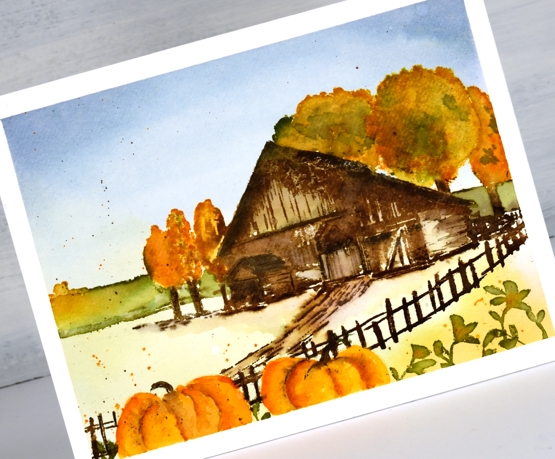
I worked in the stamp positioner for this one and there was masking involved too. I lightly stamped just the barn first, cut a mask for the roof then stamped an extra tree behind the barn. I also painted the back field in peeled paint and wild honey before returning to the trees and barn. I used the ink, stamp & blend process to build up the scene. I made sure I didn’t stamp the fence or track leading to the barn as I was planning to stamp something in the foreground. It turned out to be pumpkins which also needed to be masked before I added the fence and track.
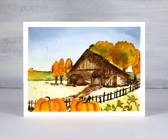
If you know your distress inks you could probably make some pretty accurate guesses as to the line up used on this panel. I added a bit of pencil colouring to the pumpkins and some little leaves along side them.
Supplies