
Pretty in pink
Posted: February 19, 2020 Filed under: Alexandra Renke, Autumn dragonflies, Autumn plant rose, Penny Black, shall we dance, the sweetest sound | Tags: Alexandra Renke cardstock, Penny Black creative dies, Penny Black stamps 7 Comments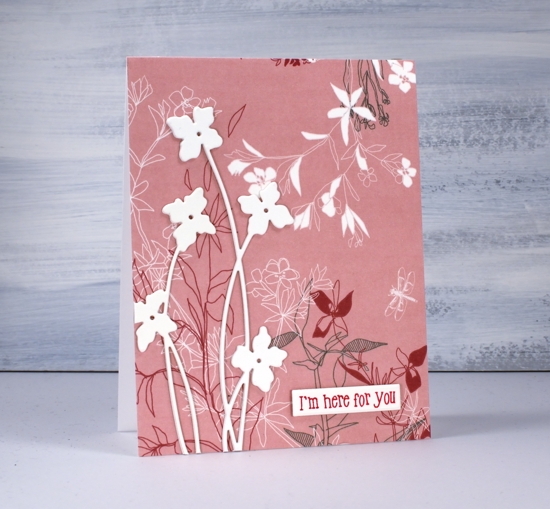
I’ve been playing with pretty paper again and have the Foiled Fox to thank for this lovely Alexandra Renke design. Make sure you pop over to the Foiled Fox blog where I’m sharing my process in making today’s cards. I believe I said it last time I worked with AR papers, the colours and patterns are so lovely I really don’t want to add much over the top.
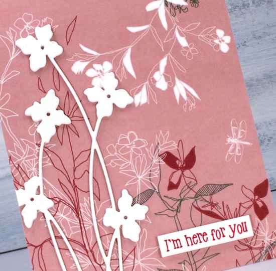
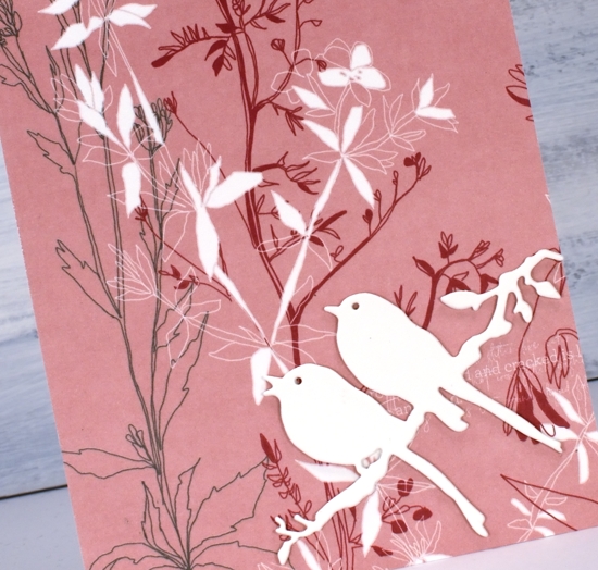
For both cards I covered the whole front with AR ‘Autumn Plant Rose’ paper. The delicate floral design covers most of the paper so I didn’t want to add too much that would clash with the paper. I chose instead to die-cut cream flowers and birds as focal images, keeping them cream coloured and stacked made them stand out from the background pattern. The tall flower die is from Penny Black and is called ‘shall we dance’. I like the way the long thin stems mimic the thin lines of the paper’s design.
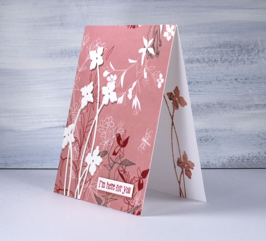
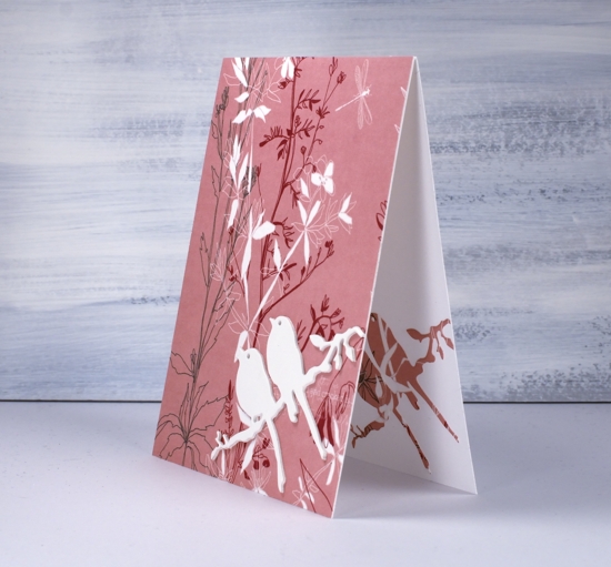
Adding the same die cut on the inside of the card was a must and simple to do after first adding stick it adhesive to the back of the patterned paper.
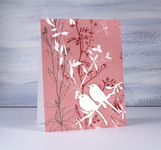
I used the same design idea and stacked three bird die-cuts for the second card and added a single patterned die-cut on the inside of the card. The die is called ‘the sweetest song’ and is another PB one.
I debated whether or not to add any sentiments and ended up deciding on one with and one without.
I will be doing more with this lovely paper and a pink abstract paper also by AR. I’ve linked the papers and supplies below and look forward to sharing more designs with you soon. Make sure you click over to the Foiled Fox and check out all the Alexandra Renke papers.
Supplies
Clover journal page
Posted: February 14, 2020 Filed under: Art Journal, crackle, Darkroom Door, Nature Walk, number medley, Stencils, warm wishes, Wildflowers Vol 2 | Tags: Art Journal, Darkroom Door stamps, Darkroom Door stencils, Ranger Distress inks, Ranger Distress stains, Wendy Vecchi 7 Comments
Are you wondering if I’m repeating myself? Didn’t I post this a few days ago? Indeed, I posted something similar on Monday, a card featuring the new ‘warm wishes’ set from Darkroom Door. At the end of the post I mentioned that I’d like to transform the design into a journal page…so I did!
I kept my colour scheme with the addition of more green and added a few extra stamp images and a bit of texture. I used a Fabriano ‘Venezia’ art journal, with drawing paper not watercolour paper. The weight of the paper is decent but if I’m going to be spritzing and adding water and ink I paint a layer of absorbant ground on both pages first.
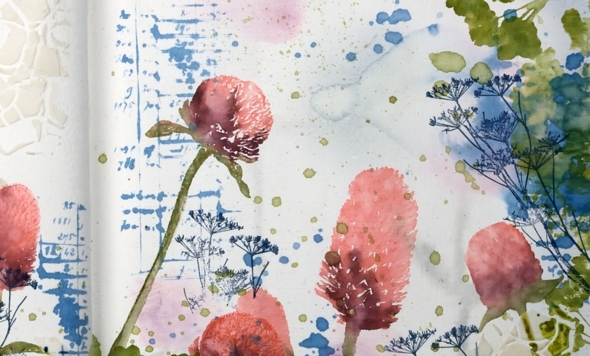
I began by inking up the clover stamps with worn lipstick, aged mahogany and peeled paint markers, spritzed them so the ink started blending on the stamp then stamped randomly across the pages. I spritzed the images lightly so the ink moved and softened and also dabbed colour and water away with a paper towel. I inked the number/account book stamp from ‘number medley’ set with stormy sky distress stain and stamped it randomly around the pages. After stamping I spritzed the images so the ink spread, diluted and ran across the page. I dabbed some of it dry but left other bits to make watermarks. I also splattered the stain around with a paintbrush. Once the first layer of stamping was dry I switched to stormy sky distress ink and a blending brush to add colour to all the page edges. Also on the dry page I added a bit of texture by applying modeling paste through the DD stencil, ‘crackle’. The crackle was not very obvious but showed up a bit more after I added more stamping.
At this point I considered the background complete and started on the more distinct stamping. As I was working in the journal I couldn’t place it in the MISTI so I placed my ‘staytion’ magnetic board under the left hand page and added some acrylic blocks underneath the board to balance the left side of the journal with the right. I used an acrylic block to stamp all the clover and positioned a stampa-ma-jig against the block a couple of times just in case I didn’t have a complete image. I was able to do touch ups with a paintbrush and extra ink if the stamping was too pale.
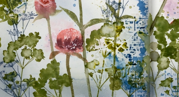
I wanted some clover-ish leaves to stamp around the flowers so I grabbed a stamp from the DD ‘wildflowers vol 2’ and stamped foliage all around in peeled paint and forest moss inks. I added some green splatter too because journal pages always need splatter! At this point I was almost finished but I wanted a little more blue on the page. Rather than add more of the number stamp I used a very delicate floral stamp from ‘nature walk’ in faded jeans archival ink so I would have fine detailed lines that wouldn’t blend or blur. To balance mass of colour at the base of the pages I added more blue across the top edges. The blending brush was going to take too long so I swiped the ink pad over the edges and some water droplets also.
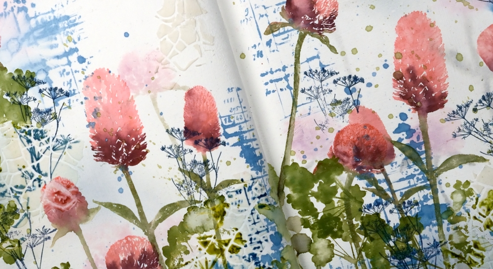
My journal is nowhere near full but it has become bulky with uneven pages because some have been glued to each other, others have been collaged. When I started the journal I glued pages together for sturdiness because that was what Vicky Papaioannou did and Vicky is an art journal wizard! She doesn’t always do that any more and neither do I because some of the pages just don’t want to be joined to each other, it makes it difficult to open them or flatten them. If you are an art journaller I would love to know if you prep your pages in some way so they can take a bit of water and liquid ink.
I hope you enjoyed seeing how a card inspired a double page spread; I definitely enjoyed working on the large scale with less pressure to keep things neat and contained!
Supplies
https://linkdeli.com/widget.js?1559654439292
Banner Blooms
Posted: February 13, 2020 Filed under: banner blooms, boxes, Darkroom Door, Penny Black, sennelier watercolours, Stencils | Tags: Darkroom Door stencils, Penny Black stamps, sennelier watercolours, Tsukineko Versafine inks 3 Comments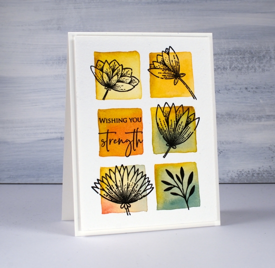
Recently I blended through a stencil to create square grid backgrounds for some floral silhouette stamping. Today’s card uses a similar technique but I wanted the squares to be less neat, a little imperfect but still recognisable as squares. I guess I could have freestyled them entirely but I wanted them to be evenly spaced and I didn’t trust myself to do that without the stencil as a guide. To achieve this look I once again taped a grid stencil (DD boxes 6 up) to a piece of cold pressed watercolour paper but instead of blending the squares then painting over them I just painted squares inside the stencil squares. I didn’t paint right up to the edges of the stencil because then liquid would have seeped underneath and made a mess. I used the stencil as my placement guide and painted a square inside each space.
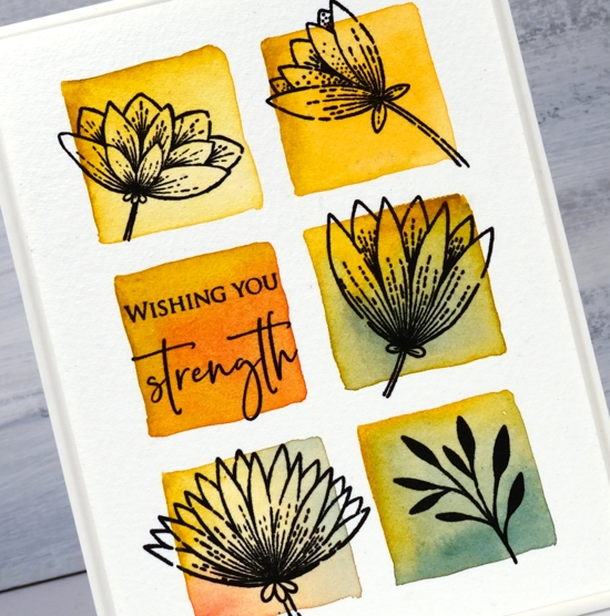
I used Sennelier watercolour paints but you could use any watercolour paints or inks. I started each square with a stroke or two of mustard yellow then added some blue, red or orange and blended it with the mustard. After it dried I flattened it in my minc then transferred it to the stamp positioner to stamp five different images from the PB banner blooms set in versafine clair nocturne ink. Simple but quite effective. I chose a sentiment from the PB ‘strength’ set for the last square.
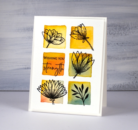
I really like the simple ‘shadow frame’ created by popping up the panel on a piece of foam; that’s why you keep seeing it!
Supplies

Sending Love
Posted: February 10, 2020 Filed under: Darkroom Door, number medley, warm wishes | Tags: Darkroom Door stamps, Fabriano Watercolour Paper, Ranger Distress inks, Ranger Distress stains 11 Comments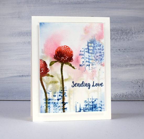
I posted a clean and simple two tone card last week featuring a new Darkroom Door set, ‘warm wishes’. The detail of the stamp was very apparent in my earlier card but this time I am showing it off with a watercolour look. The set includes five flowers ( I think they are clover) of different shapes and sizes. I have used a rounder flower on this card and stamped it several times to create a blurry background then twice with detail in the foreground.
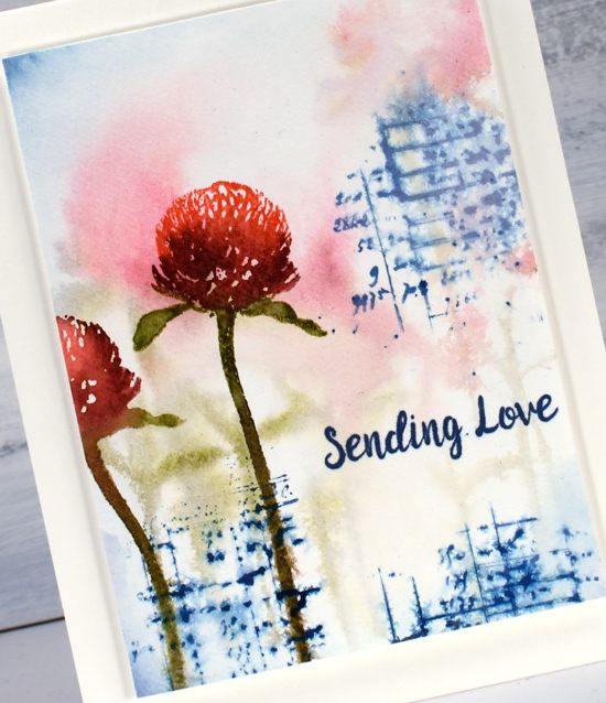
I began by taping some hot pressed watercolour paper to my glass mat then spritzing it unevenly with water. When it was fairly wet I inked the flower stamp in worn lipstick, aged mahogany and peeled paint distress inks then stamped it repeatedly over the wet panel. I re-inked the stem to stamp several times in the bottom left hand corner. To frame the design I painted some stormy sky distress stain around the edges. After the panel dried I transferred it to a stamp positioner so I could add a couple more flowers. I used the same three distress markers to ink the flower and stem then added darker green with a forest moss marker.
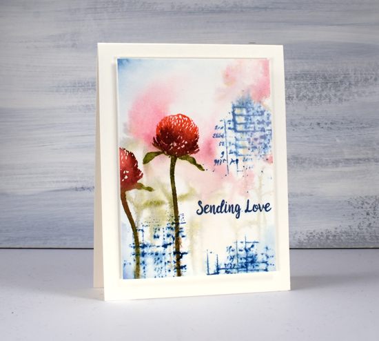
For some added interest I used a number stamp from another new Darkroom Door set, ‘number medley’. I know I am going to enjoy using this set to add texture and detail to a whole lot of projects. You probably wouldn’t have guessed the stamp is made up of numbers because I stamped with distress stain and did some spritzing to make the ink move a little.
To complete the card I added a sentiment from ‘warm wishes’ in faded jeans archival ink then popped up the whole panel with some white foam. I feel like transforming this design into an art journal page; what do you think?
For more inspiration with this new set head over to the Darkroom Door blog.
Supplies
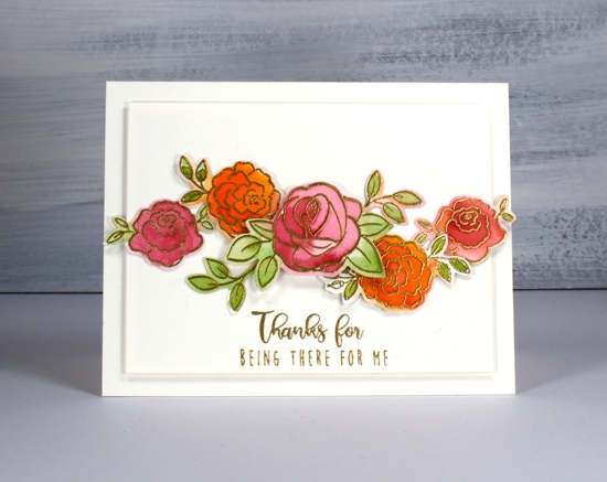
Tenderness roses
Posted: February 7, 2020 Filed under: Peerless watercolours, Penny Black, tenderness, tenderness matching dies 10 Comments
I am on the Foiled Fox blog today, one of my favourite artsy craftsy places to be. If you want to read how I created today’s cards then pop over there right now! If you want to read some of my musings and wonderings about stamps, dies and paints keep reading here and then click over there.
These roses are from a sweet little Penny Black set called ‘tenderness’ and it has co-ordinating dies. I have come a little late to the co-ordinating die game but you know I don’t like to fussy cut so it’s no surprise that I opted for the die cutting route. Another reason I haven’t used many co-ordinating dies is because I often stamp and paint directly on my panels with very few layers involved.
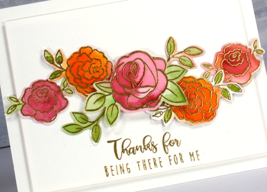
One of the questions with co-ordinating dies is how to deal with the white outline if you have a coloured background. I think I’m used to seeing it now so it doesn’t bug me as it once did. On the roses above I did paint outside the lines on a few of them so there is a mix of coloured edges and white edges. I don’t think it is too distracting either way.
Another thing you can do with co-ordinating dies is cut masks for layered stamping. The masks will be a bit bigger than the stamped image but it is easy to trim a little off or just position the masks to line up with the edge of the stamp that needs to be masked.
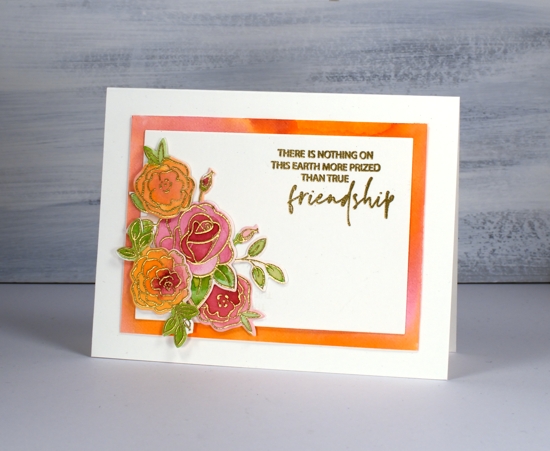
I did all the painting for these cards with peerless watercolours. Sometimes I forget about my peerless paints because they are an unassuming collection. If you haven’t heard of them before check out an earlier blog post I wrote about them. The colours blend beautifully, the range of colours is excellent and the price is pretty nice too.
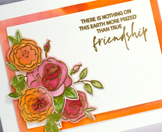
I chose friendship sentiments again, one from PB ‘love language’ and one from ‘bear cuddle’. All the supplies are listed below and here’s the link to my process on the Foiled Fox blog.
Supplies
Dragonfly Blue
Posted: February 5, 2020 Filed under: Alexandra Renke, Autumn dragonflies, little lowercase letters | Tags: Alexandra Renke cardstock, My Favorite Things, Penny Black creative dies, Penny Black stamps, WOW embossing powders 9 Comments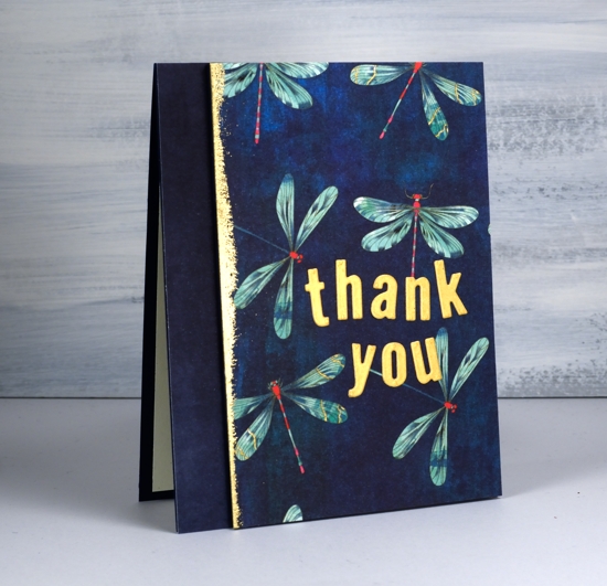
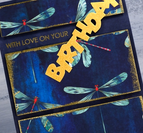
I don’t often use patterned paper on my projects but when I saw these Alexandra Renke designs from The Foiled Fox I wanted to make ALL THE THINGS and cover them with this paper! To be honest I just wanted to stick pieces of this ‘autumn dragonfly’ paper on the front of cards and call them done! The blue background is beautiful; the dragonflies are delicate and pretty and there are little gold lines here and there. What more do you need on a card front?
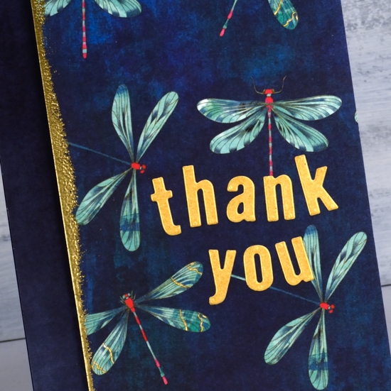
I did add a few of my own touches to the cards in the end but I might still make dragonfly paper card fronts which are simple and unadorned. Because of the little bits of gold here and there on the dragonfly wings I chose gold cardstock and embossing powder for my added elements. I swiped a versamark along edges of the dragonfly panels then embossed them with gold powder.
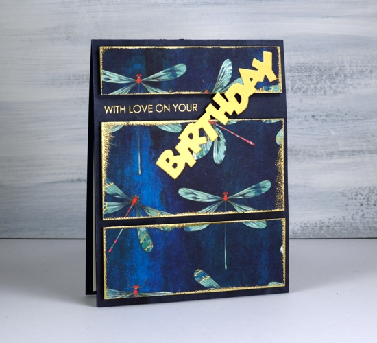
I used a co-ordinating Alexandra Renke paper on both card fronts. It’s called ‘autumn wild dark blue’ and it looks like a painted page. I popped up the dragonfly pieces on foam and added a gold embossed sentiment plus letters or words die cut from gold shimmer cardstock. I used the PB …birthday die paired with part of a sentiment from PB ‘good wishes’ set. I did all the lining up of panels with the help of the Wendy Vecchi art staytion. The board is metallic and has a magnetic ruler which can hold a panel in place while lined up with the grid lines on the board. It has saved me quite a bit of time and fidddling!
I think this paper would look good as a notebook cover and maybe as the background for an art journal page. What do you create with your prettiest papers?
Supplies
Warm Wishes
Posted: February 2, 2020 Filed under: Darkroom Door, Nature Walk, warm wishes, Wildflowers Vol 1 | Tags: Darkroom Door stamps, Tsukineko Memento inks, Tsukineko Versafine inks 5 Comments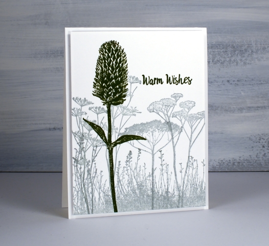
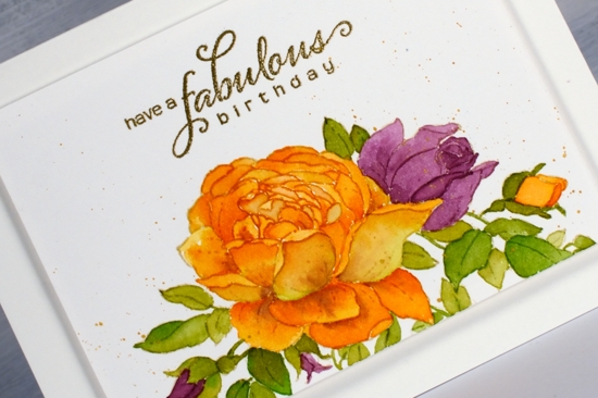
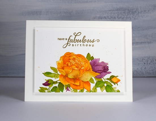
Hot off the presses and ironically cold out of my mail box here are some brand new stamps from Darkroom Door. Rachel Greig creates incredibly artistic stamps and these new flowers are no exception. The feature image and sentiment on today’s card are from the new set, ‘Warm Wishes’ which contains five flower stamps and eight sentiments.
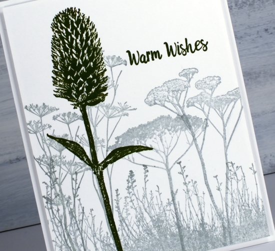
I decided not to watercolour them this time (but you know I will), instead I chose a crisp pigment ink so you would see the incredible detail of the flower head. I created a background by stamping some fave florals from DD ‘nature walk’ and ‘wildflowers vol 1’ in memento London fog ink. It is a light enough grey to show up but not take over. On the card above I stamped the feature flower from ‘warm wishes’ in versafine clair ‘shady lane’ ink and added the sentiment in the same colour.
Both the stamped panel and the card base are neenah solar white cardstock and the panel is popped up on a piece of foam to create some subtle framing.
Make sure you pop over to the Darkroom Door blog for more inspiration with the new ‘warm wishes’ set. And check back here too because I’ll be giving these stamps the watercolour treatment very soon!
Supplies
Winsome wreath
Posted: January 31, 2020 Filed under: Penny Black, winsome wreath | Tags: Penny Black stamps, Ranger Distress inks, Ranger Distress stains 12 Comments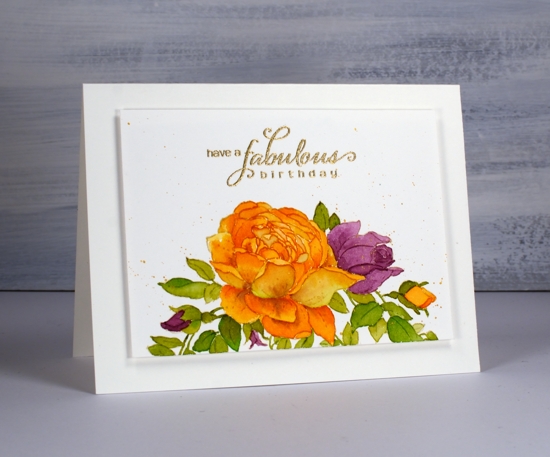
You might not recognise this stamp straight away but it is the ‘winsome wreath’ I used on a black card earlier in the week. It looks a bit different on the more traditional white watercolour paper. It also looks different because I have only used half of the stamp. I stamped the wreath on the edge of a hot pressed watercolour paper panel and once I’d finished painting it I added a few leaves under the orange rose as that space seemed a little empty.
I did the initial stamping in distress antique linen ink which is great for no-line colouring. While the panel was still in the stamp positioner I stamped the centre of the big rose in spiced marmalade ink. I did this because I find it hard to paint all those tiny petals separately and even find it hard to see them all when they are stamped in antique linen. As I was planning to paint the rose in spiced marmalade anyway it was helpful to have the centre of the rose outlined in that ink to begin with.
I dropped some spiced marmalade, seedless preserves and mowed lawn distress stain on my glass mat to use as a palette. I painted one petal at a time except for some of those tiny ones in the centre. As I painted a petal I would blend to the edges then drop in a bit more colour with my brush usually on the sections of the petals that might be shadowed by the petal adjacent. It isnt’ an exact science when I do it but I end up with some variation which adds to the realism. I also added a tiny bit of seedless preserves to some of the petals which gave them a slightly aged looked. The leaves are a mix of mowed lawn and spiced marmalade so without intending to I did another of my ‘limited palette’ cards, just three colours in the end.
I splattered some gold paint from the gansai tambi starry set over the panel and added a sentiment in gold embossing powder to match. Rather than add a coloured mat I created a subtle ‘shadow mat’ by popping up the panel on a piece of foam. Thanks for dropping by today; let me know if you can see the mistake I made with the rose but decided to just ignore because I definitely did not want to start again!
Supplies
Wonderful
Posted: January 30, 2020 Filed under: Anything but basic friendship, My Favorite Things, Roses all over | Tags: My Favorite Things, Penny Black creative dies, Ranger Distress inks 5 Comments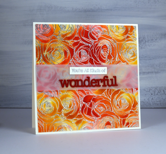
This lovely background stamp from MFT is brilliant for trapping colour. My first choice would be to colour it with paint powder like brusho or colourburst but a quicker and less messy technique is to rub distress ink cubes across the embossed panel randomly. I embossed ‘roses all over’ on hot pressed watercolour paper with silver embossing powder then randomly rubbed fossilized amber and candied apple distress inks over the panel. Because of the embossing the ink didn’t saturate the whole panel but it did leave some colour in all the sections.
Next I liberally spritzed the panel so the inks would dilute, blend and fill the petals. This technique is one a friend of mine affectionately calls ‘drowning’. The ink mixed pretty well by itself but I did use a paintbrush here and there to make sure the whole panel was coloured. I dried it, trimmed it and added a band of vellum so my sentiment strip and die-cut would not have to fight with the busy background.

I stamped part of a MFT ‘anything but basic’ sentiment on an Avery Elle simple sentiment strip. I use those sentiment strips all the time; I have a stash cut and ready on my desk for every third card! I cut the PB ‘wonderful’ twice from red cardstock (with ‘stick it double sided adhesive’ on the back) and stacked them on the vellum.
I enjoyed reading your comments about the black watercolour paper and I’m happy some of you are inspired to pull out your own to do a little experimenting. You’ll definitely be seeing it again here.
Supplies
Roses on black
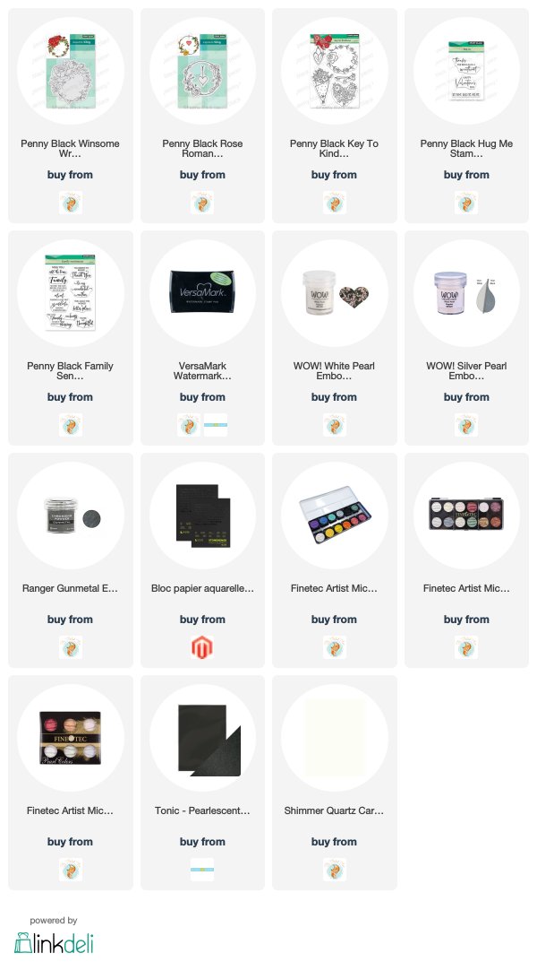
Posted: January 28, 2020 Filed under: Finetec paints, key to kindness, Penny Black, rose romance, winsome wreath | Tags: Finetec artist mica watercolour paint, Penny Black stamps, WOW embossing powders 15 Comments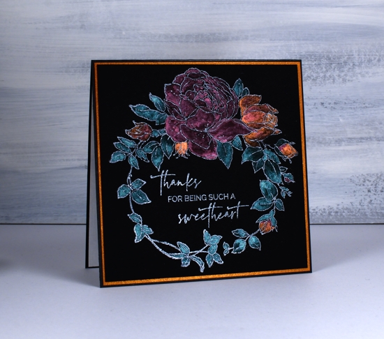
Today’s cards are my first experiment with black watercolour paper. I have already learnt a few things I will take into consideration on my next projects. I could have waited until I had played with the paper more but I decided to jump right in with these rather unusual valentine/friendship cards. The card with purple flowers does have a valentine sentiment but the other two could be used anytime to send a friendly message. Unfortunately the photos don’t convey how shimmery the paint is and the colours are brighter in real life.
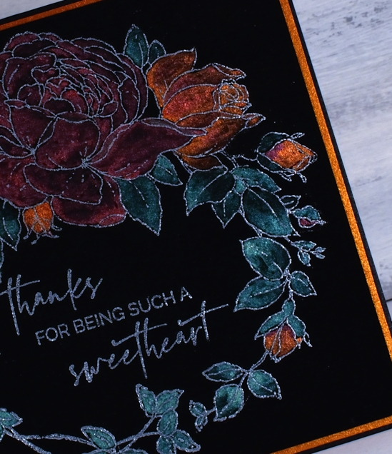
I’ve seen a few people on the interwebs using this new Stonehenge black cold press watercolour paper so I had to give it a try. As you can probably see I’ve paired it with pearlescent paints this time. I plan to try oxides next time. Because it is new to me I tried three different embossing powders wondering how much they would show up on black. On the card above I embossed PB ‘winsome wreath’with WOW silver pearl; it looks a bit silvery. On the card below I used WOW white pearl on PB ‘rose romance’: it also looks a bit silvery. On the final card I used Ranger gun metal with a wreath from PB ‘key to kindness’ set, it is a bit darker but still looks a bit silvery.
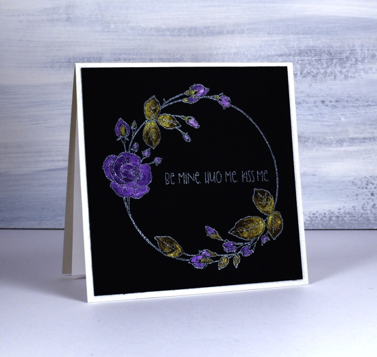
To paint the flowers I used both my Finetec pearlescent paints and pearl paints. I don’t find the two sets all that different but I think there might be a bit more shimmer in the pearlescent ones. I also have some Ken Oliver liquid metals so I used the verdi gris for the leaves above. I carried through the shimmer theme by cutting mats from copper shimmer cardstock and I made card bases from black shimmer and quartz shimmer.
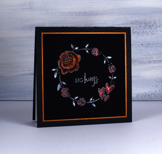
What do you think about predominantly black cards? I know some would find them too dark and sombre, some may be reminded of the painted velvet pictures from the 70’s but maybe you like the added drama. Will you try the black watercolour paper if you get a chance?
Supplies
https://linkdeli.com/widget.js?1559654439292


