
Winsome wreath
Posted: January 31, 2020 Filed under: Penny Black, winsome wreath | Tags: Penny Black stamps, Ranger Distress inks, Ranger Distress stains 12 Comments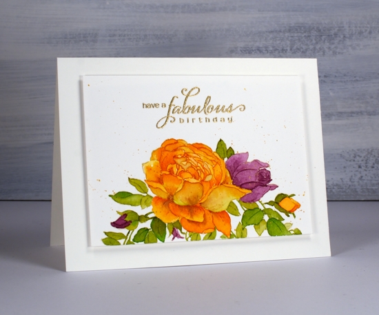
You might not recognise this stamp straight away but it is the ‘winsome wreath’ I used on a black card earlier in the week. It looks a bit different on the more traditional white watercolour paper. It also looks different because I have only used half of the stamp. I stamped the wreath on the edge of a hot pressed watercolour paper panel and once I’d finished painting it I added a few leaves under the orange rose as that space seemed a little empty.
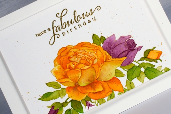
I did the initial stamping in distress antique linen ink which is great for no-line colouring. While the panel was still in the stamp positioner I stamped the centre of the big rose in spiced marmalade ink. I did this because I find it hard to paint all those tiny petals separately and even find it hard to see them all when they are stamped in antique linen. As I was planning to paint the rose in spiced marmalade anyway it was helpful to have the centre of the rose outlined in that ink to begin with.
I dropped some spiced marmalade, seedless preserves and mowed lawn distress stain on my glass mat to use as a palette. I painted one petal at a time except for some of those tiny ones in the centre. As I painted a petal I would blend to the edges then drop in a bit more colour with my brush usually on the sections of the petals that might be shadowed by the petal adjacent. It isnt’ an exact science when I do it but I end up with some variation which adds to the realism. I also added a tiny bit of seedless preserves to some of the petals which gave them a slightly aged looked. The leaves are a mix of mowed lawn and spiced marmalade so without intending to I did another of my ‘limited palette’ cards, just three colours in the end.
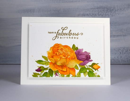
I splattered some gold paint from the gansai tambi starry set over the panel and added a sentiment in gold embossing powder to match. Rather than add a coloured mat I created a subtle ‘shadow mat’ by popping up the panel on a piece of foam. Thanks for dropping by today; let me know if you can see the mistake I made with the rose but decided to just ignore because I definitely did not want to start again!
Supplies


I really love this wreath design from PB Heather, and what a great idea to use just part of it, and the colours are so bright and pretty. Fabulous watercolouring as always. x
Beautiful Card !!
Gorgeous!
What a beautiful card, Heather! I love the colours and it does have a realistic look. It makes me happy looking at it.
This is gorgeous, Heather! Love this combination of colors and that gorgeous large bloom! Outstanding!
Gorgeous creation, I love how you made the wreath look like a boarder stamp!
This just blows me away, Heather! Stunning and I adore your position of the wreath on your focal point panel. Genius!
Thank you so much Jill; it is a very sweet stamp so I think I’ll be using it again for sure. Hopefully not too obvious is the leaf I painted in the colours of the petals!
Stunning! I absolutely love your work. A true artist. And no, I don’t see any “mistake.” Haha! Gorgeous!
[…] Card originally posted HERE […]
Looks like a leaf became a rose petal. But it was very hard to track down. I figured it out because the Shaw was slightly different. But it does not change how beautiful your finished work is!!!
You are absolutely right, a leaf became a rose petal and I didn’t notice until I was finished. I contemplated painting green over the top but I was so happy with the finished design I wasn’t prepared to risk ruining it. I decided to let it be and hope no-one would find it odd!