
Coffee art journal page
Posted: June 9, 2022 Filed under: Art Journal, coffee time, Darkroom Door, Mixed Media | Tags: Art Journal, Darkroom Door stamps, Mixed Media, Ranger archival inks 8 Comments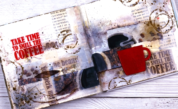
I’ve been having a delightful time in my art journals and in the Art Journal Adventure workshops. We have gone in three different directions so far and the next one is coffee or tea themed. You can see an example of a tea themed page on my classes page and here is my first coffee page.
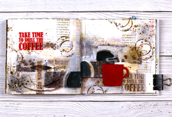
It doesn’t show up in the photo but the red cup is embossed and glossy and I want one just like it in real life! I used distress embossing glaze for both the words and the cup then had to create a visual triangle in red, do you see it?
I am currently not a coffee drinker which actually makes the quote all the more apt for me. I love the aroma! For Christmas I gave my husband a coffee subscription and each month the coffee comes in a cardboard package which smells delightful as does the mailbox !
If you are interested in joining in the art journal adventure please check out my Classes page where you will see the next two sessions or click on the Crop A While classes page.
Supplies
(Compensated affiliate links used when possible)
2022 BuJo – June theme
Posted: June 7, 2022 Filed under: Bullet Journal, Dingbat notebooks, distinctive, Penny Black | Tags: Bullet Journal, Dingbats notebook, Penny Black stamps, Ranger Distress inks, Staedtler watercolour brush pens 6 Comments
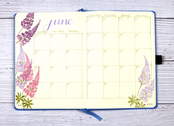
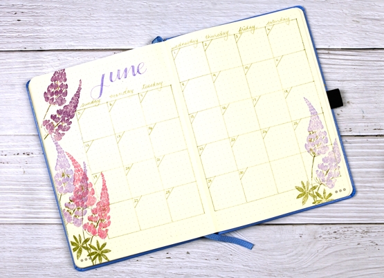
Only a few days late getting my bullet journal pages set up this month. My theme could only be lupins I decided, as my back garden is full of them.
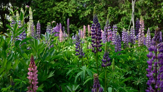
Lupins self seed and mine have been doing so with enthusiasm for the last few years but this year is the best display yet. I had to dig some out the other day because they were blocking the lavender from any chance of sunshine.
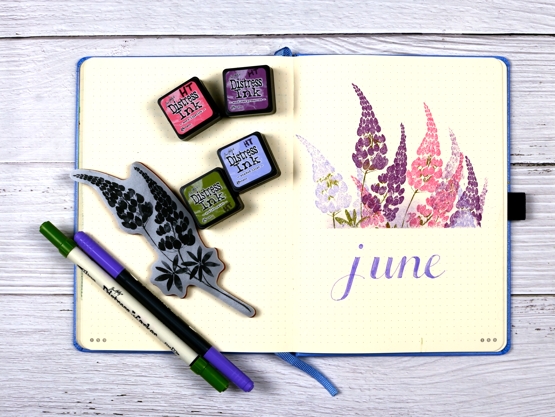
I used the Penny Black stamp ‘distinctive’ and distress colours that weren’t quite the same but not too far off what I have in my garden. Once again I masked with post-it notes before stamping which gives a crisp clean edge. I am still enjoying my Dingbats notebook but I did see some notebooks with embossed cityscape covers the other day which called my name, especially the Melbourne one.
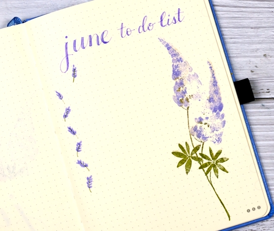
I used a distress marker along with a staedtler brushmarker for all the words and linework.
After a hot unseasonable three days back in mid May we have had only mild temperatures. We also had an incredibly violent storm, actually a ‘derecho‘ just over two weeks ago. Our house was without power for a week so that’s why you didn’t hear from me on the blog. We did not suffer any damage to our trees or house but our neighbours and neighbourhood did along with many parts of Ottawa, Ontario and Quebec. The garden got soaked and bent but it has bounced back as you see.
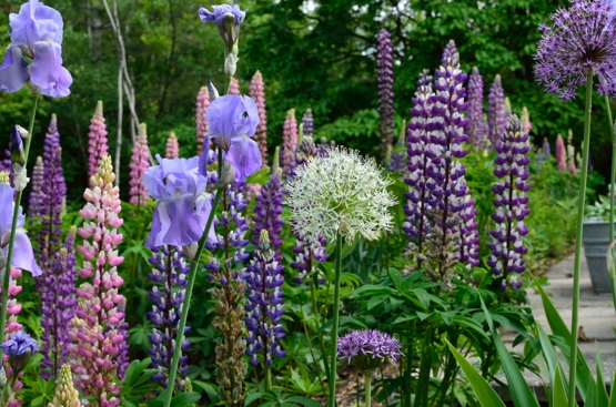
At this time of year my garden is full of pinks and purples but later in the summer there are more whites, reds and yellows. It was my first year with alliums so I am happy to see they came up. The pack I planted in autumn were mixed but I ended up with one white and all the rest purple.
By the way I have updated the Classes page for local in person classes and will be adding more in the coming weeks.
Supplies
(Compensated affiliate links used when possible)
Thoughts and Prayers
Posted: June 6, 2022 Filed under: letter background, Penny Black, purity | Tags: Coliro paints, Fabriano Watercolour Paper, Penny Black stamps, Ranger Distress inks 6 Comments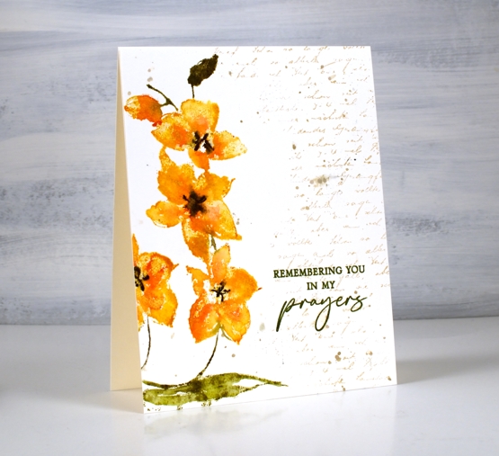
These pretty orchids are another new stamp from Penny Black. This one is called ‘purity’ and it is tall and thin featuring three flowers and a bud. I stamped one flower a second time to fill and balance the left hand side of the panel.
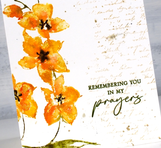
I used the same method I described for a recent floral card inking the flowers with distress inks and markers, spritzing, then stamping on hot pressed watercolour paper. Instead of spritzing water over the stamped image I added dabs of gold paint then pressed the stamp down again to spread the gold into the petals.
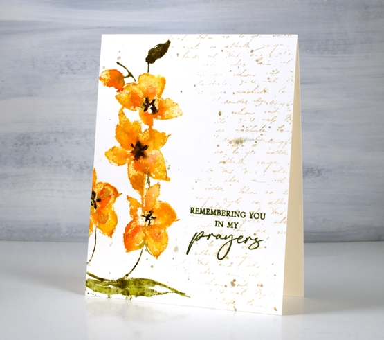
To complete the panel I stamped a partial print of the letter background stamp in antique linen distress ink and added some splatter with the same ink. I switched to archival ink for the sentiment to get a bold sharp impression with words from the new PB ‘thoughts and prayers’ set. One of my favourite ways to complete a card or an art journal page is to ‘fill’ with a bit of text. Sometimes I add it at the beginning and stamp over it, other times I added it at the end. To you have some favourite finishing touches?
Supplies
(Compensated affiliate links used when possible)
Beach Squares
Posted: June 3, 2022 Filed under: seaside, Simply Graphic | Tags: Kuretake Zig clean color real brush markers, Simply Graphic 7 Comments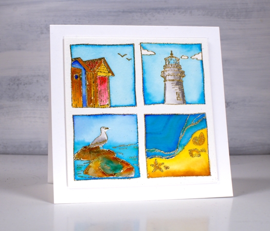
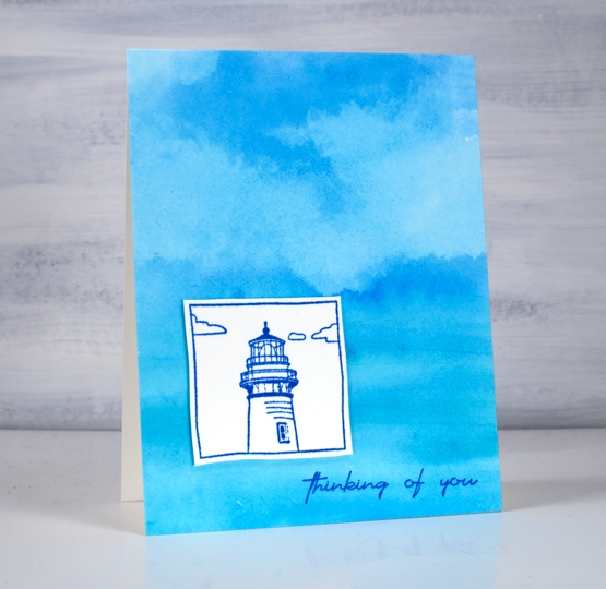
I am having fun with the Foiled Fox again today showing you all four stamps from the Simply Graphic’s seaside set. I used the lighthouse and the beach huts stamps in Wednesday’s cards. Today I arranged all four stamps in the stamp positioner then stamped with versamark on cold pressed watercolour paper before embossing in gold powder.
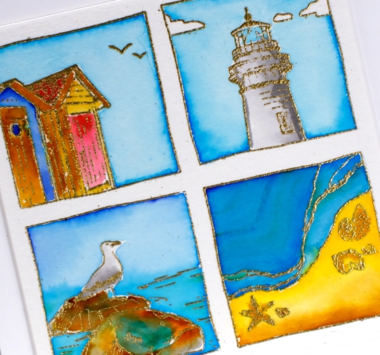
I used zig clean color real brush pens for all the colouring in the squares. The pens are highly pigmented so a little dab goes a long way. It doesn’t matter so much the exact colours I used to paint the squares but I took care to repeat the same colours in more than one square so the group looks cohesive. I used the same blues in all four squares, yellow in three of the squares and grey on the lighthouse and the bird. (Zig pens used: light blue, cobalt blue, blue, green, yellow, light brown, brown, light gray, carmine red)
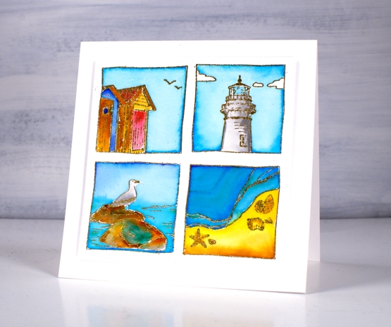
Once all the colouring was done I popped up the square panel on a few pieces of cardstock then attached to a 4¾” square cardbase. Make sure you pop over to the Foiled Fox blog and shop for inspiration and more lovely clean designs from Simply Graphic.
Supplies
(Compensated affiliate links used when possible)
Fleeting Moment
Posted: June 2, 2022 Filed under: fleeting moment, Music Background, Penny Black | Tags: Fabriano Watercolour Paper, Penny Black stamps, Ranger Distress stains 6 Comments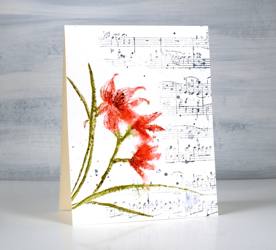
This orchid is from the new Penny Black release. It’s a large cling stamp called ‘fleeting moment. I think it is an orchid or perhaps a lily.
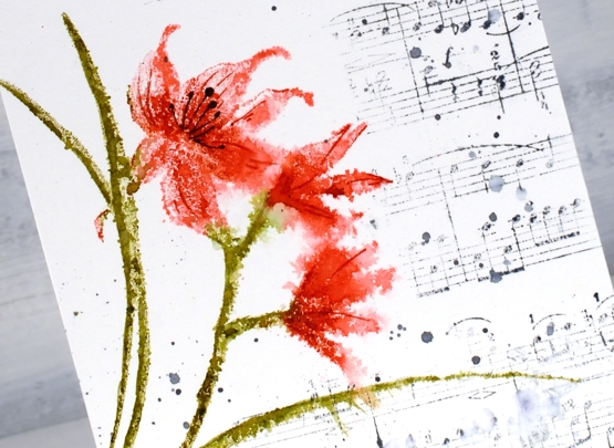
I used distress inks, worn lipstick, festive berries, to ink the petals while in a stamp positioner. I inked the stems and leaves with forest moss and peeled paint. Once stamped on hot press watercolour paper I lightly spritzed the flowers.
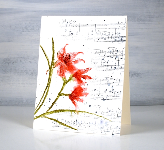
I dried the panel before adding details to the petals with markers. To fill in the panel I inked part of the music background stamp with weathered wood distress ink. After stamping I added splatters of water and ink.
The new ‘Blooming’ release is full of flowers, as the name suggests so there will be blooms aplenty over the next few weeks.
Supplies
(Compensated affiliate links used when possible)
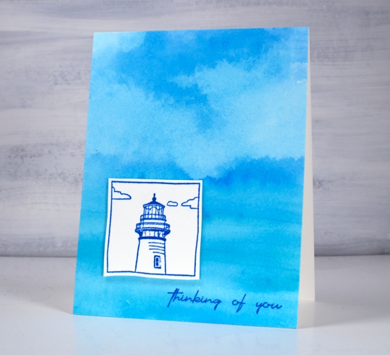
Beach Scenes
Posted: June 1, 2022 Filed under: seaside, Simply Graphic | Tags: Simply Graphic 11 Comments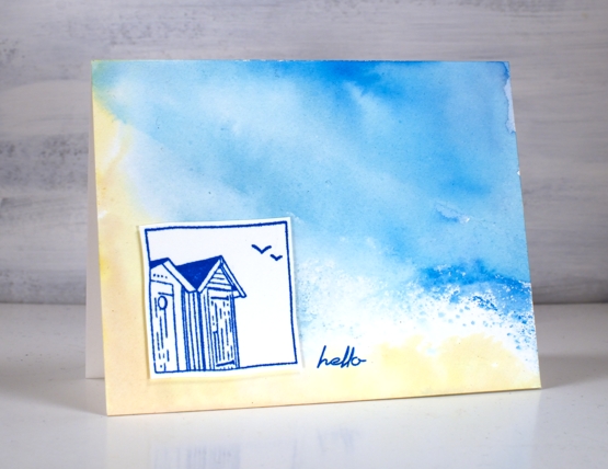
This sweet little beach hut is from Simply Graphic, the set is called ‘the little squares – seaside’. Shauna, from the Foiled Fox introduced me to Simply Graphic and when I saw this set of beach themed squares I was delighted. There are four stamps in the set and I have featured two in today’s cards. Make sure you pop over to the Foiled Fox to hear more about these cards and see other elegant stamps from Simply Graphic.
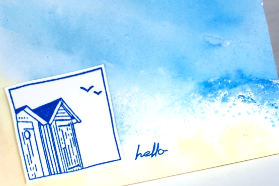
For both cards I completed the watercolour backgrounds first by smooshing distress inks on a glass mat, spritzing water and swiping hot pressed watercolour paper through the ink. I swiped more than once and tilted the panel so the inks could move. I tried to keep the yellow and the blues apart to avoid making green so there are a few gaps between the inks which looks like sea foam.
The second background was completed using the same method but I made sure the ink covered the whole panel and while dry I dabbed some off with a kleenex to make the appearance of clouds.
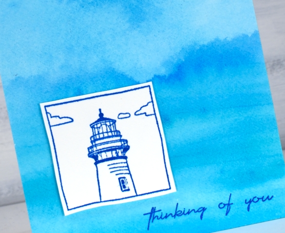
The images I have added over the seaside backgrounds are stamped in paradise versafine clair ink onto hot pressed watercolour paper.
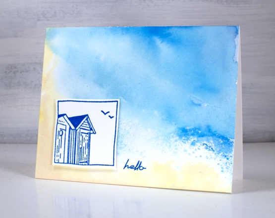
I cut the stamped squares out by hand as the edges are not straight then popped them up on a couple of layers of cardstock. I was tempted to colour the beach huts because they are generally painted in beautiful bright colours. I saved that idea for another card and kept these ones simple with sentiments added from the Simply Graphic ‘English sentiments’ set.
Make sure you drop in to see the Foiled Fox blog for more info inspiration
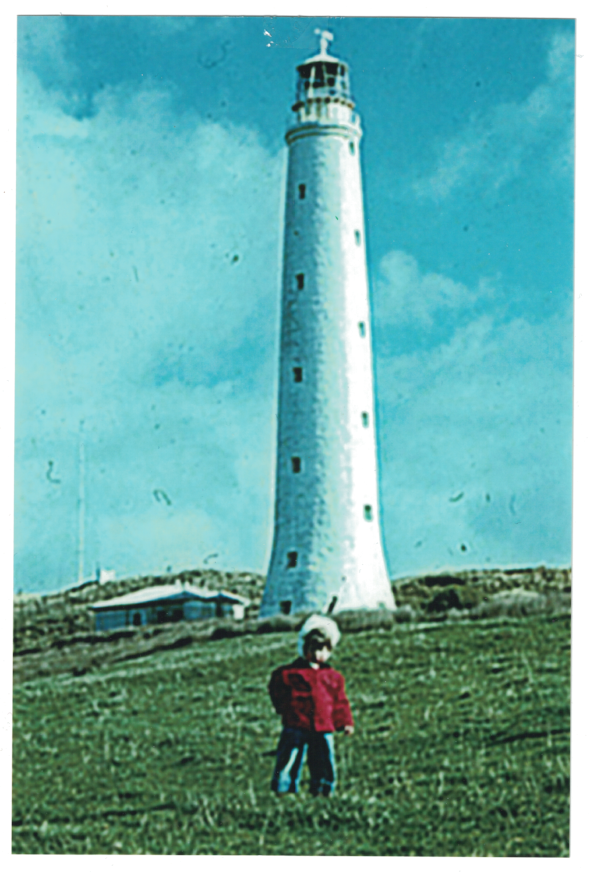
Before I end this post I will mention the Cape Wickham lighthouse on King Island. You might not have heard of either the lighthouse or the island but I was born on King Island and the CapeWickham lighthouse is the tallest in the southern hemisphere. Here’s a pic of me in front of the light.
Supplies
(Compensated affiliate links used when possible)
Distressed Gel Print backgrounds
Posted: May 20, 2022 Filed under: Art de Fleur vol 1, Darkroom Door, gel press, Nature Walk, tall flowers, Wildflowers Vol 2 | Tags: Darkroom Door stamps, gel press, gel printing, Ranger archival inks 7 Comments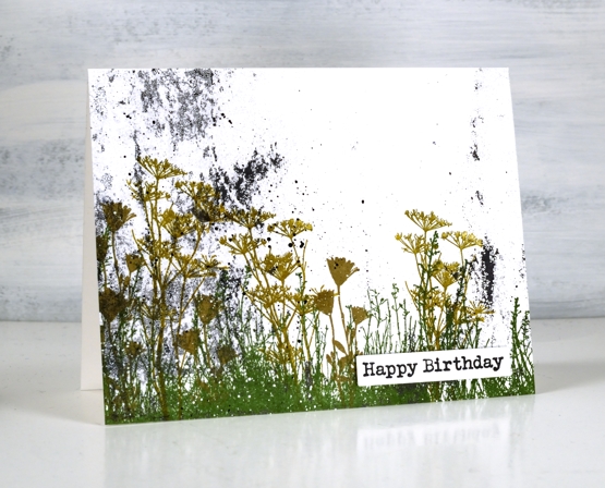
Last week I taught a couple of gel printing classes and had a blast seeing others fall in love with the process and results. As you might imagine I have many prints now, a big box waiting to be used. I thought I would use a few scrappy patchy prints as backgrounds. Some of these prints are ghost prints where I pick up a patchy layer of paint left on the gel print after a more distinct print has been taken. I also have some patchy distressed looking prints taken from a damaged gel plate. I don’t know how the surface got damaged but I still use it as a place to roll out paint before brayering on the main plate or to clean off excess paint after brayering on the main plate. The little dots you see on today’s prints are from imperfections in the damaged plate.
On the print above you can see not only the specks of black paint from the plate but also the leftover paint from the border of the plate. Most gel printers love being able to pick up some of those colourful leftovers on a future print.
Both the print above and the one below were made from excess paint so there is very little defined pattern but instead some lovely specks, blends and blobs.
I chose to make cards from these prints not just because I wanted distressed backgrounds but also because it shows how even the scrappy, incomplete, messy prints can be worth saving.
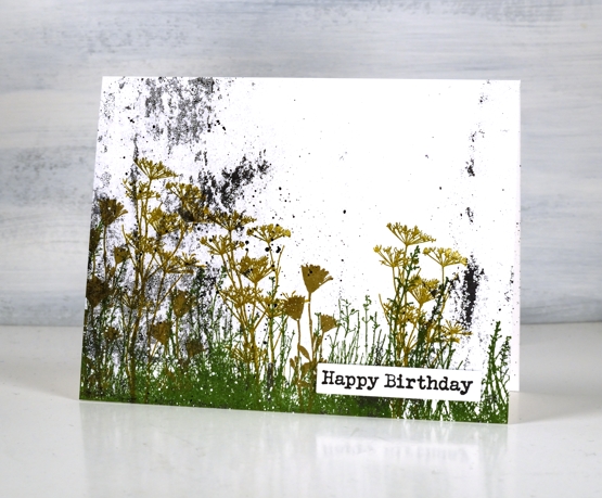
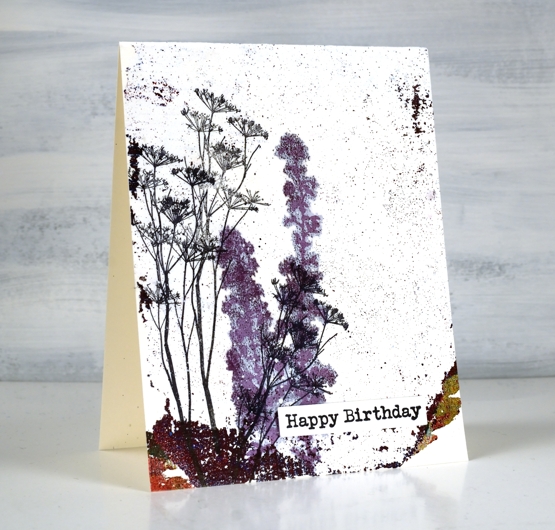
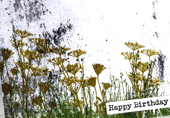
The only colour on the background print above was some black. I used rustic wilderness, wild honey and frayed burlap archival inks to stamp flowers and grasses from Darkroom Door sets, nature walk and wildflowers vol 2.
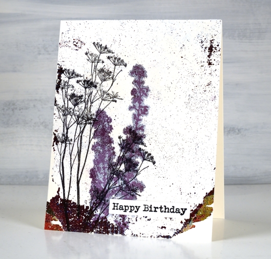
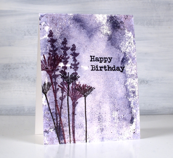
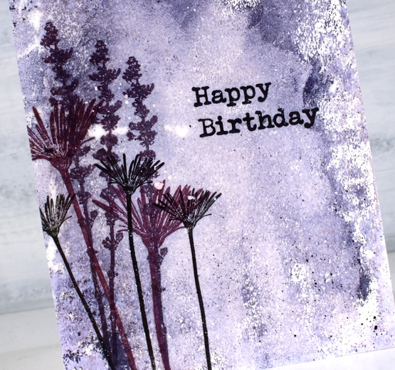
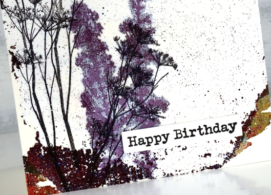
The ghost print above was pulled with rice paper. When I stamped the purple flowers in versafine clair they soaked through the paper and spread to give the image a halo surrounding it. Although it was an interesting effect I switched to archival inks for the rest of my stamping as they sit of the surface and dry quickly.
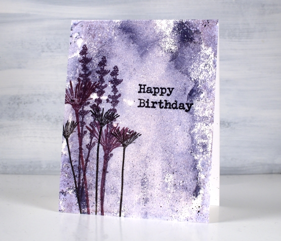
I used similar colours to stamp flowers from DD sets, tall flowers and art de fleur vol 1 over the purple ghost print.
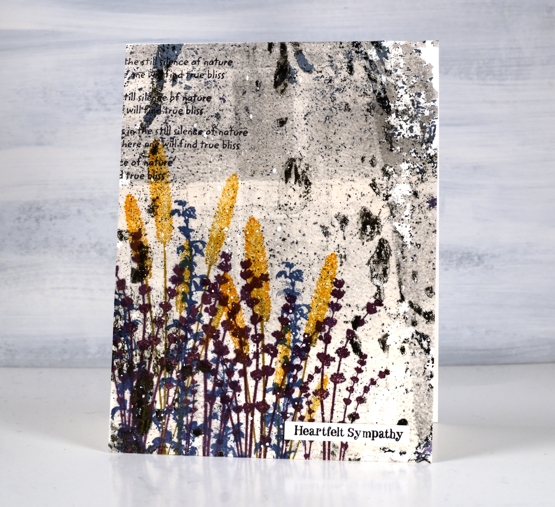
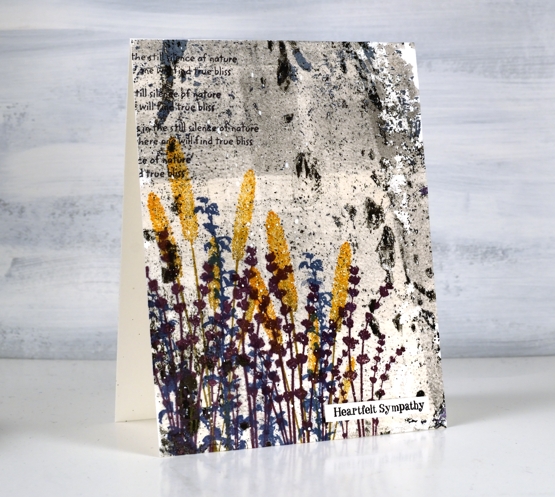
The print above was by far the busiest one I used so a bright contrasting colour seemed like a good idea. I used thistle, wild honey and faded jeans archival inks to stamp flowers from DD sets, nature walk and wildflowers vol 2. I also added some text with a stamp from the nature walk set
To attach the cards to the neenah card bases I used double sided adhesive sheets. I added some black and white paint splatter and Darkroom Door sentiments.
If you have read right to the end you are a champion. If you are a gel printer I hope you are inspired to use a few of those patchy prints you might otherwise discard. I have been using them in my art journals but it is nice to see them on cards too and it’s not as if I am going to run out anytime soon!
Supplies
(Compensated affiliate links used when possible)
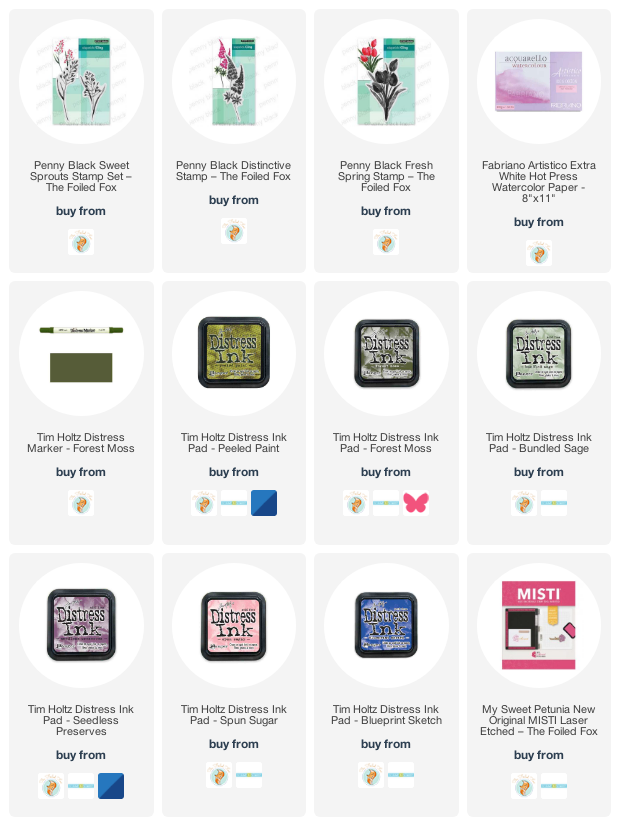
Floral Mix
Posted: May 18, 2022 Filed under: distinctive, fresh spring, Penny Black, sweet sprouts | Tags: Penny Black stamps, Ranger Distress inks 13 Comments
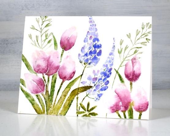
I think I told you my one tulip bloomed already but I was still inspired to stamp more. My many lupins are yet to bloom so the idea of a floral mix card appealed to me. I have teamed up Penny Black’s ‘distinctive, ‘fresh spring’ & ‘sweet sprouts’ stamp on this card.
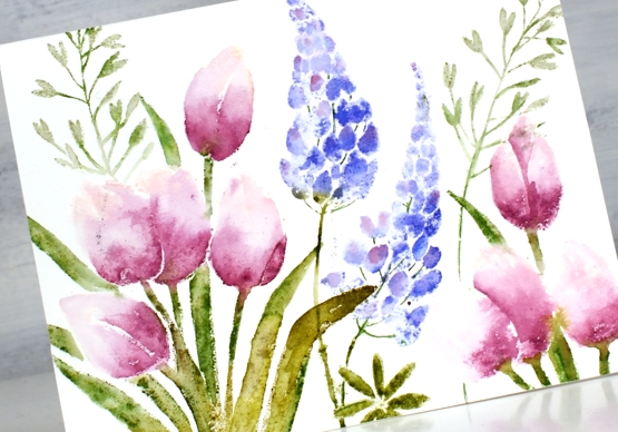
Once again I worked on hot press watercolour paper with distress inks. I usually spritz the stamp lightly with water before stamping then use a paintbrush to blend the inks or dilute them. The inks I used are listed below; I had seedless preserves as the main colour on the tulips and the highlight colour on the lupins. The technique for this card is featured in my online class Floral Faves which is still on sale for 30% off as part of my Moving Day Sale.
What’s blooming in your garden or neighbourhood right now?
Supplies
(Compensated affiliate links used when possible)
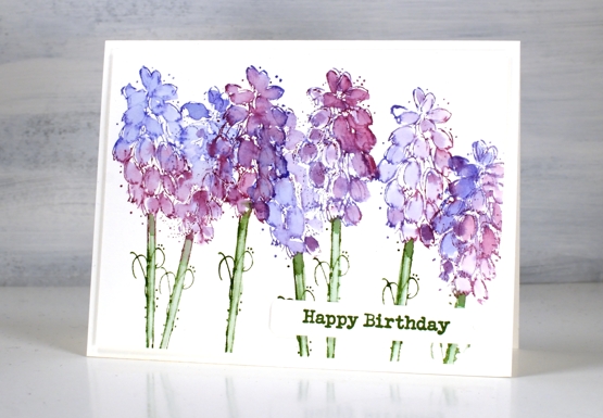
Grape Hyacinths
Posted: May 16, 2022 Filed under: Darkroom Door, Dies, fine flowers vol 2, Penny Black, Tagged | Tags: Darkroom Door stamps, Penny Black creative dies, Ranger Distress inks 7 Comments
My garden seems to have lost its grape hyacinths; I used to have quite a few that would pop up year after year but I only saw a couple this year.
We had three days above 30°C last week so there is plenty happening in the garden. The crab apple is blossoming and the last of the daffodils are hanging on. I bought some annuals and started filling pots yesterday.
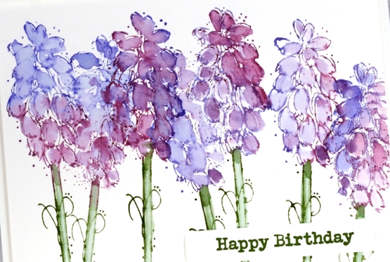
The stamp featured is from the Darkroom Door set ‘fine flowers vol 2’ designed by Godelieve Tjiskens. I inked the petals with seedless preserves and blueprint sketch distress inks then blended with water after stamping. The stems are rustic wilderness distress and the sentiment rustic wilderness archival.
Hope you are enjoying some colour in the world around you; perhaps you’re seeing warm tones if you are in the southern hemisphere.
Supplies
(Compensated affiliate links used when possible)
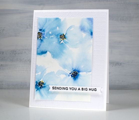
Blue Florals
Posted: May 12, 2022 Filed under: Hand painted, scripty, sennelier watercolours, Stampin Up, Taylored Expressions | Tags: Hand painted, sennelier watercolours, Staedtler watercolour brush pens, Stampin Up, Taylored Expressions 17 Comments
I spent a little while painting florals the other day. My watercolour paints were on my table so I painted two precut card panels with a few blues. I started the flowers on both cards by putting five little dabs of paint in a circle then blending them out with a wet paint brush. After blending I added dots to the centres with black and yellow markers.

Both the bold and the soft florals looked ok but the leaves I’d added didn’t work. I set the panels aside, happy that I had practised but not planning to use either pieces. When I came back to them a day or so later I did some extreme cropping which took out the leaves I didn’t like and left me with some nice blends and a configuration which had some balance.

Even if I had not cropped them and put them on cards the exercise was worthwhile. Even after years of making, practising and learning I still have the niggling feeling that everything I work on should ‘work out’! I know it is unrealistic and I am getting better at spending time practising and playing just to grow and enjoy.
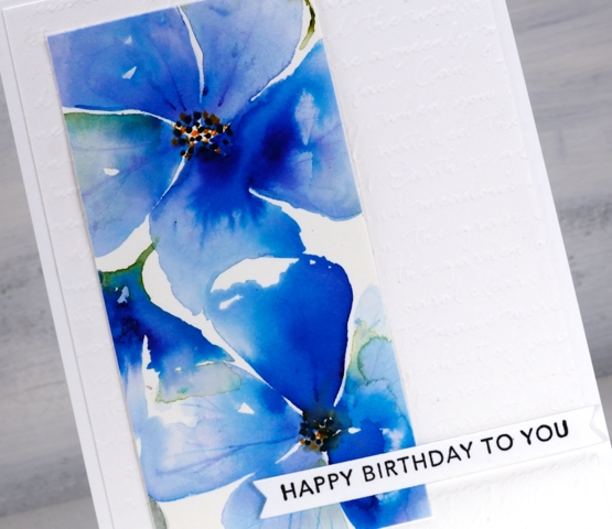
The pale blue ‘washy-er’ panel is my favourite but I love the colours in both. After cropping them I added them to an embossed panel (SU scripty) and popped up some Taylored Expressions sentiments over the top.
Supplies
(Compensated affiliate links used when possible)


