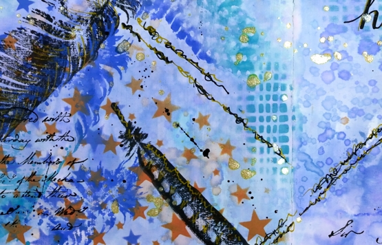
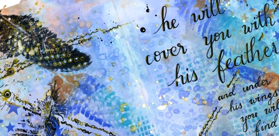
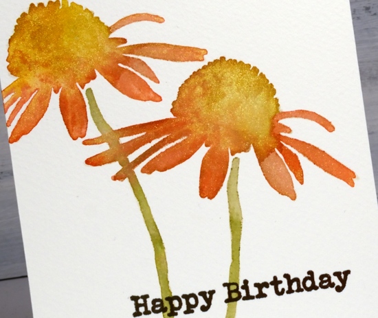
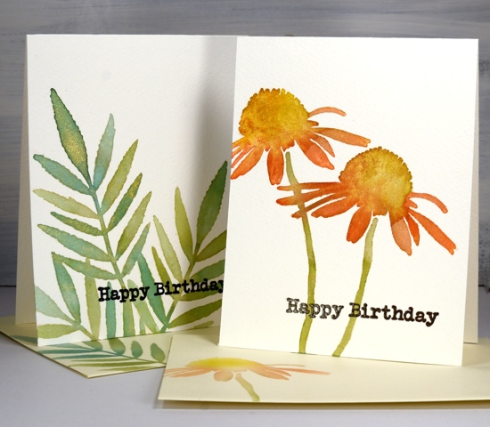
Ink and doodle journal page
Posted: August 25, 2020 Filed under: Art Journal, Correspondence, Darkroom Door, Feathers, mesh, starry night 12 Comments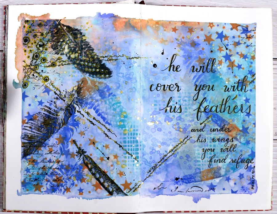
I’ve had oxide inks out on my desk the last few days so I put them to use on a journal page.
I taped the edges of the pages with painter’s tape which gave me a border and held the pages flattish while I worked and painted the page area inside the tape with absorbent ground so I could add water to the inks and move them around a little.
Because the journal pages do not lie flat any more I was only able to pick up sections of ink from my glass mat. To get more coverage I squished ink on a piece of acetate, spritzed it and dragged it across the pages spreading ink as I went.
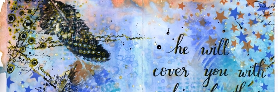
I added visual texture with two stencils from Darkroom Door then stamped feathers from the DD ‘feathers’ stamp set in black and then in the oxide inks. When it came to doodling on the page I used black and gold gel pens and wrote the verse with the same pens. I finished it off with gold and black splatters then removed the tapes to reveal an uneven but quite artistic border.
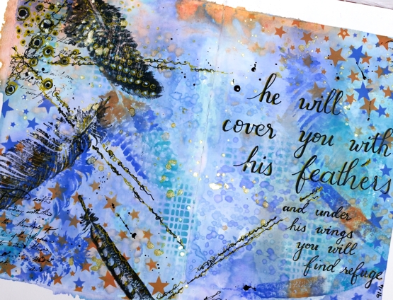
This was an unplanned experimental page as many of my pages are. I was inspired mainly by what was on my desk and a desire to doodle some of the design and not just stamp.
I am rather frustrated by the paper in this journal. It is good paper but not made to handle wet media so I am limited in creating the kind of blends and wet into wet designs I love to do. The question is do I persevere and learn some new techniques that don’t rely so much on watercolour (gasp) or do I buy a good watercolour journal?
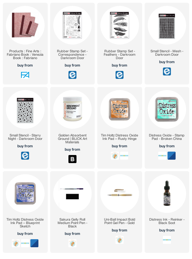
Supplies
Virtual Coffee
Posted: May 4, 2020 Filed under: brick wall, coffee time, Darkroom Door, handwritten script, Stencils, World Map | Tags: Darkroom Door stamps, Darkroom Door stencils, Ranger Distress inks 4 Comments
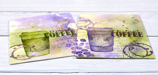
I posted a coffee themed card using the Darkroom Door ‘coffee time’ set recently which prompted a request for a pack of coffee themed cards. These ones are on their way to Australia, and were made with the addition of the word ‘virtual’ because, well, you know why. I rarely do multiples and when I do they are never exactly the same. This time I did four of one colour scheme with the cup and saucer stamp from Darkroom Door’s ‘coffee time’ set and then four more in a different colour scheme a little more like my original coffee card featuring the take out cup from the same set.
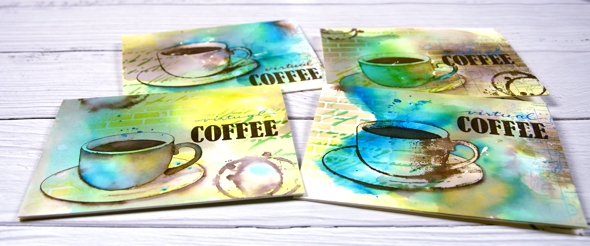
The nice thing about making multiples is starting with a large panel to create the background. I used hot pressed watercolour paper for both sets and splattered masking fluid over the panel first. I like the addition of some random white spots and shapes from a masking fluid splatter but often I wish I’d done more when I remove it from the finished project. To create the cards above I smooshed ground espresso, salty ocean and crushed olive distress inks on my glass mat. I spritzed water over the inks until they were spread over a large area then placed the watercolour panel over the top and moved it around to soak up random coloured patterns. When I turned the panel over there were blotches of each colour along with blends and blank areas. I did some further spritzing and picking up of colour until I was satisfied with the coverage. Once the panel was dry I cut it into four pieces and used both the DD handwritten script and brick wall stencils to add pattern in the same three distress inks. I used blending brushes to apply the ink which gave me soft blends that faded away into nothing at the edges.
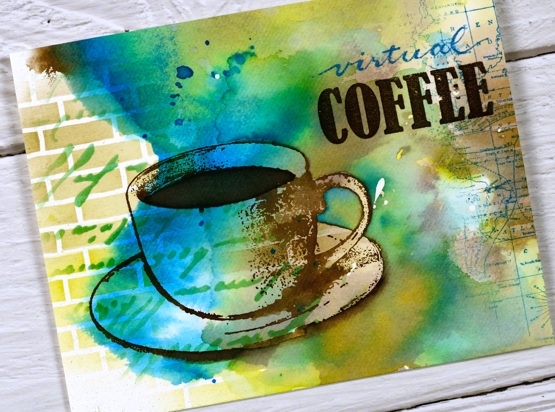
Next I add coffee cups and coffee stains in ground espresso ink. I blended ink inside the cup on some panels but on others I added more ink outside the cup to darken the negative space. It is hard to describe my process with the cups as I did each one differently and kept playing with the three inks until I was happy with the results. On a couple of the panels I added a partial print of the world map stamp. With all the artsy stuff done I just needed to add the ‘virtual coffee’ label. The word ‘coffee’ is part of one of the word stamps from the set so I masked, stamped and embossed then wrote the word ‘virtual’ above and embossed that. I was interested to see I could write the words with a papermate flair pen and then if I covered it with clear embossing powder straight away I could get the shiny embossed effect. I do have clear embossing pens but it is impossible to see what I’ve written with a clear pen!
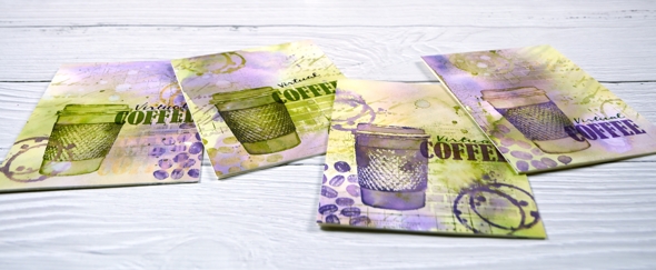
I also did four more cards with the takeaway cup stamp using much the same technique and a peeled paint/scattered straw/dusty concord colour scheme. I added a few stamped coffee beans to these ones; the ‘coffee time’ set is a very cool collection of stamps.
Thanks for joining me for ‘virtual coffee’ today. I hope your week is off to a good start.
Supplies
Coffee with a friend
Posted: April 22, 2020 Filed under: coffee time, Darkroom Door, global postmarks, handwritten script, World Map | Tags: Brusho, Darkroom Door stamps, Darkroom Door stencils, distress oxide inks, Ranger Distress inks 6 Comments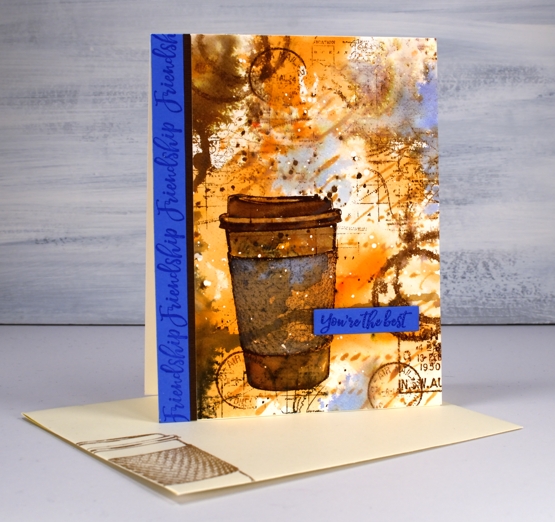
Are you missing the coffee shops? I’m sure you are missing your friends and perhaps you are missing coffee with friends. This one is for a friend of mine who loves her coffee!
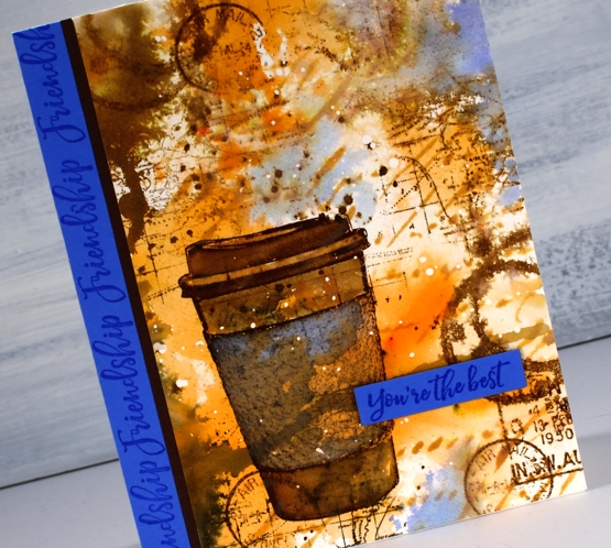
I began with a piece of hot pressed watercolour paper and splattered a few drops of masking fluid over the whole thing. Once the masking fluid was dry I sprinkled sandstone brusho on my glass mat, spritzed the brusho with water and swiped this panel through it. It took a few swipes before I had an orange and brown abstract background. I added some dark brown brusho on one side and spritzed that to make it blend and spread a bit. Once I’d dried that I blended through the new Darkroom Door ‘handwritten script’ stencil with rusty hinge oxide ink.
At this point the panel was very much just an abstract background so I stamped the cup from DD ‘coffee time’ in gathered twigs distress ink and blended the stamping with some water and extra ink. The set also has a coffee cup stain stamp so I added that here and there, spritzing it to make it blurry. I stamped some postmarks from the ‘global postmarks’ set because I can’t help myself.
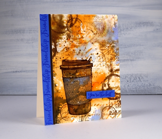
Unfortunately the coffee cup did not stand out enough from the background and the background itself looked incomplete. DD world map stamp and blueprint sketch distress ink came to the rescue. I stamped the world map several times on the panel in gathered twigs ink and then, to break up the orange and brown monopoly, I added some blueprint sketch ink in just a few places. I found some blue cardstock that matched the blue and stamped ‘friendship’ and ‘you’re the best’ from the DD ‘friendship’ strip of sentiments to finish the card. Oh, and I added a thin strip of brown cardstock separating the blue from the patterned panel.
I’m glad I didn’t give up on this panel; it is just the thing for my friend who I will enjoy a coffee with again one day.
Supplies
Classic motorcycle
Posted: April 13, 2020 Filed under: alphabet medley, brick wall, classic cars vol 1, classic motorcycles, Darkroom Door, number medley | Tags: Darkroom Door stamps, distress oxide inks 13 Comments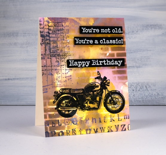
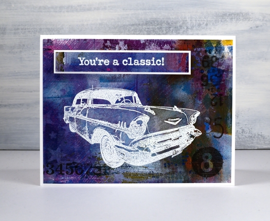
Recently I posted a classic car card and both my brother and father responded that it was time for a classic motorcycle card. It is my dad’s birthday tomorrow so here is a motorcycle themed birthday card. Unfortunately it won’t arrive in his mail box anytime soon but we will chat via the interwebs. Happy Birthday, Dad!
To create the card I pulled out the distress oxide inks; I haven’t used them lately and had forgotten the cool effects I can get when I layer them. I started by smooshing three colours on my glass mat then spritzing them with water. The three inks were dusty concord, frayed burlap and fossilized amber. The dusty concord looks more pink than purple when it’s wet, the amber gives a nice bright pop of colour and the burlap is a neutral that works with both. Before I swiped my watercolour panel through the spritzed ink I had splattered some masking fluid on it and let that dry. The little white spots here and there on the finished card are the results of using masking fluid before adding any ink. I know they are a subtle effect but I like the contrast of a few white spots.
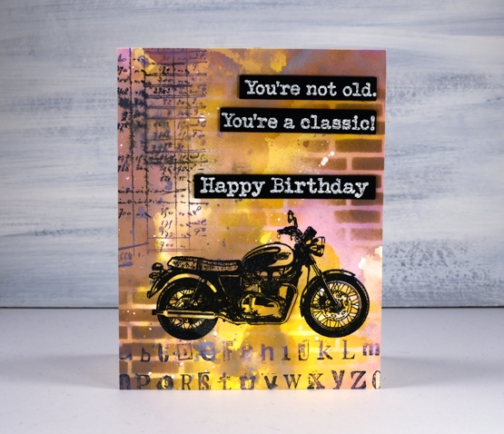
I ended up swiping the panel through the inks several times, letting it dry between swipes so the colours would layer rather than turn to mud. Once all the layering was finished I used the new Darkroom Door small brick wall stencil to blend some bricks over the panel with frayed burlap and fossilized amber inks. I stamped the motorcycle from DD ‘classic motorcycles’ set in versafine clair nocturne then added some collage numbers and letters using stamps from DD ‘alphabet medley’ and ‘number medley’ sets in black soot and dusty concord oxide ink.
I stamped and embossed sentiments from both ‘happy birthday’ and ‘classic cars vol 1’ and die cut them so I could pop them up down the side of the card. The embossing powder is Ranger ‘weathered wood’ to fit with the slightly grungy style of the card.
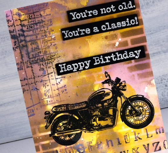
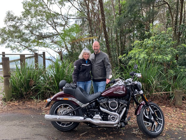
I have no idea what kind of motorcycle this is but maybe my brother can fill me in on that. About six months ago he became a Harley owner; that’s him and his lovely wife out for their first ride on the new bike. It is certainly not his first bike so maybe he will recognise some distinctive feature of the one on my card.
Thank you for getting in touch on my last post about online church and hope at this time of isolation. I am happy to hear it was an encouragement to so many of you.
Supplies
Classic car
Posted: March 25, 2020 Filed under: classic cars vol 1, Darkroom Door, diamonds, gelli plate, number medley, starry night, Stencils | Tags: Darkroom Door stamps, Darkroom Door stencils, gel printing 7 Comments
I have some mixed media goodness for you today. I know it’s pretty flat and doesn’t involve any fibres or other funky textured things but it is mixed media and currently my favourite mixed media option – gel printing. I spent a day with a friend a few weeks ago, and we printed up a storm on our gel presses. This is one of my backgrounds patterned with Darkroom Door stencils then stamped with DD stamps.

The textures in the background were made with the DD small stars stencil, diamond stencil and some corrugated cardboard. This background was cut from a bigger panel and I chose a section that had a pop of yellow in the corner; it’s only a small thing but it provides some contrast and leads the eye from left to right.
Once I’d trimmed my panel I stamped one of the cars from ‘classic cars vol 1’ in versamark ink and embossed in white. The background is so busy I needed to do something to make the car stand out a bit more so I coloured it with a white pencil which softened the area inside the stamped car just enough to make a difference. I added numbers from the new ‘number medley’ set in black so they would subtle but noticeable. The sentiment also from ‘classic cars’ set is embossed on a strip of the gel print then matted in white and popped up on some foam tape.
Supplies
Global Postmarks et al
Posted: February 26, 2020 Filed under: brick wall, Darkroom Door, diamonds, global postmarks, number medley, Stencils, tall flowers, warm wishes, Wildflowers Vol 1 | Tags: Darkroom Door stamps, Darkroom Door stencils, gel printing, liquitex acrylic paint 4 Comments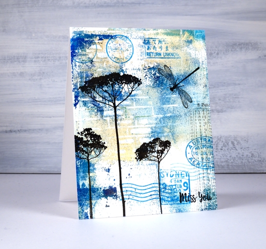
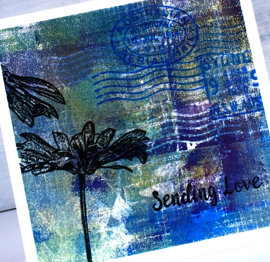
The new Darkroom Door global postmarks set features on today’s cards, and if you look closely you can see I chose several Australian postmarks but there are different shapes and sizes from all over the world. It is a very cool set and once again these cards have made me want to create an art journal page.
I’ve had my gel press out after quite a break and I’m hooked again. In any one session I always end up with some duds and some winners but the more I print, the more I like what I;m printing. One of the lessons I learnt in my latest session was the beauty of restricting my paint colours. You would think I would know that by now considering how often I restrict myself to a limited palette when watercolouring.
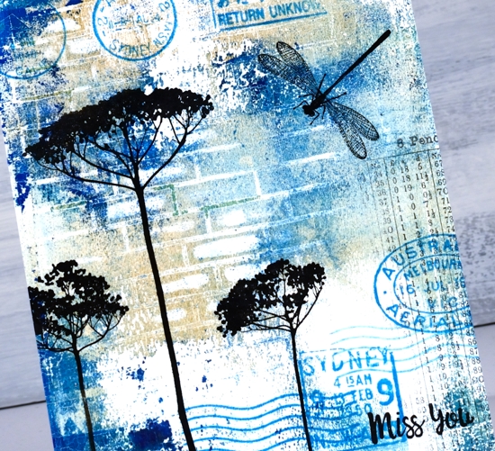
The prints I turned into today’s cards were made with a turquoise, dark blue, gold, beige and purple palette. The first card was just beige, gold, turquoise and a bit of dark blue left on the gel press from the previous print. To create patterns in the print I used Darkroom Door stencils and stamps.
I won’t go into my gel printing process because there are videos aplenty that will show you. I brayered acrylic paints onto the press and used the new ‘brick wall’ stencil along with the diamonds and starry night stencils. I also pressed the mesh background stamp and the wavy line postmark stamp into the paint before pulling a print.
After pulling the prints I used black archival and black versafine clair inks to stamp the flowers, sentiments and dragonfly. I stamped several of the global postmark stamps in mermaid lagoon archival ink and tiny numbers from the new ‘number medley’ set lightly in black.
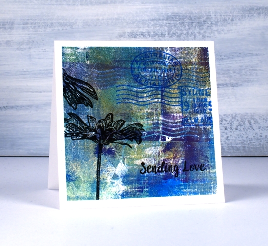
The flowers on the square card are from DD ‘tall flowers’ and are stamped in nocturne versafine clair then embossed in clear powder. The black stamping on the larger card is black soot archival ink. I tried popping up the sentiments from the ‘warm wishes’ set but it didn’t look right, the beauty of a monoprint is that it looks like it has depth and texture even though it is a single layer.
Supplies
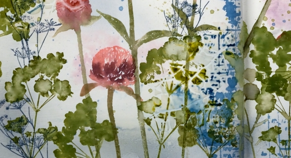
Clover journal page
Posted: February 14, 2020 Filed under: Art Journal, crackle, Darkroom Door, Nature Walk, number medley, Stencils, warm wishes, Wildflowers Vol 2 | Tags: Art Journal, Darkroom Door stamps, Darkroom Door stencils, Ranger Distress inks, Ranger Distress stains, Wendy Vecchi 7 Comments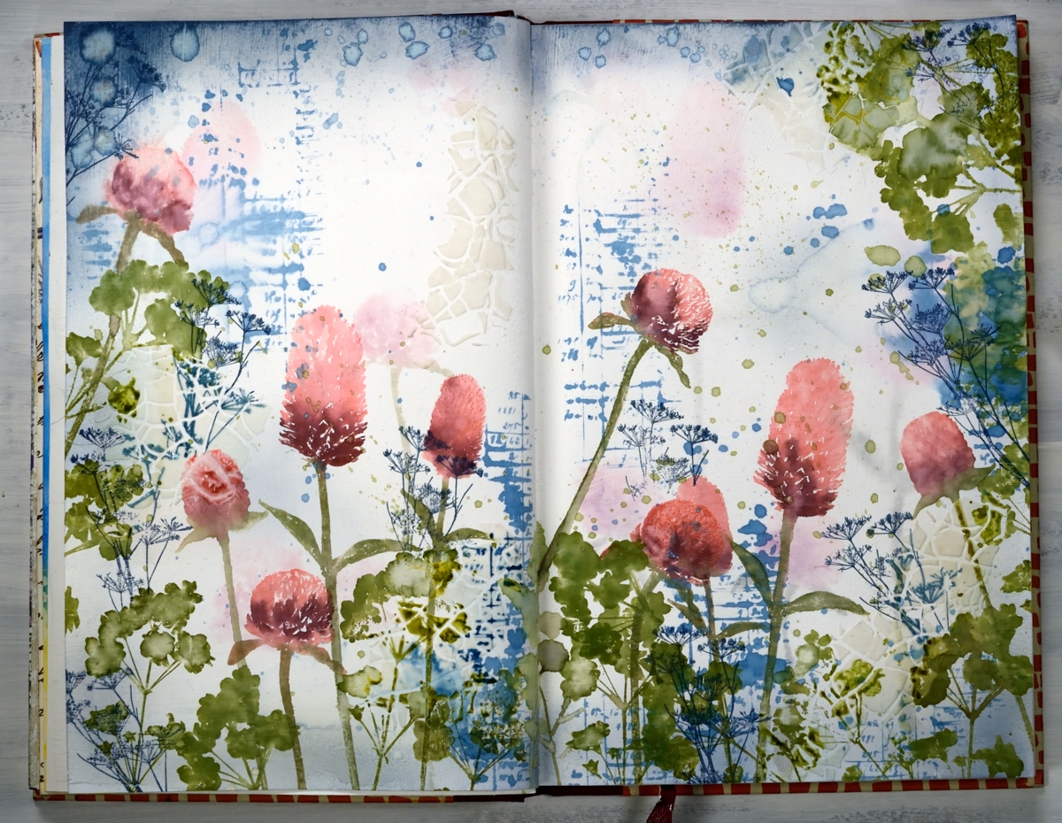
Are you wondering if I’m repeating myself? Didn’t I post this a few days ago? Indeed, I posted something similar on Monday, a card featuring the new ‘warm wishes’ set from Darkroom Door. At the end of the post I mentioned that I’d like to transform the design into a journal page…so I did!
I kept my colour scheme with the addition of more green and added a few extra stamp images and a bit of texture. I used a Fabriano ‘Venezia’ art journal, with drawing paper not watercolour paper. The weight of the paper is decent but if I’m going to be spritzing and adding water and ink I paint a layer of absorbant ground on both pages first.
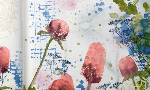
I began by inking up the clover stamps with worn lipstick, aged mahogany and peeled paint markers, spritzed them so the ink started blending on the stamp then stamped randomly across the pages. I spritzed the images lightly so the ink moved and softened and also dabbed colour and water away with a paper towel. I inked the number/account book stamp from ‘number medley’ set with stormy sky distress stain and stamped it randomly around the pages. After stamping I spritzed the images so the ink spread, diluted and ran across the page. I dabbed some of it dry but left other bits to make watermarks. I also splattered the stain around with a paintbrush. Once the first layer of stamping was dry I switched to stormy sky distress ink and a blending brush to add colour to all the page edges. Also on the dry page I added a bit of texture by applying modeling paste through the DD stencil, ‘crackle’. The crackle was not very obvious but showed up a bit more after I added more stamping.
At this point I considered the background complete and started on the more distinct stamping. As I was working in the journal I couldn’t place it in the MISTI so I placed my ‘staytion’ magnetic board under the left hand page and added some acrylic blocks underneath the board to balance the left side of the journal with the right. I used an acrylic block to stamp all the clover and positioned a stampa-ma-jig against the block a couple of times just in case I didn’t have a complete image. I was able to do touch ups with a paintbrush and extra ink if the stamping was too pale.
I wanted some clover-ish leaves to stamp around the flowers so I grabbed a stamp from the DD ‘wildflowers vol 2’ and stamped foliage all around in peeled paint and forest moss inks. I added some green splatter too because journal pages always need splatter! At this point I was almost finished but I wanted a little more blue on the page. Rather than add more of the number stamp I used a very delicate floral stamp from ‘nature walk’ in faded jeans archival ink so I would have fine detailed lines that wouldn’t blend or blur. To balance mass of colour at the base of the pages I added more blue across the top edges. The blending brush was going to take too long so I swiped the ink pad over the edges and some water droplets also.
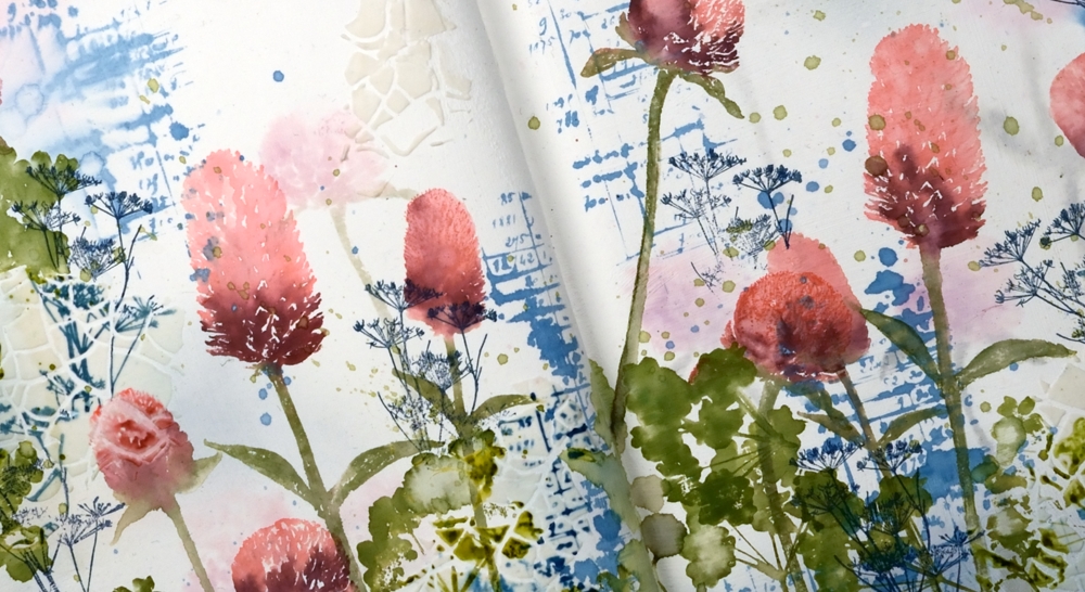
My journal is nowhere near full but it has become bulky with uneven pages because some have been glued to each other, others have been collaged. When I started the journal I glued pages together for sturdiness because that was what Vicky Papaioannou did and Vicky is an art journal wizard! She doesn’t always do that any more and neither do I because some of the pages just don’t want to be joined to each other, it makes it difficult to open them or flatten them. If you are an art journaller I would love to know if you prep your pages in some way so they can take a bit of water and liquid ink.
I hope you enjoyed seeing how a card inspired a double page spread; I definitely enjoyed working on the large scale with less pressure to keep things neat and contained!
Supplies
https://linkdeli.com/widget.js?1559654439292
Banner Blooms
Posted: February 13, 2020 Filed under: banner blooms, boxes, Darkroom Door, Penny Black, sennelier watercolours, Stencils | Tags: Darkroom Door stencils, Penny Black stamps, sennelier watercolours, Tsukineko Versafine inks 3 Comments
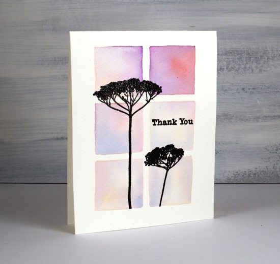
Recently I blended through a stencil to create square grid backgrounds for some floral silhouette stamping. Today’s card uses a similar technique but I wanted the squares to be less neat, a little imperfect but still recognisable as squares. I guess I could have freestyled them entirely but I wanted them to be evenly spaced and I didn’t trust myself to do that without the stencil as a guide. To achieve this look I once again taped a grid stencil (DD boxes 6 up) to a piece of cold pressed watercolour paper but instead of blending the squares then painting over them I just painted squares inside the stencil squares. I didn’t paint right up to the edges of the stencil because then liquid would have seeped underneath and made a mess. I used the stencil as my placement guide and painted a square inside each space.
I used Sennelier watercolour paints but you could use any watercolour paints or inks. I started each square with a stroke or two of mustard yellow then added some blue, red or orange and blended it with the mustard. After it dried I flattened it in my minc then transferred it to the stamp positioner to stamp five different images from the PB banner blooms set in versafine clair nocturne ink. Simple but quite effective. I chose a sentiment from the PB ‘strength’ set for the last square.
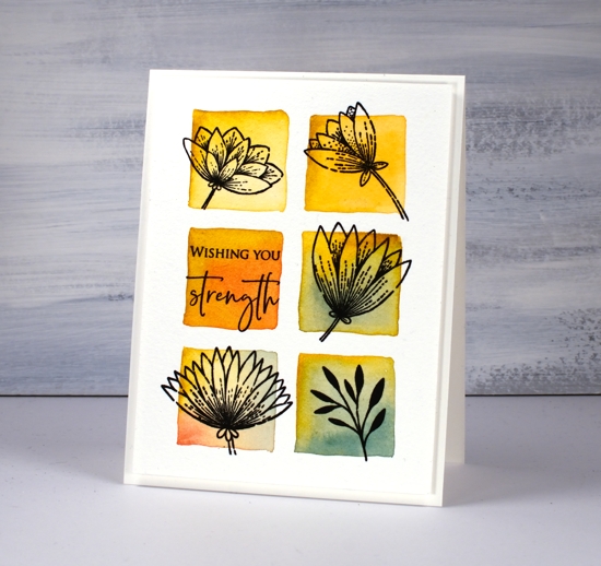
I really like the simple ‘shadow frame’ created by popping up the panel on a piece of foam; that’s why you keep seeing it!
Supplies

Stencils & watercolour
Posted: January 20, 2020 Filed under: boxes, carved flowers, carved flowers, Darkroom Door, ferns, Stencils, Wildflowers Vol 1 | Tags: Darkroom Door stamps, liquid metals, Ranger Distress inks 7 Comments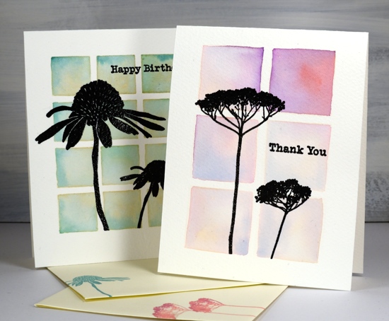
Some recent art from Kathy Racoosin inspired me to use my stencils a little differently. I used four stencils from Darkroom Door and my ever useful distress inks.
All these cards are one layer; I often attach a one layer panel to a card base and keep the layers minimal that way but this time I cut card bases from cold pressed watercolour paper and did all the stenciling and painting on directly on the card base. I taped the stencil to the card base using the grid on my glass mat to make sure the stencil sides and card sides were parallel. I used a large blending brush to transfer antique linen to the watercolour paper. Whatever ink you use through your stencil will lend some colour to the final images as it will mix with the ink painted on later.
On the twelve square background I painted peeled paint and pine needles ink using the blended antique linen as my guide. On the card below I used wilted violet, abandoned coral and blueprint sketch inks to fill the six blended squares.
After both cards had dried I used a stamp positioner to stamp the flowers in versafine clair nocturne ink. There is texture in the cold pressed watercolour bases so I stamped and restamped a few times. After stamping a couple of sentiments also from Darkroom Door I embossed all the stamping with clear powder. (I’ve listed and linked all the stamp sets and stencils at the end of this post.) I used one or two of the same distress inks to stamp matching envelopes.
For the next two cards I used the same ‘blend then paint’ method. Once again I blended antique linen ink through the stencil then for the ferns painted a section at a time switching between cracked pistachio, peeled paint and pine needles inks.
I smooshed the ink pads on my glass mat and added a little gold shimmer with a few drops of Ken Oliver’s ‘yellow gold’ liquid metals. The shimmer isn’t very obvious in the photos but in real life it adds a little pizazz!
On the cone flowers I also added shimmer and used peeled paint for the stem, and fossilized amber with abandoned coral for the flower and petals.
Techniques like this make me take a second look at my stencils. I want to try it with a different base colour next time. Take a look at Kathy’s video to see her step by step technique.
Supplies
Carved flower sunset
Posted: May 14, 2019 Filed under: carved flowers, carved leaves, circle stencil, diamonds, Wildflowers Vol 2 | Tags: Darkroom Door stamps, distress oxide inks 3 Comments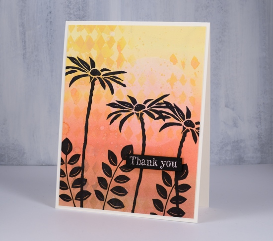
I tried out a few new products yesterday and ended up with these two cards featuring the Darkroom Door carved flower set. I coloured both cards with distress oxide inks. For this first one I smushed the oxide inks on my glass mat, added some water then painted a graduated wash going from yellow to brown. Oxide inks are designed to react with water so the diluted wash I painted on the card had a muted looked to it when it dried. I wanted to add a pale sun and some stenciled diamonds so I used my new ‘Wendy Vecchi Stay-tion’. It is a magnetic surface which is well suited to stenciling. There are four magnets to hold the stencil firmly over the paper while adding a medium through the stencil. I used it first to hold the DD circle stencil over the panel while I diluted the exposed circle with water and dabbed colour away with a paper towel. I then used the magnets and board to hold the diamond stencil while I sponged some oxide ink onto the background. I splattered some water over the panel then stamped the carved flowers and carved leaves in black archival ink.
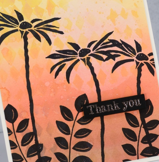
Instead of painting a wash with diluted oxide ink for the second card I blended oxide inks over the whole panel which I had added a circle mask to before I started. Once again I used the magnets and board to keep the panel in place while I blended the inks and while I dabbed out some colour through the diamond stencil. Even though the two cards look similar the techniques were a bit different; you can see the oxide ink applied with a blending brush is smoother than the painted panel. Oxides really do blend well. I used the make up blending brushes my children gave me for mothers’ day. They are not life changing but they did do a very good job 😉
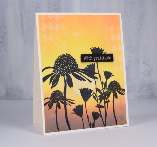
Once again I stamped carved flowers and wildflowers in jet black archival ink using the misti.
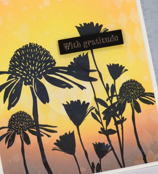
In keeping with the solid black flowers I chose to emboss sentiments on black cardstock in rose gold powder hoping it would look a bit coppery like the sunset. It did. The sentiments are from the DD ‘thank you’ sentiment strip stamped then cut out with the Avery Elle sentiment strip dies and popped up on black foam tape. The black tape is handy when the card base or element needing the tape is black or a dark colour.
It was my first time trying the Wendy Vecchi ‘stay-tion’ and I found it very useful. The magnets held the stencils and paper in place and it cleaned up easily. I am sure I will be using it often.
Don’t forget to check out the ‘Color Trio Challenge’ I am hosting with the Foiled Fox. I would love to see your three colour cards and give you the chance to win a shopping spree at the Foiled Fox store!
Supplies