Turning
Posted: April 27, 2023 Filed under: Alcohol Ink, delicate daisies, Echidna Studios, grafix, Paper Rose, Penny Black, skewed squares, turning | Tags: Echidna Studios, Penny Black creative dies, Penny Black stamps, Ranger Alcohol Ink, Ranger Distress inks 2 Comments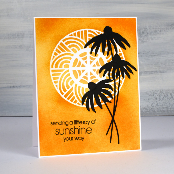
As you know I have recently been featuring some designs from my daughter’s etsy store Echidna Studios. They are available as digital stamps/cutting files. What I haven’t mentioned is that some of the designs in her store are designed by me! She has just added a batch of digital images that I designed as stencils but they can also be printed. The circle masked on the card above and the half circle on the second card are from a digital set called ‘turning‘. The beauty of digital designs is that they can be cut or printed in any size. I cut both stencils from Grafix matte duralar using my cricut.
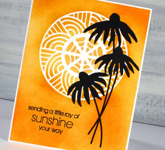
I blended three distress inks through the stencil onto neenah solar white cardstock then added the PB delicate daisies die-cuts and a PB sentiment.
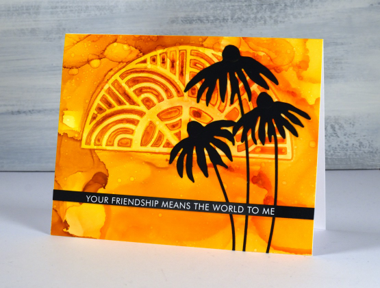
To create the half turn stenciled card I worked on Grafix white craft plastic with three alcohol inks. I dropped isopropyl alcohol and alcohol inks on the panel then dropped the stencil into position. I tried to be patient so the inks would dry and give me a complete impression of the stencil. I did help it along with an air blower and managed not to lift it too early! I splattered a little isopropyl over the top for extra interest.
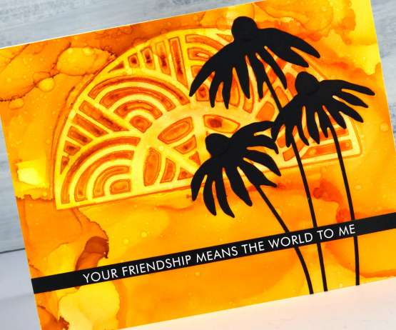
Once again I finished the card with black elements: the PB daisies and a sentiment strip from Paper Rose Studio. I hope you visit Echidna Studios store and check out the designs there. I will be featuring more in the weeks ahead. See if you can guess which of the stamp sets I designed, they are different from my daughter’s very realistic style. If you are on IG we would love you to follow Echidna Studios there too. And if you do happen to be on Instagram check out Gina Ferrari and see if you recognise anyone among her portraits.
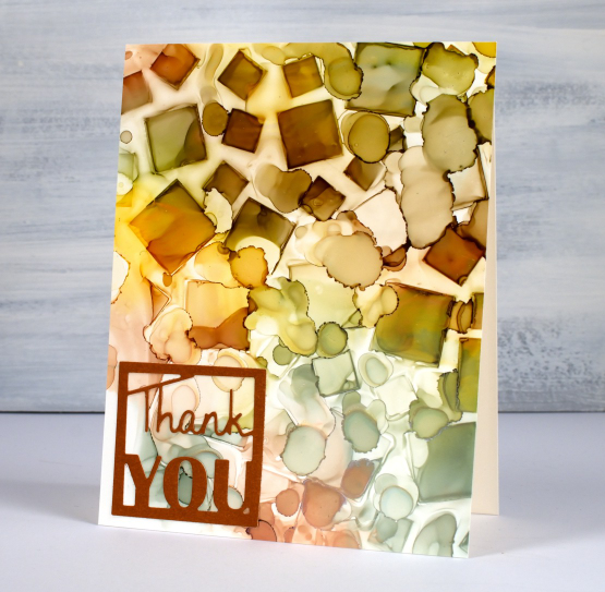
By the way, a while back I showed a sneak peak of a squares stencil I had designed and cut. You can see I used it on the card below and in the video here. The stencil is called skewed squares and it is now available as a digital file in the Echidna Studios store.
Thanks for dropping by today. I hope the sun is shining where you are; it is peeping through the clouds here.
(Compensated affiliate links from Foiled Fox, Ecstasy Crafts & Scrap n Stamp)
Birthday Window
Posted: April 24, 2023 Filed under: Penny Black, window | Tags: Fabriano Watercolour Paper, Penny Black stamps, Ranger Distress inks 4 Comments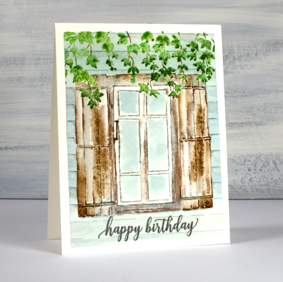
I’m a guest on the Foiled Fox blog again today featuring my first card with the new PB set, ‘window’. The window and the ivy are two separate stamps which makes them quite versatile. I wanted to try them together though so I worked in a stamp positioner with hot pressed watercolour paper.
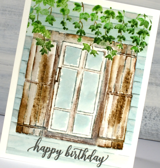
I stamped the ivy first in two greens because a range of greens definitely makes foliage look more realistic. I also added some brown for the stems. As I wanted the ivy to hang over the window and shutters I had to either mask the ivy or do some partial stamping. I did partial stamping, wiping ink off the very top of the window for the first impression then adding ink bit by bit to fill out the sections not obscured by the ivy. Once I had outlines stamped it was easy to use a paintbrush to fill out the rest of the wood around the leaves.
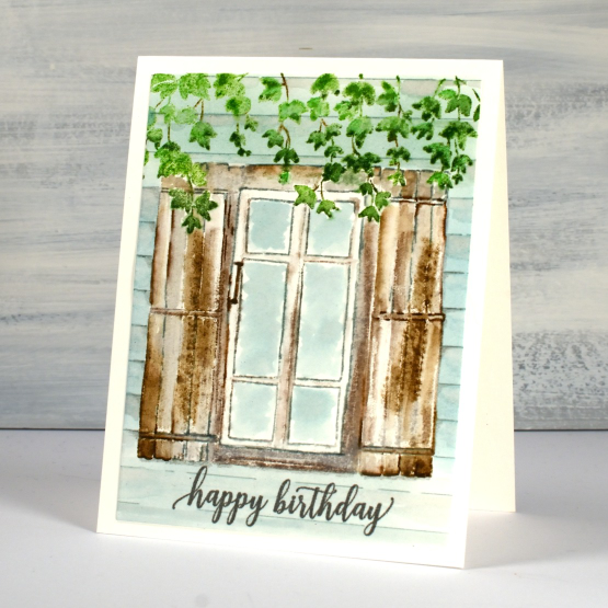
I used a mix of grey and brown for the window frame and speckled egg for the glass and side of the house adding some lines with a marker to suggest paneling. There are more details on the Foiled Fox blog so make sure you visit and say hi.
(Compensated affiliate links from Foiled Fox)
Hats Off
Posted: April 19, 2023 Filed under: Darkroom Door, hat's off, mixed boxes, Penny Black 4 Comments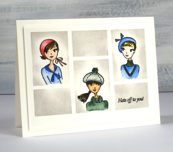
As you know I don’t often stamp, draw or paint people but these cute stamps featuring hats called to me and I decided to feature them in a grid pattern, Brady Bunch style. I taped the small Darkroom Door ‘mixed boxes’ stencil to hot pressed watercolour paper to provide the grid. Working in a stamp positioner I stamped the three hatted women in the large boxes and the sentiment from the same set in the small right hand box using Gina K’s obsidian amalgam ink.
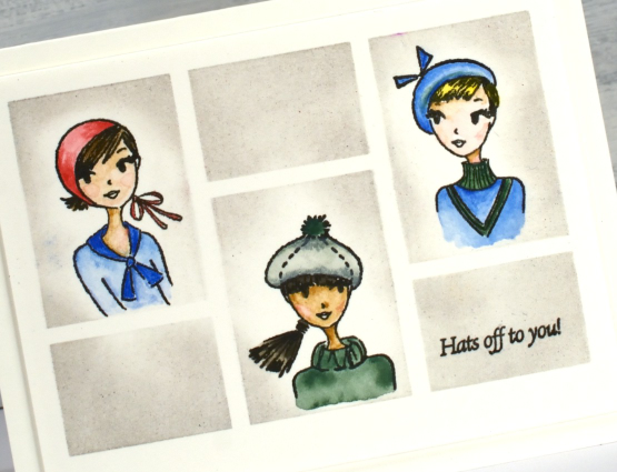
I painted the women in their hats first using Albrecht Dürer watercolour pencils, some colouring directly on the paper and some picking up paint from the tip of the pencil. As I had kept the stencil taped to the panel I was able to blend lost shadow distress ink in the spaces to frame the faces.
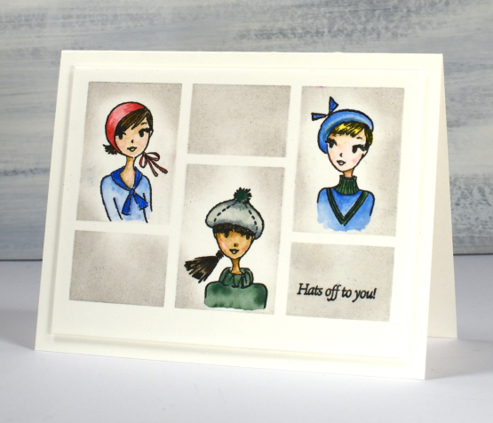
I’m thinking ‘hats off to you!’ might be a congratulatory sentiment. How would you use a card like this with that jaunty little phrase?
(Compensated affiliate links from Foiled Fox)
Darkroom Door Eyes
Posted: April 14, 2023 Filed under: Art Journal, Darkroom Door, eyes, Flower garden, French Script, gel press, Handmade book, made for you, spanish tiles, starry night, Stencils, you are everything | Tags: Art Journal, Darkroom Door stamps, Darkroom Door stencils, gel press, gel printing 4 Comments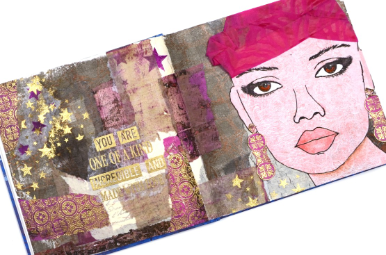
Are you surprised to see a face on one of my projects? This journal page spread was definitely outside my comfort zone but I am very happy I persevered and brought it to completion. The page began with the new ‘Eyes’ stamp set from Darkroom Door and a pile of gel prints. There are eight pairs of eyes in the set in a couple of different sizes. I chose to stamp the eyes on a pale gel print done with oxide inks and the DD background stamp ‘flower garden’. To help me draw the rest of the face around the eyes I found a magazine face with similar size eyes and that gave me the right scale and placement as I completed the head and features.
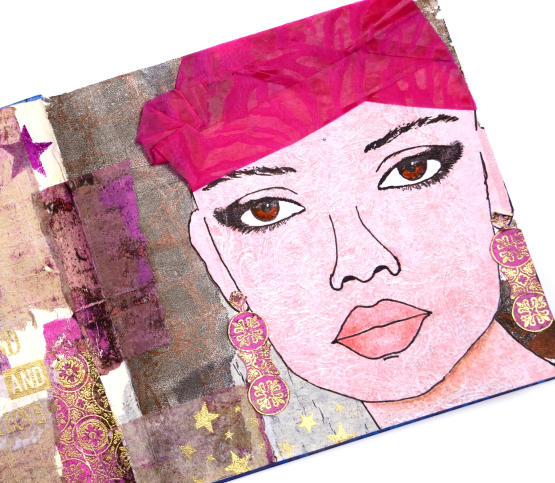
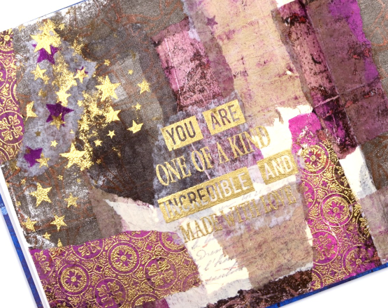
Although I like the idea of adding hair I decided to do that on a future project and used some textured wrapping from a bunch of flowers instead. The bright pink helped me choose other gel prints to complete the background collage. You might not see them all but DD background stamps and stencils are featured on most of the torn collage pieces.
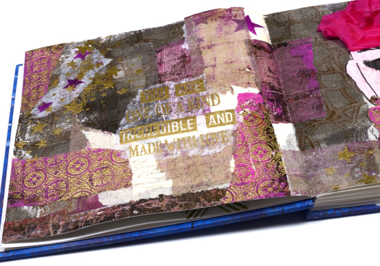
I embossed the Spanish tiles background stamp on a bright pink gel print, tore it up for collage and attached a strip to cardstock so I could cut earrings. I also used gold embossing when adding the words. I alternated phrases from the DD ‘you are everything’ set with the new DD ‘made for you’ set.
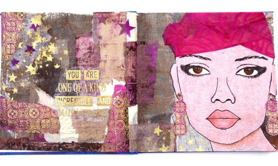
I worked in my new handmade journal which is 7″x7″. Once I had the facial features pencilled in I went over them with marker then added shading with coloured pencils. I also stenciled some stars over the collage and embossed in gold to give the whole spread more unity. The pink turban was a bit of a challenge which ended up looking a bit more like a swim cap than a turban but you get the general idea don’t you?
I will be using the eyes again both to practice drawing faces and as elements in future journal pages. I hope you are enjoying seeing the new stamps from Darkroom Door; they are always full of the artistic magic and clever ideas of Rachel Greig.
(Compensated affiliate links from Foiled Fox & Scrap n Stamp)
Birthday Garden Gate
Posted: April 13, 2023 Filed under: Echidna Studios, garden fence | Tags: Echidna Studios, Fabriano Watercolour Paper, Kuretake Zig clean color real brush markers, Penny Black stamps 3 Comments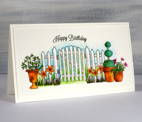
This is the second card I’ve made with the Echidna Studios ‘garden fence’ set of digital stamps. On the first card the images were smaller to fit on an A2 card and the arrangement was a little different. These digital images are great fun to work with as they are not transparent so when I position each pot it masks what ever is behind it.
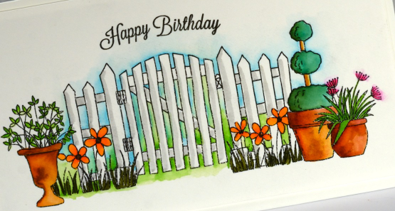
I printed the image on hot pressed watercolour paper then did all the colouring with zig clean color real brush pens. Those pens are juicy! I added only small dabs of ink to the foliage and flowers and blended it with a waterbrush. I blended blue and green between all the fence posts to make the white pop and added a line of grey as shadow.
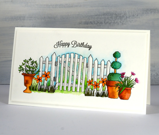
The sentiment is from an old faithful Penny Black set, banner sentiments. The curve of the stamp fitted nicely over the curve of the gate. The finished card is 7¼” x 4⅛” which is not a standard size I know. I will either make a custom envelope or put it in a slightly larger one.
Most of my garden is out from under the snow now so not too long before I can be working with real pots not digital ones!
(Compensated affiliate links from Foiled Fox, Scrap n Stamp)
Made for You
Posted: April 12, 2023 Filed under: Darkroom Door, gel press, made for you, Nature Walk, Wildflowers Vol 1 | Tags: Darkroom Door stamps, gel press, gel printing 8 Comments
Some stamps old, some stamps new and some cardstock blue is the approach I took with these sweet new label stamps. I pulled out a textured gel print on rice paper and stamped flowers from a couple of favourite floral sets from Darkroom Door.
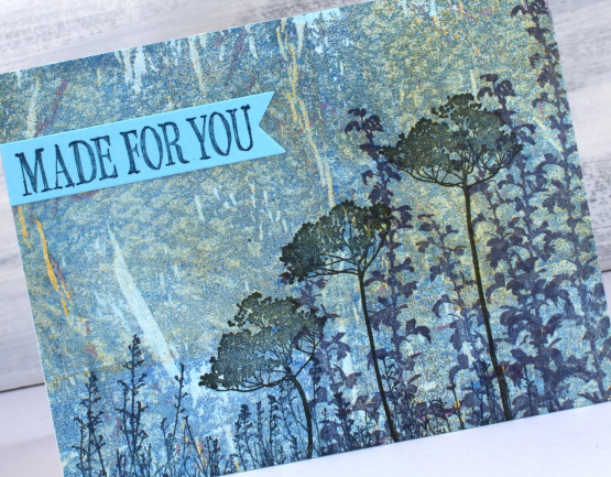
I used Ciao Bella chiascuro ink pads, the colours are deep but muted and worked beautifully with the paint colours in the gel print. Because rice paper is somewhat transparent I adhered the panel to a piece of aqua cardstock which made the print look bluer. I used the same cardstock to stamp the two phrases from the new DD ‘made for you’ set of label stamps.
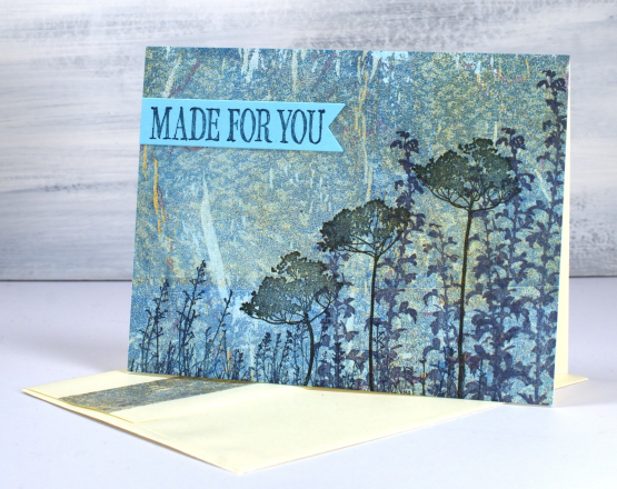
The original gel print was done on a 9″x11″ gel plate so there was enough print for two cards and some extra strips on the envelope flaps
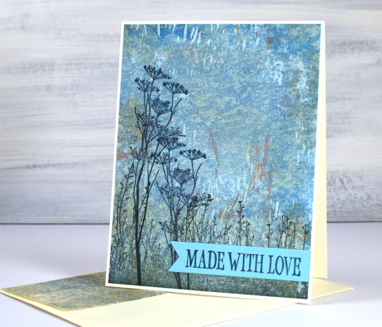
I think I have made cards a bit like this before. I love pairing DD silhouette flowers with gel prints. When I think about it, this gel print didn’t ‘work’ as far as the technique was concerned. I was using a wallpaper sample which textured swirls on it and they did not appear at all, I just got the scaly texture you can almost see. That’s the beauty of gel printing. Just because they don’t do what you expect doesn’t mean they are not usable.
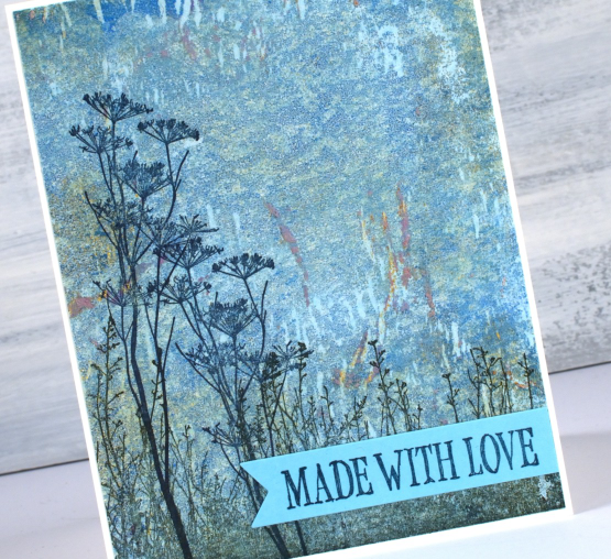
The label stamps I’ve used as sentiments were probably designed to go on handmade items such as sewing or perhaps the back of a card. I decided they worked just as well as a message on the front of a card ready to send to someone dear to me.
(Compensated affiliate links from Foiled Fox, Scrap n Stamp & Ecstasy Crafts)
Cars, Bikes and birthdays
Posted: April 11, 2023 Filed under: brushed stars, classic motorcycles, Darkroom Door, postage stamps, this way, vintage car, word labels, World Map | Tags: Darkroom Door stamps, One-Layer cards, Ranger archival inks, Ranger Distress inks, Tsukineko Versafine inks 5 Comments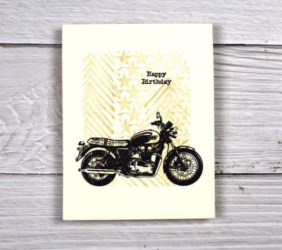
You’ve seen me use the ‘this way’ stamp behind a trio of butterflies and a classic car as well as featured on a journal page. It reminds me a little of tire tread so I have paired it again with some vehicles. For this motorbike card I masked the edges of a cream panel and stamped ‘this way’ and ‘brushed stars’ in antique linen distress ink.

After removing the masking tape I added one of the motorcycles from the classic motorcyles set in black along with a little happy birthday. I haven’t masked edges like this in a while but it makes it easy to make a simple but eye catching one layer card. You could fill the masked area with any stamping you wanted then add a bold black image over the top.

I also used ‘this way’ in the vintage style watercolour background of this card. I combined, the arrow pattern of ‘this way’ with postage stamps and world map. There is also splatter and a torn edge to keep the background looking aged. I stamped the DD vintage card on teabags and added stitching and word labels to complete the card.

(Compensated affiliate links from Foiled Fox, Scrap n Stamp)
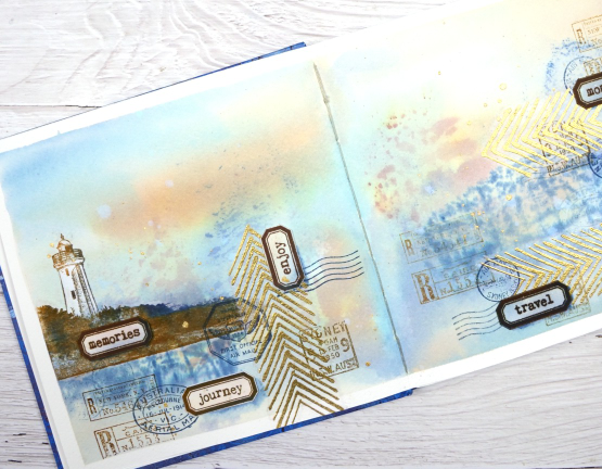
Lighthouse Journal Page
Posted: April 6, 2023 Filed under: Art Journal, Darkroom Door, global postmarks, Handmade book, this way, word labels, World Map | Tags: Art Journal, Coliro paints, Darkroom Door stamps, Fabriano Watercolour Paper, Handmade book, Ranger Distress inks 5 Comments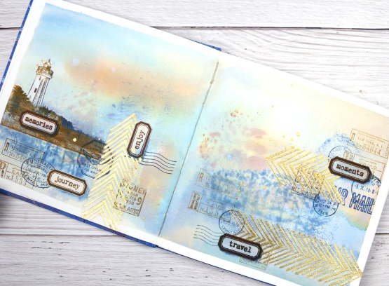
This journal spread was a joy to make. It combines so many of my favourite things. A few weeks back I posted about a new handmade art journal. This is it and these are the first pages I’ve completed. I didn’t work on the very first page; I leave that for later, so this is a few pages in. The pages are cold pressed watercolour paper so I taped the edges and created a watery blended background with distress inks smooshed on a piece of acetate then pressed onto my pages. I added more ink with a paintbrush and stamped the Darkroom Door world map stamp into the wet ink. I wasn’t trying to create sky or land or anything in particular I was just working randomly with blues and browns.
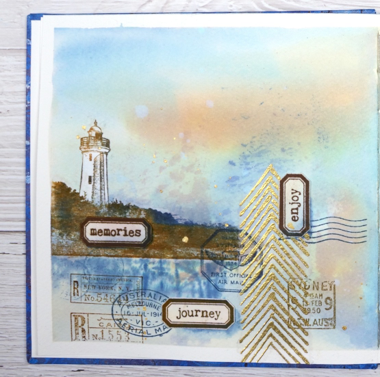
Once the background dried I used stamps from another favourite, the DD ‘global postmarks’ set, again stamped in blue and brown but archival ink, not distress, so it wouldn’t dilute and blur.
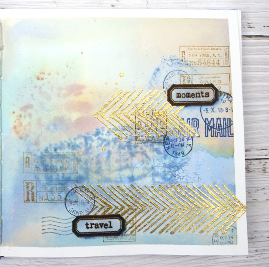
On an extra scrap of watercolour paper I picked up some smooshed and diluted ink then dried it before stamping the new ‘word labels’ stamps so I could cut them out and arrange them over the page.
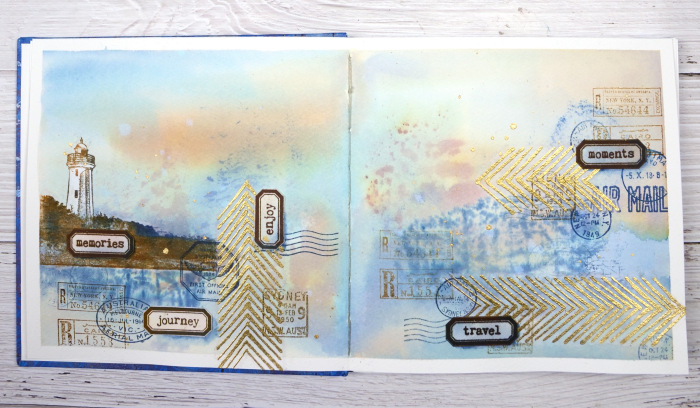
If you have been visiting my blog for a while you will have seen the lighthouse stamp before. The lighthouse is in Norah Head, on the central coast of NSW, not far from where my father lives and the Darkroom Door premises. I have visited there several times and climbed the lighthouse with my dad. You can probably see now why I chose the word labels I did. The lighthouse and the ‘this way’ arrows are stamped on tissue paper. This allowed me to move them around to work out exactly where I wanted them. The blurry world map stamping worked as a ‘reflection for the lighthouse image so that’s where it ended up.
When I am adding stamped tissue to a page I gently tear around the edges with the help of a damp paintbrush. For the lighthouse I cut carefully around the walls and light then painted white paint on the back of the tissue so it would not be transparent. Of course I splattered some water and some gold paint to complete the page.
As this was the first time I had used my new journal I was interested to see how the cold pressed watercolour paper worked. Nothing soaked through the paper to the other side and I took care to dab up liquid from the centre seam so there was not much bleed through there either. The 7″ x 7″ size gave me a little more room than the 6 x 6 journals I have been working in but wasn’t so large as to be overwhelming.
(Compensated affiliate links from Foiled Fox, Scrap n Stamp & Ecstasy Crafts)
Do red cars go faster?
Posted: April 3, 2023 Filed under: brushed stars, classic cars vol 1, Darkroom Door, this way, word labels | Tags: Darkroom Door stamps, Ranger Distress inks, Tsukineko Versafine inks 4 Comments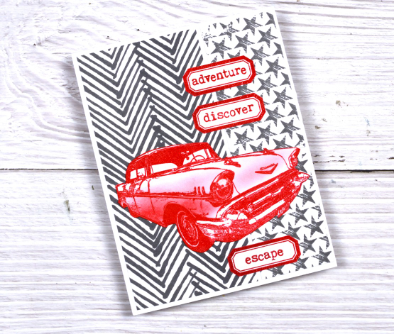
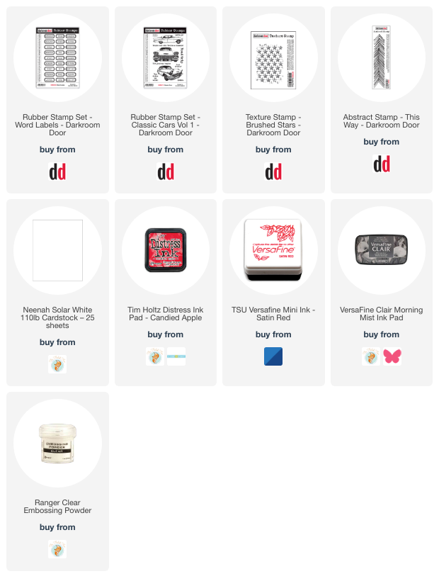
I mentioned on Friday that Darkroom Door has a new release available now and shared a butterfly card. For this bold two toned card I used the same narrow ‘this way’ stamp but in hickory smoke ink. I completed the background with the brushed stars texture stamp then added bright red elements on top.
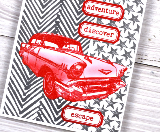
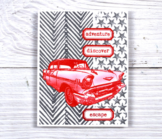
The labels are from a new DD stamp set ‘word labels’. The set includes 27 different words which will be brilliant for cards and journalling. The cool car is from the ‘classic cars vol 1’ set. I embossed it with versafine satin red ink then added shading with candied apple distress ink.
We had a red car once which I rather liked but not long after buying it we up and left for Canada so had to sell it again!
Make sure you check out the new release from Darkroom Door it is full of style and originality. You’ll be seeing more of it in the weeks to come.
(Compensated affiliate links from Foiled Fox, Scrap n Stamp & Ecstasy Crafts)
Birthday butterflies
Posted: March 31, 2023 Filed under: Brusho, Butterflies, Darkroom Door, this way | Tags: Brusho, brutus monroe embossing powder, Darkroom Door stamps 8 Comments
Darkroom Door has just released an amazing new collection of stamps so I will be showing off a few of them in the coming weeks. The narrow arrow stamp named ‘this way’ motivated me to pull out the brusho powders. Brusho is wonderful when used with embossed patterned stamps where the paint crystals can get trapped. I used both ultramarine and emerald green brusho on this card.

I embossed the ‘this way’ stamp in white powder on hot presssed watercolour paper then sprinkled brusho on top and spritzed water from above to get the colours activated. I also painted the black embossed butterflies with brusho but was a bit more strategic in my paint blending.

I popped some gold cord behind the butterflies and tucked a tiny DD birthday sentiment in as well. This slim border stamp is very versatile and in future posts I will be sharing how I used it with cars, motorbikes and a lighthouse!
(Compensated affiliate links from Foiled Fox, Scrap n Stamp)