Trees on Alcohol Ink backgrounds
Posted: December 8, 2021 Filed under: Alcohol Ink, beneath the birches, conifer, Dies, modern xmas tree, Penny Black | Tags: Penny Black creative dies, pinata alcohol ink, Ranger Alcohol Ink 4 Comments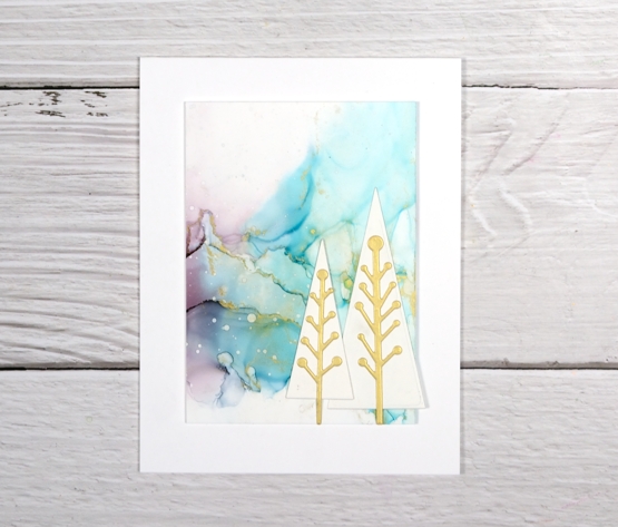
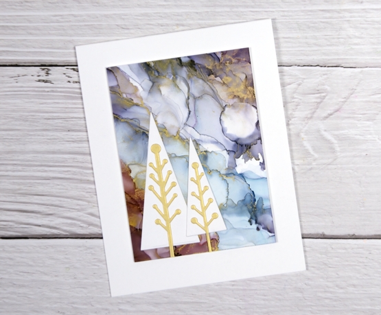
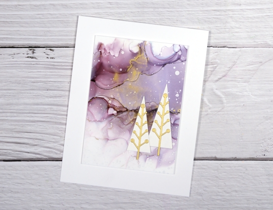
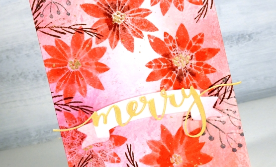
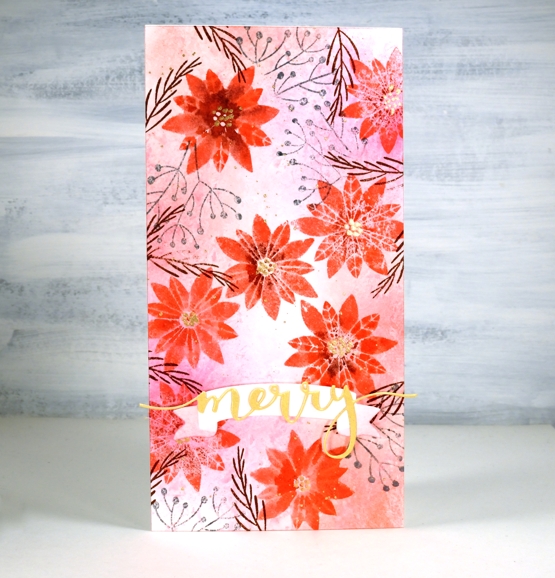
Today’s additions to the Christmas card stack are on alcohol ink backgrounds. If you have been visiting my blog for a while you will have seen the backgrounds before. I posted the panels back in June and asked you all for your thoughts on how to use them. Some of you suggested adding a quote or verse, others thought they would be good as backgrounds for cards. I liked both ideas but have chosen to cut up two of the panels for cards.

The backgrounds on the three cards above are all from one panel; I popped them up on the card base and added trees. As there was gilded alloy alcohol ink on the original design I cut the centre of the modern trees from gold shimmer cardstock.
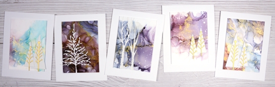
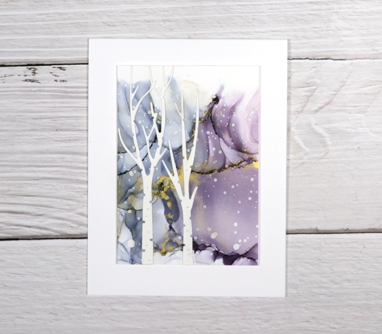
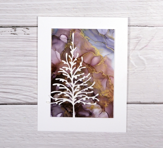
The backgrounds on the two cards below are cut from another panel. You can see where they joined up originally.
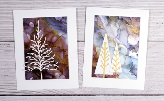
All the die-cut elements are neenah solar white cardstock (and the shimmer gold) and the card bases are also neenah solar white. This is as close to mass production as I get, same basic design but some variety within the backgrounds and added elements.
I thought about adding sentiments, just little ones below the panels but decided I liked them plain and simple. I’ll add a sentiment inside and hopefully they’ll be written and posted this week!
There are a few more alcohol ink pieces plus some paint pour scraps that have become backgrounds for die-cuts. They are still in process on my work table so you’ll see them soon.
Have a great day!
Supplies
(Compensated affiliate links used when possible)
2021 BuJo – December theme
Posted: December 2, 2021 Filed under: brilliance, Bullet Journal, delicate pines, Dingbat notebooks, Hand lettered, Penny Black, Taylored Expressions | Tags: Bullet Journal, Dingbats notebook, Hand lettering, Penny Black stamps, Staedtler watercolour brush pens, Taylored Expressions 3 Comments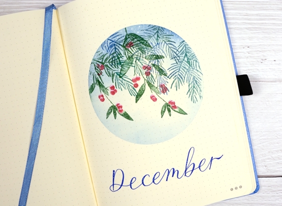
I didn’t have a lot of time to spend setting up my December pages; I can’t even believe it is December honestly. It’s a busy week but I had a snowflake idea for the theme and a bit of a plan which you can see did not happen at all. But that is ok because I can save my snowflake plan for January or February or March or Ap…….
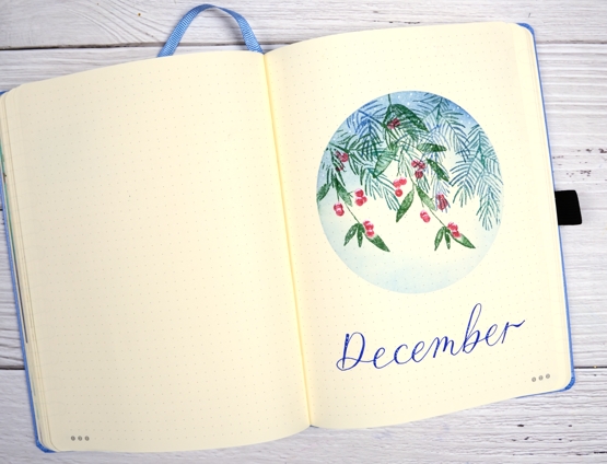
After creating the large panel for my recent stack of PB ‘delicate pines’ Christmas cards the stamp set was still on my table along with its buddy the PB ‘brilliance’ stamp set. I decided to use them together for some festive foliage. I used a mix of distress greens and blue along with a red marker for the berries and a white gel pen for the frost.
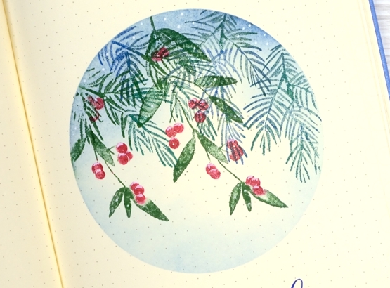
I reused a frisket film mask which I saved after creating October’s title page and stamped foliage from both PB ‘brilliance’ and ‘delicate pines’ sets. I blended over the stamping with prize ribbon distress ink then dotted white around the circle and on top of the red berries.
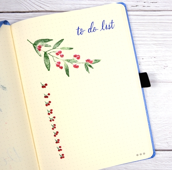
The to-do page and the calendar page have simple foliage stamping and some lettering with Pentel Flair pens.

I have used masking in quite a few of my pages this year; I might need to come up with a new favourite technique for next year. I hope your December is off to a good start. Because I can’t believe it is December I have a discount code for the Floral Faves class, Winter Wonder class and the Colour Clues class. If you use HTDEC you will get 20% off. If you are interested in giving an online class as a gift please get in touch so I can help you make it happen.
Supplies
(Compensated affiliate links used when possible)
Delicate Pines – 9 Ways!
Posted: November 29, 2021 Filed under: delicate pines, Dies, gift card pocket, joyful ornaments, jubilation, juniper, onramental branch, Penny Black, tall trees, Taylored Expressions, trees and hills | Tags: Catherine Pooler inks, Penny Black creative dies, Penny Black stamps, Taylored Expressions, Tsukineko Versafine inks 8 Comments
Welcome to a long post with quite a few photos!
When I last counted up the names on my Christmas card list and the number of cards I have completed the two numbers were not close to matching. I decided a quick way to grow the stack of cards would be to stamp a big panel then slice it up to make several cards.
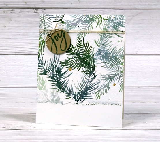
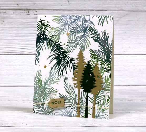
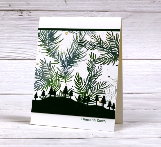
Turns out this idea was not all that quick. It took a while to make these cards because although they are from the same stamped panel, they are still all different. The photo above shows the original panel stamped with Penny Black’s new ‘delicate pines’ set of 3 stamps and two Catherine Pooler inks. After the stamping I added ink splatter then gold paint splatter.
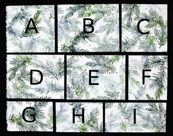
I kept the deckle edge on the 11″x14″ cold pressed watercolour panel and sliced up the panel lengthwise first. A,B & C are all 4¼” wide, D,E & F are all 4″ wide which left G,H & I all 2¾” wide. Below are all the finished cards. I used some pale gold, Bazzill avocado green and kraft cardstocks for the die cuts and framing. I used versafine clair rainforest ink to add sentiments and some linen twine here and there. All the cards are shown below with the size of the stamped panel portion included underneath (all the finished cards are 4¼”x 5½”)
A. 4¼ x 4½
B. 4¼ x 5½
C. 4¼ x 4⅛
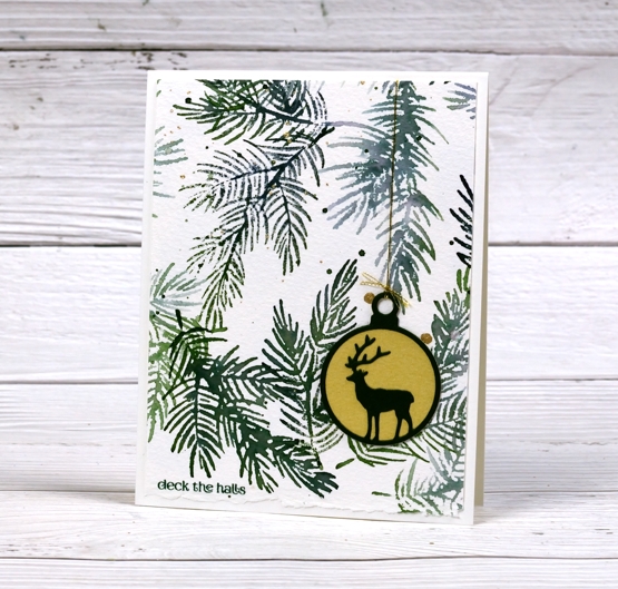
D. 4 x 5¼
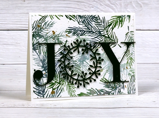
E. 4 x 5¼
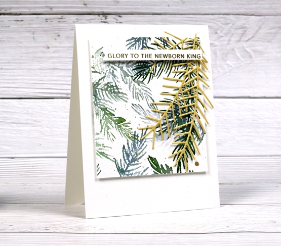
F. 4 x 3½
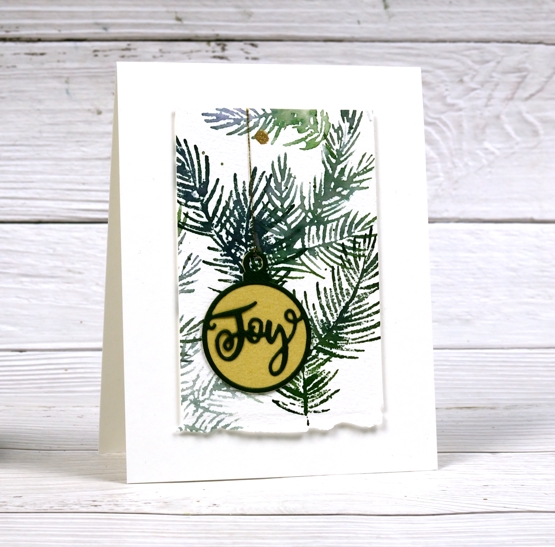
G. 2¾ x 4¼
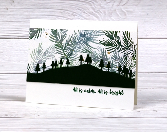
H. 2¾ x 4¼
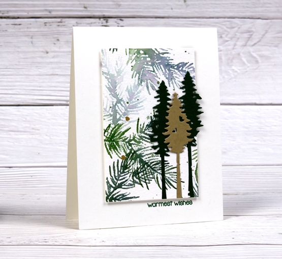
I. 2¾ x 5½
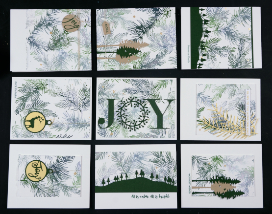
The finished cards above are in the places that correspond to the labelled photo up at the beginning of the post. I had them laid out on a cutting mat on the floor beside me as I put them all together so I didn’t get them mixed up. I wanted you to see how I used each size in a different way.
I hope you find some inspiration from these cards. Remember that three of my online classes are on sale until the end of November. Use the code HTNOV to get a 25% discount on the Floral Faves class, Winter Wonder class and the Colour Clues class.
The stores I have affiliate links with are also having sales right now (isn’t everyone?) I have put the links in the right hand side bar of the blog for easy access. Just click on the store name and start shopping!
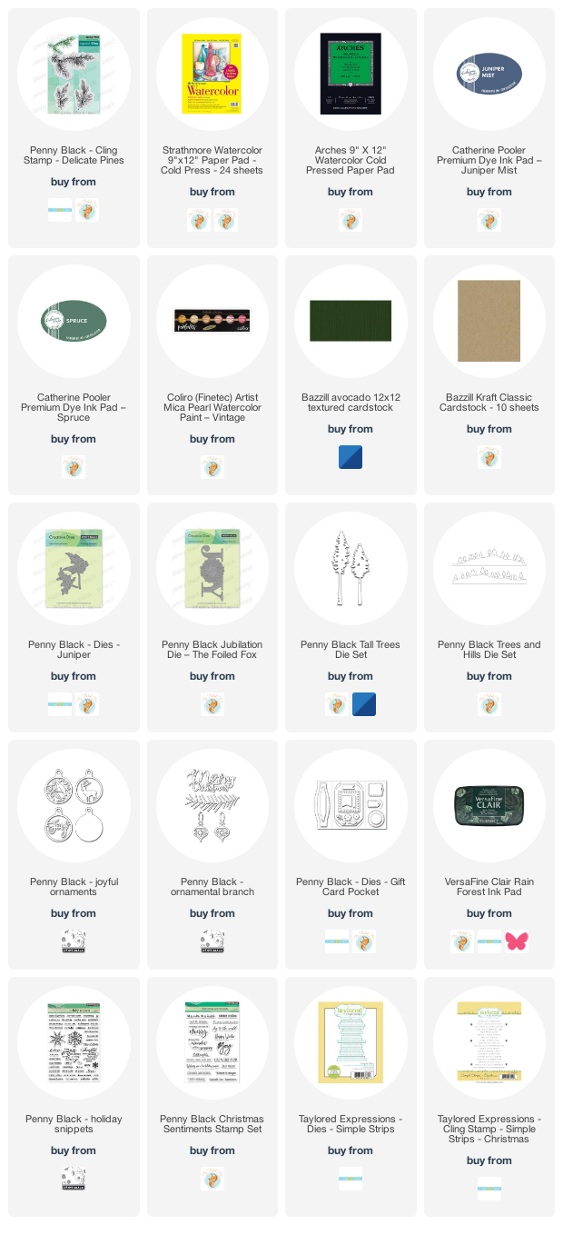
Supplies
(Compensated affiliate links used when possible)
Winter Blooms
Posted: November 26, 2021 Filed under: Penny Black, winter blooms | Tags: Catherine Pooler inks, distress markers, Penny Black stamps 5 Comments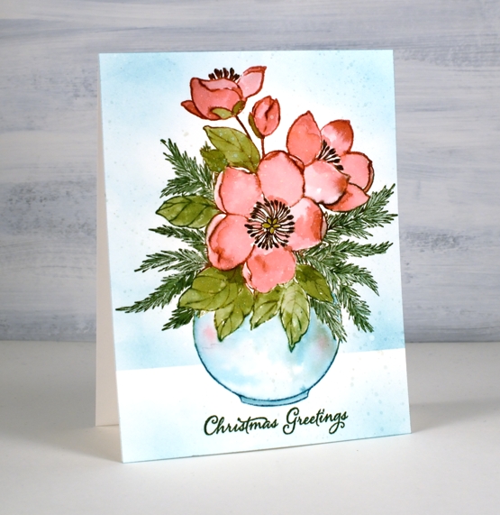
I am happy to be a guest on the Foiled Fox blog today so I hope you will pop over there and check out all the inspiration they share. I am also happy to tell you they are having a Friday – Monday sale, all the more reason to visit!
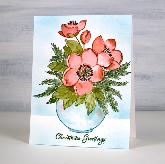
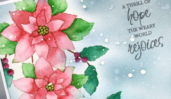
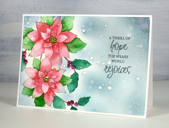
This lovely new floral arrangement from Penny Black is called ‘winter blooms’. I think the blooms are Helleborus; when I looked them up I discovered they come in many colours including pinks, reds and purples. I chose to stamp with juicy Catherine Pooler inks then blend the ink to fill the petals and leaves.
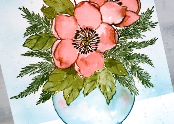
I inked all the elements except the dark centres before doing any stamping. To ink the petals and the leaves without getting ink in the wrong places I press the ink pad on the stamp then wipe the areas that don’t need that colour then do the next colour. Occasionally I end up with colours mixing or spaces with no ink. Neither of those issues cause a problem because when I spritz the stamp the inks move and dilute a little.
Once I had stamped I used water and sometimes extra ink to fill all the elements. I dried the panel before stamping the centres with dark brown ink (applied with a distress marker). I dried the panel again before blending ink over a post-it note mask to create a background and ground the vase. I added a sentiment from PB ‘festive snippets’ set stamped in both shady lane and rainforest versafine clair inks; sometimes I stamp one ink over another to match a colour in my design. As I look at these photos I notice I did not paint a shadow underneath the vase. I think I meant to…
Make sure you visit The Foiled Fox blog and store and use the code JOY2021 for a 15% discount at check out.

Three of my online classes are also on sale until the end of November. Use the code HTNOV to get a 25% discount on the Floral Faves class, Winter Wonder class and the Colour Clues class. Have a delightful weekend.
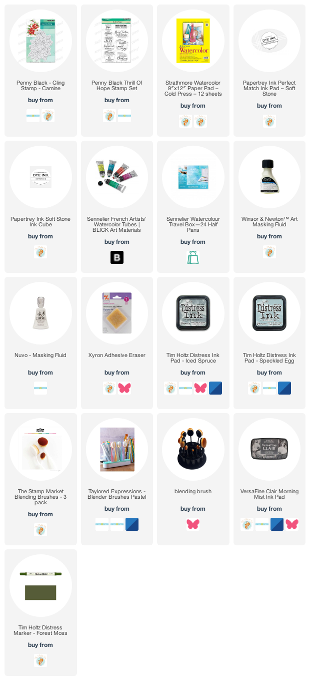
Supplies
(Compensated affiliate links used when possible)
Quick inky sky
Posted: November 24, 2021 Filed under: gorgeous grove, Penny Black | Tags: Fabriano Watercolour Paper, Penny Black stamps, Ranger Distress inks 7 Comments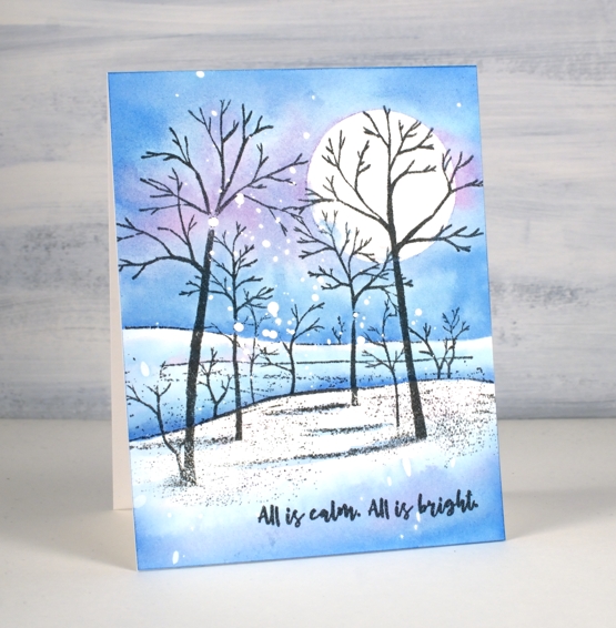
I’ve made many of these snowy scenes over the years but this was one of the quickest because the scene is all in one stamp. I already had a piece of hot pressed watercolour paper splattered with masking fluid, so that also cut out some time.
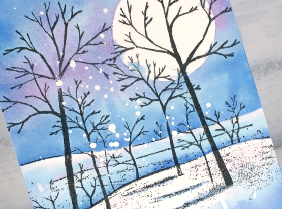
I stamped the PB ‘gorgeous grove’ stamp in versafine clair morning mist ink which I think I like better than black when the sky is not very dark. After stamping I added a frisket film circle mask which I did not seal perfectly but that’s ok; there’s a bit of cloud cover creeping over the moon.
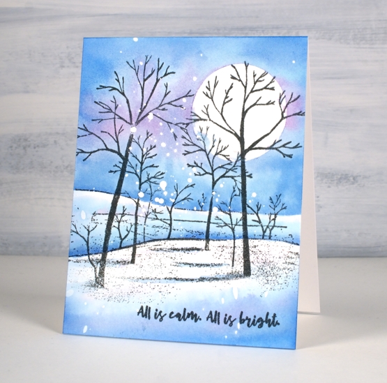
I didn’t want to spend too much time choosing colours so I just pulled out three of the newest distress inks. I’m still experimenting with the new colours so I started by painting salvaged patina around the moon then blending it with water to fill the top half of the panel above the horizon. Next I added prize ribbon ink just about everywhere and then some dabs of kitsch flamingo. I would not normally use these three colours together but it worked as distress blends often do. Once the sky was painted I dried the panel before using the same inks to paint shadows in the foreground and behind the snowy hill. The words are from PB ‘Christmas sentiments’ set stamped in morning mist to match the trees.
By the way I have a little sale going on over at my online classes site. If you use the code HTNOV you can get a 25% discount on the Floral Faves class, Winter Wonder class and the Colour Clues class.
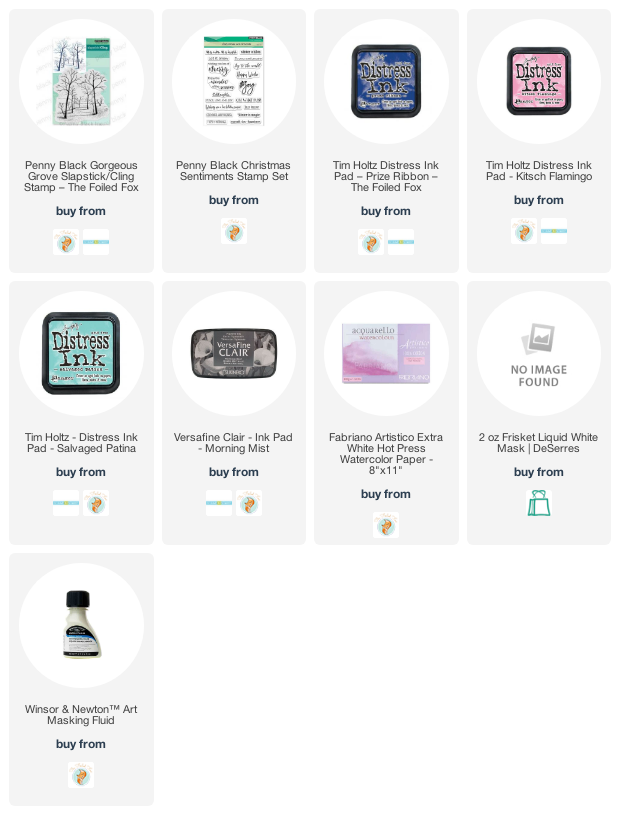
Supplies
(Compensated affiliate links used when possible)
Let Heaven and Nature Sing
Posted: November 19, 2021 Filed under: CAS, nature sings, Penny Black | Tags: Faber-Castell Albrecht Durer Watercolour pencils, Fabriano Watercolour Paper, Penny Black stamps, Ranger Distress inks 9 Comments
This sweet bird is one of four in the Penny Black set ‘Nature Sings’. It is my plan to make a similar card with all four birds. I returned to a very clean and simple style for this one utilising some masking, blending and watercolour.
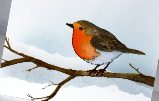
I worked on hot pressed watercolour paper because I knew I would watercolour the bird. Before stamping I tore a post-it note mask and lay it across the panel then blended speckled egg ink above it. I stamped the bird in soft stone papertrey ink then watercoloured with a few distress inks. The colours are listed below. The bird was floating in mid air so I drew a branch with a watercolour pencil then painted it with distress inks so he would have somewhere to perch. At this point I added a second area of masked blending to the background.
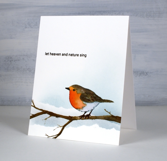
To finish off I stamped one of the sentiments from the same set in fallen leaves versafine clair ink. It just so happens that the CAS Christmas Card challenge this month is Christmas Critters so I am in!

Supplies
(Compensated affiliate links used when possible)
Back on Craft Roulette
Posted: November 17, 2021 Filed under: birds and banners, Dies, Penny Black, petals & branches | Tags: Penny Black creative dies, Penny Black stamps, Ranger Distress inks 5 Comments
I was once again a guest crafter on Craft Roulette last Friday night and it was loads of fun. Mary Gunn, the host keeps the action going with crafting, chatting, and sharing over eighty card samples made by viewers. To see Mary and I chat and create pop over to the Craft Roulette youtube channel. (To just watch the card making part you can skip to 55:11)
Craft Roulette is a crafting game show where a wheel is spun four times to choose four parameters which must be used on the project being created live during the show. Last Friday the parameters were:
Card type: ‘Lil Chubby’ ( like a slimline but wider)
Colour choice: Warm colours
Element: ‘It’s a sign’
Random: Crumpled paper
The finished card is 4″x 8″ with a blended background that I patterned with a wet crumpled tissue. The colours are warm and that banner die looks like a ‘sign’ to me so I squeaked it in.
It was lovely to see some familiar names in the chat, encouraging me and asking questions. Thank you Karen for staying up late in Wales to watch. I didn’t see all the chat because, well, I had to do some crafting but I was able to read some of it. My dad watched from Australia and was chatting along.
There is definitely an added pressure when crafting live but it is all great fun and the community is such a friendly supportive one. If you have never watched Craft Roulette, I highly recommend!
Supplies
(Compensated affiliate links used when possible)
Carmine – No Line Watercolour Video
Posted: November 16, 2021 Filed under: carmine, Penny Black, sennelier watercolours, Tutorial | Tags: distress markers, Fabriano Watercolour Paper, Papertrey ink, Penny Black stamps, sennelier watercolours, Tsukineko Versafine inks, Tutorial, video 9 Comments
I hope you enjoy today’s no-line watercolour video. When I first saw this stamp I knew it would be perfect for the technique. There are a few little petals but most of the image is made up of open leaves and petals which are easy to see while painting. I used soft stone ink for the initial image on cold press watercolour paper and Sennelier watercolour paints for all the painting.
If you don’t always have a plan for the background you will see how I added one after all the painting was done. Take a look at the video below to see my process.
This is such a pretty stamp and might get inked up again soon to keep my stock of Christmas cards growing. I think it would look good embossed in white on a coloured background. Stay tuned!
Supplies
(Compensated affiliate links used when possible)
A Winner & some Chat
Posted: November 15, 2021 Filed under: Classes, Darkroom Door, Hand drawn, Hand painted, online class, Penny Black | Tags: Classes, online class 3 Comments
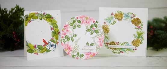
Thank you to everyone who left a comment on the Wreaths – Stamped & Painted online class launch post a week ago. It was lovely to hear from you. Thank you to all of you who have already registered in the class; I am delighted to have you making wreath cards with me. I used a random number generator to pick a winner from the comments left on last Monday’s post and the winner of a class registration is …
Jo Anna Grimsley
who wrote that she had completed her Christmas cards. YAY! and had never been done this early! Well done Jo Anna, you can now treat yourself with an online class. I will be in touch by email.
On Christmas Cards
I was interested to read that many of you had started Christmas cards, some of you don’t make holiday cards but prefer to send cards throughout the year. Several people make photo cards which I think is a great idea; I love to receive a family photo or scenic photo taken some time during the year. A few of you, like me decided to make Christmas cards throughout the year; I didn’t do that well actually so I have had to ramp up the process lately. Some of you keep it simple with a mass produced design but a few of you departed from that plan this year and have been making quite elaborate cards. Thank you so much for all your comments. I made my list yesterday and counted that I need 80+ cards. I spent the afternoon writing in all the ones that go to Australia; they need to be in the mail first.
On Markers
When I mentioned distress markers being discontinued several people commented on their disappointment with the way distress markers dried out faster than other markers. I have found that to be so with the bullet tip of the distress markers but haven’t noticed it so much with the brush tip which is what I usually use. Although I have Tombow markers I tend to forget them. I used several in the wreaths class and found them to be good as new so they are not drying out while they wait for me to choose them! For a while now I have been using the Staedtler watercolour brushmarkers and they also feature in the new class. I am enjoying them and there is a nice range of colours in the set of 36. I found them at Michaels, and with a coupon the price was not bad. I am going to do some side by side comparisons with markers and will let you know what I find.
On Handmade Books
When I posted about my first handmade book (well, first since making big storybooks with 1st graders) the other day a few of you mentioned the need for yet more supplies. I don’t own any book making supplies but I had a long spike tool from an eyelet hardware set, I think a Stampin’ Up purchase from years ago; I also have a crop-o-dile which can punch holes of a certain size. I had the stiff board backs from paper pads stashed away along with plenty of patterned papers. I had embroidery thread and linen twine which, once I bought the beeswax, worked to sew my book signatures together. I had a metal ruler and utility knife and the bone folder from my scorboard. So you see you might have most of what you need. All I bought was the beeswax and the course which was $10. I’m not receiving any affiliate income from the maker of the course; I just loved it, that’s all!
On Artsy Podcasts
I listen to a lot of podcasts on a range of topics. Over the last year I have added several art podcasts to my line up. I have been a fan of Julie Fei Fan Balzer’s Adventures in Arting podcast for years. She hosts it with her mother and they chat with each other and often have a guest to interview. It covers a whole range of art pursuits and art related topics. If card making is your artistic outlet or you are an Altenew fan you might enjoy Jennifer Rzasa’s podcast Craft Your Life. She also interviews guests and the latest was the wonderful Jennifer McGuire.
Another art themed podcast I thoroughly enjoy is Laura Horn’s Art podcast. She and her photographer husband talk all things art related and include interviews from time to time as well. Every single time I listen I am inspired or motivated. It is worth listening just to enjoy their accents. I have also been encouraged and learnt a lot from Art Juice with Louise Fletcher and Alice Sheridan. They include interviews, chats about the artistic process as well as the business side of things. (again the accents are a bonus). One more recommendation is Izzy & Gina in Stitches. Izzy Moore and Gina Ferrari are machine embroidery artists but their art is not limited to fibre, like me they have a range of artistic pursuits. Their conversations always encourage, inform and amuse. Do you have any art related pocasts you can recommend?
Thank you for your continued interest and support; I will be back with a card video next time. Take care.
Festive Fragrance
Posted: November 10, 2021 Filed under: festive fragrance | Tags: Fabriano Watercolour Paper, Penny Black stamps, Ranger Distress inks 8 Comments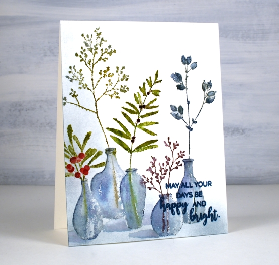
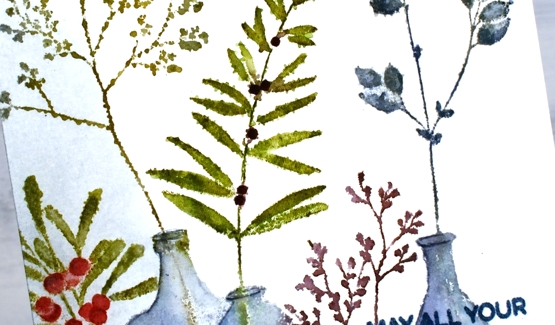
Isn’t this ‘festive fragrance‘ a pretty stamp? I know it is part of the PB Christmas release but it looks like an all-year-rounder to me. Just switching the colours around could make it quite springy or even autumnal. That’s the kind of stamp I like.
I chose to work with muted greens and blues plus a couple of berry colours. I inked with distress inks and markers plus a couple of Staedtler brush markers. I heard recently the sad news that distress markers are being discontinued so I am looking at my other markers to see which ones I might switch to when my distress markers can give no more. I think more than anything it is the colours of the distress markers that make me happy. Often when you buy a set of markers such as a 12 or 18 set many of the colours are bold rather than muted. There is a basic orange, red, yellow, light blue, dark blue, etc. You don’t find any stormy skies or picked raspberries!
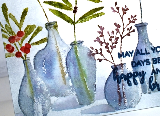
Anyway enough about that; I will keep you posted on my discoveries and choices. I used the mix of colours listed in the supplies below to ink all the foliage and used both faded jeans and weathered wood for the vases. The stamp was brand new when I inked it and I didn’t do any conditioning (such as wiping it or sanding it) so the ink beaded in a few places giving me a patchy look. I inked and stamped again for all but that tall bit of foliage. That one on the left I kept patchy as I liked the lacey look.
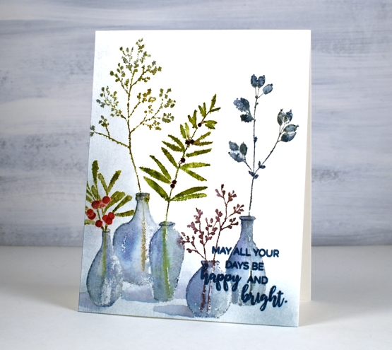
Once I had stamped and blended all the leaves and vases, I wanted to ground the collection somehow so I used a blending brush to add weathered wood ink to the base and side of the panel. I then painted shadows next to the vases with faded jeans ink. I finished the design off with a sentiment from the PB ‘happy & bright’ set knowing I would have to choose a bolder, darker ink so it would show up over the stamped vases. It is not as distinct as I would like but when the recipient looks at it up close it will be fine.
I hope you have had a chance to view the short video about my new class, ‘Wreaths – Stamped & Painted‘. Registration is open, a couple of lessons are already published and all the content will be accessible tomorrow. It is full of simple but pretty wreath designs, some very festive, others more rustic. I have included some technique lessons to show how I paint leaves and filler elements too so you can design with stamps plus your own unique touches. The giveaway is still open on my previous post where you have a chance to win a spot in the class. Make sure you pop back there and tell me how your Christmas card making is going. I see some of you have finished, some are barely started and some don’t go down that path. I think I am over half way with mine, largely because I created many wreath cards in preparation for the class!

One more bit of exciting news before I go. I am back on CRAFT ROULETTE this Friday as the guest crafter. Join me if you can on YouTube and drop a hello in the chat.
Supplies
(Compensated affiliate links used when possible)