
Festive Fragrance
Posted: November 10, 2021 Filed under: festive fragrance | Tags: Fabriano Watercolour Paper, Penny Black stamps, Ranger Distress inks 8 Comments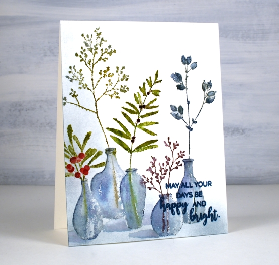
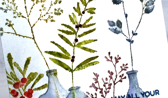
Isn’t this ‘festive fragrance‘ a pretty stamp? I know it is part of the PB Christmas release but it looks like an all-year-rounder to me. Just switching the colours around could make it quite springy or even autumnal. That’s the kind of stamp I like.
I chose to work with muted greens and blues plus a couple of berry colours. I inked with distress inks and markers plus a couple of Staedtler brush markers. I heard recently the sad news that distress markers are being discontinued so I am looking at my other markers to see which ones I might switch to when my distress markers can give no more. I think more than anything it is the colours of the distress markers that make me happy. Often when you buy a set of markers such as a 12 or 18 set many of the colours are bold rather than muted. There is a basic orange, red, yellow, light blue, dark blue, etc. You don’t find any stormy skies or picked raspberries!
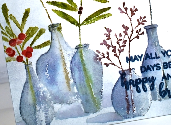
Anyway enough about that; I will keep you posted on my discoveries and choices. I used the mix of colours listed in the supplies below to ink all the foliage and used both faded jeans and weathered wood for the vases. The stamp was brand new when I inked it and I didn’t do any conditioning (such as wiping it or sanding it) so the ink beaded in a few places giving me a patchy look. I inked and stamped again for all but that tall bit of foliage. That one on the left I kept patchy as I liked the lacey look.
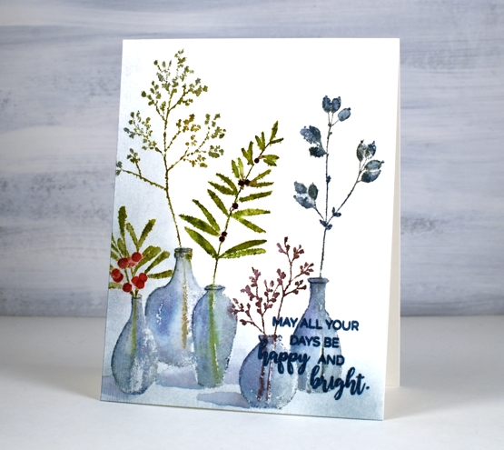
Once I had stamped and blended all the leaves and vases, I wanted to ground the collection somehow so I used a blending brush to add weathered wood ink to the base and side of the panel. I then painted shadows next to the vases with faded jeans ink. I finished the design off with a sentiment from the PB ‘happy & bright’ set knowing I would have to choose a bolder, darker ink so it would show up over the stamped vases. It is not as distinct as I would like but when the recipient looks at it up close it will be fine.
I hope you have had a chance to view the short video about my new class, ‘Wreaths – Stamped & Painted‘. Registration is open, a couple of lessons are already published and all the content will be accessible tomorrow. It is full of simple but pretty wreath designs, some very festive, others more rustic. I have included some technique lessons to show how I paint leaves and filler elements too so you can design with stamps plus your own unique touches. The giveaway is still open on my previous post where you have a chance to win a spot in the class. Make sure you pop back there and tell me how your Christmas card making is going. I see some of you have finished, some are barely started and some don’t go down that path. I think I am over half way with mine, largely because I created many wreath cards in preparation for the class!

One more bit of exciting news before I go. I am back on CRAFT ROULETTE this Friday as the guest crafter. Join me if you can on YouTube and drop a hello in the chat.
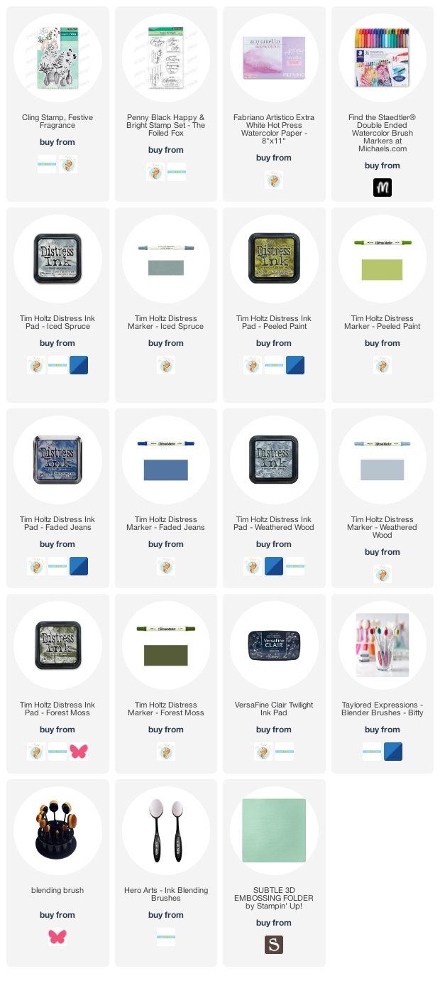
Supplies
(Compensated affiliate links used when possible)


Interesting info on the distress markers. I had no idea. There are zero stamping stores in this state.
In Florida, many stores where I could get the news.
Anyway, love the plants in the vases. Teaching classes is a great way to make sure you have created cards!
Looking forward to making the wreaths.
We do have Michaels and Hobby Lobby but they do not keep up with latest products.
Tish
Lovely card! Your Wreath class looks awesome.
What a beautiful card! That stamp can definitely be adapted for any season. I also like using muted colors, so I’ll be looking forward reading about your research… thanks!
This looks terrific Heather and the colours work beautifully together..the blue of the glass vases is particularly pleasing. It is such a shame when the tools we are used to using are discontinued and you have to search around for good alternatives. I know what you mean about sets of markers and the colours are not so varied where the Distress Markers come in such a great range of interesting and different colours. I will wait with interest to see what you find as an alternative. x
Interesting about the Distress markers. When I first started stamping about 20 years ago, I bought several Tombow markers which got used a lot for a while, but then superseded by other things. I later bought the complete set of Distress Markers when they were released, but because I didn’t understand about the significance of using watercolour paper, and they didn’t work at all well on the regular cardstock that I had used the Tombows on quite successfully, they too just fell to the bottom of the pile and got forgotten about for several years. Last year when I began revisiting the use of markers, I pulled out my collection, and found that about half of the Distress markers had dried out completely and had to be thrown out, but none of the Tombows had suffered the same fate. There seems to have been a huge difference in the quality of the 2 brands.
Yes, I think that this is a pretty stamp Heather. At first glance I thought that you had combined a couple of stamps for your composition. I love what you call the ‘patchy look’ because it makes the vases look like old handmade glass.
Although the matching, lovely colours of the Distress markers is useful, I found that they dried out rapidly and in the end I gave up replacing them.
I am about halfway through making my Christmas cards but have had a very busy few weeks. I am in spring bulb planting mode at present. My daughter and I have planted 105 in the ground this week and have 150 more to go.These will go in pots. Good luck for Friday night – I’ll be cheering you on in the wee small hours of Saturday.
Gorgeous painting on this and I’m always intrigued by the wonderful work you do on glass and vases! That is such a beautiful stamp and love the idea of using it for many occasions. Incredibly beautiful card!
Beautiful watercolouring of this lovely stamp, Heather. Your vases are just perfect in the beautiful blue colour. xx