
Gerberas
Posted: September 11, 2019 Filed under: Darkroom Door, gerberas, mesh | Tags: Darkroom Door stamps, Kuretake Zig clean color real brush markers, Ranger Distress inks 3 Comments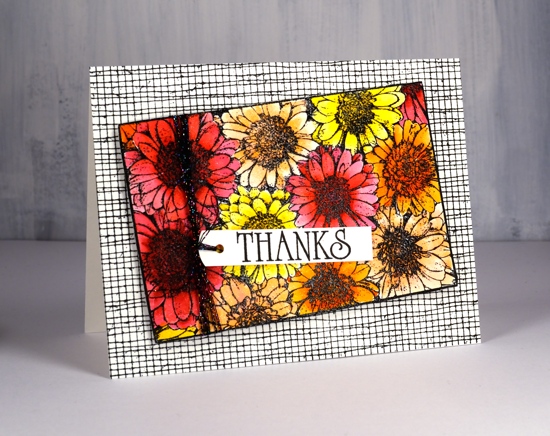
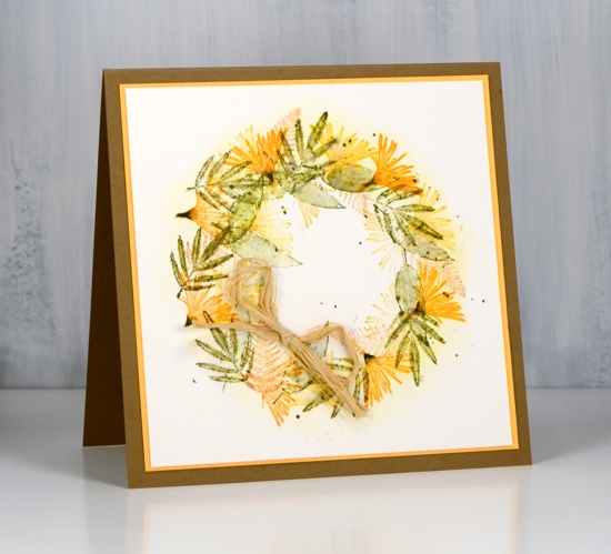
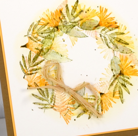
This pretty bunch of gerberas is one of the newest stamps from Darkroom Door. I would have shown it to you sooner but it arrived from Australia two days after I left to go to Australia! The inspiration for this colour scheme once again came from a simple web search. A photo popped up with pink, red, apricot and orange gerberas massed together. So that’s what I did.
I stamped in black ink and embossed in clear powder on hot pressed watercolour paper then used zig clean color real brush markers for colouring. I started each flower by colouring around the centre with the marker then blended out the colour with a brush and water. I was able to add more with the markers as needed. To give the flowers even more pizaazz I gave them all a layer of clear wink of stella. (the red and pink ones then got a coat of micro glaze because I kept touching them and getting pink and red stains on things that were not meant to be pink or red!) I wanted to mount the flowers on a background but didn’t want it to fight with the focal panel. The DD mesh stamp worked beautifully and reminds me of the decorative mesh that is sometimes wrapped around cut flowers.

I stamped a sentiment from the large DD ‘thank you’ set and threaded some sparkly black thread through the tag and round the panel. A friend gave me a stash of metallic threads recently and they are coming in handy for a little subtle sparkle.
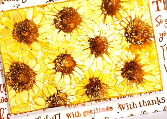
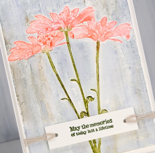
For the second card I went with a more country style look. All the gerberas feature the same fossilized amber, vintage photo and rusty hinge colour scheme with the two brown inks used also to create a background. I stamped the whole gerbera stamp in fossilized amber distress ink first then inked the centres in rusty hinge. I blended each petal with water and did the same with the centres then inked one side of the flower centres in vintage photo to add some dimension.
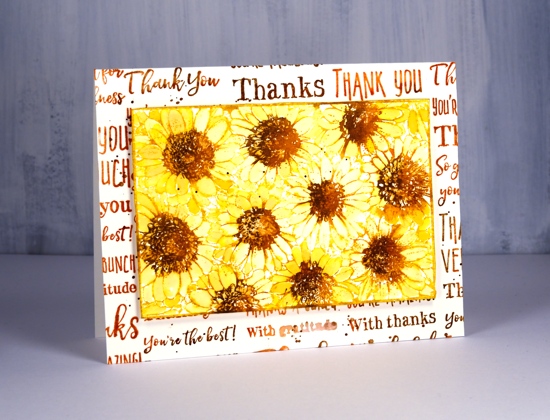
I tried a woodgrain background but it was too dark. By choosing to stamp the ‘thank you’ sentiment strip several times more of the cream background showed through. I inked the sentiment strip in vintage photo and rusty hinge distress inks and spritzed it lightly before each print. The result was blended and sometimes smudgy words. I gave both the flower panel and the background the splatter treatment then popped the gerberas up on a foam rectangle.
Gerberas are pretty classy flowers I think, they always seem to stand out in a bouquet.
Supplies
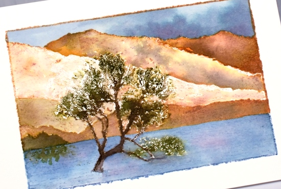
Lake Wanaka
Posted: August 26, 2019 Filed under: Darkroom Door, Lake Wanaka, Nature Walk, Stamped Landscapes | Tags: Darkroom Door stamps, Ranger Distress inks 4 Comments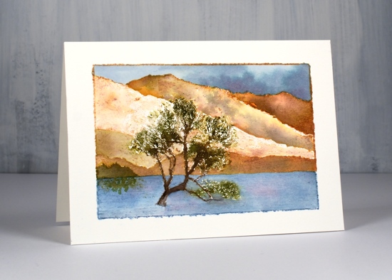
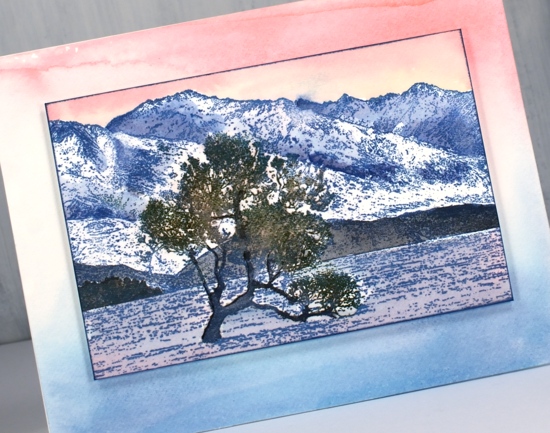
I have been creating with the new ‘Lake Wanaka‘ stamp from Darkroom Door. When I first saw this stamp I searched ‘Lake Wanaka tree’ and up came a range of inspiring images. Then I waited for the stamp to arrive so I could try to recreate some of the seasonal shots of this lake and tree in New Zealand.
For this first summer scene I worked with a hot pressed watercolour panel in my stamp positioner because I knew I was going to add inks step by step. I started by inking the lower (lake) portion of the stamp with stormy sky distress ink and the top portion of the stamp with tea dye distress ink. Next I worked with forest moss marker and ground espresso distress markers to add colour to the tree. This took a little while as the tree is made up of fine detail so I was only transferring a little ink at a time. Once the tree was defined I painted the lake with stormy sky and weathered wood ink. (smooshed onto my glass mat – I know you’ve probably got that step by now!) I switched to earth tones to paint the mountains and followed some of the definition of the stamp with rusty hinge, frayed burlap, vintage photo and tea dye inks. I painted a little stand of trees in the left corner with forest moss ink and added some reflections in the water. Once the mountains were dry I painted the sky with weathered wood, stormy sky and faded jeans ink.
For the sunset look below I used did less painting and worked with a base of one colour ink. I used faded jeans archival ink to stamp the whole image then painted more faded jeans distress ink into the shadows of the mountains, black soot ink over the foreground hills and faded jeans and spun sugar inks over the lake.
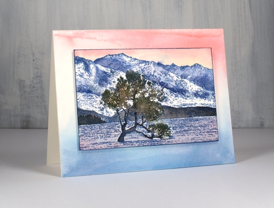
I used forest moss and ground espresso markers to ink the tree and stamp over the initial print and painted over the trunk also with ground espresso ink to make it bolder against the background. The sky is a mix of worn lipstick and spun sugar inks.
I decided to make a co-ordinating background panel by painting some worn lipstick, spun sugar and faded jeans distress stains onto my glass mat then swiping a piece of watercolour paper through it. I popped my stamped panel up on some dimensional tape.
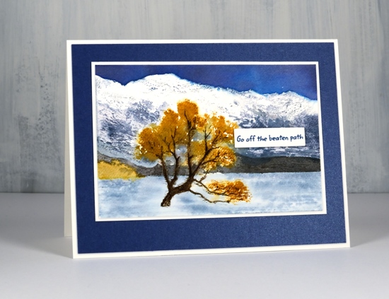
My autumn Lake Wanaka panel features the main tree and stand of trees in fossilized amber ink. I inked most of the stamp with a stormy sky marker but avoided the tree so I could use a fossilized amber marker to ink the foliage. I wanted to leave snow on the mountain tops so I did very little to that area but painted stormy sky and chipped sapphire shadows further down the mountains. Once again I painted the foothills in black soot ink. I used diluted stormy sky ink for the lake and chipped sapphire for a bold sky. When I was stamping the tree I spritzed the stamp to help the fossilized amber ink spread further.
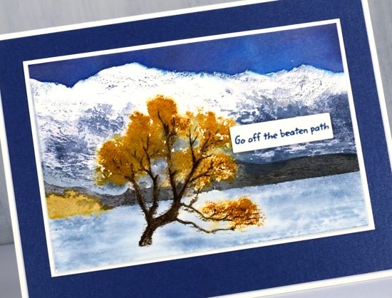
I finished the card off with white and navy mats and a little sentiment strip. I think you can probably guess why the sentiment is positioned right there. You’ve done the same I’m sure to cover a little bit that didn’t go the way you wanted it to!
Thank you for joining me today. I hope to be back before too long with more Lake Wanaka interpretations. Make sure you visit the Darkroom Door blog to see other creations featuring this stamp.
Supplies
Ocean escape
Posted: August 7, 2019 Filed under: escape, Penny Black | Tags: Penny Black stamps, Ranger Distress inks 6 Comments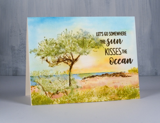
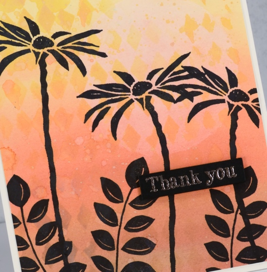
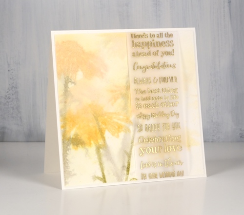
I have another scenic card to share featuring the new PB stamp ‘Escape‘. As you can imagine I was very happy to see these scenic stamps in the recent Penny Black release; I love to stamp and paint scenes. It does help to have a technique that enables you to work on the background separately from the foreground. I have used the same technique in the two cards already shared, plus this card and two more to come. It is very similar to a technique Jill Foster often uses and had demonstrated in numerous videos. I use a stamp positioner, I work on the foreground and middle ground images such as trees, grass, and canoes first and when they are completed I emboss over them with clear powder so I can paint the remaining spaces, usually sky, sea, sand or snow with inks or watercolour paints.
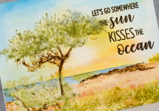
Once I am back in my workroom and reunited with my supplies I will try other techniques but I am happy with the way these scenes have worked out. For this particular card I worked on hot pressed watercolour paper and inked the grass and tree foliage with old paper distress ink then stamped. To build up depth and variety I added extra applications of old paper ink to the tree foliage and wild honey ink to the grass and scrubby areas. For the rocky outcrop and tree trunk and branches I used gathered twigs, rusty hinge and ground espresso inks and markers. The stamp includes a narrow line along the horizon which I inked with a stormy sky marker. Once all the stamping was done and dry I inked the whole stamp with versamark and embossed in clear. This step ‘seals’ the previous coloured stamping enabling me to paint or blend over the images without affecting the colours at all.
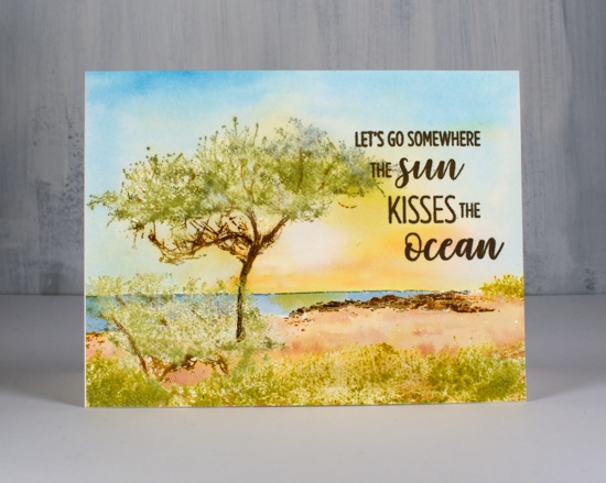
I painted the sky after adding masking tape along the horizon to protect the sea and land area. I wet the whole sky then painted salty ocean around the edges and scattered straw and wild honey ink in the centre. While the ink was still wet I blotted some colour out with a paper towel or thirsty brush to leave the bright, white sun. Once the sky dried I moved the masking tape an painted the sea in a mix of stormy sky and salty ocean ink then dropped a little wild honey ink under the ‘sun’. To finish I smooshed the tea dye and rusty hinge inks onto my glass mat so I could mix some sand colours to paint the ground. The stamp from ‘destination sentiments‘ set fitted the scene so I added it with ranger archival ground espresso ink.
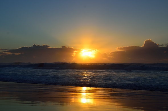
I took a few photos of a ‘Bonny Hills’ sunrise last week when visiting my brother and sister-in-law so I’ll leave you with one of those. My sister-in-law gets up every morning and takes the dog for a walk on the beach before she goes to work or starts her day. Two mornings I was there I slept way past sunrise and she showed me her beautiful photos later (kind but cruel!) Another morning I woke up ready to go and it was raining. The final morning I was there I joined her for her walk and enjoyed a lovely sunrise.
Supplies
Stamps: Escape (PB), Destination sentiments (PB)
Carved flower sunset
Posted: May 14, 2019 Filed under: carved flowers, carved leaves, circle stencil, diamonds, Wildflowers Vol 2 | Tags: Darkroom Door stamps, distress oxide inks 3 Comments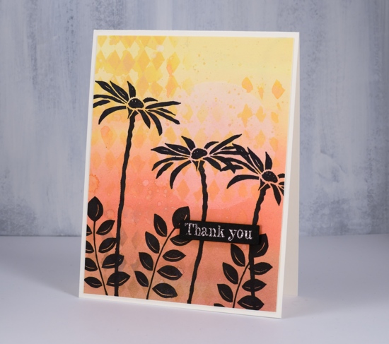
I tried out a few new products yesterday and ended up with these two cards featuring the Darkroom Door carved flower set. I coloured both cards with distress oxide inks. For this first one I smushed the oxide inks on my glass mat, added some water then painted a graduated wash going from yellow to brown. Oxide inks are designed to react with water so the diluted wash I painted on the card had a muted looked to it when it dried. I wanted to add a pale sun and some stenciled diamonds so I used my new ‘Wendy Vecchi Stay-tion’. It is a magnetic surface which is well suited to stenciling. There are four magnets to hold the stencil firmly over the paper while adding a medium through the stencil. I used it first to hold the DD circle stencil over the panel while I diluted the exposed circle with water and dabbed colour away with a paper towel. I then used the magnets and board to hold the diamond stencil while I sponged some oxide ink onto the background. I splattered some water over the panel then stamped the carved flowers and carved leaves in black archival ink.
Instead of painting a wash with diluted oxide ink for the second card I blended oxide inks over the whole panel which I had added a circle mask to before I started. Once again I used the magnets and board to keep the panel in place while I blended the inks and while I dabbed out some colour through the diamond stencil. Even though the two cards look similar the techniques were a bit different; you can see the oxide ink applied with a blending brush is smoother than the painted panel. Oxides really do blend well. I used the make up blending brushes my children gave me for mothers’ day. They are not life changing but they did do a very good job 😉
Once again I stamped carved flowers and wildflowers in jet black archival ink using the misti.
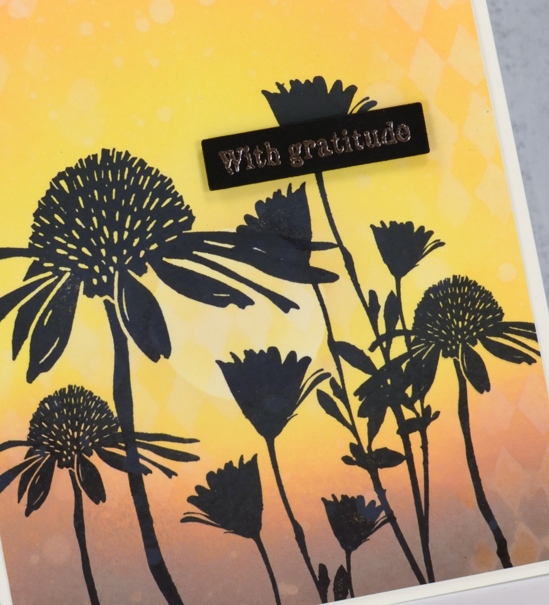
In keeping with the solid black flowers I chose to emboss sentiments on black cardstock in rose gold powder hoping it would look a bit coppery like the sunset. It did. The sentiments are from the DD ‘thank you’ sentiment strip stamped then cut out with the Avery Elle sentiment strip dies and popped up on black foam tape. The black tape is handy when the card base or element needing the tape is black or a dark colour.
It was my first time trying the Wendy Vecchi ‘stay-tion’ and I found it very useful. The magnets held the stencils and paper in place and it cleaned up easily. I am sure I will be using it often.
Don’t forget to check out the ‘Color Trio Challenge’ I am hosting with the Foiled Fox. I would love to see your three colour cards and give you the chance to win a shopping spree at the Foiled Fox store!
Supplies
Gelli plate feathers
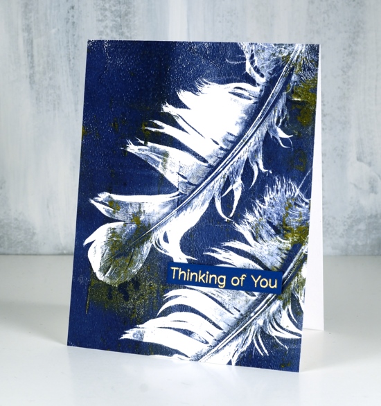
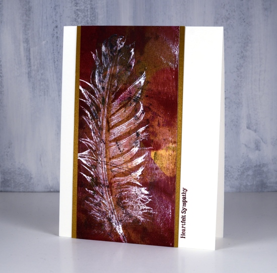
Posted: April 1, 2019 Filed under: Darkroom Door, diamonds, Feathers, gelli plate | Tags: Darkroom Door stamps, gelli plate, My Favorite Things 22 Comments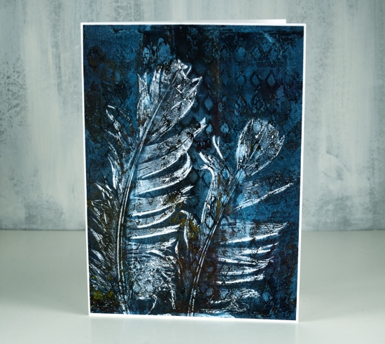
I spent a delightful day learning how to use my gelli plate last week. I have had it for years and only used it once or twice so everything my friends showed me was new and exciting.
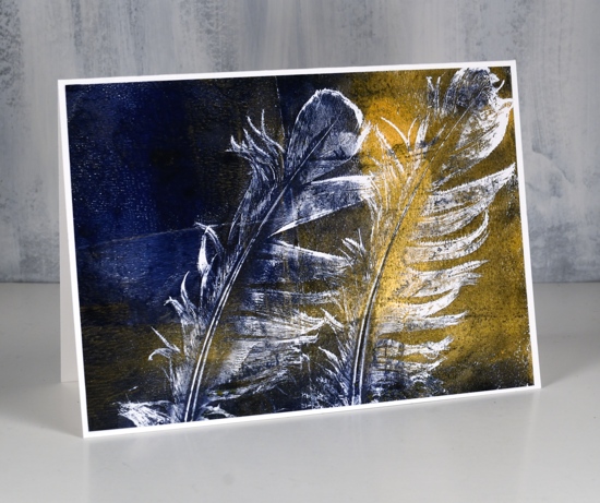
I was so happy with these feather prints, I couldn’t believe the detail using real feathers. If you want to see how it’s done check out this video on the gelli arts youtube channel.
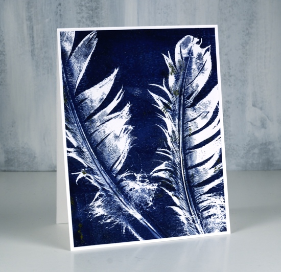
I did a few with navy and shimmery gold paint as well as some with burgandy and gold. Half of them got sentiments but only small ones as I didn’t want to cover up the lovely detail. I had a MFT sentiment already stamped and die cut which matched the panel below. I haven’t listed or linked any of the paints because I don’t remember what brands I used or colour names. If I continue with my gelli plate (and I’m pretty sure I will!) I will let you know what paints I buy.
My favourite panel is the one at the top of the post which also has the texture of the new ‘diamonds’ stencil from Darkroom Door in the background. As I was learning and experimenting I used computer paper for most prints, not the weight of cardstock I would usually use for panels on my cards. To make sure I didn’t tear or buckle the panels with glue or narrow adhesive I covered the back of all the panels with double sided adhesive sheets.
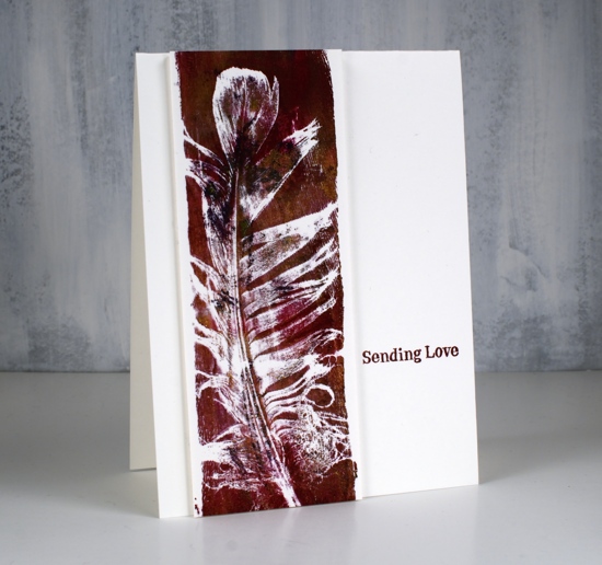
These last two narrow panels were done on watercolour paper strips. I decided to add sentiments from the new Darkroom Door sentiment strip ‘Sympathy’
Have you used a gelli plate? I love to hear what your favourite techniques are.
Supplies
Darkroom Door wedding cards
Posted: March 25, 2019 Filed under: Darkroom Door, Nature Walk, tall flowers, Woodgrain | Tags: Darkroom Door stamps, Ranger Distress inks, WOW embossing powders 9 Comments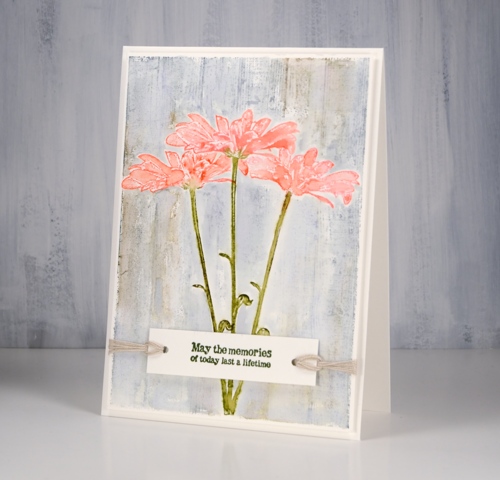
I’ve been creating with the tall flowers and nature walk stamps from Darkroom Door again, this time with a wedding theme in mind. Darkroom Door now has eight different sentiment stamps collections in list format, each one has a different theme. For two of today’s cards I isolated one sentiment by masking either side but on the second card I used a large chunk of the stamp as a feature over a soft blurry floral background. I am over on the Darkroom Door blog sharing these cards so make sure to pop over there for more details on my process.
This first wedding card made me think of a country style-decorate the barn type of wedding. I did a bit of masking to get the look of three daisies against a timber background and used twine to keep things natural and not too fancy. I inked the daisy from ‘Tall Flowers‘ set in worn lipstick, abandoned coral, forest moss and peeled paint distress ink, spritzed lightly with water and stamped in centre of a hot pressed watercolour paper panel, then used masks to stamp another on each side. I masked all three daisies so I could stamp the Woodgrain Background Stamp in weathered wood and frayed burlap distress inks.
My second card features the ‘wet on wet’ watercolour technique. The watercolour panel was very wet before I stamped the daisy stamp in wild honey and forest moss distress inks. I restamped to get paler images then dried the panel before wrapping a vellum strip with gold embossed wedding sentiments over the stamped flowers.
The very blurry style is not for everyone but in real life it does have a soft romantic look to it.
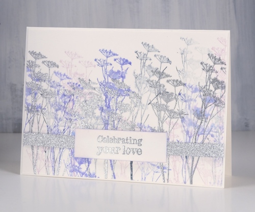
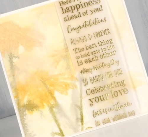
My final card features wildflower silhouettes in blueprint sketch and milled lavender ink stamped repeatedly to get first, second and third generation images as well as silver embossed flowers and sentiments with some very sparkly silver ribbon.

Working with sentiment strips that have fifteen different sentiments gives me plenty of options, some of the ‘wedding’ sentiments are totally appropriate for other events too.
I enjoyed the process of creating wedding cards in three different styles and I know I could have gone even fancier. What’s the fanciest card you have ever made?
Supplies
Steps journal page
Posted: March 7, 2019 Filed under: alphabet medley, Art Journal, Darkroom Door, mesh, Nature Walk, stone, tall flowers, Woodgrain | Tags: Art Journal, Darkroom Door stamps, distress oxide inks, Ranger Distress inks 5 Comments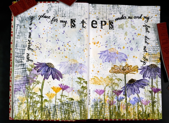
Are you a wee bit surprised to see a journal page here? I’m surprised myself, surprised but pleased. I really enjoyed dreaming it up and making it. It didn’t end up looking as I imagined but that is the way with journal pages is it not?
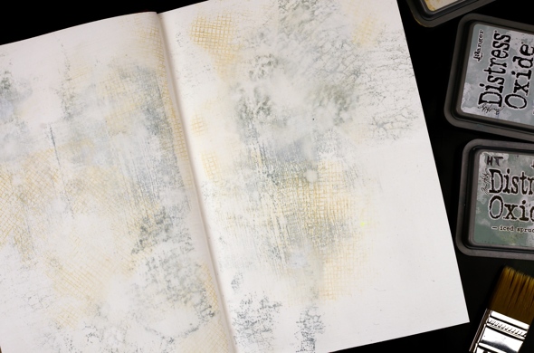
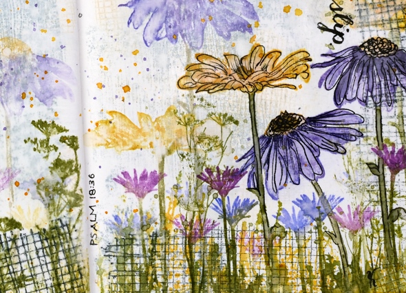
This art journal is a Fabriano journal; the paper is nice and thick but not watercolour paper so I painted over it with absorbent ground first. Then I grabbed a bunch of stamps from Darkroom Door along with three light coloured oxide inks and stamped mesh, stone and woodgrain texture stamps over the background. I spritzed it with water to soften the edges of the stamped images and dabbed some out too to make it subtler. Even after adding some water it was still bolder than I wanted so I painted another thin layer of absorbent ground over it.
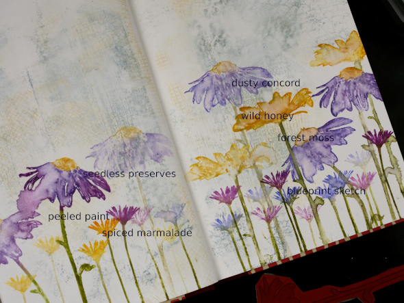
I filled the bottom of the page with repeat stampings of flowers from the Darkroom Door ‘tall flowers‘ set in distress inks then blended some of the big flowers with water. They don’t blend as well as they do on watercolour paper but the effect is still nice.
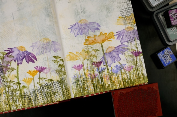
I added grass and flowers from the DD ‘ nature walk‘ set, also in distress ink then a border with the mesh texture stamp in black soot oxide ink. It was a bit bolder than I wanted so I spritzed then dabbed with a paper towel ( as you can see I’m a fan of the ‘spritz and dab’ ). I splattered wild honey, forest moss and dusty concord diluted ink over the whole spread and it ended up looking like confetti. To boost a few of the flowers I outlined them with fine tipped black markers.
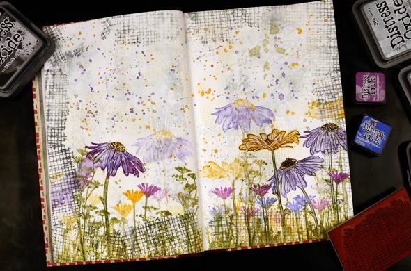
I wrote psalm 18:36 with a brush pen leaving a space to stamp the word ‘steps’ with the DD alphabet medley stamps. I find choosing words for a journal page tricky, which words and how to add them. But the beauty of a journal page is the experimental nature of it. If I don’t like something on this page, I’ll try something different on another. Once the ink had dried I sealed the large flowers and the lettering with distress micro glaze.
Do you have any art journallers you would recommend for inspiration? I already follow Rachel Greig from Darkroom Door, Julie Fei-Fan Balzer, Vicky Papaioannou and Maremi SmallArt who all have different styles and inspiring journal pages.
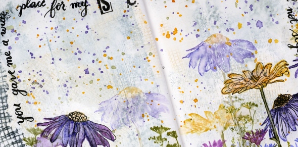
I’m hoping to create in my journals more often and will share pages here if possible. Even if you are not an art journal person the designs can usually be converted to a card and sometimes start out as cards anyway!
Art Supplies (all Darkroom Door stamps are linked in description)
Tall Flowers
Posted: February 19, 2019 Filed under: Darkroom Door, Leaves, Nature Walk, tall flowers | Tags: Darkroom Door stamps, Ranger Distress inks, Ranger Distress stains 9 Comments
I am excited to feature some new stamps from Darkroom Door today. The tall flowers are from the new ‘Tall Flowers’ set and the background flowers are from the delightful ‘Nature Walk’ set. I am a guest over on the Darkroom Door blog today, if you haven’t visited you definitely should check out all the inspiration shared there.
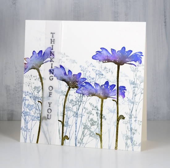
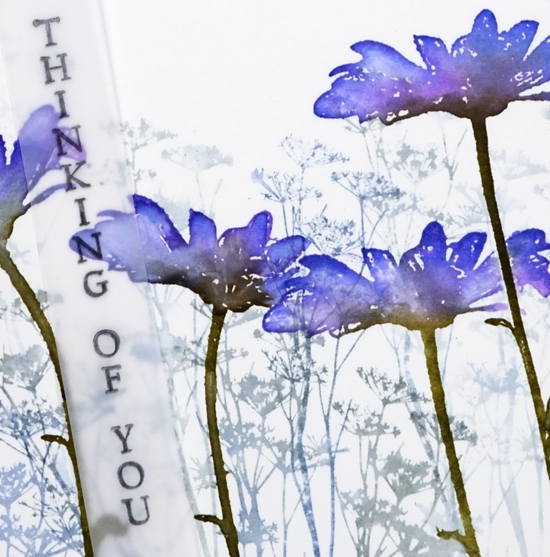
My first card features a cold pressed watercolour panel filled with one of the stamps from ‘nature walk’ set inked in iced spruce and stormy sky distress inks. I diluted the ink with a spritz of water and stamped first, second and third generation impressions. Over the top I stamped the tall daisy from ‘tall flowers’ four times with wilted violet, blueprint sketch and forest moss distress inks. Because the stems are long and thin I was able to orient them in different directions. I used a mask a couple of times to overlap the daisies. Once stamped I blended the colours with a paintbrush and water.
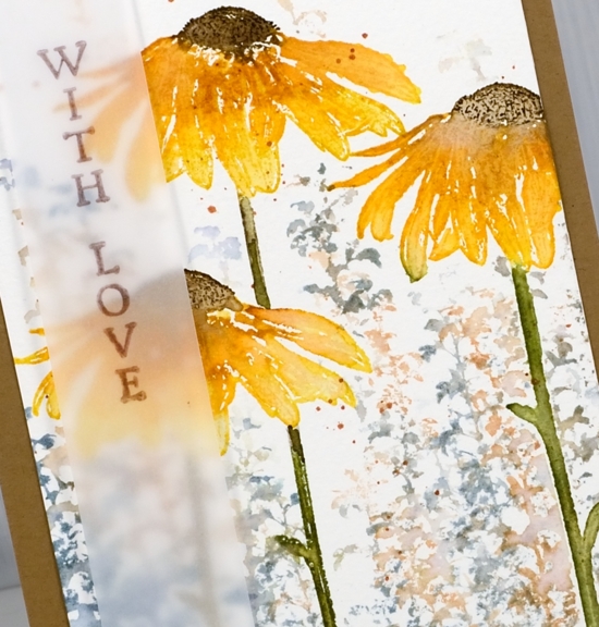
I used a similar process to create the orange toned daisy card but this time I did the background foliage after the foreground flowers by using stamped and cut out masks. The daisies are stamped in peeled paint and fossilized amber distress inks. I added extra colours one at a time with spiced marmalade marker, rusty hinge marker close to flower centre and finally ground espresso marker on the centre of the flower. I blended the inks with water then after it was dry stamped the centres again to add some texture back in. The background stamping is another stamp from the DD ‘nature walk’ set stamped with weathered wood and tea dye distress inks. I added some splatter because, well, why not!
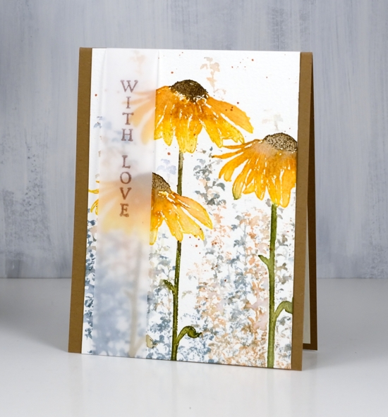
On both the daisy cards I decided to add the sentiment on a vellum strip. I liked the floral scenes too much to stamp words over them so the vellum seemed like a subtle way to do it. The recipient could even snip the sentiment off and have a picture to display if they wanted to. For this tall thin panel I used the kraft card base to frame it on two sides.
The last card is a little different; I used the small flower from ‘tall flowers’ and some little leaves from ‘leaves’ set to make a wreath.
To guide my stamping I traced a circle onto my watercolour panel. I sponged fossilized amber distress ink around circle then erased the pencil line. With the sponging as a guide, I stamped the small flower heads from ‘Tall Flowers’ set round the circle in carved pumpkin ink, holding the stamp so only flower(not stem) was inked and stamped. I repeated the process with small leaves and ferns from ‘Leaves’ set in fossilized amber, peeled paint, forest moss and tea dye distress inks. You know I splattered forest moss ink over wreath because that’s what I do then matted the panel in orange cardstock, attached to a kraft card base and added a raffia bow.
I loved creating with these beautiful tall flower stamps and couldn’t help myself from using the ‘nature walk’ stamps again because they work so well together!
Supplies
Stamps: tall flowers, nature walk, leaves


Inks: stormy sky, iced spruce, blueprint sketch, wilted violet, forest moss (purple flower card)


fossilized amber, peeled paint, weathered wood, tea dye & distress markers: spiced marmalade, rusty hinge, forest moss, ground espresso (orange flowers)


fossilized amber, peeled paint, carved pumpkin, forest moss, tea dye (flower wreath)

Papers: hot pressed watercolour, cold pressed watercolour, vellum, kraft


Also: stamp positioner, raffia

Nature walk portraits
Posted: February 5, 2019 Filed under: Avery Elle, boxes, mesh, Nature Walk, simple sentiments | Tags: Avery Elle, Darkroom Door stamps, Darkroom Door stencils, Kuretake Gansai Tambi watercolour paints, Ranger Distress inks 6 Comments
I have mentioned before how beautiful these Darkroom Door ‘nature walk’ images are but have I mentioned how easy it is to create pretty cards with them. Each card today features just one image, stamped twice over a quick watercolour background.
I created the backgrounds with my glass mat and some distress inks. I squished the ink pads down on the mat side by side (three or four colours at a time), spritzed with water then swiped my hot pressed watercolour panel through the diluted ink a few times until there was good coverage on the panel. I dried the panel with a heat tool before sponging one or two of the distress inks through a section of stencil then added splots of water for some added texture. The panels were all different, all pretty and done within minutes.
I used the MISTI for stamping because the texture of the watercolour paper makes it necessary to stamp a few times to get a solid image. I used versafine clair nocturne ink which always gives me a crisp print. Once the ink was dry I splattered gold paint from the gansai tambi starry colours palette. The gold splatter might just be my favourite part of these cards; unfortunately it’s not very obvious in the photos.
To draw more attention to the gold splatter I matted with gold and stamped the sentiments either on gold cardstock or with embossed in gold powder. The sentiments are from Darkroom Door’s new sentiment strips. The sentiments are in list format and I have kept the stamp uncut. I stamp on a cardstock panel and cut out the sentiment I want. I now have a handy die set from the Foiled Fox which neatly cuts out the smaller fonts and I always love sentiments in small fonts! The set is called ‘simple sentiments’ and it has ten lengths of sentiment strip dies.
In putting together the cards I used one more happy new product. I am always searching for textured white cardstock. Today’s cards feature a linen texture with enough depth to be seen by the camera. It is in 8½ “x11” sheets so one sheet did four card fronts, no waste. This is the first time I’ve used it so there will be more testing to come with dies, inks etc but so far, so good.
Thanks for listening to me prattle on about this and that. I hope you are enjoying some ‘nature walks’ even if they are of the snowy variety! While we have been experiencing extreme cold followed by loads of snow, friends and family on the other side of the world are experiencing extreme heat and flooding!
Supplies
Stamps: nature walk, (DD)


Stencils: mesh, boxes 12 up


Dies: Simple Sentiment (Avery Elle)

Distress inks: crushed olive, pine needles, blue print sketch, milled lavender, stormy sky, mermaid lagoon, wilted violet, worn lipstick
.


Inks: versamark, nocturne versafine clair,


Paint: gansai tambi starry colours

Paper: hot pressed watercolour paper, snowbound textured white cardstock, gold cardstock, neenah solar white

![]()

Also: Cutterpillar glass mat, MISTI, gold embossing powder


Crisp or misty
Posted: December 12, 2018 Filed under: majestic mountains, pine cones | Tags: Darkroom Door stamps, Ranger Distress stains, Tsukineko Memento inks, Tsukineko Versafine inks 11 Comments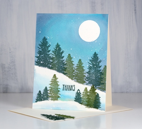
I pulled out the wonderful new trees from Darkroom Door’s ‘majestic mountains’ set to create today’s cards. I wanted to create two forest scenes, one on a crisp cold night, the other on a misty day. There are some similarities in the techniques and inks as well as differences which enabled me to create both looks. I began both times with cold pressed watercolour paper splattered with masking fluid. I like to have a few circles cut from frisket film on hand to mask a moon so I positioned one in the top right corner then tore a post-it note and positioned it diagonally across the panel. I stamped the two larger trees in versafine clair inks along the edge of the post-it mask so the trunks did not show and used one green for the largest tree and another green for the smaller.
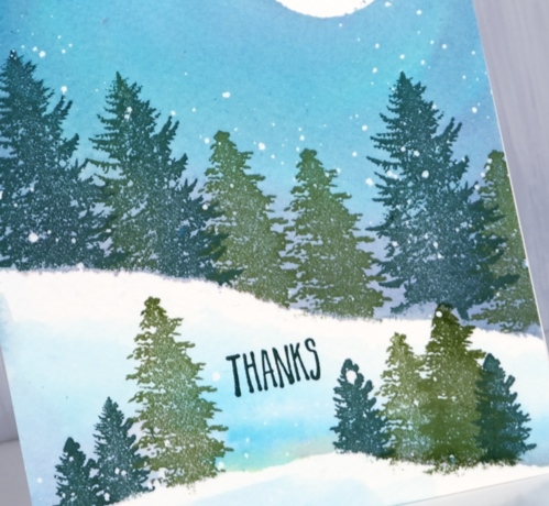
Next I removed the post-it mask and painted water along the lower edge of the stamping and upwards to fill the sky. Then while the paper was wet I added weathered wood, faded jeans and old paper distress stains to fill the sky. Once I had the sky blended I used the post-it mask again as an edge to stamp more trees including one of the smaller ones from the ‘majestic mountains’ set. Again after removing the post-it mask I painted water and blended some of the three stains into the water to create shadows behind the trees and snowbanks. To finish it off I dried the panel, removed the frisket film and masking fluid then added a sentiment from the DD ‘pine cones’ set.
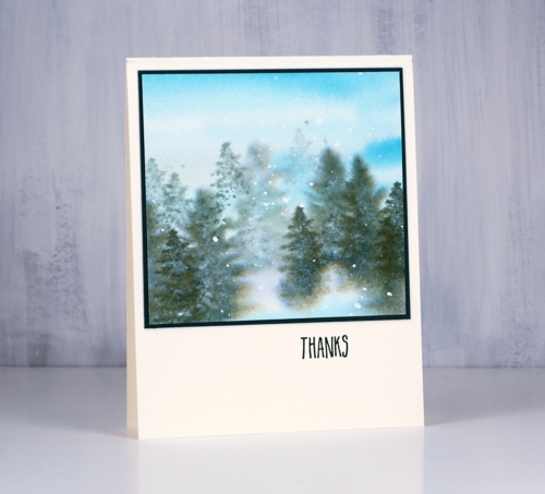
Although the colours and stamps are very similar I worked very much ‘wet into wet’ to create the second card. I painted water and diluted stain over most of the panel adding stripes of faded jeans, weathered wood and old paper. While it was wet I stamped the trees repeatedly with memento northern pine ink making first and second generation impressions to get dark foreground and lighter background images. Each time I inked the stamp I wiped ink off the trunk so it would not stamp, that way the trees all looked like they were in deep snow.
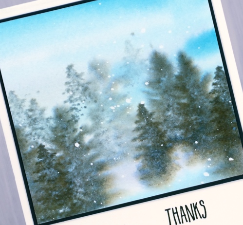
Believe it or not both panels started out the same size but a blot here and a mistake there meant this second one underwent some downsizing.
You might have noticed a stamped envelope in the first photo. I am going to try hard to stamp an envelope and my name on the back of the card as soon as I complete it. I have never been good at this but it makes a lot of sense to do it!
Supplies
Stamps:majestic mountains, pine cones (Darkroom Door)


Inks: northern pine memento, shady lane & rain forest versafine clair


Stains: faded jeans, weathered wood, old paper


Paper: cold pressed watercolour paper, neenah natural white, dark green
Also: masking fluid, glass mat


