Vintage Collage Cards
Posted: April 1, 2024 Filed under: Collage cards, Darkroom Door, Dies, gift card pocket, handwritten ledger, Mixed Media, number medley, Penny Black, Tagged | Tags: Darkroom Door stamps, Mixed Media, Penny Black creative dies, Ranger archival inks 6 Comments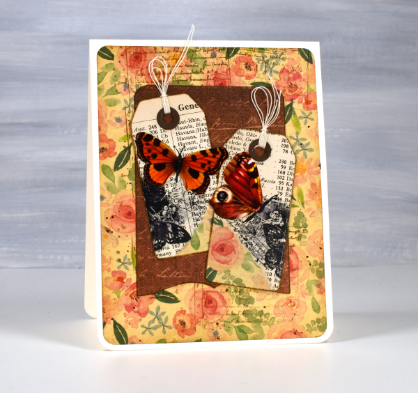
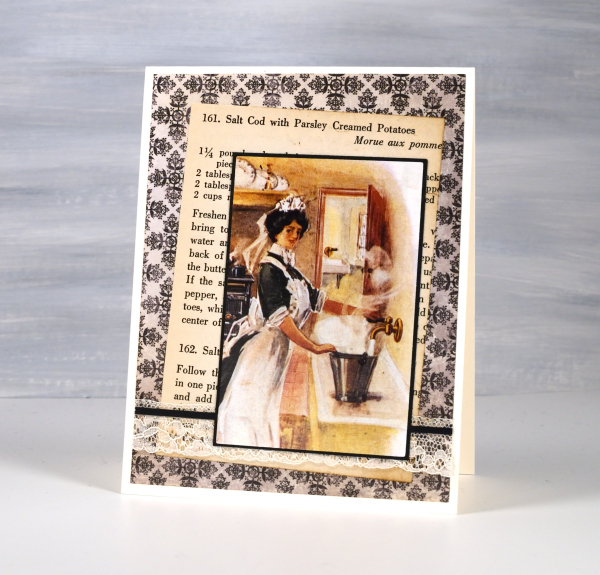
I’ve recently fallen down an vintage ephemera rabbit hole and emerged to make some of my own backgrounds and elements. There are companies that make beautiful co-ordinating ephemera, papers, chipboard pieces, etc. but I am committed to ‘using what I have’ so I’m pulling from old books, calendars, greeting cards, sewing patterns and scrapbooking paper along with a few handy tools.
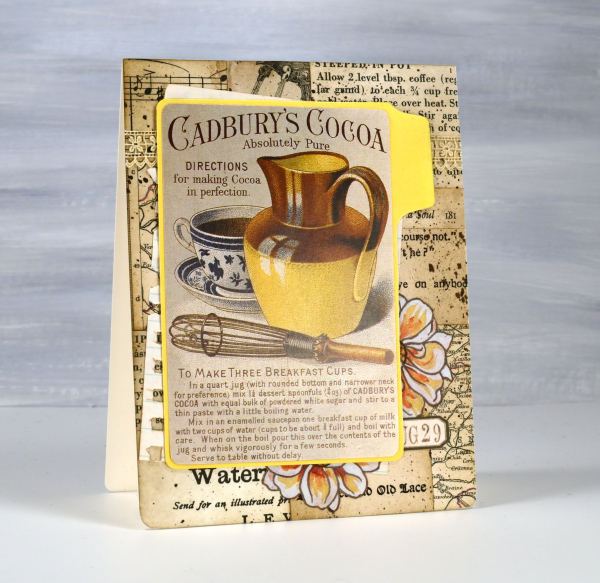
I’m not going to list every die, ink or paper but I will mention some of my favourite resources. The old books that I am removing pages from include music books, dictionaries, atlases, novels, poetry and recipe books. I also have some lovely papers and vintage pages that friends have given me, so it is fun putting them to use.

The inks I reach for are the distress brown tones from Ranger, not always the dye inks, but often the archival inks as they don’t dilute or smudge when I add glue or stamp on glossy paper.

I have a bunch of background stamps and sets from Darkroom Door which give me vintage style text, patterns and elements including but not limited to the ‘handwritten ledger‘ and ‘number medley‘.

I found amongst my Penny Black dies a file folder, notebook page, several tags, tickets, pockets and decorative borders. I also treated myself to a corner rounding punch that punches in three different sizes and of course the postage stamp die set I’ve featured a few times recently.
I pulled out twine, ribbon and lace for finishing touches and some vintage butterfly cut-outs that were all joined together by little tabs. I have had them for years ever since I inherited my mother’s teaching resources. You can seem them in the close up below.

Now just in case you are worried, I am not ripping pages out of beloved old books, but I am putting to use some books I inherited and don’t have a personal attachment to. Anne, Heidi, Jo March, Jane, Ratty and Mole are all safe! Old calendars, diaries, magazines and greeting cards are fair game because honestly, I’ve held onto some of them for a very long time. This post includes affiliate links from Foiled Fox and Scrap’n’Stamp . If you buy through these links I receive a small commission at no extra cost to you.
Meadow
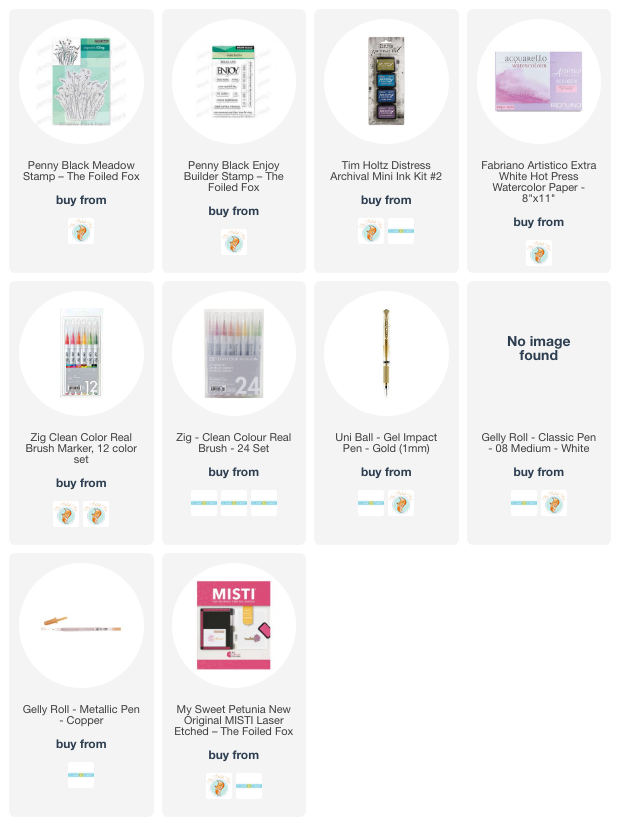
Posted: June 9, 2023 Filed under: meadow, Penny Black | Tags: Fabriano Watercolour Paper, Penny Black stamps, Ranger archival inks 8 Comments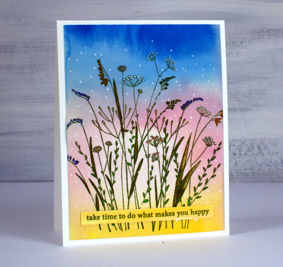
I have what I call a pile of possibility in my workroom consisting of panels that could be made into something. The smaller ones are housed in a shoebox; there are watercolour backgrounds, stamped and coloured panels, alcohol ink panels and hand painted experiments. This panel has sat in the box for years unstamped but looking very much like a sunset. I can’t remember whether it was painted with watercolour paints or swiped with watercolour inks. I imagine the pale centre circle was dabbed out with a brush or paper towel but I really can’t be sure.
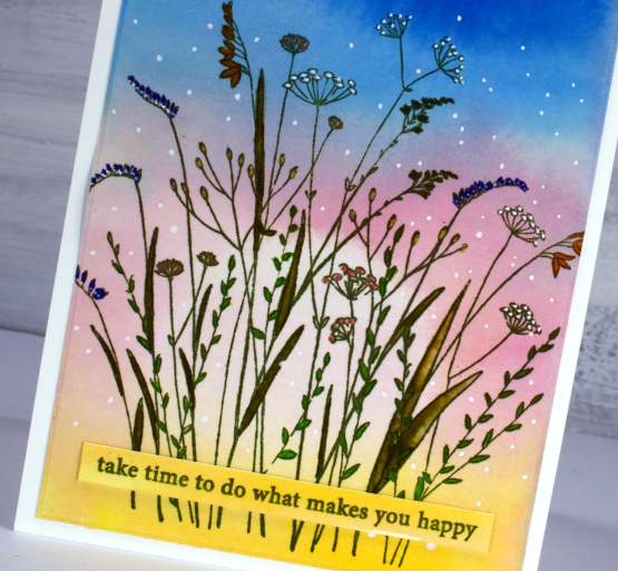
I stamped the Penny Black ‘meadow’ stamp on the panel with peeled paint archival ink then coloured inside the leaves with zig clean color real brush markers. I added spots and dots to the flowers and sky with gel pens, a white, a gold and a copper.
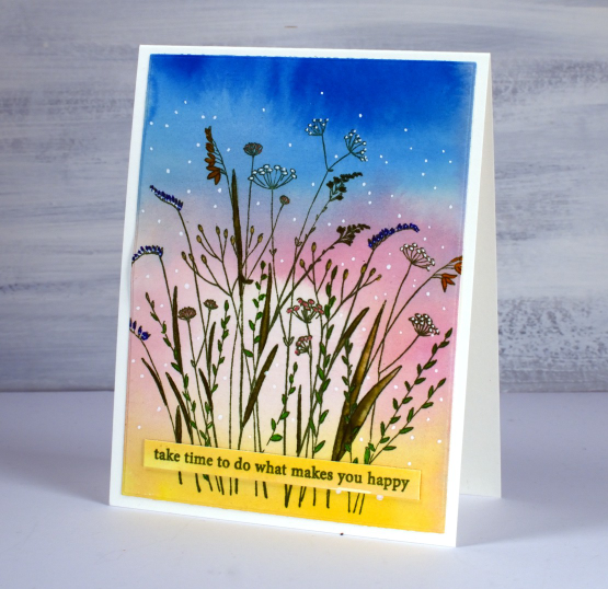
I stamped a sentiment from the PB ‘enjoy builder’ set on a left over strip. Hope you can take some time to do what makes you happy this weekend. Here are a couple of suggestions. (wink)


(Compensated affiliate links from Foiled Fox & Scrap n Stamp)
Cars, Bikes and birthdays
Posted: April 11, 2023 Filed under: brushed stars, classic motorcycles, Darkroom Door, postage stamps, this way, vintage car, word labels, World Map | Tags: Darkroom Door stamps, One-Layer cards, Ranger archival inks, Ranger Distress inks, Tsukineko Versafine inks 5 Comments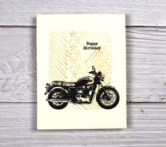
You’ve seen me use the ‘this way’ stamp behind a trio of butterflies and a classic car as well as featured on a journal page. It reminds me a little of tire tread so I have paired it again with some vehicles. For this motorbike card I masked the edges of a cream panel and stamped ‘this way’ and ‘brushed stars’ in antique linen distress ink.

After removing the masking tape I added one of the motorcycles from the classic motorcyles set in black along with a little happy birthday. I haven’t masked edges like this in a while but it makes it easy to make a simple but eye catching one layer card. You could fill the masked area with any stamping you wanted then add a bold black image over the top.

I also used ‘this way’ in the vintage style watercolour background of this card. I combined, the arrow pattern of ‘this way’ with postage stamps and world map. There is also splatter and a torn edge to keep the background looking aged. I stamped the DD vintage card on teabags and added stitching and word labels to complete the card.

(Compensated affiliate links from Foiled Fox, Scrap n Stamp)
Old Stone Doorway
Posted: February 3, 2023 Filed under: Echidna Studios, old stone doorway, sennelier watercolours, Simply Graphic, Watercolour | Tags: Echidna Studios, Faber-Castell Albrecht Durer Watercolour pencils, Ranger archival inks, sennelier watercolours, Simply Graphic 12 Comments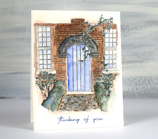
Isn’t this a sweet front path and door? It makes me want to head inside or wander around the garden. This digital stamp is another design by my daughter which is available in her etsy store, Echidna Studios. I printed it on Arches cold press watercolour paper. You know I generally use Fabriano hot press watercolour paper but I am trying to ‘use what I have’ so I pulled out the Arches for a change. I like how the texture of the paper adds texture to the front of the house.
Using my Sennelier watercolour paints I painted a wash of brown over the brickwork, blue over the door and grey for the stonework. I also mixed a bluey green for the hedges. Next I switched to watercolour pencils and added shading to the bricks and stones, coloured the leaves and painted from the tip of my pencils to make the window and door frames grey and the reflections light blue. The sentiment is from Simply Graphic and is stamped in prize ribbon sketch archival ink
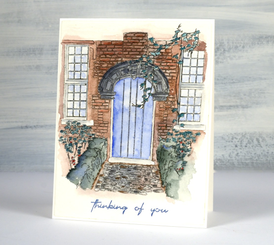
I almost stopped a couple of times as I wasn’t happy with the colours I had chosen and the lack of detail in the washes. I did keep going though and it pulled together. One thing that helps is that I didn’t use too many colours and I like the way the watercolour fades away at the edges. There are little white patches where I didn’t touch up the painting and I think they work too in adding a highlight here and there. I have printed another one out because a red brick house might also be fun to do.
The designer of this stamp is coming over for dinner tonight so I will ask where this door is in real life…
(Compensated affiliate links used when purchasing from Foiled Fox)
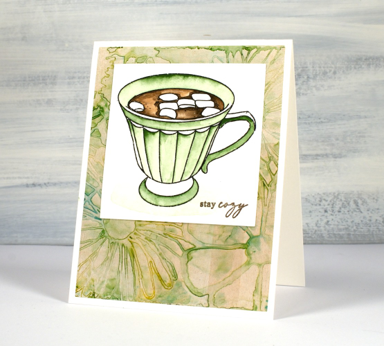
Cosy Cup of Cocoa
Posted: January 6, 2023 Filed under: Alcohol Ink, Echidna Studios, framed flowers stencil, gel press, Penny Black, tea set, The Crafter's Workshop, The Crafters Workshop | Tags: Echidna Studios, gel press, gel printing, Penny Black stamps, Ranger Alcohol Ink, Ranger archival inks 6 Comments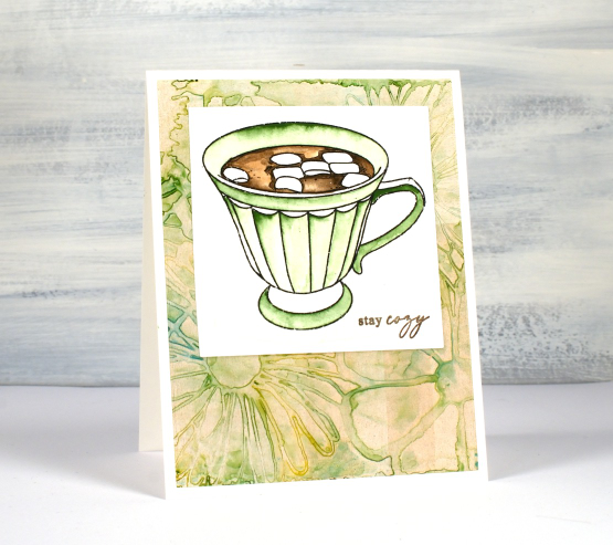
‘Tis the season for sitting by the fire, drinking hot chocolate and staying cosy. Since I last posted we have had snow, rain, ice and more snow! To create today’s card I paired a watercoloured Echidna Studios image with a alcohol ink gel print. I printed the cup from the ‘tea set‘ digital stamp set on hot pressed watercolour paper then painted it with Sennelier watercolour paints.
I added a Penny Black sentiment then framed it with a gel printed panel. It may seem like an odd combo of images but I like the way the colours worked together and it looked a little like a floral tablecloth underneath my cup image. I have only recently started using alcohol inks on my gel plate and discovered how the highly pigmented alcohol inks sometimes give me three or four prints from the one design. This pale one was either the second or third print pulled with paint after creating a colourful design on the plate with a stencil.
Hope you are staying cosy in the northern hemisphere or refreshed in the south. It is a strange thing to now celebrate my wedding anniversary and birthday in the bleak mid winter even though I was born and married in the height of summer! This weekend my husband and I are celebrating 33 years!
(Compensated affiliate links from Foiled Fox & Scrap n Stamp)

Winter Barn
Posted: October 28, 2022 Filed under: Papertrey Inks, winter barn | Tags: Fabriano Watercolour Paper, Penny Black stamps, Ranger archival inks, Ranger Distress inks 11 Comments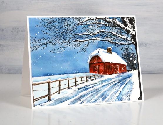
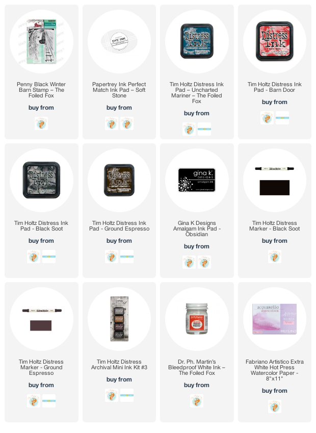
We’ve been having such warm pleasant weather lately this scene seems like a very distant prospect. The tide is turning though; it was rather chilly out today, not snow-covered-barn chilly but, could-have-worn-a-jacket chilly. This stamp is called winter barn and it’s new from Penny Black. I worked on hot pressed watercolour paper in a stamp positioner and started by stamping the whole scene in soft stone ink, a pale grey which gives me the whole scene in a pale tone which won’t interfere with the colours I add over the top. I used barn door distress ink (of course) for the barn, black soot archival and distress ink for the trees, ground espresso distress for the fence and uncharted mariner for all the sky and shadows in the driveway.
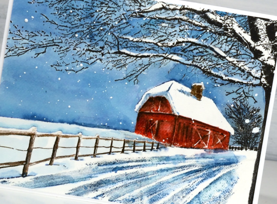
I stamped the barn with just the red ink first then as I blended added brown shadows both by re-stamping and with a paint brush. I stamped the tree in archival ink and amalgam ink (both waterproof) so I could paint the sky over the stamping. I did paint carefully around the snow laden branches to leave some areas white. I stamped the fence in ground espresso but used black soot when blending the ink to give shadows to the fence posts. I blended some areas of the driveway but left some sections unblended which seemed to work well to suggest the ruts in the snow after it’s been driven on.
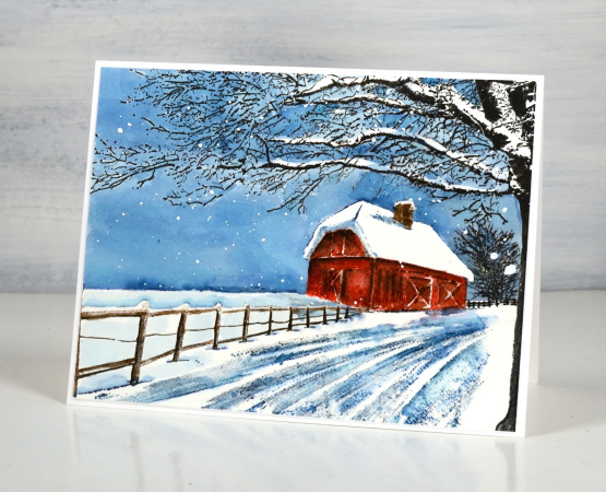
When I was happy with the scene I splattered on some white paint to look like snow.
Just a quick question for those of you with barns or experience with barns, do they often have chimneys? I would have thought the hay might be a fire risk…
(Compensated affiliate links from Foiled Fox & Scrap n Stamp)
Blooming Blue Again
Posted: July 6, 2022 Filed under: blooming, Dies, how sweet, Penny Black, Tagged | Tags: Penny Black creative dies, Penny Black stamps, Ranger archival inks, Ranger Distress inks 11 Comments
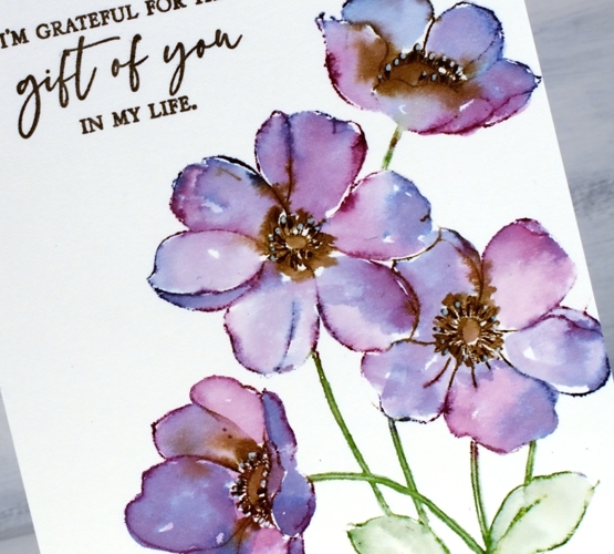
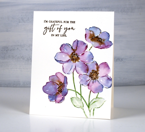
I’m still having fun with PB ‘blooming’ stamp. Once again I used blue inks but this time the combo was chipped sapphire and blueprint sketch. When blended I got blues and purples but not the pinks that seedless preserves provided. If you read my last post you might remember I unintentionally ended up with brown centres. This time I made sure I inked with fossilized amber and wild honey to create yellow centres.
I worked in the stamp positioner to make this panel and did all the green and blue inking and stamping first. I left the centres un-inked so I could add them after the petals were stamped, blended and dry. I don’t mind some blending but I didn’t want the blue and yellow to get too close and blendy because that would mean green centres. Once the yellow centres dried I used a black gel pen to add stamen.
I wanted to gussy this one up a little but still keep the clean look so I used a small piece of organza ribbon across the base of the panel then stamped on a banner die cut and tied it on with twine.
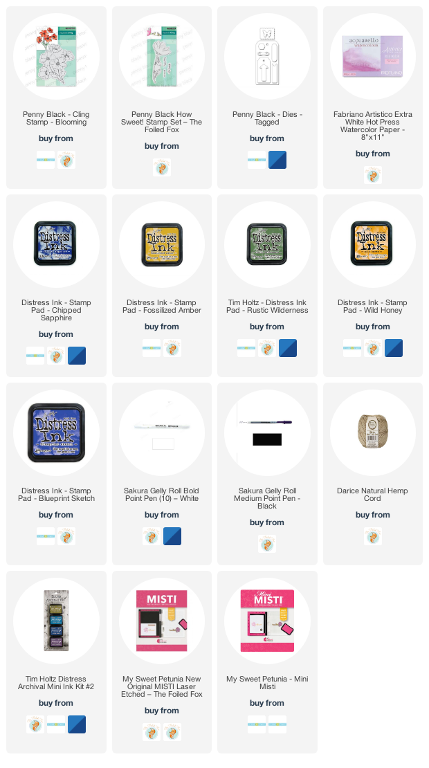
Supplies
(Compensated affiliate links used when possible)
Blooming Blue
Posted: July 4, 2022 Filed under: blooming, Penny Black | Tags: Penny Black stamps, Ranger archival inks, Ranger Distress inks 9 Comments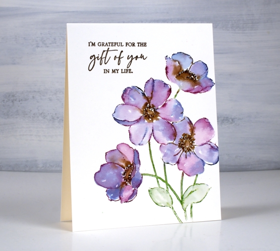
Here is another take on the PB stamp ‘Blooming’. Last week I posted a card with a blended background, brown outline stamping and painted petals. For today’s card I stamped with distress inks which I then blended into the petals.
My original plan was to have yellow centres not brown; I guess I got distracted. After inking the petals randomly with chipped sapphire and seedless preserves I added some ground espresso ink to the centres, spritzed the stamp and stamped on hot pressed watercolour paper. With the spritz of water the inks blend a little; with a paint brush I do the rest of the blending adding more ink if needed. That top flower got more brown than I would have liked but I was still happy with the overall blends.
Finishing touches include defining the centres with the bullet tip of the distress marker and adding white dots with a gel pen. The sentiment is from the PB set ‘so thankful’. I have a few more in this little series of watercolours with PB’s large outline floral stamps so I’ll see you back here soon.
Supplies
(Compensated affiliate links used when possible)
Blooming Big
Posted: June 29, 2022 Filed under: blooming, Penny Black | Tags: Penny Black stamps, Ranger archival inks, Ranger Distress inks 7 Comments
As the title hints, the stamp is called ‘blooming’ and it’s a big one. I mentioned in my previous post how much I enjoy working with the large floral outline stamps from Penny Black. I stamped ‘blooming’ twice side by side in a landscape orientation. The stamp is almost as wide as it is high but I haven’t included all the stems on this card.

Before I stamped I smooshed distress inks on a glass mat, diluted them and swiped my watercolour panel through the ink to create a soft blurry background. Once the panel dried I stamped in archival ground espresso ink then painted the flowers with the same inks I had used in the background, abandoned coral and fossilized amber. To make the flowers bolder so they would stand out from the background I painted another layer of ink then added deeper colours to part of each petal. All the inks are listed and linked below.

I painted the centres in ground espresso distress ink then used brown and black markers to go over the flower centre details and add more veins to the petals. I added highlights with a white gel pen and once again decided against a sentiment for now.
The techniques used in today’s and Monday’s card are featured in my online class Floral Faves.
And in other news, filming has begun for my next online class. I am excited to share more about it soon!
Coffee art journal page
Posted: June 9, 2022 Filed under: Art Journal, coffee time, Darkroom Door, Mixed Media | Tags: Art Journal, Darkroom Door stamps, Mixed Media, Ranger archival inks 8 Comments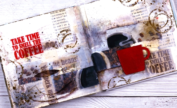
I’ve been having a delightful time in my art journals and in the Art Journal Adventure workshops. We have gone in three different directions so far and the next one is coffee or tea themed. You can see an example of a tea themed page on my classes page and here is my first coffee page.
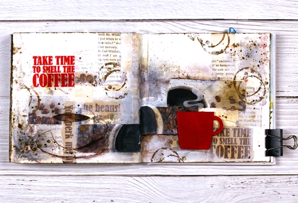
It doesn’t show up in the photo but the red cup is embossed and glossy and I want one just like it in real life! I used distress embossing glaze for both the words and the cup then had to create a visual triangle in red, do you see it?
I am currently not a coffee drinker which actually makes the quote all the more apt for me. I love the aroma! For Christmas I gave my husband a coffee subscription and each month the coffee comes in a cardboard package which smells delightful as does the mailbox !
If you are interested in joining in the art journal adventure please check out my Classes page where you will see the next two sessions or click on the Crop A While classes page.
Supplies
(Compensated affiliate links used when possible)