
Unique
Posted: June 27, 2022 Filed under: Penny Black, tranquil buds, unique | Tags: Penny Black stamps, Ranger Distress inks 15 Comments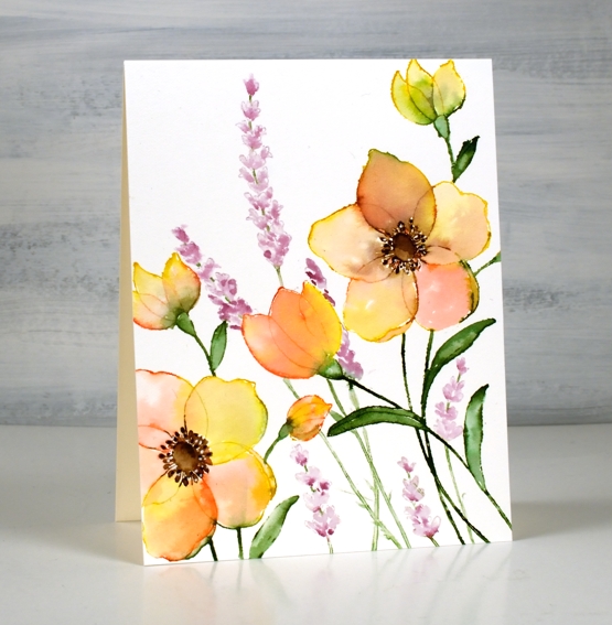
I’ve just spent some time watercolouring Penny Black outline stamps from their most recent release. I am a fan of the large floral stamps as there is plenty of space for blending colour inside the petals. There are also fewer tiny bits to paint which is important for someone who doesn’t quite have the eyesight I used to!)
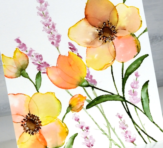
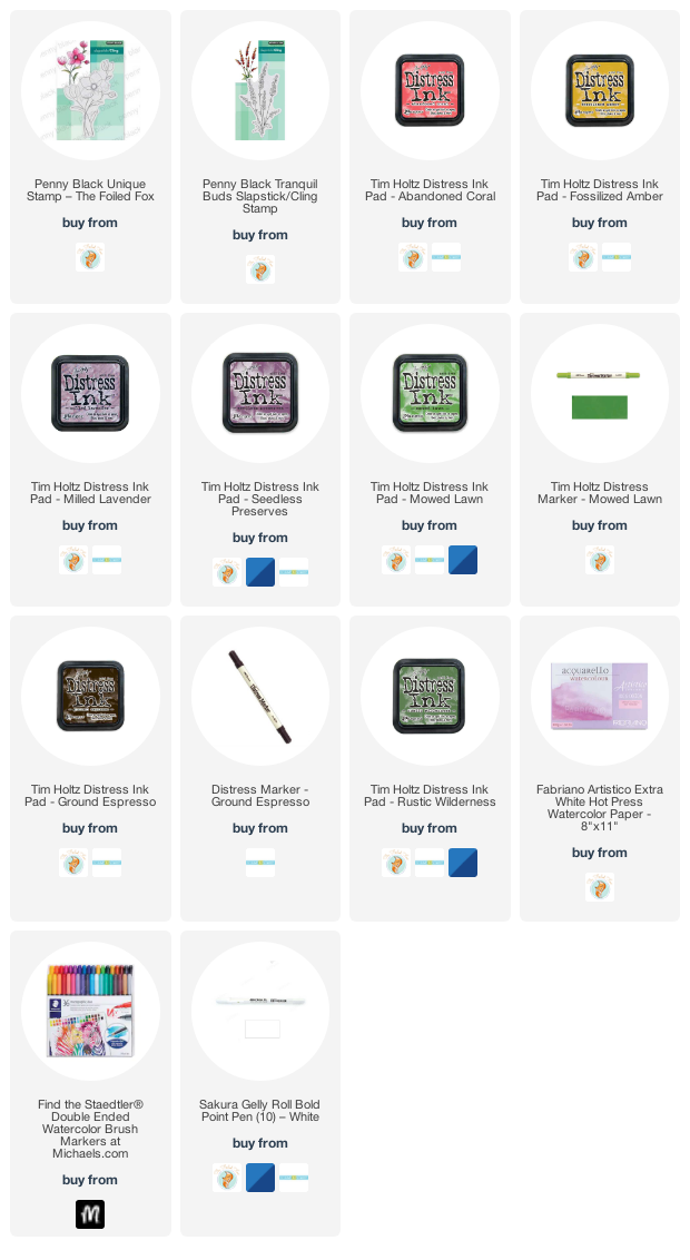
I worked on hot pressed watercolour paper in a stamp positioner with distress ink pads and markers. The large image is the new ‘unique’ stamp from PB paired with an older PB stamp ‘tranquil buds’. I randomly inked the petals of the large flowers with abandoned coral and fossilized amber, the leaves with rustic wilderness and the flower centres with ground espresso. I stamped the large flowers twice to span across the panel.
After stamping I used water and a brush to blend the stamped ink to fill the petals, stems and leaves. Once the petals were almost dry I blended the centres of the flowers. I dried the whole panel before adding the tall flowers. I did have to do some masking to make sure the ‘tranquil buds’ appeared behind the larger flowers. I think they look like lavender so I used milled lavender and seedless preserves distress inks. Once the whole panel was dry I used a dark brown marker to add detail to the flower centres and a white gel pen for little dotty highlights.
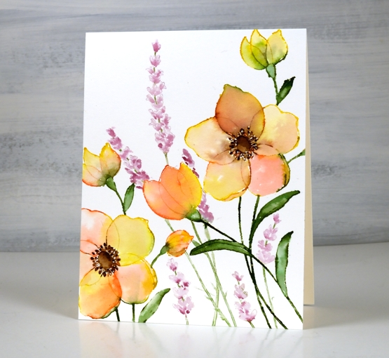
As often happens I decided against a sentiment which means I can use it for any occasion or add one later when I know who I’m sending it to.
Supplies
(Compensated affiliate links used when possible)


Your work is always exceptional, however this one stands up it as a favorite for me. I love these colors and the natural way they lay across the page. It says so much without a sentiment. Thank you for sharing!
Thank you for letting me know. I often reach for a mix of yellow and pink when watercolouring flowers. It seems that others like the effect too.
Beautiful beautiful beautiful!
Absolutely lovely! How did you get the petals of the large flower to be so shear looking? I envision applying a stamp pad to a petal (however lightly) and having a substantially darker petal than this lovely “see through” one. I like to paint but I’m not that good at drawing. That is why the use of a stamp seems like a good idea. But how do you get the image on your watercolor paper using these stamps colors that are darker than the “see through” ones on the finished product? Do you stamp only a small portion and use a water brush to spread the color? I enjoy your e-mails and thank you for sharing your talents.
The petals look transparent because I used water to pull the ink from the stamped outline so really there is not a lot of ink involved. Distress inks are transparent already and the extra water makes them even more so. I am thrilled to hear you enjoy the posts I share.
Absolutely GORGEOUS…looking at this card just makes me happy! TFS Heather. I am going to save this post so I can look at this card again and again!!!! You are a treasure! PS it is too pretty to add a sentiment – Love looking at it as is…it says you love me, thinking of you, friend, etc.
Absolutely stunning! I love the transparency of the petals. Great colour combo.
This is GORGEOUS! Wow, what beautiful colors. I could only hope to paint like this. The color blending is so well done on those petals. Did I mention this is gorgeous!
Another fabulous floral and love the anemone type flowers with the lavendar and as usual your colour palette is just perfect…a gorgeous card Heather. x
Your petals look so delicate and translucent, Heather! I love this mix of colors. A gorgeous card!
Wow that is gorgeous!
I love your combination of colours in this very pretty card Heather.
WOWZA!! This is absolutely gorgeous!! The transparency of the flower petals is stunning. You are an artist with your wet brush. I rarely place a sentiment on the front of my cards. Your cards are MUCH more frame worthy than mine and no words give the recipients the option to make it a lasting part of their decor. And this is totally worth framing!
[…] Unique → […]
Beautiful card Heather. I LOVE the colours you’ve used to creative the most gorgeous flowers. The petals look so delicate with the overlapping colours. xx