Die-cut gel print florals
Posted: July 20, 2022 Filed under: gel press, Penny Black, splendid, Taylored Expressions | Tags: gel press, Penny Black creative dies, Penny Black stamps, Taylored Expressions 5 Comments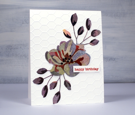
If you are thinking that’s an unusual choice of colours, patterns and textures, you’re right, but it actually makes me quite happy. This is the only layered flower die cut I have of the this type; I don’t generally do layered die cuts. It’s from Penny Black and it appealed to me because of the little buds rather than the complex flower. I know the idea of these dies is to layer in shades of the same colour going from light to dark in the layers. Instead I grabbed one of my gel printing clean up sheets which was covered in black, blue, green, pink, red and purple sections. The texture is from the brayer which I clean off on a thick sheet of paper when I’m gel printing.
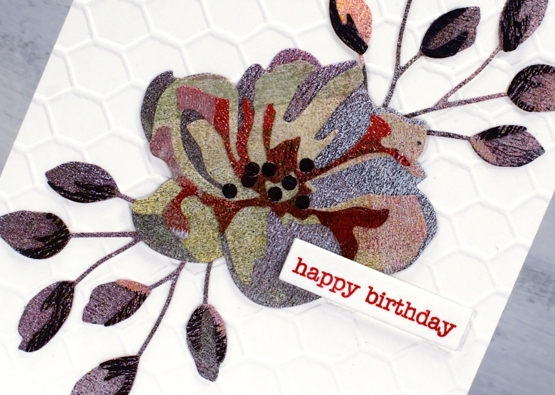
In keeping with the combination of colours and texture I decided to go for an unusual background also and attached the flower and buds to a card-base embossed with the a Taylored Expressions chicken wire pattern. I won’t be surprised if you find it a bit odd but I just can’t help reaching for gel prints and this odd scrappy combo makes me smile. By the way, those little black dots in the centre, I added them myself; they aren’t part of the original die.
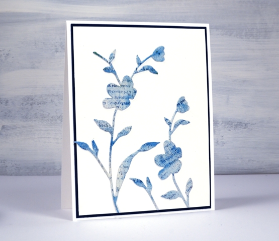
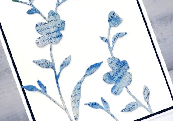
This second card has a bit more elegance. I used the PB ‘whisper’ die to cut flowers from a gel printed text transfer. The text is from a recipe page in a magazine so you might be able to pick out the word cinnamon if you look closely. The dark mat looks black but is actually dark blue to co-ordinate with the gel print. I’ve used the same die to cut both blooms but used only a portion on the right hand side.
Do you use layered dies? Do you blend the cardstock with inks or pick co-ordinating cardstock? Or perhaps you go for random colour combos like I did!
By the way, Foiled Fox is having a Penny Black sale, so pop over and have a browse.

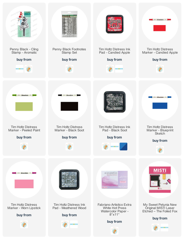
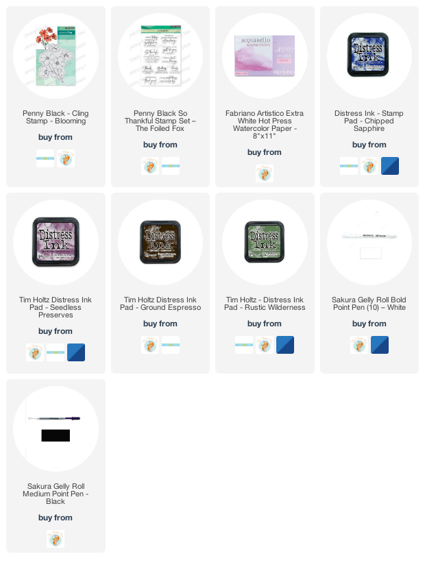
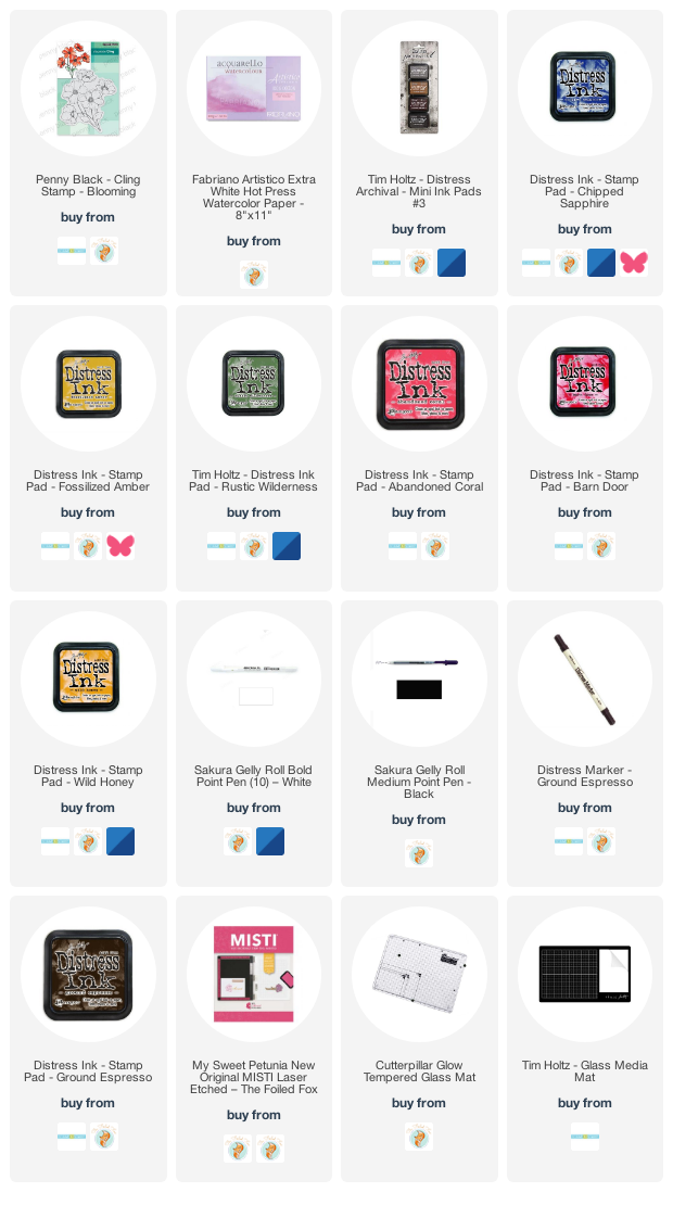
Supplies
(Compensated affiliate links used when possible)
Off to School journal page
Posted: July 15, 2022 Filed under: Alcohol Ink, Darkroom Door, Mixed Media, scratches, tickets | Tags: Art Journal, Darkroom Door stamps, Mixed Media 15 Comments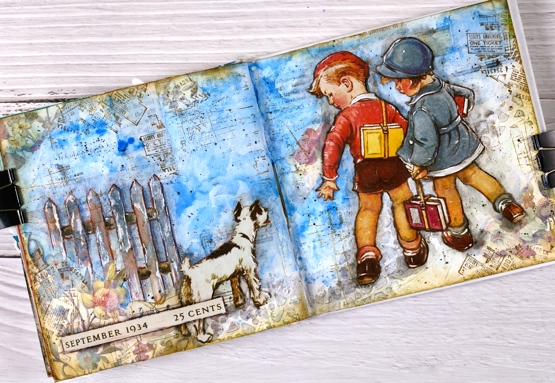
Some of you might recognise the artwork on this journal page. I have saved calendars, magazines, greeting cards and diaries over the years and now that I am creating collages and journal page spreads they are coming into their own. Quite a few years back I saw a calendar featuring covers from Good Housekeeping magazines of the 1920’s and 30’s. I thought the covers were delightful and bought two of the calendars. I enjoyed it during the year then tucked it away for future inspiration.
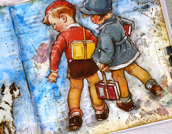
The calendar images are larger than the 6″x 6″ pages in the journals I am currently using so I chose a painting where I could cut out components and create a smaller scene. I cut the two children and the dog and glued them onto a collaged and painted background. I used floral paper mainly around the edges, blue paint for the background. The fence and cobble stone path were created with texture paste through a stencil. I used a few different Darkroom Door stamps to add vintage details across the page.
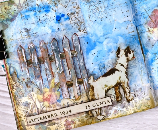
I did have to do more fussy cutting than I usually care to but these sweet images were worth it. Once they were glued down I used a black marker to go round the edges of the cut outs and immediately smudged the ink with my fingers or a damp brush. It’s a technique I have seen Vicky Papaioannou do many times on her journal pages. I used a white gel pen to add highlights, another trick from Vicky.
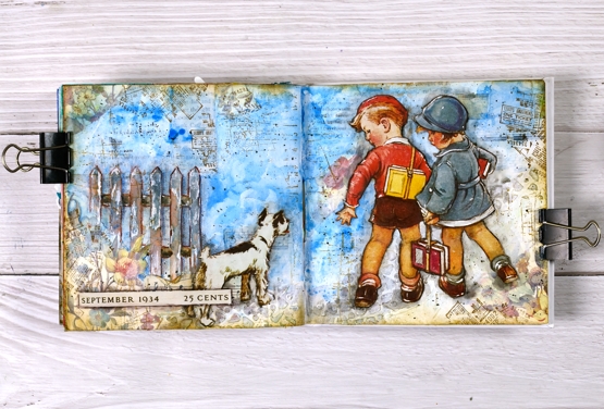
If you want to see what the original artwork by Vernon Thomas, just search good housekeeping magazine with the date I have added to the bottom left corner of my page.
Supplies
(Compensated affiliate links used when possible)
Alcohol Ink + Masks
Posted: July 13, 2022 Filed under: Alcohol Ink, artsy stems, classic motorcycles, Darkroom Door, grafix, Sizzix, you are everything | Tags: Darkroom Door stamps, grafix, grafix craft plastic 6 Comments
I’ve played with stencils and alcohol inks before so it wasn’t much of a stretch to try the same with masks. Masks are basically stencils without any frame around them. The ones I used for today’s cards are homemade from Grafix white craft plastic (also known as white opaque dura-lar).
I used the Sizzix ‘artsy stems’ dies to cut flowers from craft plastic. I also used craft plastic for the alcohol ink panels. I first tried this technique when making bookmarks for a Grafix video tutorial. I used the same funky die-cuts and alcohol inks so check out the video below for the process.
One thing I really like about working with Grafix craft plastic and matt dura-lar (in the final card) is that you can emboss on it. I make sure I preheat the heat tool so I can quickly activate the embossing powder. The craft plastic doesn’t melt or warp if you keep the heat tool moving.
All the sentiments are from Darkroom Door sets (linked below) two were embossed and the other stamped with a new ink from Ciao Bella. It took a while to dry on the craft plastic but I am impressed with the solid matte look once dry.
You can see on this last card I had to come up with a way to attach the semi transparent matte dura-lar to the coloured panel underneath. I didn’t want to use tape which would show so I poked a couple of holes through both layers and sewed the panels together with some silver cord.
All the alcohol ink panels are attached to white card bases embossed with embossing folders for some subtle texture and interest.
Supplies
(Compensated affiliate links used when possible)
Herbal Thank yous
Posted: July 11, 2022 Filed under: coriander, Footnotes, Penny Black, Simply Graphic, thyme & rosemary | Tags: Penny Black stamps, Simply Graphic 5 Comments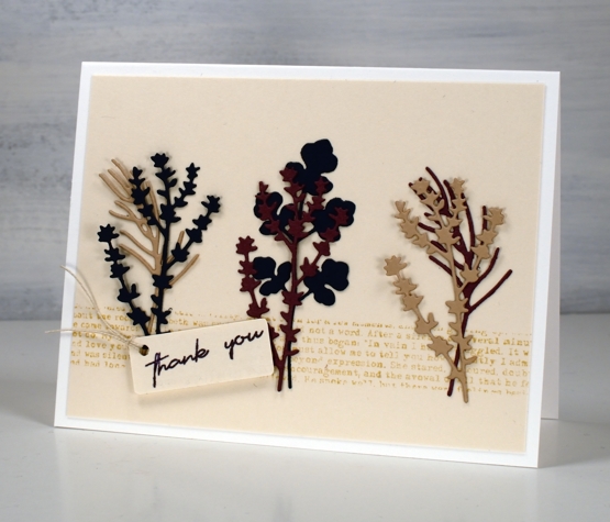
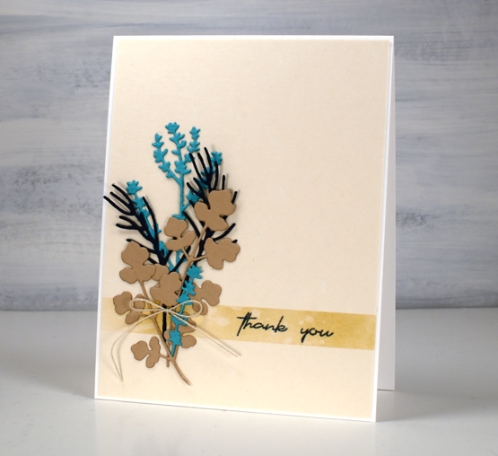
I have teamed up with the Foiled Fox again to bring you some sweet herbal die-cuts. The little stems are from Simply Graphic. The coriander stem is a single die; the thyme and the rosemary are in a pack together.
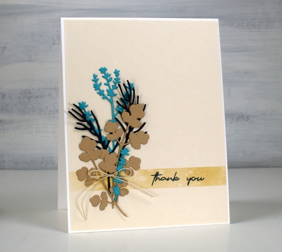
Both cards have a fairly neutral colour scheme with the contrast coming from the turquoise cardstock and the mulberry (which looks brighter in real life)
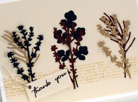
I used ink and stamping to create a ‘ribbon’ across the base of the beige panels. I masked the area then blended ink on one card and stamped text on the other.
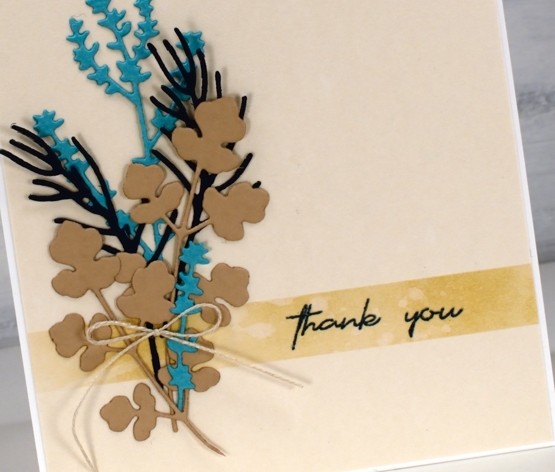
The twine details continue the neutral theme and the panels are attached to white cardbases.
There are more details on the Foiled Fox blog and more lovely nature dies from Simply Graphic in their store. I hope you pop over and enjoy a browse in both blog and store.
Now a post including two herb themed cards would not be complete without some chit chat about my herb pots would it? I have three large galvanized tubs for my herbs and the crop is growing very well. Despite the slow start to summer I have had oodles of basil along with oregano, rosemary, parsley, lavender, sage, mint and Thai basil. I picked enough basil for a homemade pesto the other night and was very proud of myself!
Let me know if you make any favourite recipes with homegrown herbs.
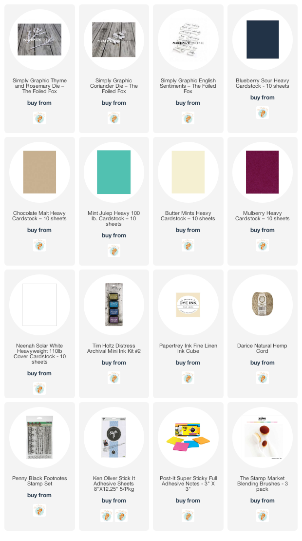
Supplies
(Compensated affiliate links used when possible)
Blooming Blue Again
Posted: July 6, 2022 Filed under: blooming, Dies, how sweet, Penny Black, Tagged | Tags: Penny Black creative dies, Penny Black stamps, Ranger archival inks, Ranger Distress inks 11 Comments
I’m still having fun with PB ‘blooming’ stamp. Once again I used blue inks but this time the combo was chipped sapphire and blueprint sketch. When blended I got blues and purples but not the pinks that seedless preserves provided. If you read my last post you might remember I unintentionally ended up with brown centres. This time I made sure I inked with fossilized amber and wild honey to create yellow centres.
I worked in the stamp positioner to make this panel and did all the green and blue inking and stamping first. I left the centres un-inked so I could add them after the petals were stamped, blended and dry. I don’t mind some blending but I didn’t want the blue and yellow to get too close and blendy because that would mean green centres. Once the yellow centres dried I used a black gel pen to add stamen.
I wanted to gussy this one up a little but still keep the clean look so I used a small piece of organza ribbon across the base of the panel then stamped on a banner die cut and tied it on with twine.
Supplies
(Compensated affiliate links used when possible)
Blooming Blue
Posted: July 4, 2022 Filed under: blooming, Penny Black | Tags: Penny Black stamps, Ranger archival inks, Ranger Distress inks 9 Comments
Here is another take on the PB stamp ‘Blooming’. Last week I posted a card with a blended background, brown outline stamping and painted petals. For today’s card I stamped with distress inks which I then blended into the petals.
My original plan was to have yellow centres not brown; I guess I got distracted. After inking the petals randomly with chipped sapphire and seedless preserves I added some ground espresso ink to the centres, spritzed the stamp and stamped on hot pressed watercolour paper. With the spritz of water the inks blend a little; with a paint brush I do the rest of the blending adding more ink if needed. That top flower got more brown than I would have liked but I was still happy with the overall blends.
Finishing touches include defining the centres with the bullet tip of the distress marker and adding white dots with a gel pen. The sentiment is from the PB set ‘so thankful’. I have a few more in this little series of watercolours with PB’s large outline floral stamps so I’ll see you back here soon.
Supplies
(Compensated affiliate links used when possible)
Blooming Big
Posted: June 29, 2022 Filed under: blooming, Penny Black | Tags: Penny Black stamps, Ranger archival inks, Ranger Distress inks 7 Comments
As the title hints, the stamp is called ‘blooming’ and it’s a big one. I mentioned in my previous post how much I enjoy working with the large floral outline stamps from Penny Black. I stamped ‘blooming’ twice side by side in a landscape orientation. The stamp is almost as wide as it is high but I haven’t included all the stems on this card.

Before I stamped I smooshed distress inks on a glass mat, diluted them and swiped my watercolour panel through the ink to create a soft blurry background. Once the panel dried I stamped in archival ground espresso ink then painted the flowers with the same inks I had used in the background, abandoned coral and fossilized amber. To make the flowers bolder so they would stand out from the background I painted another layer of ink then added deeper colours to part of each petal. All the inks are listed and linked below.

I painted the centres in ground espresso distress ink then used brown and black markers to go over the flower centre details and add more veins to the petals. I added highlights with a white gel pen and once again decided against a sentiment for now.
The techniques used in today’s and Monday’s card are featured in my online class Floral Faves.
And in other news, filming has begun for my next online class. I am excited to share more about it soon!
Unique
Posted: June 27, 2022 Filed under: Penny Black, tranquil buds, unique | Tags: Penny Black stamps, Ranger Distress inks 15 Comments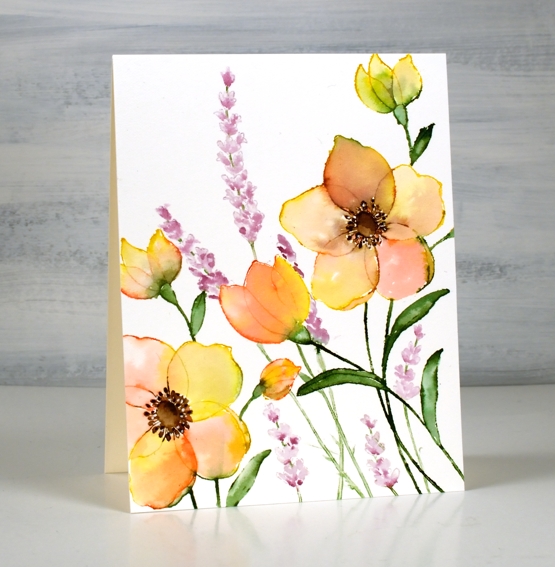
I’ve just spent some time watercolouring Penny Black outline stamps from their most recent release. I am a fan of the large floral stamps as there is plenty of space for blending colour inside the petals. There are also fewer tiny bits to paint which is important for someone who doesn’t quite have the eyesight I used to!)
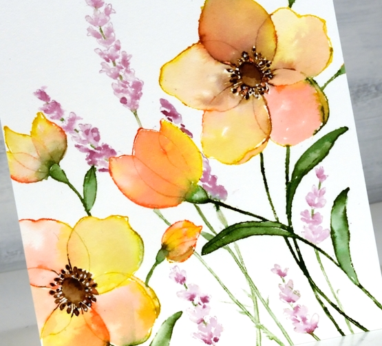
I worked on hot pressed watercolour paper in a stamp positioner with distress ink pads and markers. The large image is the new ‘unique’ stamp from PB paired with an older PB stamp ‘tranquil buds’. I randomly inked the petals of the large flowers with abandoned coral and fossilized amber, the leaves with rustic wilderness and the flower centres with ground espresso. I stamped the large flowers twice to span across the panel.
After stamping I used water and a brush to blend the stamped ink to fill the petals, stems and leaves. Once the petals were almost dry I blended the centres of the flowers. I dried the whole panel before adding the tall flowers. I did have to do some masking to make sure the ‘tranquil buds’ appeared behind the larger flowers. I think they look like lavender so I used milled lavender and seedless preserves distress inks. Once the whole panel was dry I used a dark brown marker to add detail to the flower centres and a white gel pen for little dotty highlights.
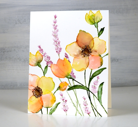
As often happens I decided against a sentiment which means I can use it for any occasion or add one later when I know who I’m sending it to.
Supplies
(Compensated affiliate links used when possible)
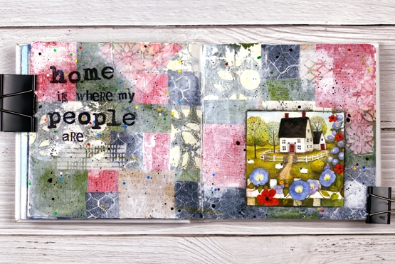
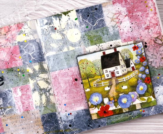
Home is… journal page
Posted: June 17, 2022 Filed under: alphabet medley, Art Journal, Darkroom Door, gel press, polka dot stencil, remington lowercase alphabet | Tags: Art Journal, Darkroom Door stamps, Darkroom Door stencils, gel press, gel printing 5 Comments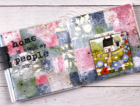
The shenanigans continue in my Art Journal Adventures workshops. Last month the theme was collage & texture and the range of pages was amazing. We all chose different papers, colours and focal images but followed a similar method to put them together.
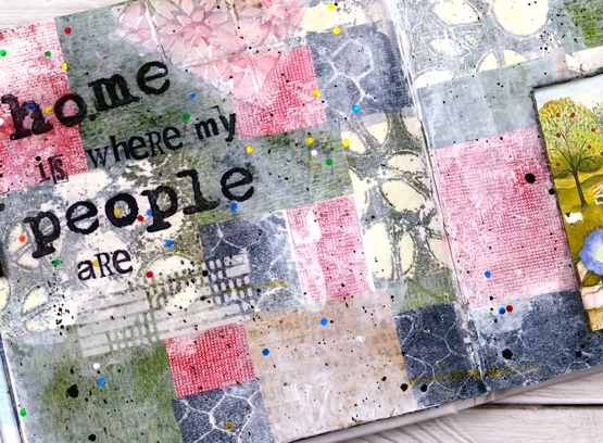
For this spread I relied heavily on my growing collection of gel prints. The little cottage picture is from a greeting card and I used it as a starting point when settling on colours. All the papers you can see are gel prints I made except for one kraft scrap down the bottom with text stamped on it. I added gesso as well as texture using modeling paste through the Ciao Bella patchwork stencil.
During each session of the class it was definitely a treat to walk around and be inspired by the ideas coming to life on all the pages. Some participants had their own stash of gel prints to draw from, others used some of mine. It was fun to see my prints pop up on other people’s pages. I loved it!
This week we are working on Tea and Coffee themed pages and next month it will be texture & movement. If you are close by and haven’t tried gel printing, I’m teaching another introductory class on July 9.
The sweet cottage with sheep at the gate looks nothing like my house! I do grow morning glory but that is about the only similarity. Home is definitely where my people are which means I have two homes very far apart. Although very much at home in Canada I claim Australia as home too, how could I not, some of my favourite people are there!
Supplies
(Compensated affiliate links used when possible)
Aromatic
Posted: June 13, 2022 Filed under: aromatic, Footnotes, Penny Black | Tags: Fabriano Watercolour Paper, Penny Black stamps, Ranger Distress inks 12 Comments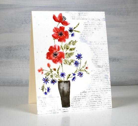
Today’s card is a companion in style to my two previous Penny Black floral cards. All three feature PB cling stamps and some sort of background filler. For this one I used a text stamp from the PB clear set, ‘footnotes’.
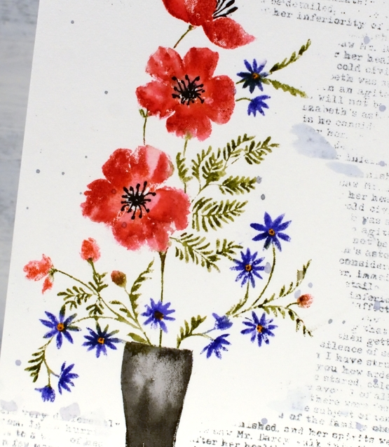
I used both distress ink pads and markers to ink the ‘Aromatic’ stamp while in the stamp positioner. To fit the image on my panel of hot pressed watercolour paper I masked at the base to make the vase a little shorter. The foliage and little flowers are so delicate I did not add any water blending after stamping but I did blend the red flowers and the vase with a paintbrush and water.
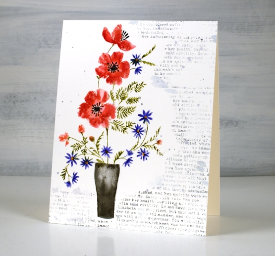
The text is stamped in weathered wood distress ink, a nice bluey-grey and splattered with the same ink. The text is actually from Pride and Prejudice which I am re-reading at the moment. While we had no power I noticed I had a copy on my e-reader so I started reading it; no bedside lamp required! Even though I know it well I am enjoying the conversations. After all who can resist hearing, ‘I am all astonishment!’ Are you a re-reader?
Supplies
(Compensated affiliate links used when possible)