Pods & Wings
Posted: April 14, 2022 Filed under: Dies, Flutters, gel press, Lavinia, Penny Black, pods stencil, soaring | Tags: gel press, gel printing, Lavinia, Mixed Media, Penny Black creative dies, Penny Black stamps 4 Comments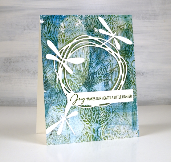
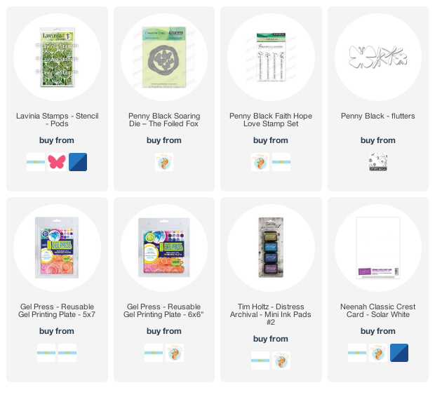
The background of today’s card is another gel print featuring a gorgeous Lavinia stencil called ‘pods’. You can’t see in the photos but in real life there is some shimmer on the print as I used silver paint along with blue, green and white.

Over the print I added a green and a white wreath die cut from Penny Black. It is part of the new ‘soaring’ set which also includes four butterflies. The background called for dragonflies rather than butterflies so I die cut three from the ‘flutters’ set, an oldy but a goodie.
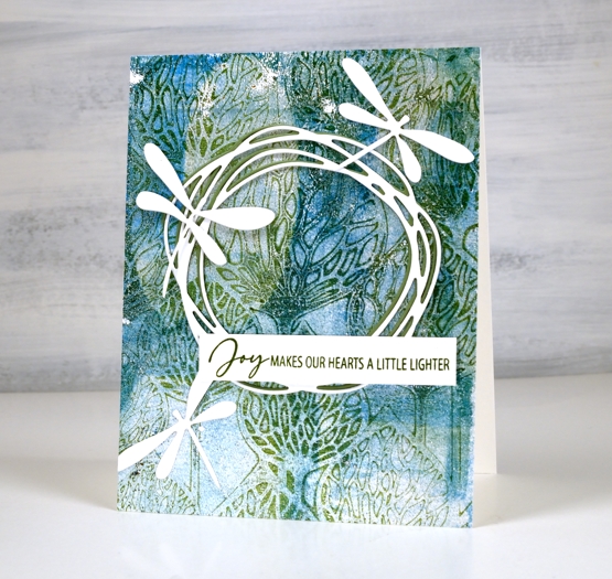
As I spent a chunk of time yesterday listening to Ann Voskamp’s book ‘One Thousand Gifts’, the joy sentiment seemed like a good match for the design.
I was watching a Julie Balzer book club discussion on youtube today as I worked and she mentioned how addictive gel printing is and how if you haven’t tried it you must (48 minute mark)! She called it the one tool that has changed her life! So I will again shamelessly plug my upcoming gel printing workshops and hope you will join me in this addiction!
Supplies
(Compensated affiliate links used when possible)
Fresh Pansies
Posted: March 30, 2022 Filed under: Brusho, pansies, Penny Black | Tags: Brusho, Fabriano Watercolour Paper, Penny Black stamps, Ranger Distress inks 13 Comments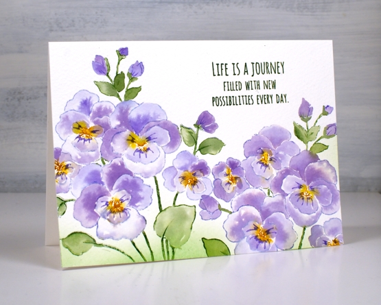
Pansies seem to be a happy flower don’t you think? This is the new ‘pansies’ stamp from Penny Black stamped twice on cold press watercolour paper.
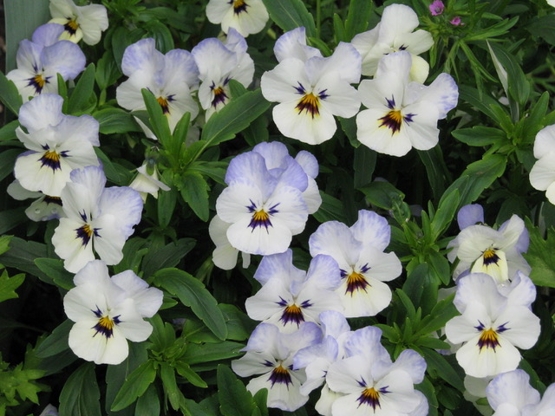
In my previous post I asked what colour suggestions you had for irises. Jan in Oregon sent me some beautiful photos she has taken over the years featuring some stunning irises, so the inspiration file has definitely been topped up. She also sent a few photos of pansies, tulips and daffodils as they are the next flowers to be featured here on the blog. The photo below was my inspiration for today’s card. I ended up with more purple petals than white as I didn’t have time for negative painting but I was still inspired and delighted by Jan’s photo.
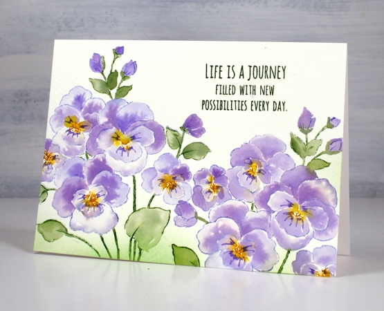
I stamped with distress inks then filled the petals with brusho watercolours using the same method I used recently for the irises. I used shaded lilac, mowed lawn and fossilized amber to stamp the outline then violet brusho and a mix of leaf green and moss green for the leaves and stems.

I used a purple marker to draw the lines coming out from the centre of the flowers, blended some mowed lawn around the stems and finished with a sentiment from the PB ‘love big’ set.
Supplies
(Compensated affiliate links used when possible)

Iris Elegance
Posted: March 28, 2022 Filed under: Brusho, iris elegance, Penny Black | Tags: Brusho, Fabriano Watercolour Paper, Penny Black stamps, Ranger Distress inks 14 Comments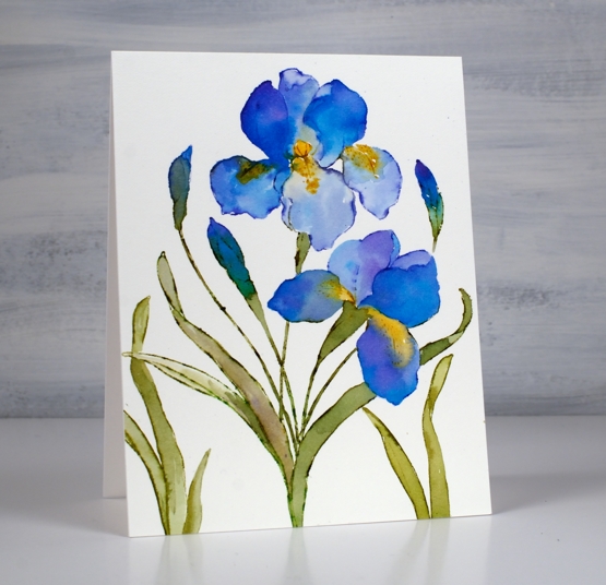
This is the second iris card I’ve painted but it probably won’t be the last. Iris Elegance from Penny Black is such a bold beautiful stamp.
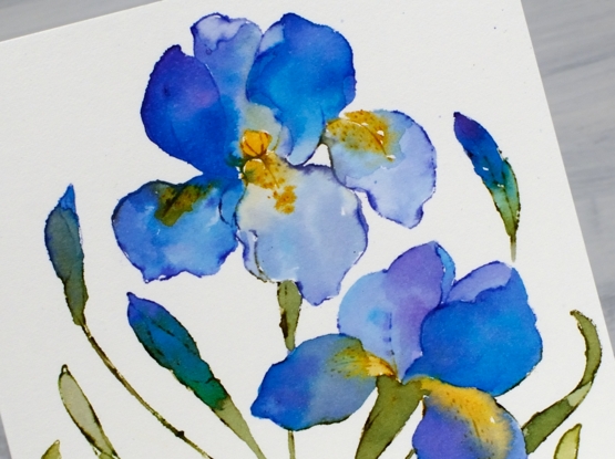
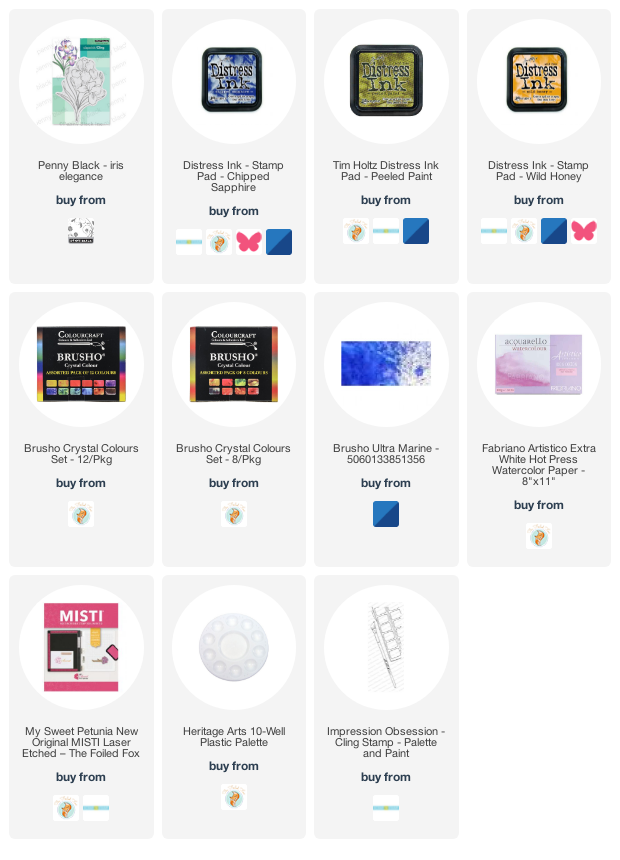
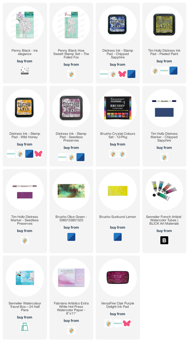
I worked on hot press watercolour paper in a stamp positioner to stamp the outline stamp in chipped sapphire, peeled paint and wild honey distress inks. I blended ink into the petals from the stamped outline but also used brusho paints to fill the petals with blends of colour. I had violet, ultramarine and moss green brusho mixed in a palette beside me so I could dip my brush and add paint to the petals.
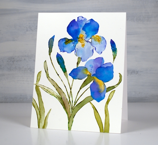
To fill out the design I stamped just leaves to the left and the right of the main image. Let me know if you have irises blooming already or suggest some petal colours to me. The yard is covered in snow again here so the irises best keep on sleeping for now!
Supplies
(Compensated affiliate links used when possible)
Circle Flowers journal page
Posted: March 25, 2022 Filed under: abstract flowers, alphabet medley, Art Journal, checkered, Classes, Darkroom Door, gel press, Hand drawn, mesh, Stencils | Tags: Art Journal, Classes, Darkroom Door stamps, Darkroom Door stencils, gel press, gel printing, Mixed Media, Penny Black creative dies 8 Comments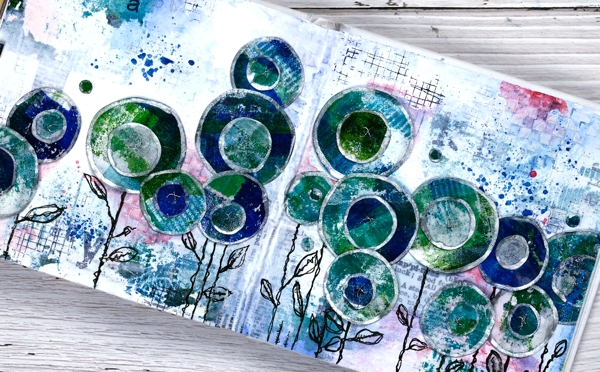
Last week I spent several happy hours gel printing. One of the prints I completed has ended all over this art journal spread. If you are a gel printer you know you can sometimes pull a couple of prints of the same design. The first one is full of colour and pattern and the second is often called a ghost print as it displays outlines and left over bits of paint.

For this journal page I used both the bold blue and green print and the ghost print. The ghost print can be seen on the top left and bottom right corners and is peeping out in a couple of other places. The first print which was very geometrical has been turned into circle flowers. It also had traces of a new stencil called ‘pods’. You will see more of it here on the blog because it is fabulous!
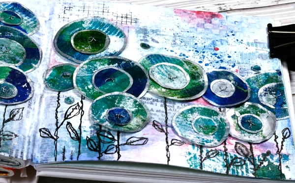
Also in the background you might see some black ink stamping (DD mesh and alphabet medley) and the texture of paste through the DD ‘checkered stencil. The text you see is a fabric tape with dictionary definitions of happiness; it is the first 49 & Market product I have bought and it is going to be handy!
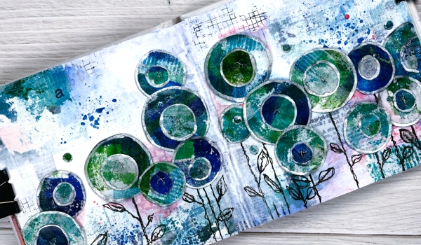
There is plenty of white gesso over the background to pull it together and mute some of the bold elements.
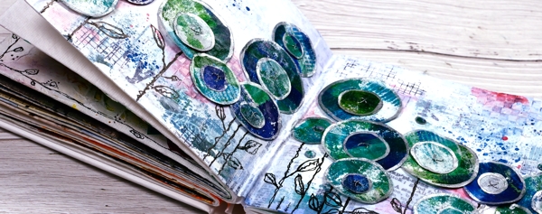
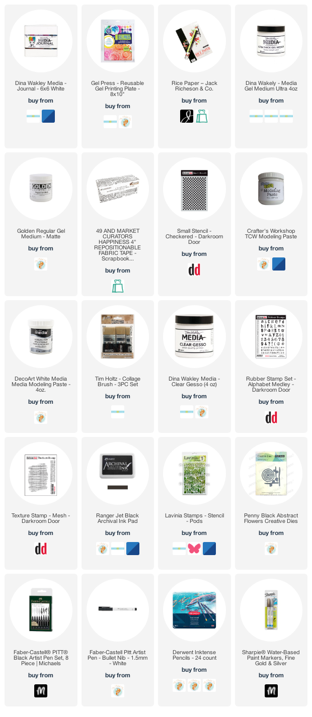
The flowers are all cut with Penny Black ‘abstract flowers’ dies which basically cut slightly wonky circles so I could have cut them myself but why bother when the machine will do it. The print was on rice paper so I could cut a few layers at once. After drawing an edge on each circle with a silver paint pen I stuck a small circle on a larger one, then sewed a cross in the centre with silver thread. There are stems in the set of dies but I doodled mine with a black marker. The blue splatters and pops of pink are from inktense pencils which are coming in handy for art journalling.
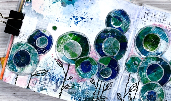
I know that was a lot of photos and chit chat but that is the way with some art journal pages especially the collage ones which involve different papers, paints, stencils, and mediums. I probably haven’t mentioned everything I used but if you are still here now I’m sure you’ve heard enough!
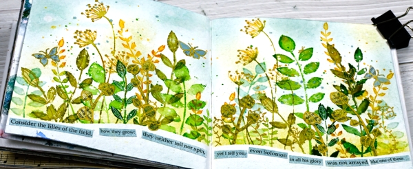
If you are in Ottawa and feel like doing a little art journalling of your own, there are still spaces left in my next Art Journal Adventure workshop where we will be creating a watercolour green and leafy spread similar to what you see below. All the details are on the Crop A While website.
Supplies
(Compensated affiliate links used when possible)
Farm Fresh floral
Posted: March 23, 2022 Filed under: farm fresh, letter background, Penny Black | Tags: Penny Black stamps 4 Comments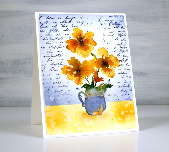
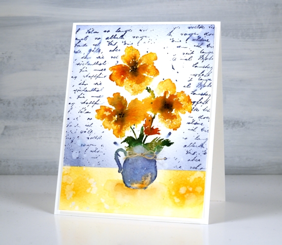
I’m having ‘fun with the Foiled Fox‘ today so I am chatting about this card over on their blog too! I posted a card the other day featuring two sweet jugs of lavender. The jugs were two separate stamps from the new PB ‘farm fresh’ set; this is the third and largest stamp from the set. I’m not sure what kind of flowers they are but that never really stops me from inking the stamp with whatever colours I choose.
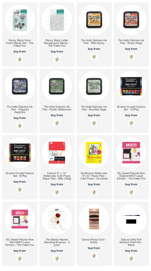
I worked in the stamp positioner on cold press watercolour paper for a little texture. Starting with the jug I inked it with chipped sapphire and bundled sage distress inks. After stamping I inked the flowers with wild honey and rusty hinge inks, spritzed the stamp with water then stamped a slightly blurred and blended impression. The leaves and stems are stamped in rustic wilderness ink which is such a lovely green; it is giving forest moss some competition as my favourite green distress ink. To add a little definition to the flower centres I drew some black dots.
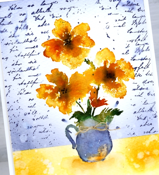
I stamped the jug of flowers on a post-it note and cut it out so I could mask the whole image while working on the background. I also masked across the panel so I could blend wild honey ink to represent a table or shelf and chipped sapphire ink with the ‘letter background’ stamp to represent the wall. To finish off I added a tiny bow to the jug. Make sure you visit the Foiled Fox blog and online store to see all the beauty and goodies they are sharing over there.
In other news I am teaching the second episode of Art Journal Adventure on Saturday March 26, Friday April 1 and Saturday April 2. There are a few spaces left if you’d like to join me at Crop A While, here in Ottawa. Each ‘episode’ is a stand alone workshop so there is no problem jumping into episode 2! Last month our journal page was a wintry scene; this time we are using watercolour techniques to go all green and leafy! For more information or to register visit the Crop A While website.
Supplies
(Compensated affiliate links used when possible)
Irises
Posted: March 21, 2022 Filed under: Brusho, how sweet, iris elegance, Penny Black | Tags: Brusho, Fabriano Watercolour Paper, Penny Black stamps, Ranger Distress inks 8 Comments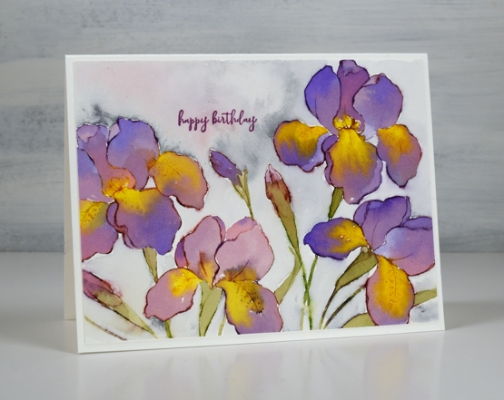
The new ‘iris elegance’ stamp from Penny Black is a delight to work with. The design is large so there is plenty of space in the petals for pretty watercolour blends. I inked the stamp with distress inks then blended the stamped ink with water to fill the flowers using some co-ordinating colours of brusho for extra depth and variation. I have been flipping back and forth between hot and cold pressed watercolour paper lately; this one is hot pressed.
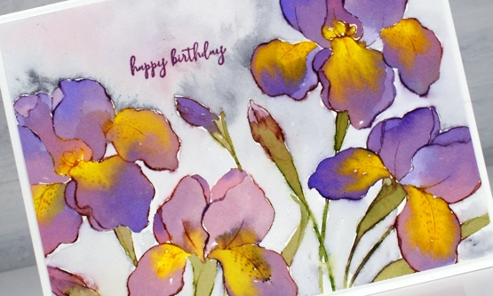
I have purple irises that come up in my garden each year but they don’t have the yellow centres I’ve featured on these ones. Yellow tends to be a pigment that pushes other pigments away which worked well on the petals. I painted the purples and then while the paint was still wet added yellow paint which spread and pushed the purple without making too much brown.
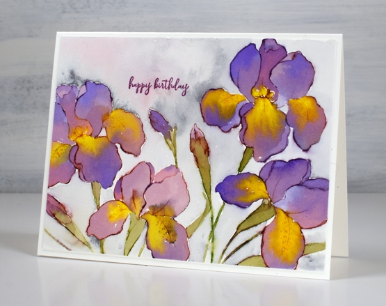
I don’t always add background but I did this time by painting water around the flowers then adding some Payne’s grey paint and a little diluted purple. Once again I chose the sweet little birthday stamp from the new ‘how sweet’ stamp set. Speaking of backgrounds, thank you so much to everyone who left me a message saying nothing more was needed on the recent poppy card. I am so encouraged by you, my kind and generous readers!
The warm weather and rain of the last few days has melted quite a lot of snow and now I see some green tips emerging. I have also spied a cardinal and a blue jay on the feeder. Spring is definitely in the air.
Supplies
(Compensated affiliate links used when possible)
Distinctive
Posted: March 18, 2022 Filed under: distinctive, how sweet, Penny Black | Tags: Penny Black stamps, Ranger Distress inks 8 Comments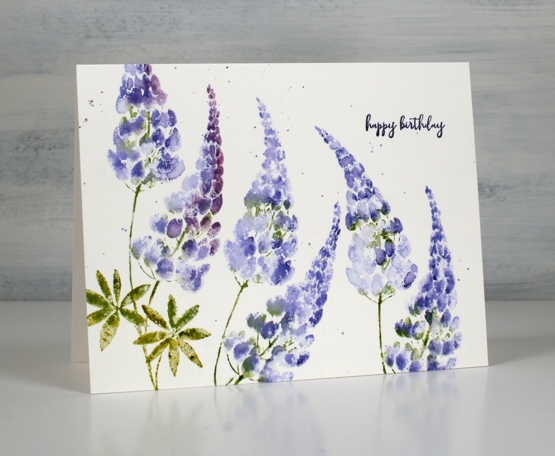
I consider lupins one of my garden successes. It may be a stretch for me to take credit because they were here when we moved in and they are not gone yet so I feel like my part in the success has been just not killing them all! They start blooming not too long after the bulbs and I have them in white, purple, pink, purple/white and dark purple. Last year I took care to chop off all the dead heads and I still had some blooming in August! Some of the plants became aphid hotels so please let me know if you have a fix for that which doesn’t involve me picking them all off by hand!
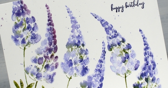
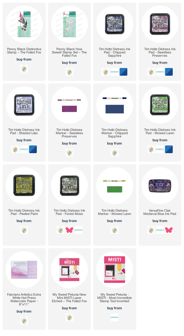
The new lupin stamp from Penny Black is called ‘distinctive’ and it has two flower heads on one stem. I used shaded lilac, chipped sapphire and seedless preserves to ink the stamp so I could create lupins that are a close match to the ones that appear in my garden. The leaves and stems were inked with mowed lawn, forest moss and peeled paint distress inks. You can see in the close up that I have a mix of blended and unblended sections on the card. I used the misti, spritzed the stamp after inking and also did a bit of blending with a paintbrush after stamping. I think the mix of textures add to the appeal and adding some water helps the ink spread on the hot pressed watercolour paper.
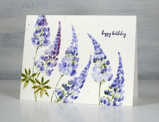
The birthday sentiment is from the new PB set, ‘how sweet’. There are three little sentiments in the set along with a floral stamp. Oh, and of course there is splatter, but you probably noticed that already!
Supplies
(Compensated affiliate links used when possible)
Brilliant
Posted: March 16, 2022 Filed under: brilliant, Peerless watercolours, Penny Black, vintage touch | Tags: Papertrey ink, Peerless Transparent Watercolors, Penny Black creative dies, Penny Black stamps 18 Comments
It seems that Penny Black always includes a poppy or two in a spring release. This large stamp is called ‘brilliant’ and I think the mix of flowers, leaves and seed heads is just lovely. I chose to do no-line watercolour with soft stone ink and peerless paints.
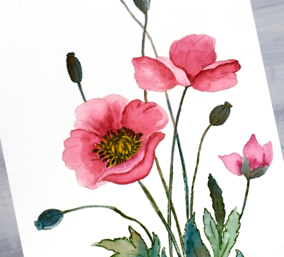
I stamped the large image in Papertrey Ink ‘soft stone’ then worked with rose red, mountain green, golden yellow and warm sepia peerless paints. If you haven’t heard of Peerless Watercolour paints take a look at the video I made about them a few years back.
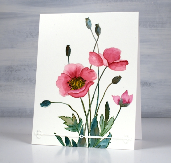
I wondered about adding background pattern or blended ink but left it clean except for the simple ‘vintage touch’ die-cut. The vintage touch set has two fancy banners as well as two dies that cut negative space banner patterns. I finished off the centre of the poppy with a black marker.
I am still undecided about the lack of background and sentiment; what do you think?
Supplies
(Compensated affiliate links used when possible)
Farm Fresh Lavender
Posted: March 15, 2022 Filed under: Background Stamps, Brick wall, Brusho, farm fresh, Penny Black | Tags: Brusho, Fabriano Watercolour Paper, Penny Black stamps, Ranger Distress inks 7 Comments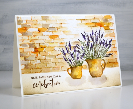
I am hoping I can fill a couple of jugs with lavender this summer. A couple of years back a friend split her lavender and gave me two plants which were coming along well last year and I hope will be even stronger and more full this year. When I have flowers in the garden I am always torn when deciding whether to cut them and bring some inside or just enjoy them outside where they will probably last longer.
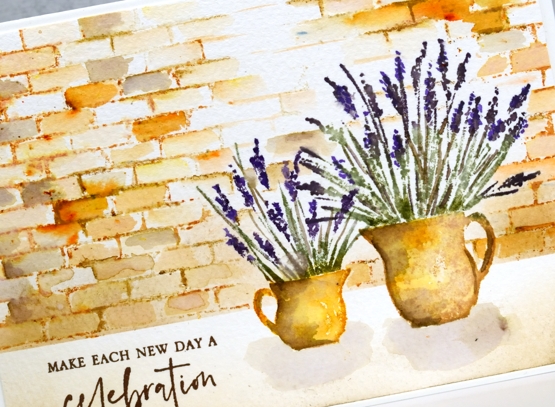
To create this little scene I used two stamps from the new Penny Black ‘farm fresh’ set and the ‘brick wall’ background stamp. I worked in a stamp positioner to create this panel. I stamped the jugs first with wild honey and tea dye distress inks. After blending the ink with water I added shadow with walnut stain ink. I used both bundled sage and rustic wilderness for the stems and a mix of milled lavender (of course) and dusty concord for the flowers.
Because I had done the jugs first I stamped and cut little masks from post-it notes to make it easier to stamp a brick wall behind them. I used tea dye to stamp the brick wall then started blending the tea dye ink to fill the bricks. I sprinkled a very small amount of sandstone brusho over the wall and started blending it in random bricks. This resulted in the warm orange bricks you see. I also added walnut stain ink to a few bricks for a darker look.
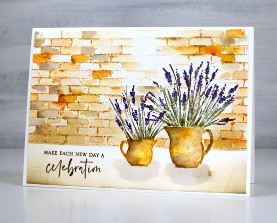
I blended antique linen and walnut ink in the foreground and painted pale shadows below the jugs. The card is finished with a sentiment from the new PB ‘love big’ stamp set.
Just in case you wondered at me thinking about cutting flowers from my garden, I’m just dreaming; it is definitely still covered in snow!
Supplies
(Compensated affiliate links used when possible)
New Penny Black Florals
Posted: March 8, 2022 Filed under: letter background, modesty, Penny Black, sweet sprouts | Tags: Fabriano Watercolour Paper, Penny Black stamps, Ranger Distress inks 8 Comments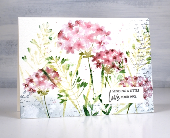
It snowed all day yesterday but spring arrived anyway in a package from Penny Black! I have a nice little stack of PB florals to share with you in the days to come and I should manage a video or two as well.
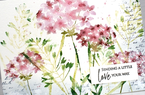
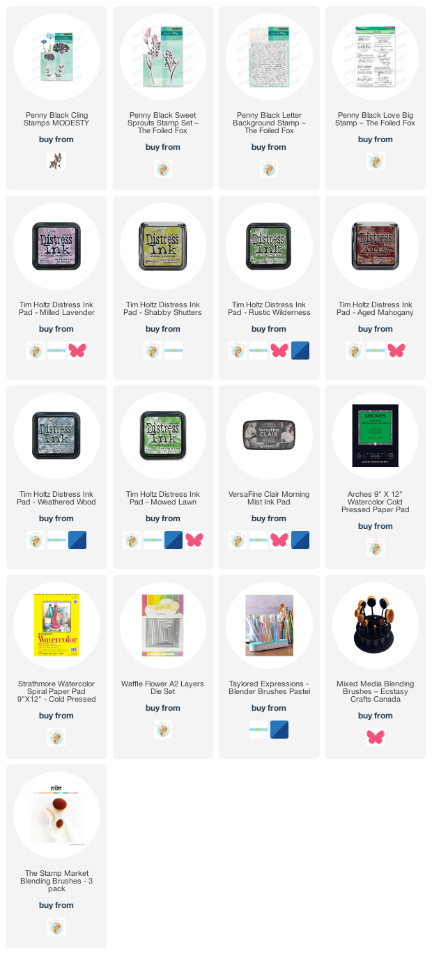
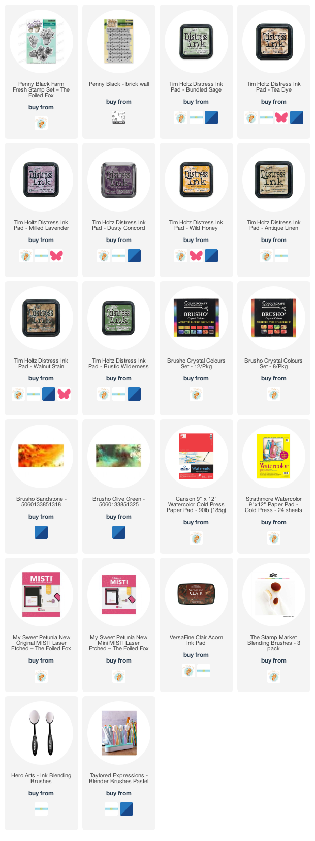
This first card features four stamps from the new Springtime release. Those of you who have been PB fans for years might notice a re-release among them. I stamped the large and small flowers from the ‘modesty’ set over foliage from the ‘sweet sprouts’ set; both sets include two large cling stamps. I used milled lavender and aged mahogany distress inks for the flowers and a mix of three distress greens for the leaves and stems. All the supplies are linked below.
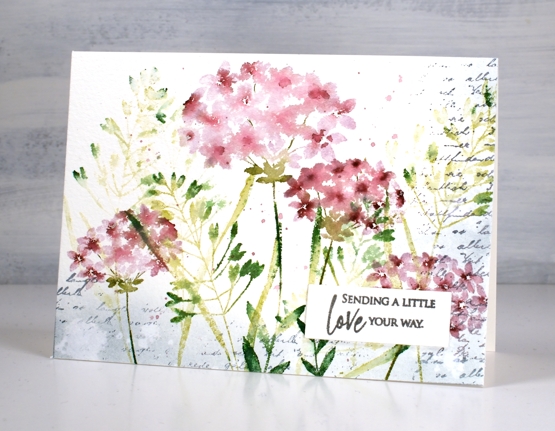
The washy blended look in the petals was achieved by spritzing the stamp before stamping along with some paint brush blending afterwards. I stamped a border of script in weathered wood with the ‘letter background stamp’ and blended the same ink around the edges. I splattered water for some watermarks and a mix of the milled lavender and aged mahogany around the flowers.
The card is 6¼”x 4½” on cold pressed watercolour paper finished with a sentiment from the new ‘love big’ set. I love the snowy cards as you are aware but I am definitely excited to be stamping florals again!
Supplies
(Compensated affiliate links used when possible)