
Irises
Posted: March 21, 2022 Filed under: Brusho, how sweet, iris elegance, Penny Black | Tags: Brusho, Fabriano Watercolour Paper, Penny Black stamps, Ranger Distress inks 8 Comments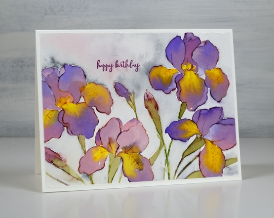
The new ‘iris elegance’ stamp from Penny Black is a delight to work with. The design is large so there is plenty of space in the petals for pretty watercolour blends. I inked the stamp with distress inks then blended the stamped ink with water to fill the flowers using some co-ordinating colours of brusho for extra depth and variation. I have been flipping back and forth between hot and cold pressed watercolour paper lately; this one is hot pressed.
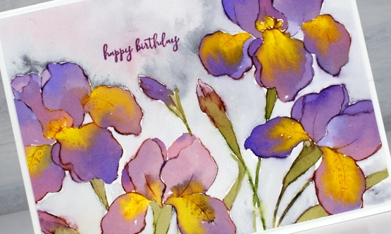
I have purple irises that come up in my garden each year but they don’t have the yellow centres I’ve featured on these ones. Yellow tends to be a pigment that pushes other pigments away which worked well on the petals. I painted the purples and then while the paint was still wet added yellow paint which spread and pushed the purple without making too much brown.
I don’t always add background but I did this time by painting water around the flowers then adding some Payne’s grey paint and a little diluted purple. Once again I chose the sweet little birthday stamp from the new ‘how sweet’ stamp set. Speaking of backgrounds, thank you so much to everyone who left me a message saying nothing more was needed on the recent poppy card. I am so encouraged by you, my kind and generous readers!
The warm weather and rain of the last few days has melted quite a lot of snow and now I see some green tips emerging. I have also spied a cardinal and a blue jay on the feeder. Spring is definitely in the air.
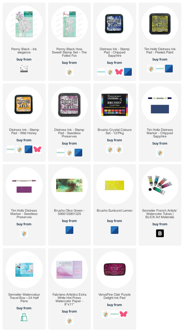
Supplies
(Compensated affiliate links used when possible)


WOW! What a beautiful effect! I love that you used distress inks, Brushos and paint to achieve this! It’s incredible and certainly nothing I could do. Love the soft background on this too. Just GORGEOUS!
Oh my it is beautiful, I can’t wait for ours to start blooming!
I used to have irises like these. I should have dug some and moved them with us. These are lovely and no pollen!
I love, love the watercoloring.
Stunning. Thank you for sharing.
Tish
Gorgeous irises Heather and the added yellow works so well..I love the background too. Glad that you now can see that Spring is just around the corner. Our clocks go forward this coming weekend so the start of lighter evenings which I love. The weather is much brighter and is certainly getting warmer too. x
I just have to wonder if everyone else who opens your posts and sees your incredible artwork is as speechless as I am when they first see your ‘offering’. All I could think/say was “Oh… My…Goodness!…HOW did she do THIS!”. On my screen it almost looks like guouache was used, it has such a soft, opaque finish!? Absolutely gorgeous! I have spring-fever and today was so beautiful, I had to go out and joyfully pull weeds!☺
[…] is the second iris card I’ve painted but it probably won’t be the last. Iris Elegance from Penny Black is such a bold beautiful […]
Gorgeous, the iris is my absolute favorite flower! I have one that looks so much like your painting!