Collage the Blues
Posted: July 31, 2024 Filed under: Darkroom Door, gel press, Nature Walk | Tags: collage, Darkroom Door stamps, gel press, gel printing, gelli plate 11 Comments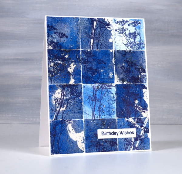
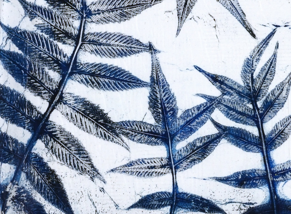
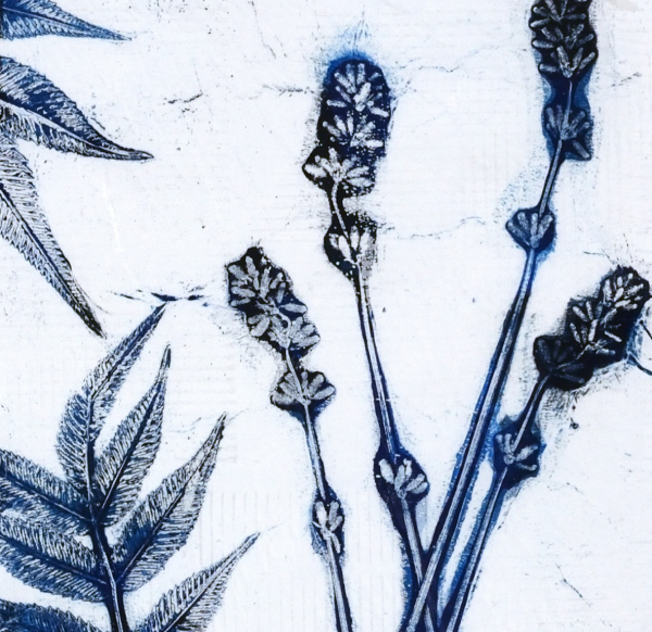
You might wonder what I do with all my gel prints, and believe me I have many, many gel prints! If I got rid of the partial prints that didn’t really work I would have less to deal with but sometimes the partial prints can become favourite cards or journal pages.
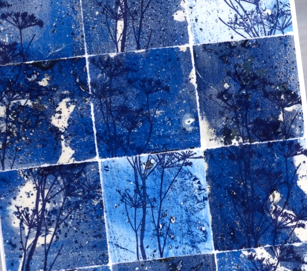
To create this collage of blues I tore a couple of partial prints into squares and stamped the delicate stamp from Darkroom Door’s nature walk set at different angles on the the squares. I put these ‘scraps’ back together and the partial prints brought shades of blue, pops of white and bits of pattern and texture.
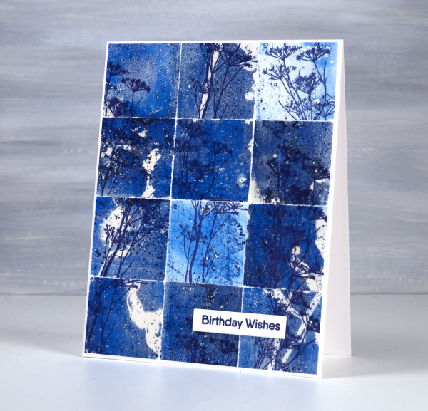
So, how many gel prints is too many? You can’t have too many!
Grafix Window Journal – Video
Posted: July 29, 2024 Filed under: Alcohol Ink, cricut, grafix, mixed media journal | Tags: Alcohol Ink, Art Journal, grafix, grafix craft plastic, Mixed Media, Ranger Alcohol Ink 1 Comment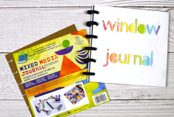
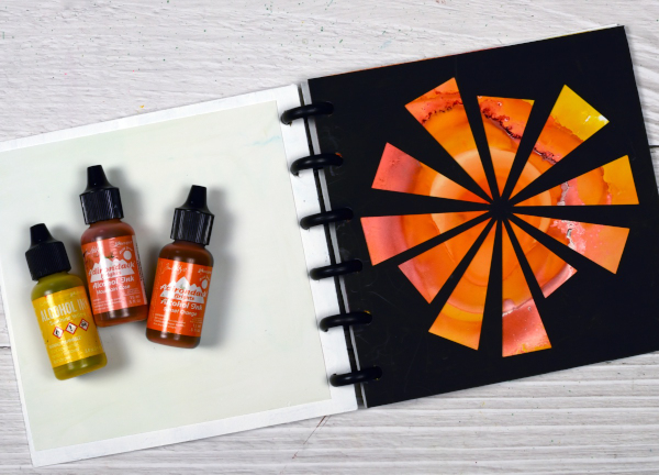
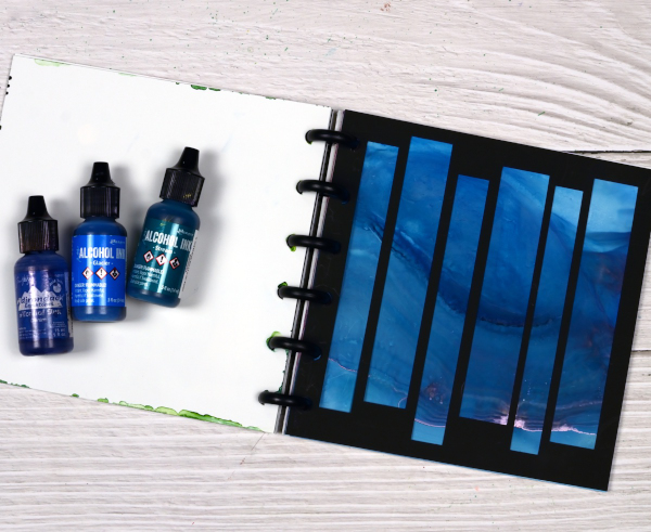
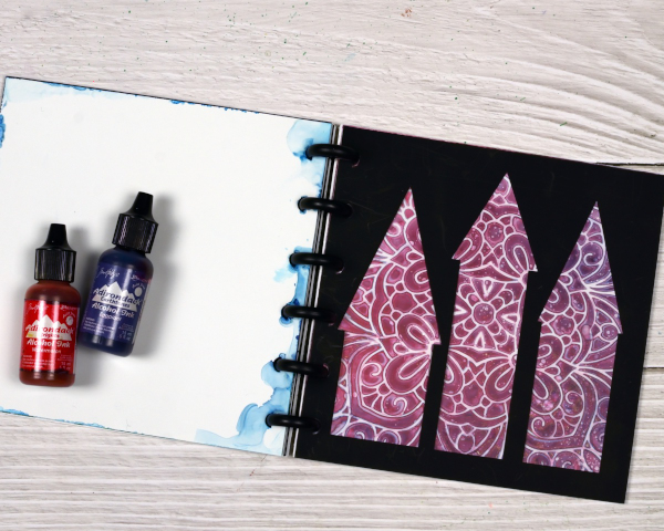
I’ve featured the Grafix Mixed Media Journal in videos a few times. I’ve made a swatch book for alcohol inks and markers and a sample book for alcohol ink techniques. Both books are good for reference. Today’s post and video feature the mixed media journal as a ‘window journal. I have added pages in pairs of black and white using the handy disc system. I have cut windows in the black pages and created alcohol ink patterns on the white pages.
You can configure the Grafix mixed media journals however you like as the pages and covers are available in separate packs or as a complete journal with different types of pages. Check out the video below to see how I put my window journal together.
You could create a window journal in many ways. I have added colour and pattern to only one side of the white pages but it would be fun to add a design on both sides so you could see the pattern through the window before the pattern and the window after.

You can see in the video that I reworked the ‘ocean’ page shown below several times. That is the beauty of white craft plastic; it is possible to take the page back to white or just dilute the ink with isopropyl alcohol and move it into a new pattern.
The final page in the book features a stencil design with alcohol inks, so simple but so effective. I cut all the windows on my Cricut using free shapes available in Cricut design space but you could cut them with dies or with a craft knife.
To see my other videos featuring the Grafix Mixed Media journal click the following links: Swatch book Swatch book cover Technique book
Brusho Daisies
Posted: July 19, 2024 Filed under: Brusho, daisy delight, Darkroom Door, Spellbinders | Tags: Brusho, brutus monroe embossing powder, Darkroom Door stamps, Spellbinders 7 Comments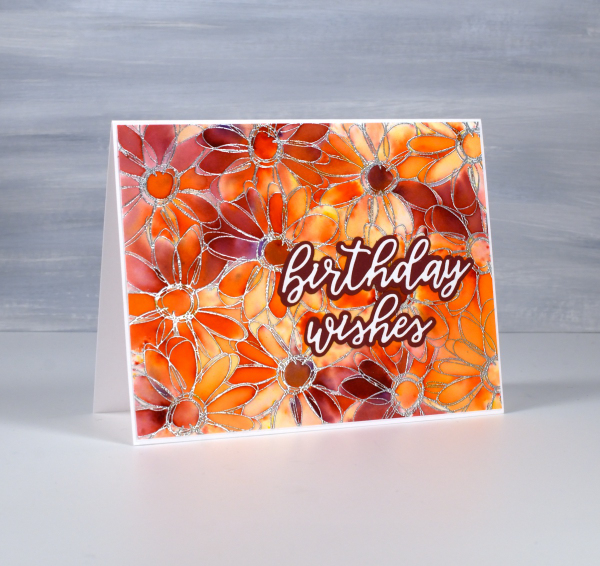
Yesterday I did some embossing with a friend and, as I was introducing her to brusho paints, I remembered how much I like the emboss resist technique with brushos. I don’t do too much heat embossing these days because of the gritty mess of embossing powder that ends up on my desk even when I am careful. But the results with brusho…
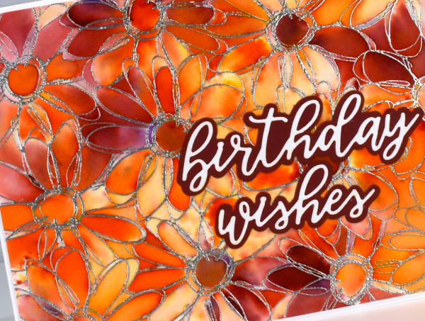
I embossed the Darkroom Door ‘daisy delight’ stamp on hot pressed watercolour paper with sterling embossing powder. I spritzed the panel with water then sprinkled orange and crimson brusho powders over the top. The trapped colour is just what I hoped for.
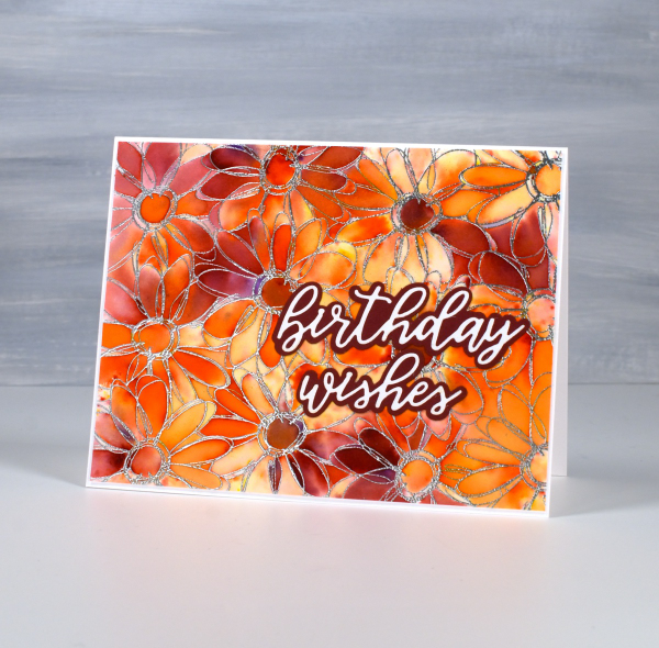
I added a Spellbinders sentiment from the die set, ‘Serenade Sentiments‘ to complete the card. So maybe it is worth getting gritty occasionally. This post includes affiliate links from Foiled Fox. If you buy through these links I receive a small commission at no extra cost to you.
Leaf & Stencil print – Video
Posted: July 16, 2024 Filed under: Darkroom Door, gel press, gelli plate, simply perfect mix & match sentiments, Tutorial | Tags: Darkroom Door stamps, gel press, gel printing, Spellbinders, video 6 Comments
Last week I shared a leaf and lavender gel print video; in today’s video I have added some gold dots through the totally dotty stencil for some shimmer and extra interest. In the video you will see the gel printing process. I turned the printed panel into five cards and I have listed the added stamps or dies below each card photo. I have an in-person botanical gel printing class coming up on Saturday July 27th and there are a couple of spaces left if you’re interested.
I added a die-cut sentiment in dark green to the panel above using the Spellbinders ‘simply perfect mix & match’ sentiment dies.
Even though I brayered blue, green and black paint very randomly on the plate, I like the way patches of one colour or another appear on the leaves.
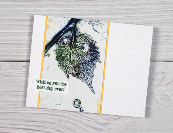
To create the card above I embossed a white panel using the Stampin’ Up embossing folder scripty, added a gold mat behind the gel printed panel and added a Darkroom Door sentiment from the ‘happy birthday’ sentiment strip.
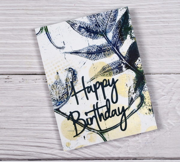
The panel above covers the whole card front and has a stacked green die-cut sentiment from the same Spellbinders set mentioned earlier. I stacked two layers for the sentiment to help it stand out from the stems on the gel print.
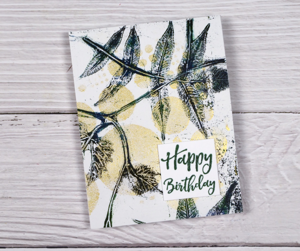
Another full card front panel above with a Darkroom Door sentiment. The gold looks shinier in real life but I think you can see some shimmer on both the card above and below.
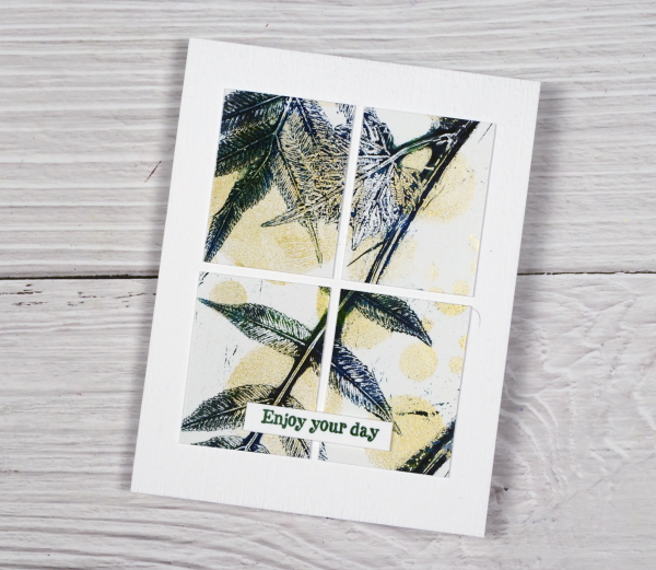
You can cut your gel print panels to any size, sometimes cutting a large shape into smaller shapes is a good way to add interest to a layout. I’ve added another DD sentiment to the card above. I had fun printing the panel and working out how to get the most out of it for cards. I can give these away individually but I think I might keep them together as a gift set.
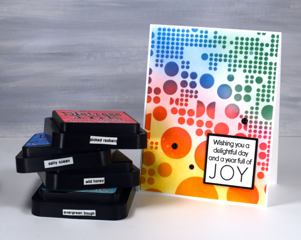
Totally Dotty
Posted: July 15, 2024 Filed under: AALL & Create, Foiled Fox store, nesting squares, Penny Black, The Foiled Fox, totally dotty stencil, Waffle Flower | Tags: AALL & Create, Penny Black stamps, Ranger Distress inks, Waffle Flower dies Leave a comment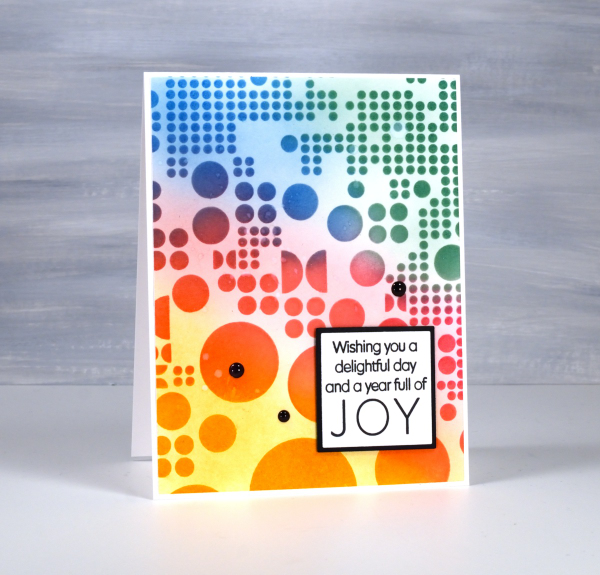
Yes, the stencil used for this card is called ‘Totally Dotty’! I mean what else would you call it? It is a large stencil from AALL & Create sent to me by the Foiled Fox so I could do totally dotty things with it. I blended inks through it for this card but I have also blended paint through it on gel prints and will no doubt use it with alcohol inks and art journals as well.
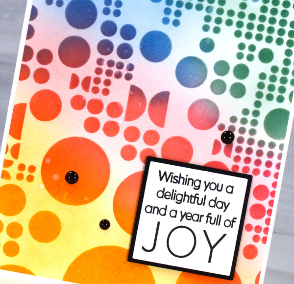
I blended wild honey, picked raspberry, salty ocean and evergreen bough distress inks through the stencil with blending brushes then, when I lifted it, blended more ink to soften the stark white background. This is a technique I’ve seen the blending wizards use.

Such a colourful background called for a contrasting sentiment so I stamped in black on white then matted in black using Waffle Flower square nesting dies. Nesting dies definitely cut down on the mistakes I make in creating very slim mats for panels. Did you see I added enamel dots; not a common embellishment for me but the water splatter just didn’t make enough impact so shiny black dots to the rescue. Make sure you pop over to the Foiled Fox blog and online store to be inspired and delighted. (Yes, there are affiliate links used in this post, no extra cost for you but a bonus to me!)
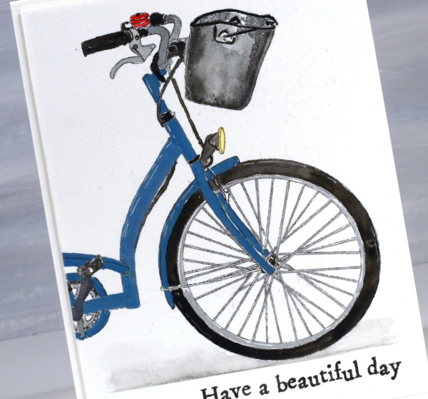
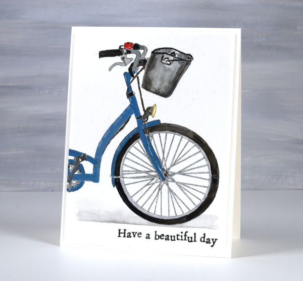
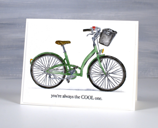
Bikes, old & new
Posted: July 11, 2024 Filed under: AALL & Create, city bike, Echidna Studios | Tags: AALL & Create, Echidna Studios, Fabriano Watercolour Paper, sennelier watercolours 8 Comments
The green bike above is a new digital bike stamp designed by my daughter. As with many of her digital designs, she snapped a photo, then turned it into a ‘storybook style’ outline drawing. It’s called City Bike and is available in the Echidna Studios etsy store as a digital stamp (not cutting file).
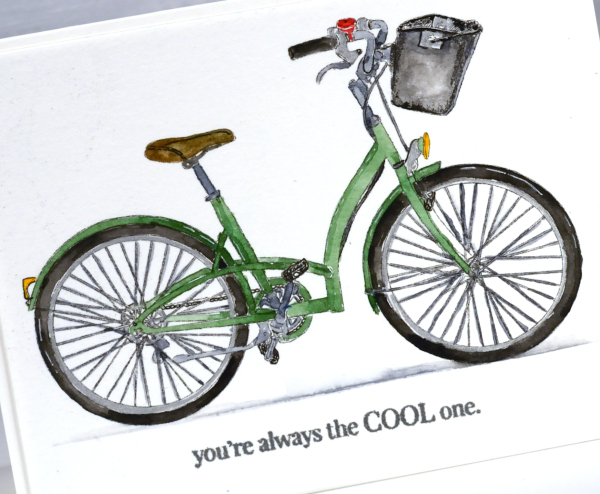
I printed the bike in two sizes on hot pressed watercolour paper so I could paint it and turn it into two cards, one landscape orientation and the second, a portrait-oriented close up of the front of the bike.

I did some of the painting with Sennelier watercolour paints but I also used a silver gel pen for the spokes and rims, metallic brush markers for the blue bike and a very fine tip black marker to go over some of the little details.
I just so happen to have a new bike of my own which means bikes are on my mind. I picked it up a few days ago and it’s definitely more modern than the one of the cards. I am pretty excited; it’s been a while since I’ve had a bike of my own and I’ve never had a new one. I have to tell you the colour is ‘sea sparkle’ which made me smile, sounds like an ink pad colour!

Back to the cards – I cut both panels with WaffleFlower A2 layering dies then added an extra panel of thick cardstock underneath to lift the picture panel a bit. I added the Penny Black ‘cool one’ sentiment and the beautiful day sentiment from the AALL & Create set ‘Everyday Sentiments’. You’ll be seeing more of the AALL & Create sentiments as they are a quirky typewriter font which I love.
Are you a bike rider? Let me know what your favourite outdoor activity is. As you may have guessed this post includes affiliate links from Foiled Fox. If you buy through these links I receive a small commission at no extra cost to you. Click over to the Echidna Studios store to see more delightful designs like this sweet bike.
Leaf & Lavender Gel Print – Video
Posted: July 9, 2024 Filed under: Classes, gel press, Tutorial | Tags: Classes, gel press, gel printing, Tutorial, video 6 Comments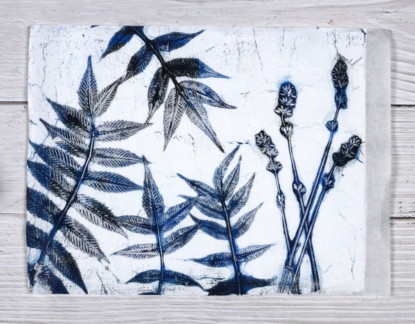
With all the summer rain and summer sun we’ve been having lately I am surrounded by plants and flowers. And when that happens what do I do? Well yes, I pick some and put them in vases. I wander around the garden and enjoy them but I also gel print them. I’ve done a couple of plant printing sessions recently and have some prints, cards and videos to share over the next few weeks.
I set up to film recently and began with what I thought would be a warm up print; I don’t always film my warm ups but I am so happy I did because I think this print was the best of the session.
I did this print without an end purpose in mind but I think it would make a great book cover for a future hand made book. The leaves look like sumac but I’m not certain. The flowers are lavender from my garden and the buds were closed when I printed them. I noticed today the buds have opened so I will pick some more and try printing them again. The fragrance was lovely as I used them but the ‘fragrance’ of acrylic paint definitely overpowers the lavender on the print.
My mind is full of botanical gel printing ideas right now as I am not only making videos but also teaching an in-person class here in Ottawa. I’ll be back with more botanical gel print inspiration soon as I’ve already turned some prints into cards.
Stencils + Alcohol Inks
Posted: July 5, 2024 Filed under: Alcohol Ink, brush lowercase alphabet, coloring book stencil, cricut, grafix, Picket Fence, Spellbinders | Tags: Alcohol Ink, cricut, grafix craft plastic, picket fence, Spellbinders 6 Comments
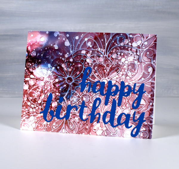
An amazing thing happened with this card. It arrived on the birthday, after being sent from Canada to Australia by an unreliable sender(me)! So now the recipient has it I am posting it here on the blog.
I have shared cards made with this technique before; it’s a fun one. I used alcohol inks on Grafix white craft plastic and for both cards I only used two inks along with isopropyl alcohol.

I start with a layer of isopropyl alcohol on the panel, then add a couple of alcohol inks and tilt the panel to move the inks and cover the whole panel. Next I drop a stencil on top, for both these cards I used the Picket Fence ‘coloring book’ stencil; it’s 6″x6″ so the panel was larger than needed for my finished card.
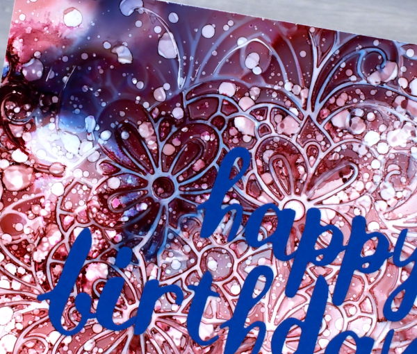
Because the ink is trapped under the stencil it takes a while to dry. Sometimes I help it along with an air pump, not a heat tool. When it is dry I like to splatter some isopropyl alcohol lightly over the panel to get little dots here and there. I don’t flood it because that would take me back to the beginning of the process. When the ink is dry I lift the stencil to reveal the intricate pattern, then choose which part of the panel I want for my card front. If I don’t like the finished panel I add more isopropyl alcohol and tilt the panel to dilute all the ink and start again. That is the beauty of working on grafix white craft plastic; you get second chances and even third or fourth if you’re fussy like me!
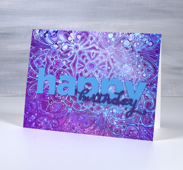
The sentiment on the card above is a combination of cricut letters and a Penny Black birthday die. On the card below I used the Spellbinders brush The sentiment on the card above is a combination of cricut letters and a Penny Black birthday die. On the card below I used the Spellbinders brush lowercase alphabet dies.
Vintage Patio set
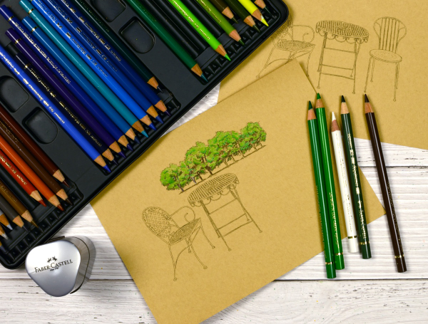
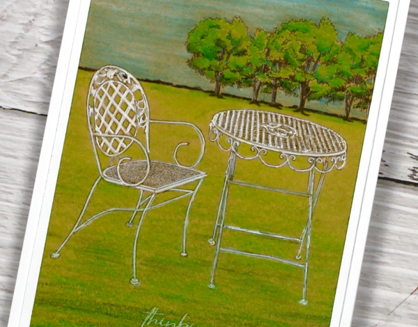
Posted: June 26, 2024 Filed under: Coloured pencil, Echidna Studios, Tori's Trees, vintage patio set | Tags: Echidna Studios, Faber-Castell Polychromos Colour Pencil 4 Comments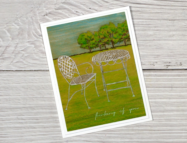
There are some lovely new summer digital images in the Echidna Studios etsy store. My daughter has been busy turning her own photos into line art for printing and colouring. I chose coloured pencils for the Vintage Patio set and added Tori’s Trees to the background. I have fun creating scenes with digital images. Even though the Vintage Patio set includes a table and two chairs I used only one chair on my card and added trees from a different digital set. Adding the ‘thinking of you‘ sentiment gave the card the card a bit of a ‘miss you’ vibe. I always like the look of coloured pencils on kraft paper so I used my Faber Castell polychromos for this card.
My initial plan was to colour the grass gradually wider from the edges of the trees to the chair and table, creating a wedge shape. I coloured the trees first with three greens then used the same greens plus a couple more to add the grass.

When I had coloured all the grass I used white and grey pencils to colour the table and chair but the green underneath muted the white so I used white gel pens to make the furniture pop. Keeping the wedge shape looked odd so I used my rectangle dies to help me ‘frame’ the image and choose a suitable cropped size.
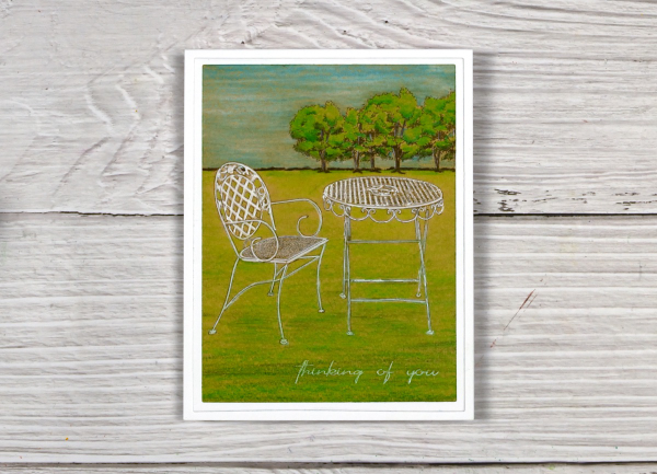
I matted the little scene with a white frame and added it to a white card base. Make sure you pop over to the Echidna Studios store to see the other summery images along with some new ‘ready to print’ coloured cards. We would love you to follow Echidna Studios on Pinterest if you use it; it will help us reach a few more card making enthusiasts!
This post includes an affiliate link from Foiled Fox. If you buy through these links I receive a small commission at no extra cost to you.
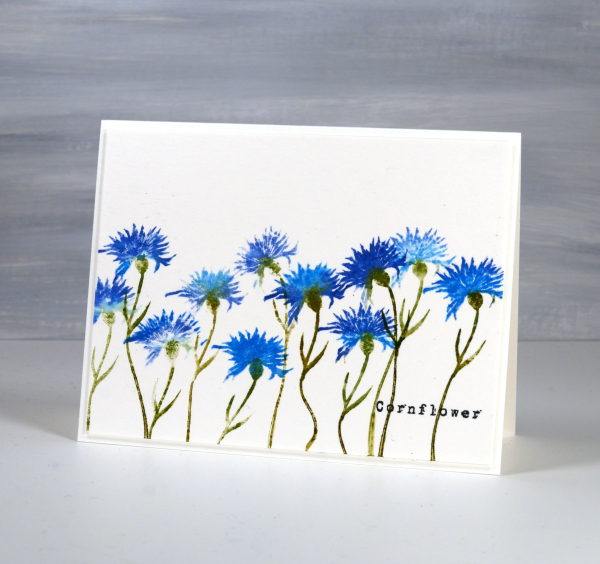
Cornflowers
Posted: June 20, 2024 Filed under: AALL & Create, cornflower, Foiled Fox store, The Foiled Fox | Tags: AALL & Create, Fabriano Watercolour Paper, Ranger Distress inks 7 Comments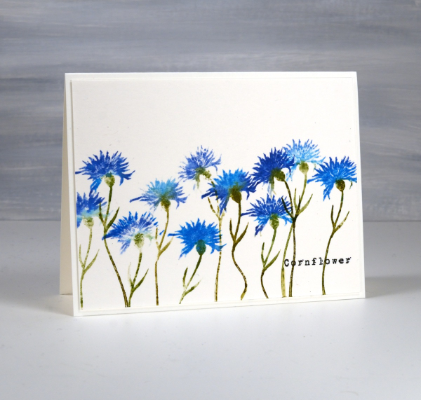
I have cornflowers growing in my garden but they are still quite small seedlings so no signs of flowers at this stage. I am hoping they will bloom some time this summer. Meanwhile I’ve been stamping some, in blue of course. I had blue cornflowers in my wedding bouquet and flower crown so they are quite special to me.
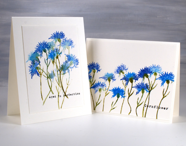
I’ve teamed up with the Foiled Fox to bring you this post and it is wonderful to be collaborating with them again. The stamps featured on today’s cards are from AALL & Create; the set is called ‘Cornflower‘ and includes two flower stamps and two sentiments.
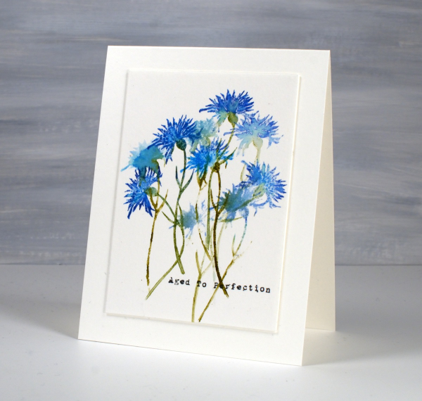
I’ve stamped the solid cornflower stamp repeatedly to create these two cards using a couple of techniques to make the flowers look different. The stem on the stamp is thin and bendable so I was able to make the flowers lean left or right and even have a wiggle in the stem! I inked the petals with both prize ribbon and salty ocean distress inks, spritzing the stamp before pressing it on the hot pressed watercolour panel so the inks blended. I also did some second generation stamping to get paler impressions of the flowers.
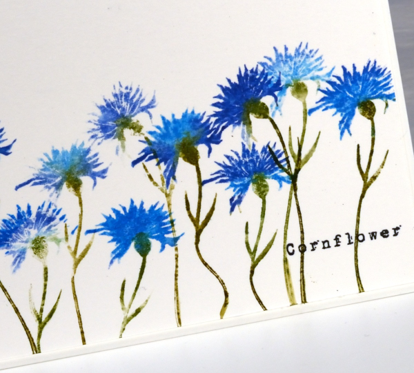
You might know that I love typewriter font so I was very happy to see a couple of word stamps in a slightly distressed typewriter font. I added them with versafine clair nocturne ink because it is such a crisp reliable ink. Thanks for dropping in; I hope you will go and check out the wealth of inspiration on the Foiled Fox blog and have a browse around their lovely online store while you’re there. (Naturally this post includes affiliate links, feel free to use them.)