Beauty of the Earth journal page
Posted: January 26, 2022 Filed under: Art Journal, Brutus Monroe, Darkroom Door, honeycomb, Nature Walk, number medley, Stencils, World Map, you are everything | Tags: Art Journal, Darkroom Door stamps, Darkroom Door stencils, Ranger archival inks, Ranger Distress inks, Ranger Distress stains 5 Comments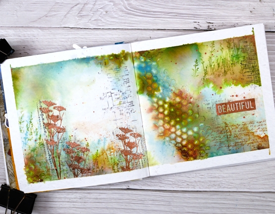
I have another double page spread in the 6″x 6″ journal today. Don’t tell the others but this one seems to be getting all the attention at present!
The pages in this journal are thick watercolour paper so I wanted to take advantage of that and use watercolour techniques. Most of the pages I have completed up until now have had a base layer of gesso or acrylic paint.
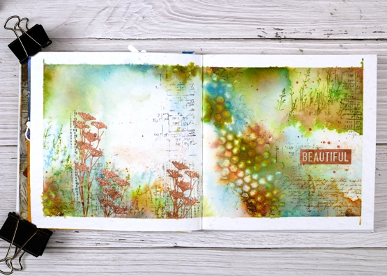
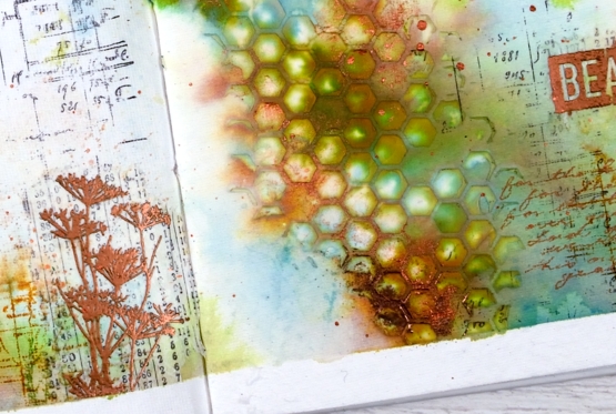
As you can see I taped the edges of the pages with tape before starting. I added some stamping in black here and there using a stamp from the Darkroom Door ‘number medley’ set. Next I used the DD ‘honeycomb’ stencil and modeling paste to add a texture strip from left to right down the centre of the spread. I added a small section bottom left also. Once the paste was dry I began painting colour around the honeycomb and across both pages. I spent a while doing this so as to see the blends and build up some depth of colour.
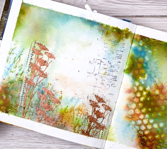
Other than some black stamping I used only three colours of distress ink, both spray stain and from the ink pads. I took care to keep some white space; sometimes I realise too late that I have colour all over the pages. I stamped some grasses in peeled paint archival ink so they would not dilute and broken china distress ink so they would dilute. I also stamped sections of the world map in rusty hinge. Although I loved the combo of peeled paint, rusty hinge and broken china I thought a bit of metallic shine would be nice so I added some wildflowers embossed in Brutus Monroe ‘penny’ powder.
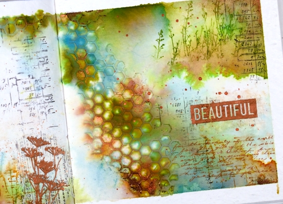
With a copper coloured gel pen I wrote the first verse of ‘For the Beauty of the Earth’ in the lower right hand corner then added the embossed word ‘beautiful’. And of course there is some copper splatter to finish it off. This is a style and look I have been hoping to create so you’ll probably see a few more like this one.
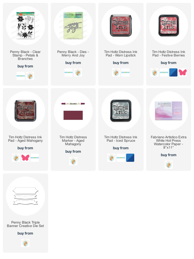
Supplies
(Compensated affiliate links used when possible

Winter Wildflowers
Posted: January 10, 2022 Filed under: Darkroom Door, Nature Walk, Woodgrain | Tags: Darkroom Door stamps, Ranger archival inks, Ranger Distress inks 4 Comments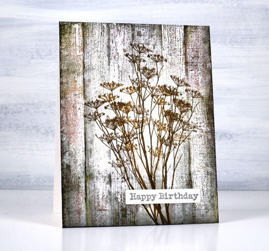
The bright and beautiful flowers of spring and summer delight me as you know but so do those left standing through autumn and winter. On a snowy walk recently I was happy to see the brown tones that show up bold and contrasting against the snow. Queen Anne’s Lace closes up and dries out after summer but that makes it all the better to balance some snow like icing.
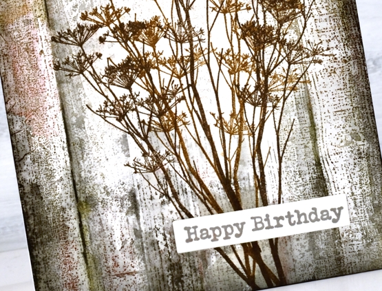
For this wintery image of dried stems against aged wood paneling I stamped the flower stems from Darkroom Door’s ‘nature walk’ first in brown archival inks so they wouldn’t blend when I worked on the background. I stamped the DD ‘woodgrain’ stamp over the top first in hickory smoke distress ink then a few more times adding black soot, forest moss and barn door distress inks. I blended as sparingly as I could to retain the texture of the stamp.
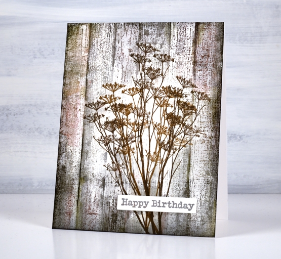
I added a sentiment from the DD ‘happy birthday’ set and now I am wondering if I can recreate the same aged wood effect on a journal page. This seems to be the way I roll at present; a journal page inspires a card then a card inspires a journal page.
By the way my Art Journal Adventure class has been postponed for now due to current restrictions here in Ontario but we will reschedule when possible. In the interim I will continue scheming and dreaming up themes and techniques!
Supplies
(Compensated affiliate links used when possible)
2022 BuJo – January theme
Posted: January 5, 2022 Filed under: Bullet Journal, Darkroom Door, Dingbat notebooks, majestic mountains, pine cones | Tags: Darkroom Door stamps, Dingbats notebook, Ranger Distress inks 6 Comments
My plan for the new year was to take a different artistic route with my bullet journal themes but here I am with the same mask, stamp, blend approach. I still have fifty pages left in my current journal so I will continue in a similar style for now and make some changes when I switch to a new one.
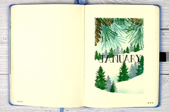
I masked the edges of the page with painter’s tape for delicate surfaces but it was still a bit sticky for the smooth bullet journal page. I did press it on my clothes first but I think post it tape is a much better choice.
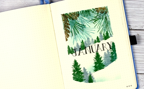
As well as a masked frame around the page I tore tape to mask snow hills across the page. I used the pinecones and needles from Darkroom Door’s ‘pine cones’ set and trees from the DD ‘majestic mountains’ set.

The inks are all distress inks (listed below) and you can see a bit of bleed through the paper. The juicier the ink the more likely it is to show through. None of the ink went right through the page so it doesn’t bother me or stop me from using the pages. I used a black fineline pen to rule the lines and letter the headings.

After a year using this particular dot journal I am still a big fan of the quality but havent’ settled on the best way to keep track of work projects past, present and future. I also want to come up with a workable chore tracker, not nearly as fun as the project tracking but necessary!
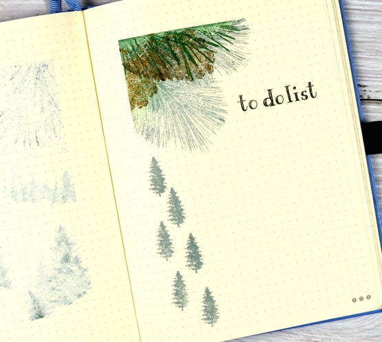
As I look at my ‘to do list’ page above I’m not so keen on the little trees to mark the list items; they look like tree shaped rain drops falling from a pinecone!
I’ll be setting up a new booklist for my 2022 reading and plan to put all the birthdays on one spread too. That won’t guarantee that I will remember to send greetings but it might help.
Supplies
(Compensated affiliate links used when possible)
Wintertide Blue
Posted: December 30, 2021 Filed under: Penny Black, wintertide | Tags: Fabriano Watercolour Paper, Penny Black stamps, Ranger Distress inks, sennelier watercolours 10 Comments
This beautiful ‘wintertide’ stamp from Penny Black is a scene in itself and the first time I stamped with it I didn’t add to it at all. This time I painted extra trees in the background for a bit more depth and atmosphere.
I began by punching a little circle mask from masking tape and placing it on the hot pressed watercolour panel. I wet the panel then painted a mix of dark blues and grey paint over some areas, leaving a few white patches. While the paint was wet I painted trees in the background which ended up with soft edges because I was working wet into wet. I sprinkled salt over the sky area and let the paint dry.
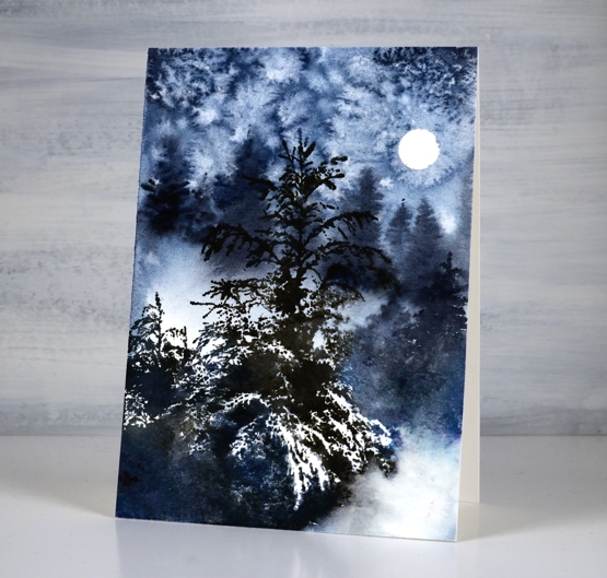
Once the paint dried I removed the salt and used a stamp positioner to stamp the ‘wintertide’ image in black soot and faded jeans ink. The little trees to the right of the feature tree were too small in comparison to the painted background trees so I painted taller trees over the top. I did a little blending of ink here and there but the stamp is so detailed with its branches and white space I tried not to fiddle with it too much. This will be the last post for 2021, I look forward to sharing projects, ideas and conversation with you here on the blog in 2022. Happy New Year!
Supplies
(Compensated affiliate links used when possible)
Woodsy Winter
Posted: December 28, 2021 Filed under: Penny Black, woodsy | Tags: Penny Black stamps, Ranger Distress inks, Ranger Distress stains 9 Comments
A winter scene for a winter birthday. Makes perfect sense especially when the recipient loves nature and spends as much time as possible enjoying the outdoors.
This card was a commission and I did plan it in my head before I began. I ended up making it twice, not because it didn’t work but because I smudged the black ink (final stamping step) before it dried! I started by blending the sky in evergreen bough and speckled egg distress ink then stamped background trees in speckled egg ink. There are three trees in the Woodsy set from Penny Black so I repeated them to fill the top of the panel then changed to iced spruce to stamp another line of trees further down and hickory smoke to stamp another line. Each colour was darker than the previous and the trees more prominent and forward in the design. Once all but the black trees were stamped I painted all their trunks just by blending the stamped ink. I used the same inks to paint shadowy dips at the base of the trees then when that was dry stamped the final foreground trees in black soot ink.
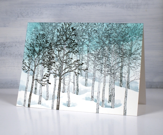
To finish I splattered white paint over the scene. The origin of this card goes way back to a card I made in 2012 using the famous Stampin Up set ‘lovely as a tree’.
Supplies
(Compensated affiliate links used when possible)
Vintage Candlelight
Posted: December 21, 2021 Filed under: candlelight, Footnotes, Karin brushmarkers, Penny Black | Tags: Fabriano Watercolour Paper, Karin brushmarkers, Penny Black stamps, Ranger Distress inks 5 Comments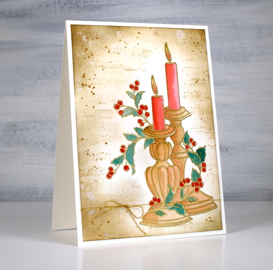
It has been a while since I created a vintage style card but the pretty ‘candlelight’ stamp from Penny Black has worked well for this technique. I embossed the image on hot pressed watercolour paper in gold powder then used Karin brush markers to paint the candles and foliage before switching to distress inks for the background.
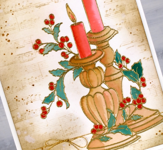
It probably wont surprise you that I used a limited palette for the colouring. I used a mix of red-209 and magenta red-170 to paint the candles, a mix of rosewood-272 and magenta red for the candle sticks, a mix of rosewood and lush green-228 for the leaves and straight red for the berries.
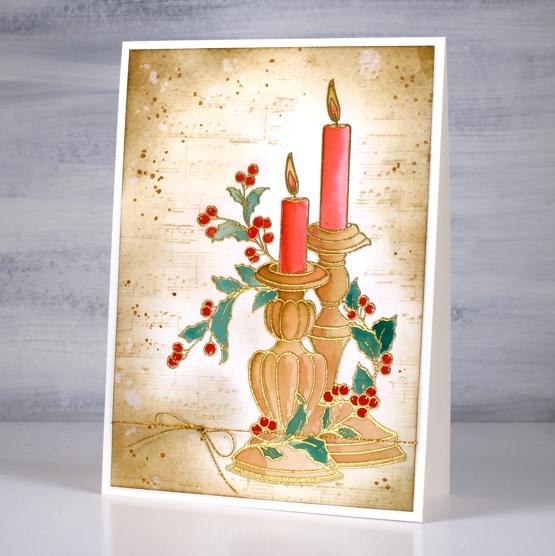
As usual I had not planned my background before I started but the colours on the candlesticks already looked vintage so I blended antique linen around the edges of the panel first then blended right up to the stamping. I stamped the music stamp from the PB set ‘footnotes’ in vintage photo then added more blending and splatter with the same ink. The stamp is tall so the card is A6 (4½” x 6¼”).
As the days are so short right now I am enjoying lighting candles and sometimes the fire. Hope things are cosy where you are.
Supplies
(Compensated affiliate links used when possible)
Brilliance and Joy
Posted: December 17, 2021 Filed under: berries, Dies, jumbo joy, Penny Black, Taylored Expressions | Tags: Penny Black creative dies, Penny Black stamps, Ranger Distress inks, Taylored Expressions 3 Comments
Today’s cards are similar to a recent collection I posted stamped with the delicate pines stamp. I created eight cards this time and repeated some designs because I’m getting down to the wire with these last cards.
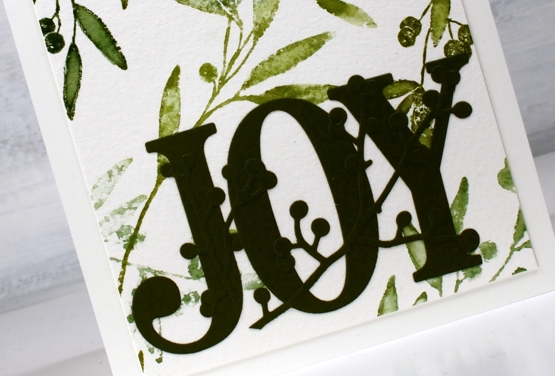
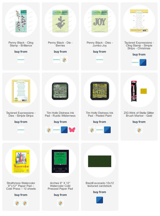
I stamped the ‘brilliance’ foliage stamp on a large 11″x14″ cold press watercolour panel in rustic wilderness and peeled paint inks. I blended the leaves with water and with a gold wink of stella pen so some have some shine.
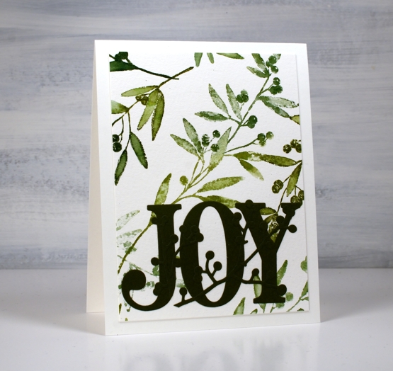
I played around with a few options for colouring the berries but ended up leaving them green. Red paint pen was not bad but not better and vanilla sparkle embossing powder didn’t work either, so green and natural they stayed. I used a few dies from Penny Black and a sentiment strip from Taylored Expressions and eight more cards were completed. Some were sent straight away and didn’t even make it to the photo shoot!
I have received some lovely cards this week from across the city, country and world. Thank you so much for brightening my day and inspiring my creativity.
By the way, we have added another Art Journal Adventure workshop at Crop A While on Saturday January 22. Click here for more information
Supplies
(Compensated affiliate links used when possible)
Quick inky sky
Posted: November 24, 2021 Filed under: gorgeous grove, Penny Black | Tags: Fabriano Watercolour Paper, Penny Black stamps, Ranger Distress inks 7 Comments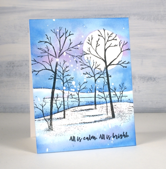
I’ve made many of these snowy scenes over the years but this was one of the quickest because the scene is all in one stamp. I already had a piece of hot pressed watercolour paper splattered with masking fluid, so that also cut out some time.
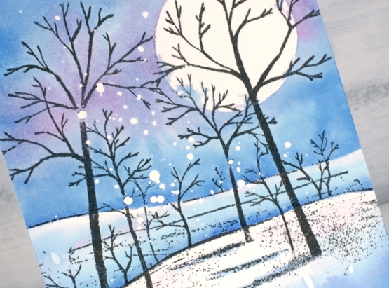
I stamped the PB ‘gorgeous grove’ stamp in versafine clair morning mist ink which I think I like better than black when the sky is not very dark. After stamping I added a frisket film circle mask which I did not seal perfectly but that’s ok; there’s a bit of cloud cover creeping over the moon.
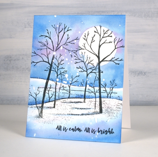
I didn’t want to spend too much time choosing colours so I just pulled out three of the newest distress inks. I’m still experimenting with the new colours so I started by painting salvaged patina around the moon then blending it with water to fill the top half of the panel above the horizon. Next I added prize ribbon ink just about everywhere and then some dabs of kitsch flamingo. I would not normally use these three colours together but it worked as distress blends often do. Once the sky was painted I dried the panel before using the same inks to paint shadows in the foreground and behind the snowy hill. The words are from PB ‘Christmas sentiments’ set stamped in morning mist to match the trees.
By the way I have a little sale going on over at my online classes site. If you use the code HTNOV you can get a 25% discount on the Floral Faves class, Winter Wonder class and the Colour Clues class.
Supplies
(Compensated affiliate links used when possible)
Let Heaven and Nature Sing
Posted: November 19, 2021 Filed under: CAS, nature sings, Penny Black | Tags: Faber-Castell Albrecht Durer Watercolour pencils, Fabriano Watercolour Paper, Penny Black stamps, Ranger Distress inks 9 Comments
This sweet bird is one of four in the Penny Black set ‘Nature Sings’. It is my plan to make a similar card with all four birds. I returned to a very clean and simple style for this one utilising some masking, blending and watercolour.
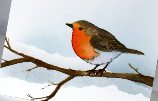
I worked on hot pressed watercolour paper because I knew I would watercolour the bird. Before stamping I tore a post-it note mask and lay it across the panel then blended speckled egg ink above it. I stamped the bird in soft stone papertrey ink then watercoloured with a few distress inks. The colours are listed below. The bird was floating in mid air so I drew a branch with a watercolour pencil then painted it with distress inks so he would have somewhere to perch. At this point I added a second area of masked blending to the background.
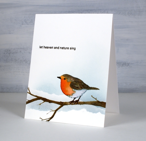
To finish off I stamped one of the sentiments from the same set in fallen leaves versafine clair ink. It just so happens that the CAS Christmas Card challenge this month is Christmas Critters so I am in!

Supplies
(Compensated affiliate links used when possible)
Back on Craft Roulette
Posted: November 17, 2021 Filed under: birds and banners, Dies, Penny Black, petals & branches | Tags: Penny Black creative dies, Penny Black stamps, Ranger Distress inks 5 Comments
I was once again a guest crafter on Craft Roulette last Friday night and it was loads of fun. Mary Gunn, the host keeps the action going with crafting, chatting, and sharing over eighty card samples made by viewers. To see Mary and I chat and create pop over to the Craft Roulette youtube channel. (To just watch the card making part you can skip to 55:11)
Craft Roulette is a crafting game show where a wheel is spun four times to choose four parameters which must be used on the project being created live during the show. Last Friday the parameters were:
Card type: ‘Lil Chubby’ ( like a slimline but wider)
Colour choice: Warm colours
Element: ‘It’s a sign’
Random: Crumpled paper
The finished card is 4″x 8″ with a blended background that I patterned with a wet crumpled tissue. The colours are warm and that banner die looks like a ‘sign’ to me so I squeaked it in.
It was lovely to see some familiar names in the chat, encouraging me and asking questions. Thank you Karen for staying up late in Wales to watch. I didn’t see all the chat because, well, I had to do some crafting but I was able to read some of it. My dad watched from Australia and was chatting along.
There is definitely an added pressure when crafting live but it is all great fun and the community is such a friendly supportive one. If you have never watched Craft Roulette, I highly recommend!
Supplies
(Compensated affiliate links used when possible)