
Dotty thanks
Posted: April 12, 2019 Filed under: big thanks, dots and hearts, dotted fill in | Tags: Concord & 9th, Ranger Distress inks, Tsukineko Versafine inks 5 Comments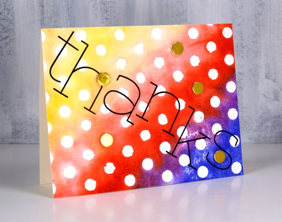
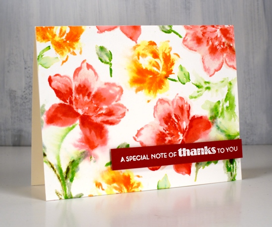
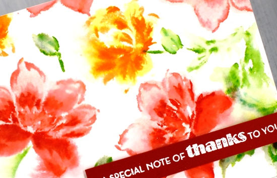
Polka dots are make happy patterns in my opinion. Add rainbow colours and it’s a double happy. I created this simple card with the Concord & 9th ‘dotted fill-in stamp set’. I inked the background stamp with a rainbow of distress inks, spritzed the stamp with water to blend the overlapping colours a little then stamped on watercolour paper.
I thought a bold black sentiment would stand out so I arranged the letters from the C&9 ‘big thanks’ set across the panel and stamped in versafine clair nocturne ink. The only embellishments are little gold circles die cut with the ‘dots and hearts’ die from gold foiled cardstock and popped up over a few of the polkadots.
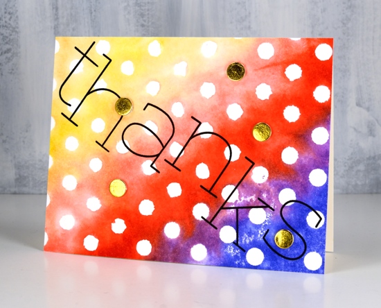
So simple. So dotty. So happy.
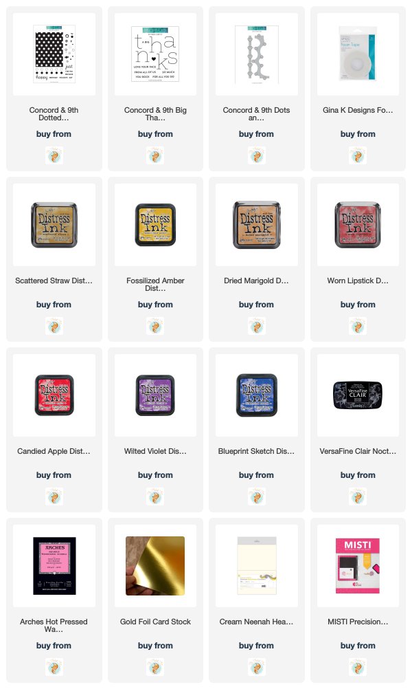
Supplies
Blooming journal page
Posted: April 8, 2019 Filed under: Art Journal, Hand lettered, Hypnotic, Penny Black, Script, timeless, winter branches | Tags: Penny Black stamps, Penny Black stencils, Ranger Distress inks, Ranger Distress stains 13 Comments
I’m been working in one of my Fabriano Venezia art journals again experimenting with vintage style. I started by painting absorbant ground over the double page spread then stamped the PB ‘script’ stamp in tea dye and antique linen distress inks. I spritzed the inked stamp before pressing it onto the page so I would get blurred prints.

Once that dried I spread modeling paste through the PB hypnotic stencil and had to go and do something else so I wouldn’t mess it up before it was dry. Even so I still stuck my finger on it while it was wet and smudged some.

Once the paste dried I spritzed the ‘see ya latte’ shimmerz spray over the pages then wiped it off the stencilled area so it would darken the background. I am not an experienced art journaller but I am using one to try things out. On this page I was trying to create a vintage look. I stamped the ‘timeless’ rose stamp from Penny Black three times in brown distress inks then blended the ink into the petals. My journal is not watercolour paper so ink and paint don’t move on the page as easily. I didn’t like the roses enough to keep them all, instead I covered some with flowers cut from leftover Italian papers. I glued them on with matte medium and painted diluted gesso over them to decrease the contrast then added a bit of distress vintage medium for the aged tea stain look.

I did a smaller collage of flowers on the opposite corner then stamped PB winter branches over the pages with vintage photo and ground espresso distress inks. I added some pretty scroll stamping with the PB set ‘flourish borders’ in white ink and some more of the ‘script’ stamp in brown ink. Tattered rose distress stain matched the paper flowers so I splattered a decent amount of that over everything too! I mentioned on my previous journal page post how I struggle with adding words to a page. I chose a quote from Ruth Chou Simon’s book ‘Gracelaced‘ which encourages and challenges me every time I open it. I wanted to write the words with my nib pen but when I tried, the ink spread into the page and looked like a blob so I wrote on calligraphy paper, tore the words into strips and glued them over the blob. Some of the letters are blurred because I didn’t let it dry long enough. I need a bit more patience when working in my art journals…
Not exactly what I set out to create but as I said, the art journal is for playing with mediums and ideas. Have a great day
Supplies
Butterfly Garden
Posted: April 3, 2019 Filed under: butterfly garden, Penny Black, Tagged | Tags: Peerless Transparent Watercolors, Penny Black creative dies, Penny Black stamps, Ranger Distress inks, Tsukineko Versafine inks 3 Comments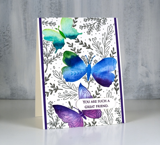
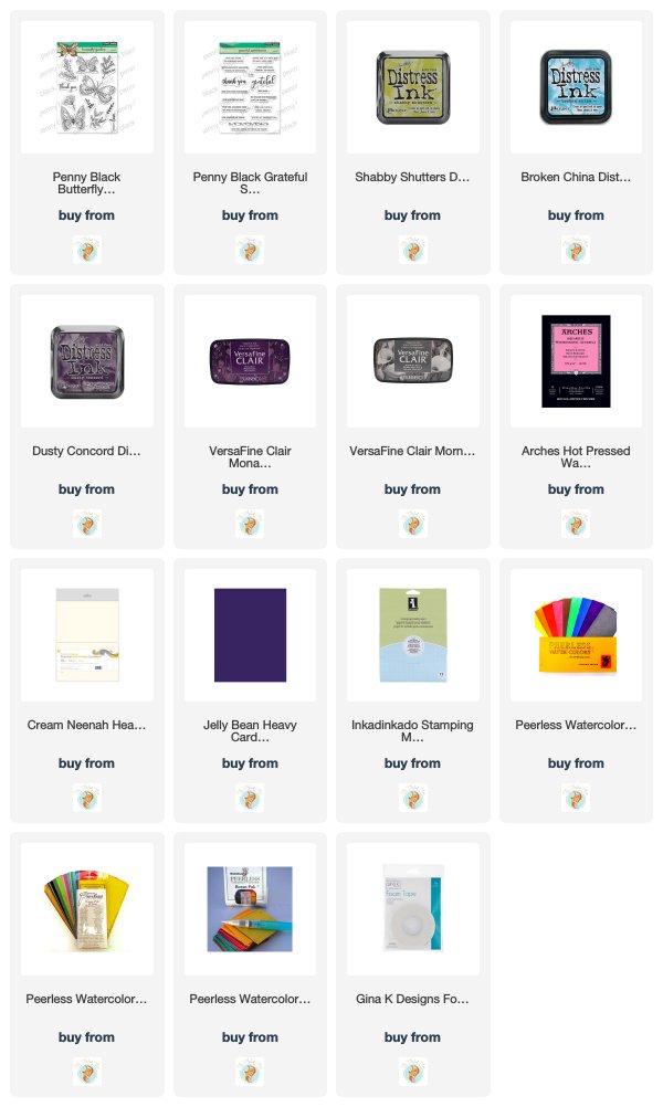
Butterfly garden is a new transparent set from Penny Black with a nice mix of butterflies, leaves and flowers. I chose to watercolour the butterflies first then mask them before adding background foliage. I stamped the top butterfly in shabby shutters distress ink, the middle in broken china and the bottom one in dusty concord on hot pressed watercolour paper.
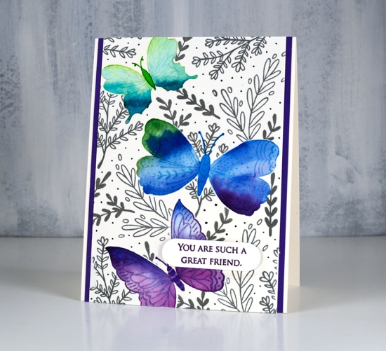
I used peerless watercolours to fill each butterfly with colour starting with a light green then blending to darker greens to fill the wings. I then added green first to the middle butterfly and blended into blue and a little bit of purple. The last one I blended from blue to purple. I stamped them again on masking paper, cut them out and covered the watercolouring before stamping leaves all over the panel in morning mist versafine clair ink. As I wanted to fill the panel with lots of stamping I used acrylic blocks so I could easily turn the stamps around to fit them in all the spaces. I drew little dots in grey marker to fill the background even more.
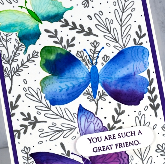
To finish the card I matted with purple cardstock, stamped a sentiment from the PB grateful sentiments set in monarch versafine clair, die cut it and popped it up with Gina K’s dimensional tape which adds just a little height without being too bulky.
Supplies
Darkroom Door wedding cards
Posted: March 25, 2019 Filed under: Darkroom Door, Nature Walk, tall flowers, Woodgrain | Tags: Darkroom Door stamps, Ranger Distress inks, WOW embossing powders 9 Comments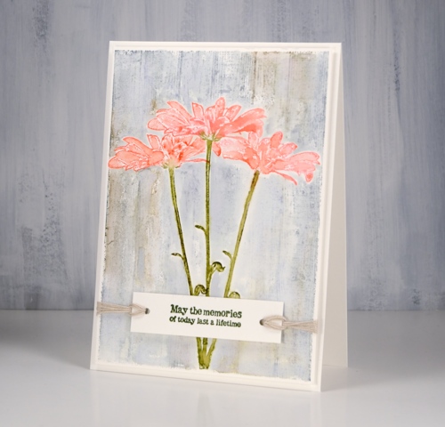
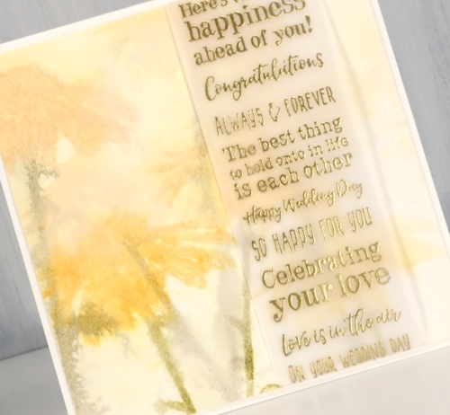
I’ve been creating with the tall flowers and nature walk stamps from Darkroom Door again, this time with a wedding theme in mind. Darkroom Door now has eight different sentiment stamps collections in list format, each one has a different theme. For two of today’s cards I isolated one sentiment by masking either side but on the second card I used a large chunk of the stamp as a feature over a soft blurry floral background. I am over on the Darkroom Door blog sharing these cards so make sure to pop over there for more details on my process.
This first wedding card made me think of a country style-decorate the barn type of wedding. I did a bit of masking to get the look of three daisies against a timber background and used twine to keep things natural and not too fancy. I inked the daisy from ‘Tall Flowers‘ set in worn lipstick, abandoned coral, forest moss and peeled paint distress ink, spritzed lightly with water and stamped in centre of a hot pressed watercolour paper panel, then used masks to stamp another on each side. I masked all three daisies so I could stamp the Woodgrain Background Stamp in weathered wood and frayed burlap distress inks.
My second card features the ‘wet on wet’ watercolour technique. The watercolour panel was very wet before I stamped the daisy stamp in wild honey and forest moss distress inks. I restamped to get paler images then dried the panel before wrapping a vellum strip with gold embossed wedding sentiments over the stamped flowers.
The very blurry style is not for everyone but in real life it does have a soft romantic look to it.
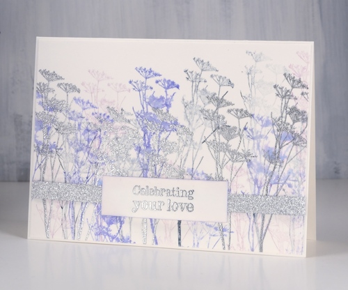
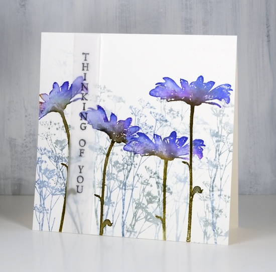
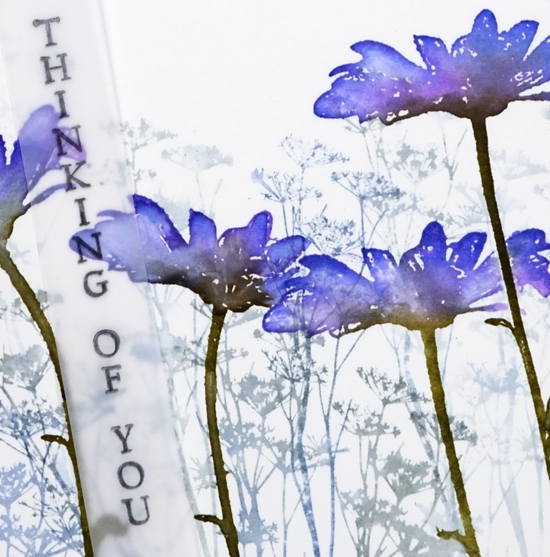
My final card features wildflower silhouettes in blueprint sketch and milled lavender ink stamped repeatedly to get first, second and third generation images as well as silver embossed flowers and sentiments with some very sparkly silver ribbon.

Working with sentiment strips that have fifteen different sentiments gives me plenty of options, some of the ‘wedding’ sentiments are totally appropriate for other events too.
I enjoyed the process of creating wedding cards in three different styles and I know I could have gone even fancier. What’s the fanciest card you have ever made?
Supplies
At Grace
Posted: March 12, 2019 Filed under: at grace | Tags: Penny Black stamps, Ranger Distress inks, Ranger Distress stains 5 Comments
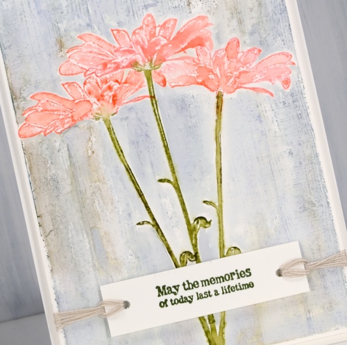
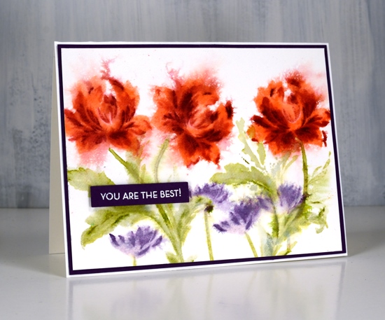
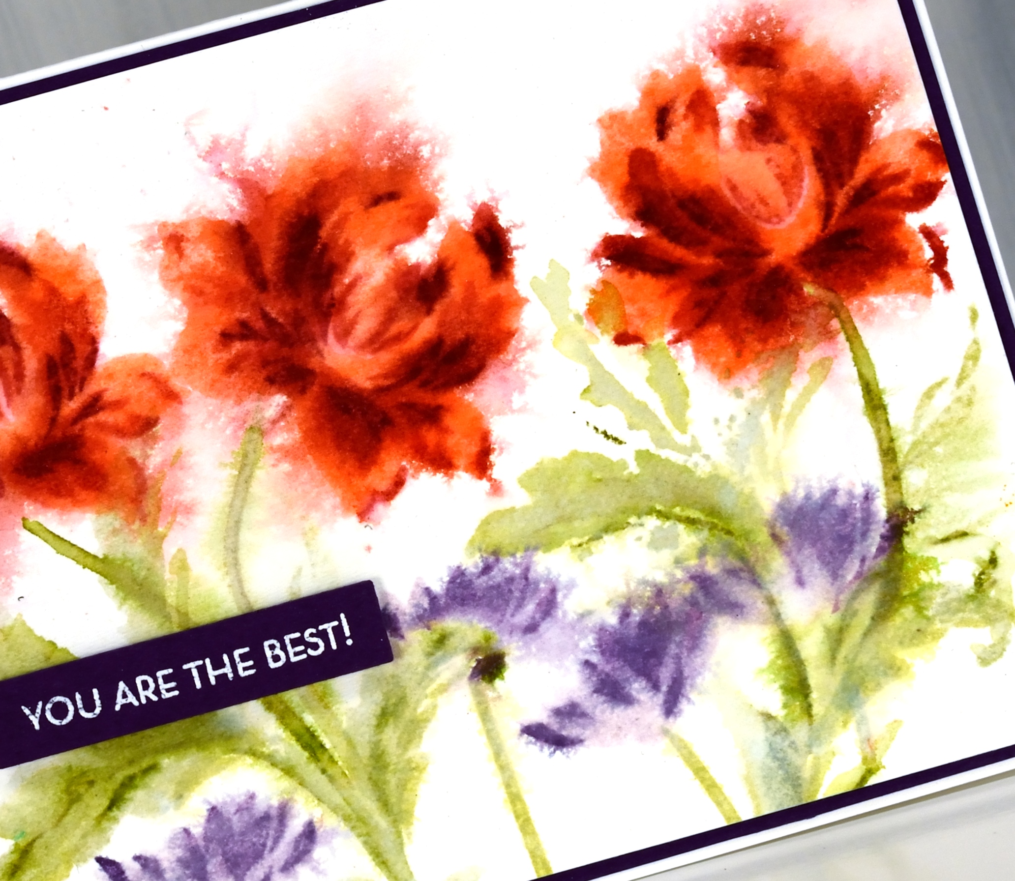
These lovely magnolias are part of the new ‘Timeless’ release from Penny Black. The stamp is quite a large one but I have stamped twice on this panel to cover most of the card front. I used my stamp positioner so I could build up the colour in the petals step by step.
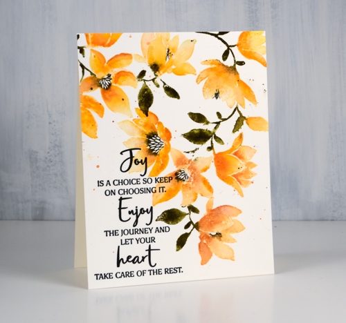
I started by stamping the whole stamp in scattered straw distress ink on hot pressed watercolour paper. While in the positioner I used dried marigold, carved pumpkin, spiced marmalade and rusty hinge inks or markers to gradually add darker colours on the flowers to create depth and shadow. I painted over some of the petals to soften the blends then moved on to stamp the leaves and stems in forest moss stain. Finally I inked the centre of the flowers with a black soot marker to stamp the patterned section.
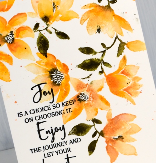
Before stamping the sentiment from the new ‘sentiment stamp set’ in versafine clair nocturne ink I splattered some green and orange ink over the panel.
I am thoroughly enjoying reading what your favourite flowers are. Thank you for participating in the giveaway: it is still open so pop over to my previous post if you haven’t entered yet.
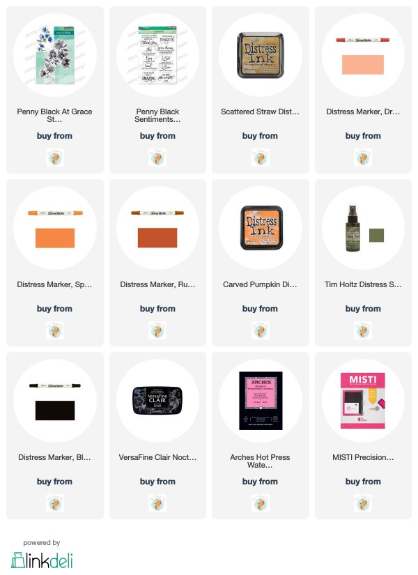
Supplies
Steps journal page
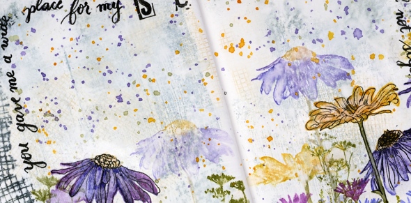
Posted: March 7, 2019 Filed under: alphabet medley, Art Journal, Darkroom Door, mesh, Nature Walk, stone, tall flowers, Woodgrain | Tags: Art Journal, Darkroom Door stamps, distress oxide inks, Ranger Distress inks 5 Comments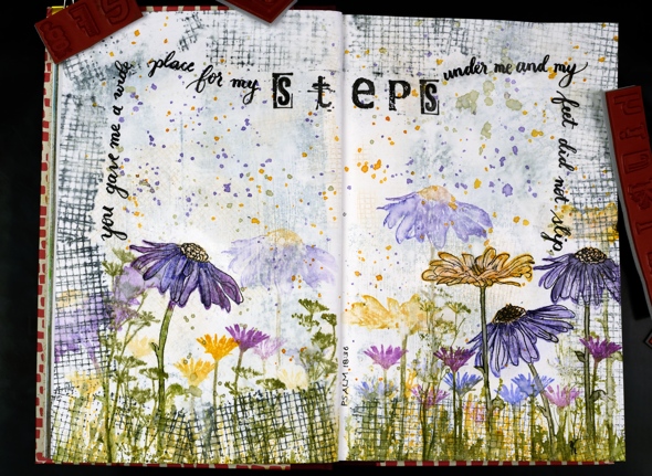
Are you a wee bit surprised to see a journal page here? I’m surprised myself, surprised but pleased. I really enjoyed dreaming it up and making it. It didn’t end up looking as I imagined but that is the way with journal pages is it not?
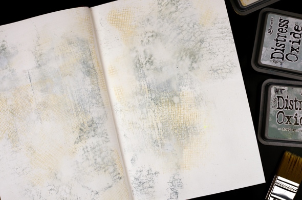
This art journal is a Fabriano journal; the paper is nice and thick but not watercolour paper so I painted over it with absorbent ground first. Then I grabbed a bunch of stamps from Darkroom Door along with three light coloured oxide inks and stamped mesh, stone and woodgrain texture stamps over the background. I spritzed it with water to soften the edges of the stamped images and dabbed some out too to make it subtler. Even after adding some water it was still bolder than I wanted so I painted another thin layer of absorbent ground over it.
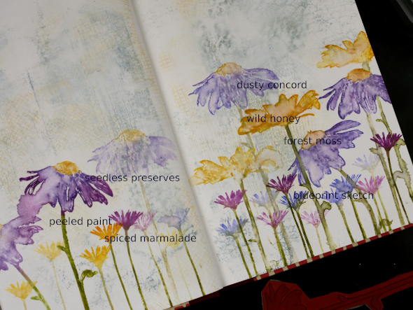
I filled the bottom of the page with repeat stampings of flowers from the Darkroom Door ‘tall flowers‘ set in distress inks then blended some of the big flowers with water. They don’t blend as well as they do on watercolour paper but the effect is still nice.
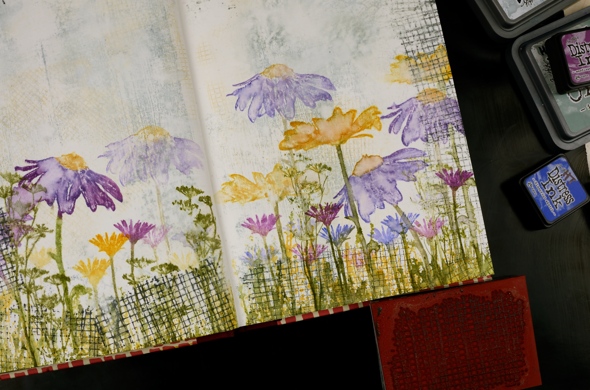
I added grass and flowers from the DD ‘ nature walk‘ set, also in distress ink then a border with the mesh texture stamp in black soot oxide ink. It was a bit bolder than I wanted so I spritzed then dabbed with a paper towel ( as you can see I’m a fan of the ‘spritz and dab’ ). I splattered wild honey, forest moss and dusty concord diluted ink over the whole spread and it ended up looking like confetti. To boost a few of the flowers I outlined them with fine tipped black markers.
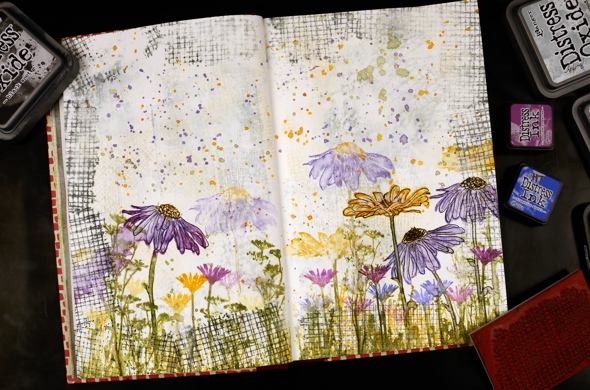
I wrote psalm 18:36 with a brush pen leaving a space to stamp the word ‘steps’ with the DD alphabet medley stamps. I find choosing words for a journal page tricky, which words and how to add them. But the beauty of a journal page is the experimental nature of it. If I don’t like something on this page, I’ll try something different on another. Once the ink had dried I sealed the large flowers and the lettering with distress micro glaze.
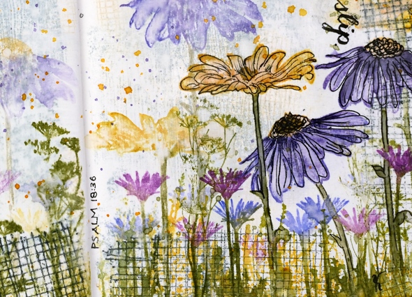
Do you have any art journallers you would recommend for inspiration? I already follow Rachel Greig from Darkroom Door, Julie Fei-Fan Balzer, Vicky Papaioannou and Maremi SmallArt who all have different styles and inspiring journal pages.
I’m hoping to create in my journals more often and will share pages here if possible. Even if you are not an art journal person the designs can usually be converted to a card and sometimes start out as cards anyway!
Art Supplies (all Darkroom Door stamps are linked in description)
Angelique
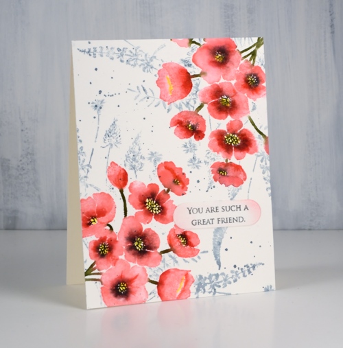
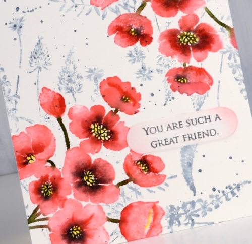
Posted: March 6, 2019 Filed under: Altenew, Angelique, Leaf Canopy | Tags: Altenew, Ranger Distress inks, Ranger Distress stains 12 Comments
These pretty blooms represent my first experiment with an Altenew layering floral stamp set; this one is called ‘Angelique’. I clearly remember my Stampin’ Up days with the 2-step stamping but I haven’t done any in a while. I don’t think the layering sets are necessarily designed for watercolour styles but you know that’s how I like to do things. I experimented with a few processes, stamping then spritzing and spritzing then stamping, spritzing the paper not the stamp, the stamp not the paper and spritzing everything!
I think, but I’m not exactly sure, I mainly spritzed the stamp for this panel with maybe a tiny spritz after stamping on that left hand flower. I started by stamping the largest layer in spun sugar distress stain. Next layer I stamped in worn lipstick distress ink with a spritz of water to dilute it, the final detail layer I stamped in festive berries distress ink. Because I started with stain and spritzed the ink before stamping the image was wet enough to soften and blend a bit. I did a bit with a paint brush too but I didn’t want to lose the detailed layers.
The leaves I did in a similar manner with bundled sage, mowed lawn and forest moss. The sentiment from Altenew’s Leaf Canopy set is embossed in white on a red cardstock strip and popped up on dimensional foam tape.
The second panel was stamped with less spritzing during the stamping process, just a little in fact on layer number two. Instead I waited until all the stamping was done and spritzed in one direction to make the petals feather out then the other direction to balance things. This time I used abandoned coral, fired brick and aged mahogany inks for the roses, milled lavender and dusty concord for the little flowers and old paper, shabby shutters and peeled paint for the leaves. Even though it looks like black, I matted the panel with purple cardstock and added an embossed sentiment also on purple and cut it out with the Avery Elle sentiment dies that are making me neat and happy right now.
You might be wondering why I don’t just stamp these very pretty floral stamps with out adding any spritzes of water?? Sorry I just don’t think I can do it…
Supplies
Floral corners
Posted: February 22, 2019 Filed under: a floral twist, painter's vase, Penny Black | Tags: Penny Black stamps, Ranger Distress inks, Tsukineko Versafine inks 10 Comments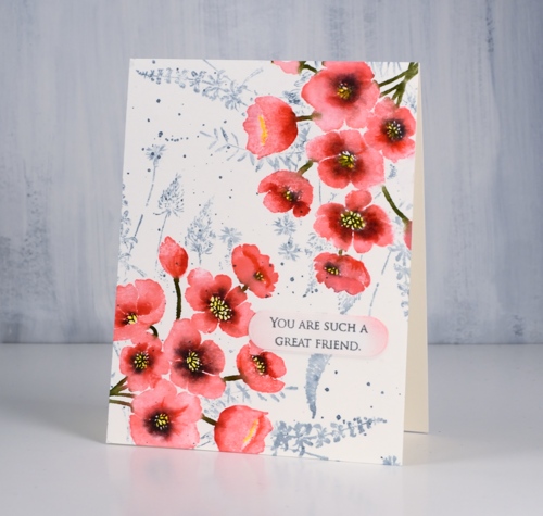
Today’s card features two new brushstroke stamps from Penny Black. The pink flowers in two corners of my panel are from a vase + flowers set called ‘painter’s vase’. I just used the flower stamp but there is a vase stamp I’ll use another day.
I used my stamp positioning tool (MISTI) and placed the flower stamp overlapping one corner of the hot pressed watercolour panel. I stamped the whole image in worn lipstick distress ink knowing the forest moss ink would be bold enough to cover the pink later. Without moving stamp or panel I inked centres and edges of the flowers with candied apple distress ink, stamped then blended the two pinks with water. I then added black soot ink to the flower centres, stamped and let the panel dry. I coloured in the flower centres with a sun yellow inktense pencil and shaded some of the flower centres and edges with poppy red. Then I flipped the panel 180° and repeated the whole process.
To add a background I had to mask the flowers so I stamped them on masking paper, cut them out and covered my completed corners while I stamped ‘a floral twist‘ stamp in weathered wood distress ink and added a few splatters too. All that was left was to add a sentiment; I decided on something small from ‘grateful sentiments’ on a little die cut label with the edges sponged in worn lipstick ink.
Thanks for dropping by today; it is great to be blogging with a bit of regularity again.
Supplies
Tall Flowers
Posted: February 19, 2019 Filed under: Darkroom Door, Leaves, Nature Walk, tall flowers | Tags: Darkroom Door stamps, Ranger Distress inks, Ranger Distress stains 9 Comments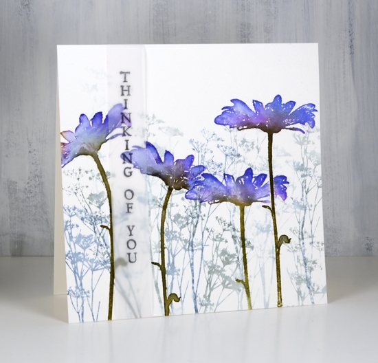
I am excited to feature some new stamps from Darkroom Door today. The tall flowers are from the new ‘Tall Flowers’ set and the background flowers are from the delightful ‘Nature Walk’ set. I am a guest over on the Darkroom Door blog today, if you haven’t visited you definitely should check out all the inspiration shared there.
My first card features a cold pressed watercolour panel filled with one of the stamps from ‘nature walk’ set inked in iced spruce and stormy sky distress inks. I diluted the ink with a spritz of water and stamped first, second and third generation impressions. Over the top I stamped the tall daisy from ‘tall flowers’ four times with wilted violet, blueprint sketch and forest moss distress inks. Because the stems are long and thin I was able to orient them in different directions. I used a mask a couple of times to overlap the daisies. Once stamped I blended the colours with a paintbrush and water.
I used a similar process to create the orange toned daisy card but this time I did the background foliage after the foreground flowers by using stamped and cut out masks. The daisies are stamped in peeled paint and fossilized amber distress inks. I added extra colours one at a time with spiced marmalade marker, rusty hinge marker close to flower centre and finally ground espresso marker on the centre of the flower. I blended the inks with water then after it was dry stamped the centres again to add some texture back in. The background stamping is another stamp from the DD ‘nature walk’ set stamped with weathered wood and tea dye distress inks. I added some splatter because, well, why not!
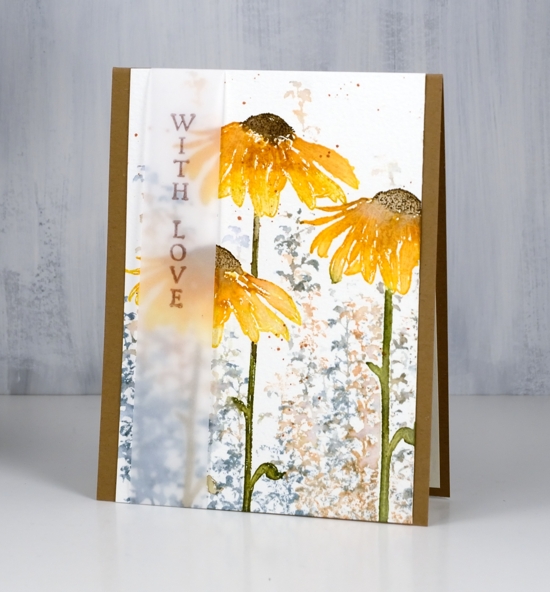
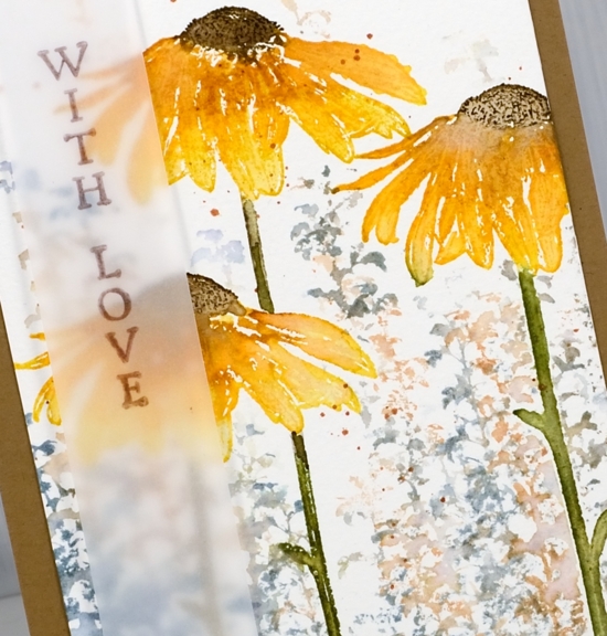
On both the daisy cards I decided to add the sentiment on a vellum strip. I liked the floral scenes too much to stamp words over them so the vellum seemed like a subtle way to do it. The recipient could even snip the sentiment off and have a picture to display if they wanted to. For this tall thin panel I used the kraft card base to frame it on two sides.
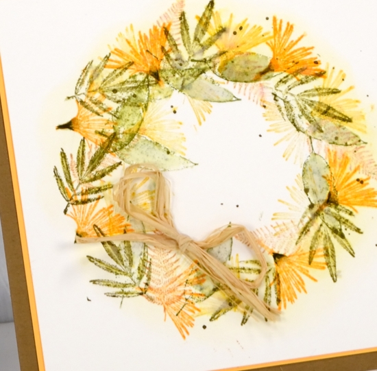
The last card is a little different; I used the small flower from ‘tall flowers’ and some little leaves from ‘leaves’ set to make a wreath.
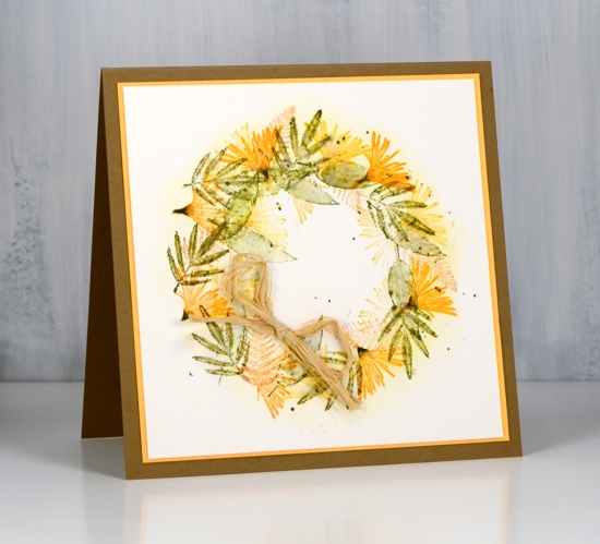
To guide my stamping I traced a circle onto my watercolour panel. I sponged fossilized amber distress ink around circle then erased the pencil line. With the sponging as a guide, I stamped the small flower heads from ‘Tall Flowers’ set round the circle in carved pumpkin ink, holding the stamp so only flower(not stem) was inked and stamped. I repeated the process with small leaves and ferns from ‘Leaves’ set in fossilized amber, peeled paint, forest moss and tea dye distress inks. You know I splattered forest moss ink over wreath because that’s what I do then matted the panel in orange cardstock, attached to a kraft card base and added a raffia bow.
I loved creating with these beautiful tall flower stamps and couldn’t help myself from using the ‘nature walk’ stamps again because they work so well together!
Supplies
Stamps: tall flowers, nature walk, leaves


Inks: stormy sky, iced spruce, blueprint sketch, wilted violet, forest moss (purple flower card)


fossilized amber, peeled paint, weathered wood, tea dye & distress markers: spiced marmalade, rusty hinge, forest moss, ground espresso (orange flowers)


fossilized amber, peeled paint, carved pumpkin, forest moss, tea dye (flower wreath)

Papers: hot pressed watercolour, cold pressed watercolour, vellum, kraft


Also: stamp positioner, raffia

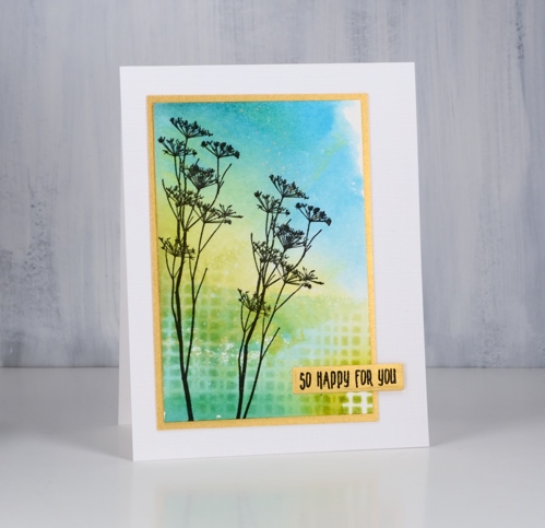
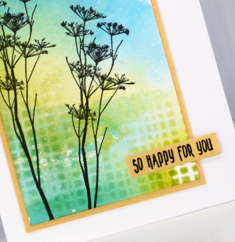
Nature walk portraits
Posted: February 5, 2019 Filed under: Avery Elle, boxes, mesh, Nature Walk, simple sentiments | Tags: Avery Elle, Darkroom Door stamps, Darkroom Door stencils, Kuretake Gansai Tambi watercolour paints, Ranger Distress inks 6 Comments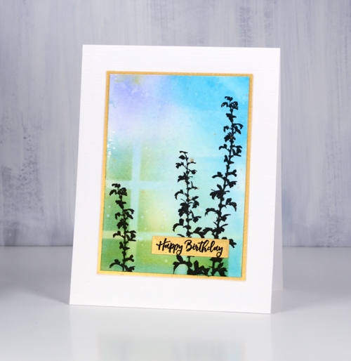
I have mentioned before how beautiful these Darkroom Door ‘nature walk’ images are but have I mentioned how easy it is to create pretty cards with them. Each card today features just one image, stamped twice over a quick watercolour background.
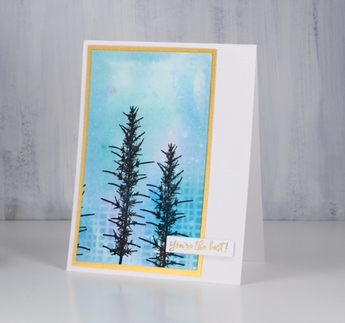
I created the backgrounds with my glass mat and some distress inks. I squished the ink pads down on the mat side by side (three or four colours at a time), spritzed with water then swiped my hot pressed watercolour panel through the diluted ink a few times until there was good coverage on the panel. I dried the panel with a heat tool before sponging one or two of the distress inks through a section of stencil then added splots of water for some added texture. The panels were all different, all pretty and done within minutes.
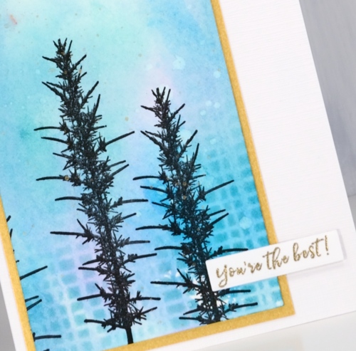
I used the MISTI for stamping because the texture of the watercolour paper makes it necessary to stamp a few times to get a solid image. I used versafine clair nocturne ink which always gives me a crisp print. Once the ink was dry I splattered gold paint from the gansai tambi starry colours palette. The gold splatter might just be my favourite part of these cards; unfortunately it’s not very obvious in the photos.
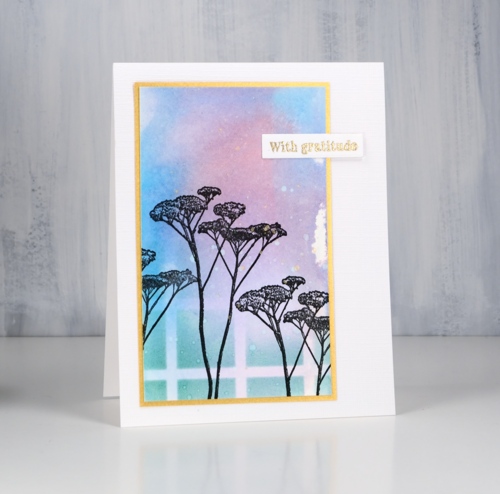
To draw more attention to the gold splatter I matted with gold and stamped the sentiments either on gold cardstock or with embossed in gold powder. The sentiments are from Darkroom Door’s new sentiment strips. The sentiments are in list format and I have kept the stamp uncut. I stamp on a cardstock panel and cut out the sentiment I want. I now have a handy die set from the Foiled Fox which neatly cuts out the smaller fonts and I always love sentiments in small fonts! The set is called ‘simple sentiments’ and it has ten lengths of sentiment strip dies.
In putting together the cards I used one more happy new product. I am always searching for textured white cardstock. Today’s cards feature a linen texture with enough depth to be seen by the camera. It is in 8½ “x11” sheets so one sheet did four card fronts, no waste. This is the first time I’ve used it so there will be more testing to come with dies, inks etc but so far, so good.
Thanks for listening to me prattle on about this and that. I hope you are enjoying some ‘nature walks’ even if they are of the snowy variety! While we have been experiencing extreme cold followed by loads of snow, friends and family on the other side of the world are experiencing extreme heat and flooding!
Supplies
Stamps: nature walk, (DD)


Stencils: mesh, boxes 12 up


Dies: Simple Sentiment (Avery Elle)

Distress inks: crushed olive, pine needles, blue print sketch, milled lavender, stormy sky, mermaid lagoon, wilted violet, worn lipstick
.


Inks: versamark, nocturne versafine clair,


Paint: gansai tambi starry colours

Paper: hot pressed watercolour paper, snowbound textured white cardstock, gold cardstock, neenah solar white

![]()

Also: Cutterpillar glass mat, MISTI, gold embossing powder


