Nature’s glory
Posted: March 6, 2020 Filed under: nature's glory, Papertrey Inks, Penny Black | Tags: distress markers, Papertrey ink, Penny Black stamps, Tsukineko Versafine inks 8 Comments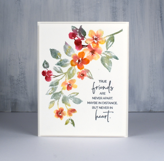
This artistic spray of flowers is a new brushstroke stamp from Penny Black called ‘nature’s glory’. As you can see it is big enough to fill a 4 ¼” x 5 ½” card front but you could use just a part of it for a smaller panel. I like the way it curves leaving me an obvious place for a sentiment. I think I’ve mentioned before I don’t always think about sentiment placement in advance so the shape of this stamp helped me out.
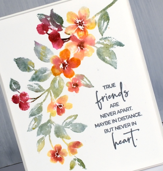
I stamped on hot pressed watercolour paper using a stamp positioner to enable me to build up colour and detail. I used a combination of Papertrey ink cubes and distress markers to ink sections of the stamp. I started with the harvest gold ink cube for the flowers, scarlet jewel for the berries and a few flowers and ocean tides for the leaves. I spritzed the stamp very lightly before stamping on the panel. Some of the leaves ended up with petal colours on them, some flowers ended up with a bit of blue-green and the red of the berries bled into the leaves also. To add a bit more definition to a few of the berries and flowers I switched to distress markers to ink brown centres in the flowers, green on a stem or two and orange on a couple of petals. Once again I spritzed the stamp lightly before stamping so the extra ink would blend on the stamp before hitting the paper.
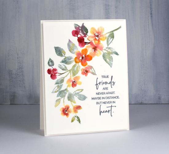
The sentiment, from the new PB sentiment set ‘magical friendship’ is stamped in versafine clair ‘misty morning’ and the whole panel popped up on a piece of foam.
Thanks for dropping by.
Supplies

Blooming Bunch
Posted: March 4, 2020 Filed under: blooming bunch, Penny Black | Tags: Fabriano Watercolour Paper, no-line watercolour, Penny Black stamps, Ranger Distress inks 5 Comments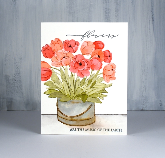
It’s time for a new release from Penny Black! This one’s called Secret Garden and it is full of gorgeous floral stamps and dies (and other cuteness). I will be sharing projects here on the blog in the coming weeks.
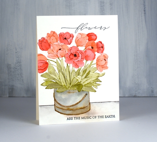
This lovely bucket of tulips turned out to be the perfect stamp for distress ink no-line watercolour. I inked the flowers one at a time in either festive berries or abandoned coral then blended ink from stamping along with a little extra from smooshing on my glass mat. I kept the panel (hot pressed watercolour paper) in the stamp positioner as I was painting my way through the flowers. I blended the stamped ink within each flower and added more ink towards the base of the petals. I tried to work on flowers that were not adjacent to each other so the inks didn’t run into each other. When all the flowers were done I inked some of the outlines again with a marker and re-stamped to add a bit of definition here and there.
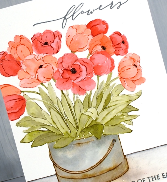
I used forest moss distress ink for the stems and leaves. Forest moss is quite a dark ink so I diluted it for some of the leaves and was able to get depth and shadows.
Painting the bucket was my favourite part of the process; it isn’t fiddly and the mix of vintage photo and stormy sky ink made it look old. To ground the image I ruled a line with a black soot marker then blended the ink downward and painted a shadow at the base of the bucket with some stormy sky ink and a tiny bit of abandoned coral ink. I finished the card with a sentiment from the new ‘blooming sentiments’ set. It is one sentiment but I did some masking in order to stamp the large word at the top and the rest of the text at the bottom of my card front in versafine clair versafine clair misty morning.
See you again soon with more from the PB ‘Secret Garden’.
Supplies
Beloved View – 2 ways
Posted: March 2, 2020 Filed under: beloved view, Penny Black, Stamped Landscapes | Tags: Fabriano Watercolour Paper, Penny Black stamps, Ranger Distress inks, Ranger Distress stains 8 Comments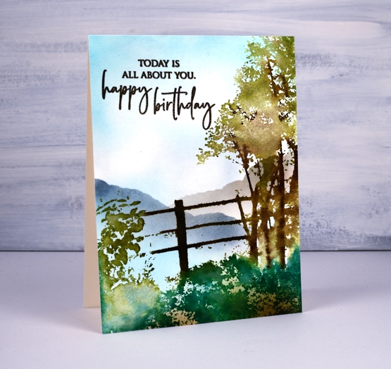
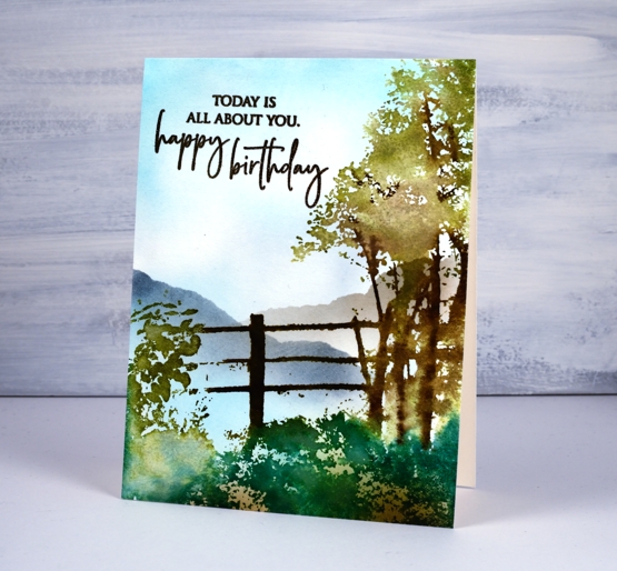
I haven’t done scenic stamping for a while so ‘beloved view’ from Penny Black called out to me. I decided to stamp it two ways, that way you can see the versatility and I will have two more birthday cards. To begin I smooshed some mermaid lagoon and weathered wood distress inks on a glass mat, diluted the ink with water then swiped the watercolour paper through the inks to create the look of a cloudy sky. I dried the panel then put it in a stamp positioner so I could build up the scene a colour at a time. First I inked the fence in gathered twigs and ground espresso distress inks then, after stamping, blended the browns with a brush and water. Next I inked the foliage of the tree in peeled paint and forest moss inks, spritzed and stamped. I let that dry a little then used a brown marker to ink some of the branches before stamping again. For the foreground foliage I used a mix of pine needles distress ink along with peeled paint. I did a bit more blending with a paint brush then dried the whole panel.
I switched to blending brushes to add the rest of the detail including brown ink along the lower edge and mermaid lagoon around the edge of the sky. I added two hills by blending over the edge of a torn post it note first in weathered wood ink then on the right with hickory smoke ink.
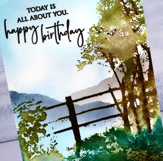
The sentiment is from PB ‘special sentiments’ and is stamped in versafine vintage sepia ink. Now I’m sure this never happens to you but as I was stamping the sentiment a second time I got it slightly off set. Several unappealing fixes popped into my head but I decided to keep stamping the sentiment so with extra ink the two ‘prints’ would join together. This would not have been totally successful if I had left them only stamped but once I embossed with clear powder the text no longer appeared to be a double image! Phew, crisis averted.
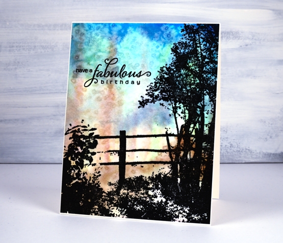
On my second card I created an abstract background first then, once dry, I stamped ‘beloved view’ over the top in versafine clair nocturne ink to create a silhouette,
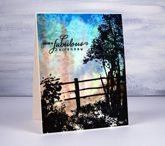
The ‘impressionistic’ background was painted with distress stains, salty ocean, chipped sapphire, vintage photo and peeled paint. I spritzed water and painted them without trying to create a scene other than keeping the brown stain in vertical strips a bit like trees. Once I had the background covered I sprinkled salt over the wet panel to add some texture.
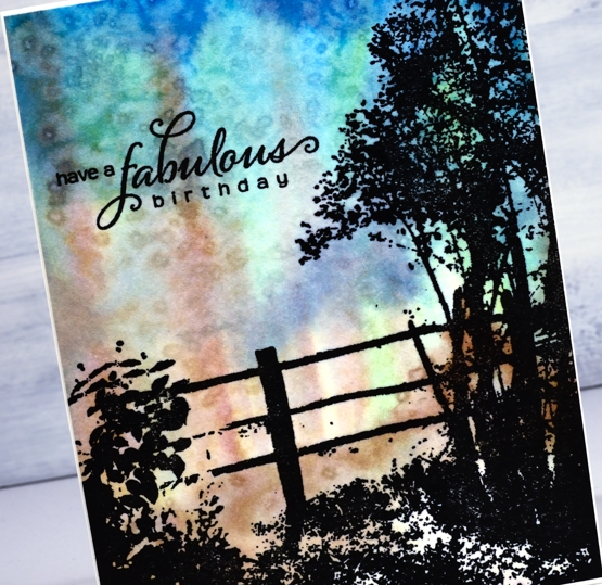
Once the salt dried I rubbed it off and did the silhouette stamping. The paper is hot pressed watercolour so it has a little texture; to get a solid image of the foreground scene I had to stamp several times in black and the stamp positioner made that possible. The sentiment from PB ‘heartfelt’ is also stamped in nocturne ink. I trimmed the panel so the card base would create a very narrow frame all around.
My stash is always a little short on masculine cards so these two are sure to come in handy. And by the way, my cards are now for sale in two Ottawa locations, A Curated Nest on Wellington Street and Crop A While on St Joseph Boulevard. Thanks for dropping by today
Supplies
Shimmer floral
Posted: February 21, 2020 Filed under: Brutus Monroe, Coliro paints, floral medley, Penny Black, square frames | Tags: brutus monroe embossing powder, Coliro paints, Finetec artist mica watercolour paint, Penny Black creative dies, Penny Black stamps 8 Comments
The fun continues around here with pearlescent paints and black watercolour paper. I just wish the photos would show better how pretty the shimmery paints are. The Foiled Fox sent me some yummy new paints from Coliro, I used the ‘ocean’ and the ‘vintage’ sets for this card. I also tried out the ‘penny’ embossing powder from Brutus Monroe. It is a copper colour which worked nicely with the paints I chose. I embossed part of the Penny Black ‘floral medley’ stamp in one corner of my black watercolour paper panel then flipped the panel and moved the stamp around a little before stamping more flowers on the other corner. I paired up a couple of stamps from the PB ‘strength’ sentiment set to emboss a sentiment in between the florals.
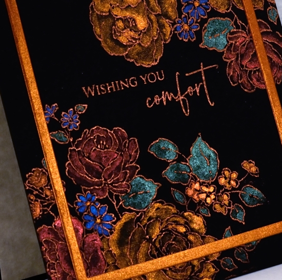
Coliro (or Finetec) paints are full of shimmer and look amazing on dark paper but can also be used on light or white paper for more subtle effects. I have painted them on neenah black cardstock before, the colours looked great but I like the way watercolour paper gives me more flexibility with blending from dark to light. When attempting light and dark areas on black paper I have to think about the direction of my blending. On white watercolour paper I paint strong colour then blend it with water to decrease the intensity and so end up with a lighter area. On dark paper I paint an area in bright pearlescent paint and then dilute it with water to get a darker or shadow area. Shading isn’t really necessary of course, the colours look great painted as solid sections without shading.
To finish off the card I die-cut a frame from copper coloured shimmer paper. I have two frame dies from the PB ‘square frames’ set still linked together so I get a plain frame when I run the two decorative dies through the machine together.
I am teaching a ‘Watercolour on Black’ workshop in Ottawa at the end of March where we will be playing with these lovely shimmer paints and creating stamped and painted panels that really shine. Click over to my upcoming classes page for more details.
Supplies

Pretty in pink
Posted: February 19, 2020 Filed under: Alexandra Renke, Autumn dragonflies, Autumn plant rose, Penny Black, shall we dance, the sweetest sound | Tags: Alexandra Renke cardstock, Penny Black creative dies, Penny Black stamps 7 Comments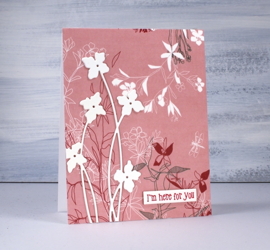
I’ve been playing with pretty paper again and have the Foiled Fox to thank for this lovely Alexandra Renke design. Make sure you pop over to the Foiled Fox blog where I’m sharing my process in making today’s cards. I believe I said it last time I worked with AR papers, the colours and patterns are so lovely I really don’t want to add much over the top.
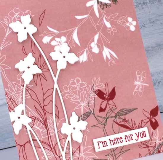
For both cards I covered the whole front with AR ‘Autumn Plant Rose’ paper. The delicate floral design covers most of the paper so I didn’t want to add too much that would clash with the paper. I chose instead to die-cut cream flowers and birds as focal images, keeping them cream coloured and stacked made them stand out from the background pattern. The tall flower die is from Penny Black and is called ‘shall we dance’. I like the way the long thin stems mimic the thin lines of the paper’s design.
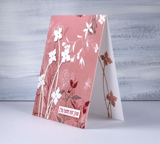
Adding the same die cut on the inside of the card was a must and simple to do after first adding stick it adhesive to the back of the patterned paper.
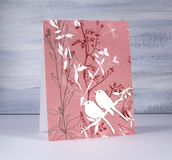
I used the same design idea and stacked three bird die-cuts for the second card and added a single patterned die-cut on the inside of the card. The die is called ‘the sweetest song’ and is another PB one.
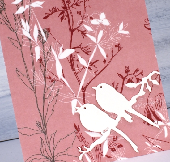
I debated whether or not to add any sentiments and ended up deciding on one with and one without.
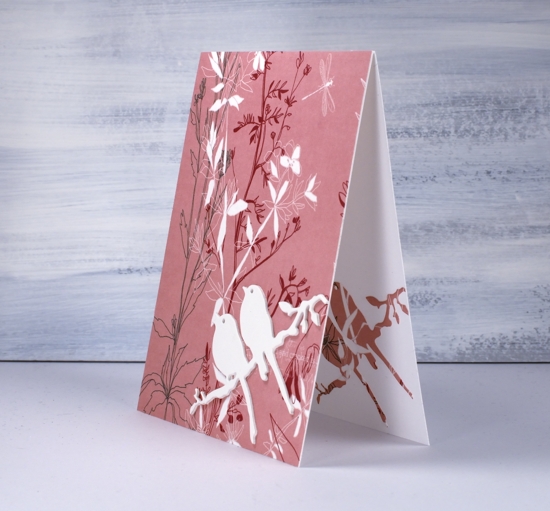
I will be doing more with this lovely paper and a pink abstract paper also by AR. I’ve linked the papers and supplies below and look forward to sharing more designs with you soon. Make sure you click over to the Foiled Fox and check out all the Alexandra Renke papers.
Supplies
Banner Blooms
Posted: February 13, 2020 Filed under: banner blooms, boxes, Darkroom Door, Penny Black, sennelier watercolours, Stencils | Tags: Darkroom Door stencils, Penny Black stamps, sennelier watercolours, Tsukineko Versafine inks 3 Comments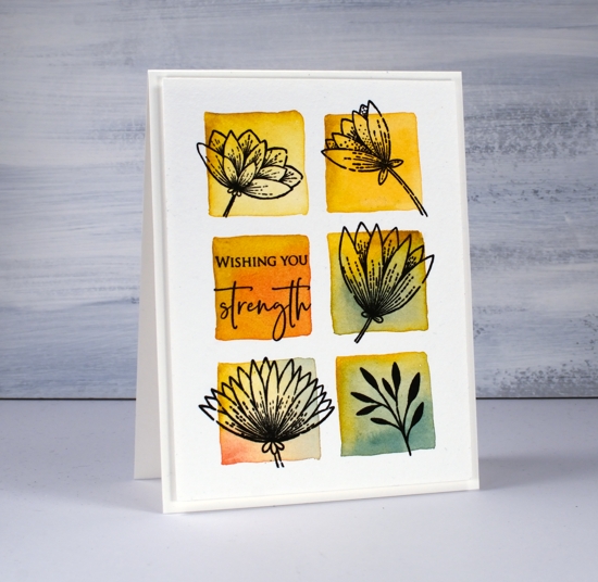
Recently I blended through a stencil to create square grid backgrounds for some floral silhouette stamping. Today’s card uses a similar technique but I wanted the squares to be less neat, a little imperfect but still recognisable as squares. I guess I could have freestyled them entirely but I wanted them to be evenly spaced and I didn’t trust myself to do that without the stencil as a guide. To achieve this look I once again taped a grid stencil (DD boxes 6 up) to a piece of cold pressed watercolour paper but instead of blending the squares then painting over them I just painted squares inside the stencil squares. I didn’t paint right up to the edges of the stencil because then liquid would have seeped underneath and made a mess. I used the stencil as my placement guide and painted a square inside each space.
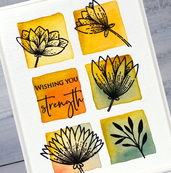
I used Sennelier watercolour paints but you could use any watercolour paints or inks. I started each square with a stroke or two of mustard yellow then added some blue, red or orange and blended it with the mustard. After it dried I flattened it in my minc then transferred it to the stamp positioner to stamp five different images from the PB banner blooms set in versafine clair nocturne ink. Simple but quite effective. I chose a sentiment from the PB ‘strength’ set for the last square.
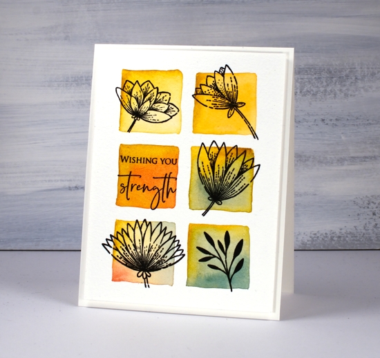
I really like the simple ‘shadow frame’ created by popping up the panel on a piece of foam; that’s why you keep seeing it!
Supplies

Tenderness roses
Posted: February 7, 2020 Filed under: Peerless watercolours, Penny Black, tenderness, tenderness matching dies 10 Comments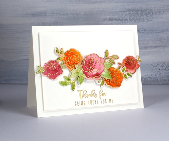
I am on the Foiled Fox blog today, one of my favourite artsy craftsy places to be. If you want to read how I created today’s cards then pop over there right now! If you want to read some of my musings and wonderings about stamps, dies and paints keep reading here and then click over there.
These roses are from a sweet little Penny Black set called ‘tenderness’ and it has co-ordinating dies. I have come a little late to the co-ordinating die game but you know I don’t like to fussy cut so it’s no surprise that I opted for the die cutting route. Another reason I haven’t used many co-ordinating dies is because I often stamp and paint directly on my panels with very few layers involved.
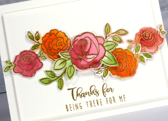
One of the questions with co-ordinating dies is how to deal with the white outline if you have a coloured background. I think I’m used to seeing it now so it doesn’t bug me as it once did. On the roses above I did paint outside the lines on a few of them so there is a mix of coloured edges and white edges. I don’t think it is too distracting either way.
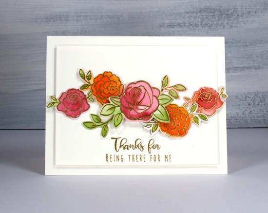
Another thing you can do with co-ordinating dies is cut masks for layered stamping. The masks will be a bit bigger than the stamped image but it is easy to trim a little off or just position the masks to line up with the edge of the stamp that needs to be masked.
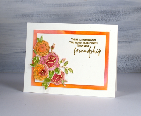
I did all the painting for these cards with peerless watercolours. Sometimes I forget about my peerless paints because they are an unassuming collection. If you haven’t heard of them before check out an earlier blog post I wrote about them. The colours blend beautifully, the range of colours is excellent and the price is pretty nice too.
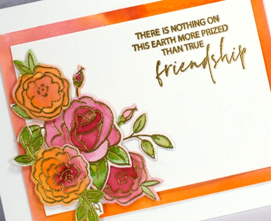
I chose friendship sentiments again, one from PB ‘love language’ and one from ‘bear cuddle’. All the supplies are listed below and here’s the link to my process on the Foiled Fox blog.
Supplies
Winsome wreath
Posted: January 31, 2020 Filed under: Penny Black, winsome wreath | Tags: Penny Black stamps, Ranger Distress inks, Ranger Distress stains 12 Comments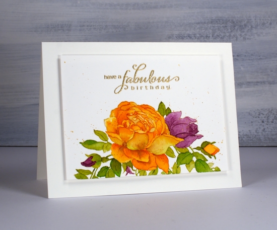
You might not recognise this stamp straight away but it is the ‘winsome wreath’ I used on a black card earlier in the week. It looks a bit different on the more traditional white watercolour paper. It also looks different because I have only used half of the stamp. I stamped the wreath on the edge of a hot pressed watercolour paper panel and once I’d finished painting it I added a few leaves under the orange rose as that space seemed a little empty.
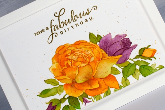
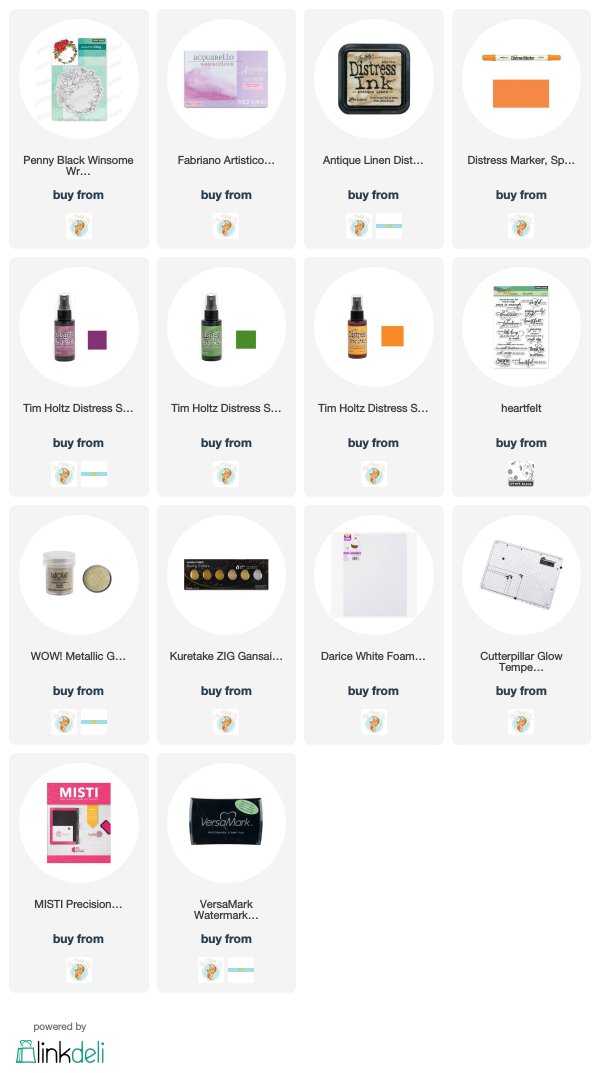
I did the initial stamping in distress antique linen ink which is great for no-line colouring. While the panel was still in the stamp positioner I stamped the centre of the big rose in spiced marmalade ink. I did this because I find it hard to paint all those tiny petals separately and even find it hard to see them all when they are stamped in antique linen. As I was planning to paint the rose in spiced marmalade anyway it was helpful to have the centre of the rose outlined in that ink to begin with.
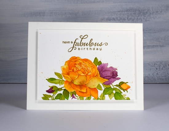
I dropped some spiced marmalade, seedless preserves and mowed lawn distress stain on my glass mat to use as a palette. I painted one petal at a time except for some of those tiny ones in the centre. As I painted a petal I would blend to the edges then drop in a bit more colour with my brush usually on the sections of the petals that might be shadowed by the petal adjacent. It isnt’ an exact science when I do it but I end up with some variation which adds to the realism. I also added a tiny bit of seedless preserves to some of the petals which gave them a slightly aged looked. The leaves are a mix of mowed lawn and spiced marmalade so without intending to I did another of my ‘limited palette’ cards, just three colours in the end.
I splattered some gold paint from the gansai tambi starry set over the panel and added a sentiment in gold embossing powder to match. Rather than add a coloured mat I created a subtle ‘shadow mat’ by popping up the panel on a piece of foam. Thanks for dropping by today; let me know if you can see the mistake I made with the rose but decided to just ignore because I definitely did not want to start again!
Supplies
Roses on black
Posted: January 28, 2020 Filed under: Finetec paints, key to kindness, Penny Black, rose romance, winsome wreath | Tags: Finetec artist mica watercolour paint, Penny Black stamps, WOW embossing powders 15 Comments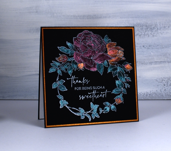
Today’s cards are my first experiment with black watercolour paper. I have already learnt a few things I will take into consideration on my next projects. I could have waited until I had played with the paper more but I decided to jump right in with these rather unusual valentine/friendship cards. The card with purple flowers does have a valentine sentiment but the other two could be used anytime to send a friendly message. Unfortunately the photos don’t convey how shimmery the paint is and the colours are brighter in real life.
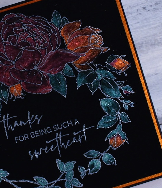
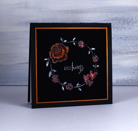
I’ve seen a few people on the interwebs using this new Stonehenge black cold press watercolour paper so I had to give it a try. As you can probably see I’ve paired it with pearlescent paints this time. I plan to try oxides next time. Because it is new to me I tried three different embossing powders wondering how much they would show up on black. On the card above I embossed PB ‘winsome wreath’with WOW silver pearl; it looks a bit silvery. On the card below I used WOW white pearl on PB ‘rose romance’: it also looks a bit silvery. On the final card I used Ranger gun metal with a wreath from PB ‘key to kindness’ set, it is a bit darker but still looks a bit silvery.
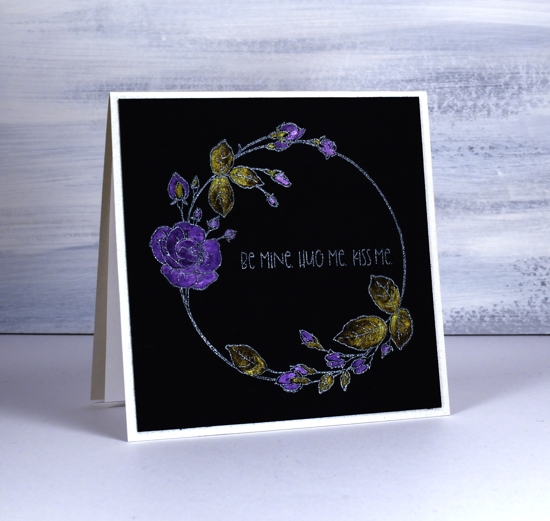
To paint the flowers I used both my Finetec pearlescent paints and pearl paints. I don’t find the two sets all that different but I think there might be a bit more shimmer in the pearlescent ones. I also have some Ken Oliver liquid metals so I used the verdi gris for the leaves above. I carried through the shimmer theme by cutting mats from copper shimmer cardstock and I made card bases from black shimmer and quartz shimmer.
What do you think about predominantly black cards? I know some would find them too dark and sombre, some may be reminded of the painted velvet pictures from the 70’s but maybe you like the added drama. Will you try the black watercolour paper if you get a chance?
Supplies
https://linkdeli.com/widget.js?1559654439292
Flower heart
Posted: January 23, 2020 Filed under: passionate blooms | Tags: Penny Black creative dies, Penny Black stamps, Ranger Distress inks 6 Comments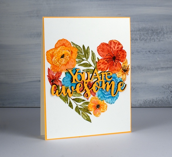
I have seen this stamp on quite a few cards lately, just pop over to the Penny Black blog if you want to see some other colour schemes and techniques. I have surprised myself with this colour scheme and also by choosing a large heart motif in the first place. I don’t usually make Valentine’s day cards so when I decided to ink this stamp it was always going to be for a versatile friendship card.

I worked on hot pressed watercolour paper in the stamp positioner and inked one flower at a time. It is easier to ink a single flower with a marker but when I don’t have the colour marker I need I use an inkpad and just wipe excess ink off the stamp. Each time I stamped a flower or leafy section I blended the ink with a paintbrush and added extra ink if necessary by picking it up off my glass mat. On some of the flowers blending the colour resulted in loss of definition so I restamped after all the colouring was done. That’s the beauty of keeping it in the stamp positioner.
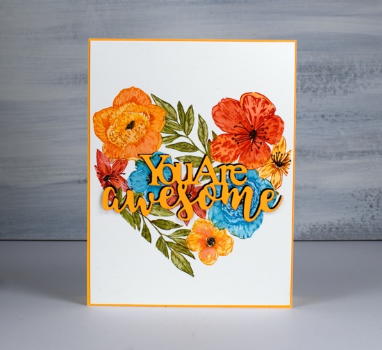
The distress inks I used were carved pumpkin, barn door, mermaid lagoon and peeled paint; I’m pretty sure I’ve never used that combo before. I added centres to the flowers with a black marker.
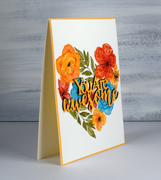
I chose a die-cut sentiment that spans the heart and chose orange cardstock to stand out against the background. Even though the sentiment was over the top of mainly red and turquoise flowers it got a little lost so I cut a black layer as well and stacked two orange over a slightly offset black.
On my last post ‘Creating in Colors’ commented, ‘...I love it when you design cards for which I have the stamps and/or stencils! I’m inspired to try these.‘ I was so pleased to read that. It makes me happy when that happens; its always good to get a fresh idea for supplies we already have.
Supplies