
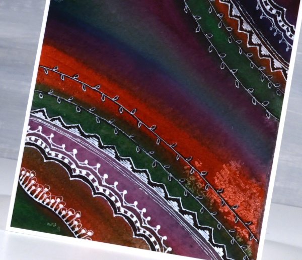
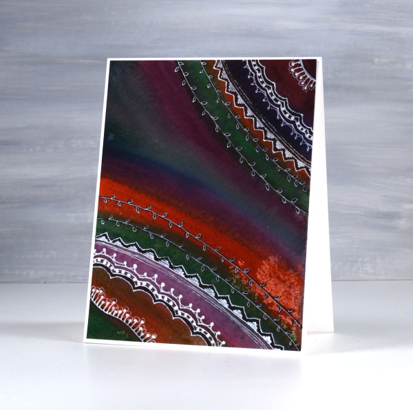
HB shimmer on black
Posted: December 30, 2025 Filed under: cricut, Finetec paints, Hand drawn | Tags: cricut, Finetec artist mica watercolour paint, Hand drawn, Kuretake Gansai Tambi watercolour paints 2 Comments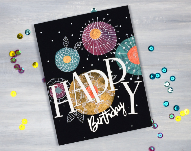
As I’ve mentioned before I have a ‘pile of possibility’ which is actually a box filled with panels that might be good for a future card or project. This painted and doodled panel came from that pile. I think I created it when I was teaching shimmer paint on black watercolour paper back in 2021!
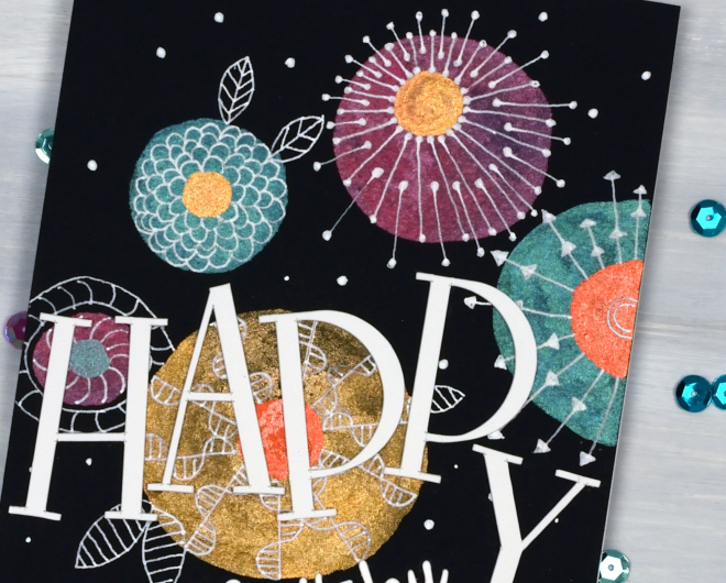
I have a selection of metallic paints, also called mica or shimmer paints from Finetec and Kuretake. They all work well on black and show up more dramatically than on white or pale coloured paper. My next bookmaking project will be an art journal made up of black watercolour paper pages so I’m planning to put my shimmer paints and markers to use along with opaque paints and markers.
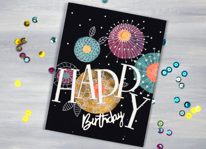
To turn this panel into a birthday card I doodled with white gel pens then cut the HAPPY letters on the cricut and paired them with a smaller die-cut ‘birthday’.
Whimsy and Watercolour
Posted: February 24, 2025 Filed under: Classes, Hand drawn, Hand painted, sennelier watercolours, Watercolour | Tags: Classes, Fabriano Watercolour Paper, sennelier watercolours 3 Comments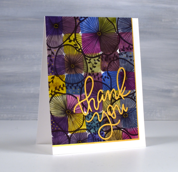
As I mentioned in January I have been playing with watercolour techniques then adding whimsical doodles over the top. Today’s card is another example. I switched the order in the title of the blog post because the whimsy has over powered the watercolour in this panel even though both elements are still obvious.
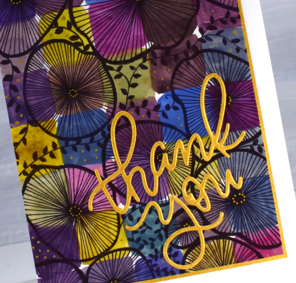
I used only three paint colours to paint the squares on the watercolour paper, some touching while wet, resulting in soft blends. All the colours you see were mixed from the same three paints – a blue, a pink and a mustard. The doodling was done with a black fine tip pen and a gold gel pen.
Even though the gold details from the gel pen are a minor part of the design they were the catalyst for choosing a gold mat and sentiment. In my upcoming in-person class I am teaching design principles and assembly techniques for card making and this thank you card is one of my examples. ( I wish I could remember who makes that pretty thank you die, but I’m not sure)
The bookshelf card
Posted: January 28, 2025 Filed under: Hand drawn, Watercolour | Tags: Fabriano Watercolour Paper, Hand drawn, Hand painted 2 Comments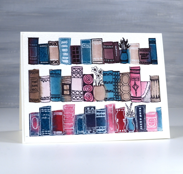
Last year I taught a workshop called ‘Watercolour & Whimsy’ where we experimented with colour mixing in art journals and on watercolour panels, some of which we turned into cards later. This panel began very simply as I mixed three or four paints to make a range of different colours. Because I stuck with a few paints I knew they would all look cohesive on the panel.
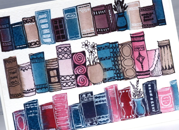
I used a half inch flat brush to paint rough rectangles in lines. I was inspired by schlemmer.art but where she turned her rectangles into houses, I turned mine into books!
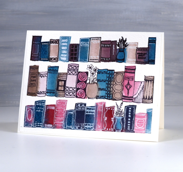
I used a black fine tip pen and a white gel pen to decorate the book spines and turned three paint strokes into vases instead of books. A simple idea to paint, a relaxing theme to doodle and something I will definitely try again.
Watercolour and Whimsy
Posted: January 17, 2025 Filed under: Hand drawn, Hand painted, Moda Scrap | Tags: Hand drawn, Hand painted, sennelier watercolours 6 Comments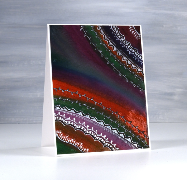
Last year I taught a class called watercolour and whimsy. The watercolour part focused on colour mixing and how to limit your palette and get cohesive results. The whimsy part included stenciling and doodling. The truth is we spent most of our time on the watercolour leaving little time for the whimsy.
I have gone back to my panels to finish the doodling details. Most were done on cold press watercolour paper with a mix of pan paints and tube paints. For each panel I chose several colours that would not necessarily look great together straight out of the pan/tube but with some mixing ending up looking like they were born to be together. This first one is a favourite. I love the way a deep green, a purple, an orangey red and a blue ended up looking so good together.
I did most of the doodling with a white gel pen with some black sharpie underneath here and there for more contrast. I have more cards to share made as part of the same class. The watercolour colour mixing part of the process is very relaxing and enjoyable. I haven’t added sentiments to either of these cards but I can add one before sending if I wish.

On the panel above and below, I painted again with a limited palette but touched each brush stroke to a previous stroke so that colours flowed into each other. The result was blends, watermarks and harder lines.
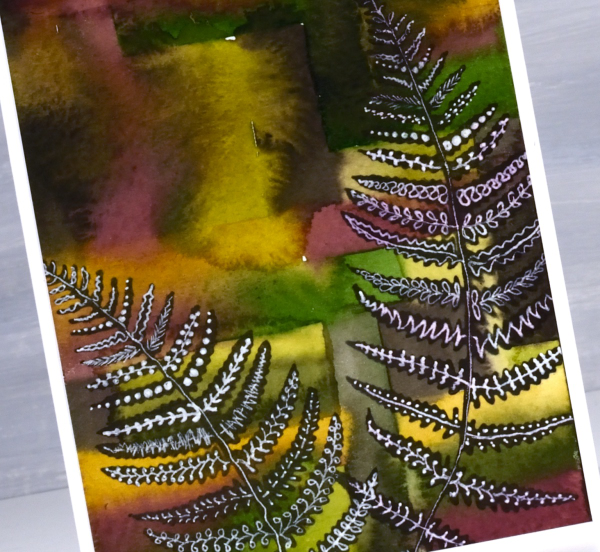
To add some whimsy I blended black ink through fern stencils. They are homemade stencils created die-cutting into grafix stencil film with dies from the Moda Scrap ‘fern die set‘.
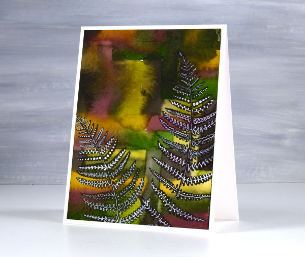
Once the black ink was dry I doodled different patterns on the fronds with white gel pens. This post includes affiliate links from Foiled Fox. If you buy through these links I receive a small commission at no extra cost to you.
Stripes and strips
Posted: November 14, 2023 Filed under: Christmas background, Dies, Hand drawn, Hand lettered, My Favorite Things, Penny Black, starry night | Tags: collage, My Favorite Things, Penny Black creative dies 8 Comments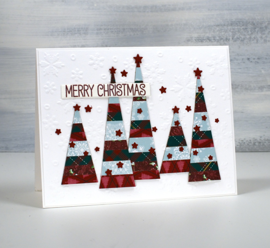
If you have scraps of patterned or solid coloured paper today’s post is for you. I made a panel of striped cardstock by cutting thin strips of patterned paper and gluing them to a piece of light cardstock. From my homemade ‘striped cardstock’ I cut a hand drawn tree, a hand drawn bird and some simple triangle trees. You could use dies for all the elements I was just playing with ideas and decided to sketch and cut myself.
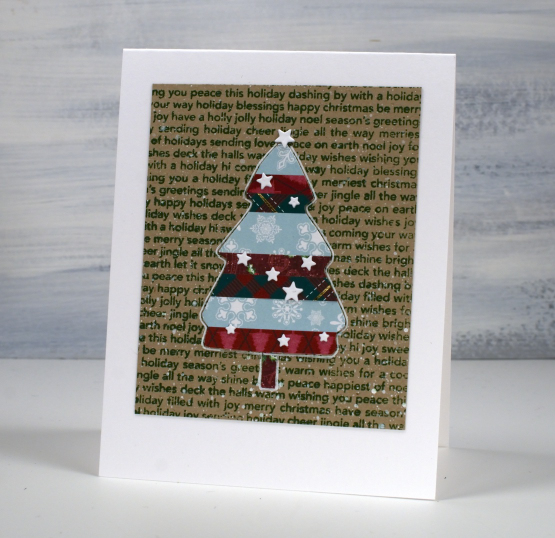
I used an embossed snowflake background for the card at the top of the page, a stamped kraft background for the tree above and then plain kraft for the bird. The little stars that decorate each card I did not hand cut of course! They are cut with the PB ‘starry night die’ and applied with the help of one of those sticky ended tools. Little embellishments have a high fiddliness factor which I don’t appreciate but these tiny stars were necessary!

I added outlines to both the bird and the tree with white or black gel pen along with some dots and a handwritten sentiment.
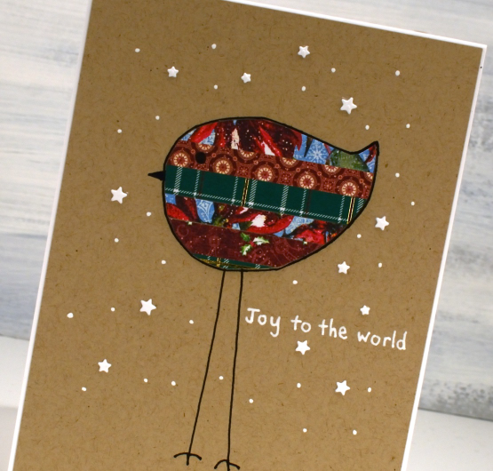
Cutting my own shapes was fun and put some of the many paper scraps to good use!
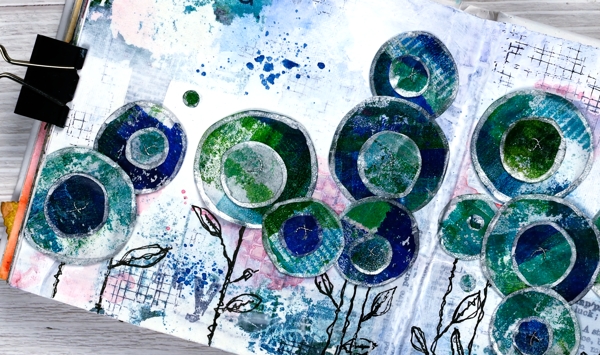
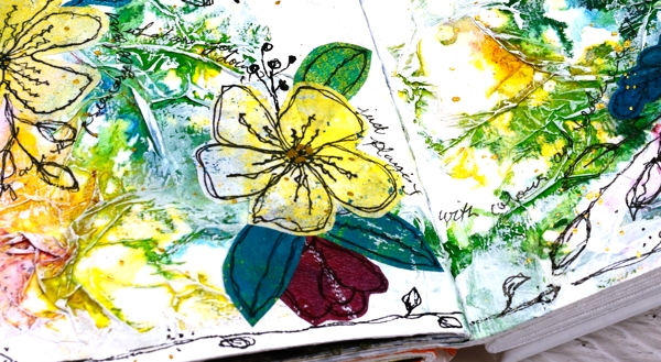
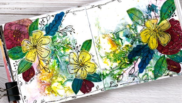
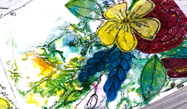
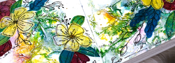
Circle Flowers journal page
Posted: March 25, 2022 Filed under: abstract flowers, alphabet medley, Art Journal, checkered, Classes, Darkroom Door, gel press, Hand drawn, mesh, Stencils | Tags: Art Journal, Classes, Darkroom Door stamps, Darkroom Door stencils, gel press, gel printing, Mixed Media, Penny Black creative dies 8 Comments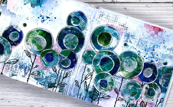
Last week I spent several happy hours gel printing. One of the prints I completed has ended all over this art journal spread. If you are a gel printer you know you can sometimes pull a couple of prints of the same design. The first one is full of colour and pattern and the second is often called a ghost print as it displays outlines and left over bits of paint.

For this journal page I used both the bold blue and green print and the ghost print. The ghost print can be seen on the top left and bottom right corners and is peeping out in a couple of other places. The first print which was very geometrical has been turned into circle flowers. It also had traces of a new stencil called ‘pods’. You will see more of it here on the blog because it is fabulous!
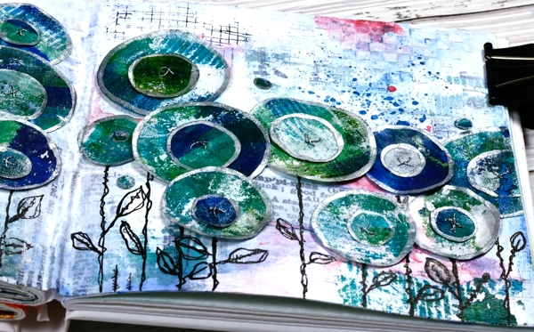
Also in the background you might see some black ink stamping (DD mesh and alphabet medley) and the texture of paste through the DD ‘checkered stencil. The text you see is a fabric tape with dictionary definitions of happiness; it is the first 49 & Market product I have bought and it is going to be handy!
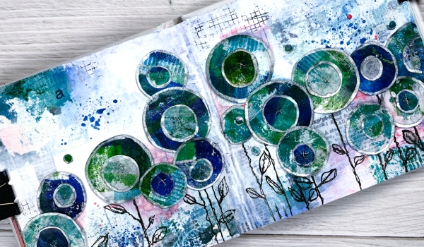
There is plenty of white gesso over the background to pull it together and mute some of the bold elements.
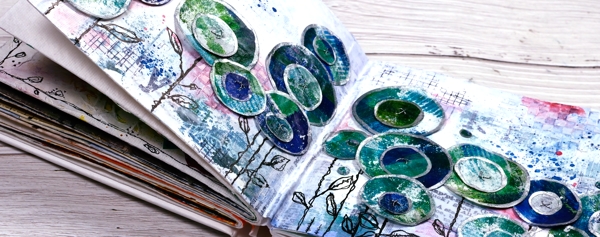
The flowers are all cut with Penny Black ‘abstract flowers’ dies which basically cut slightly wonky circles so I could have cut them myself but why bother when the machine will do it. The print was on rice paper so I could cut a few layers at once. After drawing an edge on each circle with a silver paint pen I stuck a small circle on a larger one, then sewed a cross in the centre with silver thread. There are stems in the set of dies but I doodled mine with a black marker. The blue splatters and pops of pink are from inktense pencils which are coming in handy for art journalling.
I know that was a lot of photos and chit chat but that is the way with some art journal pages especially the collage ones which involve different papers, paints, stencils, and mediums. I probably haven’t mentioned everything I used but if you are still here now I’m sure you’ve heard enough!
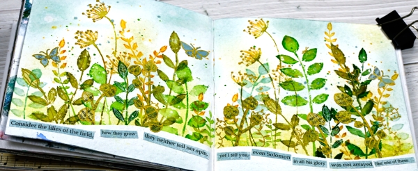
If you are in Ottawa and feel like doing a little art journalling of your own, there are still spaces left in my next Art Journal Adventure workshop where we will be creating a watercolour green and leafy spread similar to what you see below. All the details are on the Crop A While website.
Supplies
(Compensated affiliate links used when possible)
2022 BuJo – March theme
Posted: March 10, 2022 Filed under: Bullet Journal, Dingbat notebooks, Hand drawn, Hand lettered | Tags: Bullet Journal, Dingbats notebook, Ranger Distress inks, Staedtler watercolour brush pens 3 Comments
Yes we are a third of the way through March but better late than never. I live in the north where March rarely means spring flowers; more often it means spring snow so my theme is still wintery!

I actually left my home and went away last weekend to the mountains and did a little skiing and relaxing so this theme seemed appropriate. Our accommodation looked nothing like my hand drawn cabin but was lovely just the same.
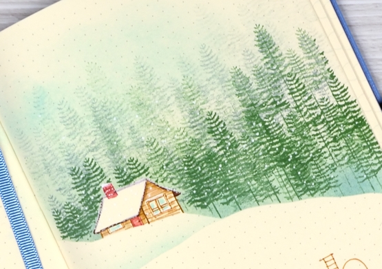
The trees on these pages were stamped with a Simply Graphic stamp, ‘pine forest‘ in rustic wilderness and iced spruce inks.
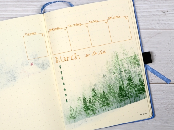
Simply Graphic is a French company with some very cool stamp and die designs. The Foiled Fox just started carrying more of their product and sent me a few stamps to try out. You will see more in tomorrow’s post.
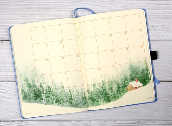
I used post-its to mask, drew my own cabin with Staedtler markers then lightly watercoloured it with distress inks.
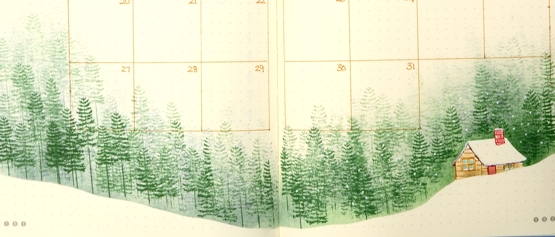
I made many mistakes on these pages because I was rushing but I managed to cover them up or work around them!
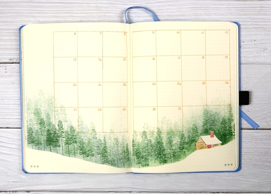
If you haven’t seen one of my bullet journal spreads before I am working in a ‘Dingbats’ notebook; it’s A5 and dotted and I think the quality is excellent.
Supplies
(Compensated affiliate links used when possible)

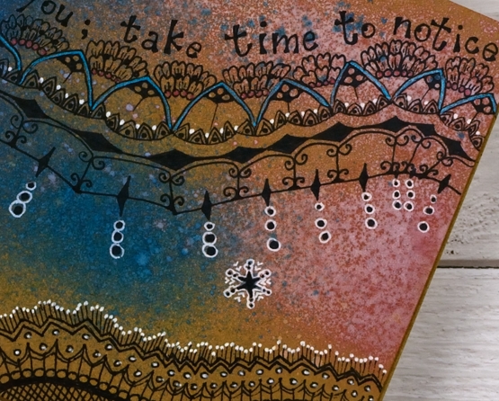
Doodle on Kraft
Posted: February 23, 2022 Filed under: Art Journal, Hand drawn | Tags: Art Journal, distress oxide inks, Hand drawn 6 Comments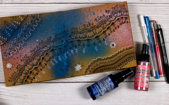
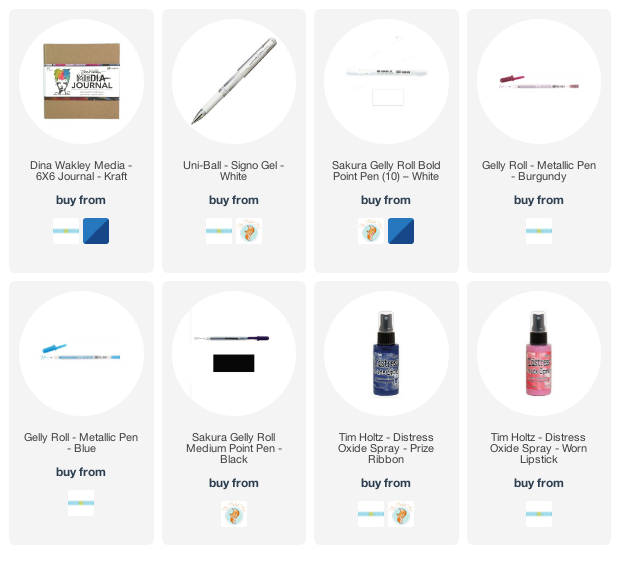
As you know I’ve been enjoying the 6″x 6″ white Dina Wakley journal; I have two on the go now full of experiments and ideas for my upcoming Art Journal Adventure workshop. Ranger has also made a kraft journal the same size so yes, I had to try it.
As you can see in these photos working on a kraft background tones down the colours used on top. I could paint the pages white before starting but I am interested in experimenting with kraft backgrounds for now. I also bought a few distress oxide sprays the other day. I love the traditional distress sprays but hadn’t tried the oxide sprays before. They are a good match for the kraft journal as a little ink soaks in while plenty of pigment sits on the surface.
I used prize ribbon and worn lipstick sprays on this page then doodled with a black gel pen. For inspiration I looked at zentangle pages I’d saved on pinterest and instagram and adapted them to spread across the pages. I also found pink and blue metallic gel pens from years ago and did some colouring in. I used a white gel pen to highlight parts of my design.
As I worked I wanted to make everything brighter to compensate for the brown background but that is an experiment for another page. If I had started my doodling in white the overall effect would be brighter but I like the opacity of the black.
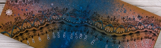
I found the quote in a book I am currently reading and it seemed to fit my meandering pattern.
The art journal workshops that were originally planned for January have been rescheduled in late February and early March. You can find out more on my classes page or on the Crop A While website where you can register for either the March 4th or 12th workshop.
Supplies
(Compensated affiliate links used when possible)
Crumple & Colour journal page
Posted: February 14, 2022 Filed under: Art Journal, gel press, Hand drawn | Tags: Art Journal, Dr Ph Martin Hydrus watercolor paints, gel printing 6 Comments
While creating art journal pages lately I’ve noticed that they often look a bit rubbishy until the end or just before the end! It’s a good thing to keep in mind throughout the process, especially as the process sometimes stretches over a few days.
I started this page while I was at Crop A While and a friend looked over at me and said, “Heather is having fun playing with toilet paper!” For the record I was having fun with tissue paper not toilet paper! Working in the 6″x 6″ Dina Wakley journal I glued crumpled tissue paper over the whole spread with gel medium, scrunching it as I went to make folds and texture over the pages. (it didn’t look at all special at this point)
Later I used my Dr Ph Martin’s hydrus watercolours to drop blue, yellow and red ink over the pages. I worked one ink at a time tilting and diluting the ink so it would spread over and around the crumpled paper. (still underwhelming)
I let the watercolours dry and left the page for several days. The colours were bright and there were some nice blends and patterns but too bright for me so I painted over the spread with white gesso. My aim was not to totally cover the watercolours but to soften their impact and highlight the texture of the paper. I used my fingers to move the paint and a baby wipe to remove it where it was too thick. (looking better but still messy)
Settling on a focal point for an art journal page is sometimes hard; I don’t always begin with one in mind. You won’t be too surprised to see I chose flowers. I have a box of gel printed panels, some on rice paper and some on light card or computer paper. I found several prints on rice paper that matched the colours on the page and doodled flowers and leaves on them with a permanent black marker. I cut them out and started arranging them on the pages. (it was beginning to show promise)
After quite a few rearrangements I glued down the flowers and leaves making sure I didn’t cover up all the yummy colour and texture but also didn’t cover up the important white space. (it was finally looking ok) With the elements in place I continued to doodle more foliage on the pages including a border around the whole spread. I scribbled some thoughts around the flowers then splattered gold paint over the finished pages.
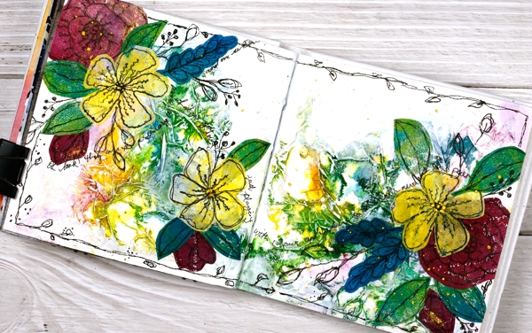
I am very happy with the final result but had no idea it would end up like this. At one point during the process I thought, “hmmm, I don’t think I’ll do this technique again…”
But I will.
Supplies
(Compensated affiliate links used when possible)
A Winner & some Chat
Posted: November 15, 2021 Filed under: Classes, Darkroom Door, Hand drawn, Hand painted, online class, Penny Black | Tags: Classes, online class 3 Comments
Thank you to everyone who left a comment on the Wreaths – Stamped & Painted online class launch post a week ago. It was lovely to hear from you. Thank you to all of you who have already registered in the class; I am delighted to have you making wreath cards with me. I used a random number generator to pick a winner from the comments left on last Monday’s post and the winner of a class registration is …
Jo Anna Grimsley
who wrote that she had completed her Christmas cards. YAY! and had never been done this early! Well done Jo Anna, you can now treat yourself with an online class. I will be in touch by email.
On Christmas Cards
I was interested to read that many of you had started Christmas cards, some of you don’t make holiday cards but prefer to send cards throughout the year. Several people make photo cards which I think is a great idea; I love to receive a family photo or scenic photo taken some time during the year. A few of you, like me decided to make Christmas cards throughout the year; I didn’t do that well actually so I have had to ramp up the process lately. Some of you keep it simple with a mass produced design but a few of you departed from that plan this year and have been making quite elaborate cards. Thank you so much for all your comments. I made my list yesterday and counted that I need 80+ cards. I spent the afternoon writing in all the ones that go to Australia; they need to be in the mail first.
On Markers
When I mentioned distress markers being discontinued several people commented on their disappointment with the way distress markers dried out faster than other markers. I have found that to be so with the bullet tip of the distress markers but haven’t noticed it so much with the brush tip which is what I usually use. Although I have Tombow markers I tend to forget them. I used several in the wreaths class and found them to be good as new so they are not drying out while they wait for me to choose them! For a while now I have been using the Staedtler watercolour brushmarkers and they also feature in the new class. I am enjoying them and there is a nice range of colours in the set of 36. I found them at Michaels, and with a coupon the price was not bad. I am going to do some side by side comparisons with markers and will let you know what I find.
On Handmade Books
When I posted about my first handmade book (well, first since making big storybooks with 1st graders) the other day a few of you mentioned the need for yet more supplies. I don’t own any book making supplies but I had a long spike tool from an eyelet hardware set, I think a Stampin’ Up purchase from years ago; I also have a crop-o-dile which can punch holes of a certain size. I had the stiff board backs from paper pads stashed away along with plenty of patterned papers. I had embroidery thread and linen twine which, once I bought the beeswax, worked to sew my book signatures together. I had a metal ruler and utility knife and the bone folder from my scorboard. So you see you might have most of what you need. All I bought was the beeswax and the course which was $10. I’m not receiving any affiliate income from the maker of the course; I just loved it, that’s all!
On Artsy Podcasts
I listen to a lot of podcasts on a range of topics. Over the last year I have added several art podcasts to my line up. I have been a fan of Julie Fei Fan Balzer’s Adventures in Arting podcast for years. She hosts it with her mother and they chat with each other and often have a guest to interview. It covers a whole range of art pursuits and art related topics. If card making is your artistic outlet or you are an Altenew fan you might enjoy Jennifer Rzasa’s podcast Craft Your Life. She also interviews guests and the latest was the wonderful Jennifer McGuire.
Another art themed podcast I thoroughly enjoy is Laura Horn’s Art podcast. She and her photographer husband talk all things art related and include interviews from time to time as well. Every single time I listen I am inspired or motivated. It is worth listening just to enjoy their accents. I have also been encouraged and learnt a lot from Art Juice with Louise Fletcher and Alice Sheridan. They include interviews, chats about the artistic process as well as the business side of things. (again the accents are a bonus). One more recommendation is Izzy & Gina in Stitches. Izzy Moore and Gina Ferrari are machine embroidery artists but their art is not limited to fibre, like me they have a range of artistic pursuits. Their conversations always encourage, inform and amuse. Do you have any art related pocasts you can recommend?
Thank you for your continued interest and support; I will be back with a card video next time. Take care.


