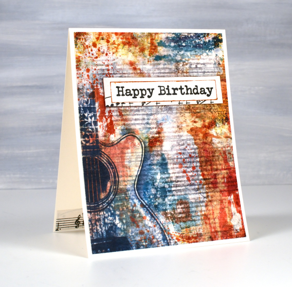
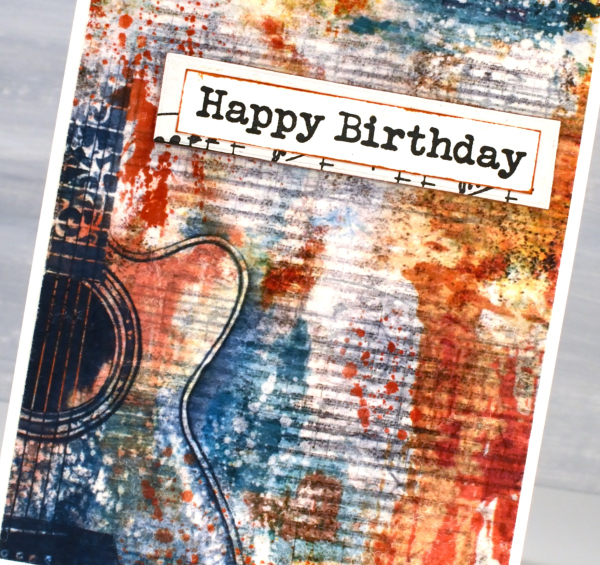
Christmas Greenery
Posted: November 21, 2025 Filed under: Christmas inchies, Darkroom Door, Elizabeth Craft Designs, Gina K, global postmarks, Penny Black, postage stamps | Tags: Darkroom Door stamps, Elizabeth Craft Designs, Penny Black creative dies, Penny Black stamps 7 Comments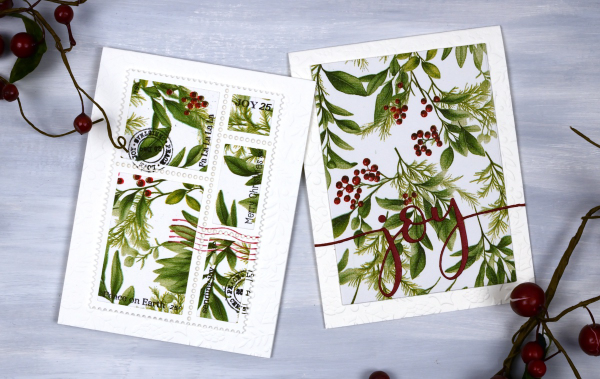
Yes, finally a Christmas card post. I have been playing around with paper napkins for some of my Christmas cards. All the designs in today’s post use panels from a greenery + berries design. I peel off the printed layer from the three layer napkins or serviettes (depending where you’re from) and glue it to cardstock. I’ve used both double sided adhesive (pricey) and glue sticks (slightly curls the cardstock). Either option works I just need to take some time to flatten the glued panels.
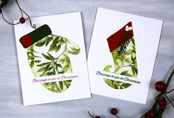
Sometimes when attaching the fragile napkin layer to the cardstock you get some creases; I think they add interest and texture so I don’t let them worry me. I used my cricut and the Echidna Studio stocking design and mitten designs to cut out large features to add to an embossied background.
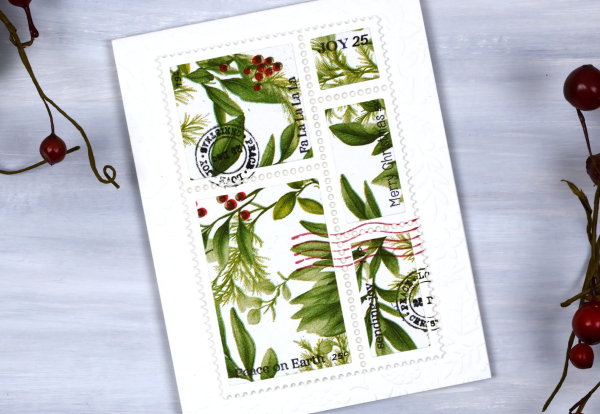
I also used the lovely postage dies from Elizabeth Craft and the Darkroom Door Global Postage and Christmas Inchies stamps to add postmarks along with small sentiment stamps from Penny Black to add words. For the card below I simply cut the word joy using a PB die and added it to a large panel. You could definitely make all these cards with patterned papers or your own painted or printed papers. I just get tempted by the beautiful paper serviettes out there and end up buying them for craft and dinner!

I am packed up ready to do Christmas card making with some friends from church tomorrow. We are making 2-for-1 cards to give to the residents in a local nursing home. I’ll try and share a few of the designs next week. Have a lovely weekend.
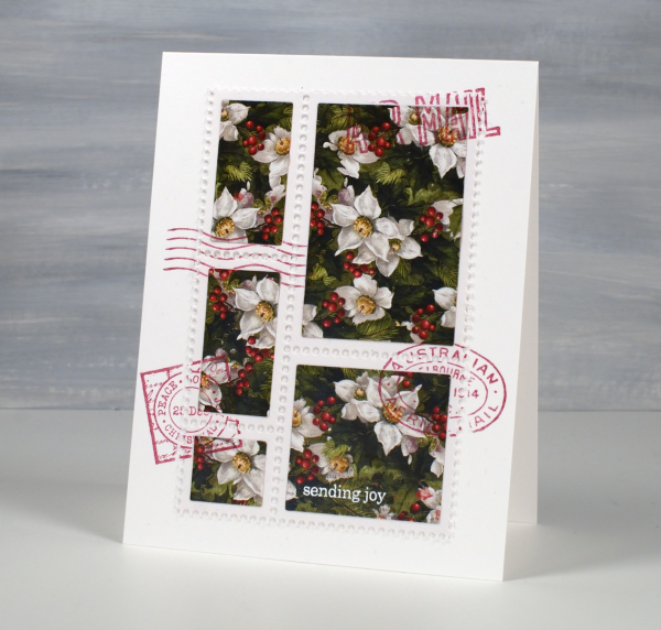
Faux Postage Christmas cards
Posted: November 1, 2024 Filed under: Christmas inchies, Darkroom Door, Elizabeth Craft Designs, global postmarks, postage stamps | Tags: Darkroom Door stamps, Elizabeth Craft Designs 6 Comments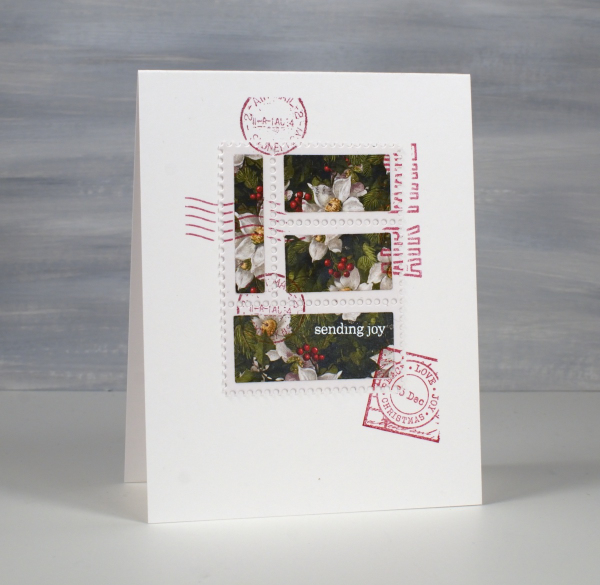
Around this time last year I bought a faux postage die set from Elizabeth Craft Designs. I’ve used it a couple of times with watercolour panels but a friend recently inspired me to try with Christmas papers. I cut a white perforated panel and used the co-ordinating rectangle dies to cut the poinsettia paper.
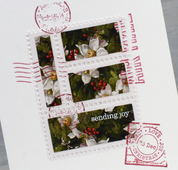
The Elizabeth Craft die is a large one so I was able to get the four stamp section above and the five stamp section below out of one die-cut panel. I used a paper from the Simple Stories ‘Simple Vintage Yuletide’ paper pad.
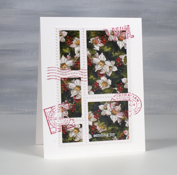
Of course I had to add some postmarks to my faux postage and Darkroom Door stamps are perfect for that. I used red ink and stamps from both Global Postmarks and Christmas Inchies sets.
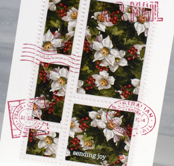
I only added one bit of text to the ‘postage stamp’ and using white embossing powder to make it show up. The ‘sending joy’ is from Penny Black’s very useful ‘holiday snippets’ set – it’s an oldie but a goodie!
I know it’s been a bit quiet on the blog over the last few months and when I have posted it has usually involved leaves! I’m sure there will be more leaves but during November I will be posting Christmas card designs and will hopefully be popping up here a few times a week. Thanks for visiting.
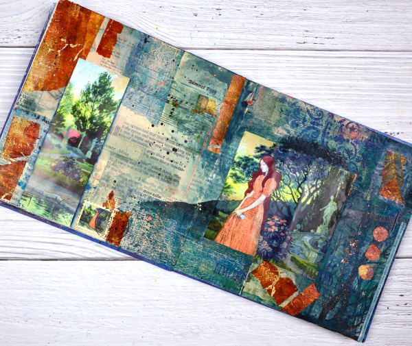
Girl in the Garden Journal Page
Posted: June 18, 2024 Filed under: Alexandra Renke, Art Journal, Darkroom Door, gel press, global postmarks, mandala | Tags: Alexandra Renke, Art Journal, collage, Darkroom Door stamps, gel press, gel printing 4 Comments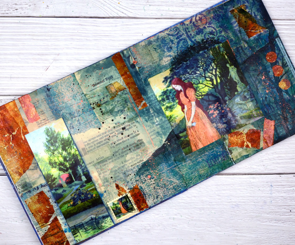
Although I made this page a month or so back; it is an appropriate theme for right now. We are in the ‘garden days’. My back garden is looking colourful and I love wandering out there each day to see what is growing, blooming or falling over!

This page began as a collage of book page pieces. I didn’t have a plan but wanted a base. I used pages from an old novel, an old atlas, sewing instructions, sheet music and other scraps to cover the double page spread in my 7″x7″ handmade journal. Months passed before I came back to do more.
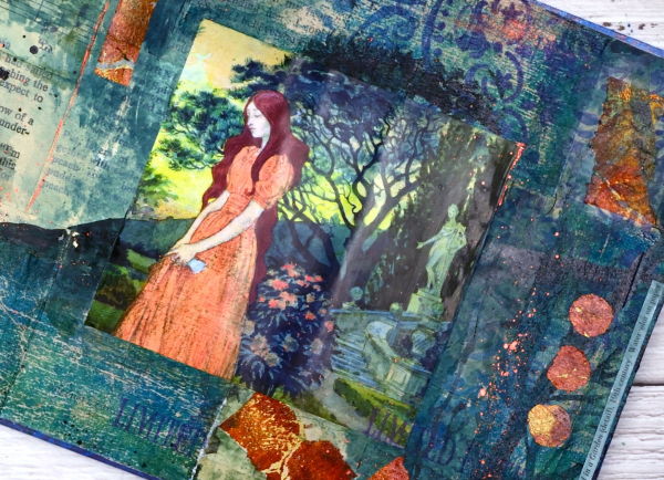
Before adding colour I painted some off white paint over the collaged pages. You might think the calendar image was the inspiration for the pages but bronze and the teal gel prints came first. Both prints were on tissue paper and were most likely made as I picked up extra paint around a primary design. As they were on tissue paper they revealed some of the print underneath when glued to the journal pages. I added ink through an Alexandra Renke mandala stencil.
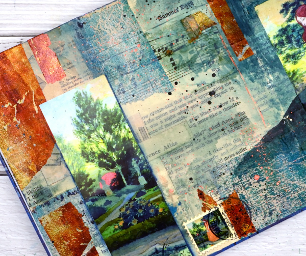
At this point I went looking for pictures to add to the colourful abstract pages and this one from a calendar co-ordinated well. It is from an old art calendar and is a detail from Eugene Grasset’s painting ‘Young Girl in a Garden’. I used some liquid watercolours to extend the painting onto my journal pages, made a faux stamp, added some splatter and stamping then let it all dry. Sometimes I’m not sure when a journal page is finished but I think this one is.
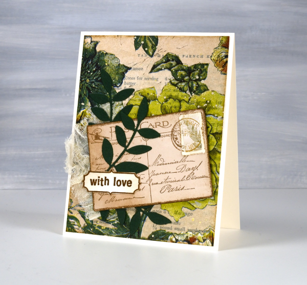
Greenery Collage Cards
Posted: April 3, 2024 Filed under: Collage cards, Darkroom Door, Dies, Finetec paints, gift card pocket, global postmarks, Leaves, measuring tape, Mixed Media, paris postcard, Penny Black, Tim Holtz, wild flowers #1 | Tags: collage, Darkroom Door stamps, Finetec artist mica watercolour paint, Mixed Media, Penny Black creative dies, Penny Black stamps, Tim Holtz 6 Comments
Continuing with the collage theme I have three cards featuring greenery from a paper napkin. I know people have been creating with paper napkins for years but I am new to the game. I have a small collection of pretty paper napkins to use on cards, book covers and journal pages. The green ones featured here are large dinner napkins found at Winners, probably in that tempting ‘just before the checkout’ area!

I glued the printed layer of the napkin over book pages to make my main panels and aged the edges with green and brown inks. I created a couple of little vintage postcards with the Paris postcard stamp, a background with the Measuring Tape stamp, sentiments and postmarks all from Darkroom Door.
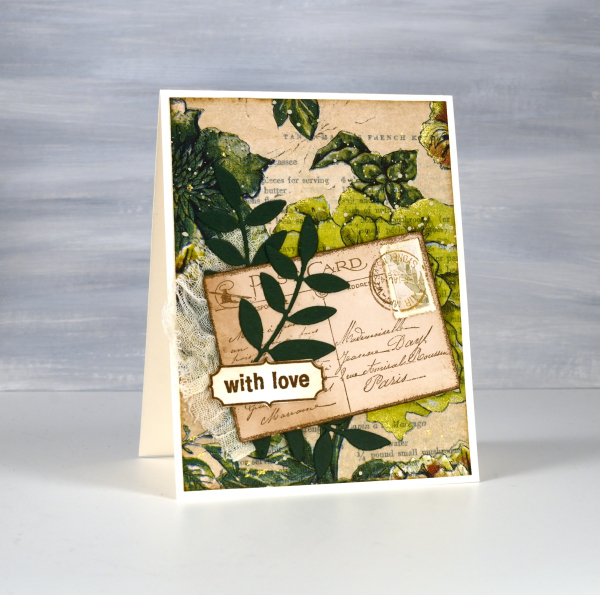
Once again I used some cute dies from Penny Black to cut tickets, file divider, tag and leaves adding blending around the edges for the vintage look.
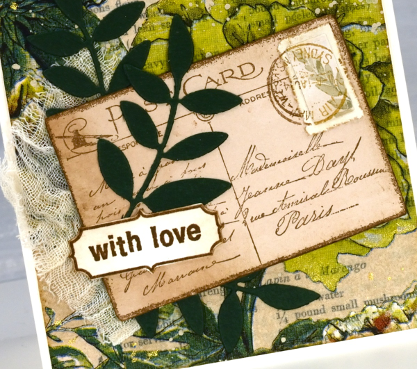
The scrap of cheesecloth, the lace and the grosgrain ribbon were all found around here, maybe the ribbon is actually vintage; it looks a bit discoloured from age which meant it co-ordinated well.

The lovely Queen Anne’s lace die is from the Tim Holtz ‘wildflowers #1 set.
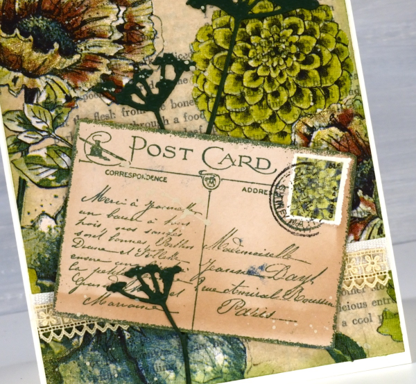
I did make my own little postage stamps for the postcards because I’m still in love with faux postage. These ones had to be quite small so I didn’t use a die I just punched tiny holes with a needle to perforate the edges. You can see a bit of splatter here and there with ivory paint and there are touches of gold watercolour paint on the petals of a few flowers too!
This post includes affiliate links from Foiled Fox and Scrap’n’Stamp . If you buy through these links I receive a small commission at no extra cost to you.
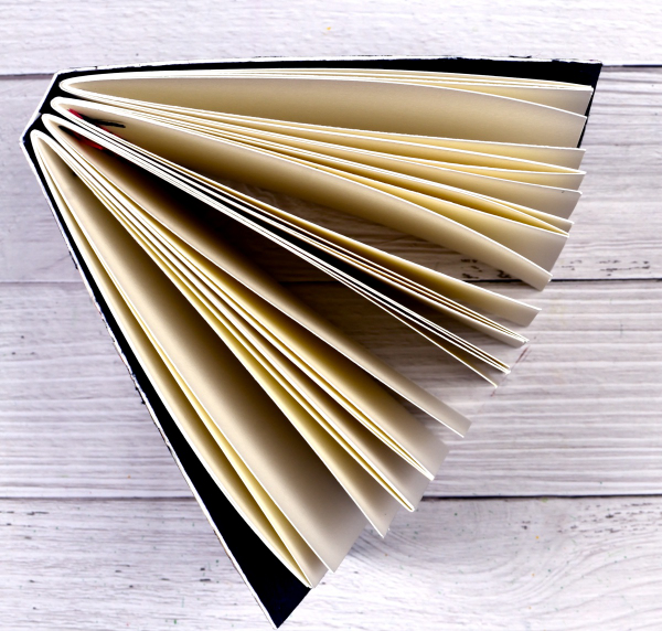
Scrappy Journal Challenge
Posted: March 18, 2024 Filed under: Darkroom Door, gel press, global postmarks, Handmade book | Tags: Darkroom Door stamps, gel press, gel printing, Handmade book 6 Comments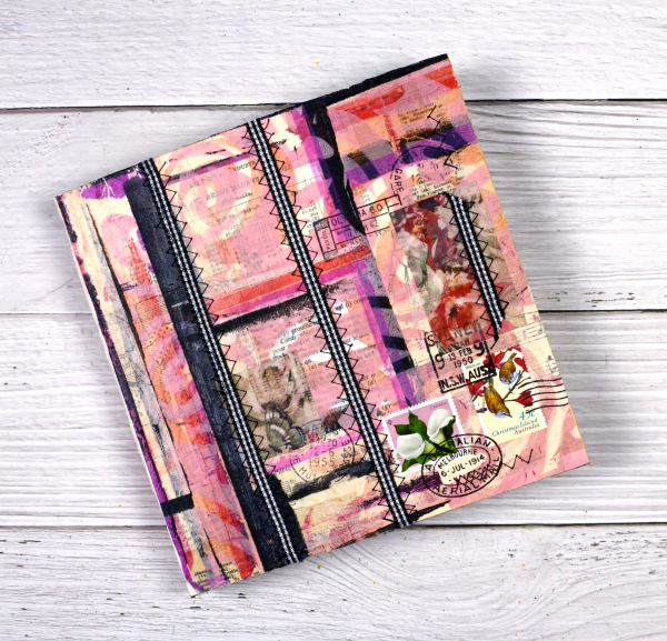
I’ve mentioned the Handmade Book Club before because I enjoy the 5 Day Challenges they offer. The most recent challenge was held last week and was called the ‘Scrappy Journal Challenge‘. The designer and teacher of the challenges, Ali Manning, came up with a tall narrow design which was very attractive. I changed the shape for mine because I will soon need a new art journal and the challenge was the perfect opportunity to get one made. The zig-zag sewing of the signatures was initially tricky but I soon got into a satisfying rhythm and finished them with only one early unpicking incident.
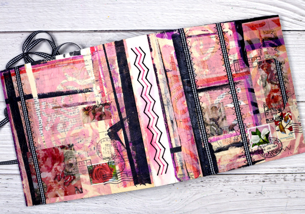
Other than the size of the book and the type of paper in the pages, I followed all the instruction from Ali. She is one of the best teachers I have had the privilege to learn from. I used watercolour paper for my pages and a heavy watercolour paper for the cover. I collaged the cover with vintage papers, then gel printed tissue, fabric washi tape and used postage stamps. The last details added were the gingham ribbon sewn onto the cover with a sewing machine.

The first photo in this post shows the front cover, next the full cover and spine, above is the back cover and below you can see the top view and four signatures.
After sewing the ribbon onto the cover there were random lines of stitching on the inside of the cover so I glued black mulberry paper with gold thread in it over the complete inside cover. After I’d taken the photos I decided to add gingham ribbon ties to both the front and back covers to tie the book closed.
This is the third challenge I have completed with the Handmade Book Club. Here are the links to the other books I’ve made. Mixed Media Journal, Small Coptic Journal, 7×7 Coptic Journal
Faux Postage Stamps – Video
Posted: March 7, 2024 Filed under: Darkroom Door, Elizabeth Craft Designs, fine flowers vol 2, global postmarks, Nature Walk, postage stamps, Tutorial | Tags: Darkroom Door stamps, Elizabeth Craft Designs, Ranger Distress inks, video 7 Comments
Recently I created some faux postage stamps from a stamped and watercoloured panel. I pulled out another floral panel from my ‘pile of possibilities’ and filmed myself making some more faux postage stamps to feature on cards. The watercoloured panel features a repeated flower from the Darkroom Door set, ‘fine flowers vol 2’ and there is a video of my watercolouring process for that too.
The large postage die set I used is from Elizabeth Craft Designs and includes a die to cut perforated stamps of different sizes which remain joined until you cut or tear them apart. There are also dies which cut rectangles to fit in each of the ‘postage stamp’ spaces. There are also bonus number and symbol dies, so the set offers quite a lot.
I chose this set because I liked the way the postage stamps were all joined and I have the option of creating combinations or individual stamps. There are dies available from other companies which just cut the perforated lines and I demonstrate how to do the same thing with that kind of die towards the end of the video. Adding stamped postmarks and even small words makes the faux postage look real and I’m really enjoying using stamped panels, patterned papers and gel prints to make my own postage. I think any hand delivered card I make from now on should have a handmade postage stamp on it!

Family celebrations
Posted: February 27, 2024 Filed under: Ciao Bella, Darkroom Door, global postmarks, rice papers | Tags: Ciao Bella, Darkroom Door stamps, Mixed Media 9 Comments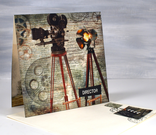
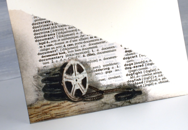
We recently enjoyed an exciting weekend as a family celebrating a birthday and a premiere. I used rice papers, sheet music and dictionary pages to create two custom cards. If you have done any of my online classes you might know my son is a videographer. He filmed my five classes for me but most of his time is spent on very different projects. Over the last few years he has been working on his first movie length documentary. It premiered in Ottawa a couple of weeks ago and our family along, with an excited crowd, were blown away by ‘City Limits: Ottawa’s Hip Hop History’.

I had a lovely time creating a celebratory card using a sheet of Ciao Bella’s rice paper. I have a little stash of Ciao Bella papers that I hadn’t dipped into and this was definitely the right occasion. The paper is aptly called ‘The director‘. I cut a large section to be the card front, tore a corner featuring film reels to go inside and transformed two small bits into faux stamps for the envelope. I am a little obsessed with faux stamps at present and like to make them realistic with the Darkroom Door global postmarks stamp set.

I used a couple of dictionary pages to add to the overall theme. Behind the projector panel is a dictionary page featuring the word ‘film’ and you can see the torn section of the ‘documentary’ page below.
We celebrated my husband’s birthday the same weekend and I paired the CiaoBella blue note cards rice paper panel this time with sheet music, being that my husband is a guitarist. The rice paper already had a tiny music print on it but the music paper I glued behind had a larger staff. I used it inside the card and under the greeting as well.
And yes, he did sight read the little segment I glued inside the card; he’s a musician!
This post includes affiliate links from Ecstasy Crafts where you can find these beautiful rice papers and many more. If you buy through these links I receive a small commission at no extra cost to you.
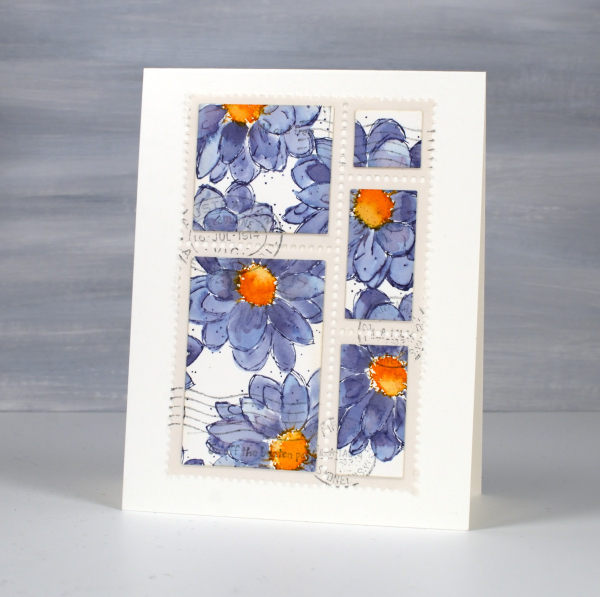
Postage Stamp Tulips
Posted: February 7, 2024 Filed under: Darkroom Door, Elizabeth Craft Designs, global postmarks, online class, Penny Black, postage stamps, splendiferous | Tags: Darkroom Door stamps, Elizabeth Craft Designs, Fabriano Watercolour Paper, online class, Penny Black stamps 11 Comments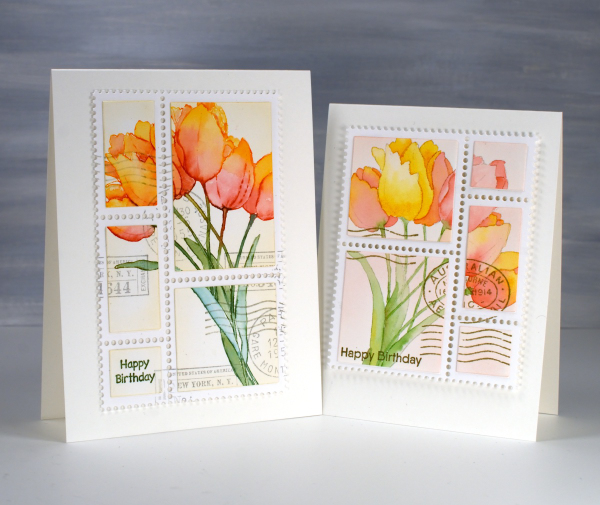
I’ve been inspired so many times by my talented friend Stamping Matilda, aka Godelieve Tijskens including her delightful faux postage stamps. I’ve wanted to make some for a while so I treated myself to a fancy die from Elizabeth Craft Designs. There are many ways to make faux postage stamps including with a clever tracing wheel usually use for sewing.

Once I had my die on hand I had to decide what to make my stamps from. I decided not to stamp something especially for the faux stamps. Instead I started using patterned papers and stamped panels that were sitting around looking pretty but not serving any other purpose. The two tulip panels featured on today’s cards were made for my online class Floral Faves. There is a lesson in the class where I show a range of methods for no-line watercolour. In designing and filming the class I created quite a few no-line watercolour panels that were never turned into cards…until now. I stamped the tulips using the Penny Black stamp, ‘Splendiferous‘.

The ‘postage stamps‘ die cuts a large panel of perforated stamps all joined together. There are also small dies in the set that cut rectangles to attach inside the perforated sections. Once I had my tulip sections attached I used Darkroom Door set, ‘global postmarks‘ to add postmarks. I popped up my faux postage stamps on one A4 card and one slightly smaller card. Of course I proceeded to search my pile of possibility for more panels to turn into faux stamps! Today’s post features an affiliate link to Scrap’n’Stamp. If you buy through this link I receive a small commission at no extra cost to you.
Lighthouse Journal Page
Posted: April 6, 2023 Filed under: Art Journal, Darkroom Door, global postmarks, Handmade book, this way, word labels, World Map | Tags: Art Journal, Coliro paints, Darkroom Door stamps, Fabriano Watercolour Paper, Handmade book, Ranger Distress inks 5 Comments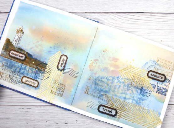
This journal spread was a joy to make. It combines so many of my favourite things. A few weeks back I posted about a new handmade art journal. This is it and these are the first pages I’ve completed. I didn’t work on the very first page; I leave that for later, so this is a few pages in. The pages are cold pressed watercolour paper so I taped the edges and created a watery blended background with distress inks smooshed on a piece of acetate then pressed onto my pages. I added more ink with a paintbrush and stamped the Darkroom Door world map stamp into the wet ink. I wasn’t trying to create sky or land or anything in particular I was just working randomly with blues and browns.
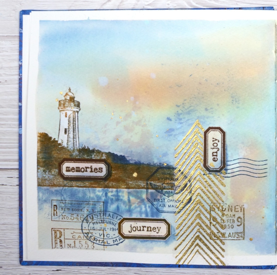
Once the background dried I used stamps from another favourite, the DD ‘global postmarks’ set, again stamped in blue and brown but archival ink, not distress, so it wouldn’t dilute and blur.
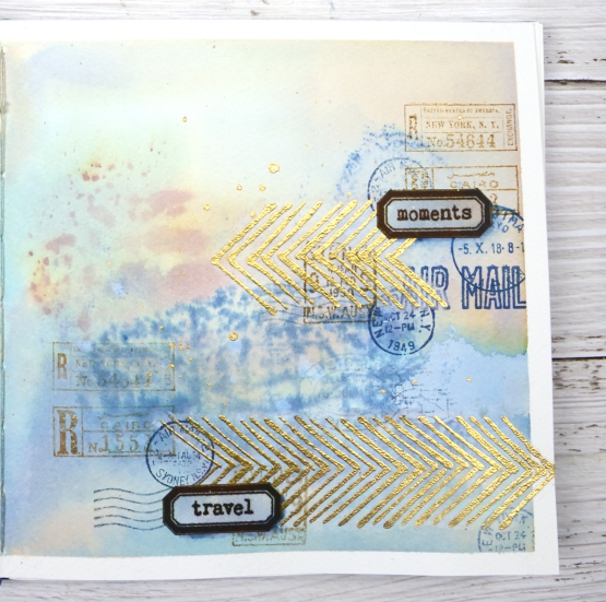
On an extra scrap of watercolour paper I picked up some smooshed and diluted ink then dried it before stamping the new ‘word labels’ stamps so I could cut them out and arrange them over the page.
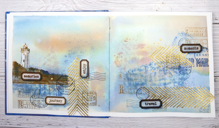
If you have been visiting my blog for a while you will have seen the lighthouse stamp before. The lighthouse is in Norah Head, on the central coast of NSW, not far from where my father lives and the Darkroom Door premises. I have visited there several times and climbed the lighthouse with my dad. You can probably see now why I chose the word labels I did. The lighthouse and the ‘this way’ arrows are stamped on tissue paper. This allowed me to move them around to work out exactly where I wanted them. The blurry world map stamping worked as a ‘reflection for the lighthouse image so that’s where it ended up.
When I am adding stamped tissue to a page I gently tear around the edges with the help of a damp paintbrush. For the lighthouse I cut carefully around the walls and light then painted white paint on the back of the tissue so it would not be transparent. Of course I splattered some water and some gold paint to complete the page.
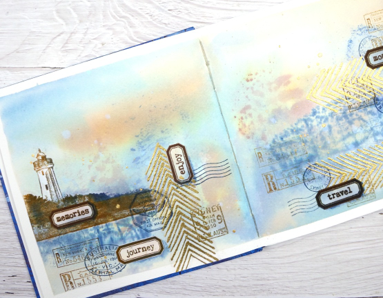
As this was the first time I had used my new journal I was interested to see how the cold pressed watercolour paper worked. Nothing soaked through the paper to the other side and I took care to dab up liquid from the centre seam so there was not much bleed through there either. The 7″ x 7″ size gave me a little more room than the 6 x 6 journals I have been working in but wasn’t so large as to be overwhelming.
(Compensated affiliate links from Foiled Fox, Scrap n Stamp & Ecstasy Crafts)
Vintage layers
Posted: April 5, 2021 Filed under: Darkroom Door, French Script, global postmarks, mesh, Nature Walk, Papertrey Inks, scratches, you are everything | Tags: Darkroom Door stamps, Dr Ph Martin Hydrus watercolor paints, Fabriano Watercolour Paper, Papertrey ink 12 Comments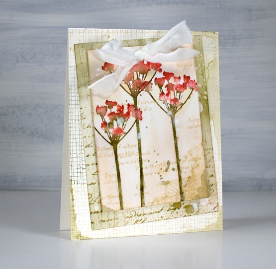
Today’s cards developed bit by bit over a week or so. I worked on flower panels one day, middle layers another day, let them sit a few days, searched for ribbon another day and finally a week later put them together still adding stamping, splattering and blending right up until I called them finished!
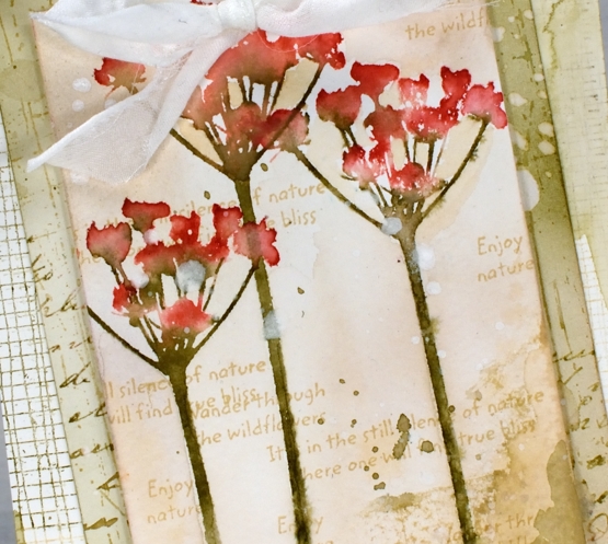
I featured the silhouette floral stamps from the new Darkroom Door ‘you are everything’ set. There are four floral stamps along with eighteen word stamps I mentioned in a previous post. The flowers above are stamped on cold press watercolour paper with papertrey inks. I used pale peony and pure poppy on the petals and olive twist on the stems. I spritzed lightly before stamping then blended further with a paintbrush on the paper. I used the same technique on the purple flowers in the second card but worked on hot pressed watercolour paper.
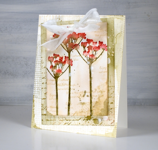
For the vintage and collage details on the card I above I used olive twist and fine linen inks to add painted areas, stamped text, splatter and blending with a brush.
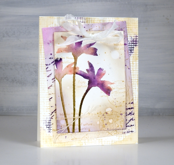
The flowers above are stamped in pale peony, royal velvet and olive twist and I stuck with fine linen and royal velvet as the inks on the layered areas also.
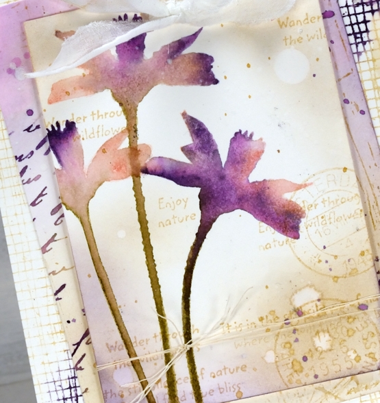
I’ve listed all the stamps I used to add texture and interest to the floral panel and the layers underneath. You can see some of my favourite ‘filler’ stamps including French script and global postmarks. I also splattered water and white paint for some watermarks and subtle blots!
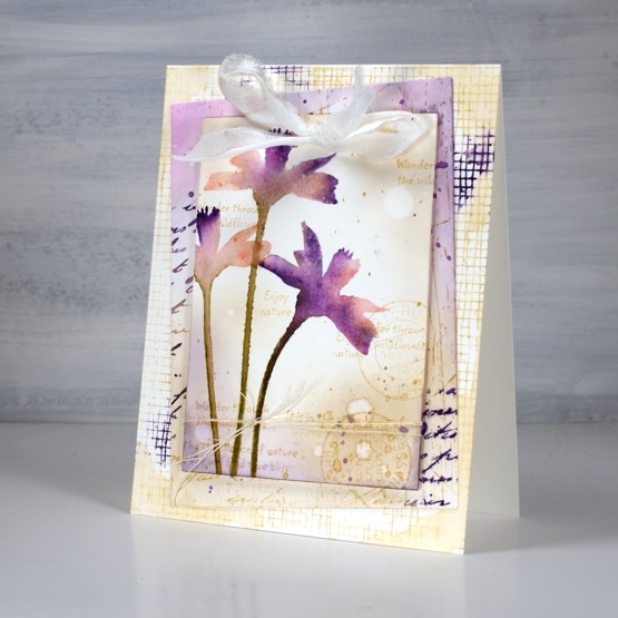
To finish both cards I punched a couple of holes in the top to thread some fabric through. I didn’t have a cream silk or sheer ribbon so I ripped some strips of what might be silk but I can’t remember. The ripped edge worked fine with my vintage layered look.
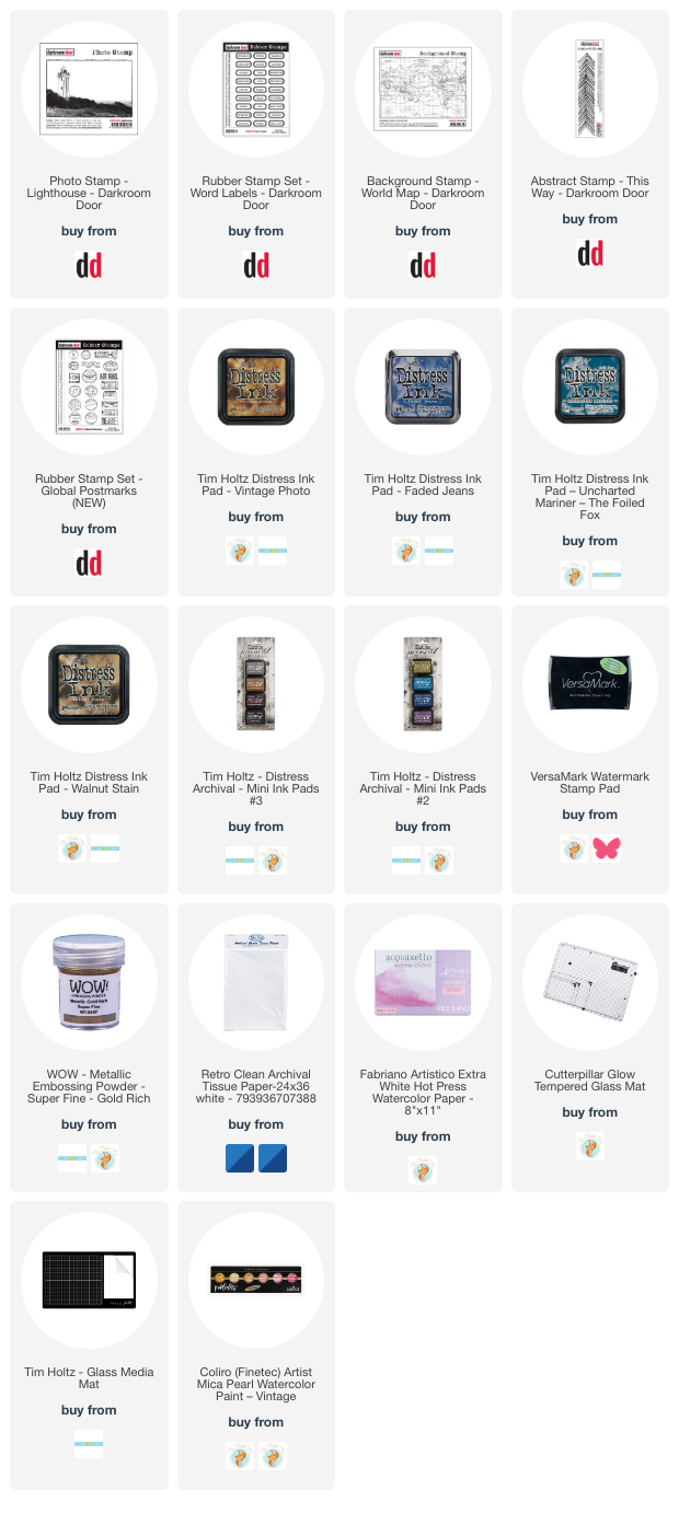
Supplies
(Compensated affiliate links used when possible)