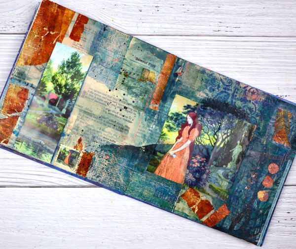
Girl in the Garden Journal Page
Posted: June 18, 2024 Filed under: Alexandra Renke, Art Journal, Darkroom Door, gel press, global postmarks, mandala | Tags: Alexandra Renke, Art Journal, collage, Darkroom Door stamps, gel press, gel printing 4 Comments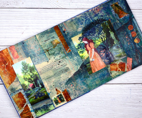
Although I made this page a month or so back; it is an appropriate theme for right now. We are in the ‘garden days’. My back garden is looking colourful and I love wandering out there each day to see what is growing, blooming or falling over!

This page began as a collage of book page pieces. I didn’t have a plan but wanted a base. I used pages from an old novel, an old atlas, sewing instructions, sheet music and other scraps to cover the double page spread in my 7″x7″ handmade journal. Months passed before I came back to do more.
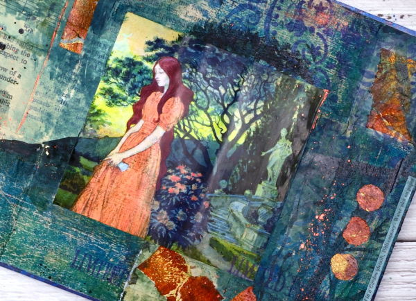
Before adding colour I painted some off white paint over the collaged pages. You might think the calendar image was the inspiration for the pages but bronze and the teal gel prints came first. Both prints were on tissue paper and were most likely made as I picked up extra paint around a primary design. As they were on tissue paper they revealed some of the print underneath when glued to the journal pages. I added ink through an Alexandra Renke mandala stencil.
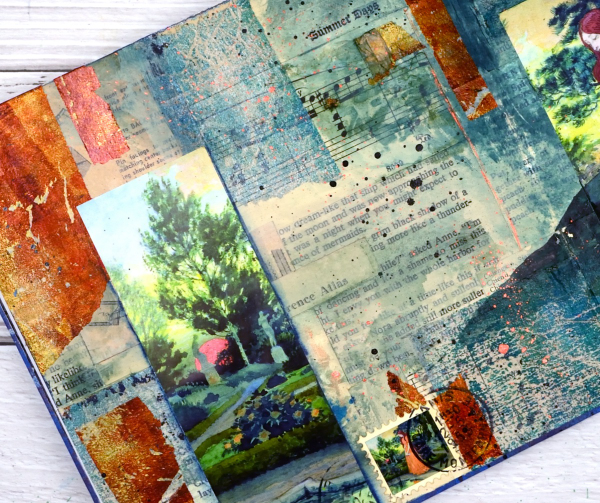
At this point I went looking for pictures to add to the colourful abstract pages and this one from a calendar co-ordinated well. It is from an old art calendar and is a detail from Eugene Grasset’s painting ‘Young Girl in a Garden’. I used some liquid watercolours to extend the painting onto my journal pages, made a faux stamp, added some splatter and stamping then let it all dry. Sometimes I’m not sure when a journal page is finished but I think this one is.
Ocean Collage in Art Journal
Posted: May 2, 2024 Filed under: Art Journal, gel press, Handmade book | Tags: Art Journal, collage, gel printing 3 Comments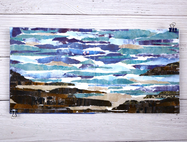
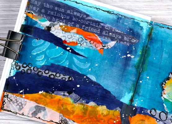
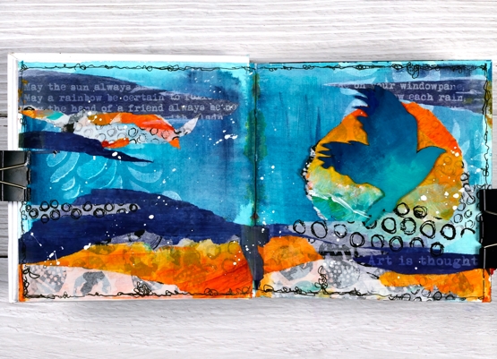
I guess the title gives it away but I hope you can see the ocean, the rocks and the shore in this art journal spread. As with many recent blog posts I used gel prints to create this scene in my 7”x7“ journal.

I created this double page scene after seeing a torn paper landscape a friend had created. I tore strips of paper from several blue prints and brown prints. As I laid them out I realized that the order in which I glued them would affect the end result. I had intentionally ripped the paper to have white edges that looked like the surf.
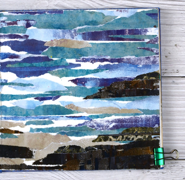
Rather than try and plan the whole design I just started gluing and some how it worked. It is a technique I will try again to see if I can settle on some general instructions.
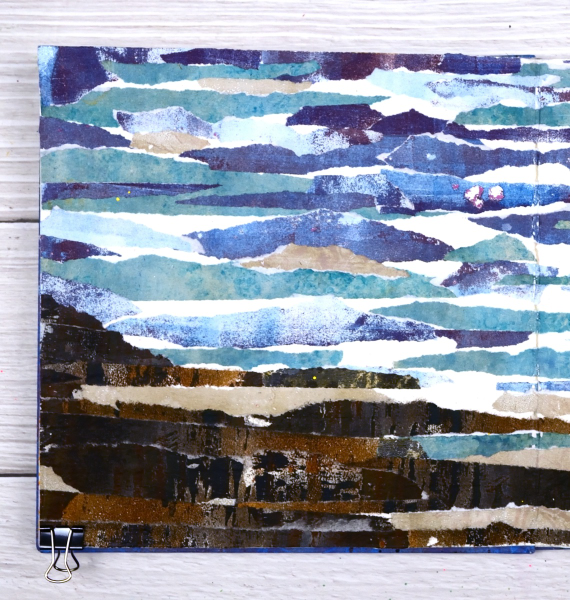
You can see there are some patches of white here and there where I didn’t cover the journal page at all. I felt those patches acted as white caps and surf or sand.

As I sit and write this I can see the ocean out the window and a couple of hours ago I was walking on a beach which looks a bit like these pages. Although the inspiration for this page came out of my memory it seemed like a good day to share an ocean view.
Vintage Butterfly Journal page
Posted: August 8, 2023 Filed under: 49 and Market, 6"x 6" journal, Art Journal, Curators Adverts, gel press | Tags: Art Journal, gel press, gel printing 4 Comments
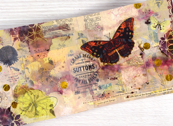
I recently completed this spread in my Ranger 6″x6″ kraft journal. The background or base of my page is covered in collage so by the time the page was finished very little of the kraft colour showed through.
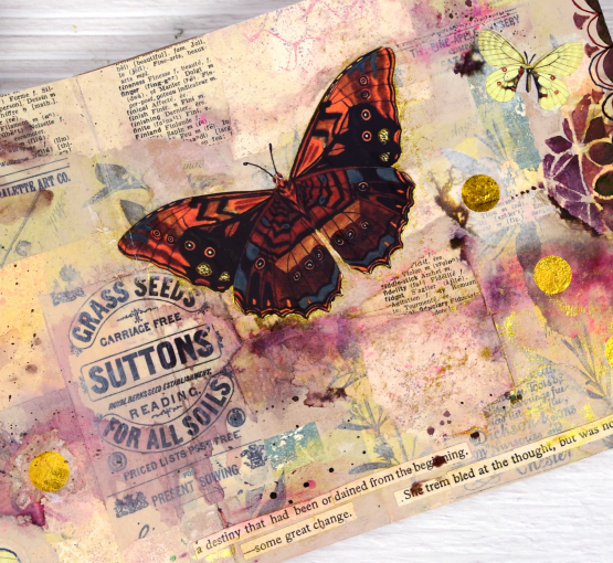
When I started this page I didn’t have a plan but I did have patterned papers on my table. I had some pink, yellow and apricot coloured gel print scraps, some yellow-green tissue paper printed with botanical images and as always, some vintage book pages. Some of the gel printed scraps were left over from the cards I featured in a post last week. I glued down the gel print scraps in no particular arrangement then began gluing the green tissue over the top. I have some fancy washi tape called ‘Curators Adverts‘ which is 4″ wide and covered in black-on-cream ads. I tore some pieces of that and added them over the paper collage.

The collaged page sat on my desk for several weeks before I resumed by adding acrylic paint in pale neutral tones including sand and old ivory. The paint began to tie the page together but it was still lacking a focal point. I flipped through the DK Bees, Birds and Butterflies Sticker Anthology and chose a few pale yellow butterflies which I added to the bottom left and top right corner.

You know I love splatter on my cards and journal pages so I added some droplets of dark brown ink, then spritzed it to dilute and move it around the page. The brown ink diluted to burgandy and pink tones which made me go back to the sticker anthology in search of a bolder butterfly. Once I had added it to the page I worked with walnut stain distress ink and Parker writing ink to add scallop patterns by hand and through the beaded mandala stencil.
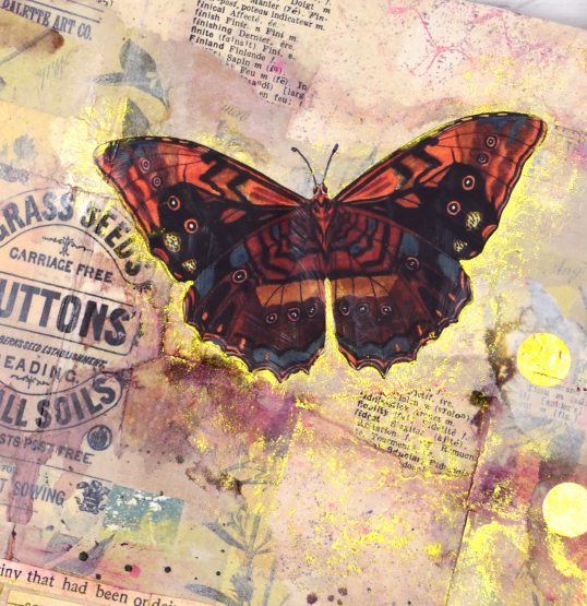
Final touches included some gold polka dot tissue paper, some sentences cut from book pages and sparkly gold watercolour paint. I really like the warm pinky brown tones of this page with some subtle yellow and green appearing sparingly. The vintage ad for grass seed is also a nice feature, centered but not the main attraction.
Collage is a favourite technique for me when beginning journal pages, how do you like to get started on a fresh new spread?
The World is a Garden
Posted: April 28, 2023 Filed under: Art Journal, daisy delight, Darkroom Door, eyes, Handmade book, sketched alphabet | Tags: Art Journal, Darkroom Door stamps, Fabriano Watercolour Paper, Ranger Distress inks 4 Comments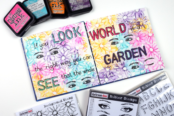
Do you recognise this set? It is the Darkroom Door ‘Eyes’ set I featured on a journal page a couple of weeks back. For this journal page I used a smaller pair of eyes and also one eye from the closed eye stamp so I could create a ‘wink’!
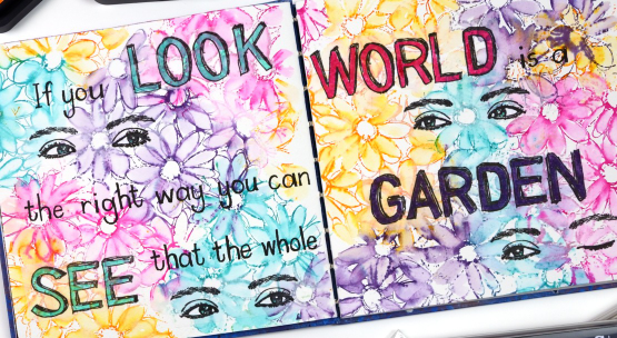
The background is stamped loosely with four bright distress inks and the DD ‘daisy delight’. When I say stamped loosely I was not looking for complete images so I inked sections of the stamp with a couple of inks then stamped on the journal page. I did the same again with a different pair of inks until I had filled both pages. Because distress inks react so well with water and my pages are cold pressed watercolour paper it was easy to blend the petals with a wet paintbrush. Where the inks overlapped I got some nice blends; there were a few muddy blends but overall look is of a garden bed of daisies which is what I wanted.
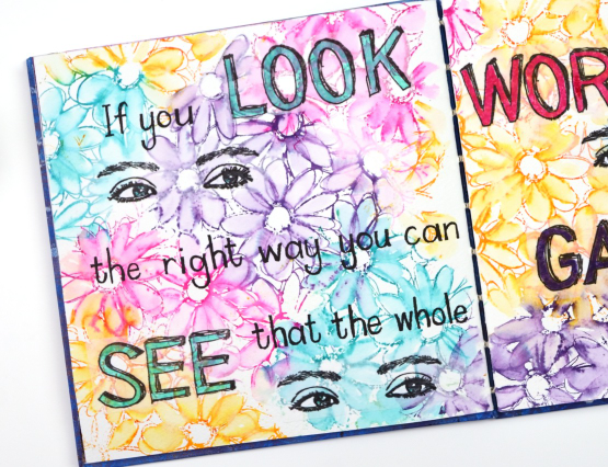
No surprise that I did not have the whole design planned out from the beginning so I had to work out the best way to add the eyes without disturbing the very dilutable flowers I had already watercoloured. I ended up stamping them on tissue paper and gluing them down with a gluestick so as to not add more liquid to the background. I also stamped the large letters for the quote on tissue paper using the DD ‘sketched alphabet’ stamp set. Having the eyes and the words stamped on tissue made it easy to play with the arrangement until I was happy with it. The smaller words making up the quote I wrote by hand with a black marker.

The quote is from ‘The Secret Garden’ by Frances Hodgson Burnett, a book I enjoyed reading as a child and a parent.
Just a quick question for you, did you try reading the quote straight across the two pages or did you see it went down the left then up to the right? Just wondering because I didn’t even think of both options when I was laying it out.
(Compensated affiliate links from Foiled Fox & Scrap n Stamp)
Darkroom Door Eyes
Posted: April 14, 2023 Filed under: Art Journal, Darkroom Door, eyes, Flower garden, French Script, gel press, Handmade book, made for you, spanish tiles, starry night, Stencils, you are everything | Tags: Art Journal, Darkroom Door stamps, Darkroom Door stencils, gel press, gel printing 4 Comments
Are you surprised to see a face on one of my projects? This journal page spread was definitely outside my comfort zone but I am very happy I persevered and brought it to completion. The page began with the new ‘Eyes’ stamp set from Darkroom Door and a pile of gel prints. There are eight pairs of eyes in the set in a couple of different sizes. I chose to stamp the eyes on a pale gel print done with oxide inks and the DD background stamp ‘flower garden’. To help me draw the rest of the face around the eyes I found a magazine face with similar size eyes and that gave me the right scale and placement as I completed the head and features.
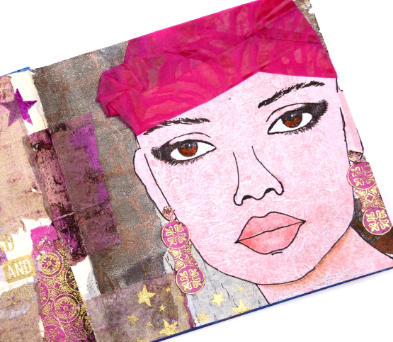
Although I like the idea of adding hair I decided to do that on a future project and used some textured wrapping from a bunch of flowers instead. The bright pink helped me choose other gel prints to complete the background collage. You might not see them all but DD background stamps and stencils are featured on most of the torn collage pieces.
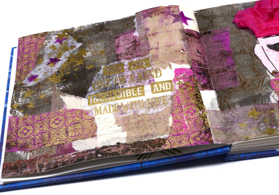
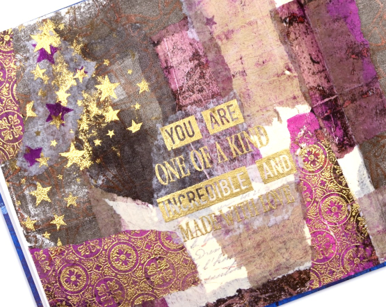
I embossed the Spanish tiles background stamp on a bright pink gel print, tore it up for collage and attached a strip to cardstock so I could cut earrings. I also used gold embossing when adding the words. I alternated phrases from the DD ‘you are everything’ set with the new DD ‘made for you’ set.
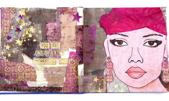
I worked in my new handmade journal which is 7″x7″. Once I had the facial features pencilled in I went over them with marker then added shading with coloured pencils. I also stenciled some stars over the collage and embossed in gold to give the whole spread more unity. The pink turban was a bit of a challenge which ended up looking a bit more like a swim cap than a turban but you get the general idea don’t you?
I will be using the eyes again both to practice drawing faces and as elements in future journal pages. I hope you are enjoying seeing the new stamps from Darkroom Door; they are always full of the artistic magic and clever ideas of Rachel Greig.
(Compensated affiliate links from Foiled Fox & Scrap n Stamp)
Lighthouse Journal Page
Posted: April 6, 2023 Filed under: Art Journal, Darkroom Door, global postmarks, Handmade book, this way, word labels, World Map | Tags: Art Journal, Coliro paints, Darkroom Door stamps, Fabriano Watercolour Paper, Handmade book, Ranger Distress inks 5 Comments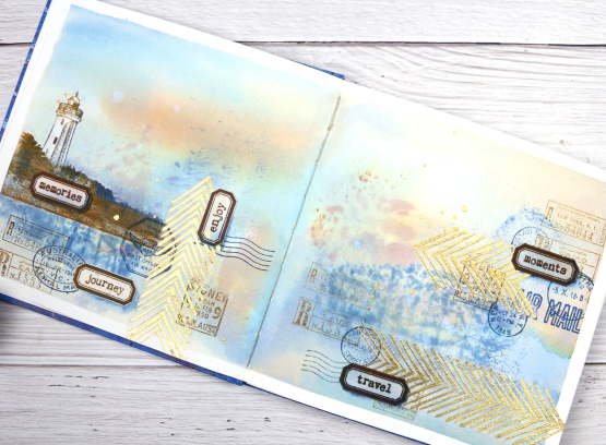
This journal spread was a joy to make. It combines so many of my favourite things. A few weeks back I posted about a new handmade art journal. This is it and these are the first pages I’ve completed. I didn’t work on the very first page; I leave that for later, so this is a few pages in. The pages are cold pressed watercolour paper so I taped the edges and created a watery blended background with distress inks smooshed on a piece of acetate then pressed onto my pages. I added more ink with a paintbrush and stamped the Darkroom Door world map stamp into the wet ink. I wasn’t trying to create sky or land or anything in particular I was just working randomly with blues and browns.
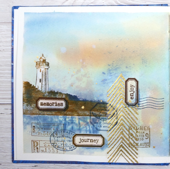
Once the background dried I used stamps from another favourite, the DD ‘global postmarks’ set, again stamped in blue and brown but archival ink, not distress, so it wouldn’t dilute and blur.
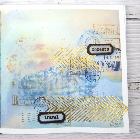
On an extra scrap of watercolour paper I picked up some smooshed and diluted ink then dried it before stamping the new ‘word labels’ stamps so I could cut them out and arrange them over the page.
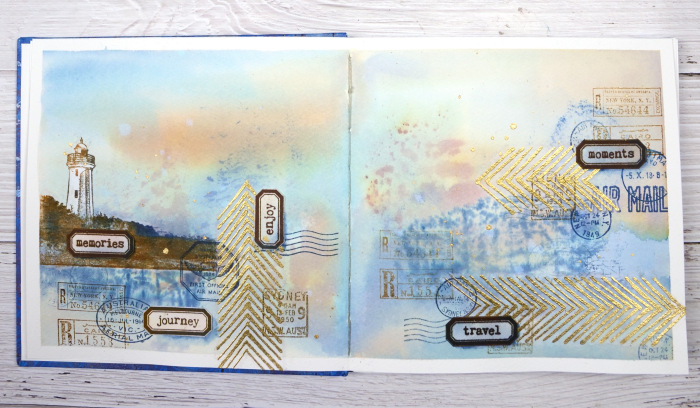
If you have been visiting my blog for a while you will have seen the lighthouse stamp before. The lighthouse is in Norah Head, on the central coast of NSW, not far from where my father lives and the Darkroom Door premises. I have visited there several times and climbed the lighthouse with my dad. You can probably see now why I chose the word labels I did. The lighthouse and the ‘this way’ arrows are stamped on tissue paper. This allowed me to move them around to work out exactly where I wanted them. The blurry world map stamping worked as a ‘reflection for the lighthouse image so that’s where it ended up.
When I am adding stamped tissue to a page I gently tear around the edges with the help of a damp paintbrush. For the lighthouse I cut carefully around the walls and light then painted white paint on the back of the tissue so it would not be transparent. Of course I splattered some water and some gold paint to complete the page.
As this was the first time I had used my new journal I was interested to see how the cold pressed watercolour paper worked. Nothing soaked through the paper to the other side and I took care to dab up liquid from the centre seam so there was not much bleed through there either. The 7″ x 7″ size gave me a little more room than the 6 x 6 journals I have been working in but wasn’t so large as to be overwhelming.
(Compensated affiliate links from Foiled Fox, Scrap n Stamp & Ecstasy Crafts)
Time Art Journal page
Posted: March 6, 2023 Filed under: 6"x 6" journal, Art Journal, Darkroom Door, diamonds, gel press, ransom alphabet, starry night, Stencils | Tags: Art Journal, Darkroom Door stamps, Darkroom Door stencils, gel press, gel printing 4 Comments
This journal page is unlike many of my other pages but contains some of my favourite papers and techniques. What you can’t see is the design I started underneath about a year ago. It had the look of a watercolour sunset but everytime I flipped to that page I didn’t know what to do with it; eventually I covered it up completely.
This is the same as the 6″x6″ watercolour paper journal I use in my Art Journal Adventure workshops. The clock and the starry sky background are gel prints. I did them quite a while ago but because of their size I didn’t know how to use them. The clock was 7″ across before I cut it. It’s an image transfer from a Tiffany’s catalog which arrived at my house for no reason. I don’t have anything from Tiffany’s but I can tell you the images in that catalog are perfect for gel print image transfers! The starry sky was also a large print made with large stencils from Darkroom Door. I could have cut up the panel for cards but I wanted to keep it together if possible. I did end up tearing it into two pieces before gluing it to the page. The galaxy type strip from left to right covers the area where the two pieces meet.
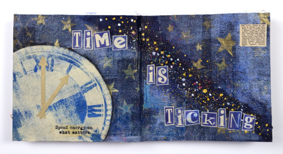
The theme of time is not meant to bully me into being busy, more to remind me that time is precious and why not use it wisely. I printed the letters for the phrase on the rice paper leftovers from the cut out clock using the Darkroom Door ransom alphabet set. That little definition in the corner is from a little palm sized dictionary bought second hand for collage.
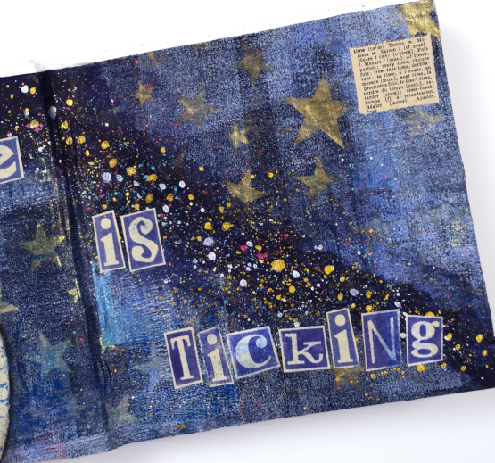
The splatter on the black gesso strip is finetec pearlescent paints which tie in with the gold metallic printing on the star gel print. Considering the double page was uninspiring for so long, I’m quite happy with how it turned out.

(Compensated affiliate links from Foiled Fox, Scrap n Stamp)
Tea, Coffee, Art Journalling?
Posted: February 28, 2023 Filed under: 6"x 6" journal, Art Journal, Background Stamps, coffee time, Cup of tea, Darkroom Door, Dies, Gazette, Penny Black, Script, Time, What's in your cup, World Map | Tags: Art Journal, Darkroom Door stamps, Penny Black creative dies, Penny Black stamps, Ranger Distress inks 2 Comments
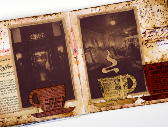
Today I am posting a few pages from last year’s Art Journal Adventure workshops. I taught seven different ‘episodes’ last year and one month the theme was coffee and tea. I did a few pages before the sessions and then created a different page during each class. I don’t like replicating the same spread in my art journal so each one had a different colour scheme and style.

Even though I am more of a herbal tea drinker than a coffee drinker I ended up creating three coffee themed pages and two tea themed. You can see the first coffee themed page here. As you can see from the three spreads featured here I use a variety of techniques, papers and elements in my pages. The common technique on these pages is a watercolour background and the common element is the chipboard cups. Both the coffee themed pages feature photos from an old coffee themed diary. In both cases I took my colour scheme from the photo and added browns.
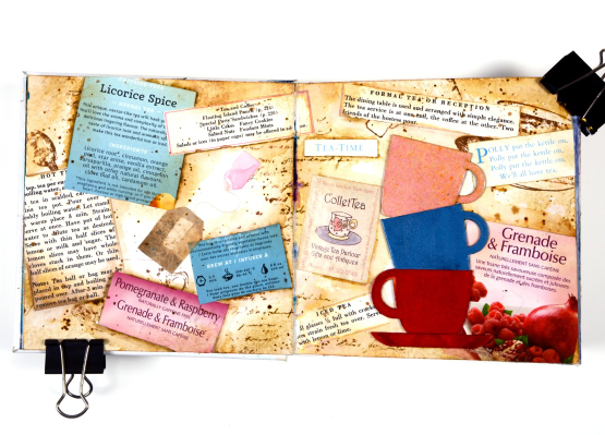
This tea themed page could also be called ‘these are a few of my favourite teas!’ I used packaging from boxes and sachets, embossed the teacups to match and add snippets from old books and magazines.
These pages show how I gather elements and papers from here, there and everywhere when creating a page. I used inks, embossing powders and glazes, stamps and stencils for these pages but I also used an old diary, packaging, pages from a vintage recipe book, and old teabags!
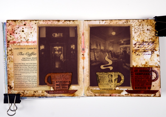
I almost didn’t finish this last spread but once I had stamped then glazed the cute chipboard cups I knew I had to finish. Now I want a mug with vintage newsprint on it!
Art Journal Adventure for 2023 kicks off this week. There is still space in the Friday class and the Monday class. We will be creating with semi- transparent papers.
(Compensated affiliate links from Foiled Fox, Scrap n Stamp)
Art Journal Adventure & how it started
Posted: February 2, 2023 Filed under: Art Journal, Classes | Tags: Art Journal, Classes 3 Comments
I have been art journaling for quite a while now but I only started teaching in-person art journaling workshops in 2022. I was inspired to start after doing an online class with Dina Wakley and talking with the owner of the Crop A While where I have taught for years. The page shown here was completed using Dina Wakley supplies and techniques she demonstrated.
One of the things that made me enthusiastic was the journal she used. The size and the type of pages are a great match for me and for a class setting. The journal is 6″x6″ and the paper is heavy weight watercolour paper. In class we have covered a whole range of techniques and mediums because the paper can take it.
This page features acrylic paints, printed tissue papers, black markers and a chipboard bird. The page Dina demonstrated was definitely more abstract than mine; it took me a while playing with the torn papers and textures but I finally settled on a loose ocean and sunset theme.
When I started teaching Art Journalling I called the class ‘Art Journal Adventure’ and it turned out to be aptly named. It has been a a wonderful adventure so far. I have made new friends, learnt and taught new techniques and developed quite strong mixed media muscles! Last year we had seven episodes of Art Journal Adventure and I am starting up again in 2023 with season 2. The titles ‘season’ and ‘episode’ are just fun titles I settled on; you can start at any time (you don’t have to join at the beginning).
The first episode for this year is now posted on my ‘classes‘ page and the Crop A While website also. I guess the theme does take something from the page shown here as we will be layering semi-transparent papers such as printed rice paper, table napkins and tissue. Are you an art journaller? What size journal do you use? What’s the paper like? I am always interested to hear what my creative friends are enjoying.
(Compensated affiliate links used when purchasing from Foiled Fox, Scrap n Stamp)
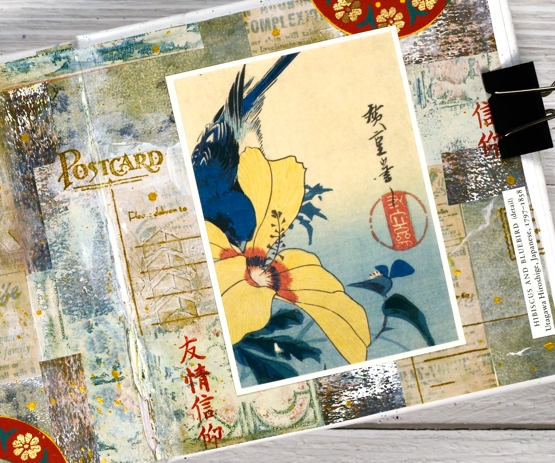
Collage behind Hibiscus and Bluebird
Posted: September 8, 2022 Filed under: Art Journal, Darkroom Door, Gazette, Penny Black, vintage postcard | Tags: Art Journal, collage, Darkroom Door stamps, Penny Black stamps 4 Comments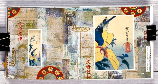
One of my favourite techniques when art journaling is to create a collage background from gel prints, patterned papers, stamping, stencilled texture and paint. Sometimes I know what focal elements I will add over the top, other times I wait to be inspired by the completed collage.
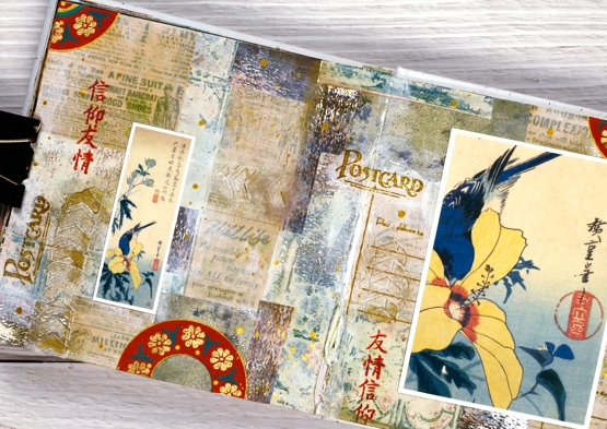
When creating this collage spread in the 6″x 6″ art journal I used gel prints and patterned papers in neutral tones: pale green, beige and browns. I did some stamping with Darkroom Door and Penny Black stamps on kraft paper and over the top of the collage. The focal point is an image from the front of a greeting card. As is sometimes the case, the back of the card featured a smaller version of the same art. I used both on my pages along with some handmade printed paper from a friend. I was very happy with the way the colours worked together and was happy to save and use a card sent by a dear friend. ( I cut the artist’s name from the card and added it to my page.)
Supplies
(Compensated affiliate links used when purchasing from Foiled Fox, Scrap n Stamp and Ecstasy Crafts)