Vintage Car
Posted: December 9, 2020 Filed under: 1920s Chic, classic cars vol 1, classic motorcycles, Darkroom Door, vintage car | Tags: Darkroom Door stamps, distress markers, Ranger Distress inks 3 Comments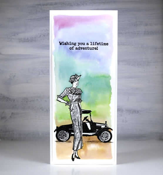
The new vintage car stamp pairs perfectly with one of the ladies from the classy 1920’s chic stamp set, both from Darkroom Door. I made two slimline cards and went with a rainbow colour scheme.

To position the car behind the woman I stamped her first, masked her with a post-it note mask I had cut out and then stamped the vintage car over the top. As both were stamped in nocturne versafine clair pigment ink I was able to emboss in clear powder to make it easier to paint a multicoloured background. I used distress inks smooshed on my glass mat but painted water around the images first so I could drop colour in and blend one colour with the next. On the card below I stamped the car three times in Memento London fog ink and once in a rainbow of distress inks. I applied the rainbow with a marker and spritzed the stamp before stamping so the colours began to blend before hitting the watercolour paper panel.

I stuck with London fog ink for the first two sentiments from DD classic cars vol 1 and switched back to the markers when stamping the birthday sentiment from DD happy birthday set. In keeping with the rainbow car I blended the same inks over the card base with blending brushes. The sentiment on the first card is from the DD classic motorcycles set
Speaking of dresses, but none quite so chic as the stamped one, I am continuing to wear dressed every day during December as I fundraise for the Dressember campaign which fights against human trafficking. My fundraising total has reached $795. If you would like to contribute just click over to my Dressember page. Thank you, thank you to those who have already done so.
Supplies
(Compensated affiliate links used when possible)

Wise Men
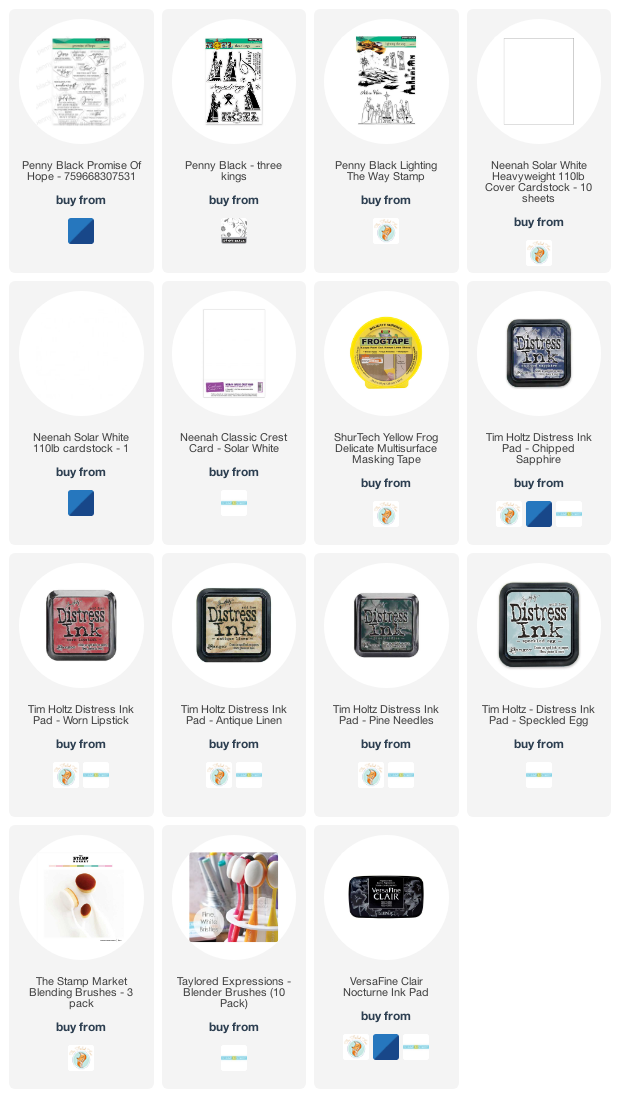
Posted: December 8, 2020 Filed under: lighting the way, Penny Black, three kings | Tags: Penny Black stamps, Ranger Distress inks 5 Comments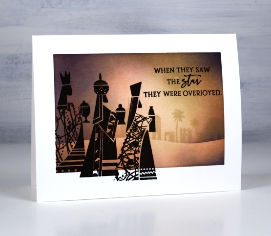
I have two more one-layer ink blended cards today created using exactly the same technique as yesterday’s cards. I masked the edges of the neenah solar white card front with painter’s tape then used blending brushes to build up colour to fill the inside space.
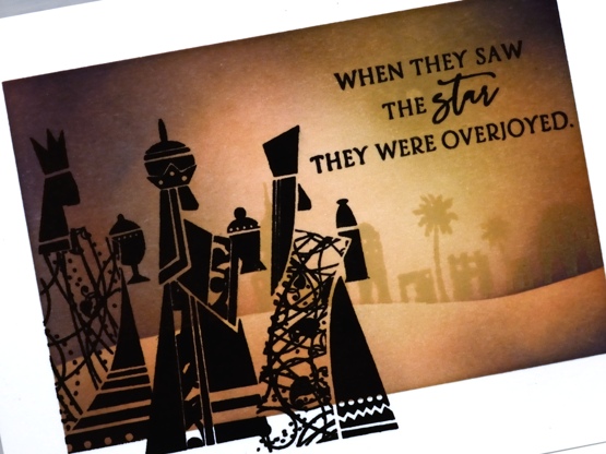
On both cards I placed a tiny circle post-it mask in the sky to be the star then blended the lightest colour over the whole panel. On the card above I started with antique linen distress ink; on the single wise man card below I started with speckled egg distress ink. Once the base colour was in place I positioned a hill shaped post-it note to mask the land area while I worked on the sky. On the card above I used worn lipstick then chipped sapphire. On the card below I blended pine needles followed by chipped sapphire.
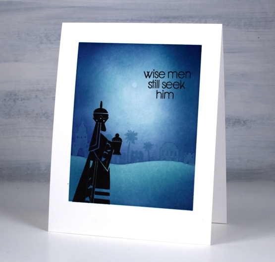
For both cards I completed the sky blending then removed the tiny circle mask and blended over the top of the white dot so it would still be the brightest spot but without the crisp edges that would make it look too much like the moon.
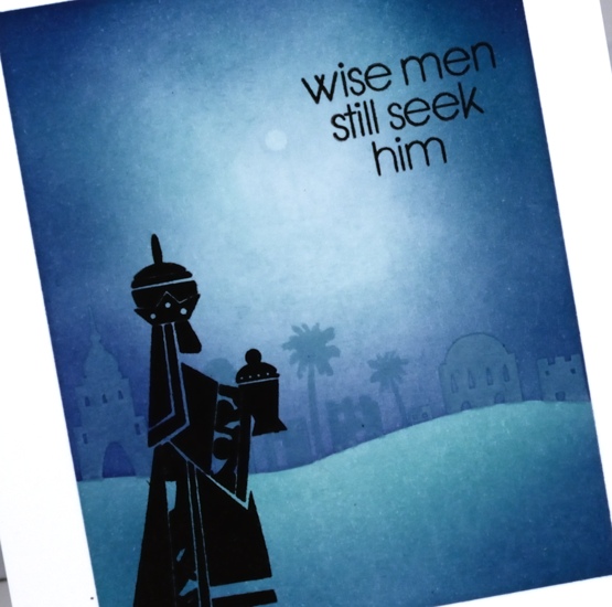
Before removing the mask over the land area I stamped the Bethlehem stamp from PB lighting the way set along the edge of the mask in the lightest ink (antique linen or speckled egg). With the sky complete I placed the other half of the curved mask over the sky and removed the lower mask so I could blend the darker colours along the base of the design.
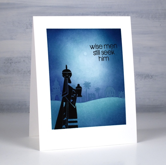
On the portrait oriented card I added one wise man from the PB three kings set in versafine clair nocturne ink while the tapes were still in place around the edges. On the card with three wise men I stamped one king with the tapes in place then removed the tapes to stamp two more kings overlapping the masked edge. I used sentiments from the PB set promise of hope.
I’ve mentioned my brother David’s videos a couple of times this year. He has created quite a few series since churches went online in March. Even though many churches are meeting in person again he is still creating short, thoughtful bible talks. You might be interested in his current series, God’s plan for Christmas. He is posting a new video everyday from Dec 1 -25 explaining the Christmas back story. There was nothing last minute about the birth of Jesus; it was planned from the beginning. As we prepare for a Christmas which will probably look a little different than usual you might enjoy taking a few minutes each day to think about the birth of Christ and what it means for us. You can find his God’s plan for Christmas series here
Supplies
(Compensated affiliate links used when possible)
 https://linkdeli.com/widget.js?id=f5e8378456858c916708
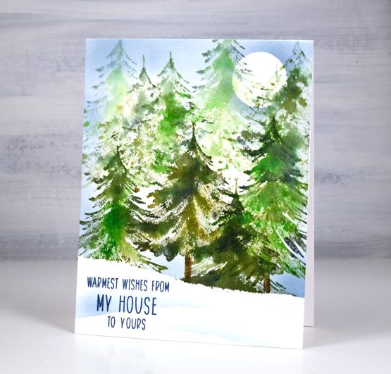
Tannenbaum Forest – video
Posted: December 4, 2020 Filed under: Penny Black, tannenbaum trio, Uncategorized | Tags: Fabriano Watercolour Paper, Penny Black stamps, Ranger Distress inks 11 Comments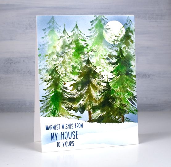
Funny story about this card, I realised last night that, although I had written in it, addressed it and even added the stamp to the envelope, I hadn’t taken the photos to go with today’s video tutorial. I pulled it out of the envelope, took some photos, did a little editing magic so you couldn’t see my handwriting on the inside then popped it back in the envelope. It’s mailed now, on its way to Australia.
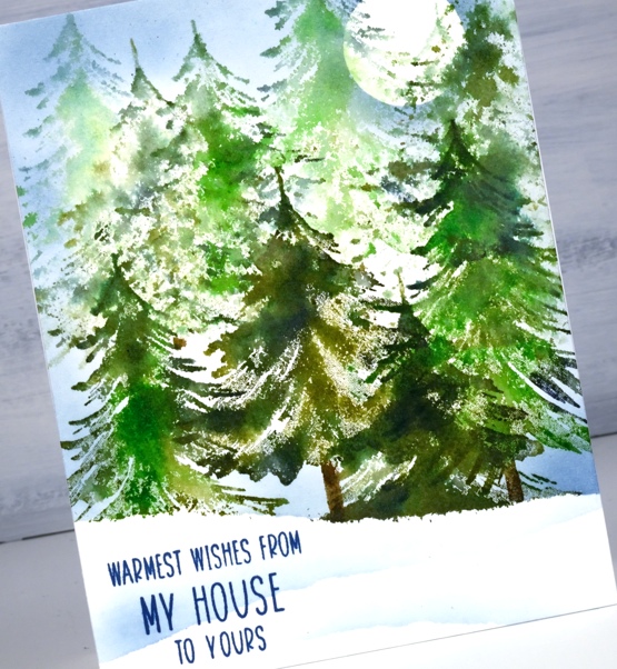
This is one of two videos I’ve made featuring the tannebaum trio set from Penny Black. I’ll post the other one soon. I did generational stamping in a few colours to get the background trees to appear to be in the distance. It’s a fairly speedy technique which you could mass produce once you got into the swing of things.
As I’ve said before ‘you can never have too many tree stamps’ and the three in this set are no exception. You have already seen me pop them in a few cards on their own to add a foreground tree to a snowy scene or to be a single focal point on one of the mini cards I posted yesterday.
Thank you again for your interest in and support of the Dressember campaign. A couple of close friends I have made through card making helped move my fundraising total along yesterday. Thank you so much!
Supplies
(Compensated affiliate links used when possible)
Winter Quietude
Posted: December 2, 2020 Filed under: Penny Black, quietude, Stamped Landscapes, tannenbaum trio | Tags: Penny Black stamps, Ranger Distress inks, Stonehenge watercolour paper 10 Comments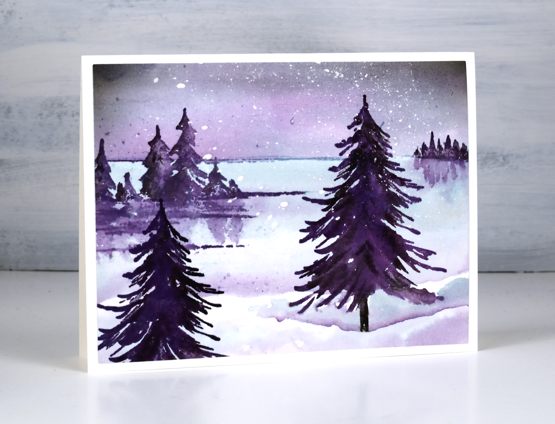
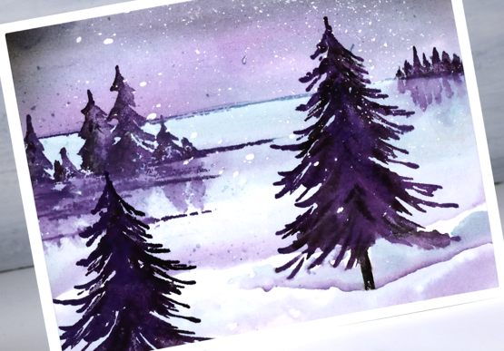
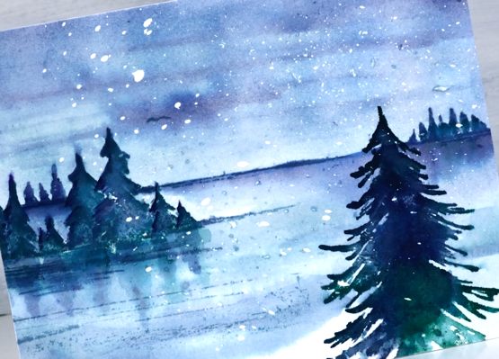
When I posted a card stamped with the PB ‘quietude’ stamp recently I mentioned I would be making a more wintery looking version. Today I have two different colour schemes featuring snow and an extra tree from the tannenbaum trio set.
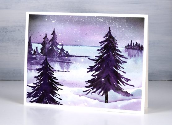
In this snowscape inspired by my friend Liz’s love for all things purple, I used speckled egg, dusty concord and black soot distress inks to paint a sky, a lake and snowbank shadows. I stamped the top of the scene first in speckled egg so I would know where to paint the sky then used a paintbrush and smooshed ink to fill the area above the horizon. I dried that then painted the lake area with speckled egg and dusty concord before stamping the trees in dusty concord and black soot inks.
For the colour scheme below I again used speckled egg but with pine needles and chipped sapphire distress inks.
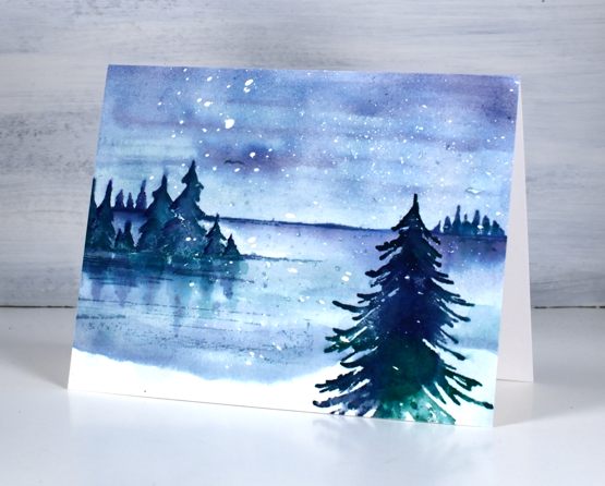
The falling snow on both cards is a result of splattered masking fluid on hot pressed watercolour paper. I splattered it ahead of time and did all the stamping and painting before rubbing it off to reveal all the white dots.

If you have been reading this blog for a while you will know I have participated in the Dressember campaign in the past to raise awareness and funds to fight human trafficking. I’ve signed up again and will be wearing a dress every day in December while I share information about the work being done around the world to end modern day slavery. To support this cause please visit my fundraising campaign page https://dressemberijm-2020.funraise.org/fundraiser/heather-telford where you can donate. I will be posting the daily dresses on my instagram account with occasional updates here on the blog. (Please note I have signed up with Dressember Canada this time so tax receipts will be sent to Canadian donors only.)
Supplies
(Compensated affiliate links used when possible)
Shells
Posted: November 30, 2020 Filed under: Darkroom Door, seashell filmstrip, seashells | Tags: Darkroom Door stamps, Ranger Distress inks 9 Comments
Let’s take a break from the snowy scenes I’ve been serving up lately and instead spend some time at the beach. If only I could! I’ve always been a shell collector, even last year when I was walking along Soldiers Beach on the NSW Central Coast with my dad I collected shells for the fun of it. I didn’t end up bringing them home but it was fun to look along the sand and in the rockpools. This card features shells from the Darkroom Door Seashells set and a background stamped with the new DD filmstrip stamp seashells.
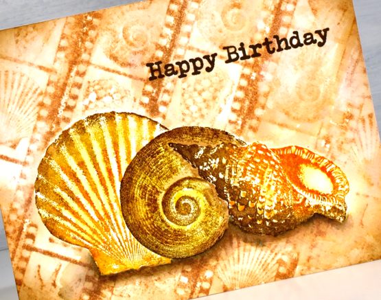
I stamped the large shells first making a mask for each one out of a post it note so I could before stamping a second or third shell and mask all three when I stamped the repeated filmstrip background. The large shells I stamped first in archival ink then over the top in distress ink which I blended to fill and add shading to the shells. The background I stamped in tea dye distress ink using the MISTI to keep the stamp in place and move the watercolour paper panel. After stamping the background I blended over the top with a paintbrush and water and dabbed away liquid to halt the blurring so I could still see the shell images.

Once I’d trimmed the panel to size I blended vintage photo ink around the edges with a blending brush and painted shadows under the large shells with dark browns and black. As usual the supplies are all listed below.
Have a great day even if you can’t collect seashells and definitely if you can!
Supplies
(Compensated affiliate links used when possible)
Woodland Getaway (and a winner!)
Posted: November 26, 2020 Filed under: Nature's Friend, Penny Black, woodland getaway | Tags: Penny Black stamps, Ranger Distress inks 3 Comments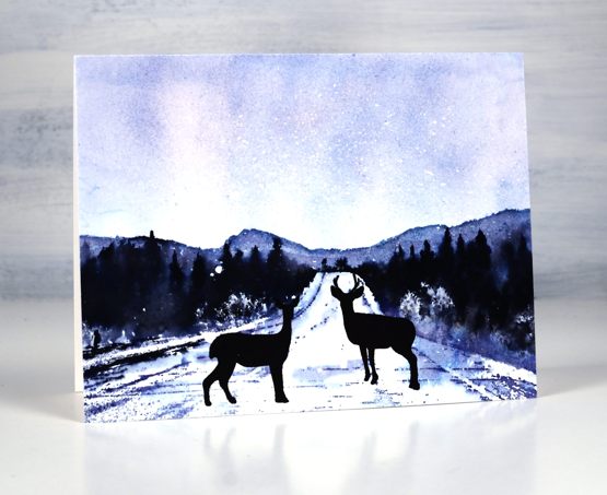
Before I give you the details about this winter scene I want to announce the winner of a registration in my new online class, Winter Wonder. Congratulations Colett, who told us plenty of things she loves about winter.
Sledding with the grandkids. Skating. Skiing. The way sound is so clear and crisp on those very cold cold days. Crisp snow beneath my feet and the crunch it makes. Hoar frost on the trees. Chickadees and other birds sitting all puffed up on the feeder. Sitting by the crackling fire with a good cup of coffee. Lots to love about winter!
This forest landscape is a new PB stamp called woodland getaway To turn it into a snowy scene I used hot pressed watercolour paper splattered with masking fluid. I began by creating a sky with chipped sapphire ink smooshed on a glass mat, I spritzed the ink with water and swiped the panel through it several times to pick up ink and fill the top half of the panel.
I dried the inky sky before moving the panel into the stamp positioner. I stamped the scene first in stormy sky distress ink, the lightest colour, painted over the distant hills and added a little chipped sapphire ink to the edges. I inked the trees in black arteza real brush pen, stamped and repeated to build up the forest area. I spritzed the stamp a little to move the ink.
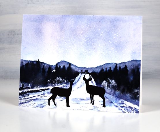
To define the track and edges I stamped in chipped sapphire and blended with some water to get shadow. Did you notice I called it a track not a road? I’m trying to avoid the ‘deer in the headlights’ interpretation. That is not what I was going for; I prefer to think of it as a trail where the skiers or snowshoers (?) came over a rise and surprised a couple of deer crossing the track. The deer from PB nature’s friends are stamped in versafine clair nocturne ink.
Just in case you are planning a little shopping this weekend the Foiled Fox is having a sale, Friday through Monday. I thought you should know!

Supplies
(Compensated affiliate links used when possible)
Frozen Vista
Posted: November 25, 2020 Filed under: frozen vista, juniper, layered Xmas wreath die set, Penny Black, Uncategorized, Winter lantern | Tags: brutus monroe embossing powder, Penny Black creative dies, Penny Black stamps, Ranger Distress inks 6 Comments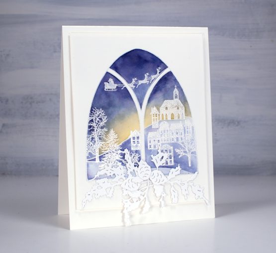
This lovely window stamp is from a Penny Black set, frozen vista which includes two arched window stamps. I stamped it on hot pressed watercolour paper in versamark then embossed in white powder. I used three distress inks to paint over the embossing, chipped sapphire in the sky, scattered straw at the horizon and stormy sky on the snowy ground.
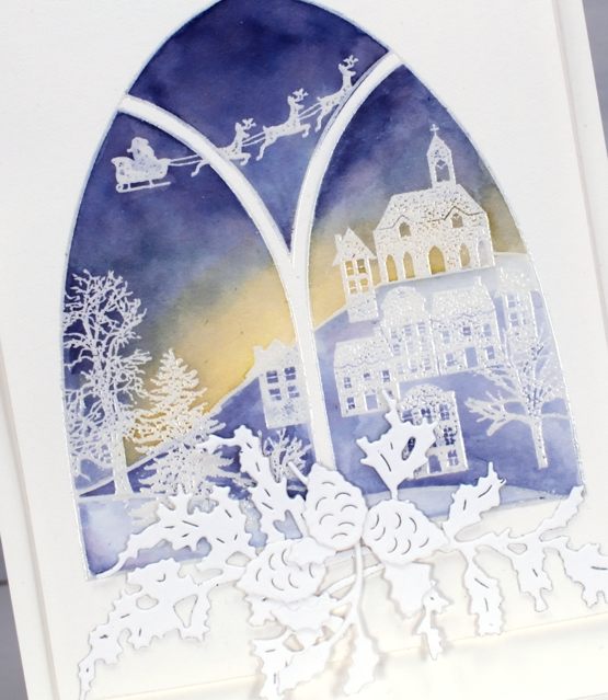
To make a swag below the window I added double sided adhesive to some neenah solar white cardstock then die cut the PB juniper dies, holly from the layered Xmas set and pinecones from the winter lantern set.
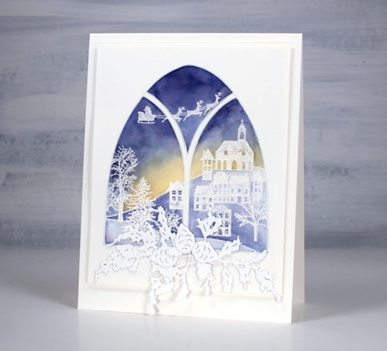
Because of the subtle colours and abundance of white and offwhite I popped up the painted panel on a couple of layers of cardstock to give it a shadow frame on the same coloured card base.
Supplies
(Compensated affiliate links used when possible)

Birdhouse Blessings
Posted: November 16, 2020 Filed under: birdhouse blessings, Finetec paints, Penny Black, sennelier watercolours | Tags: Finetec artist mica watercolour paint, Penny Black stamps, Ranger Distress inks, sennelier watercolours 5 Comments
This delightful scene is called ‘birdhouse blessings’ and it makes me want to have birdhouses and bird feeders scattered across my backyard. A few days ago my husband and I were doing what may well be our final outdoor workout of the year and watched chickadees and a cardinal flit back and forth from tree to hedge.

I worked on a hot pressed watercolour panel which I’d splattered with masking fluid (as per usual). I only just got my hands on some speckled egg distress ink and stain so that’s what I used for the background colour. It is a lovely colour and I’m very happy with the inky background. I smooshed ink on my glass mat, diluted it then swiped the panel through it to pick up colour.
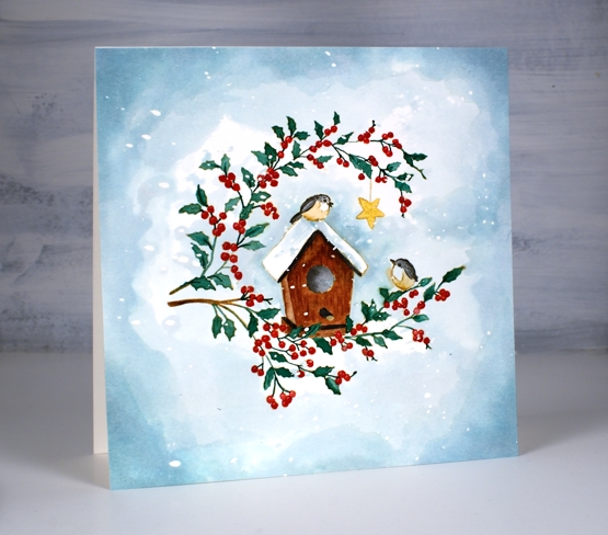
I stamped the large stamp in antique linen then did some no-line watercolour with Sennelier watercolour paints. While painting those little leaves and berries I did wonder if I should have chosen watercolour markers instead of paint brush and paints but I was already committed, so me and my very small paint brush kept on painting. When I finished painting all the elements I used speckled egg distress stain to darken the edges of the panel and frame the little scene. When I removed the masking fluid there were pretty little snowflakes over the whole panel.
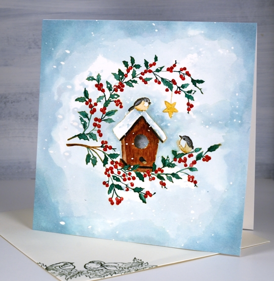
I painted the little star in gold and debated whether I would add a gold frame as well. Decided in the end I liked it just the way it was. (psst a little bird wants to tell you ‘Winter Wonder’ is coming!)
Supplies

Wreath & Wings
Posted: November 4, 2020 Filed under: Coliro paints, Hand lettered, mirthful, wreath & wings | Tags: Coliro paints, distress markers, Hand lettering, Penny Black creative dies, Penny Black stamps, Ranger Distress inks, Staedtler watercolour brush pens 6 Comments
I’ve combined a new PB stamp, ‘wreath & wings’ with a new PB die, ‘mirthful’ for simple elegant style Christmas card.

I used distress inks and markers to ink the wreath elements and birds, keeping the stamp in the positioner so I could work a bit at a time. I inked the stamp, stamped the image then did a bit of blending with a paintbrush to fill the leaves, berries and birds.

I used a gold gel pen to colour some of the berries then continued the gold highlights in the die cut word. The die has decorative diamond cut outs so I cut gold ones to add to the burgandy letters and framed the panel in the same burgandy cardstock.
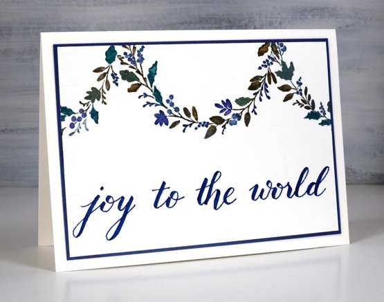
For the second card I decided to use the curve of the wreath as a hanging garland. Using a centering ruler to help me with positioning I stamped half the wreath on the centre top edge of the watercolour panel, then stamped another part loop either side.
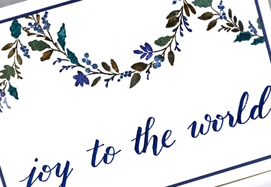
Once again I worked on hot pressed watercolour paper so I could blend the ink on the leaves. I used ocean coliro pearlescent paint on some of the leaves and berries for a little shimmer.
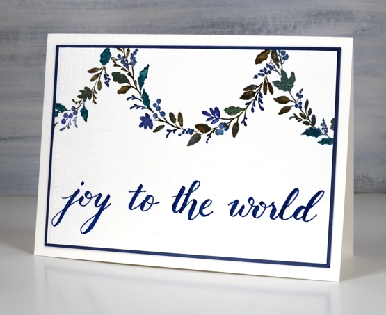
I wrote the sentiment for this one using the darkest blue marker from the Staedtler watercolour 36 brush pen set and matted the panel in a dark blue cardstock.
Even though I don’t like to over do my designs I’m wondering if the blue card is a bit sparsely decorated. What do you think?
Burgandy Card Supplies
Blue Card Supplies
 <
<
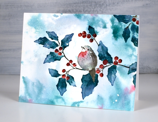
Season’s Tweetings video
Posted: November 3, 2020 Filed under: season's tweetings | Tags: distress markers, Penny Black stamps, Ranger Distress inks, Tutorial, video 9 Comments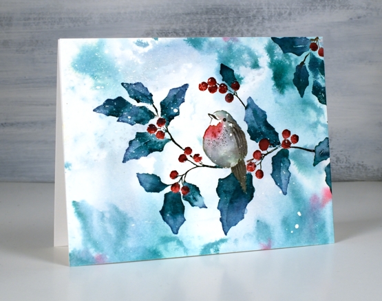
This sweet bird on a branch is a single stamp from the new Penny Black release ‘Season of Hope’. The stamp is called ‘season’s tweetings’ and I used it here to create both the bokeh background and the foreground watercoloured image. I filmed my process so you’ll see how I use the same blending technique to build up colour on the leaves and just a few tones to paint the little bird. (the video might look familiar to you if you have a membership with Penny Black)
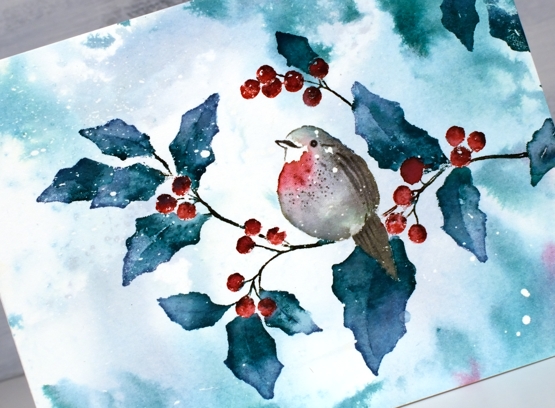
We have a few centimetres of snow on the ground this morning so this sort of scene is becoming way more likely!
Thanks for dropping by today, I will be back with more of the PB new release over the coming weeks.
Supplies