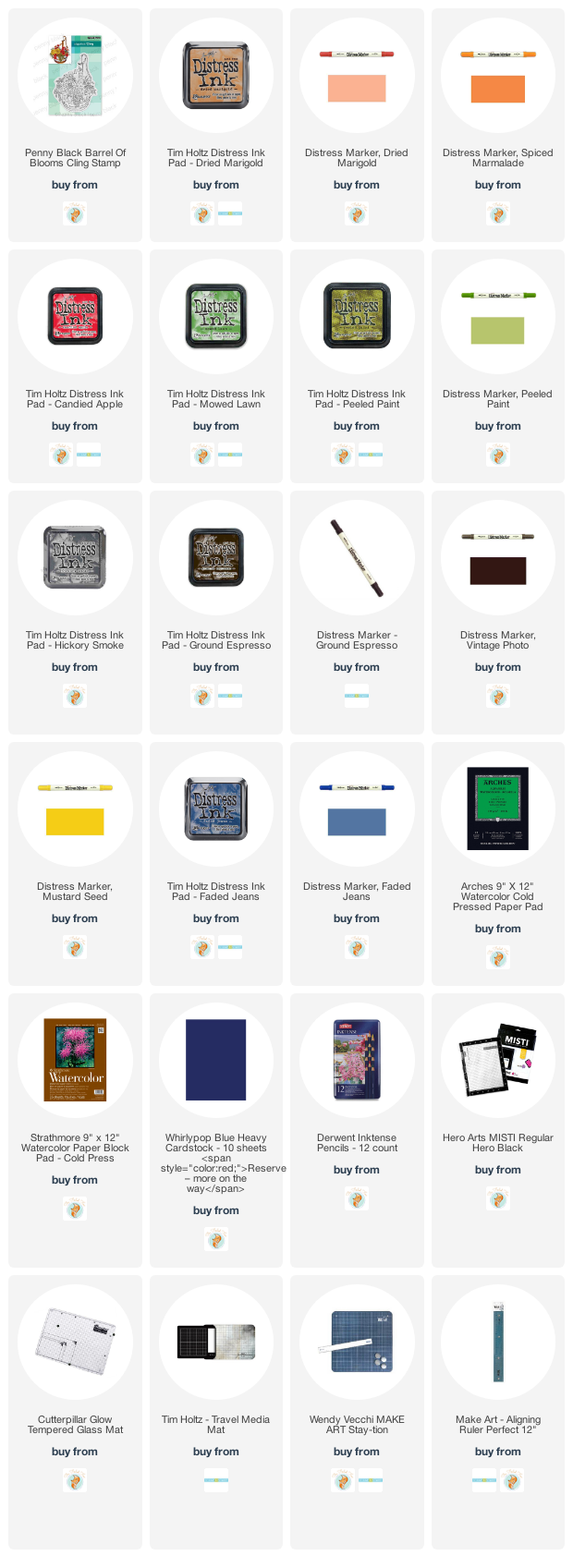
Double Embossed
Posted: August 31, 2020 Filed under: Background Stamps, Brutus Monroe, dotted fusion, Penny Black | Tags: brutus monroe embossing powder, Penny Black stamps 8 Comments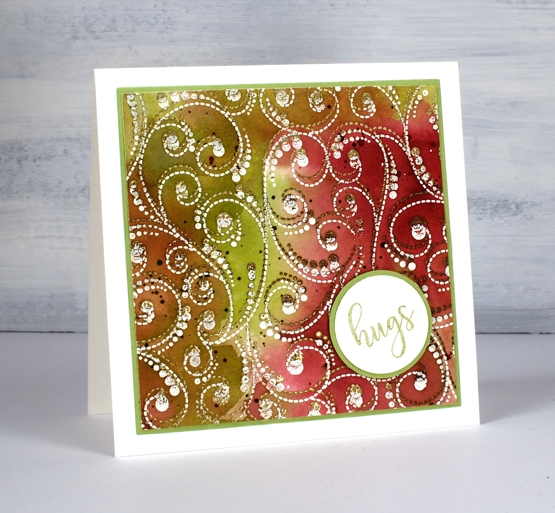
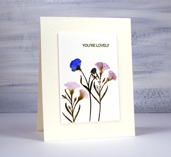
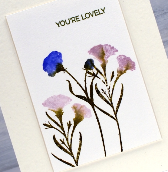
At the risk of losing you I have to begin this post by directing you to the beautiful inspiration for this card. Just pop over to the wonderful blog of Anna-Karin Evalddson to see her double embossing. There is so much texture in her card. When I first saw it I was sure it was heat embossed and then dry embossed because the surface looked so 3D. Anna-Karin did a video of her process, which I watched then immediately went and made the card above. I often see cards which inspire me and I save or tag or pin them for another time; rarely do I immediately act on the inspiration.
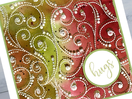
I didn’t achieve the 3D effect that Anna-Karin did but I like the play of double embossing and the unusual combination of colours and embossing powders. I worked on hot pressed watercolour paper, embossing the ‘dotted fusion’ stamp from PB first in a mix of ‘sandcastle’ & ‘potting soil’. (supplies linked below). I moved the panel a little to one side then embossed again in a cream embossing powder.
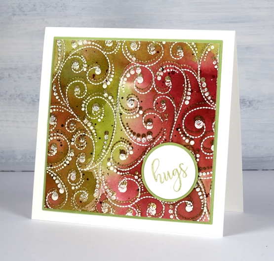
To colour the panel I pulled out my distress stains, not the sprays, (but they would work) the daubers. I hardly ever reach for them now as they are no longer available so I don’t want to taunt you with something you can’t have. I still really like the daubers for applying a strong liquid ink in a confined space. In this case I dabbed them on the glass mat, spritzed some water and swiped the embossed panel through the colours (aged mahogany, peeled paint and old paper). Anna-Karin just used distress inkpads and her results were amazing.
To keep with the circle/dotty theme I stamped a word from PB ‘huggable’ set on a circle, matted on a circle and put the card together. Oh and there is splatter too, no surprises there.
that’s a booster colour scheme btw, if you do my online class you will hear about that! 😉
Supplies
Parsley, sage & mint
Posted: August 18, 2020 Filed under: Brutus Monroe, gel press, Penny Black | Tags: brutus monroe embossing powder, gel printing, Penny Black stamps 16 Comments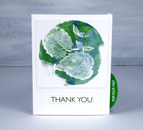
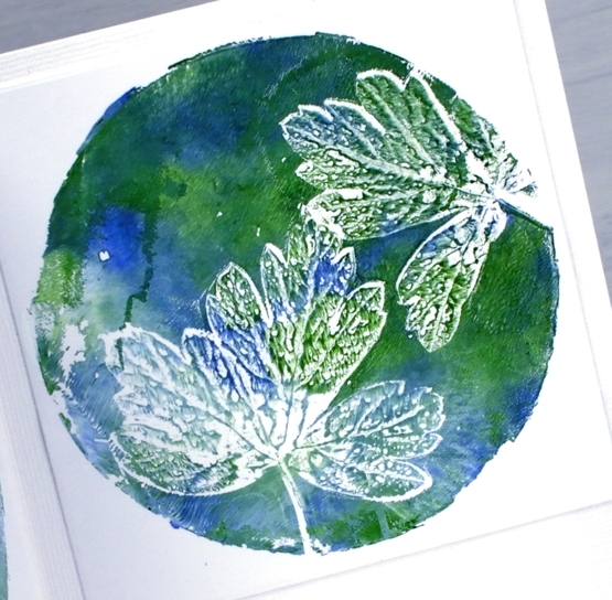
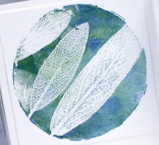
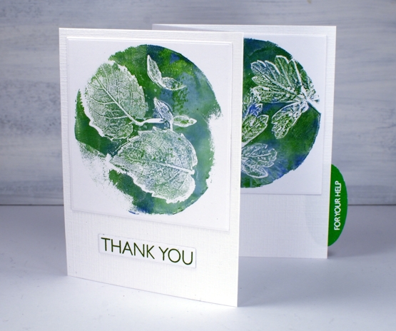
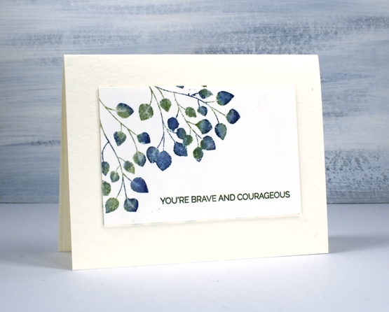
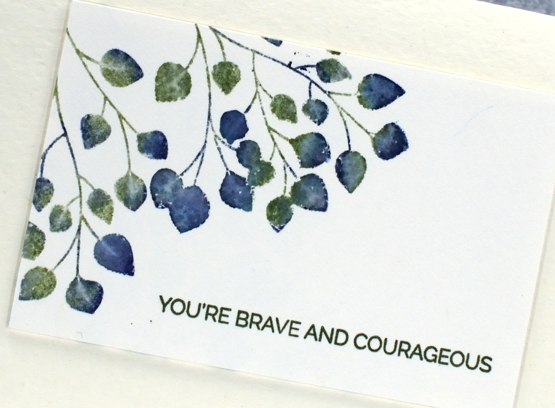
As I hoped I fitted in some gel printing the other day. I picked leaves from my garden and experimented to see which would give me a good print. It also took me some trial and error to get the amount of paint right too.
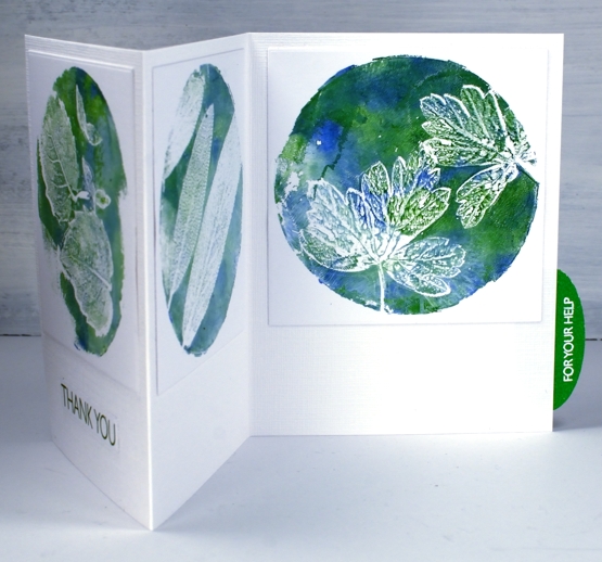
I brayered titanium white, ultamarine blue and hooker’s green onto my circle gel plate then lay down the back of the leaf on the paint. I lay white cardstock over the top and taped one edge of the cardstock to my table before lifting it to see the print. Without untaping the cardstock I removed the leaves and lay the cardstock back down to take another print, that which was left by the leaf.
I know some extra visuals, even a video might be more helpful than a description so I am working towards that goal. Gel printing can be rather hit and miss for me so I haven’t done any filming yet.
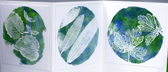
I decided to use all three prints on the one card so cut a piece of snowbound textured cardstock 10⅞ ” x 4¾” and scored it at 3⅝” and 7¼”. I die cut each print using a 3¼” square die and attached them directly to the textured card base. I stamped ‘Thank you’ from PB ‘million thanks’ set on white in peeled paint archival ink then embossed ‘for your help’ from the same set in white on green then cut it out with an oval punch to make a tab on the side of the card.
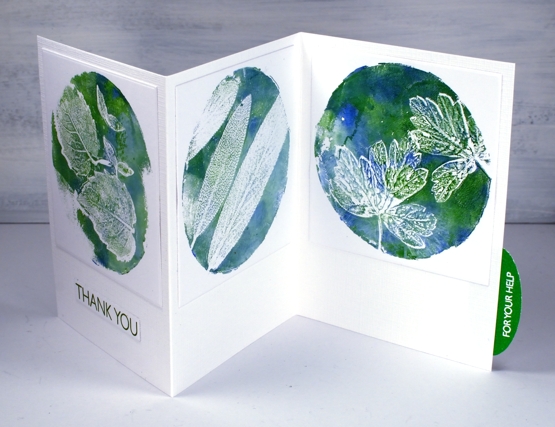
This card is for my daughter who has put hours or work and loads of enthusiasm into our garden this year. It’s looking good and we have high hopes for the tomatoes, brussel sprouts and cantaloupes still growing!
Join my online class COLOUR CLUES to create card sized works of art!
Supplies
Hydrangeas
Posted: August 7, 2020 Filed under: Arteza, hydrangea, it's your birthday, Papertrey Inks, Penny Black, Studio Katia, watercolour real brush pens | Tags: Arteza, Papertrey ink, Penny Black creative dies, Penny Black stamps, real brush pens, Studio Katia 10 Comments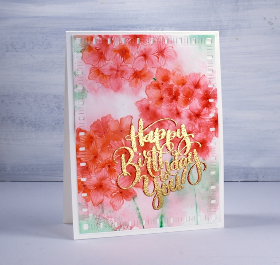
When I tried a bit of hydrangea painting the other day it got me thinking about hydrangea stamps and I’m not sure if I have ever inked this PB one before. As you know I tend to go for the blues and purples (like my mother before me) but I decided to go more for the pinky red you can find in some hydrangeas. As you can see I didn’t end up with pinky red; I have orangy red which I have never seen on a hydrangea! My mother always wanted her hydrangeas to be blue, purple or pink so she and my dad added something to the soil to make that happen.
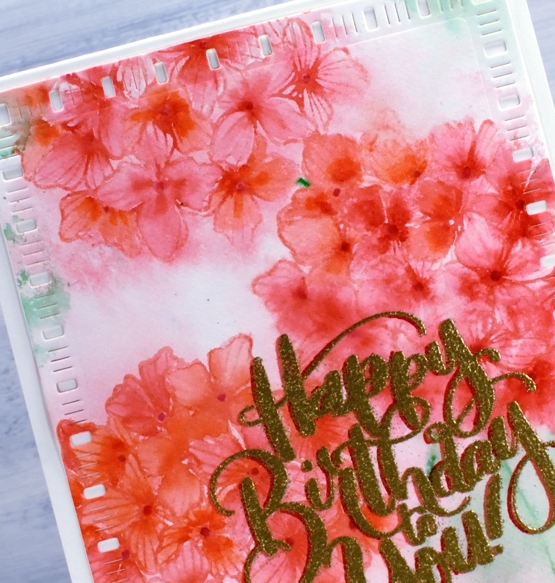
Before I began stamping I scribbled rouge pink and punch pink Arteza real brush pens on my glass mat, spritzed it with water then swiped my hot pressed watercolour panel through it. I dried the panel before beginning the stamping. In the stamp positioner I inked the hydrangea first with Papertrey ‘pale peony’ ink then dabbed the arteza pens on the stamp as well to get a variegated print. I spritzed then stamped and repeated the process to get three hydrangeas. To colour inside the petals I used three arteza pens (rouge pink, punch pink, apricot) to dab a little colour then blended to fill the petals with a paintbrush and water.
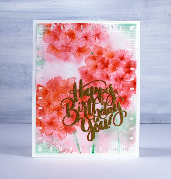
I decided to try a fancy drop shadow greeting and it kind of worked; don’t look too closely. I stamped first in versafine clair tulip red, dried that, powdered it with the anti-static-thingy, dried it again and powdered it again and then moved the panel ever so slightly left before stamping with versamark and embossing with gold. Despite all my efforts gold powder still stuck to the supposedly dry tulip red ink. As a fix I used a red marker to make the shadow to the left a little more prominent. Then in another fit of fanciness I cut the panel with a dainty dashes die. I don’t know what came over me! Maybe it’s because it’s Friday or maybe it’s because I am getting increasingly excited about opening my online class on Monday.

Thank you to all of you who have signed up already; I am thrilled by the response so far. If you don’t know what I am talking about pop over here and find out!
Supplies
Nature’s glory background
Posted: August 3, 2020 Filed under: nature's glory, Papertrey Inks, Penny Black, Triple Banner | Tags: Fabriano Watercolour Paper, Papertrey ink, Penny Black stamps 3 Comments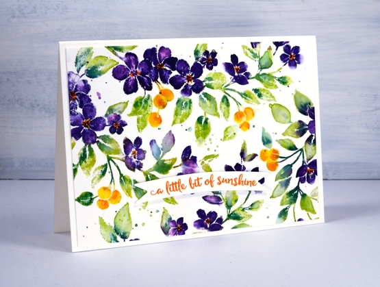
The nature’s glory stamp from Penny Black is a current fave of mine so I decided to try it with a different colour scheme. (previous cards here and here)
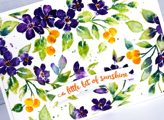
I worked on hot pressed watercolour paper with papertrey ink cubes then distress markers for some smaller details. The spray of flowers has a curve to it so I was able to move it around and stamp it four times in order to fill the 4¼” x 6″ panel.
I used a Papertrey ink royal velvet ink cube to ink the flowers and wiped any stray purple ink off the stamp before inking the leaves with green parakeet and the berries with bright buttercup. I spritzed the stamp before stamping so the inks would move a little. Before stamping again I added spiced marmalade distress ink to the berries and pine needles distress ink to the leaves with markers, gave the stamp another light spritz and stamped again.
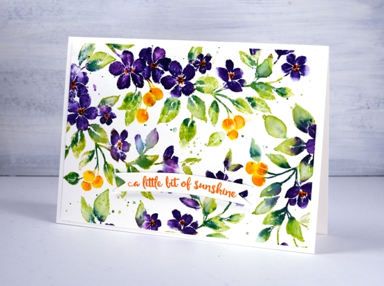
I switched to a paintbrush to blend some of the leaves, berries and petals. When the ink dried I used the spiced marmalade marker again to add orange centres to the purple flowers.
I stamped a sentiment from PB ‘happy snippets’ on a banner die cut and popped it up over the panel. Oh and I splattered too…you probably noticed that.
Supplies
Refreshing winners
Posted: July 24, 2020 Filed under: Catherine Pooler inks, Penny Black, Script, soulful silhouettes | Tags: Catherine Pooler inks, Penny Black stamps 6 Comments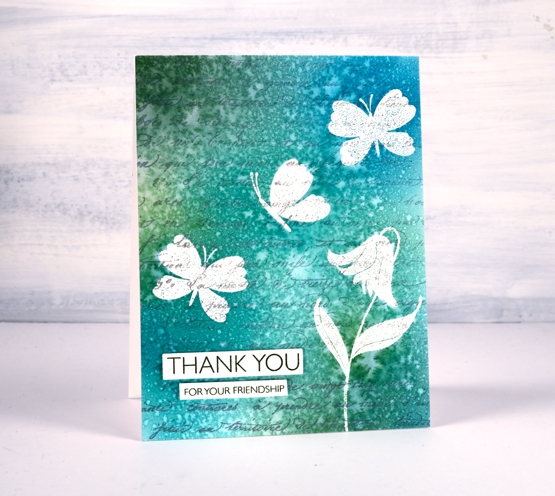
I want to thank everyone who participated in the ‘Refreshing’ giveaway I hosted with the Foiled Fox. I enjoyed reading your preferred ways to find refreshment and noticed many of you head to your garden during the cooler parts of the day, sit by the water if you have some nearby, or on your porch or patio. Some find doing something creative refreshing and there were quite a few mentions of drinks and good books. I would love to be sitting by the water these days but as that is not possible right now I am doing many of the things you are. Thanks so much for sharing those snapshots of your life. Without further ado, I would like to congratulate Martha and Kathy.
You have won a gift certificate to go shopping at the Foiled Fox online store. I am sure you can find some refreshment there! Shauna from the Foiled Fox will be in touch with more details.
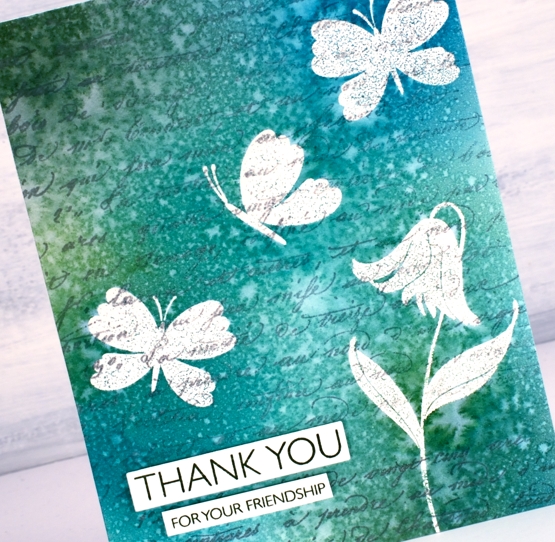
Today’s card features a technique I’m going to call emboss resist masking. It involves embossing in order to resist the application of ink over the top but I wanted the finished project to look as though I masked the butterflies and flowers rather than have shiny raised images at the end. The trick is to iron off the embossing powder once the project is completed.
I know this isn’t a new technique but I was looking at some inspiration pics on pinterest and decided it was a good way to get the effect I wanted.
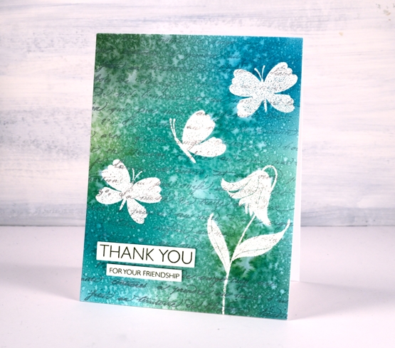
I stamped the PB ‘script’ background stamp in hickory smoke archival ink so the print would not attract embossing powder or be blurred when I added others inks or water. The archival ink is fast drying and permanent.
I used a stamp positioner to stamp a flower and some butterflies from the PB ‘soulful silhouettes’ set in versamark then I embossed in clear powder. To cover the panel with colour I chose four Catherine Pooler inks (listed below) and applied them with blending brushes. I gave the whole panel a couple of spritzes with water which resulted in the lovely pattern you see on the finished card. I didn’t dab it with paper towel or dry it with a heat tool. I was actually patient and let it air dry on the desk because the spritz looked like rain on a window.
Once it was dry I got some scrap paper and lay the panel face down on the scrap paper and ironed it without steam. I changed the scrap paper several times because the embossing powder transfers to the scrap. Eventually there is none left on the original panel. I chose a couple of sentiments from the million thanks set and stamped them in CP spruce ink.
Supplies
Soulful Silhouettes
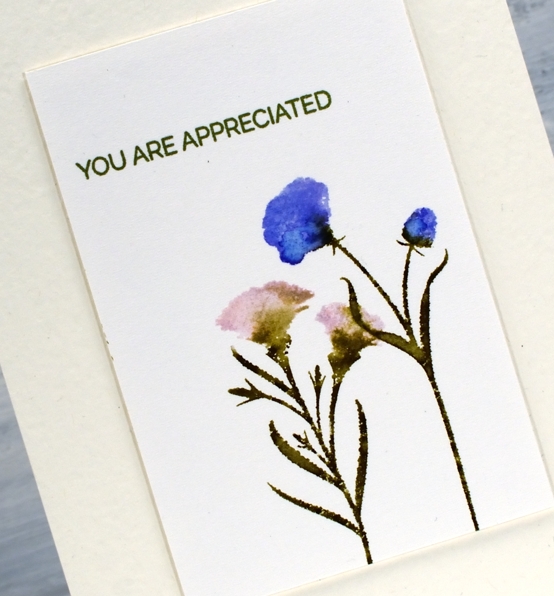
Posted: July 13, 2020 Filed under: Penny Black, soulful silhouettes | Tags: Fabriano Watercolour Paper, Penny Black stamps, Ranger Distress inks, Tsukineko Versafine inks 6 Comments
There is a lovely new clear set of silhouette stamps in the latest Penny Black release. I’ve used it to create a set of co-ordinated cards in a simple clean style.
I chose some of my favourite distress inks to create slightly blended prints.
All the stamped images are from ‘soulful silhouettes’ and the sentiments are from the ‘trust me builder’ set.
I used hot pressed watercolour for all the stamped panels and white luxe textured cardstock for all the bases.
After inking the silhouette stamps for each design I gave the stamp a very light spritz of water, just enough so there would be blends and watermarks on the stamped image. I couldn’t predict how each would turn out so there are some dryer areas with no blending and some parts where ink has bled into the adjacent ink quite distinctly.
I often pop up my stamped or painted panels on pieces of foam but this time they are raised on just one piece of cardstsock cut a little smaller than the main panel.
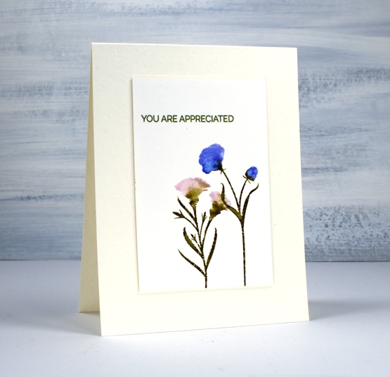
The ‘trust me builder’ set is designed so we can make sentiments that begin with the words ‘trust me…’ then finish with one of seven different phrases. I kept the sentiments short using only the endings which are in a smaller simpler font.
Supplies
Groovy Greenery
Posted: July 10, 2020 Filed under: groovy greenery | Tags: Fabriano Watercolour Paper, Papertrey ink, Penny Black stamps, Tsukineko Versafine inks 5 Comments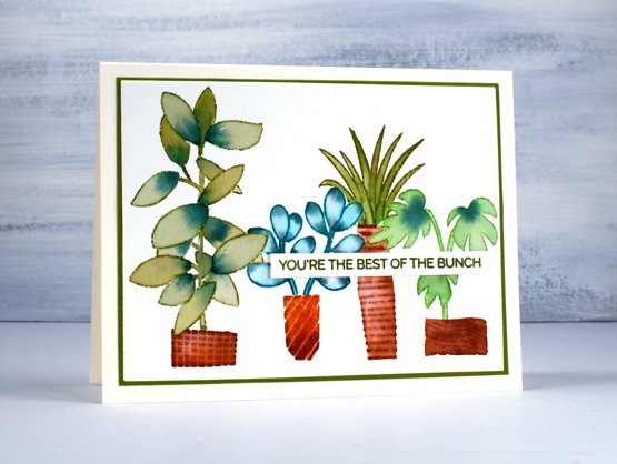
Groovy greenery is the name of this set; it’s full of cute plants and pots, seven of each that you can mix and match.
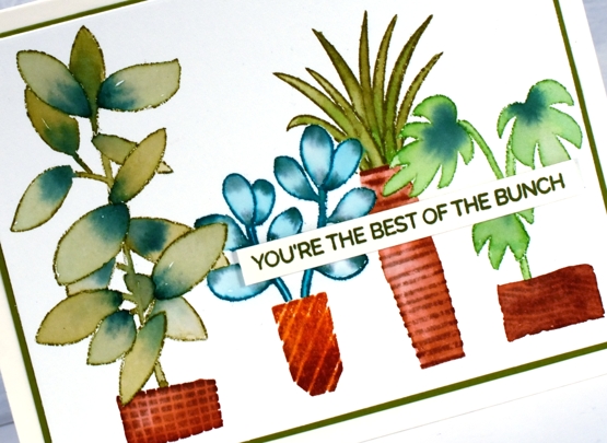
I stamped all the plants and containers with Papertrey ink cubes. I mixed and matched with four different greens making sure I used a combination of two greens in each plant. I stamped the greenery in one ink then blended the inside of the leaves with the stamping ink plus one other. I did some basic masking with post it notes so I could have leaves overlap the leaves of the plant beside and some leaves overlap the pots.
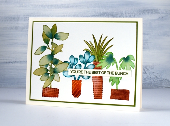
The pots are all narrower at one end than the other so they are designed to be tall not wide but I decided to have some looking a little wonky and wide, kind of like I might have made them myself.
The sentiment is from the new PB ‘trust me builder’ set. There is a large ‘trust me’ stamp and seven phrases to finish the sentence. I just used one of the phrases. I stamped the sentiment in dark green and matted the panel to match.
Just a reminder to enter the giveaway I am hosting with Foiled Fox right now. You need to go back to Monday’s blog post and leave a comment letting me know what you are doing for refreshment these days. Thank you everyone who already let me know, I enjoyed reading all your refreshing tips and past times, some of them are exactly the same as mine and there are a few involving sitting by the water that I wish were mine!
Supplies
Barrel of Blooms
Posted: July 8, 2020 Filed under: barrel of blooms, Penny Black | Tags: Fabriano Watercolour Paper, Inktense, Penny Black stamps, Ranger Distress inks 7 Comments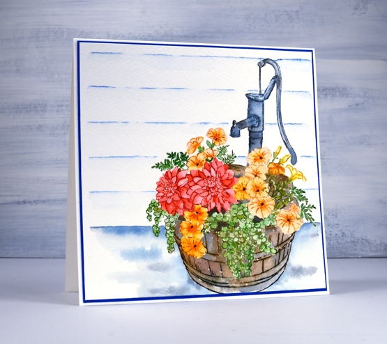
This washtub full of flowers is called ‘barrel of blooms’ and it’s a beauty from the new PB release. I worked on cold pressed watercolour paper in a stamp positioner so I could ink a section, stamp it, blend that section, wipe the stamp then ink another section.
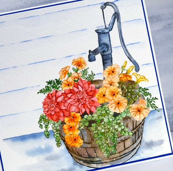
I stamped colour by colour, inking with distress ink cubes and markers. Once I’ve stamped a section I blend it with a paintbrush pulling out the ink of the outline and adding extra where necessary. I used a couple of different green inks for the leaves, candied apple, spiced marmalade and dried marigold for the flowers then a mix of brown and grey for the barrel. All the inks are listed below. Because I do all the stamping and painting with the panel in the stamp positioner I am able to re-stamp a section after I’ve painted to add some of the detail back in.
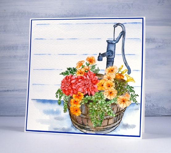
To ground the image I painted some faded jeans and hickory smoke ink around the base and behind the barrel. I used a dark blue inktense pencil and the Wendy Vecchi stay-tion + ruler to add the look of wood wall behind then matted the panel with co-ordinating blue cardstock.
I don’t have a barrel tub like this one for my flowers but I have three old galvanised tin tubs filled with herbs and they are thriving in the current summer weather.
Supplies
Refreshing
Posted: July 6, 2020 Filed under: illustrious, soulful silhouettes, Uncategorized | Tags: distress markers, Fabriano Watercolour Paper, Foiled Fox guest post, Penny Black stamps, Ranger Distress inks 28 Comments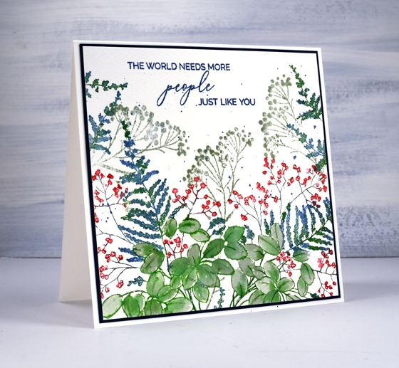
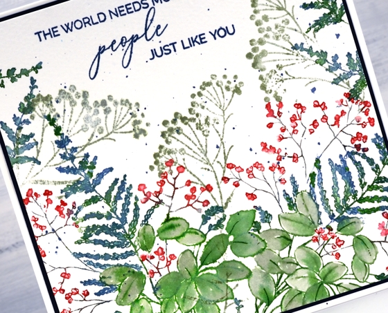
I’m excited to show you some new summery plant goodness from Penny Black and it’s happening here and on the Foiled Fox blog! I used the new cling stamp ‘illustrious‘, a stamp from the clear set ‘soulful silhouettes‘ and a sentiment from the ‘just like you‘ mini set.
The new release is called ‘Refreshing’ so I have teamed up with Shauna from the Foiled Fox to provide a little refreshment through a giveaway!
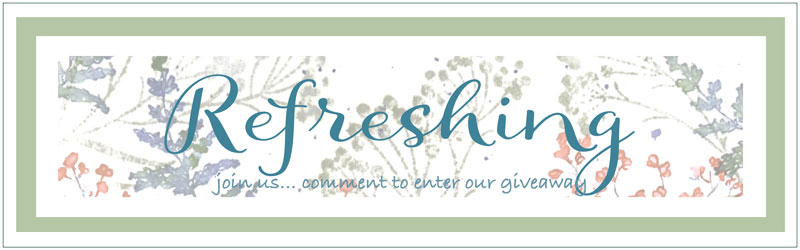
All you need to do to enter is comment on this post telling me what you like to do for refreshment these days.
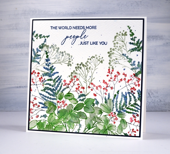
I used distress inks and cold pressed watercolour for this card. I definitely seem to be drawn to blues and greens right now; they’re a little cooler than my oft used pinks and orange combo. You can read more about my process on the Foiled Fox blog but let me say the MISTI was very helpful in creating this leafy panel. I worked on the large leaves first, inking them in mowed lawn then painting them with bundled sage. I moved onto the fern shaped plant which I inked with mowed lawn and faded jeans then did the tiny flowers last in candied apple and hickory smoke.
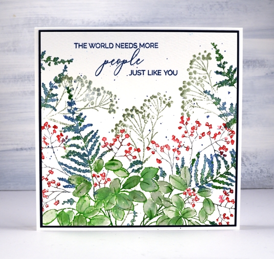
The illustrious stamp is stamped once on the left then partially stamped on the right and to fill the top edges I just inked and stamped the tip of the fern a few times. I used one stamp from the soulful silhouettes set as filler in bundled sage ink.
I would love to hear some of your most refreshing ideas or past times. Do you have a recipe, a book recommendation, a past time or favourite get away? We are still staying close to home here in Ottawa but I am enjoying my hammock in the backyard, oodles of audio books and the occasional iced coffee or tea.
Supplies
The Good Life
Posted: July 2, 2020 Filed under: birches, Penny Black, Stamped Landscapes, the good life | Tags: Dr Ph Martin Hydrus watercolor paints, grafix, Penny Black stamps, Ranger Distress inks 11 Comments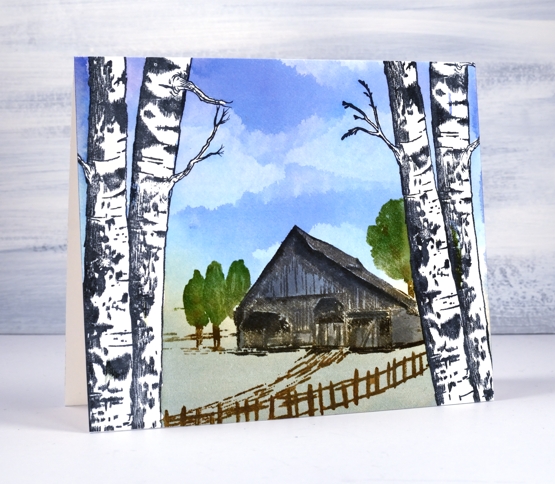
I am happy to have a stamped and painted scene to share today. I often create scenic cards and panels in winter but I used liquid frisket on this panel to create a summer vista seen through a frame of birches. I teamed up with Grafix , used their liquid frisket kit and filmed the process.
With a technique like this it would be easy to make a card for any season. The birches could frame a snow scene, autumn foliage or even some mountains in the distance.
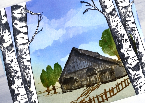
Painting the sky was fun, you can see in the video I painted the whole sky area in blue then added all the clouds by dabbing colour away with a kleenex tissue.
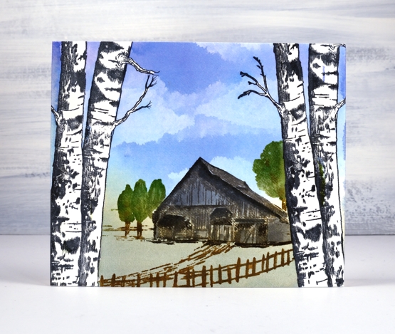
You can see in the video I stamped the house and trees with archival ink first then built up colour, depth and shadow with distress inks for the watercolour look. Because the Dr Ph Martin inks used on the sky are permanent once dry I was able to stamp and blend over the house and trees without affecting the sky at all and of course over the masked trees too.
Supplies