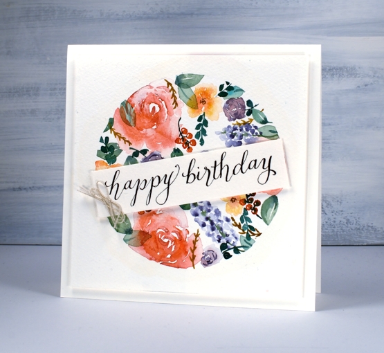
Apricot watercoloured flowers
Posted: June 24, 2020 Filed under: A2 layers, Hand painted, Penny Black, sennelier watercolours, Waffle Flower | Tags: Fabriano Watercolour Paper, Hand painted, Penny Black stamps, sennelier watercolours, Waffle Flower dies 11 Comments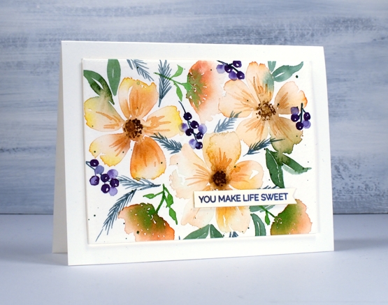
I have another hand painted watercolour today paired with a sweet little stamp from the new Penny Black set ‘trust me builder’. I used my Sennelier half pan watercolours on Fabraino cold pressed watercolour paper. I am still learning how to arrange elements in my paintings but I know for a random pattern (is that an oxymoron?) it is best to do the largest elements first, then the next biggest and so on, in this panel ending with the small splatters and dots.
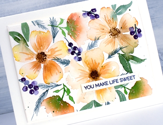
Unless you are after a symmetrical design odd numbers of elements are usually more pleasing to the eye so I have three large flowers then three medium sized flowers but I slipped up on the berry clusters, there are four not five and I can see where I should have painted another!
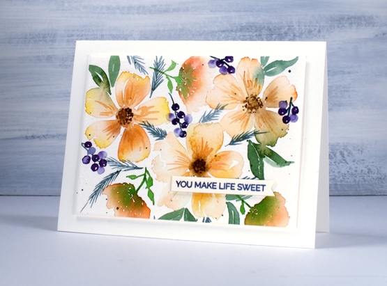
I painted this design on a larger panel and then cropped it to make it look more balanced. I used a rectangle die to choose the part of the panel I wanted but you can do the same with two pieces of ‘L’ shaped cardstock held on opposite sides of a panel and moved to ‘frame’ the design. I popped up my painted panel on foam and my stamped sentiment on one extra piece of cardstock.
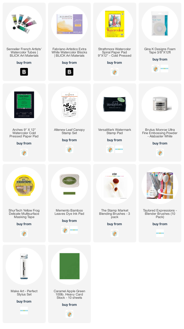
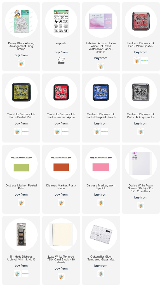
Supplies
All about you
Posted: June 17, 2020 Filed under: Penny Black, springtime sigh | Tags: Fabriano Watercolour Paper, Penny Black stamps, Ranger Distress inks, sennelier watercolours 9 Comments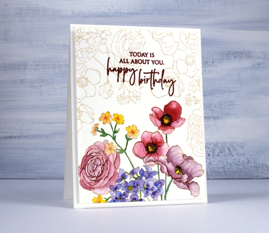
More than once I have created cards that inspire me to make art journal pages. This time it was the other way around; I created an art journal page that inspired this card. Perhaps I should be showing you the journal page first but it contains as yet unreleased stamps so I have to keep it under wraps for a little while longer. (just in case you hadn’t seen them yet, Jill has been sharing some sneak peeks of new PB products over on the PB blog). The panel is stamped on cold pressed watercolour paper. I kept it in the stamp positioner so I could add some detail once all the paint was completed.
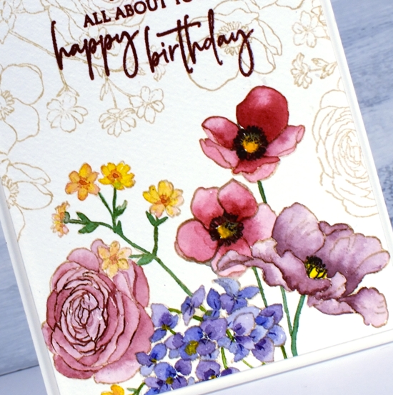
I stamped PB ‘Springtime Sigh’ in antique linen distress ink then painted the flowers with Sennelier watercolour paints. To keep the panel cohesive I used the same red and blue paints to create a variety of reds and burgandies for the four large flowers. The blue showed up in the purple flowers and the green stems. Once all the painting was finished I partially stamped the rose with ‘aged mahogany’ distress ink and added little details to the other flowers with a chipped sapphire distress marker and a black soot marker.
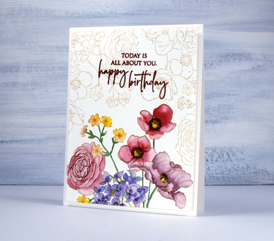
The combination of antique linen outline and faded burgandy petals gave the painted flowers a vintage look so I filled the rest of the panel with the same image stamped in antique linen, then chose crimson red versafine to stamp the sentiment from PB ‘special sentiments’.
Supplies
Hand painted veggie card
Posted: June 10, 2020 Filed under: Altenew, Hand painted, Leaf Canopy | Tags: Altenew, Fabriano Watercolour Paper, Hand painted, sennelier watercolours 8 Comments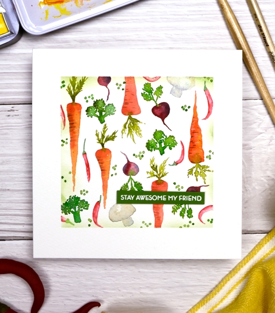
I’ve been painting again but took a break from florals. I pictured this veggie panel in my head before I sat down to paint it and realised part way through I should have been working bigger. I did the carrots first and as they were the biggest vegetable I regretted making them so small. All the rest of the veggies had to be pretty tiny to make it work.
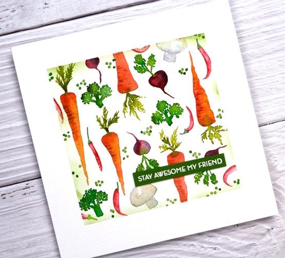
I used Fabriano cold pressed watercolour paper and Sennelier watercolour paints. The card is one layer so I folded the piece of watercolour paper then masked the edges before I started painting. I had watched some youtube tutorials to glean hints including Jenna Rainey’s ‘farmer’s market‘ and Laurie Tsou’s ‘drawing fruits and vegetables‘.
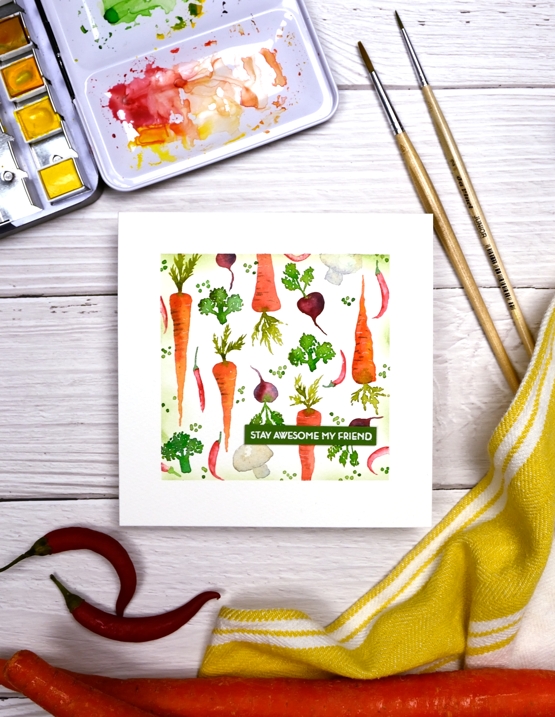
When I had filled the panel with carrots, broccoli, beets, chiles and mushrooms it still looked unfinished so I had to include the peas. I am not a fan of peas but as you can see they are the perfect filler, for a painting mind you, not a meal. When I was a child I was required to eat the number of peas that matched my age at the time and yes my family still brings that up and amuses themselves by asking if the required number of peas are on my plate! After I’d added the peas, with a stylus not a paintbrush, I still needed more definition on the masked edges so I blended some bamboo branch memento ink lightly over the tape. The sentiment is from Altenew’s ‘leaf canopy’ set.
Stay awesome my friends and eat your veggies. Or paint them if that’s more your style. Or better yet, grow them, paint them then eat them!
Supplies
Birthday birdhouses
Posted: June 8, 2020 Filed under: A2 layers, Additional A2 layers, Good neighbours, Penny Black, Triple Banner, Waffle Flower | Tags: Fabriano Watercolour Paper, Penny Black creative dies, Penny Black stamps, Ranger Distress inks, Waffle Flower dies 7 Comments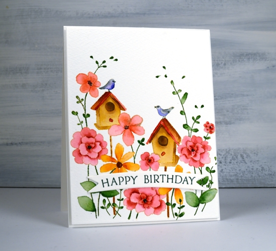
I hope your garden is full of birds and blooms right now, mine is getting there slowly. If you are having a birthday during this season, it’s possibly a little different to past celebrations. My birthday is in the dead of winter but I do remember fondly when it was in the height of summer when birds, blooms and strawberries were in abundance!
To create this bright happy card I did some no line watercolour with distress inks. I stamped the PB ‘good neighbors’ outline stamp in antique linen then did all the painting with distress inks smooshed on my glass mat. For fine lines and tiny spaces I used distress markers.
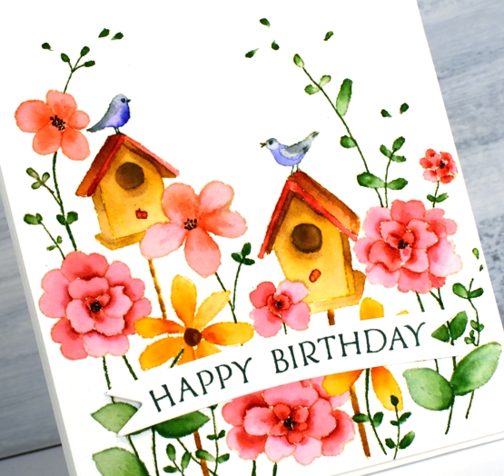
I used cold pressed watercolour paper for this one; I switch back and forth between hot pressed and cold pressed, often choosing hot pressed for the ease of stamping detailed stamps. Once I was finished I decided to pop up the panel on a piece of foam but first I cut the panel with the new love of my card making life, Waffle Flowers ‘additional A2 layers’ dies. I love both their A2 layers dies and additional layers dies the same, no favouritism, in fact the reason I love them is because there are two sets making it possible to mat panels with a ⅛” border. I’m not demonstrating that feature on this card but I will be on future projects. I also love the fact that my rectangle is even and perfect first go. My cutter still does a great job just not sure if my steady hand and eye do the stellar job they once did.

I finished off the card by cutting two banners with one of Penny Black’s triple banner dies, two so it was raised up just a bit, not as much as foam tape would raise it. I stamped a sentiment from banner sentiments on the banner but if you know this set you might realise the stamp doesn’t actually curve that way; let me tell you it does when you snip it in two and arrange it on the door of your misti.
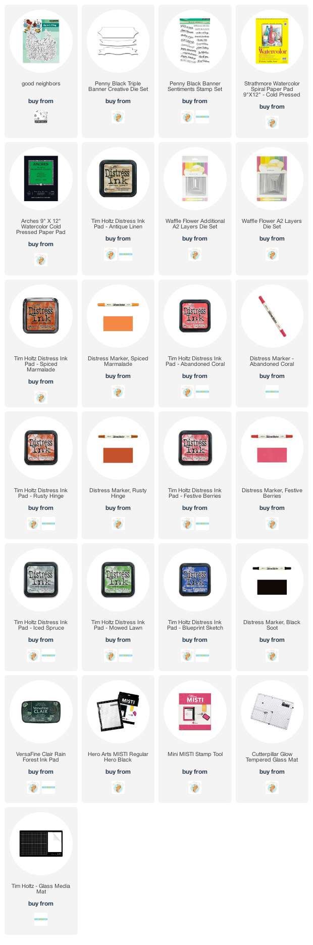
Supplies
Warm wishes circle
Posted: June 5, 2020 Filed under: Darkroom Door, warm wishes | Tags: Darkroom Door stamps, Fabriano Watercolour Paper, Ranger Distress inks 3 Comments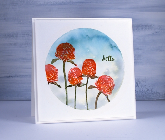
I am hanging out on the Foiled Fox blog today sharing a Darkroom Door project. I’m pretty happy to tell you Foiled Fox is carrying some Darkroom Door stamps now. I’m always happy when my favourite products come to my favourite stores! Today’s card features the DD ‘warm wishes’ set with it’s pretty clover flowers and sweet sentiments.
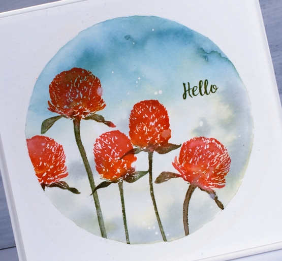
Before stamping I traced a circle on a piece of hot pressed watercolour paper then painted masking fluid around the edge of the circle to mask off the area inside. I also splattered some dots of masking fluid inside the circle. I used two distress inks to paint the background starting by smooshing the inks on my glass mat and adding a little water so I had a diluted ink to pick up with my paintbrush. I painted broken china ink on the top section of the circle and bundled sage on the bottom blending them together a little while keeping the centre of the circle lighter than the edges. Once the background was dry I placed the panel in my misti so I could stamp the flowers multiple times if necessary. The flower heads are a mix of worn lipstick and spiced marmalade distress inks and the stems are stamped in forest moss distress ink.
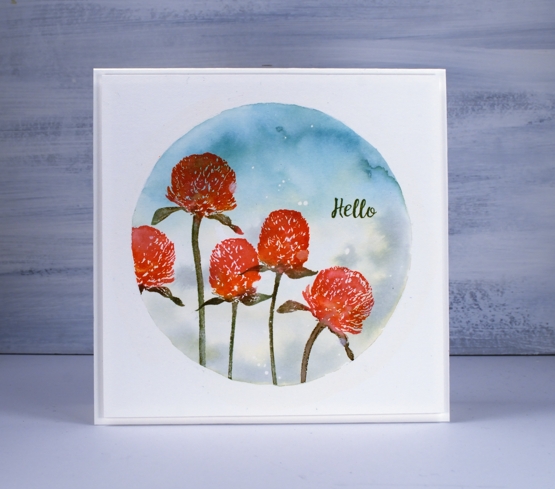
I splattered a few water droplets over the finished panel and dabbed them away with a paper towel to leave watermarks. With all the stamping and painting complete I removed the masking fluid (so satisfying) and popped up the panel on a piece of foam before attaching to a luxe white textured card base. Make sure you pop over to the Foiled Fox blog and store today to see the other Darkroom Door products in stock.
Supplies

Disappearing lilacs
Posted: June 3, 2020 Filed under: lilacs, Penny Black | Tags: Fabriano Watercolour Paper, Penny Black stamps, Ranger Distress inks, Tsukineko Versafine inks 9 Comments
I keep returning to these lovely stamps because they handle watercolour effects so well. My other examples are more defined than this one but I like both techniques. I worked on cold pressed watercolour paper for this one and started by wetting the panel so I could stamp a pale washy background. I used only three distress inks, shaded lilac, blueprint sketch and mowed lawn. I inked the stamp with mostly shaded lilac and mowed lawn, spritzed it with water then stamped on the wet panel. The result is the pale disappearing images you see in the background.
I dried the panel before doing another impression with the lilac stamp, this time I added a few drops of water onto the panel and a spritz of water to the stamp. The ink blended on the stamp and pooled a little on the panel. My last impression was the more defined print on the right hand side. For this one the panel was dry but the stamp still got a spritz of water to move the ink.
I chose an area of stamping with very little definition as the spot for my sentiment stamped in versafine imperial purple.
Are your lilacs blooming? Mine are along with the first iris and some lupins so the blues and pinks are currently well represented in my garden. Yay!
Supplies

Masked hand painted circle
Posted: June 1, 2020 Filed under: Hand drawn, Hand lettered, sennelier watercolours | Tags: Fabriano Watercolour Paper, Hand lettering, Hand painted, sennelier watercolours 10 Comments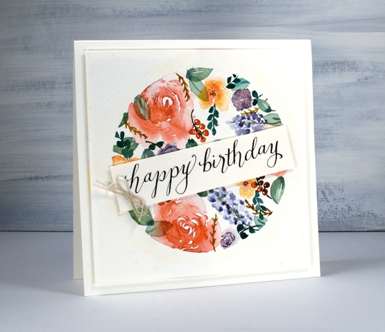
A few weeks ago I posted a floral wreath I’d painted and asked your opinion on adding a sentiment. In the end I didn’t risk stamping or writing one because I didn’t want to spoil the finished wreath with an inky mistake. So….can you guess why I have a large sentiment strip stuck across this floral circle I painted?
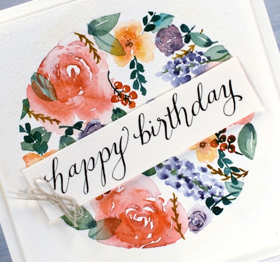
To create the floral circle I drew a circle in pencil on cold pressed watercolour paper then painted liquid frisket (masking fluid) to a width of about half an inch around the outside of the circle. I used my Sennelier watercolours to paint three large roses first then moved onto other flowers, leaves and berries until the circle was fairly full. With a random design like this one whether it is painted or stamped it makes sense to start with the largest images to make sure you can fit them in then finish off will little leaves, dots or tiny flowers to fill any spaces at the end.
Once the painted circle was complete I practiced a ‘happy birthday’ greeting on scraps of watercolour paper with my nib pen and some black ink until I was happy with the size and style. I had only written 2½ letters before a large blob of black ink landed on the panel where the letter ‘p’ should have been! As you probably guessed that is the reason I have a large birthday banner obscuring some of my pretty flowers.
Supplies
https://linkdeli.com/widget.js?id=f5e8378456858c916708
Masked Wildflowers Video
Posted: May 29, 2020 Filed under: Darkroom Door, Tutorial, warm wishes, Wildflowers Vol 1 | Tags: Darkroom Door stamps, Fabriano Watercolour Paper, Ranger Distress inks, Tutorial 11 Comments
I have a simple design for you today and I turned on the camera while I was doing it. It’s probably something you have tried before but might be new to a few readers. I used washi tape to mask off a frame on a one layer hot pressed watercolour card base then created a watercolour background with distress inks and salt.
The stamps are some of my favourite silhouette stamps from the Darkroom Door ‘wildflowers vol 1’ set with a sentiment from a recent set ‘warm wishes’.
It was fun creating a one layer card again; some of you will remember when I was part of the ‘One Layer Wednesday’ challenge and ‘One Layer Simplicity’ challenge a few years back.
Let me know if you try this technique, I’d love to hear or see what you came up with.
Supplies

Alluring Cut Up
Posted: May 22, 2020 Filed under: Alluring, Penny Black | Tags: Fabriano Watercolour Paper, Penny Black stamps, Ranger Distress inks 10 Comments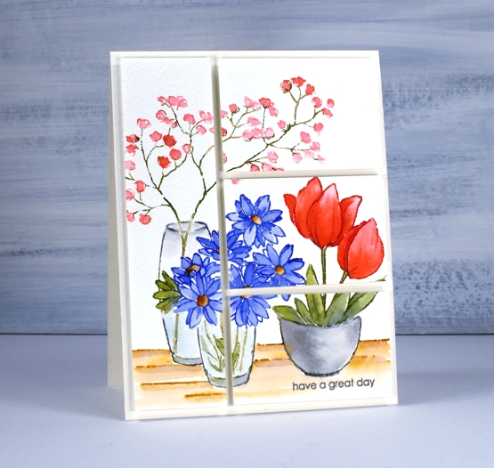
This watercoloured panel stamped with the PB ‘alluring’ stamp has been sitting around for a long time. I’ve been trying to come up with a slightly different way to turn it into a card. I create a great many cards with one large stamped and painted panel and little else so I wanted to mix things up a little with this one. I finally decided to slice up the panel then pop it up on foam backing.
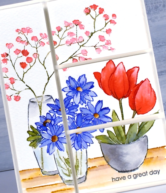
I stamped the original panel on cold pressed watercolour paper and used one of my favourite watercolour techniques. Instead of stamping in a pale water soluble ink then painting with ink or watercolour paint I ink the different parts of the scene with different inkpads or markers, spritz the ink with water then stamp. With some extra ink handy on my glass mat I use a paint brush to blend the stamped ink into the petals, leaves and other shapes adding extra ink where needed.
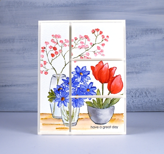
When slicing it up I took care to divide it unevenly while making sure some elements carried across to adjacent sections. That way the eye moves across the panel and doesn’t come to halt in the middle. I’ve listed the inks I used below, all distress inks in either ink cube or marker form. Oh and by the way have you seen the new distress colour? ‘Speckled Egg’ looks like it might be a blue green or even better a grey blue; I wonder how it compares with tumbled glass and broken china. Regardless, it’s part of the blue family so yes, I will be getting it in a few different forms. How about you?
Supplies
Country Charisma
Posted: May 15, 2020 Filed under: country charisma, Penny Black | Tags: Fabriano Watercolour Paper, Papertrey ink, Penny Black stamps 13 Comments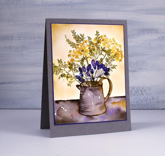
This rustic style card features a few stamps from the Penny Black ‘country charisma’ set. The clear set includes a jug, a watering can and four floral/foliage stamps to pop in the jug. I had a rough plan in my head as I started stamping but it didn’t work quite how I had hoped. I almost quit half way through but I remembered a tip I had heard from the talented Jenna Rainey in one of her recent videos where she recommended not stopping too soon. Sometimes a painting or card can look unappealing part way through but balanced and complete when more detail, colour or texture is added.
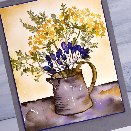
I worked on hot pressed watercolour paper with some masking fluid splattered on it. I stamped the jug first in papertrey ink cubes ‘smokey shadow’ and ‘cocoa bean’. I blended the inks to fill the jug, adding extra ink from my glass mat where necessary. I let the jug dry before adding flowers and foliage. The leaves and flowers I inked with bright buttercup and olive twist ink cubes. I spritzed them lightly with water before stamping and did minimal blending with a very small brush on the panel. At this point it looked a little ho-hum so I took a chance and stamped another flower in ‘royal velvet’ and ‘enchanted evening’. Can we take a second to wonder how these delightful ink names are chosen? I think I would have fun with that job! The purple flowers definitely added some contrast but it was still a bit of a patchy design; it lacked depth. I ruled a line of black soot ink across the panel then blended the ink downwards adding cocoa bean and stormy sea inks I’d already used and a few drops of the buttercup and royal velvet.
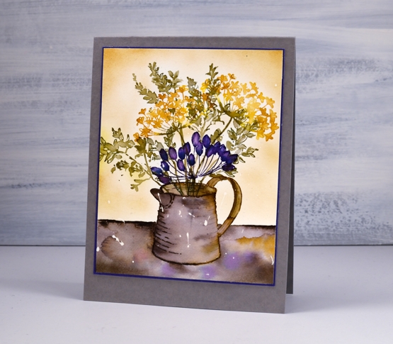
With the jug grounded I felt I was almost there but the background needed a little something. Trying to watercolour around all those little leaves was not an option so I pulled out the blending brushes and blended some bright buttercup ink around the edges and a little bit over the flowers. It is possible to add a very pale layer with a blending brush which was exactly what I needed for this design. I removed the masking fluid to reveal the white blotches adding to the overall rustic look.
To finish off the card I added a very narrow mat in the purply blue colour and attached that to a new fave, ‘luxe grey cardstock’. I think I mentioned recently the lovely luxe white textured cardstock from the Foiled Fox; it’s a creamy colour that works well with my watercolour paper. The same textured cardstock comes in grey; I rarely use grey card bases but I think that might change with this lovely luxe grey.
Have a great weekend, friends.
Supplies