
Masked & Blended Leaves
Posted: October 24, 2024 Filed under: Echidna Studios, grafix, Leaves digital stamps and cut files, Spellbinders | Tags: Echidna Studios, Fabriano Watercolour Paper, grafix, Ranger Distress inks, Spellbinders 5 Comments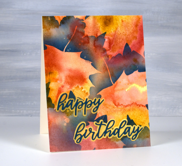
It’s been a couple of weeks since I posted, sorry about the blog neglect. In my last post (which also featured leaves) I mentioned I had just started to see some reds and oranges along with the earlier yellow leaves. This week the colours have been stunning! So many deep reds contrasting with the remaining greens and still more yellows and oranges. Even crawling in traffic has had its upside as I gaze at the autumn leaves.
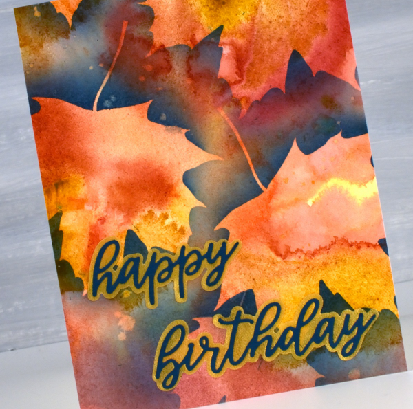
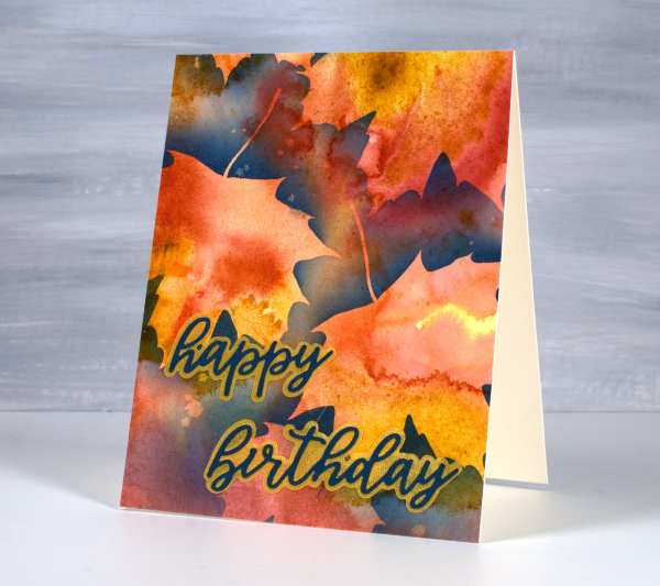
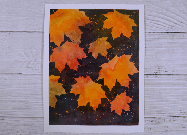
About a month ago I posted a video showing how I created a watercolour painting of leaves using masking (more leaves). Today’s card featured the same process using a maple leaf design from the Echidna Studios Leaves digital stamp set. Instead of painting the final dark layer over the masks, as shown in the video, this time I blended chipped sapphire ink using a blending brush. I think the navy edge around the leaves shows them off beautifully but because I didn’t blended too heavily you can still see the watercolour underneath. I finished this card off with a layered sentiment from the Spellbinders ‘serenade sentiments etched dies set‘
This post includes affiliate links from Foiled Fox. If you buy through these links I receive a small commission at no extra cost to you.
Green leaf print
Posted: October 10, 2024 Filed under: Darkroom Door, gel press, gelli plate | Tags: Darkroom Door stamps, gel press, gel printing 3 Comments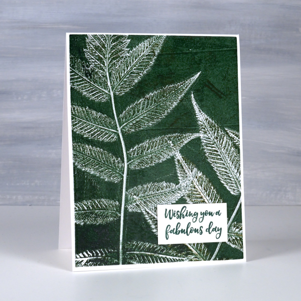
More leaf prints on the blog! Yes, I have a few more leaf print projects to share before I move into Christmas cards. To see the technique for this type of print pop over to my youtube channel and take a look at my last two videos. This plant is called false spirea and it prints very clearly showing all those lovely veins on the back of the leaves.
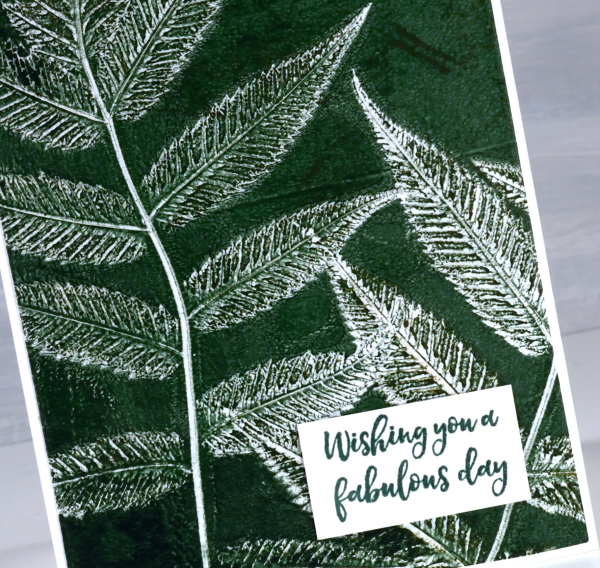
I’ve been playing with colour mixing when using acrylics and watercolours and it is definitely worth experimenting. Adding a little black to a bright green paint gave me a deeper and darker green as shown on this card.
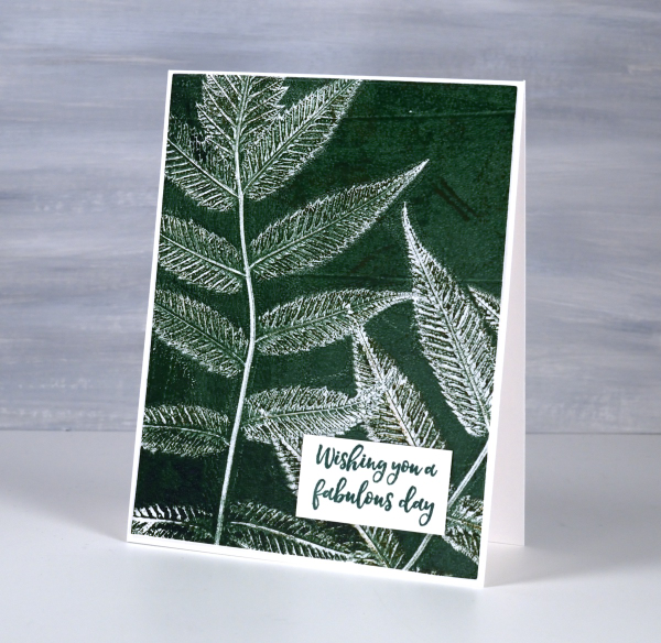
I used this card as a birthday card yesterday as the sentiment from Darkroom Door is useful for any special day. I’ve been thinking that the leaves are late in changing this year. What is it like where you are? We are now seeing some nice reds, yellows and oranges around. Of course after the leaves change they fall so that’s another task coming up in the next few weeks.
Masked Autumn Leaves – Video
Posted: September 23, 2024 Filed under: Echidna Studios, grafix, Leaves digital stamps and cut files, Tutorial | Tags: Echidna Studios, Fabriano Watercolour Paper, grafix, video 4 Comments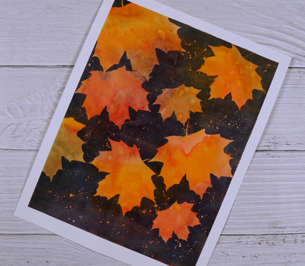
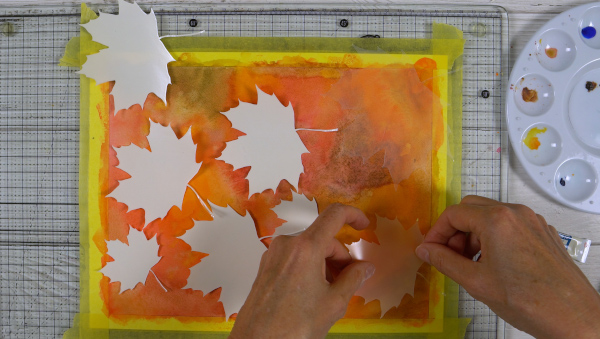
I recently completed an autumn painting using Grafix extra tack frisket film to mask autumn leaves. I began by painting the whole panel in yellows, oranges, reds, browns and greens. I used watercolour paints and did some mixing on my palette and also on the hot pressed watercolour paper.
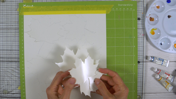
Once I had a multicoloured panel I added maple leaf masks cut on my Cricut from Grafix extra tack frisket film. I used the maple leaf image from the new Echidna Studios Leaves digital stamp and cut files set. The set includes six different leaves: Hickory, Maple, Honey Locust, Linden, Sumac, and Oak. I cut maple leaves in a variety of sizes. Watch the video below to see the whole process.
I liked using this method rather than painting one leave at a time because it was quicker and resulted in more random colour patterns on the leaves.
I left my panel as an 8.75″x11.25″ painting but you could also cut a panel up into several pieces to make autumn or thanksgiving cards.
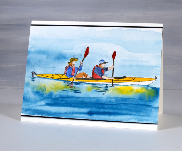
Gone Kayaking
Posted: September 11, 2024 Filed under: Echidna Studios, Gone Kayaking | Tags: Echidna Studios, Fabriano Watercolour Paper 7 Comments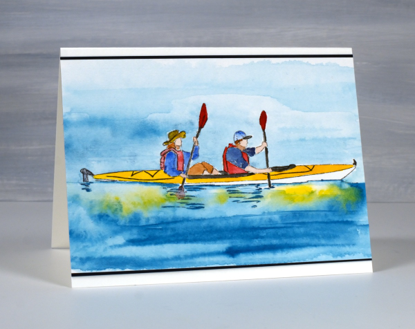
Not only is this a delightful digital stamp from Echidna Studios, it could also be a depiction of what I am doing as you read this post. Even though I am writing this post before I leave home, when it is published I will be camping and could be kayaking, biking, hiking, reading or snoozing in the hammock, who knows?
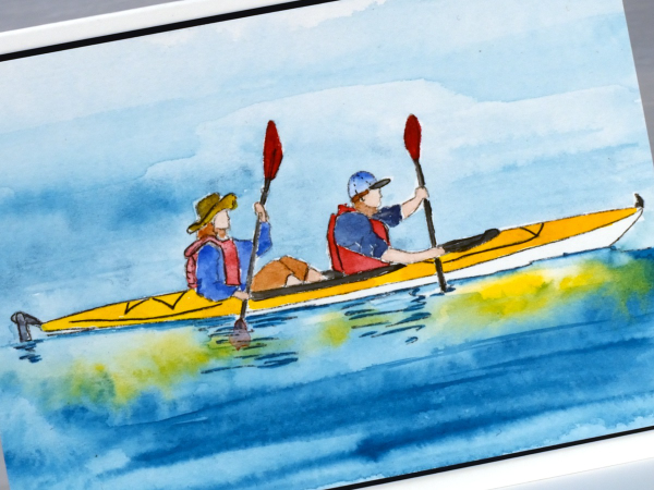
This two-person kayaking image is one of the digital designs in the ‘Gone Kayaking‘ set designed by my daughter. The other image features a single kayak. I printed the image on hot pressed watercolour paper then painted it with Sennelier watercolour paints. I sometimes finish off a watercolour with a finetip marker adding fine lines or definition which might have got lost in the painting process.
Thanks for dropping in, I’ll be back with more art when I return from my camping get-away.
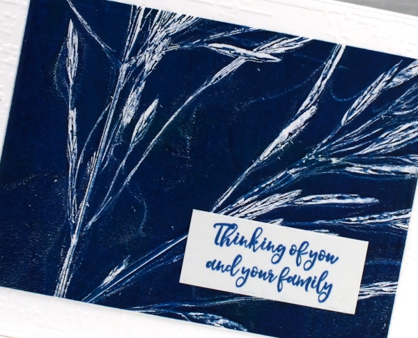
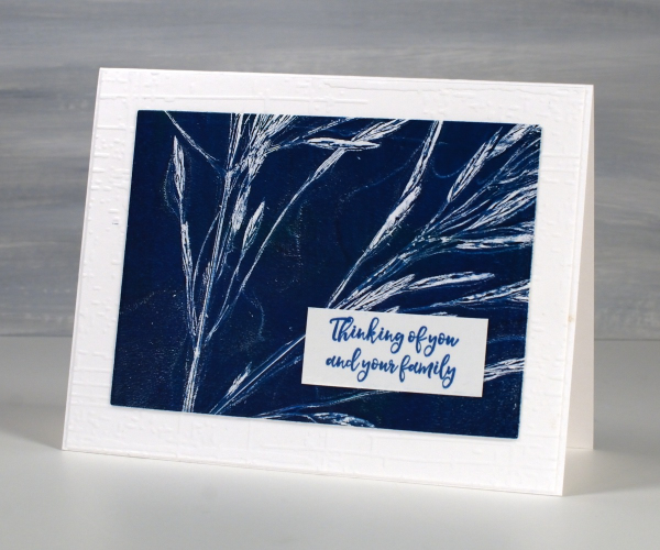
Grass Print Sympathy cards
Posted: August 28, 2024 Filed under: Alexandra Renke, gel press | Tags: Alexandra Renke, gel press, gel printing, gelli plate 2 Comments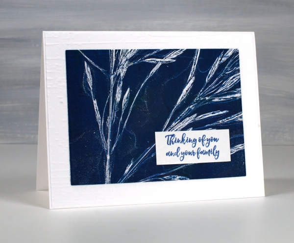
As I mentioned in my last post life has been busy with different crafting lately (children’s crafts for camp) so I am sharing more botanical gel prints from earlier in the summer.

I filmed a short video for this one; it’s the same process I used with the lacy leaves but this time with long stalks of grass.
It is good to pick the grass before it gets too dry, that way the seeds don’t separate from the stalk and end up in the paint or on the print.

Once again I turned the 5″x 7″ print into sympathy cards and embossed a background for both cards using the ‘exposed brick’ embossing folder from Stampin Up. For the card above I cut tags using lovely stitched edge tag dies from Alexandra Renke.
As summer is drawing to a close I will mention that I keep the grasses and flowers that I have used for gel printing for a few more months. The layers of paint hold them together making it possible to continue to do botanical gel printing for a little longer.
This post includes affiliate links from Foiled Fox. If you buy through these links I receive a small commission at no extra cost to you.
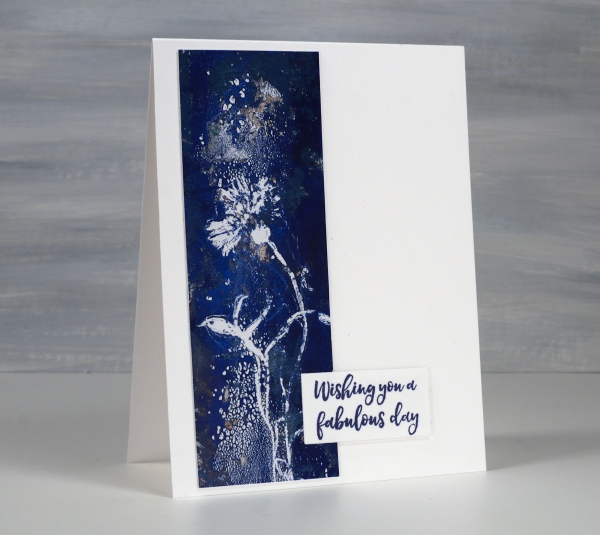
Gel Printed Cornflower & Grasses
Posted: August 21, 2024 Filed under: Darkroom Door, gel press, Waffle Flower | Tags: Darkroom Door stamps, gel press, gel printing, Waffle Flower dies 10 Comments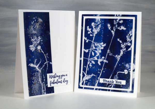
Arting and crafting has looked a bit different for me recently. This week I am ‘Professor Paint’ doing crafts each day with the children at our church day camp. There has been quite a bit of prep and experimenting going on over the past weeks. I made the sign for my ‘Art Lab’ at camp using gel prints but the crafts we’ve been doing haven’t involved gel printing at all. We have done some watercolouring with paint and water soluble markers though.
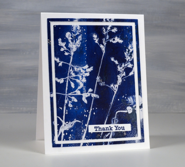
The two cards shown today were both made from one print. I don’t always take time to plan the layout of a botanical print so some prints look balanced and others don’t. I ended up cutting the cornflower image off the side of the full print to make the card below and left the grasses together to make the card above.
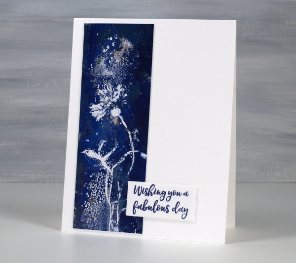
The print was definitely not perfect. You can see on the card above some odd texture from the paint. I thought it looked a bit like a spray of water above and below the cornflower.
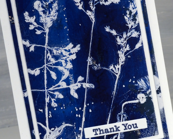
I don’t remember which paints I used but it looks like either two blues or a blue and a black.
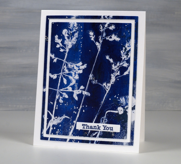
I’ve made a few cards lately using the framing technique above. I use three nesting dies to cut a large rectangle panel, then another inside and another inside that. I leave the middle frame out of the layout but could save it for another card or a strip on an envelope perhaps. The sentiments are from Darkroom Door. The printing technique used was the one shown in my last short video.
Window Box
Posted: August 8, 2024 Filed under: Echidna Studios, Finetec paints, Stampin Up, Window box | Tags: Coliro paints, digital stamps, Echidna Studios, Fabriano Watercolour Paper, Finetec artist mica watercolour paint, Staedtler watercolour brush pens, Stampin Up 4 Comments
Don’t you just want a window like this? With blooming flowers not wilting in the heat! This digital stamp is called ‘Window Box’ and it is new from Echidna Studios. My daughter designed it and there are three files to play with in the set, the image you see here as well as a separate window image and a separate window box image. I’m looking forward to trying the window box image by itself enlarged to fill a card front.
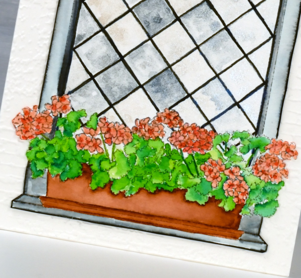
I printed the image on hot pressed watercolour paper and used Staedtler watercolour brush markers to colour the flowers, leaves, box and window frame. The window panes I painted with Coliro pearlcolors from Finetec. Some pearl or metallic paints are ‘interference’ paints which look very different on black paper as compared to white. The blue pearl paint I used from the ‘Ocean’ set looks very blue on black paper but looked silvery grey on white even with a touch of cream depending on the way the light hits it. This was exactly the effect I wanted so the panes appear like old leadlight windows where each pane reflects the light differently.
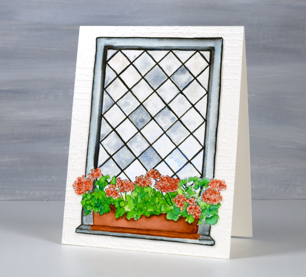
I coloured the leaves with two greens, blending them together with water and a paintbrush. I used the same technique for the flowers with a coral and a peach coloured marker. The planter was painted with a terracotta colour and the frame with black, diluted to appear grey in places. I wasn’t planning to cut this image out but it really needed to be attached to an embossed panel of aged brick. I’m sure you understand. The embossing folder is ‘exposed brick’ from Stampin Up. This post includes affiliate links from Foiled Fox. If you buy through these links I receive a small commission at no extra cost to you.
Leaf Print Sympathy cards
Posted: August 6, 2024 Filed under: gel press, Penny Black | Tags: gel press, gel printing, Penny Black stamps 10 Comments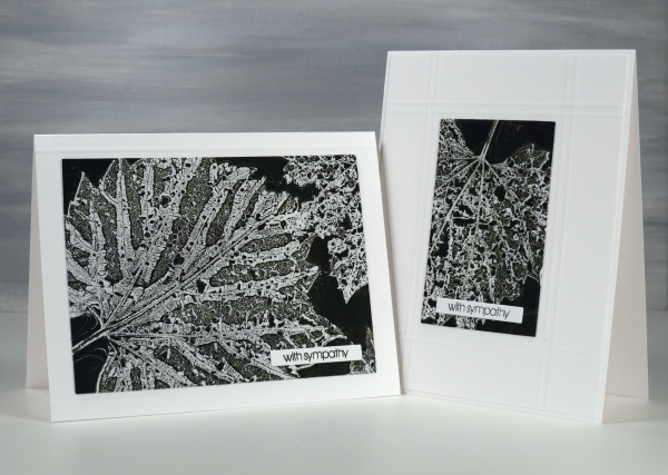
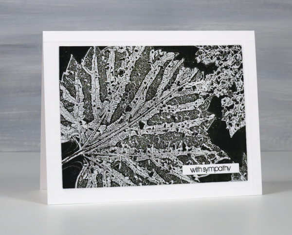
I’ve been collecting leaves, flowers and grasses over recent weeks for botanical gelprinting and thought I would try some damaged leaves eaten by beetles. The holes in the leaves leave a lacy pattern on the print which is delicate alongside the leaf veins.
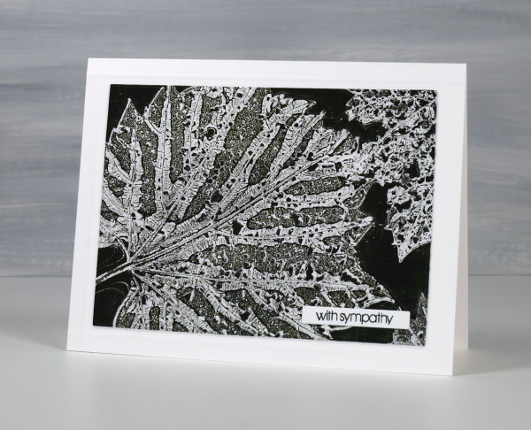
I applied black and green paint to a 5″x7″ gel plate and lay the leaves vein-side down in the paint. I used printer paper for this print and pressed it down on top of the leaves.
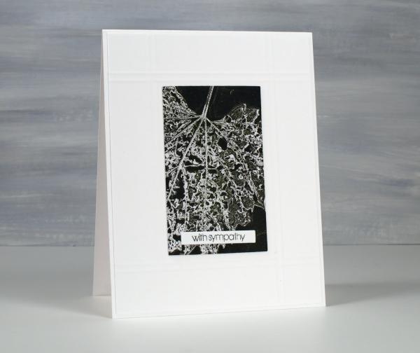
After pressing the paper firmly over the whole surface I lifted one corner to remove a leaf then pressed it down again and repeated on other corners to remove all three leaves. By lifting just a corner at the time the paper stayed in the same place to pick up the texture print left by the leaf on the plate. You can see the process in the short video below.
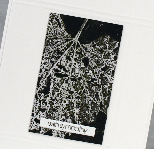
I decided to make a couple of sympathy cards using a small Penny Black sentiment. To add a bit of interest around the gel prints I scored criss-crossing lines on the background panel using my scor-pal. So don’t bypass those imperfect leaves when looking for gel printing elements; the intricate patterns are quite beautiful. This post includes affiliate links from Scrap’n’Stamp . If you buy through these links I receive a small commission at no extra cost to you.
Collage the Blues
Posted: July 31, 2024 Filed under: Darkroom Door, gel press, Nature Walk | Tags: collage, Darkroom Door stamps, gel press, gel printing, gelli plate 11 Comments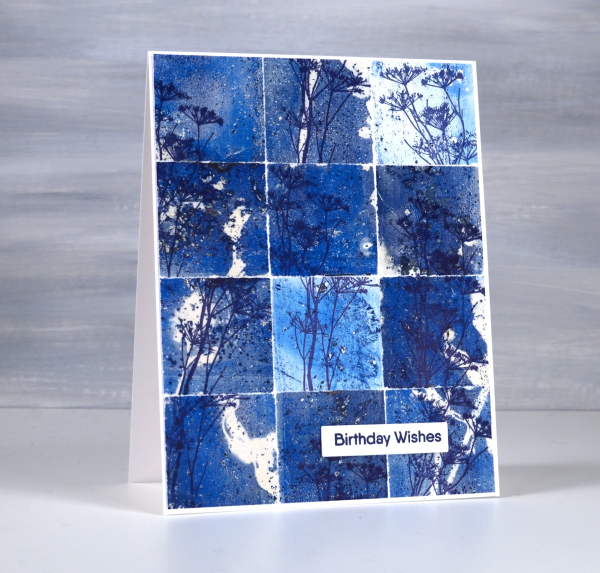
You might wonder what I do with all my gel prints, and believe me I have many, many gel prints! If I got rid of the partial prints that didn’t really work I would have less to deal with but sometimes the partial prints can become favourite cards or journal pages.
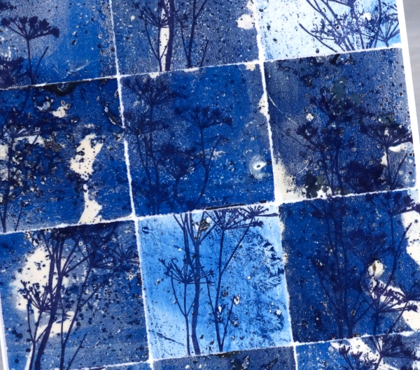
To create this collage of blues I tore a couple of partial prints into squares and stamped the delicate stamp from Darkroom Door’s nature walk set at different angles on the the squares. I put these ‘scraps’ back together and the partial prints brought shades of blue, pops of white and bits of pattern and texture.
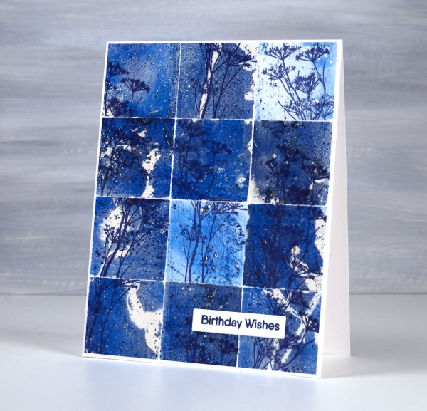
So, how many gel prints is too many? You can’t have too many!
Grafix Window Journal – Video
Posted: July 29, 2024 Filed under: Alcohol Ink, cricut, grafix, mixed media journal | Tags: Alcohol Ink, Art Journal, grafix, grafix craft plastic, Mixed Media, Ranger Alcohol Ink 1 Comment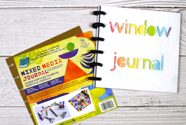
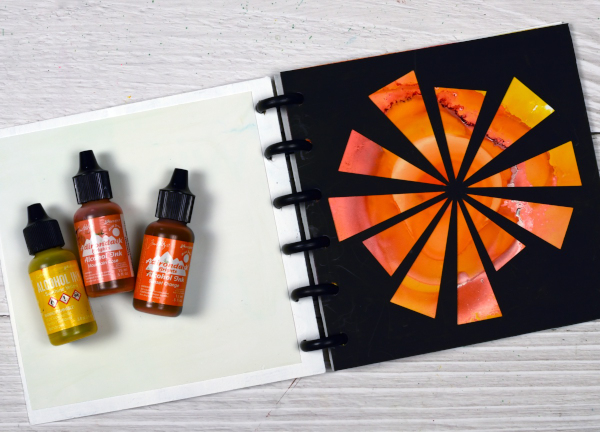
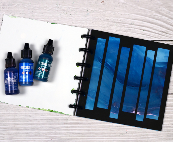
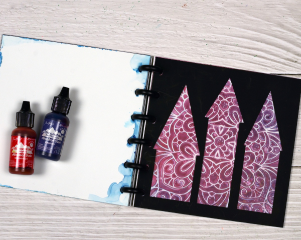
I’ve featured the Grafix Mixed Media Journal in videos a few times. I’ve made a swatch book for alcohol inks and markers and a sample book for alcohol ink techniques. Both books are good for reference. Today’s post and video feature the mixed media journal as a ‘window journal. I have added pages in pairs of black and white using the handy disc system. I have cut windows in the black pages and created alcohol ink patterns on the white pages.
You can configure the Grafix mixed media journals however you like as the pages and covers are available in separate packs or as a complete journal with different types of pages. Check out the video below to see how I put my window journal together.
You could create a window journal in many ways. I have added colour and pattern to only one side of the white pages but it would be fun to add a design on both sides so you could see the pattern through the window before the pattern and the window after.

You can see in the video that I reworked the ‘ocean’ page shown below several times. That is the beauty of white craft plastic; it is possible to take the page back to white or just dilute the ink with isopropyl alcohol and move it into a new pattern.
The final page in the book features a stencil design with alcohol inks, so simple but so effective. I cut all the windows on my Cricut using free shapes available in Cricut design space but you could cut them with dies or with a craft knife.
To see my other videos featuring the Grafix Mixed Media journal click the following links: Swatch book Swatch book cover Technique book


