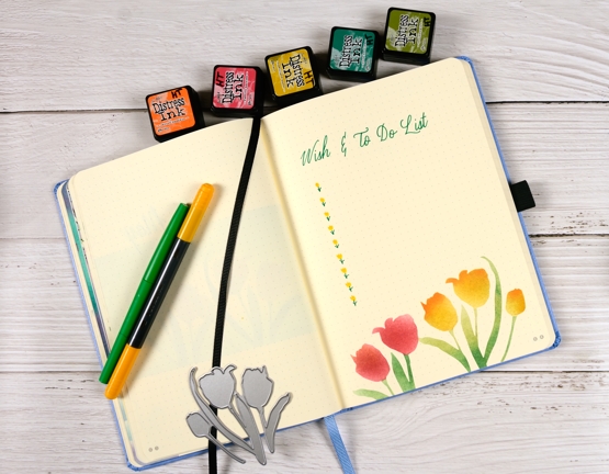
2021 BuJo – May title page & to-do list
Posted: May 4, 2021 Filed under: Bullet Journal, Dingbat notebooks, Penny Black, Promise Me | Tags: Bullet Journal, Dingbats notebook, Penny Black creative dies, Ranger Distress inks, Staedtler watercolour brush pens 1 Comment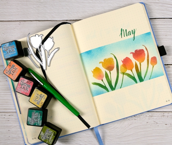
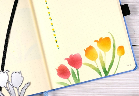
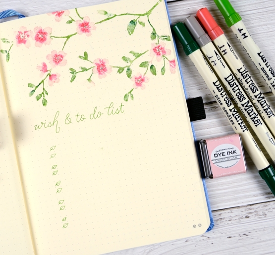
Each month I plan to post the theme for the next month just before the month starts. I even managed to finish this page a week before May 1st but didn’t get it photographed until this morning! Last month blossom was my theme and I am yet to see blossom in my garden, tulips however, have appeared. I only have one tulip that has survived the critters, it is a yellow-red mix and it is blooming at the moment.
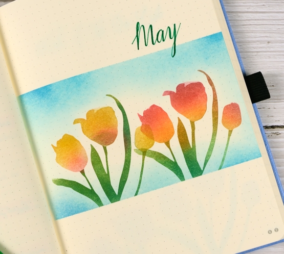
To create my tulip panel I masked above and below with large post-it notes then die cut the tulips from masking paper using the PB ‘promise me 2’ die. Like my own tulip these ones are a mix of red and yellow.
I blended distress inks with blending brushes and got better at protecting the leaves while blending the flowers by the time I did the wish/to-do list page. I drew little stems in green then used the brush tip end of the staedtler brush pen to make the yellow tulip petals.
Just for interest I looked back over my Jan-April wish/to do lists to see how if I am managing to get things done. Most months I check off more than I don’t but never all. I have had my next online class as an item on every list this year and some months I made progress, others I didn’t due to how I was feeling and what other commitments I had. But great progress has been made in April and May so ‘FLORAL FAVES’ is coming!
Supplies
(Compensated affiliate links used when possible)
Tropical florescence
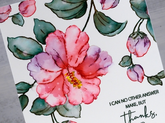
Posted: May 3, 2021 Filed under: Brutus Monroe, florescence, Penny Black | Tags: brutus monroe embossing powder, Fabriano Watercolour Paper, Penny Black stamps, Ranger Distress inks 8 Comments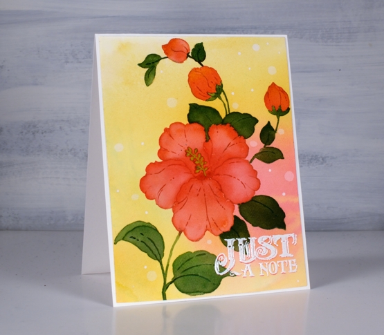
This is the second appearance of the beautiful hibiscus stamp from Penny Black (it’s called Florescence and it’s a stunner) and I’ve been working with it behind the scenes as I complete my next online class. To create this tropical look I smooshed worn lipstick and wild honey inks on my glass mat and spritzed water over them until they ran together then took a piece of hot pressed watercolor paper and swiped it through the diluted inks. To get good coverage and blends I tilted and spritzed more water on the panel then left it to dry.
With the panel in a stamp positioner I inked the large hibiscus and buds with worn lipstick ink stamped then inked the rest of the stamp with antique linen so I could see the whole image for some no-line watercolour. I painted one petal at a time with worn lipstick ink adding more towards the center of the flower. For the buds I used a mix of worn lipstick and wild honey.

For the leaves I stamped and painted with rustic wilderness distress and sometimes added worn lipstick to the blend so I’d have variation in the leaf colours.
That little sentiment seemed to lend itself to the tropical, surf shop vibe so I stamped once in worn lipstick, then moved the panel ever so slightly down so I could stamp again in white to create a drop shadow look. I definitely dried it and used an anti static tool before sprinkling the white embossing powder over the words otherwise it could have all ended up white.
I’m so excited to have another online class in the works; the projects are all filmed so it’s editing time, supply list creating time and intro filming time. I’ll have more details, dates and sneak peaks for you soon!
Supplies
(Compensated affiliate links used when possible)
Garden fresh
Posted: April 28, 2021 Filed under: garden fresh, scripty | Tags: distress markers, Fabriano Watercolour Paper, Papertrey ink, Penny Black stamps, Ranger Distress inks, Stampin Up 7 Comments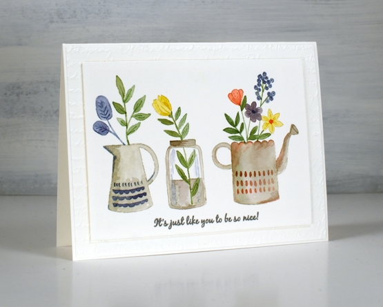
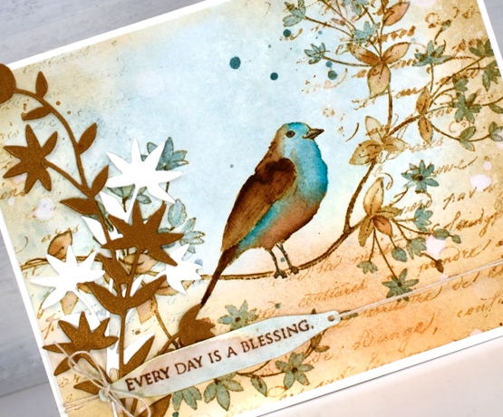
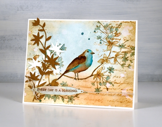
Inspiration for today’s card came from a watercolour artist I saw on Instagram. Her name is Garima Srivastava and she paints loads of florals sometimes in cute little jars and vases. I saw one of her paintings then pulled out the new Penny Black ‘garden fresh’ clear set to create my own little trio.
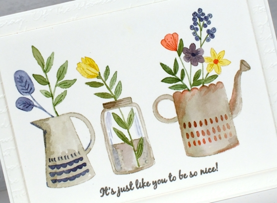
I stamped on hot press watercolour paper with Papertrey soft stone ink, a pale grey that works well for no line watercolour. To paint inside the outline images I used a mix of distress inks and markers, sometimes picking up smooshed ink off my glass mat, other times inking the stamp with a marker to add some definition.
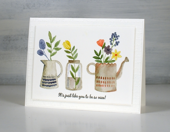
To finish the panel I stamped a sentiment from the new PB ‘ever thanks’ set in versafine clair morning mist ink then popped it up over the embossed mat made with one of my new embossing folders. (SU ‘scripty’). I’m looking forward to filling jars and jugs with flowers. Right now the daffodils are making a fine effort but a little too sparse to cut any for indoors.
Supplies
(Compensated affiliate links used when possible)
Bird’s eye view
Posted: April 23, 2021 Filed under: bird's eye view, Dies, Flower Frolic, gift card pocket, Karin brushmarkers, Penny Black, Script | Tags: distress markers, Karin brushmarkers, Penny Black creative dies, Penny Black stamps, Ranger Distress inks 7 Comments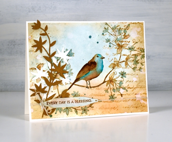
This cute bird on a branch stamp is new from Penny Black and is called ‘bird’s eye view’. We recently installed a new bird feeder in our backyard. It is on a shepherd’s hook metal pole to discourage the squirrels. The feeder itself has the anti-squirrel spring mechanism which closes access to the seed when something as heavy as a squirrel lands on it. You can probably guess what I’m going to say next; squirrels are wily creatures as are chipmunks! I can say that no adult squirrels have successfully fed directly from the feeder, they hang around underneath and eat what falls to the ground. We have seen a smaller squirrel climb the pole and lean over to take seed from the feeder without putting weight on it and a chipmunk that is light enough to sit on the feeder and stuff it’s face happily!
I know from experience you win some and lose some with feeders and I am enjoying the cardinal couple, the chickadees and the sparrows that are popping in. I think we’ve seen a finch or two but not certain.
To create this vintage themed card I limited myself to a brown and blue colour scheme. The browns are tea dye, antique linen and vintage photo distress inks; the blues are speckled egg distress ink plus the arctic blue and cyan Karin brushmarkers. First I smooshed tea dye and speckled egg inks on a glass mat, diluted them with water then swiped a piece of hot pressed watercolour paper through the inks. Once the background was dry I stamped the ‘bird’s eye view’ image on the panel with antique linen and kept the panel in the stamp positioner while I added darker ink by applying distress marker to the stamp where I needed darker browns and black.
I painted the leaves in both tea dye and speckled egg inks and did the same with the bird before adding vintage photo ink to the wing, tail and legs. Once the bird was finished I felt the speckled egg blue was not deep enough so I used the blue Karin markers to add ink directly to the paper then blended with a paintbrush.
To add to the vintage look I blended around the edge of the panel with vintage photo ink then dropped splats of water here and there to create watermarks. I also stamped the PB script stamp which never fails to add some vintage charm. I hunted through my dies to find a pretty foliage die that mimics the shape of leaves and cut both bronze and cream pieces to attach to the left of the panel. Continuing the vintage theme I stamped a partial sentiment on a little tag and tied it to the panel with twine. Yes, of course there is also some ink splatter.
Let me know if you have successfully deterred squirrels from you backyard bird feeders; I’d love to hear your techniques.
Supplies
(Compensated affiliate links used when possible)
Companions
Posted: April 21, 2021 Filed under: companions, Penny Black | Tags: distress markers, Papertrey ink, Penny Black stamps, Ranger Distress inks, Tsukineko Versafine inks 6 Comments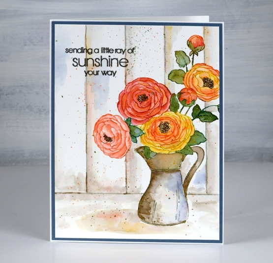
Today’s jug of flowers is yet another lovely floral from the new Penny Black ‘Delight’ release. I went for something of a vintage effect with this one by painting the jug in muted brown and grey tones and adding some woodwork in the background.
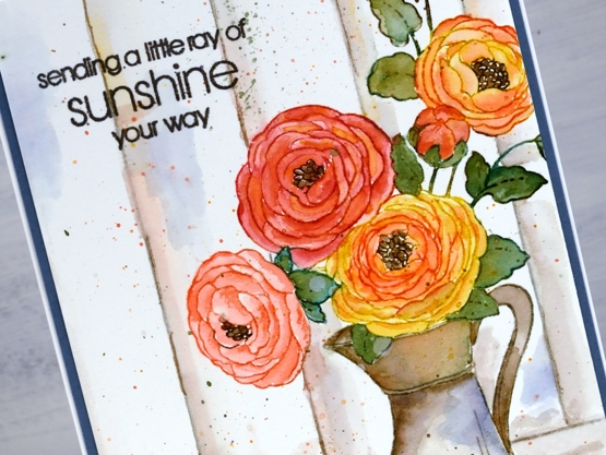
To begin I stamped the whole image on hot pressed watercolour paper in papertrey soft stone ink. I chose mustard seed and abandoned coral distress inks to make colour blends to paint all the flowers and buds. I used a mix of pine needles and forest moss inks for the leaves and stems then stamped and painted the flower centres with gathered twigs ink. For the look of an old metal or ceramic jug I used pumice stone and gathered twigs inks doing some restamping and blending with both inks to define and fill the jug.
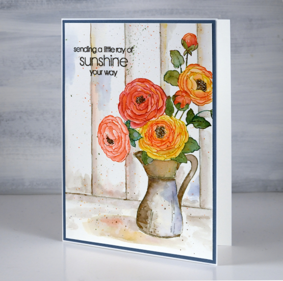
Once the jug and flowers were complete I painted a shadow underneath with pumice stone ink then dropped some of the flower and jug colours into the wet shadow. To ground the image I ruled both a base line then vertical ‘wood panel’ lines with a t-ruler in pumice stone ink. I used pumice stone ink to paint shadow and shading on the wood then realised I needed another colour to lift the whole vintage toned panel. I chose chipped sapphire ink to add some blue to the panels and the jug as it is the complement to yellow mustard seed ink used on the flowers. It definitely made a difference so I stayed with the blue in choosing a dark blue cardstock to frame the panel. (I demonstrate how I make colour choices for stamping and painting in my online class COLOUR CLUES) I finished the card with by adding splatter and a sentiment from the new PB ‘thinking of you’ set.
Supplies
(Compensated affiliate links used when possible)
2021 BuJo – April daily record
Posted: April 17, 2021 Filed under: blissful blossoms, Bullet Journal, Dingbat notebooks, Penny Black, Uncategorized | Tags: Bullet Journal, Dingbats notebook, distress markers, Papertrey ink, Penny Black stamps 4 Comments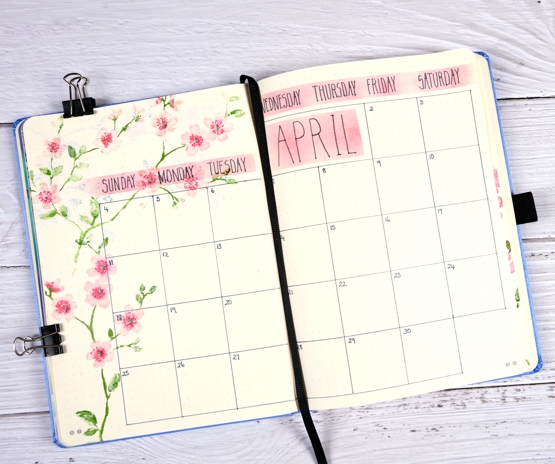
Here is my month at a glance record with the April blossom theme. If you look closely you will see I left no space for April 1st so I tacked it on at the end of the March page and moved on!
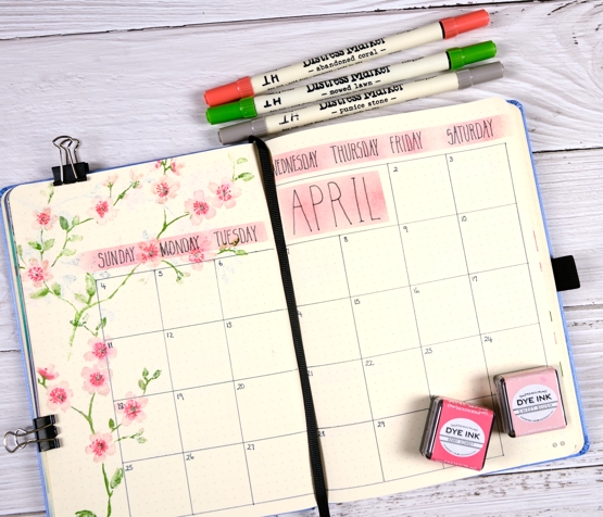
I used the same blissful blossom stamp from Penny Black that I used on the title page and to-do list. This time I masked some strips for blending pink before writing the days and the month title. You can see some evidence of bleed through in the top left corner but it’s just blossom so I like the shadowy effect.
Supplies
(Compensated affiliate links used when possible)
Florescence
Posted: April 16, 2021 Filed under: florescence, Karin brushmarkers, Penny Black | Tags: Fabriano Watercolour Paper, Karin brushmarkers, Papertrey ink, Penny Black stamps, Tsukineko Versafine inks 11 Comments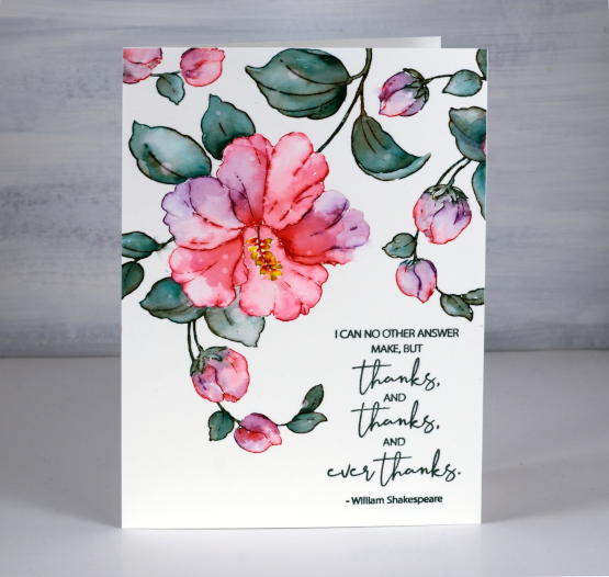
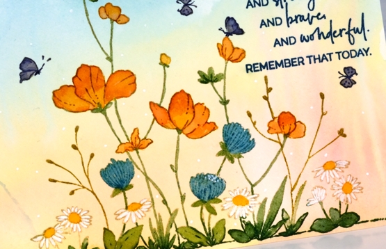
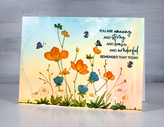
I hope you have already seen some of the gorgeous new stamps from the Penny Black ‘Delight’ release. I am thoroughly enjoying the large floral stamps and will be sharing projects here on the blog over the coming weeks. This beautiful hibiscus stamp is called ‘florescence’ and it is a joy to work with.
To create this large 4½”x 6¼” card I used Karin brush markers to both stamp and paint the image. With the hot pressed watercolour panel in a stamp positioner I stamped first in Papertrey soft stone ink so I could see the outline image then inked the flower and buds with the magenta and magenta red markers. When I am inking a stamp with a marker I always turn the marker tip on its side to protect the point. I inked the leaves and stems with both lush green and henna markers to create more of a muted green. When painting the leaves and flowers I drew ink from the stamped lines as well as adding it to the panel directly with the brush markers. I also dabbed ink away to create water marks and gradation in the petals and leaves. I stamped and painted the anther and filament (yes I looked that up) in magenta and canary markers. To finish the flower painting I strategically placed some large and small water droplets on the leaves and petals. After letting them sit for 30 seconds or so I dabbed them up with a paper towel to reveal pale dots here and there.

To fill the top of the panel I stamped and painted the buds a couple more times leaving a blank space bottom right for the large thank you sentiment from the new ‘ever thanks’ set. I stamped in versafine olympia green; I’ve heard the original versafine inks are being phased out so I will keep stamping with them while I have them but buy the versafine clair inks from now on.
Both the Foiled Fox and Penny Black are hosting giveaways right now so click on the links I created for a chance to win.
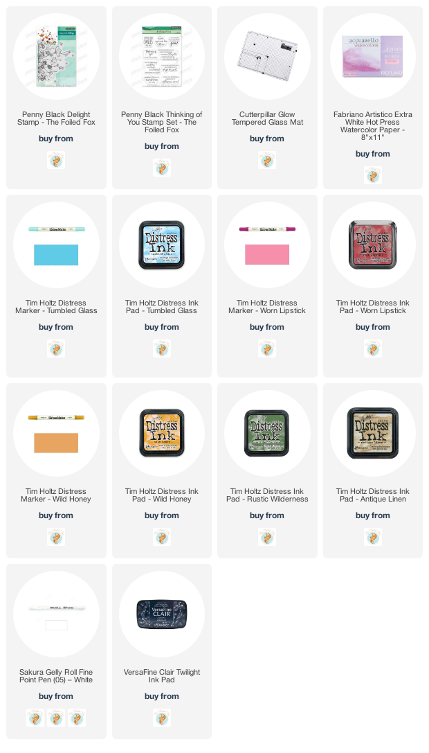
Supplies
(Compensated affiliate links used when possible)
Garden Delight
Posted: April 14, 2021 Filed under: delight, Penny Black | Tags: distress markers, Penny Black stamps, Ranger Distress inks, Tsukineko Versafine inks 30 Comments
It’s a doubly exciting day today! Not only have a I teamed up with the Foiled Fox for a giveaway, I am also sharing the first of my posts featuring new Penny Black stamps.
The new release is called ‘Delight’ and the stamp on this card is called ‘delight’! And I am delighted to tell you more about this garden card.
You can probably tell that I painted the background first; it’s a smoosh, spritz, swipe background! I smooshed broken china, worn lipstick and wild honey distress inks on my glass mat, spritzed water on the inks and the hot pressed watercolour paper then swiped the paper through the inks. I tipped and tilted the panel to get the colours to mix and move then let it dry standing on its edge.
Once it was totally dry I put the panel in a stamp positioner to do all the stamping and painting. I stamped the base of the stamp with rustic wilderness, the larger flowers with worn lipstick and the rest of the stamp with antique linen. Using the glass mat as a palette I smooshed the distress inks already mentioned so I could add water and pick up ink with a paintbrush. To create white petals on the daisies I used a white gel pen then added little white dots here and there around the panel.
The ‘delight’ stamp is fairly large so this card ended up being 6¼”x4½”. I finished the card with a sentiment from the new PB ‘thinking of you’ set stamped in twilight versafine clair ink. To enter the giveaway The Foiled Fox is hosting let me know in the comments what is on your crafty wishlist right now. I am wondering about trying some gouache paints so that is top of my list. What are you hoping and saving for?
Make sure you pop over to the Foiled Fox blog to see all the beautiful cards they have been sharing and browse around their lovely store; you might find your wish list growing while you’re there.
Supplies
(Compensated affiliate links used when possible)
Alcohol ink gel print
Posted: April 12, 2021 Filed under: Alcohol Ink, gel press, Penny Black, Taylored Expressions | Tags: gel press, gel printing, Penny Black creative dies, Penny Black stamps, pinata alcohol ink, Ranger Alcohol Ink, Taylored Expressions 5 Comments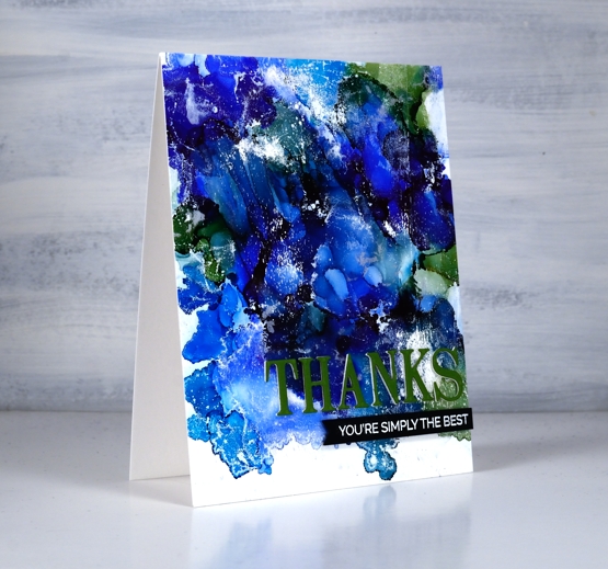
I tried a technique this week that I’ve seen demonstrated by gel printing wizards but never tried myself. In some ways it’s not that different from making abstract alcohol ink patterns on yupo or craft plastic but I found that I ended up with more of a distressed look which is rather nice.
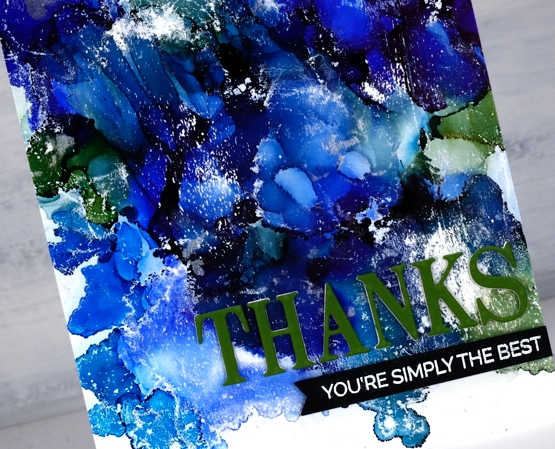
I started with a not entirely clean gel plate and three or four alcohol inks, I’m not sure exactly which ones I used as I was very much in experimenting mode. Obviously there was a green and some blues in there and in real life you can see I also had a silver. I dropped dots of the different colours on the gel plate added rubbing alcohol and blew it all around with the air blower. It dried quite quickly so it took several additions of inks and rubbing alcohol before I was happy with the coverage. Once the AI had dried completely I brayered white acrylic paint over the painted area and took a print on some white cardstock. You can see the usual overlapping patterns of alcohol ink blobs but also some white patches and ‘grazes’ from the acrylic paint.
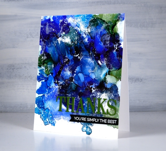
I trimmed the panel and added a three layer PB die cut sentiment along with an additional sentiment strip. I will definitely be trying this technique again.
Supplies
(Compensated affiliate links used when possible)
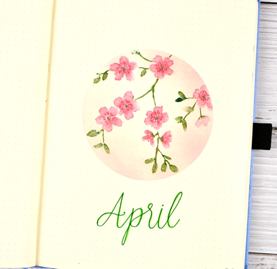
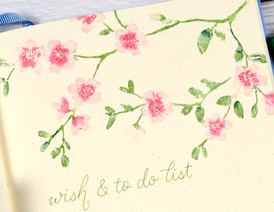
2021 BuJo – April theme
Posted: April 10, 2021 Filed under: blissful blossoms, Bullet Journal, Dingbat notebooks, Papertrey Inks, Penny Black | Tags: Bullet Journal, Dingbats notebook, distress markers, Papertrey ink, Penny Black stamps 10 Comments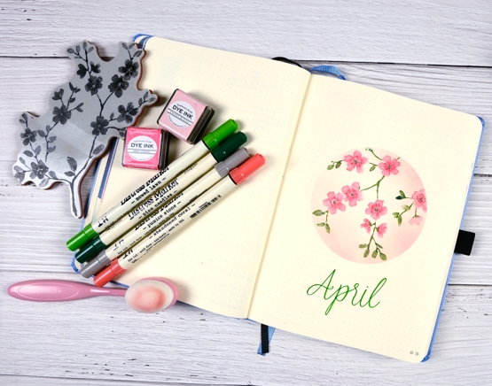
April’s bullet journal pages do not feature snow! I haven’t seen any blossoms yet but I’m sure I will before April is over so I chose blossoms for this month’s theme. As I’ve done for January, February and March, I masked a shape in the middle of the page with a large piece of post-it paper and did all my stamping and blending inside the masked area.
This is the first page I’ve used stamps for in my bullet journal so there was some experimenting involved. The stamp I chose is a ‘brushstroke’ stamp designed to look painted and I never use these stamps without adding some water and blending. Stamping ‘blissful blossoms’ on the non-watercolour paper meant minimal water so as to not get too much bleed through to the back of the page.
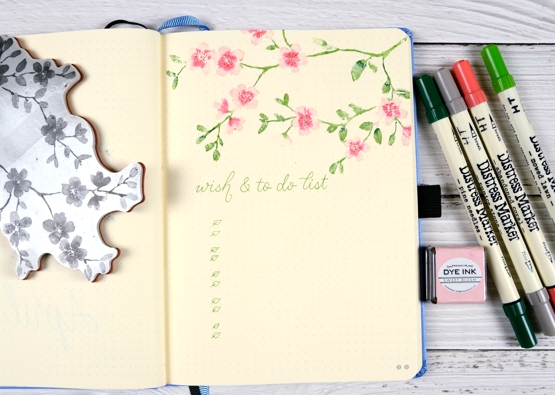
For both the title page and the to-do list page I inked the blossoms with pink ink cubes then added the rest of the colour with distress markers. I spritzed the stamp ever so lightly with water before stamping and blended the flowers and leaves ever so lightly on the page with a blender pen.
There was some bleed through but it wasn’t bad and I stamped over the top of it with the same blossoms when creating my April month spread that I’ll share another day.
Hope April is off to a good start for you. We have had gorgeous sunshine all week but I have seen there is rain coming. But you know what they say, “April showers bring May flowers”!
Supplies
(Compensated affiliate links used when possible)