Cars, Bikes and birthdays
Posted: April 11, 2023 Filed under: brushed stars, classic motorcycles, Darkroom Door, postage stamps, this way, vintage car, word labels, World Map | Tags: Darkroom Door stamps, One-Layer cards, Ranger archival inks, Ranger Distress inks, Tsukineko Versafine inks 5 Comments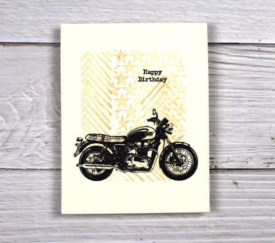
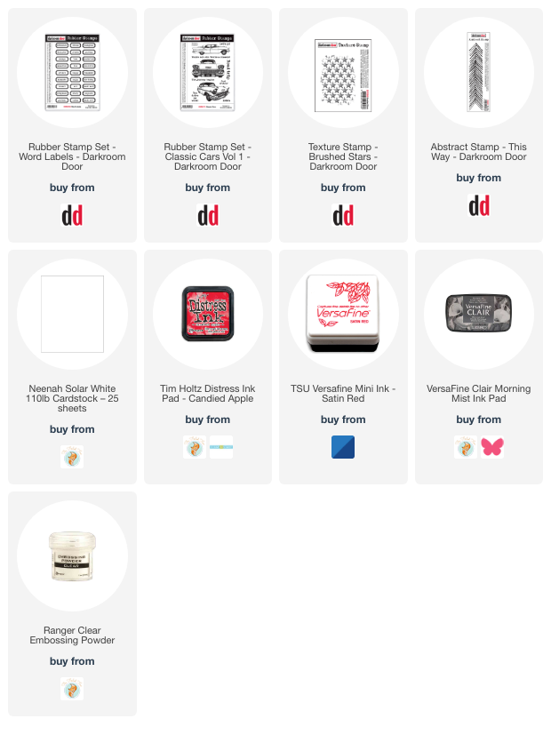
You’ve seen me use the ‘this way’ stamp behind a trio of butterflies and a classic car as well as featured on a journal page. It reminds me a little of tire tread so I have paired it again with some vehicles. For this motorbike card I masked the edges of a cream panel and stamped ‘this way’ and ‘brushed stars’ in antique linen distress ink.

After removing the masking tape I added one of the motorcycles from the classic motorcyles set in black along with a little happy birthday. I haven’t masked edges like this in a while but it makes it easy to make a simple but eye catching one layer card. You could fill the masked area with any stamping you wanted then add a bold black image over the top.

I also used ‘this way’ in the vintage style watercolour background of this card. I combined, the arrow pattern of ‘this way’ with postage stamps and world map. There is also splatter and a torn edge to keep the background looking aged. I stamped the DD vintage card on teabags and added stitching and word labels to complete the card.

(Compensated affiliate links from Foiled Fox, Scrap n Stamp)
Lighthouse Journal Page
Posted: April 6, 2023 Filed under: Art Journal, Darkroom Door, global postmarks, Handmade book, this way, word labels, World Map | Tags: Art Journal, Coliro paints, Darkroom Door stamps, Fabriano Watercolour Paper, Handmade book, Ranger Distress inks 5 Comments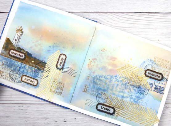
This journal spread was a joy to make. It combines so many of my favourite things. A few weeks back I posted about a new handmade art journal. This is it and these are the first pages I’ve completed. I didn’t work on the very first page; I leave that for later, so this is a few pages in. The pages are cold pressed watercolour paper so I taped the edges and created a watery blended background with distress inks smooshed on a piece of acetate then pressed onto my pages. I added more ink with a paintbrush and stamped the Darkroom Door world map stamp into the wet ink. I wasn’t trying to create sky or land or anything in particular I was just working randomly with blues and browns.
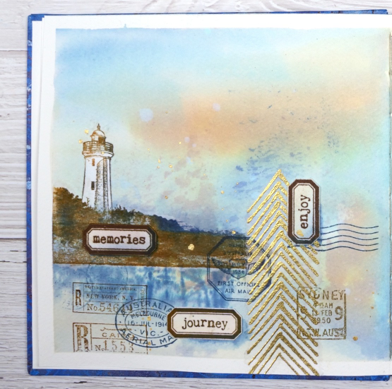
Once the background dried I used stamps from another favourite, the DD ‘global postmarks’ set, again stamped in blue and brown but archival ink, not distress, so it wouldn’t dilute and blur.
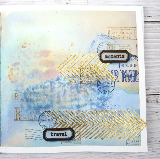
On an extra scrap of watercolour paper I picked up some smooshed and diluted ink then dried it before stamping the new ‘word labels’ stamps so I could cut them out and arrange them over the page.
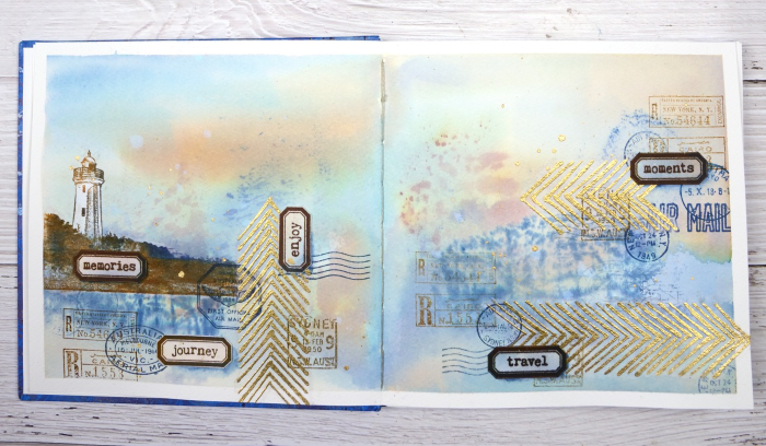
If you have been visiting my blog for a while you will have seen the lighthouse stamp before. The lighthouse is in Norah Head, on the central coast of NSW, not far from where my father lives and the Darkroom Door premises. I have visited there several times and climbed the lighthouse with my dad. You can probably see now why I chose the word labels I did. The lighthouse and the ‘this way’ arrows are stamped on tissue paper. This allowed me to move them around to work out exactly where I wanted them. The blurry world map stamping worked as a ‘reflection for the lighthouse image so that’s where it ended up.
When I am adding stamped tissue to a page I gently tear around the edges with the help of a damp paintbrush. For the lighthouse I cut carefully around the walls and light then painted white paint on the back of the tissue so it would not be transparent. Of course I splattered some water and some gold paint to complete the page.
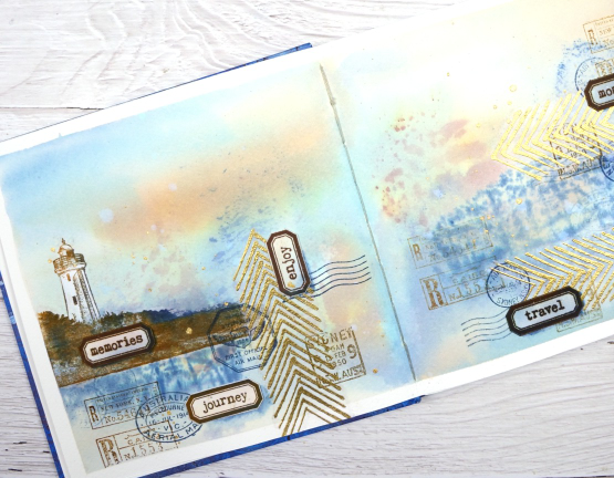
As this was the first time I had used my new journal I was interested to see how the cold pressed watercolour paper worked. Nothing soaked through the paper to the other side and I took care to dab up liquid from the centre seam so there was not much bleed through there either. The 7″ x 7″ size gave me a little more room than the 6 x 6 journals I have been working in but wasn’t so large as to be overwhelming.
(Compensated affiliate links from Foiled Fox, Scrap n Stamp & Ecstasy Crafts)
Do red cars go faster?
Posted: April 3, 2023 Filed under: brushed stars, classic cars vol 1, Darkroom Door, this way, word labels | Tags: Darkroom Door stamps, Ranger Distress inks, Tsukineko Versafine inks 4 Comments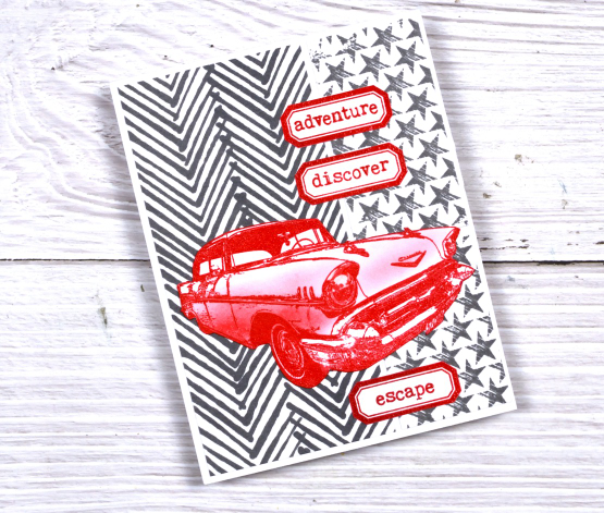
I mentioned on Friday that Darkroom Door has a new release available now and shared a butterfly card. For this bold two toned card I used the same narrow ‘this way’ stamp but in hickory smoke ink. I completed the background with the brushed stars texture stamp then added bright red elements on top.
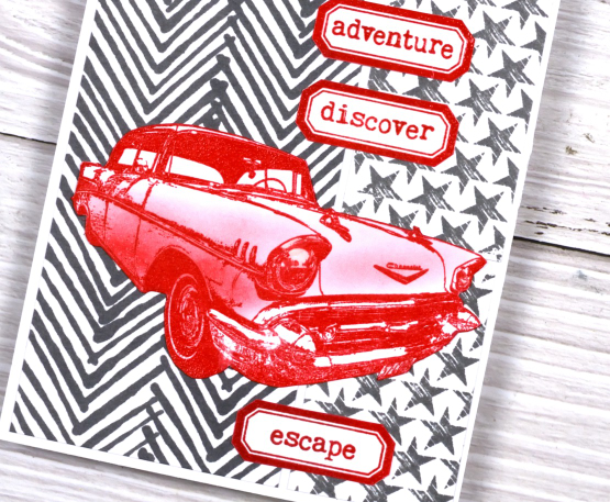
The labels are from a new DD stamp set ‘word labels’. The set includes 27 different words which will be brilliant for cards and journalling. The cool car is from the ‘classic cars vol 1’ set. I embossed it with versafine satin red ink then added shading with candied apple distress ink.
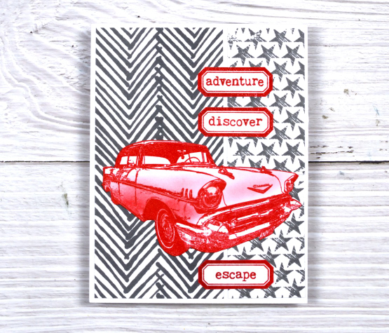
We had a red car once which I rather liked but not long after buying it we up and left for Canada so had to sell it again!
Make sure you check out the new release from Darkroom Door it is full of style and originality. You’ll be seeing more of it in the weeks to come.
(Compensated affiliate links from Foiled Fox, Scrap n Stamp & Ecstasy Crafts)
Canopy
Posted: March 27, 2023 Filed under: canopy, Penny Black | Tags: Fabriano Watercolour Paper, Penny Black stamps, Ranger Distress inks 5 Comments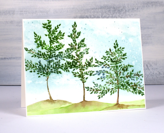
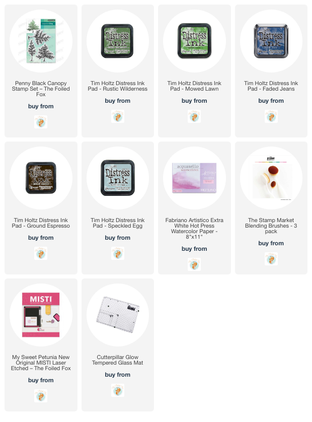
Today I am delighted to be sharing this card on the Foiled Fox blog. I have mentioned before how much I like the people at the Foiled Fox and we seem to enjoy a lot of the same artsy things. This new set from Penny Black is called ‘Canopy’ and it includes three similar trees of different sizes.
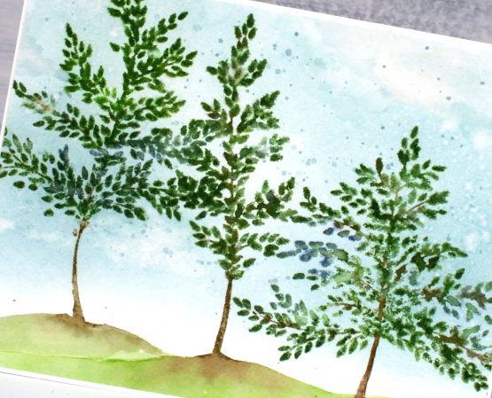
I completed the sky first by blending speckled egg ink over the panel of hot pressed watercolour paper. I painted over the blended ink with water then dabbed away some of the ink with a tissue to create the look of clouds. I also added some splatters because why not?
I stamped the trees one at a time and added a hill below the trunk each time. Painting the little hill while the ink on the trunk was still wet made it possible to softly blend the brown and green inks together.
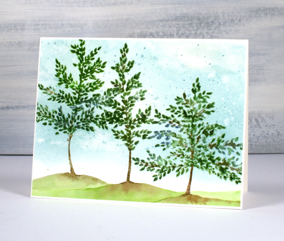
Make sure you pop over to the Foiled Fox blog to learn more about my process and to browse their lovely projects and products. You know how I feel about tree stamps; you can never have too many. I love the whimsical bendy trunks on these ones; they look like they are swaying in a breeze.
(Compensated affiliate links from Foiled Fox)
Welcome Home
Posted: March 21, 2023 Filed under: Penny Black, Welcome Home | Tags: Fabriano Watercolour Paper, Penny Black stamps, Ranger Distress inks 5 Comments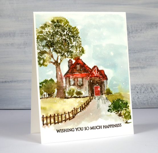
This sweet scene is called ‘Welcome Home’ and it is a new rubber cling stamp from Penny Black. Yes you can see little white flecks on the panel again, not snow, just textural interest, or perhaps rain. I used a panel of hot pressed watercolour paper splattered with masking fluid. As usual with a scenic stamp I kept the panel in a stamp positioner throughout the whole process.
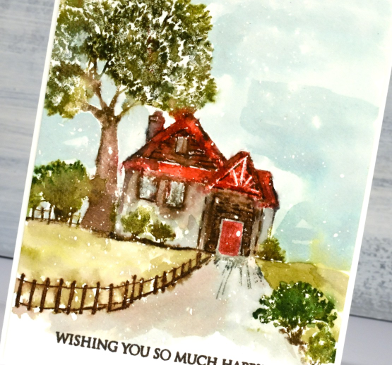
I stamped first in antique linen so I could see the whole scene as I added colour bit by bit to the cottage, fence and trees. I used a mix of distress ink pads and markers. To blend the inks I sometimes spritz the stamp before stamping so the inks start moving or I use a paintbrush after stamping to move the inks to fill an area like the roof or walls of the cottage. If some details get lost in the blending I use a marker to add definition back to the scene eg. bricks, roof and chimney outlines.
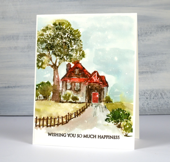
I loosely painted the grass, sky and driveway with smooshed distress inks. I thought the wide sentiment worked well to balance the height of the tree and stamped it in dark brown. It’s another new one from PB’s ‘delightful day’ set.
(Compensated affiliate links from Foiled Fox, Scrap n Stamp)
Lovely
Posted: March 13, 2023 Filed under: lovely, Penny Black | Tags: Fabriano Watercolour Paper, Penny Black stamps, Ranger Distress inks 7 Comments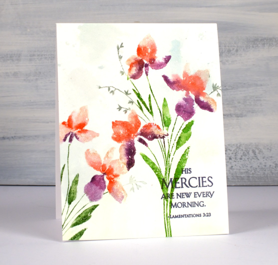
I have another lovely new stamp from Penny Black and it is aptly named ‘Lovely’! It is a brushstroke stamp, meaning that it is semi solid and made from a painted image to look like you painted it. I find that dye inks and water based markers are great for this type of stamp.
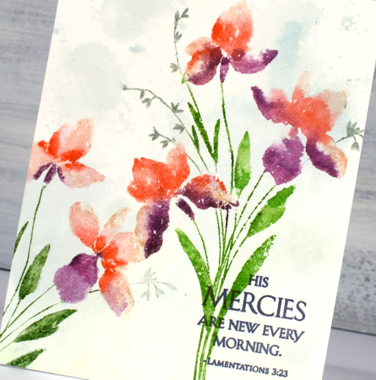
I worked on hot press watercolour paper which had some masking fluid splattered over it. I sometimes use masking fluid even when I am not creating a snowy scene because I like the slightly aged or ‘rainy’ look it gives my stamping and painting. I wanted to do the background before I stamped so I smooshed some speckled egg and mowed lawn distress inks on my glass mat, spritzed water to dilute it then swiped my watercolour panel through it. The result is very soft but enough to add subtle interest to the background.
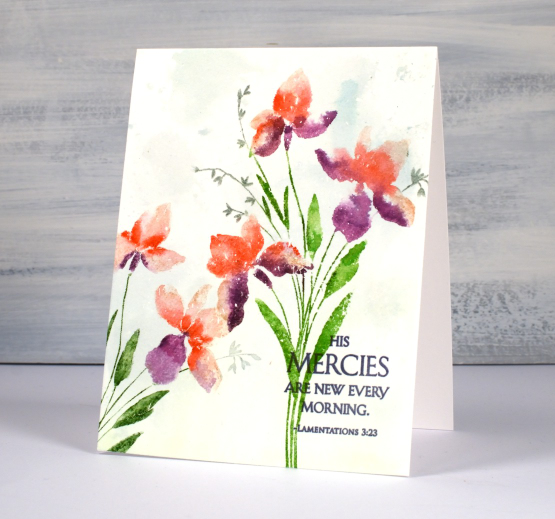
I inked the flowers with a mix of tattered rose, abandoned coral and seedless preserves distress inks, spritzed the stamp with water then stamped. I used a paintbrush to blend the ink to fill the petals. You can see me use this technique in a video here. I inked the stems with mowed lawn and the tiny flowers with iced spruce. I do use a mix of large and small ink pads when I ink the stamp along with distress markers. I know distress markers are discontinued but I will keep using mine until the bitter end. I managed to reink a marker the other day following a video a friend told me about. The video maker used a distress stain but I had a re-inker in the required colour so I used the re-inker. I didn’t see any improvement until the next day after the ink had time to soak through the tube and into the brush tip.
Because I love the matchy-matchy I pulled out a Ciao Bella ink to stamp the sentiment from the new PB set ‘blessings’. My colour inspiration was from a photo Jan sent me last year. My colours are not as subtle as the ones in the photo but I still like the unusual mix of coral and purple. Thanks for the inspiration, Jan, I went to my file of your pics as soon as I started working with this stamp!
(Compensated affiliate links from Foiled Fox, Scrap n Stamp & Ecstasy Crafts)
Prized
Posted: March 10, 2023 Filed under: Penny Black, prized | Tags: Fabriano Watercolour Paper, Penny Black stamps, Ranger Distress inks 17 Comments
Penny Black has new stamps! And of course I am especially interested in new flowers and tree stamps. This rose, aptly named ‘prized’ is just one of the new stamps I will be sharing on the blog in the next few weeks.
My mother loved roses and she and my father grew them in every garden they made. My dad has several lovely ones out the front and the back of his retirement unit. I think he has one with peachy/yellow colouring a bit like this one.
To colour the ‘prized’ rose I worked on hot pressed watercolour paper and kept it in a stamp positioner. I inked the petals with both fossilized amber and abandoned coral distress inks. I spritzed the inked stamp before stamping which made the ink wetter and easier to blend into each petal shape. When using this technique I always smoosh the ink pad on my glass mat so I can pick up ink there as well.
While the petals dried I inked the leaves and stem with forest moss and a small amount of faded jeans distress inks then followed the same technique as above to paint the leaves. I went back to the petals and did a second round of stamping and blending adding candied apple ink to the centre of the rose to deepen the colour.
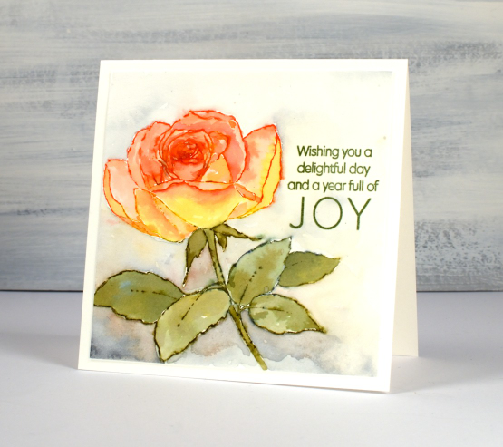
After I had completed the flower I used mix of diluted inks to paint around the rose. I added hickory smoke to the other four inks as I blended around the edges of the flower and feathered out to pale yellow or grey at the edges of the watercolour panel.
I chose the title sentiment from the PB set ‘delightful day’ and stamped it in peeled paint archival ink.
Hope you are having a delightful day!
(Compensated affiliate links from Foiled Fox, Scrap n Stamp)
Tea, Coffee, Art Journalling?
Posted: February 28, 2023 Filed under: 6"x 6" journal, Art Journal, Background Stamps, coffee time, Cup of tea, Darkroom Door, Dies, Gazette, Penny Black, Script, Time, What's in your cup, World Map | Tags: Art Journal, Darkroom Door stamps, Penny Black creative dies, Penny Black stamps, Ranger Distress inks 2 Comments
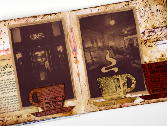
Today I am posting a few pages from last year’s Art Journal Adventure workshops. I taught seven different ‘episodes’ last year and one month the theme was coffee and tea. I did a few pages before the sessions and then created a different page during each class. I don’t like replicating the same spread in my art journal so each one had a different colour scheme and style.

Even though I am more of a herbal tea drinker than a coffee drinker I ended up creating three coffee themed pages and two tea themed. You can see the first coffee themed page here. As you can see from the three spreads featured here I use a variety of techniques, papers and elements in my pages. The common technique on these pages is a watercolour background and the common element is the chipboard cups. Both the coffee themed pages feature photos from an old coffee themed diary. In both cases I took my colour scheme from the photo and added browns.
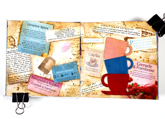
This tea themed page could also be called ‘these are a few of my favourite teas!’ I used packaging from boxes and sachets, embossed the teacups to match and add snippets from old books and magazines.
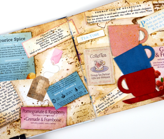
These pages show how I gather elements and papers from here, there and everywhere when creating a page. I used inks, embossing powders and glazes, stamps and stencils for these pages but I also used an old diary, packaging, pages from a vintage recipe book, and old teabags!
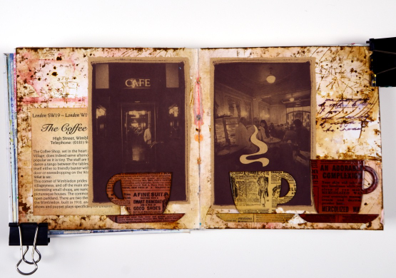
I almost didn’t finish this last spread but once I had stamped then glazed the cute chipboard cups I knew I had to finish. Now I want a mug with vintage newsprint on it!
Art Journal Adventure for 2023 kicks off this week. There is still space in the Friday class and the Monday class. We will be creating with semi- transparent papers.
(Compensated affiliate links from Foiled Fox, Scrap n Stamp)
Leafy
Posted: February 15, 2023 Filed under: Finetec paints, leaf trio, nature's garlands, Penny Black | Tags: Finetec artist mica watercolour paint, Penny Black stamps, Ranger Distress inks 3 Comments
I am sharing this project on the Foiled Fox blog today. It’s a lovely place to visit; make sure you drop in and browse their blog and online store.
I know today’s card is completely unseasonal but occasionally I stamp outside my climate zone! I used a couple of Penny Black transparent sets to create a simple masked and watercoloured birthday card. Most of the leaves stamped were from the PB ‘leaf trio set’ which has three leaf sprays (I used two). The twiggy stamp is from the PB ‘nature’s garlands’ set.
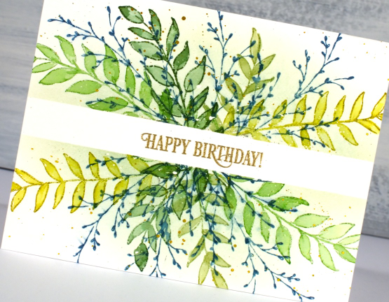
I worked on hot pressed watercolour paper which had some liquid frisket splattered on it. I kept the panel in my stamp positioner but you could easily do this technique without. I placed a strip of washi tape across the panel to mask the centre for a sentiment later. I stamped each leafy spray in one of four greens first with the panel facing one way then again with the panel flipped 180°.
Once I had stamped all the leaves in greens I used a paintbrush and water to blend ink into all the leaves. Once that was dry I stamped the twiggy stamp in uncharted mariner ink. Even though it was a green card uncharted mariner still demanded to be included!
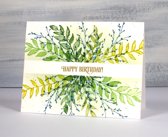
With the washi still in place I blended some shabby shutters ink over the stamping to give a crisp edge to the masked area. I might have been a little impatient and smudged some of the blue ink. I removed the washi to add the gold embossed sentiment but then wanted gold splatter so replaced the washi. I am making these mistakes so you don’t have to! I was happy with the fresh look to the card. It reminded me of an art journal page you can see if you scroll down to the end of another post here. I have said before that sometimes cards inspire art journal pages or vice versa. Today’s card was inspired by an art journal page which was in turn inspired by a card in my ‘Wreaths – Stamped & Painted‘ class.
Are you already creating springy cards? Have you left winter stamping behind?
(Compensated affiliate links from Foiled Fox)
Streaming
Posted: January 26, 2023 Filed under: Penny Black, Stamped Landscapes, streaming | Tags: Fabriano Watercolour Paper, Penny Black stamps, Ranger Distress inks, Staedtler watercolour brush pens 8 Comments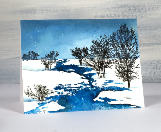
As I write this a snow storm continues outside so there will be scenes like this one to enjoy in days to come. The whole scene is one of Penny Black’s beautiful scenic stamps; this one is called ‘streaming’. I worked on hot pressed watercolour paper in a stamp positioner and had splattered masking fluid over the panel before I began.
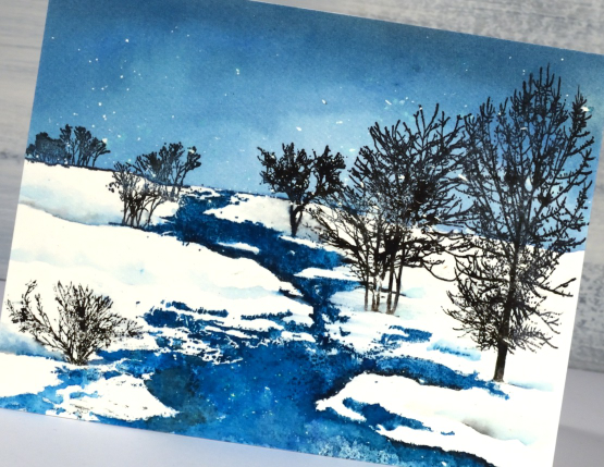
I used a few different inks so I could blend in some areas and get sharp images in others. The first thing I stamped was the top of the stamp including the horizon in uncharted mariner distress ink. Once I could see the horizon I painted more of the same ink to fill the sky adding a little black soot to the blending at the top to darken the sky. I let the panel dry before stamping the stream also in uncharted mariner ink. I took my time blending the stream because I wanted a bit of variety in the depth of colour. You can probably see a few areas that look quite dark where I added black ink to create the look of shadow at the water’s edge.
I inked the trees in black archival ink and black starless sky ink (from Ciao Bella) I also used black and blue markers here and there to add ink to fiddly places. I painted some of my own shadowy snow drifts to fill out the scene.
(Compensated affiliate links from Foiled Fox, Ecstasy Crafts & Scrap n Stamp)