Brilliant
Posted: March 16, 2022 Filed under: brilliant, Peerless watercolours, Penny Black, vintage touch | Tags: Papertrey ink, Peerless Transparent Watercolors, Penny Black creative dies, Penny Black stamps 18 Comments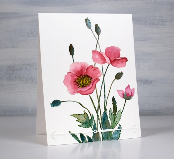
It seems that Penny Black always includes a poppy or two in a spring release. This large stamp is called ‘brilliant’ and I think the mix of flowers, leaves and seed heads is just lovely. I chose to do no-line watercolour with soft stone ink and peerless paints.
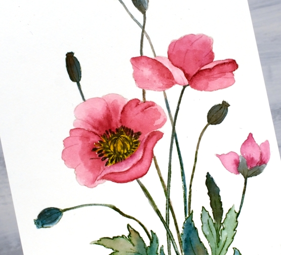
I stamped the large image in Papertrey Ink ‘soft stone’ then worked with rose red, mountain green, golden yellow and warm sepia peerless paints. If you haven’t heard of Peerless Watercolour paints take a look at the video I made about them a few years back.
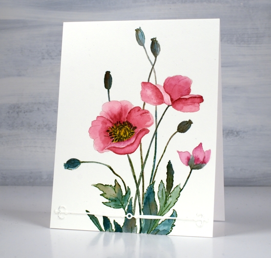
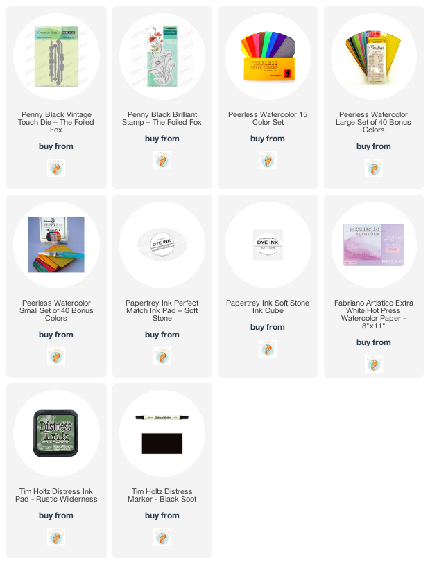
I wondered about adding background pattern or blended ink but left it clean except for the simple ‘vintage touch’ die-cut. The vintage touch set has two fancy banners as well as two dies that cut negative space banner patterns. I finished off the centre of the poppy with a black marker.
I am still undecided about the lack of background and sentiment; what do you think?
Supplies
(Compensated affiliate links used when possible)
Farm Fresh Lavender
Posted: March 15, 2022 Filed under: Background Stamps, Brick wall, Brusho, farm fresh, Penny Black | Tags: Brusho, Fabriano Watercolour Paper, Penny Black stamps, Ranger Distress inks 7 Comments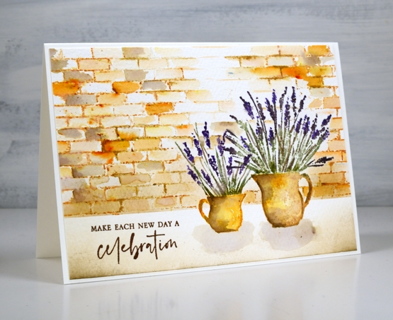
I am hoping I can fill a couple of jugs with lavender this summer. A couple of years back a friend split her lavender and gave me two plants which were coming along well last year and I hope will be even stronger and more full this year. When I have flowers in the garden I am always torn when deciding whether to cut them and bring some inside or just enjoy them outside where they will probably last longer.
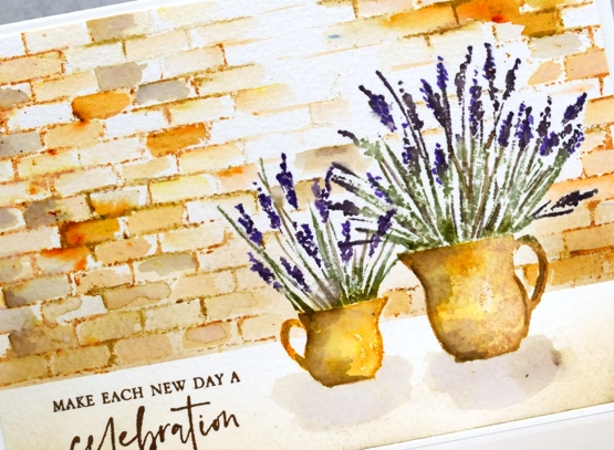
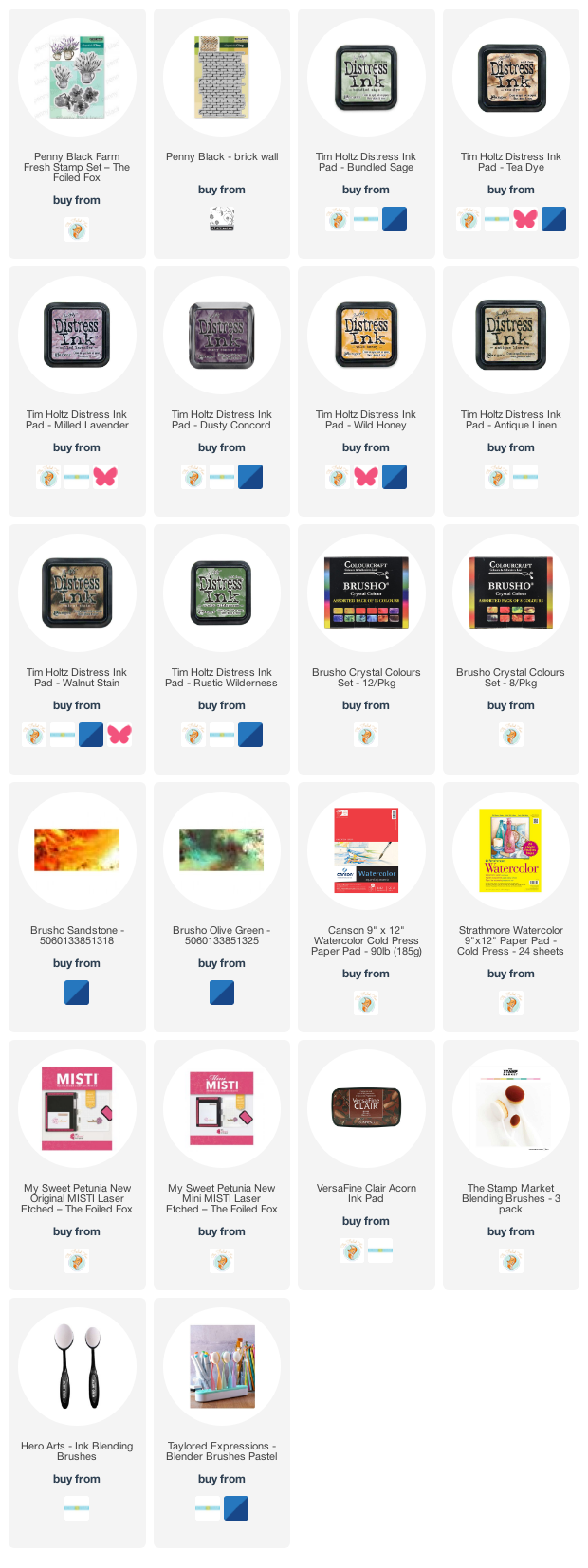
To create this little scene I used two stamps from the new Penny Black ‘farm fresh’ set and the ‘brick wall’ background stamp. I worked in a stamp positioner to create this panel. I stamped the jugs first with wild honey and tea dye distress inks. After blending the ink with water I added shadow with walnut stain ink. I used both bundled sage and rustic wilderness for the stems and a mix of milled lavender (of course) and dusty concord for the flowers.
Because I had done the jugs first I stamped and cut little masks from post-it notes to make it easier to stamp a brick wall behind them. I used tea dye to stamp the brick wall then started blending the tea dye ink to fill the bricks. I sprinkled a very small amount of sandstone brusho over the wall and started blending it in random bricks. This resulted in the warm orange bricks you see. I also added walnut stain ink to a few bricks for a darker look.
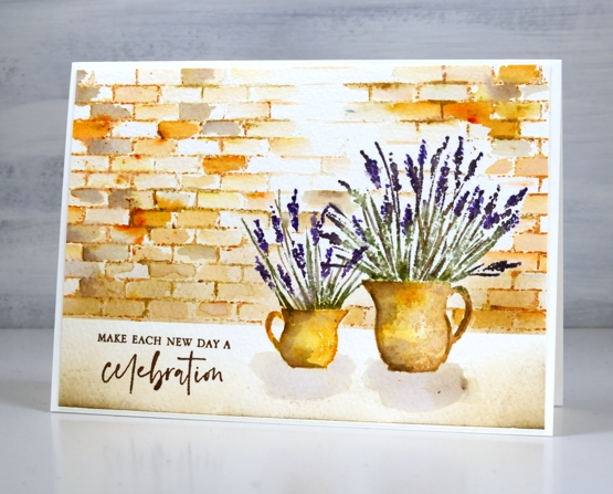
I blended antique linen and walnut ink in the foreground and painted pale shadows below the jugs. The card is finished with a sentiment from the new PB ‘love big’ stamp set.
Just in case you wondered at me thinking about cutting flowers from my garden, I’m just dreaming; it is definitely still covered in snow!
Supplies
(Compensated affiliate links used when possible)
New Penny Black Florals
Posted: March 8, 2022 Filed under: letter background, modesty, Penny Black, sweet sprouts | Tags: Fabriano Watercolour Paper, Penny Black stamps, Ranger Distress inks 8 Comments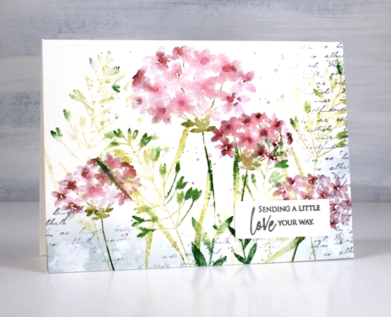
It snowed all day yesterday but spring arrived anyway in a package from Penny Black! I have a nice little stack of PB florals to share with you in the days to come and I should manage a video or two as well.
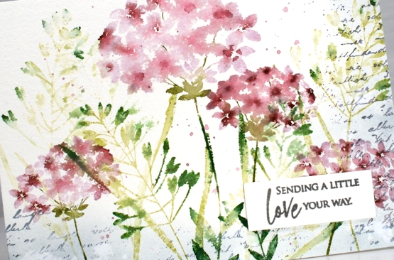
This first card features four stamps from the new Springtime release. Those of you who have been PB fans for years might notice a re-release among them. I stamped the large and small flowers from the ‘modesty’ set over foliage from the ‘sweet sprouts’ set; both sets include two large cling stamps. I used milled lavender and aged mahogany distress inks for the flowers and a mix of three distress greens for the leaves and stems. All the supplies are linked below.
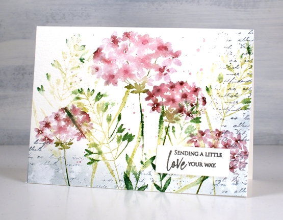
The washy blended look in the petals was achieved by spritzing the stamp before stamping along with some paint brush blending afterwards. I stamped a border of script in weathered wood with the ‘letter background stamp’ and blended the same ink around the edges. I splattered water for some watermarks and a mix of the milled lavender and aged mahogany around the flowers.
The card is 6¼”x 4½” on cold pressed watercolour paper finished with a sentiment from the new ‘love big’ set. I love the snowy cards as you are aware but I am definitely excited to be stamping florals again!
Supplies
(Compensated affiliate links used when possible)
Blue flowers on red gel print
Posted: March 2, 2022 Filed under: gel press, harmonious, Penny Black, Tim Holtz, wild flowers #1 | Tags: gel press, gel printing, Penny Black stamps, Tim Holtz, To 3 Comments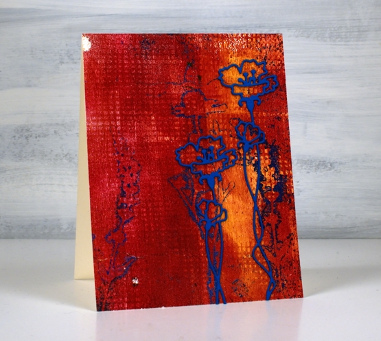
Here is another of my gel prints from last week. When I sit down to write my process for you I get a little confused as to the order I did things. With gel printing you need to do the top layer of the final print first on the plate then layer the background over the top. I don’t list the paints I use for my prints because I end up with many paints over my work surface during a printing session of several different brands. If you are wondering about paints for gel printing, use any acrylics you have and see what you like best.
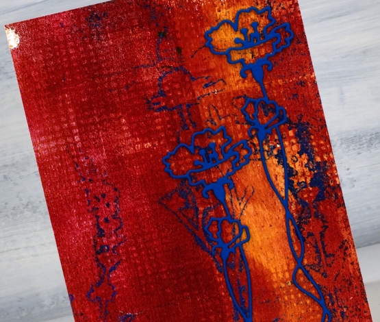
I imagine I brayered blue paint on the plate first, then pressed the fiddly flower die cuts into the paint, took a print to remove all but the outlines of blue then brayered the orange and red over that. I added texture to the red layer and took the final print, I think. The grid print you see was made by pressing a textured piece of cardstock into the paint on the gel plate. I guess I need to video my process for myself as well as to share with you!
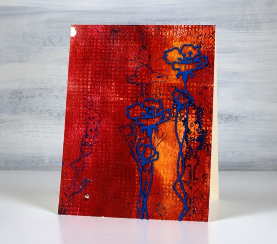
The blue prints were not as distinct as I had hoped; I’ll keep working on that. I do like the shadow flowers though and when I found an outline flower die from Penny Black I stacked two blue layers and added it over the shadows. I like its grunginess, bold colours, shadow flowers and grid texture. And those two odd white dots were made as old paint peeled off the plate. Gel printing is full of delightful surprises.
Supplies
(Compensated affiliate links used when possible)

Trilling Duo
Posted: February 16, 2022 Filed under: Brusho, Penny Black, trilling trio | Tags: Brusho, Penny Black stamps 7 Comments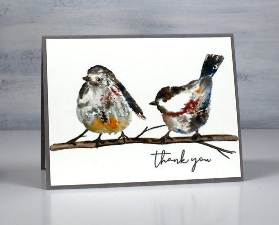
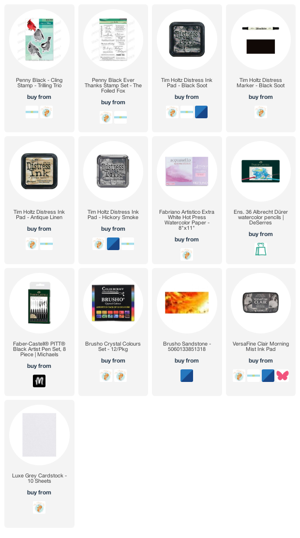
A couple of weeks back I created a card with the cardinal stamp from the PB set ‘trilling trio‘ and promised to be back with the other birds before too long. The set is called trilling trio because there are three bird stamps. I have paired up the other two for this panel and used brusho watercolour powder to add colour to the images. I love brusho powders but have not had them out much lately.
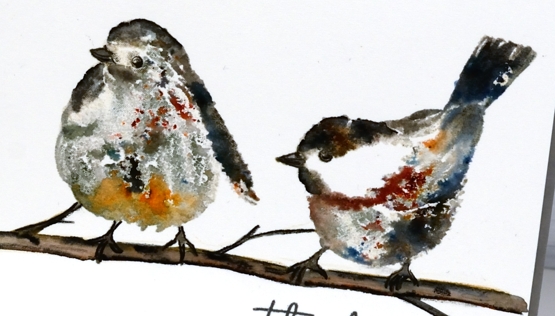
To stamp these two sweet birds I used neutral inks, water and the powders. I worked in a stamp positioner so I could stamp multiple times adding a little this or that each time. I used antique linen and hickory smoke inks for the first impression. Antique linen is pale and hickory smoke is grey so I put them where I wanted the light and dark areas to be but neither colour was so strong it couldn’t be diluted. The second time I stamped I spritzed the stamp with water so it was transferring ink and water. While the image was still wet I sprinkled some brusho very sparingly. If you haven’t used black brusho before you should; it is the absolute bomb because it is made up of other colours. The cute bird on the right is sprinkled with black brusho which resulted in spots of black, red, blue and grey. I also sprinkled some brown brusho.
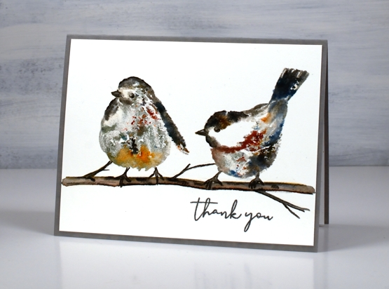
On the left hand bird I used some black brusho as well as some sandstone on the lower front feathers. I blended the stamping a little with a paint brush but not much as I wanted to see the magic speckles where the brusho lands and dilutes. I drew and painted the little branch with watercolour pencils and some black soot ink then added the ‘thank you’ from PB ‘ever thanks’ set. I just realised as I stare at the bird on the left that it appears to have three legs! That’s a twig on the far left just in case you were wondering!!
Supplies
(Compensated affiliate links used when possible)
Winter Sky
Posted: February 11, 2022 Filed under: panoramic, Penny Black, Picturesque (trees) | Tags: Penny Black stamps, Ranger Distress inks 4 Comments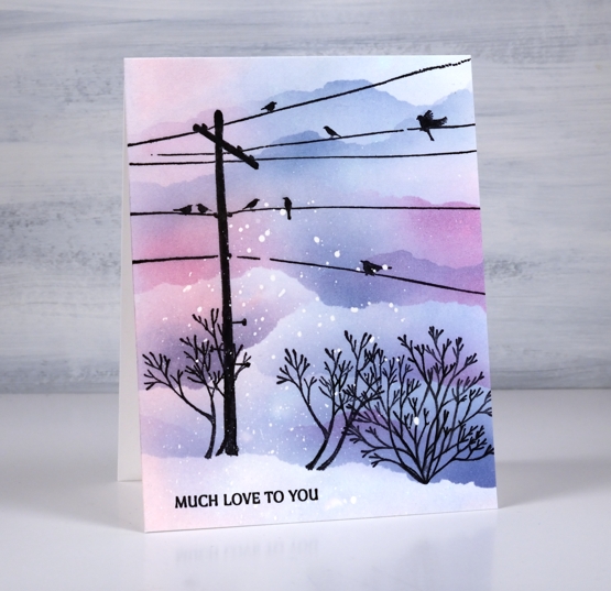
I’m teaming up with the Foiled Fox today to bring you this wintery sunset sky. Make sure you pop over to the Foiled Fox blog and online store to see what they have been creating lately. This slightly unrealistic scene features stamps from Penny Black. The telegraph pole and little plant on the right are from the ‘panoramic‘ set, the plant on the left is from the ‘picturesque‘ set and the sentiment is from the ‘ever thanks‘ set.
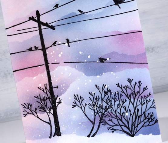
I worked on a piece of hot pressed watercolour paper but you could do this design on normal white cardstock by leaving out one step. I splattered masking fluid over the panel then when it was dried swiped it through some kitsch flamingo and faded jeans ink. The swipe gave me a pale blue, pink and purple background. I stamped the telegraph pole first with jet black archival ink then decided to mask a snow bank at the base of the panel. Even though the panel was already coloured I blended more colour above the mask to make the sky darker than the foreground snow. While the mask was in place I stamped all the plants along the edge.
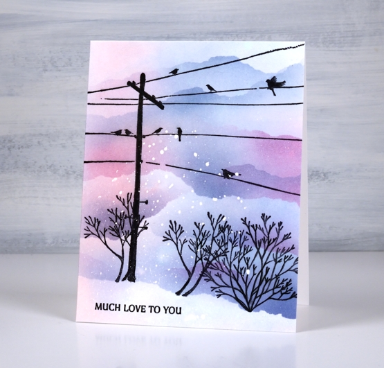
I used blending brushes to add the colour using the original two inks plus chipped sapphire and tore more masks to create clouds/snowbanks to fill the top of the panel. I hadn’t set out include all that masked blending but it looked so pretty I just kept blending! So if you wanted to work on normal cardstock and do all the colour with blending brushes you would just omit the ‘swipe through the ink’ step. Hope the sky is looking pretty where you are; I have seen some beautiful skies lately, both morning and night.
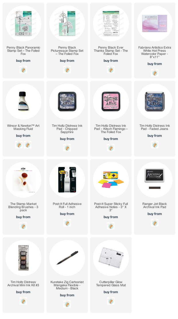
Supplies
(Compensated affiliate links used when possible)
Far North Village
Posted: February 9, 2022 Filed under: Penny Black, picturesque, snowy village | Tags: Penny Black stamps, Ranger Distress inks 18 Comments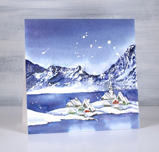
It is a little while since I stamped and watercoloured a card. It’s been all alcohol-inky and art-journally around here lately. Yesterday I stamped, painted and blended three cards with PB stamps which was a nice way to spend the day.
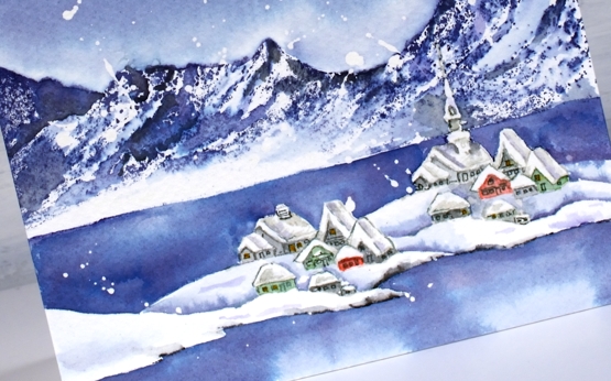
I had two pieces of inspiration for this scene. One is a youtube channel I have been enjoying for a year or so about life in Longyearbyen, the world’s most northern town situated on Svalbard, an island between Norway and the north pole. The other inspiration was a watercolour painting I saw on instagram by Evgenia Gorbacheva. My scene is different from both inspiration pieces as I featured the PB stamps, ‘picturesque’ and ‘snowy village’.
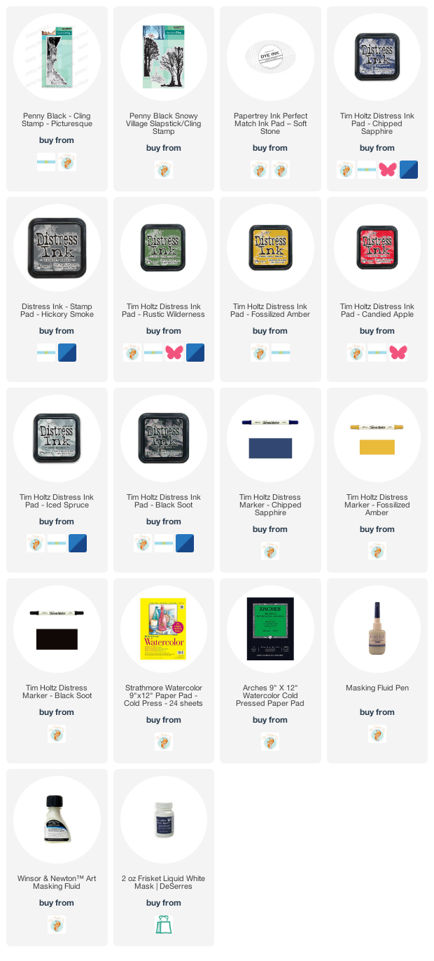
My panel of cold pressed watercolour paper already had masking fluid splattered over it so that is why there are random white ‘snowflakes’. I worked out roughly where the mountains would go then stamped the village below in soft sky ink. The first impression included the church spire but I left it un-inked for the second print so the building would look different. After stamping I sketched the snowbanks and coast line in pencil then painted over the church spire with liquid frisket (masking fluid).
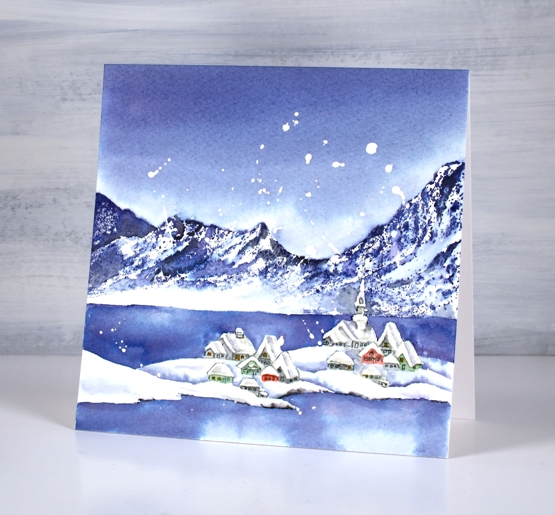
I stamped the mountain stamp in chipped sapphire (also known as absolute favourite blue ink) taking care to leave a bit of the stamp un-inked so there would be an open white area of snow. I blended some of the stamped ink, adding black here and there but kept some untouched to look crisp.
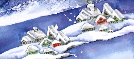
I painted all the buildings with distress inks smooshed on my glass mat (iced spruce, hickory smoke, rustic wilderness and candied apple). While they dried I painted the water and the snowbanks around the village. After that all dried I painted the sky with chipped sapphire then returned to the buildings to add grey shadows on and around the snow covered rooftops. I added the windows and doors with a grey marker and extra definition to the shore line with a black marker.
Not sure if I will send this one anywhere; I’ve grown a little attached to it!
Supplies
(Compensated affiliate links used when possible)
2022 BuJo – February theme
Posted: February 8, 2022 Filed under: Bullet Journal, Dingbat notebooks, Hand lettered, Penny Black, Soft Grace, Spread Cheer | Tags: Bullet Journal, Dingbats notebook, Hand lettering, Penny Black stamps, Tsukineko Memento inks 2 Comments
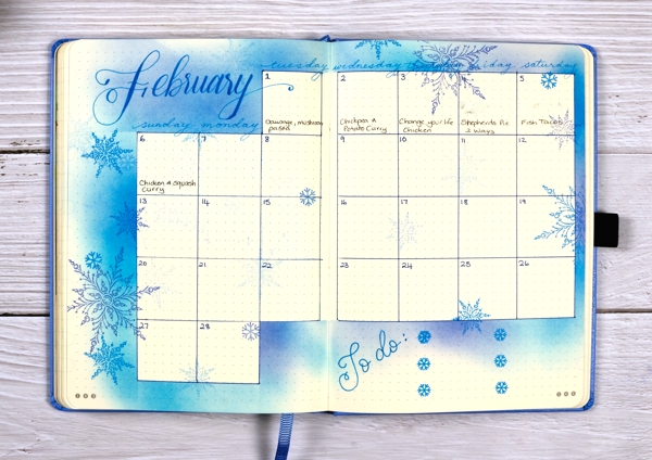
I am a week late with my February BuJo set up; we are already 25% of the way through the month! I went with the snowflake theme as we have plenty of snow now and I assume more to come. It is a pretty simple layout on account of the need to get it done so I could record and plan in the journal rather than on scraps of paper!

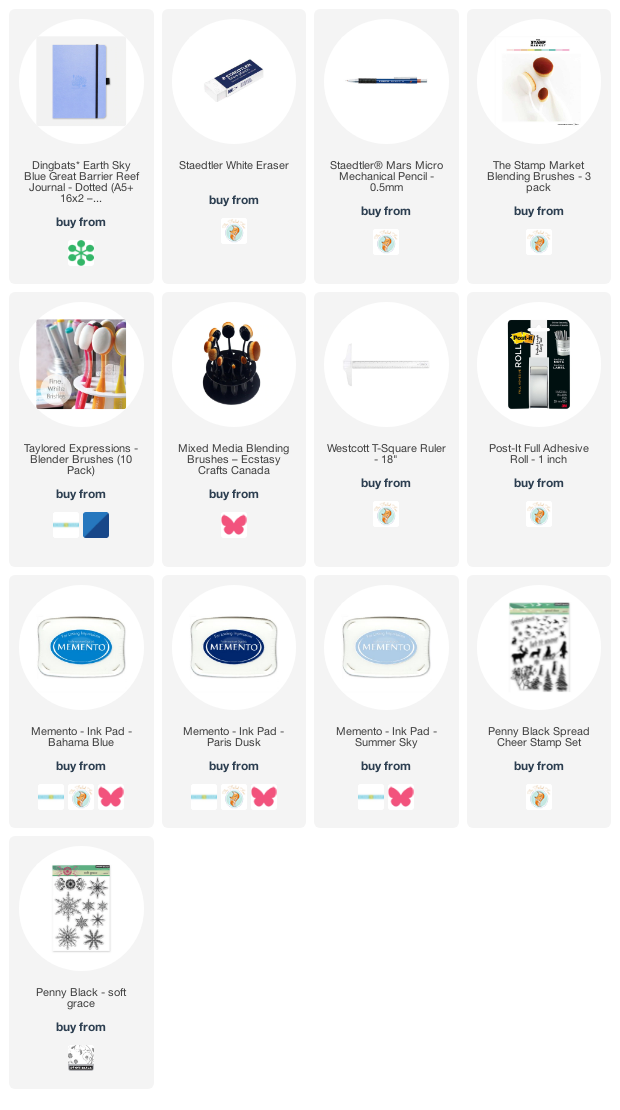
I lay a piece of post-it tape across the page then used brushes to blend memento inks above the tape. I used three blue inks (listed below) and used the same inks to stamp snowflakes to decorate the top half of the page. I’ve found post-it tape to be very safe on these pages. Washi tape and painter’s tape (delicate) have both taken some surface off if I have not been careful. I wrote ‘February’ with the Bahama Blue memento marker but haven’t linked it as I am not sure where to get them these days. I was delighted to find mine still worked and had plenty of ink in it.
I ruled up the calendar grid as I often do then used strips of post-it tape to mask as I blended ink around the edges. Once again I stamped snowflakes from Penny Black sets to decorate the spread. As we are already a week into the month I added the to do list to the calendar page. The important thing at this stage is to do the ‘to-dos’ not to decorate them!
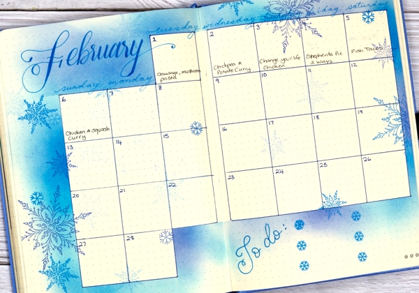
If you are in the middle of winter right now what are you up to? Are you hunkered down inside or braving the outdoors? I am definitely doing both; we have enjoyed several cross country skis and a few walks but I have also been busy with journal projects, sorting and organizing supplies and planning future classes and lessons.
Supplies
(Compensated affiliate links used when possible)
Trilling Trio
Posted: January 17, 2022 Filed under: Penny Black, Stampin Up, subtle, trilling trio | Tags: Penny Black stamps, Stampin Up 15 Comments
Trilling Trio from Penny Black arrived on the scene late last year and features three different birds. My card today uses just the cardinal stamp but I have coloured it two ways so as to have the male and the female on my panel.

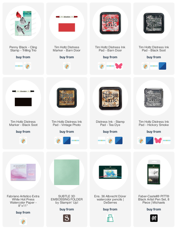
I worked with distress inks and watercolour pencils on hot pressed watercolour paper and I kept the panel in the stamp positioner so I could build the colours gradually. I stamped the female cardinal first in antique linen ink so it gave me a pale outline then I used tea dye, vintage photo and barn door inks to add colour. I spritzed the stamp lightly before stamping so the colours would blend but then did more blending with a paintbrush. I added black around the eye and beak both by stamping and by colouring directly on the panel. To add texture to the feathers I used sharpened watercolour pencils. I added the male cardinal behind using more barn door ink along with the tea dye and black soot inks.
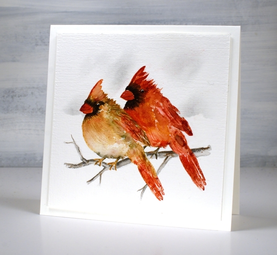
Once the birds were completed I drew a small branch with watercolour pencils, blended it and then used a blending brush and a torn piece of post-it note to add shadow in the background. I ran the panel through with the ‘subtle’ embossing folder from SU; it adds such nice canvas texture! There are two more delightful bird stamps in the set which I hope to feature soon!
We are getting much snow today so I will be hunkered down in the work room or maybe taking a turn clearing the path and driveway!
Supplies
(Compensated affiliate links used when possible)
Wintertide Blue
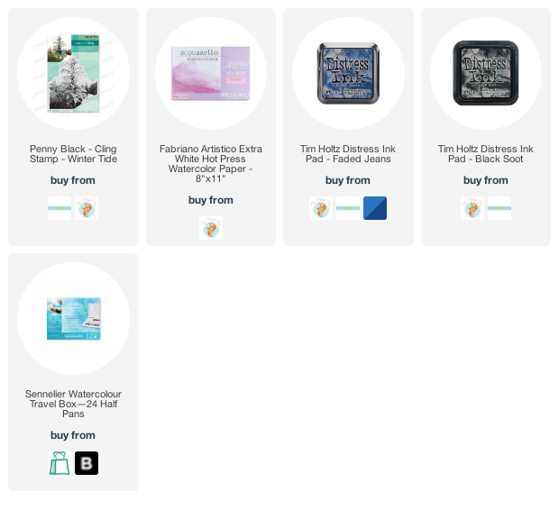
Posted: December 30, 2021 Filed under: Penny Black, wintertide | Tags: Fabriano Watercolour Paper, Penny Black stamps, Ranger Distress inks, sennelier watercolours 10 Comments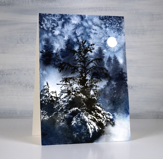
This beautiful ‘wintertide’ stamp from Penny Black is a scene in itself and the first time I stamped with it I didn’t add to it at all. This time I painted extra trees in the background for a bit more depth and atmosphere.
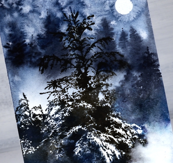
I began by punching a little circle mask from masking tape and placing it on the hot pressed watercolour panel. I wet the panel then painted a mix of dark blues and grey paint over some areas, leaving a few white patches. While the paint was wet I painted trees in the background which ended up with soft edges because I was working wet into wet. I sprinkled salt over the sky area and let the paint dry.
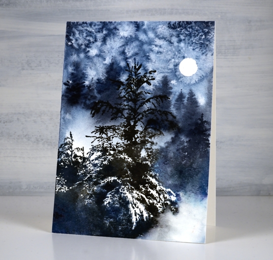
Once the paint dried I removed the salt and used a stamp positioner to stamp the ‘wintertide’ image in black soot and faded jeans ink. The little trees to the right of the feature tree were too small in comparison to the painted background trees so I painted taller trees over the top. I did a little blending of ink here and there but the stamp is so detailed with its branches and white space I tried not to fiddle with it too much. This will be the last post for 2021, I look forward to sharing projects, ideas and conversation with you here on the blog in 2022. Happy New Year!
Supplies
(Compensated affiliate links used when possible)
