2022 BuJo – June theme
Posted: June 7, 2022 Filed under: Bullet Journal, Dingbat notebooks, distinctive, Penny Black | Tags: Bullet Journal, Dingbats notebook, Penny Black stamps, Ranger Distress inks, Staedtler watercolour brush pens 6 Comments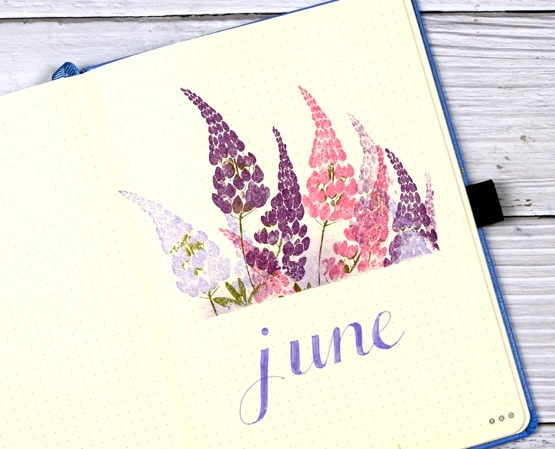
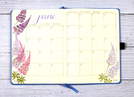
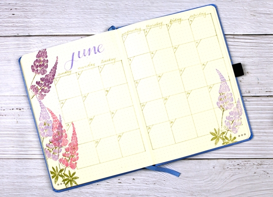
Only a few days late getting my bullet journal pages set up this month. My theme could only be lupins I decided, as my back garden is full of them.

Lupins self seed and mine have been doing so with enthusiasm for the last few years but this year is the best display yet. I had to dig some out the other day because they were blocking the lavender from any chance of sunshine.
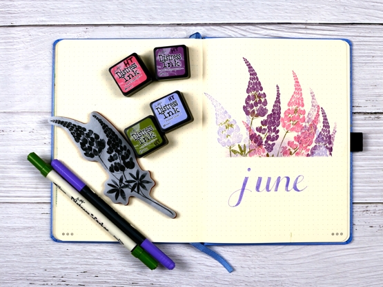
I used the Penny Black stamp ‘distinctive’ and distress colours that weren’t quite the same but not too far off what I have in my garden. Once again I masked with post-it notes before stamping which gives a crisp clean edge. I am still enjoying my Dingbats notebook but I did see some notebooks with embossed cityscape covers the other day which called my name, especially the Melbourne one.
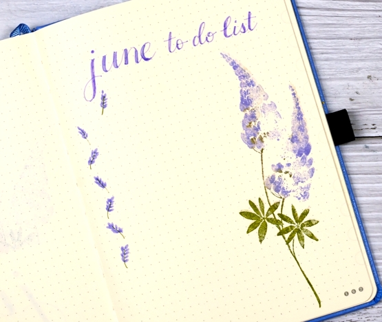
I used a distress marker along with a staedtler brushmarker for all the words and linework.
After a hot unseasonable three days back in mid May we have had only mild temperatures. We also had an incredibly violent storm, actually a ‘derecho‘ just over two weeks ago. Our house was without power for a week so that’s why you didn’t hear from me on the blog. We did not suffer any damage to our trees or house but our neighbours and neighbourhood did along with many parts of Ottawa, Ontario and Quebec. The garden got soaked and bent but it has bounced back as you see.
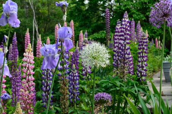
At this time of year my garden is full of pinks and purples but later in the summer there are more whites, reds and yellows. It was my first year with alliums so I am happy to see they came up. The pack I planted in autumn were mixed but I ended up with one white and all the rest purple.
By the way I have updated the Classes page for local in person classes and will be adding more in the coming weeks.
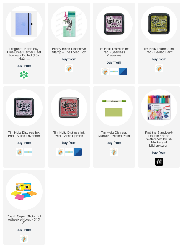
Supplies
(Compensated affiliate links used when possible)
Thoughts and Prayers
Posted: June 6, 2022 Filed under: letter background, Penny Black, purity | Tags: Coliro paints, Fabriano Watercolour Paper, Penny Black stamps, Ranger Distress inks 6 Comments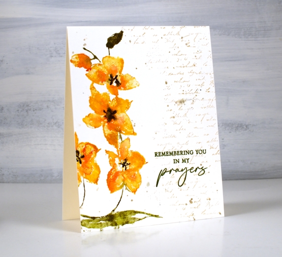
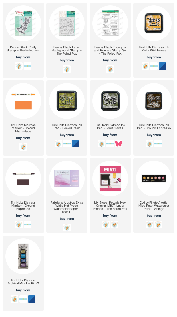
These pretty orchids are another new stamp from Penny Black. This one is called ‘purity’ and it is tall and thin featuring three flowers and a bud. I stamped one flower a second time to fill and balance the left hand side of the panel.
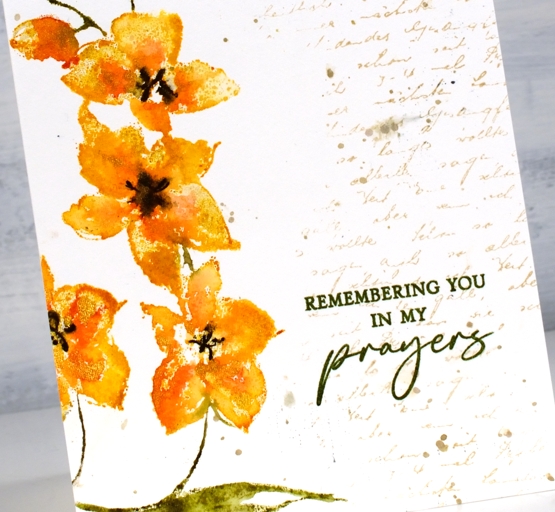
I used the same method I described for a recent floral card inking the flowers with distress inks and markers, spritzing, then stamping on hot pressed watercolour paper. Instead of spritzing water over the stamped image I added dabs of gold paint then pressed the stamp down again to spread the gold into the petals.
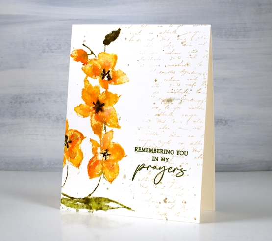
To complete the panel I stamped a partial print of the letter background stamp in antique linen distress ink and added some splatter with the same ink. I switched to archival ink for the sentiment to get a bold sharp impression with words from the new PB ‘thoughts and prayers’ set. One of my favourite ways to complete a card or an art journal page is to ‘fill’ with a bit of text. Sometimes I add it at the beginning and stamp over it, other times I added it at the end. To you have some favourite finishing touches?
Supplies
(Compensated affiliate links used when possible)
Fleeting Moment
Posted: June 2, 2022 Filed under: fleeting moment, Music Background, Penny Black | Tags: Fabriano Watercolour Paper, Penny Black stamps, Ranger Distress stains 6 Comments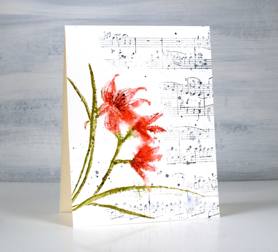
This orchid is from the new Penny Black release. It’s a large cling stamp called ‘fleeting moment. I think it is an orchid or perhaps a lily.
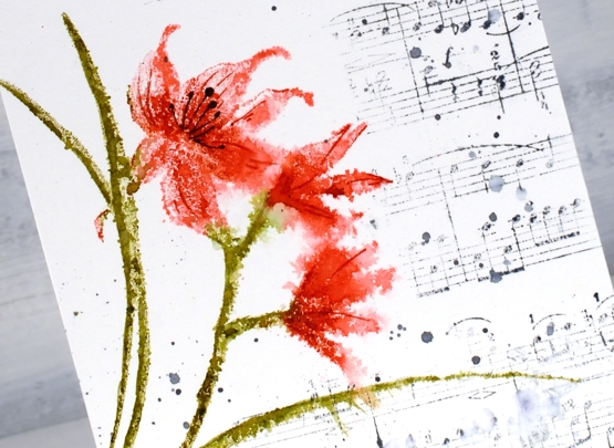
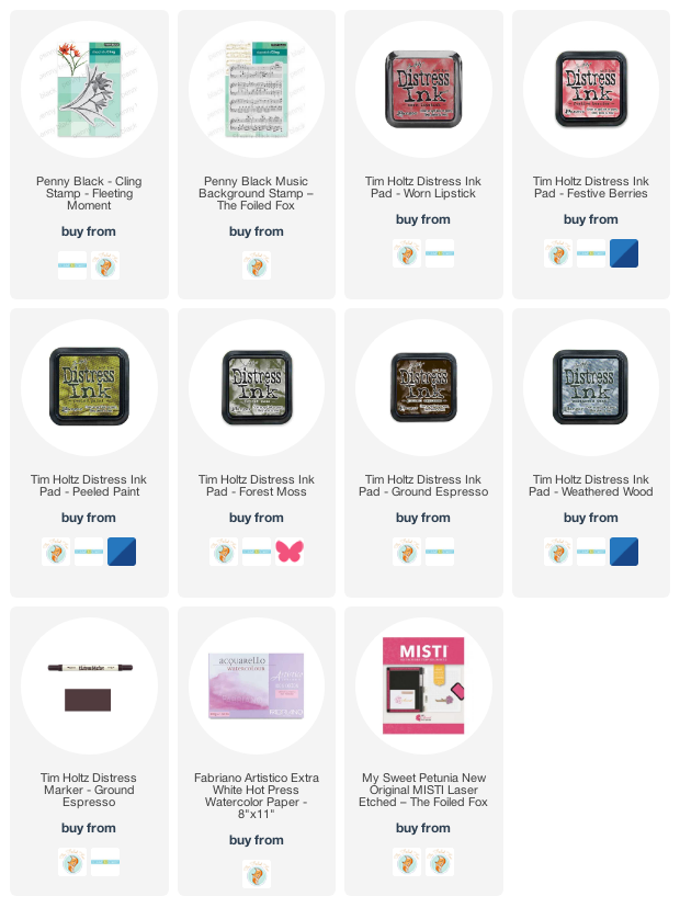
I used distress inks, worn lipstick, festive berries, to ink the petals while in a stamp positioner. I inked the stems and leaves with forest moss and peeled paint. Once stamped on hot press watercolour paper I lightly spritzed the flowers.
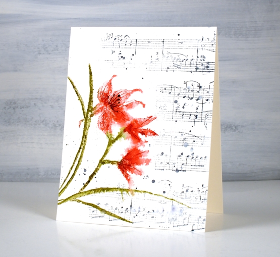
I dried the panel before adding details to the petals with markers. To fill in the panel I inked part of the music background stamp with weathered wood distress ink. After stamping I added splatters of water and ink.
The new ‘Blooming’ release is full of flowers, as the name suggests so there will be blooms aplenty over the next few weeks.
Supplies
(Compensated affiliate links used when possible)
Floral Mix
Posted: May 18, 2022 Filed under: distinctive, fresh spring, Penny Black, sweet sprouts | Tags: Penny Black stamps, Ranger Distress inks 13 Comments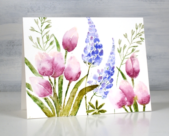
I think I told you my one tulip bloomed already but I was still inspired to stamp more. My many lupins are yet to bloom so the idea of a floral mix card appealed to me. I have teamed up Penny Black’s ‘distinctive, ‘fresh spring’ & ‘sweet sprouts’ stamp on this card.
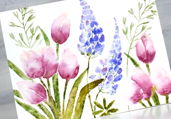
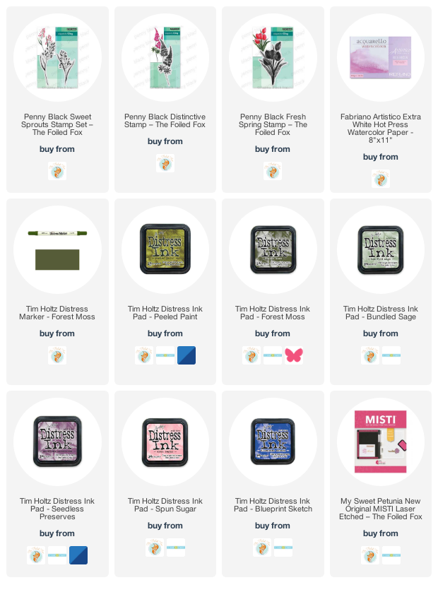
Once again I worked on hot press watercolour paper with distress inks. I usually spritz the stamp lightly with water before stamping then use a paintbrush to blend the inks or dilute them. The inks I used are listed below; I had seedless preserves as the main colour on the tulips and the highlight colour on the lupins. The technique for this card is featured in my online class Floral Faves which is still on sale for 30% off as part of my Moving Day Sale.
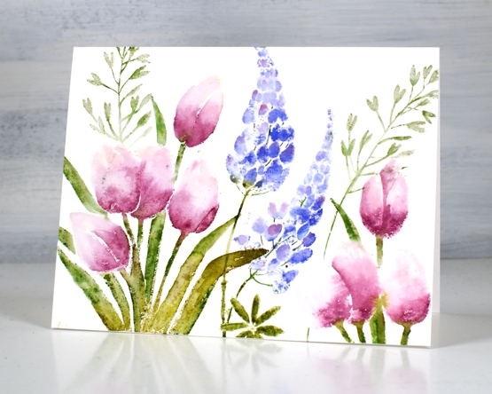
What’s blooming in your garden or neighbourhood right now?
Supplies
(Compensated affiliate links used when possible)
Fresh Spring
Posted: May 10, 2022 Filed under: fresh spring | Tags: Fabriano Watercolour Paper, Penny Black stamps, Ranger Distress inks, Tsukineko Versafine inks 4 Comments
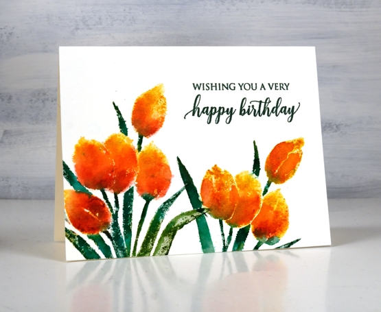
Now that May has arrived I feel it is the right time to post tulip cards. My one tulip is blooming and the tulip festival is a week away. I have used the Penny Black ‘fresh spring’ stamp on hot press watercolour paper with distress inks.
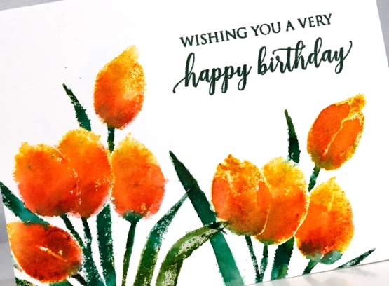
Sometimes I stamp then blend with a paintbrush after stamping. This time the blends from a spritz of water on the inked stamp were almost enough without adding anything. I did a little blending on a few tulips and a few leaves but some of the blends just happened so I let them be.
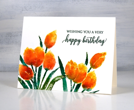
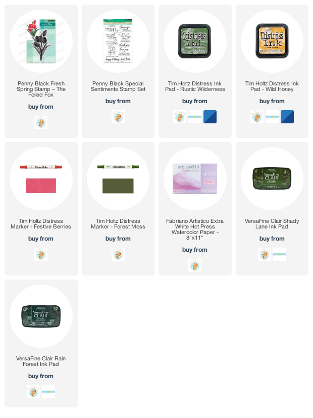
I inked the tulips with wild honey distress ink and added festive berries over the base of the petals with a marker. Same with the leaves but using rustic wilderness with added forest moss for depth and variation. I know the distress markers are discontinued but they are so useful for adding ink selectively I will keep using them ’til they give up! The sentiment is from the PB set ‘special sentiments’.
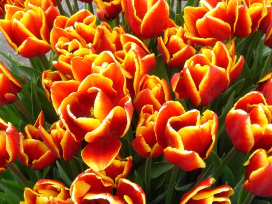
My friend Jan recently sent me some more floral inspiration pics so I have added the inspiration for today’s card below. Thank you Jan.
Supplies
(Compensated affiliate links used when possible)
2022 BuJo – May theme
Posted: May 4, 2022 Filed under: Bullet Journal, Coloured pencil, Dingbat notebooks, Hand lettered, Penny Black, springtide | Tags: Bullet Journal, Dingbats notebook, Faber-Castell Polychromos Colour Pencil, Penny Black stamps, Ranger archival inks 5 Comments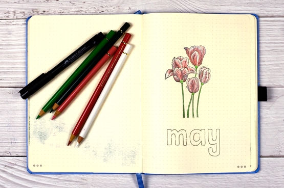
It’s been a while since the last bullet journal feature. I gave the journal a break over April; I was in recovery and catch up mode. We have skipped to May which is the month of the tulip festival in Ottawa so the theme was an easy pick. Coloured pencils seemed to make sense too as I have been working with them a bit lately.
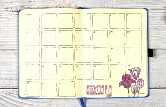
I drew all my calendar squares by hand purposely making them a little wavy with breaks and dots. The Penny Black clear stamp ‘springtide’ seemed to work with an outline theme so I stamped in jet black archival on each page then coloured with polychromos pencils.
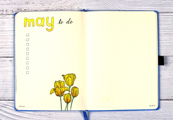
For each tulip colour scheme I used at least two co-ordinating colours; for the yellow tulips I used four. I forgot that both Ranger archival inks and FaberCastell polychromos pencils are oil based so the first layer of pencil blending ended up dragging some black ink. As you can see it didn’t spoil the result but I probably should have stamped the outline in memento or distress ink.
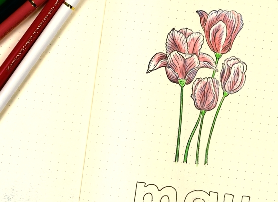
I kept the titles simple with some hand drawn block letters. I know that to-do list is empty in the photo but believe me that is no longer the case! Visiting the Ottawa Tulip Festival will be on the list for sure!
Supplies
(Compensated affiliate links used when possible)

Pencil Daisies
Posted: May 3, 2022 Filed under: Coloured pencil, daisy dream, Karin brushmarkers, springtide | Tags: Faber-Castell Polychromos Colour Pencil, Gouache paints, Karin brushmarkers, Penny Black stamps 8 Comments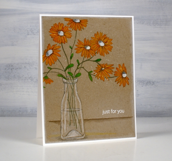
When I stamped the PB ‘brilliant’ stamp for my recent pencil poppy card I also stamped several other outline stamps on kraft cardstock for pencil colouring. This stamp is called ‘daisy dream’ and is coloured with Karin pigment decobrush markers, white gouache and Faber-Castell coloured pencils.
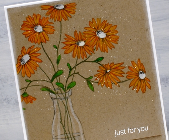
In my recent pencil poppies post I referred you to the talented Debby Hughes for a video tutorial about colouring with gouache and coloured pencils. I used some of the same tips for this card but ended up using the Karin pigment brushmarkers as well. I coloured the petals on the flowers above with the gold marker. The effect was very similar to painting gouache first but easier because the marker brush tip did such a good job on those narrow petals. I painted the centres with white and the leaves with the Karin ‘leaf green’ marker before using coloured pencils to add details and shading to the flowers and stems. The glass vase is coloured with a white and two grey pencils.
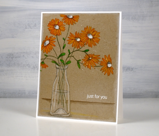
I added some shading below and behind the vase, a white embossed sentiment and some white gouache splatter before attaching the panel to a white card base.
I now have three daffodils blooming in my garden so there should be at least 47 more coming! I did plant 50 daffodil bulbs a year and a half ago and they are supposed to multiply aren’t they?
Supplies
(Compensated affiliate links used when possible)

Pencil Poppies
Posted: April 29, 2022 Filed under: brilliant, Coloured pencil, Gouache, Penny Black | Tags: Faber-Castell Polychromos Colour Pencil, Gouache paints, Penny Black stamps 10 Comments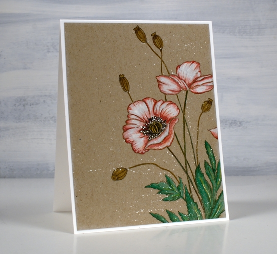
Today’s pencil and gouache technique was inspired by a beautiful card recently posted by Debby Hughes. Debby did a video of her process so if you are interested you can pop over to her youtube channel and follow her directions like I did.
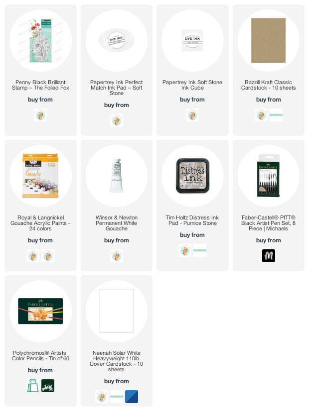
I used a different stamp, ‘brilliant’ from Penny Black but the other supplies and technique are the same as Debby’s. I stamped on kraft cardstock with pumice stone ink, painted inside the petals with white gouache then did all the colouring with Faber Castell Polychromos pencils.
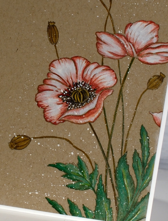
When I first stamped the ‘brilliant’ poppy stamp I used Papertrey ink soft stone ink which is my current favourite for no-line watercolour techniques. It stamped well on the kraft cardstock but when I looked at it ten minutes later it had faded quite a bit. It would be fine for someone whose eyesight is perfect but mine is not so I stamped in pumice stone distress which gave me a bit more contrast.

Debby’s technique included painting the petals in white gouache then colouring over the top. I hadn’t tried it before but I will do it again in the future. It worked very well and took the place of my previous method which was colouring in white pencil first then adding colours over the top before blending again in white. Painting with gouache first gave me a base which happens to also be a nice matte surface to colour over. I finished the design with some white gouache splatter as Debby did. So basically I am saying, ‘ do what she did!’ Thank you Debby for a great technique tutorial.
The polychromos pencils I used were: white, medium flesh, medium cadmium red, raw umber, emerald green, pine green, naples ochre and walnut brown.
Supplies
(Compensated affiliate links used when possible)
Fresh Bouquet
Posted: April 27, 2022 Filed under: fresh bouquet, how sweet, Karin brushmarkers, Penny Black | Tags: Avery Elle, Karin brushmarkers, Penny Black stamps 4 Comments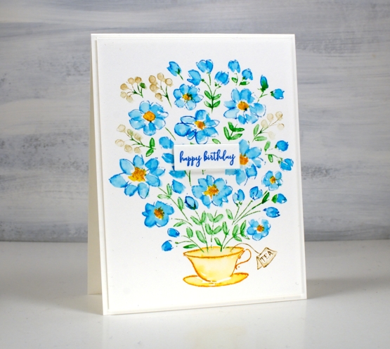
My Karin markers have been a bit neglected lately so I brought them out to work with the cute cup of flowers stamp from the PB ‘fresh bouquet’ set. I worked in a stamp positioner on hot pressed watercolour paper. First I inked the flower centres with the gold marker, next the blue petals with cyan, leaves with grass and berries with rosewood.
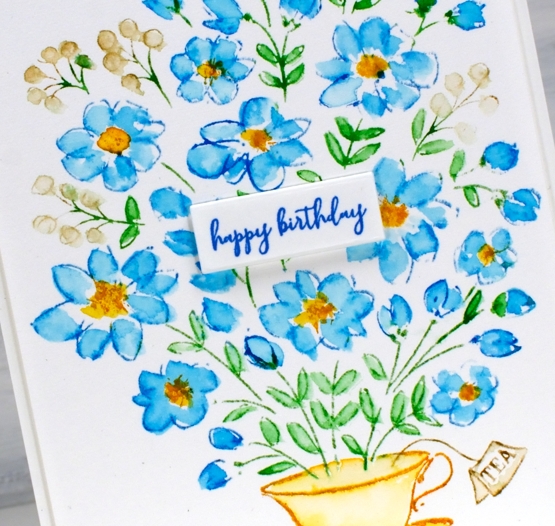
I used a paintbrush and water to pull ink from the stamping to fill the petals and leaves working loosely but taking care not to blend much from one ink to the next. Blue and yellow make green as you know and I didn’t want the petals or centres turning green.
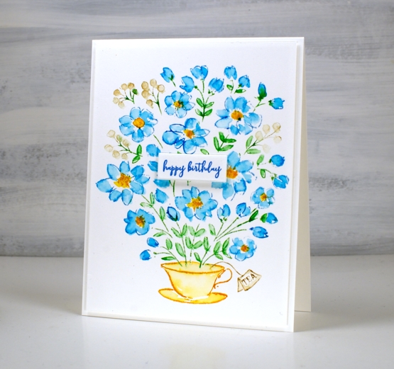
Adding a sentiment was a bit tricky. The cup of flowers stamp comes with a large and lovely sentiment but it would have covered too many flowers. I need birthday cards at present so I stamped the little ‘happy birthday’ from the PB ‘how sweet’ set in paradise versafine clair ink and then wondered where to place it. It is rare that I will place a sentiment right in the middle of a card but it just seemed to work this time.
I have some beautiful tea cups, some from my mother, my nanna and my grandma. I rarely use them because I like a large mug of tea. Perhaps I could occasionally put a few flowers in one, once I have more than two tiny flowers in my garden.
Supplies
(Compensated affiliate links used when possible)
Pods & Wings
Posted: April 14, 2022 Filed under: Dies, Flutters, gel press, Lavinia, Penny Black, pods stencil, soaring | Tags: gel press, gel printing, Lavinia, Mixed Media, Penny Black creative dies, Penny Black stamps 4 Comments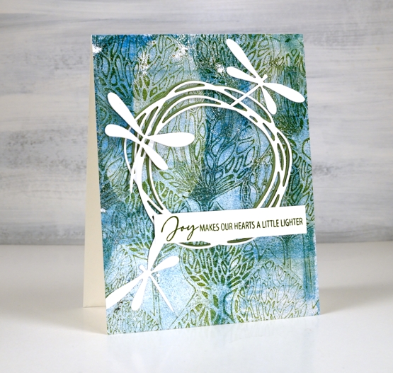
The background of today’s card is another gel print featuring a gorgeous Lavinia stencil called ‘pods’. You can’t see in the photos but in real life there is some shimmer on the print as I used silver paint along with blue, green and white.

Over the print I added a green and a white wreath die cut from Penny Black. It is part of the new ‘soaring’ set which also includes four butterflies. The background called for dragonflies rather than butterflies so I die cut three from the ‘flutters’ set, an oldy but a goodie.
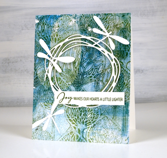
As I spent a chunk of time yesterday listening to Ann Voskamp’s book ‘One Thousand Gifts’, the joy sentiment seemed like a good match for the design.
I was watching a Julie Balzer book club discussion on youtube today as I worked and she mentioned how addictive gel printing is and how if you haven’t tried it you must (48 minute mark)! She called it the one tool that has changed her life! So I will again shamelessly plug my upcoming gel printing workshops and hope you will join me in this addiction!
Supplies
(Compensated affiliate links used when possible)