
Pencil Daisies
Posted: May 3, 2022 Filed under: Coloured pencil, daisy dream, Karin brushmarkers, springtide | Tags: Faber-Castell Polychromos Colour Pencil, Gouache paints, Karin brushmarkers, Penny Black stamps 8 Comments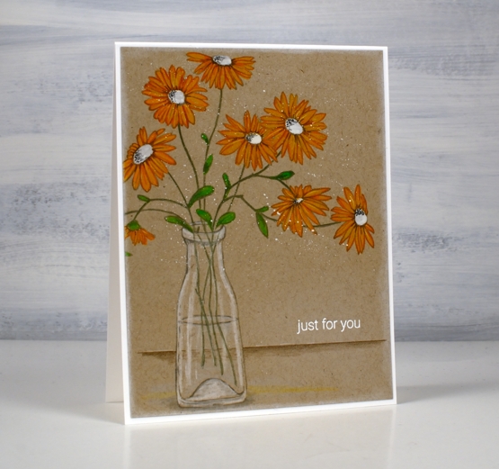
When I stamped the PB ‘brilliant’ stamp for my recent pencil poppy card I also stamped several other outline stamps on kraft cardstock for pencil colouring. This stamp is called ‘daisy dream’ and is coloured with Karin pigment decobrush markers, white gouache and Faber-Castell coloured pencils.
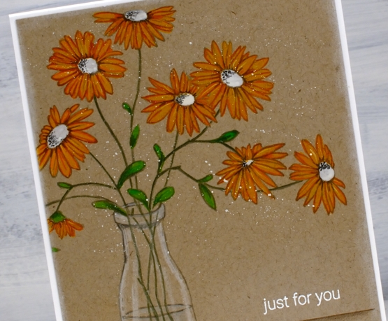
In my recent pencil poppies post I referred you to the talented Debby Hughes for a video tutorial about colouring with gouache and coloured pencils. I used some of the same tips for this card but ended up using the Karin pigment brushmarkers as well. I coloured the petals on the flowers above with the gold marker. The effect was very similar to painting gouache first but easier because the marker brush tip did such a good job on those narrow petals. I painted the centres with white and the leaves with the Karin ‘leaf green’ marker before using coloured pencils to add details and shading to the flowers and stems. The glass vase is coloured with a white and two grey pencils.
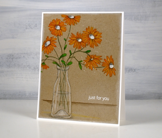
I added some shading below and behind the vase, a white embossed sentiment and some white gouache splatter before attaching the panel to a white card base.
I now have three daffodils blooming in my garden so there should be at least 47 more coming! I did plant 50 daffodil bulbs a year and a half ago and they are supposed to multiply aren’t they?
Supplies
(Compensated affiliate links used when possible)


Love seeing you show us different mediums. I’m surprised that you could use pencil crayons on top of Karin markers. I would have thought the surface would be made slippery or non porous and the pencil would just slide off leaving no colour. Now I have to go experiment. Thank you as always for sharing your knowledge. 😊
I was quite pleased to see I could add a bit of shading on top of the Karin pigment markers. I am going to do more experimenting. So far I think it works better to put darker pencil over lighter markers I don’t think the pale pencils will show up well. Have fun with your experimenting; let me know if you discover any cool tricks!
Thank you.
Another fantastic look on the kraft card Heather and the Karin Markers and the FC pencils work well together and the white shaded centres of the daisies really pop. x
Sorry Heather the above comment is from but my husband’s details were logged in for some reason and I thought you might wonder who this was..lol. x
So pretty! I like the shadow line, as it helps to add realism to your card. Don’t have markers, but, boy, you make me think I might want some.
Pencils on kraft looks amazing! The white just pops off this card. Beautiful work coloring and blending those daisies! I am amazed at the results you achieve with markers.
Beautiful colouring of these sweet poppies, Heather. LOVE the idea of using a marker as the base … as you said, easier to get into those tight corners. Will have to give that a try. I love how you’ve shaded your vase and added a horizon line too. Makes this into a scene rather than a vase of flowers. Those special touches make such a big difference. Always inspired and learn so much when I come by. xx