Winter Sky
Posted: February 11, 2022 Filed under: panoramic, Penny Black, Picturesque (trees) | Tags: Penny Black stamps, Ranger Distress inks 4 Comments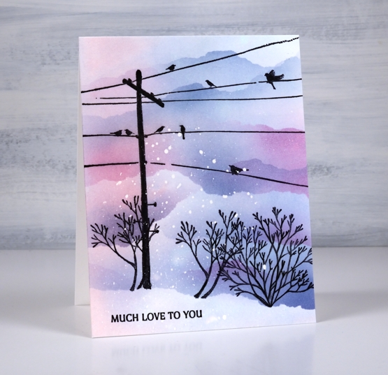
I’m teaming up with the Foiled Fox today to bring you this wintery sunset sky. Make sure you pop over to the Foiled Fox blog and online store to see what they have been creating lately. This slightly unrealistic scene features stamps from Penny Black. The telegraph pole and little plant on the right are from the ‘panoramic‘ set, the plant on the left is from the ‘picturesque‘ set and the sentiment is from the ‘ever thanks‘ set.
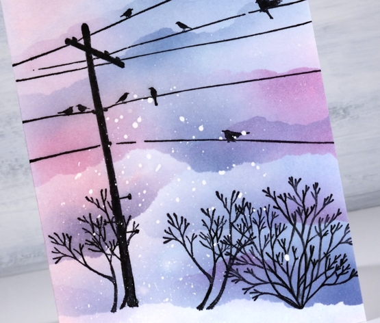
I worked on a piece of hot pressed watercolour paper but you could do this design on normal white cardstock by leaving out one step. I splattered masking fluid over the panel then when it was dried swiped it through some kitsch flamingo and faded jeans ink. The swipe gave me a pale blue, pink and purple background. I stamped the telegraph pole first with jet black archival ink then decided to mask a snow bank at the base of the panel. Even though the panel was already coloured I blended more colour above the mask to make the sky darker than the foreground snow. While the mask was in place I stamped all the plants along the edge.
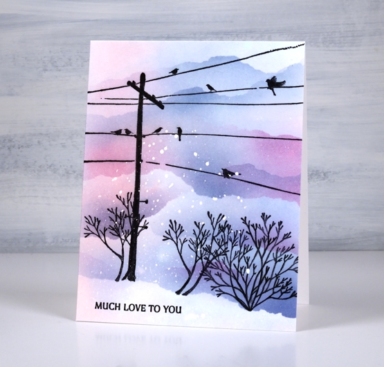
I used blending brushes to add the colour using the original two inks plus chipped sapphire and tore more masks to create clouds/snowbanks to fill the top of the panel. I hadn’t set out include all that masked blending but it looked so pretty I just kept blending! So if you wanted to work on normal cardstock and do all the colour with blending brushes you would just omit the ‘swipe through the ink’ step. Hope the sky is looking pretty where you are; I have seen some beautiful skies lately, both morning and night.
Supplies
(Compensated affiliate links used when possible)
Far North Village
Posted: February 9, 2022 Filed under: Penny Black, picturesque, snowy village | Tags: Penny Black stamps, Ranger Distress inks 18 Comments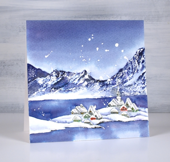
It is a little while since I stamped and watercoloured a card. It’s been all alcohol-inky and art-journally around here lately. Yesterday I stamped, painted and blended three cards with PB stamps which was a nice way to spend the day.
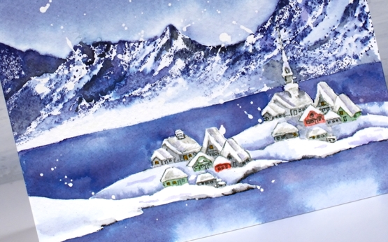
I had two pieces of inspiration for this scene. One is a youtube channel I have been enjoying for a year or so about life in Longyearbyen, the world’s most northern town situated on Svalbard, an island between Norway and the north pole. The other inspiration was a watercolour painting I saw on instagram by Evgenia Gorbacheva. My scene is different from both inspiration pieces as I featured the PB stamps, ‘picturesque’ and ‘snowy village’.
My panel of cold pressed watercolour paper already had masking fluid splattered over it so that is why there are random white ‘snowflakes’. I worked out roughly where the mountains would go then stamped the village below in soft sky ink. The first impression included the church spire but I left it un-inked for the second print so the building would look different. After stamping I sketched the snowbanks and coast line in pencil then painted over the church spire with liquid frisket (masking fluid).
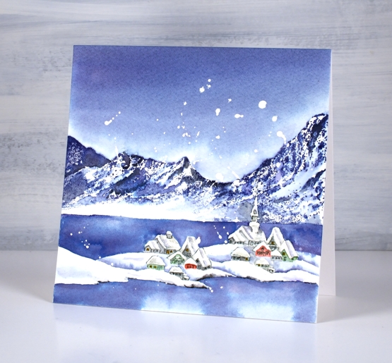
I stamped the mountain stamp in chipped sapphire (also known as absolute favourite blue ink) taking care to leave a bit of the stamp un-inked so there would be an open white area of snow. I blended some of the stamped ink, adding black here and there but kept some untouched to look crisp.
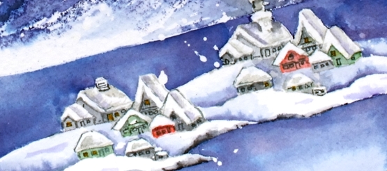
I painted all the buildings with distress inks smooshed on my glass mat (iced spruce, hickory smoke, rustic wilderness and candied apple). While they dried I painted the water and the snowbanks around the village. After that all dried I painted the sky with chipped sapphire then returned to the buildings to add grey shadows on and around the snow covered rooftops. I added the windows and doors with a grey marker and extra definition to the shore line with a black marker.
Not sure if I will send this one anywhere; I’ve grown a little attached to it!
Supplies
(Compensated affiliate links used when possible)
2022 BuJo – February theme
Posted: February 8, 2022 Filed under: Bullet Journal, Dingbat notebooks, Hand lettered, Penny Black, Soft Grace, Spread Cheer | Tags: Bullet Journal, Dingbats notebook, Hand lettering, Penny Black stamps, Tsukineko Memento inks 2 Comments
I am a week late with my February BuJo set up; we are already 25% of the way through the month! I went with the snowflake theme as we have plenty of snow now and I assume more to come. It is a pretty simple layout on account of the need to get it done so I could record and plan in the journal rather than on scraps of paper!
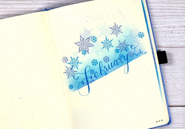
I lay a piece of post-it tape across the page then used brushes to blend memento inks above the tape. I used three blue inks (listed below) and used the same inks to stamp snowflakes to decorate the top half of the page. I’ve found post-it tape to be very safe on these pages. Washi tape and painter’s tape (delicate) have both taken some surface off if I have not been careful. I wrote ‘February’ with the Bahama Blue memento marker but haven’t linked it as I am not sure where to get them these days. I was delighted to find mine still worked and had plenty of ink in it.
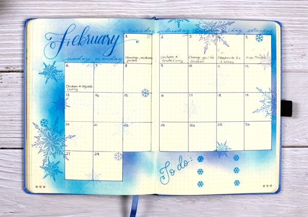
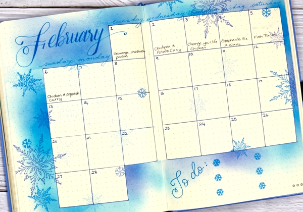
I ruled up the calendar grid as I often do then used strips of post-it tape to mask as I blended ink around the edges. Once again I stamped snowflakes from Penny Black sets to decorate the spread. As we are already a week into the month I added the to do list to the calendar page. The important thing at this stage is to do the ‘to-dos’ not to decorate them!
If you are in the middle of winter right now what are you up to? Are you hunkered down inside or braving the outdoors? I am definitely doing both; we have enjoyed several cross country skis and a few walks but I have also been busy with journal projects, sorting and organizing supplies and planning future classes and lessons.
Supplies
(Compensated affiliate links used when possible)
Trilling Trio
Posted: January 17, 2022 Filed under: Penny Black, Stampin Up, subtle, trilling trio | Tags: Penny Black stamps, Stampin Up 15 Comments
Trilling Trio from Penny Black arrived on the scene late last year and features three different birds. My card today uses just the cardinal stamp but I have coloured it two ways so as to have the male and the female on my panel.
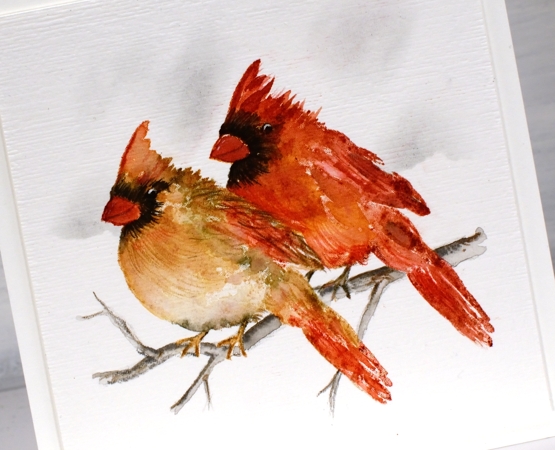
I worked with distress inks and watercolour pencils on hot pressed watercolour paper and I kept the panel in the stamp positioner so I could build the colours gradually. I stamped the female cardinal first in antique linen ink so it gave me a pale outline then I used tea dye, vintage photo and barn door inks to add colour. I spritzed the stamp lightly before stamping so the colours would blend but then did more blending with a paintbrush. I added black around the eye and beak both by stamping and by colouring directly on the panel. To add texture to the feathers I used sharpened watercolour pencils. I added the male cardinal behind using more barn door ink along with the tea dye and black soot inks.
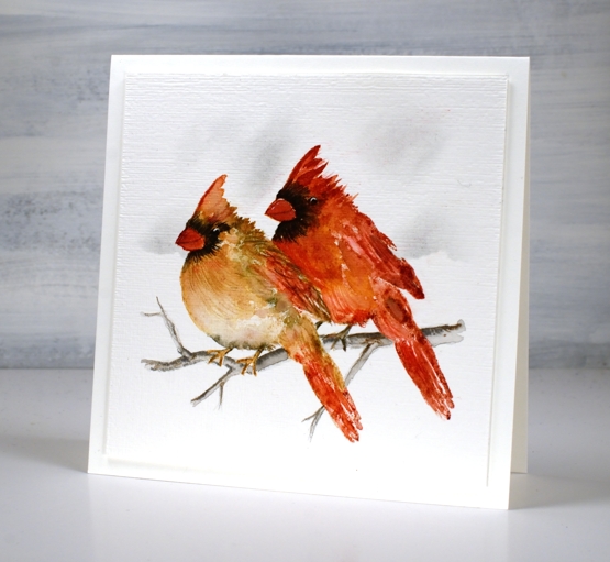
Once the birds were completed I drew a small branch with watercolour pencils, blended it and then used a blending brush and a torn piece of post-it note to add shadow in the background. I ran the panel through with the ‘subtle’ embossing folder from SU; it adds such nice canvas texture! There are two more delightful bird stamps in the set which I hope to feature soon!
We are getting much snow today so I will be hunkered down in the work room or maybe taking a turn clearing the path and driveway!
Supplies
(Compensated affiliate links used when possible)
Wintertide Blue
Posted: December 30, 2021 Filed under: Penny Black, wintertide | Tags: Fabriano Watercolour Paper, Penny Black stamps, Ranger Distress inks, sennelier watercolours 10 Comments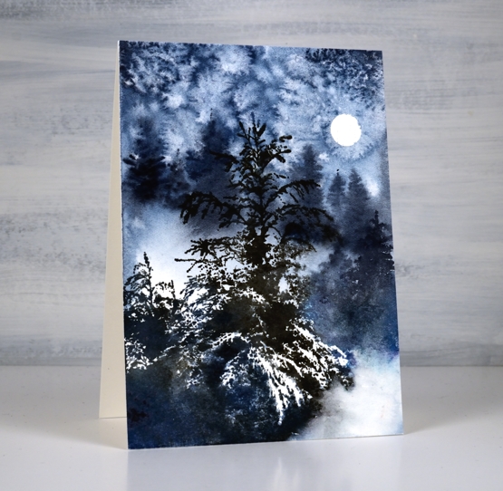
This beautiful ‘wintertide’ stamp from Penny Black is a scene in itself and the first time I stamped with it I didn’t add to it at all. This time I painted extra trees in the background for a bit more depth and atmosphere.
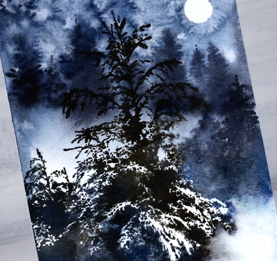
I began by punching a little circle mask from masking tape and placing it on the hot pressed watercolour panel. I wet the panel then painted a mix of dark blues and grey paint over some areas, leaving a few white patches. While the paint was wet I painted trees in the background which ended up with soft edges because I was working wet into wet. I sprinkled salt over the sky area and let the paint dry.
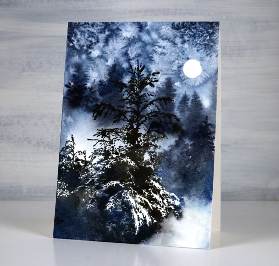
Once the paint dried I removed the salt and used a stamp positioner to stamp the ‘wintertide’ image in black soot and faded jeans ink. The little trees to the right of the feature tree were too small in comparison to the painted background trees so I painted taller trees over the top. I did a little blending of ink here and there but the stamp is so detailed with its branches and white space I tried not to fiddle with it too much. This will be the last post for 2021, I look forward to sharing projects, ideas and conversation with you here on the blog in 2022. Happy New Year!
Supplies
(Compensated affiliate links used when possible)
Woodsy Winter
Posted: December 28, 2021 Filed under: Penny Black, woodsy | Tags: Penny Black stamps, Ranger Distress inks, Ranger Distress stains 9 Comments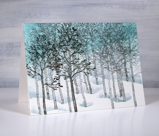
A winter scene for a winter birthday. Makes perfect sense especially when the recipient loves nature and spends as much time as possible enjoying the outdoors.
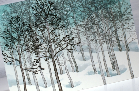
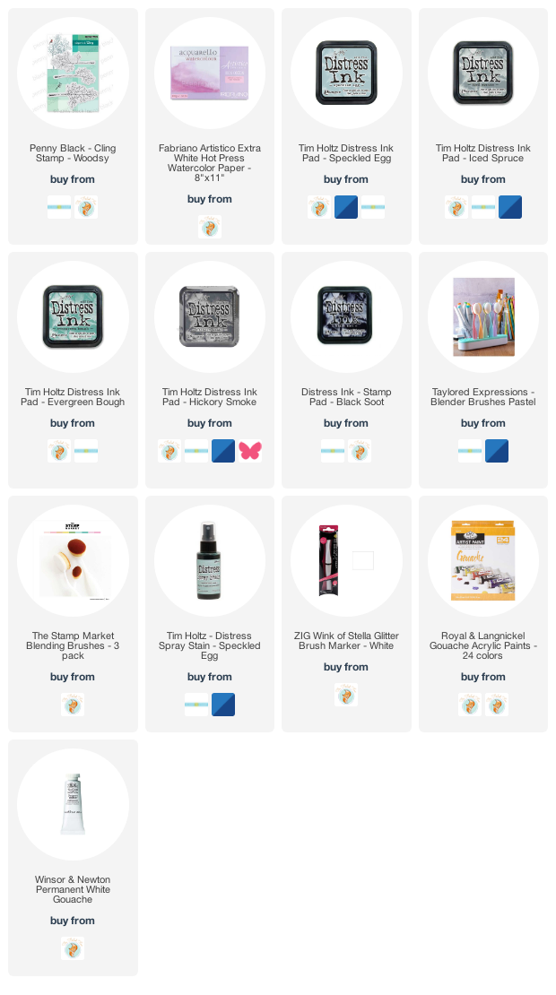
This card was a commission and I did plan it in my head before I began. I ended up making it twice, not because it didn’t work but because I smudged the black ink (final stamping step) before it dried! I started by blending the sky in evergreen bough and speckled egg distress ink then stamped background trees in speckled egg ink. There are three trees in the Woodsy set from Penny Black so I repeated them to fill the top of the panel then changed to iced spruce to stamp another line of trees further down and hickory smoke to stamp another line. Each colour was darker than the previous and the trees more prominent and forward in the design. Once all but the black trees were stamped I painted all their trunks just by blending the stamped ink. I used the same inks to paint shadowy dips at the base of the trees then when that was dry stamped the final foreground trees in black soot ink.
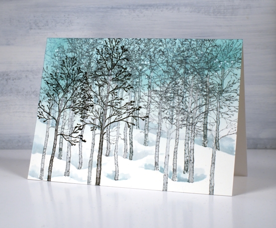
To finish I splattered white paint over the scene. The origin of this card goes way back to a card I made in 2012 using the famous Stampin Up set ‘lovely as a tree’.
Supplies
(Compensated affiliate links used when possible)
Vintage Candlelight
Posted: December 21, 2021 Filed under: candlelight, Footnotes, Karin brushmarkers, Penny Black | Tags: Fabriano Watercolour Paper, Karin brushmarkers, Penny Black stamps, Ranger Distress inks 5 Comments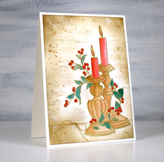
It has been a while since I created a vintage style card but the pretty ‘candlelight’ stamp from Penny Black has worked well for this technique. I embossed the image on hot pressed watercolour paper in gold powder then used Karin brush markers to paint the candles and foliage before switching to distress inks for the background.
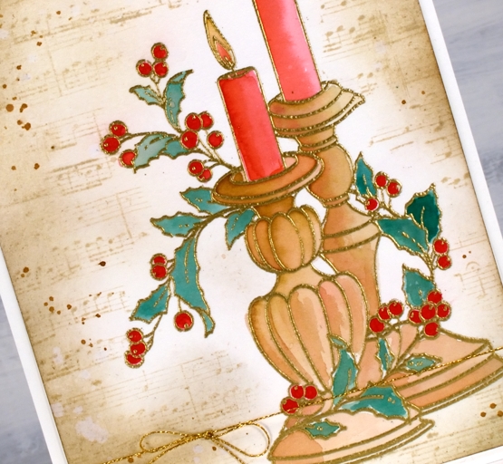
It probably wont surprise you that I used a limited palette for the colouring. I used a mix of red-209 and magenta red-170 to paint the candles, a mix of rosewood-272 and magenta red for the candle sticks, a mix of rosewood and lush green-228 for the leaves and straight red for the berries.
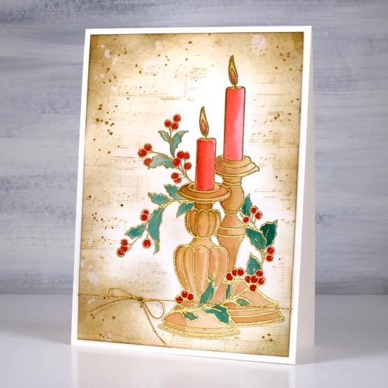
As usual I had not planned my background before I started but the colours on the candlesticks already looked vintage so I blended antique linen around the edges of the panel first then blended right up to the stamping. I stamped the music stamp from the PB set ‘footnotes’ in vintage photo then added more blending and splatter with the same ink. The stamp is tall so the card is A6 (4½” x 6¼”).
As the days are so short right now I am enjoying lighting candles and sometimes the fire. Hope things are cosy where you are.
Supplies
(Compensated affiliate links used when possible)
Brilliance and Joy
Posted: December 17, 2021 Filed under: berries, Dies, jumbo joy, Penny Black, Taylored Expressions | Tags: Penny Black creative dies, Penny Black stamps, Ranger Distress inks, Taylored Expressions 3 Comments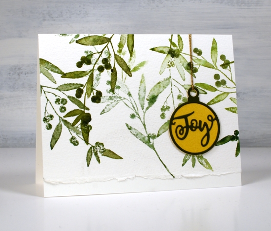
Today’s cards are similar to a recent collection I posted stamped with the delicate pines stamp. I created eight cards this time and repeated some designs because I’m getting down to the wire with these last cards.
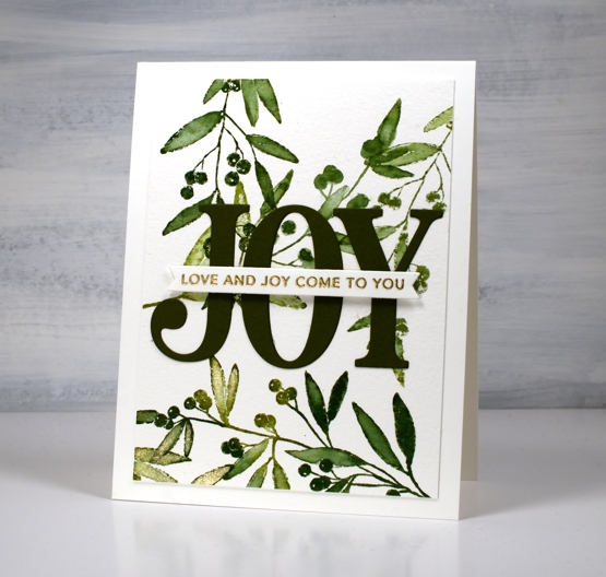
I stamped the ‘brilliance’ foliage stamp on a large 11″x14″ cold press watercolour panel in rustic wilderness and peeled paint inks. I blended the leaves with water and with a gold wink of stella pen so some have some shine.
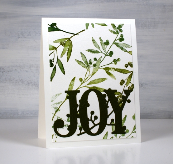
I played around with a few options for colouring the berries but ended up leaving them green. Red paint pen was not bad but not better and vanilla sparkle embossing powder didn’t work either, so green and natural they stayed. I used a few dies from Penny Black and a sentiment strip from Taylored Expressions and eight more cards were completed. Some were sent straight away and didn’t even make it to the photo shoot!
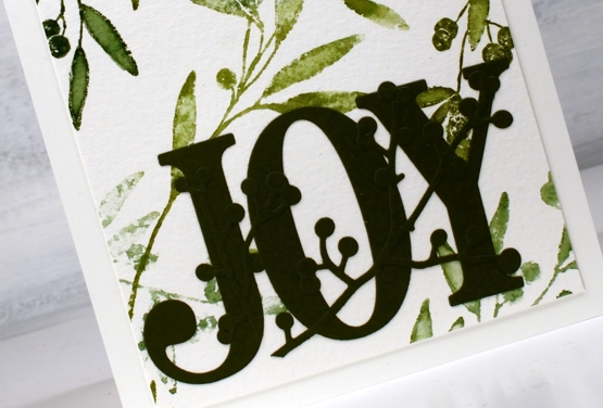
I have received some lovely cards this week from across the city, country and world. Thank you so much for brightening my day and inspiring my creativity.
By the way, we have added another Art Journal Adventure workshop at Crop A While on Saturday January 22. Click here for more information
Supplies
(Compensated affiliate links used when possible)
Christmas baubles
Posted: December 13, 2021 Filed under: Alcohol Ink, bird ornament, Dies, manger, paint pouring, Penny Black, Taylored Expressions, weathered | Tags: Penny Black creative dies, Penny Black stamps, sizzix embossing folder, Taylored Expressions 8 Comments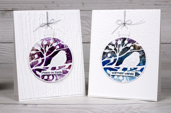
Here are a few more cards made from patterned panels I had sitting around. The panels were very pretty experiments using brusho, paint poring and alcohol inks but at the time I made them I didn’t have a plan for them. Last week they came into their own when paired with Penny Black dies and a few of my favourite embossing folders.
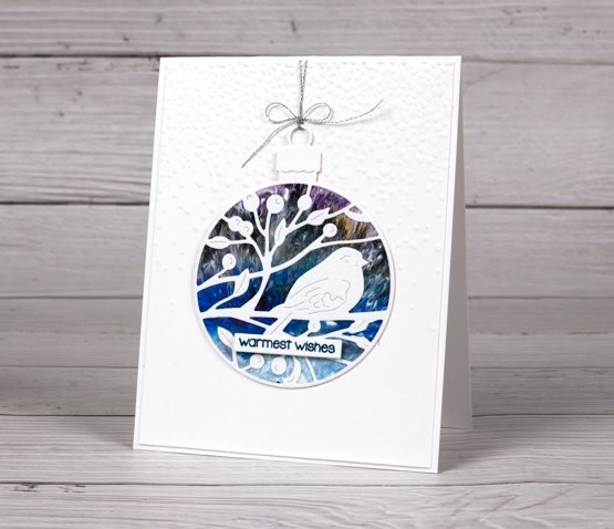
The background above is from an acrylic paint pouring day I had with a friend. The result looked like peacock feathers but works well as a northern night sky too.
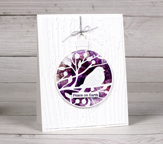
The purple panels above and below right were brusho & cling wrap on photo paper another technique taught to me by a friend.
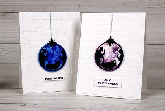
The blue background below is alcohol ink; you probably recognise the patterns made possible with just one or two colours plus some isopropyl alcohol.
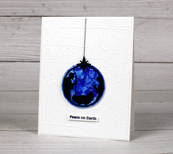
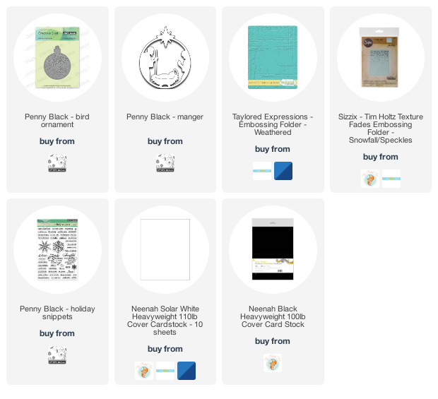
The dies are listed below and the embossing folders are a mix of currrent and retired. Above is ‘weathered’ from Taylored Expressions. The tiny squares folder is a retired Spellbinders one (SEL 006), the woodgrain is Tim Holtz/Sizzix also retired but there are plenty of new options around. The Tim Holtz/Sizzix Snowfall fade folder at the top of the page is still available and I often reach for it.
I enjoyed using some scraps and samples that were too pretty to throw away to make simple but unique Christmas cards. I think I almost have enough for this year so I will start next year’s stack early!
Supplies
(Compensated affiliate links used when possible)
2021 BuJo – December theme
Posted: December 2, 2021 Filed under: brilliance, Bullet Journal, delicate pines, Dingbat notebooks, Hand lettered, Penny Black, Taylored Expressions | Tags: Bullet Journal, Dingbats notebook, Hand lettering, Penny Black stamps, Staedtler watercolour brush pens, Taylored Expressions 3 Comments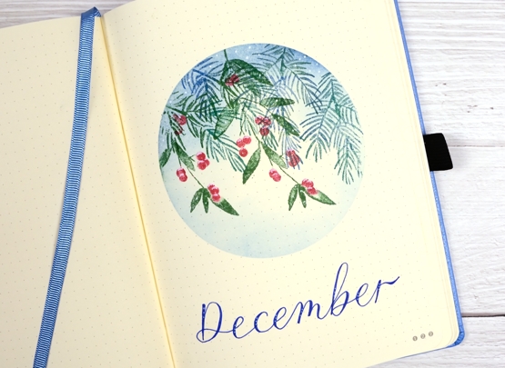
I didn’t have a lot of time to spend setting up my December pages; I can’t even believe it is December honestly. It’s a busy week but I had a snowflake idea for the theme and a bit of a plan which you can see did not happen at all. But that is ok because I can save my snowflake plan for January or February or March or Ap…….
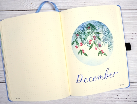
After creating the large panel for my recent stack of PB ‘delicate pines’ Christmas cards the stamp set was still on my table along with its buddy the PB ‘brilliance’ stamp set. I decided to use them together for some festive foliage. I used a mix of distress greens and blue along with a red marker for the berries and a white gel pen for the frost.
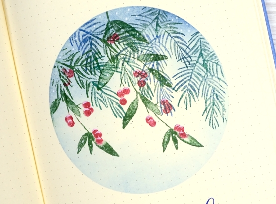
I reused a frisket film mask which I saved after creating October’s title page and stamped foliage from both PB ‘brilliance’ and ‘delicate pines’ sets. I blended over the stamping with prize ribbon distress ink then dotted white around the circle and on top of the red berries.
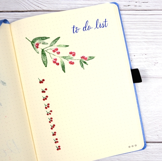
The to-do page and the calendar page have simple foliage stamping and some lettering with Pentel Flair pens.

I have used masking in quite a few of my pages this year; I might need to come up with a new favourite technique for next year. I hope your December is off to a good start. Because I can’t believe it is December I have a discount code for the Floral Faves class, Winter Wonder class and the Colour Clues class. If you use HTDEC you will get 20% off. If you are interested in giving an online class as a gift please get in touch so I can help you make it happen.
Supplies
(Compensated affiliate links used when possible)