
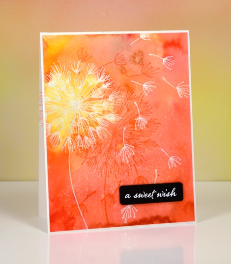
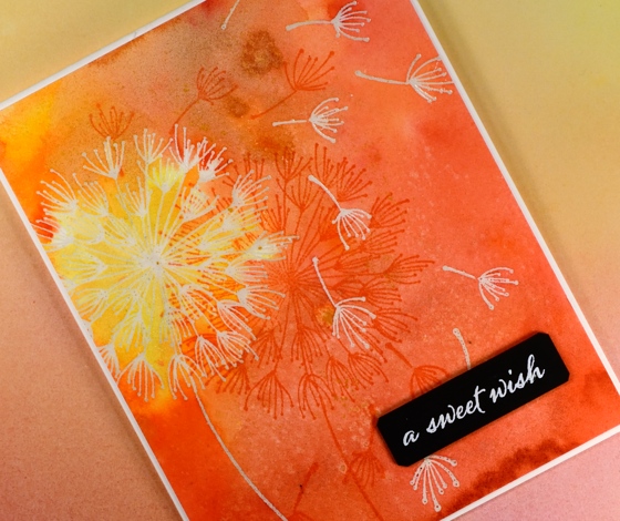
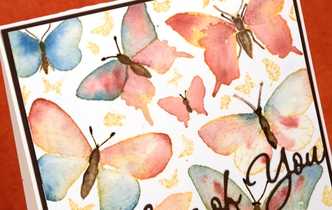
Shimmer and shine
Posted: August 24, 2016 Filed under: Sweet Perfume | Tags: Finetec artist mica watercolour paint, Penny Black stamps, Tsukineko Versafine inks 9 Comments
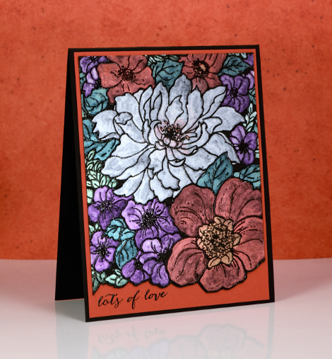
I’m excited to be guest posting on the Foiled Fox blog today. To find out how I got the pretty shimmer on this card check out the post here.
Stamps: Sweet Perfume, Happy Snippets(PB)
More Glimpses
Posted: August 18, 2016 Filed under: CAS, Nature's Silhouettes, Stamped Landscapes, Woodland Beauty | Tags: Dr Ph Martin Hydrus watercolor paints, Penny Black stamps, Tsukineko Versafine inks 13 Comments
I have two more cards made from my experiments with new stamps on watercolour strips. Both today’s strips and yesterday’s were splattered with masking fluid before I started. For the deer card I also added a circle of masking tape before painting the sky in blue, purple, pink and yellow watercolour paint. I painted the horizon edge in blue and tilted the strip up so the paint flowed toward the moon, one colour blending into another

Once the sky dried I removed the masking fluid and tape then stamped the branches from ‘woodland beauty’ and the deer from ‘ nature’s silhouettes’ in black before painting some shadows in front of the deer’s legs.

I used a similar process for the single tree scene, painting the sky first while leaving some unpainted paper at the bottom to be the snowbanks. Once the sky dried I removed the masking fluid and positioned a post-it mask below the horizon and stamped the single tree from the ‘woodland beauty’ set over the mask. Once I removed the mask I painted shadows on the snow in the foreground and behind the tree.
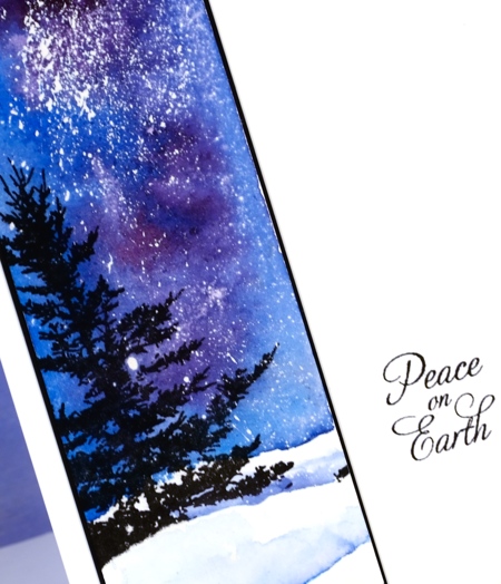
The four little panels in today’s and yesterday’s posts are a taste of the new stamps and the types of scenes I expect to be creating over the next few months. I really enjoyed working small; have you tried it?
Supplies:
Stamps: Nature’s Silhouettes, Woodland Beauty, Joy Filled (PB)
Paints: Dr Ph Martin Hydrus watercolour paints
Inks: Versafine Onyx black ink (Tsukineko)
Cardstock: Fabriano 100% cotton hot pressed watercolour paper, Neenah epic black cardstock
Also: masking fluid, masking tape
Glimpses
Posted: August 17, 2016 Filed under: CAS, Into the sky, Nature's Silhouettes, Prancers | Tags: Brusho, Penny Black stamps, Ranger Distress stains, Tsukineko Versafine inks 24 Comments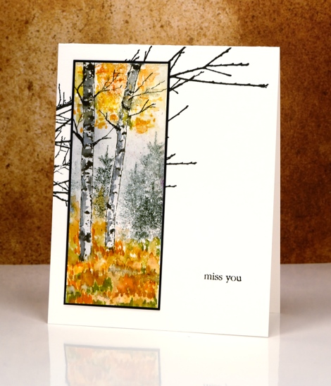
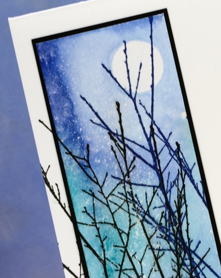
You have probably already caught up with the fact that Penny Black has two new collections of stamps and dies. When I first receive new stamps my head fills with ideas and designs to try and this time was no exception. I had a little pile of bookmark sized watercolour paper strips on my table so I decided to try some of my ideas on mini projects rather than full sized panels. That way I was able to play with a few stamps and several ideas in a short space of time. The strips I worked on have become the cards I’m sharing today and tomorrow. I have also had a chance to develop some of the designs into full sized panels. On the strip above I used an old favourite, the little tree stamp from the ‘Prancers’ set as background for the new birch trunk stamps.
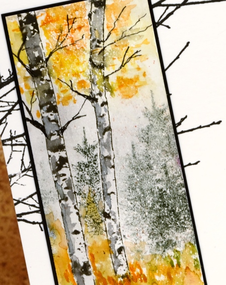
I stamped the two trunks from the new ‘Nature’s silhouettes’ transparent set on watercolour paper already covered in spots of masking fluid. I masked the trunks with post-its while I stamped the fir tree in the background then painted colour at the top and bottom of the panel with a combination of brusho and distress markers. I added some shadow and twigs to the trunks to make them look more tree like.
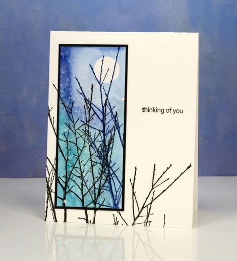
On my second mini panel I masked a moon with masking tape then used distress stains to paint a blue and green sky over the splatters of masking fluid. I turned this into a little scene by adding the ‘Into the Sky’ stamp in blue and black ink. I love this delicate stamp of branches and decided to stamp it on both the bases for today’s cards. It mimics the twiggy branches on the birch trees above and continues some of the upward reaching branches in the panel below.
Supplies:
Stamps: Nature’s Silhouettes, Prancers, Into the sky, Snippets (PB)
Paints: Brusho powders (Colourcraft)
Inks: Versafine Majestic Blue & Onyx black ink (Tsukineko) Black Soot, Rusty hinge, Spiced marmalade, Peeled paint distress markers, Evergreen Bough & Blueprint sketch distress stains (Ranger)
Cardstock: Fabriano 100% cotton hot pressed watercolour paper, Neenah epic black cardstock
Also: masking fluid, masking tape
Watercolour Fuchsias
Posted: August 5, 2016 Filed under: Fuchsia, Watercolour | Tags: Penny Black creative dies, Penny Black stamps, Tsukineko Versafine inks 10 Comments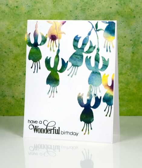
I’ve been cutting up watercolour panels again; it really is a great way to use up experiments or abandoned projects. Sometimes I have panels that were my ‘practice’ for something else or part of a class where I demonstrated a technique but then moved on. The colours in the panels are pretty but the pattern might be a bit random or unattractive. Using a die cut means I can cut from the sections where I really like what the colours are doing. These panels were painted with Gansai Tambi paints.
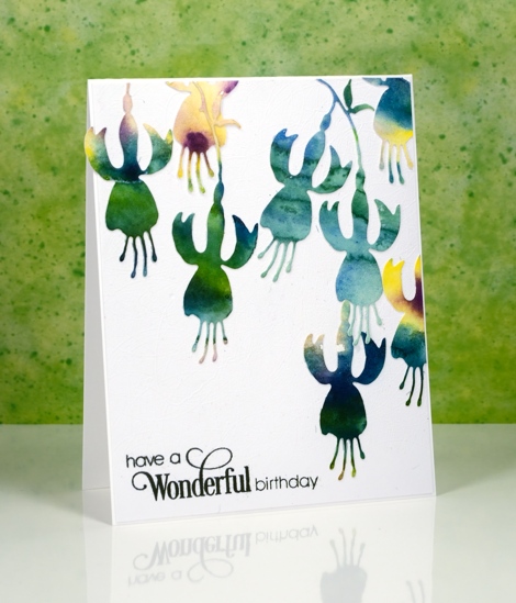
I put stick-it adhesive on the back then cut all these fuchsias from a couple of panels featuring the same blue green tones. I arranged them then attached them all to a white panel and then to a white card base. My photography didn’t pick up the texture on the white panel as it is quite subtle but it is a cute trick if you want to try it. The cutting base panel for my die-cutting machine is very well used all over so when a piece of cardstock is run through the machine the base transfers an intricate pattern of intersecting lines which creates subtly textured cardstock. I am going to include this card in the Casology ‘Watercolour’ challenge.

Supplies:
Stamps: Sprinkles and Smiles (PB)
Die:
Dandee Wishes
Posted: August 2, 2016 Filed under: Brusho, Color Burst, Dandee | Tags: Brusho, color burst, liquid metals, Penny Black stamps, Tsukineko Versafine inks 20 Comments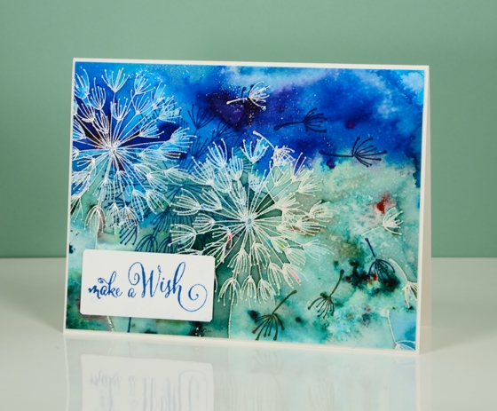
This is the birthday card we gave our older daughter today.
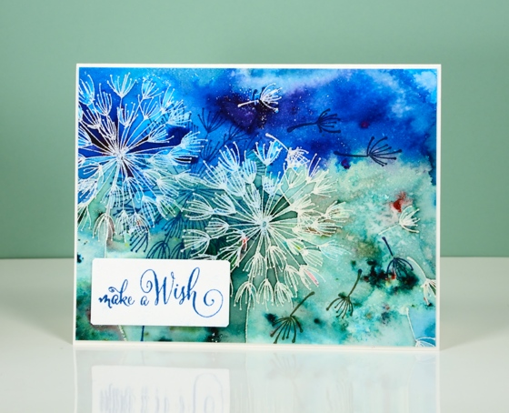
I painted the panel a while ago but just turned it into a card for her birthday. Both this blue one and the orange one further down the page were emboss resist experiments. What is fun with emboss resist and watercolour powders is the variation and depth of colour changes from one side of an embossed line to another. To see an awesome example of this, check out Lindsey’s card.
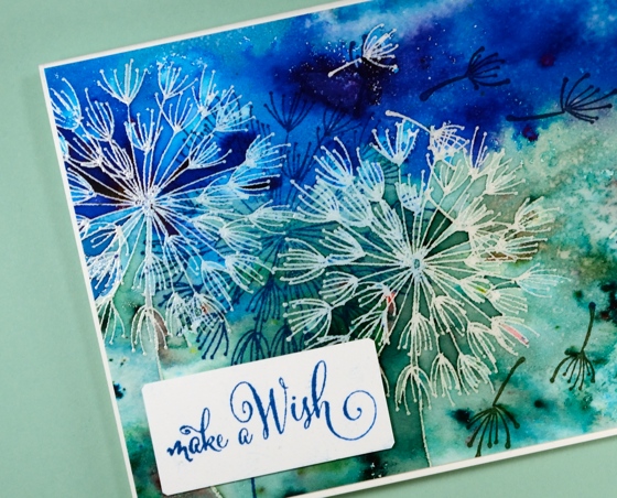
For both colour schemes I embossed the dandee stamps in clear powder on watercolour paper. I sprinkled blue and green brusho powders on the one above then spritzed water to activate the powders. I used a paintbrush to do some colour moving but not much; most of the design is the magic of the paint.
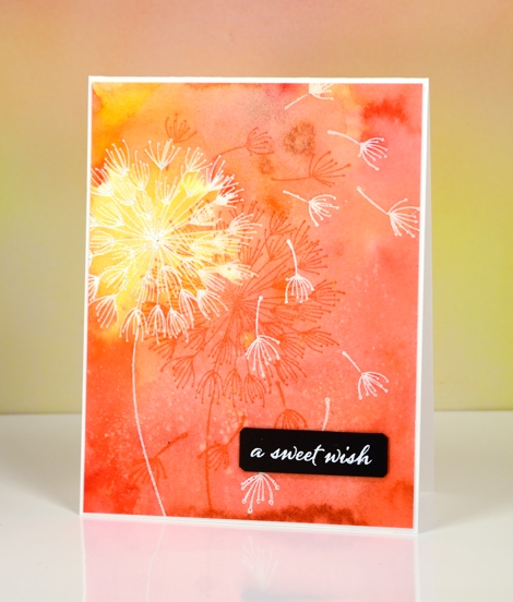
The orange and yellow card was done in a similar fashion but I used colorburst powders and added some yellow gold liquid metal when I added water. There is a shimmery patch of colour as well as specks of gold in real life.
When I came back to the panels the other day I stamped the dandee stamps again over the panel in versafine inks and added popped up sentiments.
Thanks for dropping by.
Supplies:
Stamps: A Sweet Day, Dandee, Happy Snippets (PB)
Paints: Colorburst powders and Liquid Metals (Ken Oliver) Brusho powders (Colourcraft)
Inks: Versamark, Versafine Habanero, Deep Lagoon, Majestic Blue, Olympia Green(Tsukineko)
Cardstock: Fabriano 100% cotton hot pressed watercolour paper, Neenah epic black
Also: clear embossing powder, white embossing powder
Pencil colouring
Posted: July 16, 2016 Filed under: Glee | Tags: Faber-Castell Polychromos Colour Pencil, Penny Black stamps, Tsukineko Versafine inks 7 Comments
I continue to grab opportunities to participate in the 30 day colouring challenge and have once again used the new “glee” stamp from Penny Black. I used a combination of brusho and liquid metals on my earlier card; for this one I pulled out my Faber-Castell polychromos set. I blended pencil with pencil rather than use a liquid blender or blending pencil. I chose two browns for the centre of the flowers, a yellow and two burgandies for the petals and two greens for the leaves. To blend pencil with pencil I generally colour with my lighter shade first then over the top with my darker shade and then blend again with the lighter shade. Once all my colouring was done I shaded lightly around all the images with a purple pencil. I chose purple because it is opposite yellow on the colour wheel; positioning contrasting colours next to each other helps to make them stand out more than they would otherwise. I stuck with the purple-gold combo when I added a mat and a sentiment,
Supplies
Stamps: Glee, Words of Kindness (PB)
Ink: Versamark ink, Versafine onyx black (Tsukineko)
Pencils: raw umber, burnt sienna, dark cadmium yellow, middle cadmium red, dark red, earth green yellowish, olive green yellowish, purple violet (Faber Castell)
Paper: hot pressed Fabriano watercolour paper, gold and purple cardstock
Also: gold embossing powder
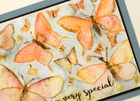
More butterflies
Posted: July 9, 2016 Filed under: butterfly charmer, Watercolour | Tags: Faber-Castell Albrecht Durer Watercolour pencils, Penny Black stamps, Ranger Distress inks, Tsukineko Versafine inks 17 Comments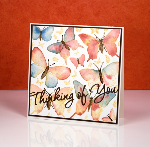
I didn’t intend for this week to be all about butterflies but that’s the way it turned out. To create this panel I coloured the little butterflies on the butterfly charmer stamp using what I am calling the colour drop method. I don’t think it is anything new but I needed a name for this little technique. I stamped the large stamp with wild honey distress ink then painted the butterflies with water one at a time. The water blended the wild honey ink to give each butterfly a warm yellow tone but it also gave me a pool to drop another colour into. I took colour from my water colour pencils and dropped it onto the wet wings and let it spread into the whole wet area. I moved from wing to wing so they could dry a little before adding a second colour to an adjacent area. I did video the process and have sped it up and posted it on my instagram
When the wings were all dry I drew over the butterfly bodies, legs and antennae with either a dark brown watercolour pencil or a distress marker then blended the brown with a very small paintbrush and a wee bit of water. The finished panels remind me of botanical books.
The first one I did using this method is below. I added colour to the little butterflies also and filled in the background.
I used Faber-Castell Albrecht Dürer watercolour pencils over rusty hinge distress ink for this one
You can see on the close up that you don’t lose all the definition of the stamped image when you paint over it; there are faint outlines of pattern underneath.
Thanks for dropping in; have a great weekend.
Supplies:
Stamps: Butterfly charmer, Happy Snippets (PB)
Dies: Wishes
Inks: wild honey distress ink, rusty hinge distress ink (Ranger) Versafine vintage sepia (Tsukineko)
Cardstock: Hot pressed Fabriano watercolour paper, brown cardstock, green cardstock
Also: Albrecht Durer watercolor pencils (Faber-Castell)
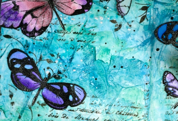
Limberlost Journal page & video
Posted: July 6, 2016 Filed under: Art Journal, Butterfly trio, Muse, Script, Tutorial, Verdure | Tags: Art Journal, color burst, Dr Ph Martin Hydrus watercolor paints, Faber-Castell Albrecht Durer Watercolour pencils, Penny Black stamps, Tsukineko Versafine inks, Tutorial, video 21 Comments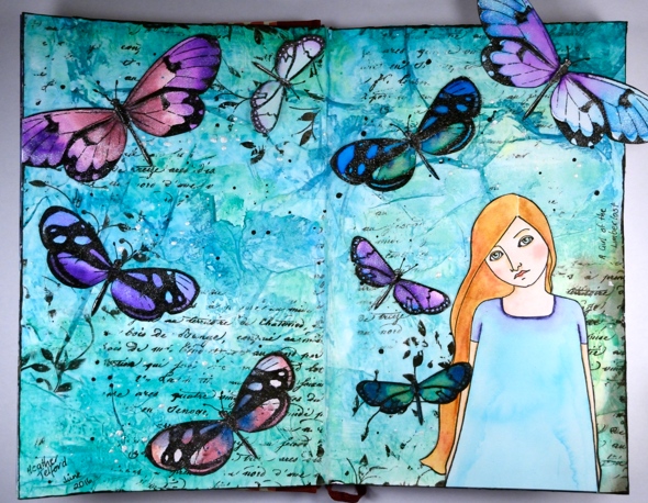
It is over a year ago since I completed a page in my art journal so it was a good thing when I was asked to create an art journal video for the Penny Black blog. The latest release from PB, Artistic Endeavors includes some beautiful stamps designed with journaling in mind. The page I created last year was a Narnia page so I decided to stick with the literary theme and make another book inspired page. My inspiration this time is ‘A Girl of the Limberlost’ by Gene Stratton-Porter. I read the book quite a few years ago but really enjoyed it and could see the butterfly and figure stamp working well on such a page.
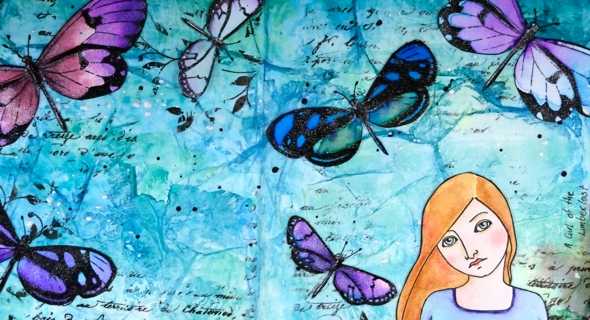
The main character, Elnora, catches moths to sell to collectors in order to support herself through high school. She lives on the edge of the Limberlost, a forested and swampy region where she finds the moths she later sells. I know these stamps depict butterflies but I chose to exercise some artistic license.
Because I wanted to watercolour both the butterflies and the girl I stamped them on watercolour paper, painted them, then cut them out so I could attach them to the page.
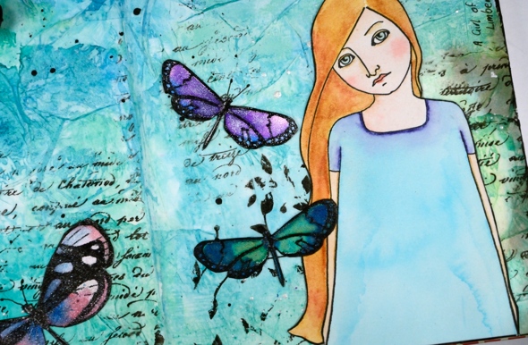
To add texture to the background I glued torn strips of tissue paper all over it then did partial stamping with a script stamp and a leafy stamp.
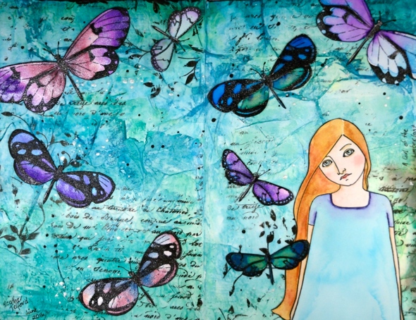
Journal pages take me a long time so despite the fact that I sped up just about all the footage, it is still on the lengthy side. I hope you enjoy it and, maybe like me, get inspired to pull out a neglected art journal. Or perhaps you’ll go and check the book out of the library…
Edited to add: In the video I mentioned learning a lot from Vicky Papaioannou; her videos are here:https://www.youtube.com/user/vickypgr
Supplies:
Stamps: Muse, Script, Verdure, Butterfly trio (PB)
Art Journal: Fabriano 24cm x 15.5cm
Art supplies: Faber-Castell gel medium , Tsukineko Versafine Onyx Black ink , clear embossing powder, Ken Oliver Colorburst powders (merlot, violet, ultramarine blue), Ken Oliver liquid metals (platinum, verdi gris, ultramarine blue), Faber-Castell Stampers big brush pen, lead pencil, Pigma 0.3 micron pen, Faber-Castell Albrecht Durer watercolour pencils (medium flesh, brown ochre, juniper green, ochre, burnt ochre, venetian red, delft blue, warm grey 3), tissue paper, Dr Ph Martin Hydrus liquid watercolours (Hansa yellow light, phthalo blue, phthalo green, carbon black) Art glitter designer dries clear adhesive, Ranger distress micro glaze.
OLS29 Christmas in July
Posted: July 1, 2016 Filed under: CAS, One-Layer Simplicity challenge, Spread Cheer | Tags: Faber-Castell Albrecht Durer Watercolour pencils, Penny Black stamps, Speedball elegant writer, Tsukineko Memento inks, Tsukineko Versafine inks 18 Comments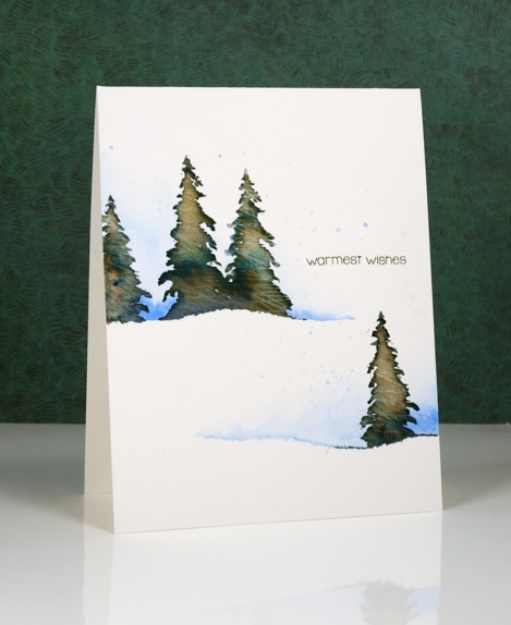
I am hosting the One Layer Simplicity Challenge this month and the theme is ‘Christmas in July’. I know some of you make Christmas cards all year but I usually start around now and keep going until December! If you haven’t even thought about Christmas cards then perhaps this challenge will be a motivator. Perhaps you want to enjoy the summer sun and not think about December at all – that is totally fine too!
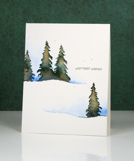
To make this one layer card I tore a piece of painter’s tape lengthwise into two strips and positioned them on my watercolour paper card base. I painted some blue along the torn tape edge and faded it to white. Keeping the tape in place I stamped a few trees in Memento Northern Pine ink and added a few dabs of black elegant writer pen. After stamping I painted over the tree to blend the ink. Northern Pine separates into brown and green when diluted which gives the foliage some variety in colour.
I’ve been reading a book called ‘The Non-Designer’s Design Book’ which has made me think about layout in terms of alignment, repetition, contrast and proximity. The book is concerned mainly with text documents like business cards, menus, ads, etc but the principles are relevant to art layout too. I found myself trying to apply what I’ve learnt when working out where my sentiment would go.
Supplies:
Stamps: Spread Cheer(PB)
Inks: Northern Pine Memento ink, Versafine Olympia green (Imagine Craft/Tsukineko)
Pencils & Pens: blue watercolour pencil (Faber Castell), elegant writer pen (Speedball)
Cardstock: Canson Moulin du Roy 100% cotton hot pressed watercolour paper
Bright Poppy Gems
Posted: June 15, 2016 Filed under: Poppy Gems | Tags: Fabriano Watercolour Paper, Kuretake Zig clean color real brush markers, Penny Black stamps, Tsukineko Versafine inks 15 Comments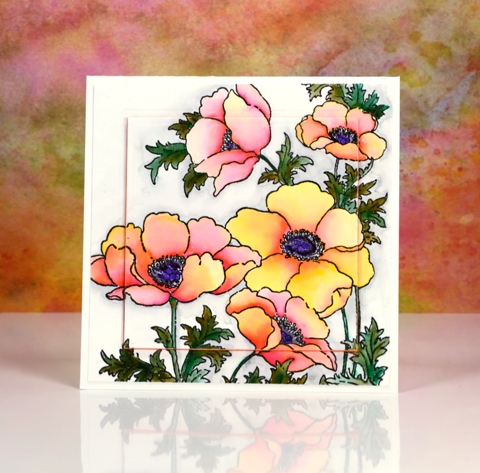
I’m sharing some more colouring today and yes, more poppies too. Poppies just keep on popping up on this blog don’t they!? Believe it or not I used the same medium on today’s card as yesterday’s very bright and bold card. The colours today are still bright but are blended out to much paler shades.
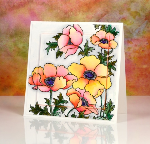
I stamped the large ‘poppy gems’ stamp in versafine onyx black and embossed in clear then used zig clean color real brush pens. Yesterday I pretty much filled the petals with colour and blended one colour over another. On today’s card I started with a little pink at the centre edge of each petal and a little yellow at the outside edge and blended the two colours with water to create a softer effect.
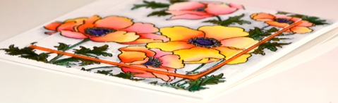
I spied the raised panel layout on a couple of pretty cards recently and chose to do it on this one with a piece of orange fun foam. I have an even paler more pastel poppy card up next. See you soon and thanks for dropping by.
Supplies:
Stamps: Poppy gems, (PB)
Inks: Versafine Onyx Black (Tsukineko) Zig Clean Color real brush markers (Kuretake)
Cardstock: Fabriano 100% cotton hot pressed watercolour paper
Also: orange fun foam, spellbinders square die


