Pink poinsettia poem
Posted: December 17, 2019 Filed under: poinsettia poem, xmas poinsettia cut out | Tags: brutus monroe embossing powder, Fabriano Watercolour Paper, Papertrey ink, Penny Black creative dies, Penny Black stamps 4 Comments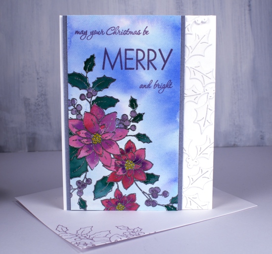
I have a less traditional colour scheme for you today featuring pink and purple on this pretty poinsettia stamp from Penny Black. I wasn’t set on being non-traditional when I started but it headed that way as I progressed. I started by smooshing tumbled glass and blueprint sketch distress stains on my glass mat, adding water then swiping a piece of hot pressed watercolour paper through it to create a soft background. Once it dried I used my stamp positioner to stamp and emboss the ‘poinsettia poem’ stamp in silver embossing powder.
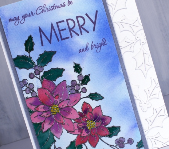
I smooshed papertrey ink cubes onto my glass mat to use as watercolours and painted the flowers in scarlet jewel and royal velvet, the leaves in pine feather and the berries in winter wisteria. I used a gold gel pen to colour the centres. The card is not quite so bold as the photo suggests but even so I wanted some light and bright features alongside the painted panel so I framed it in silver and added some die cut holly to the white card base.
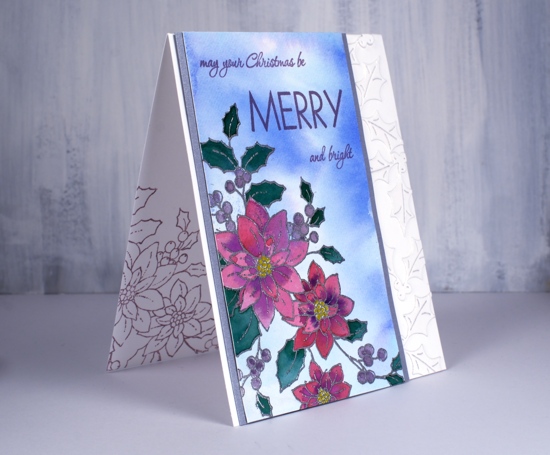
In keeping with my resolve I stamped inside the card and on the envelope with winter wisteria ink and add the sentiment in the same.
Supplies
Wreath & wreath
Posted: December 4, 2019 Filed under: conifer wreath, homespun, Penny Black | Tags: Fabriano Watercolour Paper, Finetec artist mica watercolour paint, Penny Black creative dies, Penny Black stamps, Ranger Distress inks, Ranger Distress stains 4 Comments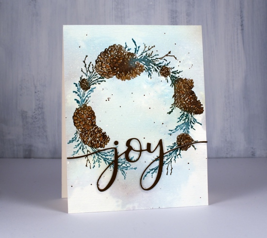
I have two more wreaths to share today; I don’t think I’ve ever made so many wreath cards. This year I did them in a class and I’ve done them here at home more than a few times with little stamps and big stamps. The fact that Penny Black came out with such beautiful wreaths this year kept the inspiration going.
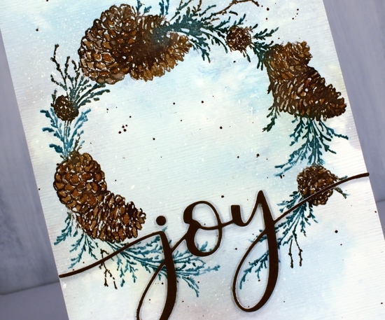
The stamp above is called ‘conifer wreath’ and the stamp below ‘homespun’. I used the same technique for both. Working on hot pressed watercolour paper (psst Foiled Fox has Fabriano in stock now!!) I splattered masking fluid over the paper before I started stamping or painting so I would have dots of snow appear at the end. Once the masking fluid was dry I used my glass mat and spread some pine needles, evergreen bough and gathered twigs distress stain over the mat. I diluted it with water then swiped both panels through the stain to pick up pale green and brown blurry colour.
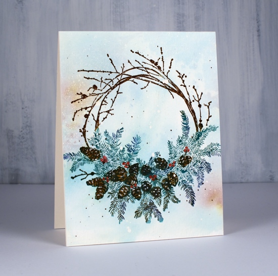
Once the background ink dried I used the stamp positioner to stamp the wreaths colour by colour using pine needles and forest moss distress inks for the foliage, gathered twigs and black soot for the twigs and pine cones and chipped sapphire for some added depth. I drew a few berries on the wreath below with a festive berries marker then painted over them with red from the finetec pearlescent paint set.
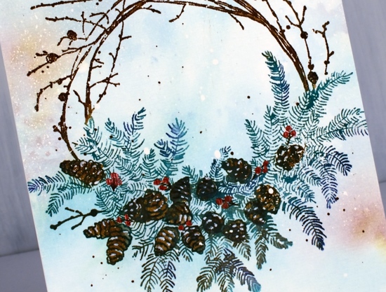
To add a little snow to the pine cones I used a white gel pen then splattered some green and brown ink around the wreaths. Once all the ink was dry I removed the masking fluid then added some texture to the panel with the clever SU embossing folder ‘subtle’.
To add a sentiment to the conifer wreath I die-cut a few ‘joy’ words with the PB die, ‘merry & joy’, stacked them and added them over the bottom of the wreath. Now what I really need to get done is a wreath to hang over my fireplace!
Supplies
Merry Misty Melody
Posted: December 2, 2019 Filed under: misty melody, Papertrey Inks, Penny Black, Wendy Vecchi | Tags: Papertrey ink, Penny Black creative dies, Penny Black stamps, Ranger Distress inks 6 Comments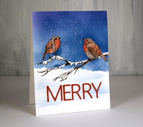
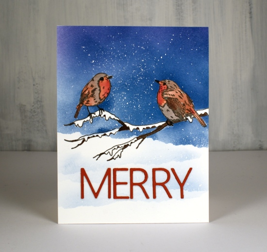
I am thrilled to be over on the Foiled Fox blog again, sharing these sweet little birds. They are from a new Penny Black set, ‘Misty Melody’ and I’ve paired them with one word from the PB ‘…bright’ die for a wintry scene. By the way there happens to be a 15% discount sale happening until the end of Dec 2 so now is a good time to visit.

I worked on hot pressed watercolour paper as I planned to do a bit of blending on the birds. I made a mask for the birds on the branch by stamping it on some masking paper and cutting it out. For someone who dislikes fussy cutting I seem to have warmed to it a little. With the stamp in my positioner I stamped the birds on branch stamp on the watercolor paper in smokey gray versafine ink and on masking paper.
I chose the Papertrey ink cubes that I have been using over and over to stamp little wreaths and foliage patterns. To watercolour with them I squished dark chocolate, Americana and scarlet jewel onto the glass mat where I could add a drop of water and pick up colour with a paintbrush. I found an image of a European Robin as my guide and painted the breast with the two red inks, the Americana was too brown, the scarlet jewel too pink but the mix was ideal. For the wings and tales I used a mix of Americana and dark chocolate and the rest of the body I painted with distress hickory smoke. I went over the beak and eyes with a black micron pen and then painted the branches in a mix of dark chocolate and black soot. Once that dried I went over the birds’ feet with the micron pen.
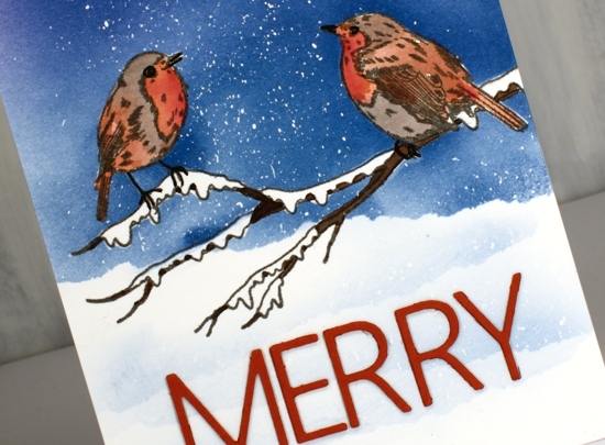
With all the bird and branch painting done I had to decide whether to paint the background sky or blend it with blending brushes or sponges. As I had the mask ready to go I chose blending brushes and positioned the mask to protect the painted birds and branch. I splattered masking fluid over the whole panel and let it dry. To create snow banks in the foreground I tore the edge off a piece of post-it note to mask just under the birds.
I stuck with the Papertrey ink cubes for the blended sky using mainly ‘blueberry sky’ and a bit of ‘royal velvet’. As I blended over the masking fluid I could see I was going to have a nice snowy sky. Once the sky color was a deep blue I repositioned the torn mask lower down three more times and blended over it for a soft ‘snowbank’ look. I didn’t have to pick up more ink as there was plenty still on the bristles of the blending brush.
Once all my painting and blending was complete I removed the masking fluid gently by rubbing it with my fingers; it is always very satisfying to see the snowy sky appear. To finish the card I cut two layers of the word MERRY from red cardstock backed with stick-it adhesive sheet and stuck them over the snowbanks. As you can see the letters come out of the die individually, I used the negative piece of cardstock and my magnetic ‘staytion’ and ruler to position them all correctly.
Thank you for dropping by today, all the supplies I used are linked below. I will be back here and on the Foiled Fox blog very soon.
Supplies
Snowflake garland
Posted: November 20, 2019 Filed under: crystalline, snowflake tag | Tags: Penny Black creative dies 12 Comments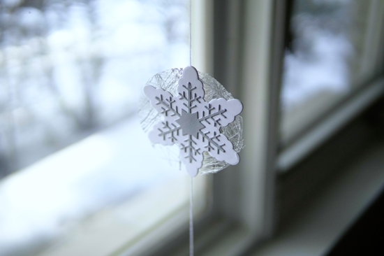
At the risk of boring you silly I will mention once again that I have a booth in an art market in four days! One of the items I wanted to make for the market was garlands. I thought the new ‘snowflake tag’ dies from Penny Black would be lovely with some sparkly beads and they are but it took me a lot longer than anticipated to put it all together. I almost left it at one but decided a pair might be nice; the second one was much quicker as I had thought it all through.
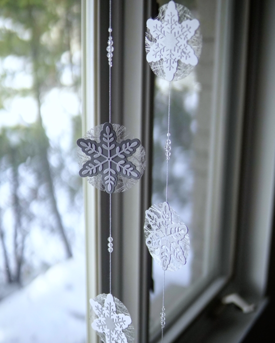
I used white cord with a silver thread through it, clear facet cut beads, a mix of shimmer silver and white cardstock and a spiderwebby silver fabric (from France).
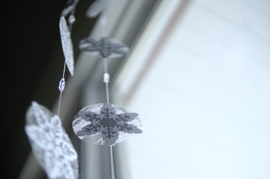
I ended up with six snowflakes on each garland with clear beads grouped on the twine in between the snowflakes. Each snowflake is actually double sided so the twine is glued in between the two and for some I glued a contrasting snowflakes on each side.
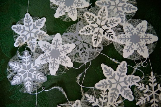
The spiderwebby fabric is apparently interfacing for dress making but its silver colour makes it perfect for adding a little shimmer and shine to paper craft projects.
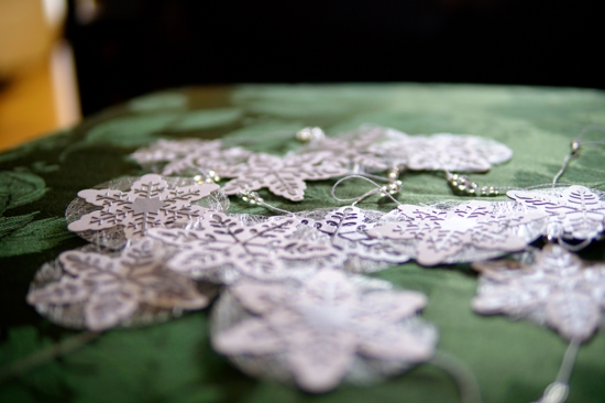
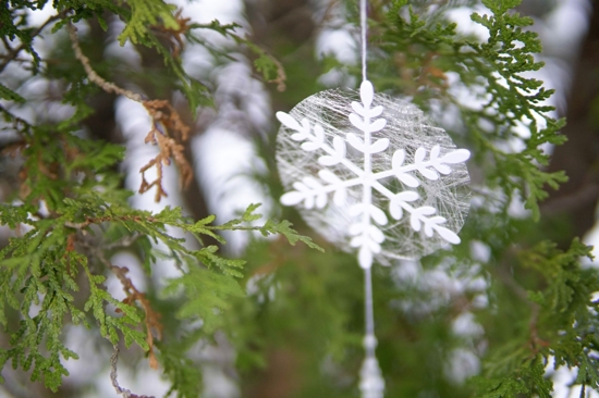
Despite being photographed in a tree the snowflake garland is a delicate thing and should not be used outdoors!
Supplies
https://linkdeli.com/widget.js?1559654439292
A happy anniversary
Posted: November 15, 2019 Filed under: Hand lettered, numbers, Penny Black, spontaneous joy | Tags: Finetec artist mica watercolour paint, Hand lettering, Penny Black creative dies, Penny Black stamps 9 Comments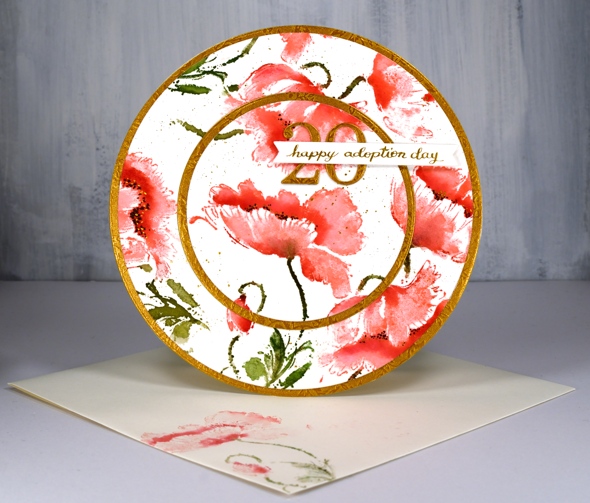
What a treat it was to design and make this card at the request of a friend of mine. Her daughter, also a friend of mine celebrated the 20th anniversary of her adoption day yesterday so an extra special card was needed. Inspired once again by the beautiful round card made by Peet Roeven I chose the PB stamp ‘spontaneous joy’ and a red and gold colour scheme. I worked in a stamp positioner to add colour to the flowers gradually beginning with worn lipstick distress ink for the petals then candied apple distress ink for extra depth and shadow. I blended a little with a paintbrush and water but I didn’t want to lose the detail by blending over all the stamping.
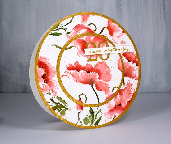
I used mowed lawn and peeled paint distress ink for the stems and leaves; two greens adds interest even on those small areas. I added black dots to the centres of the flowers then some gold dots with finetec pearlescent paint. To finish it off I splattered some of the same gold paint. I have been pulling out my finetec paints quite often recently, not so much for the main elements but for details and finishing touches. I used the same gold and a pen & nib to write my own sentiment strip.
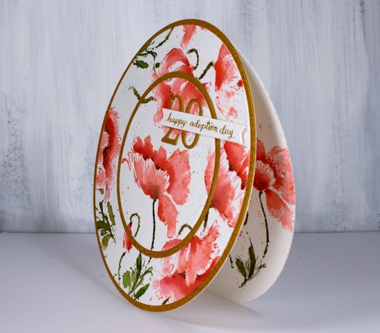
While all the inks were out I stamped a flower on a second panel of watercolour paper and on an envelope. I used a set of circle dies to cut the main panel and back panels into large circles and to cut a circle out of the centre of the front panel. I used a piece of embossed gold cardstock to cut extra circles and the number ’20’ using the PB ‘numbers’ die set.
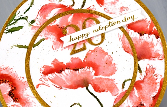
To assemble the card I scored across the top of the the back circle, applied adhesive above the score line and attached the two panels together. Having the score line on the back panel means the front decorative panel doesn’t need to bend at all. I also sliced a very slim bit of the bottom of the back circle so the card will stand up and not roll away!
Thanks for dropping by today, I hope you have a lovely weekend.
Supplies
https://linkdeli.com/widget.js?1559654439292
Time for tea
Posted: November 6, 2019 Filed under: Cup of tea, Tagged, teacups | Tags: Darkroom Door stamps, Penny Black creative dies, Ranger Distress inks 10 Comments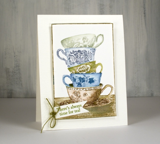
I love this little stack of teacups from Darkroom Door. I have some pretty teacups that belonged to my Nanna, some from my Grandma and some from my mother. I don’t often use them because I like a much bigger cup of tea but I love having them. There are intricate details on the cups on this stamp but I have chosen not to colour the patterns individually, instead colouring each cup a different colour. I kept my colour scheme muted sticking with inks I have been using to stamp forests and trees lately.
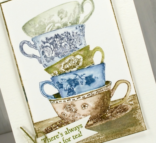
I used a stamp positioner so I could ink one cup at a time. I kept a wet cloth handy to wipe off any ink that ended up on the adjacent cups. after stamping I blended the stamping with a damp brush to gently spread ink into the cup but not dilute the pretty patterns.
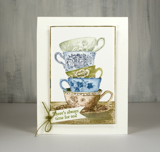
The stamp has its own frame so I trimmed with scissors right next to the frame and ran a peeled paint marker along the edge to make sure it was all inked. I chose my sentiment from another DD tea themed set, ‘Cup of tea” and cut it out with a PB tag die. I had hemp twine which exactly matched so I added a little bow to the tag. The stamped panel is popped up on adhesive backed foam on a textured cardbase.
Hope you have time for tea today, unless of course you are all about the coffee, but that’s a card for another day!
Supplies
Creamy poinsettias
Posted: October 9, 2019 Filed under: diamond cut, geometrix: rectangle die, Ink to Paper, jolly holly, layered poinsettia, Penny Black, scarlet season | Tags: Ink to Paper, Penny Black creative dies, Penny Black stamps 5 Comments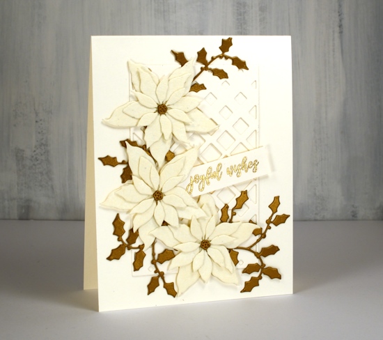
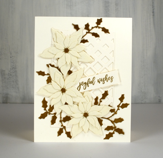
Lately I have been die-cutting poinsettias from all sorts of different cardstock. I have a poinsettia Christmas card class coming up so I’ve been playing around with lacy paper, shimmer paper, kraft paper and watercolour paper with plans to also cut up some pretty plaid paper. These two cards feature a lovely cardstock called ‘Ivory WorldWin twist’ which is a smooth ivory cardstock on one side a lace texture on the other side. I bought it at Crop A While, my local scrapbooking store. The lacy side is almost spiderwebby but in a delicate pretty way not a ‘look what’s behind the filing cabinet’ way.
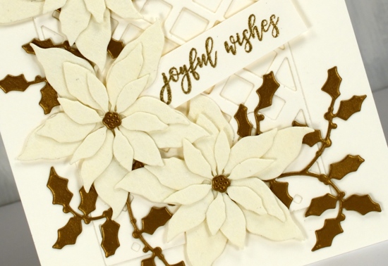
The card bases are neenah cream cardstock, and so is the sentiment strip and the PB ‘diamond cut’ behind the poinsettias. I used the PB ‘layered poinsettia die set’ for this trio of poinsettias; I like the size which makes it possible to fit three on a card front. (two more cards with these dies here and here) The PB jolly holly die cuts are a dark gold cardstock. I didn’t pop anything up on dimensional tape as it was getting pretty dimensional anyway with seven layers! That must be some kind of a record for me. I used glue for the flowers, narrow double sided tape for the diamond frame and stickit adhesive on the back of the holly.
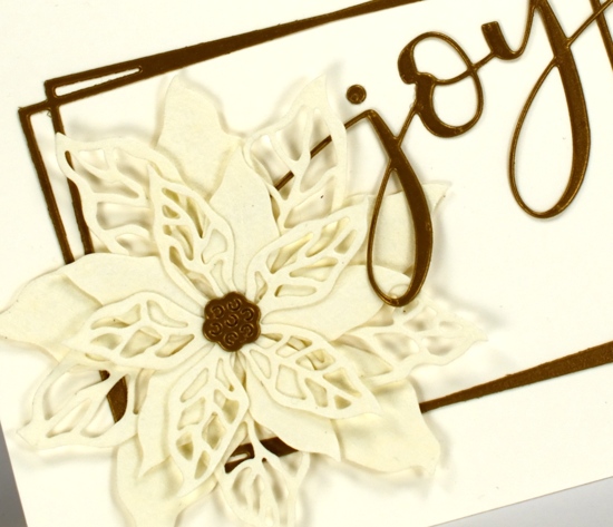
The second card features the same cardstocks but a new PB poinsettia stamp ‘scarlet season’ which has both solid and filigree flowers. I cut them once again from the lacy cardstock and layered them over a funky rectangle die from ‘Ink to Paper’ and added the PB ‘joy’.
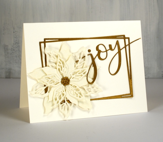
I’m not sure if it is the lacy paper or the colour combo but these cards have a bit of a retro look to them. I think these designs would be pretty with patterned vellum too.
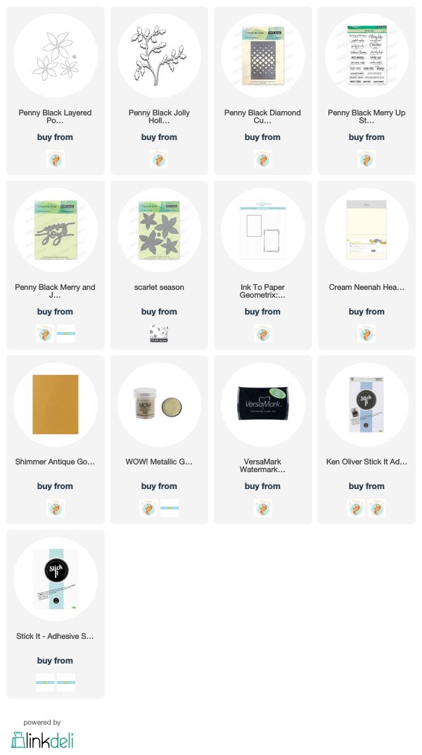
As always the supplies are linked below; I have added a second affiliate with my Canadian readers in mind. The store is Scrap ‘n’ Stamp in BC. If you buy through my affiliate links from either Foiled Fox or Scrap ‘n’ Stamp there is no extra cost to you but I receive a commission. Thanks for dropping by today.
Supplies
Golden Delight
Posted: October 8, 2019 Filed under: Color Burst, golden delight | Tags: color burst, Penny Black creative dies, Penny Black stamps 5 Comments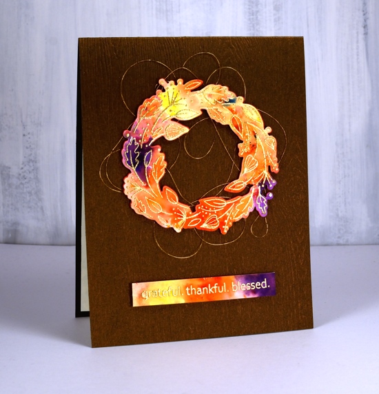
I decided to let the colorburst paint powders do the colouring for me on this cute little wreath from Penny Black. I embossed the wreath in gold on hot pressed watercolour paper and embossed the sentiment at the same time.
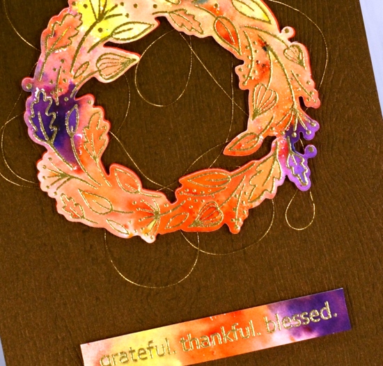
I sprinkled four colours of Ken Oliver’s colorburst powders over the embossing then spritzed with water and watched the colours emerge and spread. I helped them out a little with a paintbrush so paint filled every nook and cranny. Once the panel was dry I die cut the wreath and trimmed the sentiment to the right size then cut a wreath from adhesive backed foam also to pop up the watercoloured one. Before I attached the wreath to the card base I looped some gold embroidery thread back and forth around the wreath letting the adhesive hold it in place.
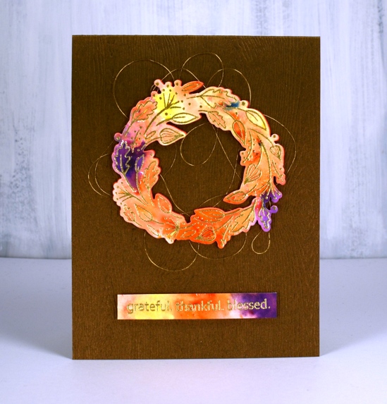
The woodgrained card base not only has texture it also has a little bronze shimmer to it. I bought it from my local scrapbooking store but you could get the same effect with a woodgrain embossing folder.
Feeling grateful, thankful and blessed to be part of this encouraging and inspiring community.
Supplies
I’ve been playing with the alcohol inks again!
Posted: October 2, 2019 Filed under: Alcohol Ink, Penny Black, simple serif alphabet dies, tall flowers | Tags: Concord & 9th, grafix craft plastic, Penny Black creative dies, Penny Black stamps, pinata alcohol ink, Ranger Alcohol Ink, Yupo Paper 11 Comments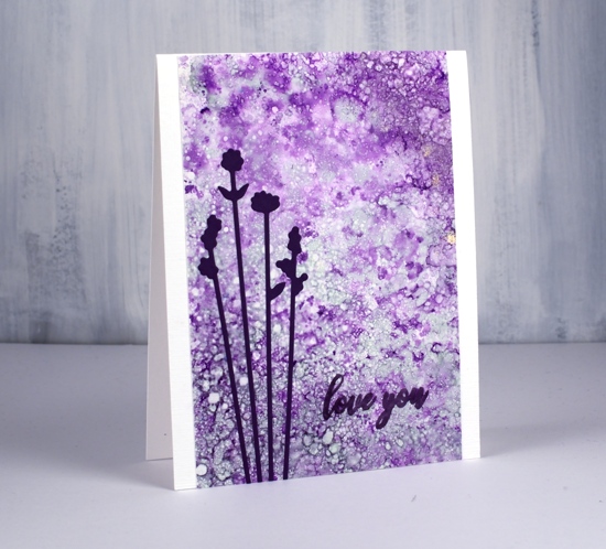
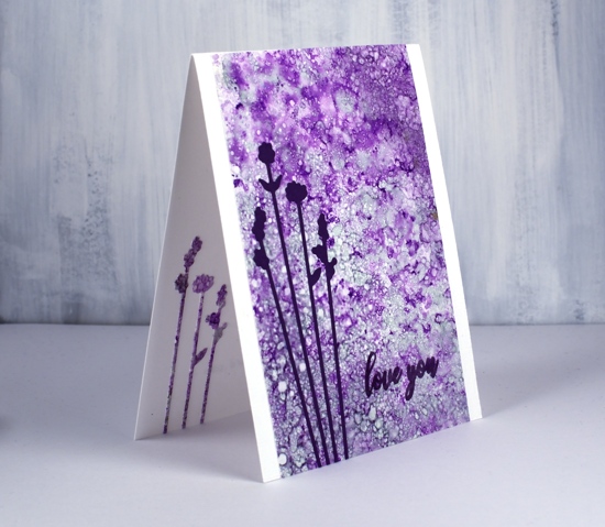
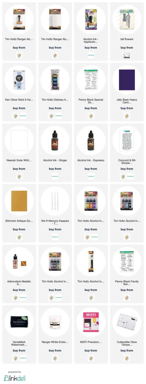
Last weekend I spent Saturday creating with alcohol inks while learning from Kathryn Kanadian who was in Ottawa teaching a couple of classes. Kathryn is a wonderful teacher and I now have a few new tricks to try and techniques to practice. This lavender panel was created with dots of ink on an applicator; I used passion purple, rich gold (Pinata) and juniper (Ranger) along with some blending solution or isopropyl alcohol. I dabbed the applicator all over the craft plastic for quite a while and added blending solution and more ink when needed. The gold ink didn’t move much but the other two colours created a lot of pattern. These delicate flowers which look a little like lavender are cut with PB ‘tall flowers’ dies. The sentiment from the PB ‘special sentiments’ set I stamped with dusty concord archival ink. I had a section of the patterned panel left over so I was able to die cut some more flowers to pop inside the card. You can be sure I put stick-it adhesive on those panels before I cut such skinny flowers out.
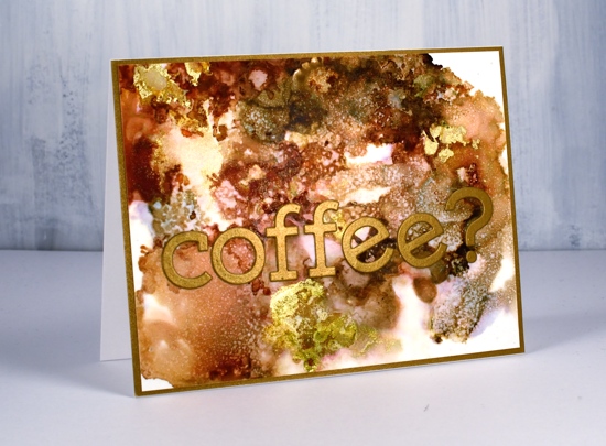
The panel of browns and gold below came together as Kathryn was encouraging us to experiment with blending solution to move the ink. I used more than I usually would and was delighted with all the variation of colour I achieved, the dotted patterns and the splotches of gold here and there. I used ginger, espresso (Ranger) and rich gold (Pinata). Kathryn had samples of her wonderful work including a coffee themed card that inspired this one.
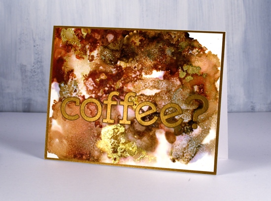
I used the Concord & 9 ‘simple serif’ alphabet dies to cut the letters from antique gold cardstock and framed the panel in antique gold also.
The daisy panel was a bit of a breakthrough for me as I had only made landscapes with alcohol inks by accident or trial and error in the past. With the introduction of a stylus and alcohol ink brushes I was able to paint some daisies and splatter a rain shower over the top of them.
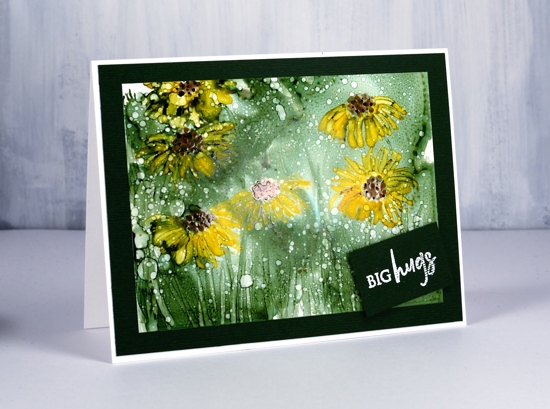
I began by creating a green background with the help of some isopropyl alcohol and green ink (not sure if it was meadow or pesto??) I used a stylus to dot the centres of the flowers in copper and pitch alcohol inks (Ranger) then I used a brush to paint petals around the centres and stems and grass at the base. The splatters of isopropyl alcohol pulled the composition together.
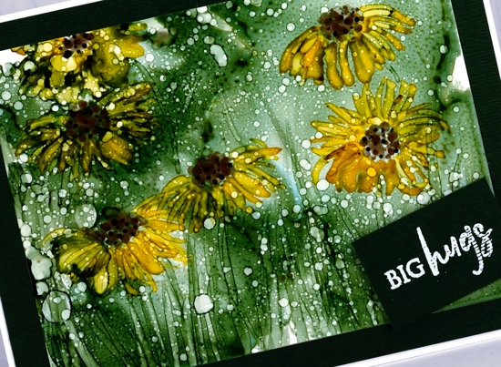
Although it looks black the cardstock framing the panel is actually dark green. I embossed a little sentiment from the PB ‘family sentiments’ set in white powder.
I created a few more panels during the class which hopefully I will turn into cards soon. Thanks Kathryn for a wonderful class.
Supplies
Filigree thank you
Posted: September 18, 2019 Filed under: Filigree Foliage | Tags: Fabriano Watercolour Paper, Penny Black creative dies, Penny Black stamps, Ranger Distress inks 11 Comments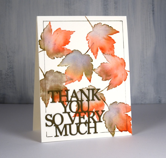
This leaf is from a PB stamp set called ‘filligree foliage. I haven’t used it for a few years but it is perfect for creating some autumn leaves. As the name suggests each leaf has a filigree pattern on it but you can’t see it on this card because I am using the stamp for its shape not its pattern. To see cards I’ve made in the past with this set click over here, here and here
I worked on hot pressed watercolour paper and moved the stamp around each time I stamped it. I used abandoned coral and frayed burlap distress inks, an odd combo, but one which seemed to work and even gave me a some purply blue in a few places. After stamping the leaf I immediately blended the ink with a paintbrush and water until I had filled the entire shape diluting all the stamped ink as I did so.
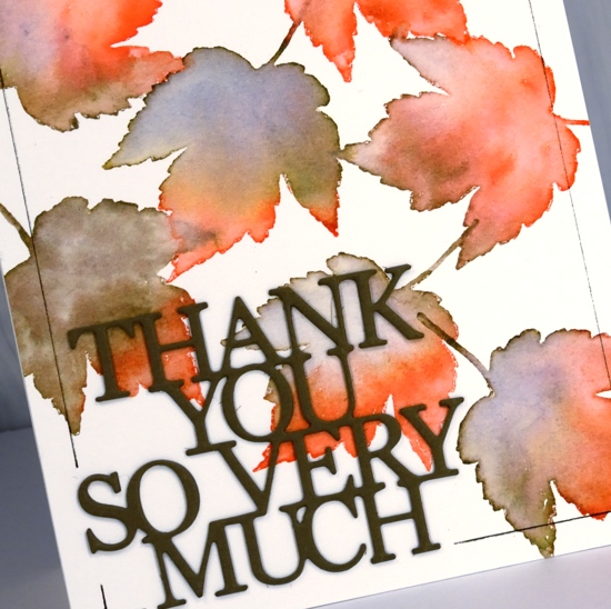
I added a double stacked sentiment die cut from olive green cardstock then ruled a thin brown frame around the edge with the help of the ‘staytion’ magnetic board and ruler. I know the ‘staytion’ was designed with stenciling in mind but it makes lining up die cut words and letters easy as well as ruling lines.
Can you believe I have another card for the current CAS watercolour challenge?