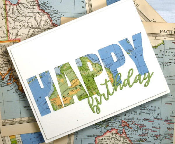
The map card
Posted: October 21, 2025 Filed under: Collage cards, cricut, Spellbinders | Tags: collage, cricut, Spellbinders 6 Comments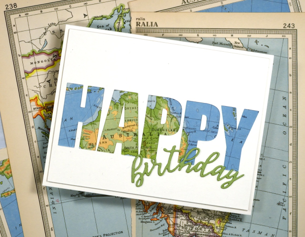
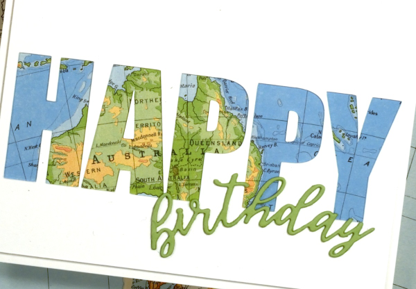
I’ve recently been using the cricut to cut letters in different fonts to complete my cards. I took the process a little further by cutting words out of the card front in order to reveal some coloured paper behind. This one shows a vintage map; tomorrow’s card features some patterned paper from a magazine.
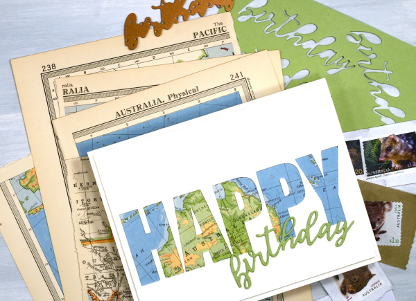
To create this birthday card for my son who just returned from visiting our family in Australia I had fun positioning the map behind the cut out to reveal some of the places he stayed. The map page is from an old atlas I am using for collage. The birthday die-cut is from the Spellbinders ‘serenade sentiments’ set which also has co-ordinating shadow dies. (currently the shadow for the word ‘birthday’ is missing somewhere in my work room!)
I wish I could tell you which font I used on the cricut but it appears I didn’t record that important information, something tall and bold! You could also do this technique with alphabet dies, the trick is to have dies open enough to show a decent amount of the paper behind. When cutting the letters out of course I am saving them in case I can use them on another card.
The Calendar Card
Posted: January 9, 2025 Filed under: Collage cards, simply perfect mix & match sentiments, Spellbinders | Tags: collage, Spellbinders 8 Comments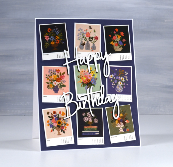
I’ve always liked the thumbnail page on a calendar. There’s something about seeing all the pictures in miniature which I find very cute. So when I bought a desktop calendar for a friend’s birthday I decided to remove the thumbnail page and create the card from the tiny month images.
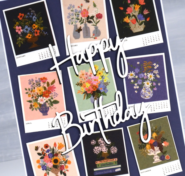
The calendar is made by the Rifle Paper company and the paintings are quite delightful.
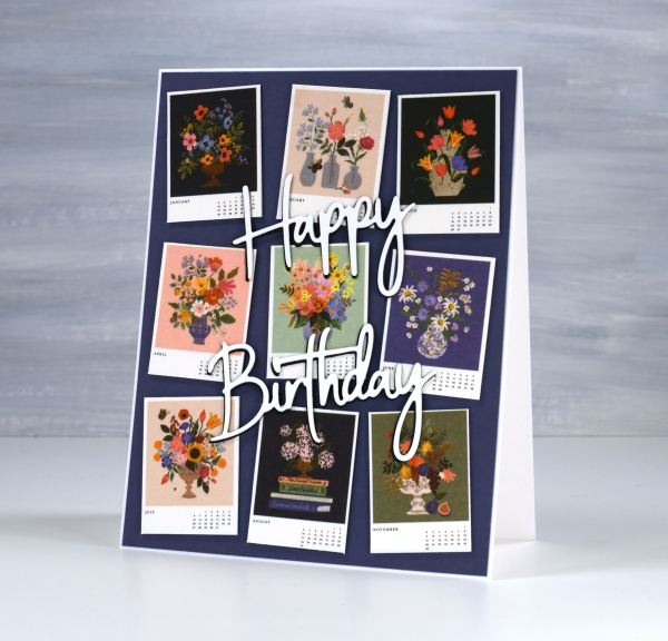
I stacked a white die-cut sentiment on a black one to help it stand out against the busy background. The dies are Spellbinders ‘simply perfect mix & match’ sentiment dies.
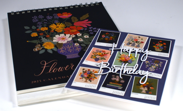
This gift has the added feature that if the recipient wishes, she can give me back the calendar pages as the months pass and I will turn them into cards for her to use. I enjoyed coming up with this card and idea and will be going through my calendar collection in the future to find both thumbnails and full pages I can turn into cards. In some ways I have come full circle; I made cards from calendars when I first started card making as a child.
Collage the Blues
Posted: July 31, 2024 Filed under: Darkroom Door, gel press, Nature Walk | Tags: collage, Darkroom Door stamps, gel press, gel printing, gelli plate 11 Comments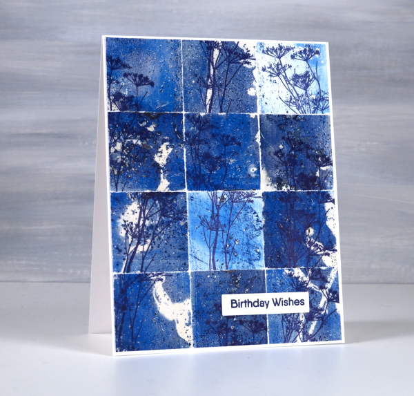
You might wonder what I do with all my gel prints, and believe me I have many, many gel prints! If I got rid of the partial prints that didn’t really work I would have less to deal with but sometimes the partial prints can become favourite cards or journal pages.
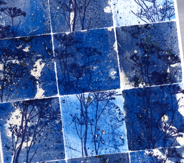
To create this collage of blues I tore a couple of partial prints into squares and stamped the delicate stamp from Darkroom Door’s nature walk set at different angles on the the squares. I put these ‘scraps’ back together and the partial prints brought shades of blue, pops of white and bits of pattern and texture.
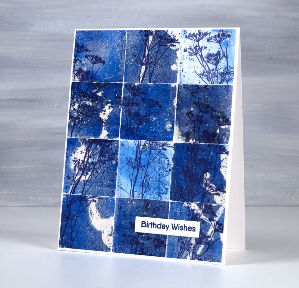
So, how many gel prints is too many? You can’t have too many!
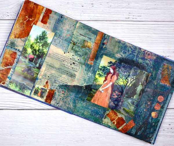
Girl in the Garden Journal Page
Posted: June 18, 2024 Filed under: Alexandra Renke, Art Journal, Darkroom Door, gel press, global postmarks, mandala | Tags: Alexandra Renke, Art Journal, collage, Darkroom Door stamps, gel press, gel printing 4 Comments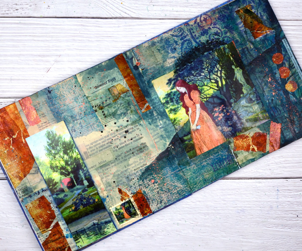
Although I made this page a month or so back; it is an appropriate theme for right now. We are in the ‘garden days’. My back garden is looking colourful and I love wandering out there each day to see what is growing, blooming or falling over!

This page began as a collage of book page pieces. I didn’t have a plan but wanted a base. I used pages from an old novel, an old atlas, sewing instructions, sheet music and other scraps to cover the double page spread in my 7″x7″ handmade journal. Months passed before I came back to do more.
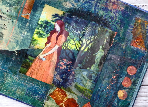
Before adding colour I painted some off white paint over the collaged pages. You might think the calendar image was the inspiration for the pages but bronze and the teal gel prints came first. Both prints were on tissue paper and were most likely made as I picked up extra paint around a primary design. As they were on tissue paper they revealed some of the print underneath when glued to the journal pages. I added ink through an Alexandra Renke mandala stencil.
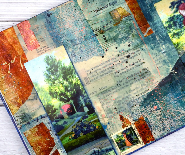
At this point I went looking for pictures to add to the colourful abstract pages and this one from a calendar co-ordinated well. It is from an old art calendar and is a detail from Eugene Grasset’s painting ‘Young Girl in a Garden’. I used some liquid watercolours to extend the painting onto my journal pages, made a faux stamp, added some splatter and stamping then let it all dry. Sometimes I’m not sure when a journal page is finished but I think this one is.
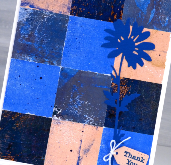
Pink & Blue Squares
Posted: May 18, 2024 Filed under: Collage cards, Dies, gel press, gift card pocket, Penny Black, Tim Holtz, wild flowers #1 | Tags: collage, gel printing, Penny Black creative dies, Tim Holtz 3 Comments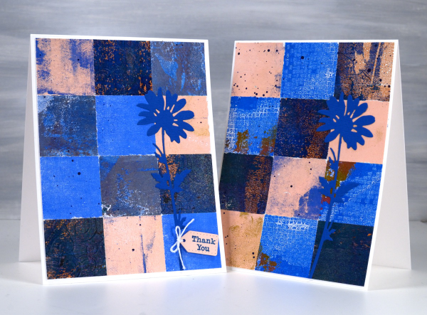
As mentioned in previous posts my stash of gel prints is considerable. I am always on the look out for ways to use them. Large prints are great for covers on handmade books; I use many smaller prints for card fronts and collage.
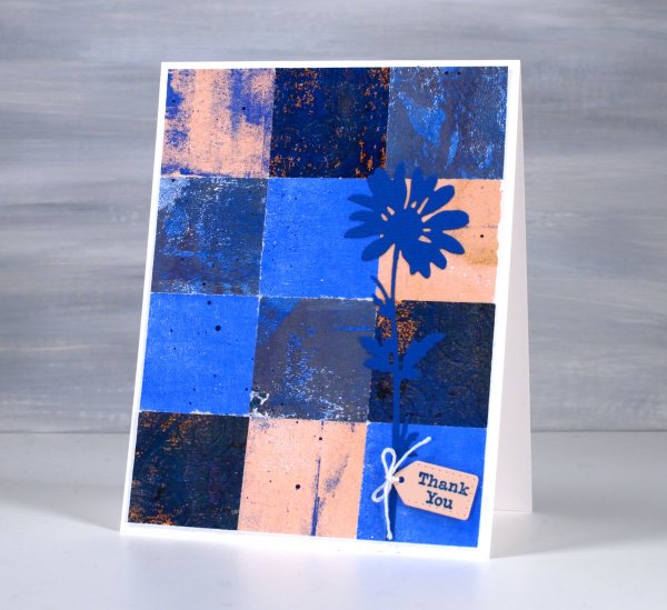
These two collage cards are made from four or five different gel prints. I punched the squares with a 1 3/8″ punch then fiddled around with the layout until I was happy with it. Because I love things to match all the prints had some blue in them and there is some repetition of pink as well.
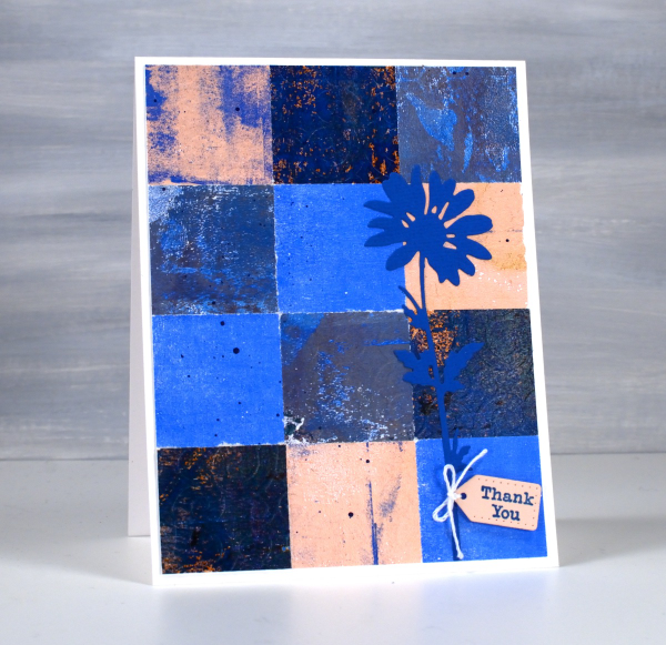
The prints were part of my stash and were not made specifically for these cards so some have patterns and others were probably second or third pulls to clean off a plate. Once I had them arranged to my satisfaction I die-cut Tim Holtz wildflowers and added a tiny Penny Black tag. You’ll see more of this style in the next few weeks as I made them in several different colour combinations. Those of you who know me might have noticed the dark blue splatter on the both cards; I always think a bit of splatter ties thing s together.
Ocean Collage in Art Journal
Posted: May 2, 2024 Filed under: Art Journal, gel press, Handmade book | Tags: Art Journal, collage, gel printing 3 Comments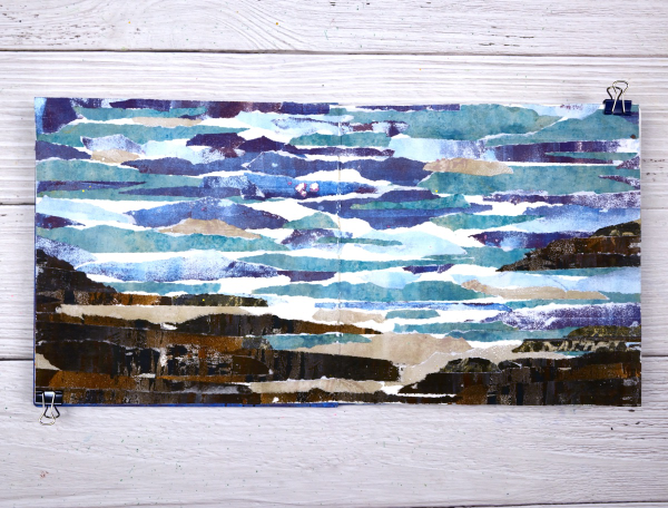
I guess the title gives it away but I hope you can see the ocean, the rocks and the shore in this art journal spread. As with many recent blog posts I used gel prints to create this scene in my 7”x7“ journal.

I created this double page scene after seeing a torn paper landscape a friend had created. I tore strips of paper from several blue prints and brown prints. As I laid them out I realized that the order in which I glued them would affect the end result. I had intentionally ripped the paper to have white edges that looked like the surf.
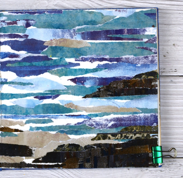
Rather than try and plan the whole design I just started gluing and some how it worked. It is a technique I will try again to see if I can settle on some general instructions.
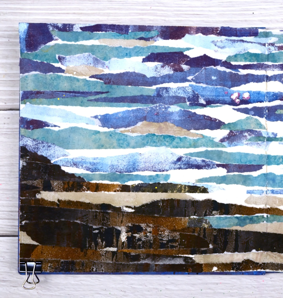
You can see there are some patches of white here and there where I didn’t cover the journal page at all. I felt those patches acted as white caps and surf or sand.

As I sit and write this I can see the ocean out the window and a couple of hours ago I was walking on a beach which looks a bit like these pages. Although the inspiration for this page came out of my memory it seemed like a good day to share an ocean view.
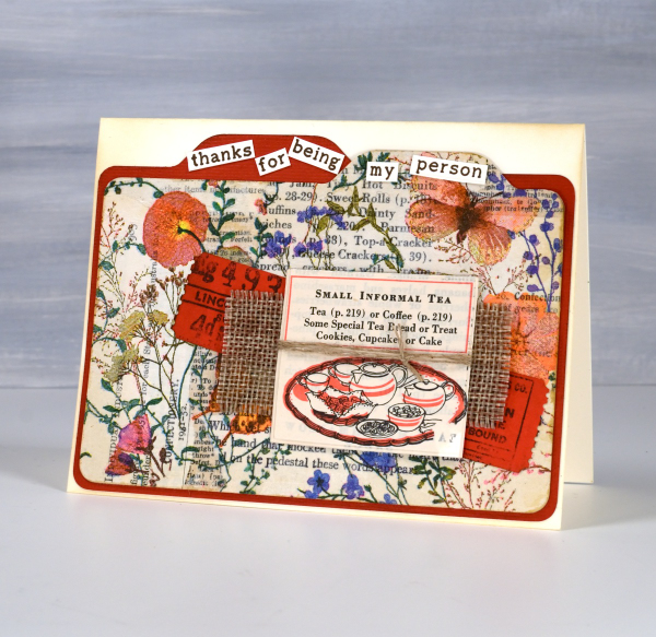
Floral Collage Cards
Posted: April 8, 2024 Filed under: A Pocket Full, Collage cards, Dies, Penny Black, Taylored Expressions, this way | Tags: collage, Darkroom Door stamps, Penny Black creative dies, Penny Black stamps, Taylored Expressions 2 Comments
The collage and ephemera cards just keep coming. Today’s cards feature old book page collage overlaid with one layer of a floral napkin. I have a few collaged ‘mini masterboards’ made so I can cut elements or backgrounds out when I need them. For the card above I picked the rusty orange from the napkin to be the accent colour.
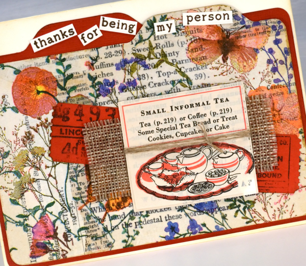
I recently bought a notch punch so I can create file dividers of any size; in the card above I made the blank orange one a little larger to show behind the floral & collage one. I added tickets stamped and die-cut, a scrap of hessian and a cut out from an old Betty Crocker ‘Good and Easy Cook Book‘!
On the second card I used an aged book page as the background and added the paper napkin layer to the mini notebook page with some mulberry paper for framing and contrast. The little green postage stamp is real and the vintage label is stamped.
For the recent collage cards I have pulled out some supplies that I’d almost forgotten, the pretty label border stamps, the mulberry paper and the ‘office’ type dies from Penny Black are in the current rotation.
The file dividers on the card below remind me of a recipe card box which is why it ended up with the little recipe book snippet on it. The sentiment is from Taylored Expressions ‘Simple Strips – Thanks’ but I chopped it up to add to the file tabs.
This post includes affiliate links from Foiled Fox and Scrap’n’Stamp . If you buy through these links I receive a small commission at no extra cost to you.
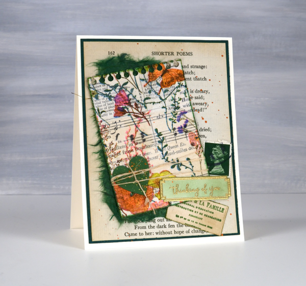
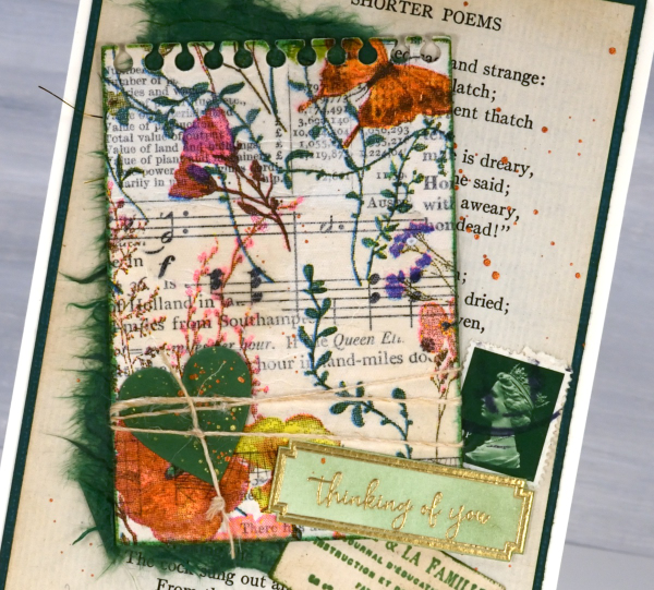
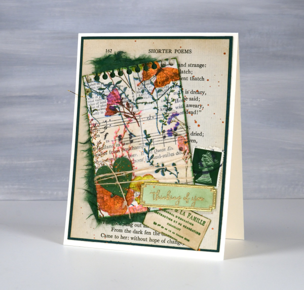
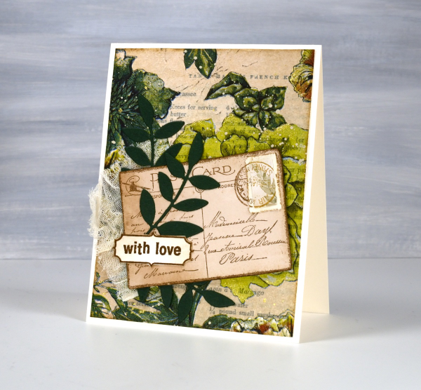
Greenery Collage Cards
Posted: April 3, 2024 Filed under: Collage cards, Darkroom Door, Dies, Finetec paints, gift card pocket, global postmarks, Leaves, measuring tape, Mixed Media, paris postcard, Penny Black, Tim Holtz, wild flowers #1 | Tags: collage, Darkroom Door stamps, Finetec artist mica watercolour paint, Mixed Media, Penny Black creative dies, Penny Black stamps, Tim Holtz 6 Comments
Continuing with the collage theme I have three cards featuring greenery from a paper napkin. I know people have been creating with paper napkins for years but I am new to the game. I have a small collection of pretty paper napkins to use on cards, book covers and journal pages. The green ones featured here are large dinner napkins found at Winners, probably in that tempting ‘just before the checkout’ area!

I glued the printed layer of the napkin over book pages to make my main panels and aged the edges with green and brown inks. I created a couple of little vintage postcards with the Paris postcard stamp, a background with the Measuring Tape stamp, sentiments and postmarks all from Darkroom Door.
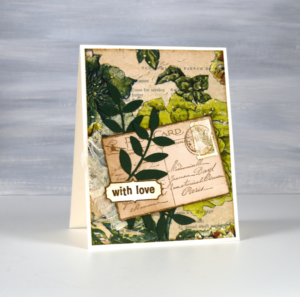
Once again I used some cute dies from Penny Black to cut tickets, file divider, tag and leaves adding blending around the edges for the vintage look.
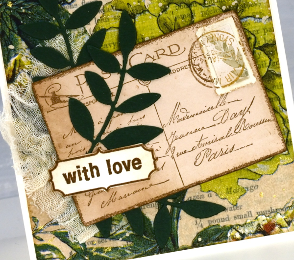
The scrap of cheesecloth, the lace and the grosgrain ribbon were all found around here, maybe the ribbon is actually vintage; it looks a bit discoloured from age which meant it co-ordinated well.

The lovely Queen Anne’s lace die is from the Tim Holtz ‘wildflowers #1 set.
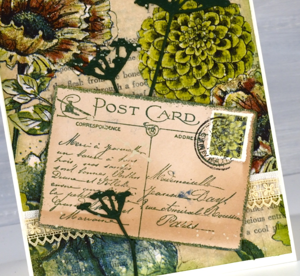
I did make my own little postage stamps for the postcards because I’m still in love with faux postage. These ones had to be quite small so I didn’t use a die I just punched tiny holes with a needle to perforate the edges. You can see a bit of splatter here and there with ivory paint and there are touches of gold watercolour paint on the petals of a few flowers too!
This post includes affiliate links from Foiled Fox and Scrap’n’Stamp . If you buy through these links I receive a small commission at no extra cost to you.
Stripes and strips
Posted: November 14, 2023 Filed under: Christmas background, Dies, Hand drawn, Hand lettered, My Favorite Things, Penny Black, starry night | Tags: collage, My Favorite Things, Penny Black creative dies 8 Comments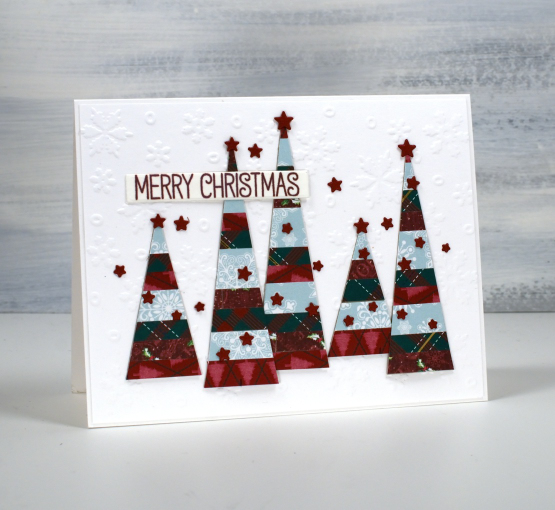
If you have scraps of patterned or solid coloured paper today’s post is for you. I made a panel of striped cardstock by cutting thin strips of patterned paper and gluing them to a piece of light cardstock. From my homemade ‘striped cardstock’ I cut a hand drawn tree, a hand drawn bird and some simple triangle trees. You could use dies for all the elements I was just playing with ideas and decided to sketch and cut myself.
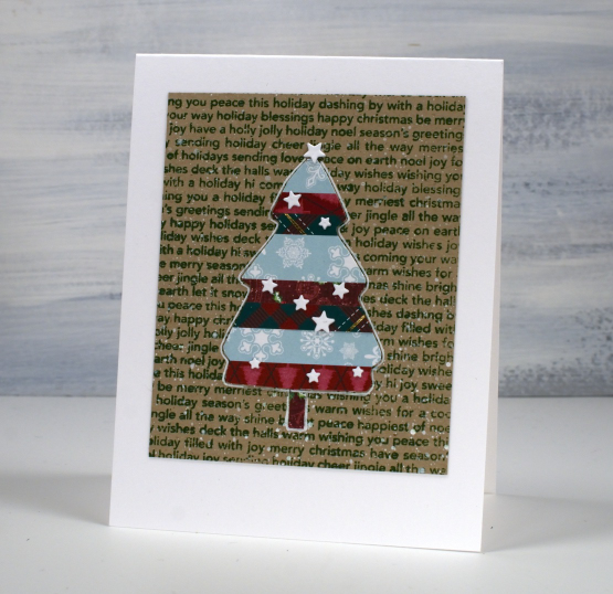
I used an embossed snowflake background for the card at the top of the page, a stamped kraft background for the tree above and then plain kraft for the bird. The little stars that decorate each card I did not hand cut of course! They are cut with the PB ‘starry night die’ and applied with the help of one of those sticky ended tools. Little embellishments have a high fiddliness factor which I don’t appreciate but these tiny stars were necessary!

I added outlines to both the bird and the tree with white or black gel pen along with some dots and a handwritten sentiment.
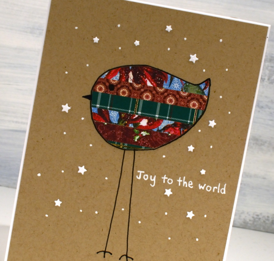
Cutting my own shapes was fun and put some of the many paper scraps to good use!
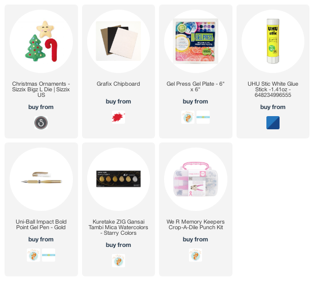
Chipboard Decorations
Posted: December 9, 2022 Filed under: chipboard, christmas ornaments, gel press, grafix, Sizzix, Tutorial | Tags: collage, gel press, gel printing, grafix, Tutorial 3 Comments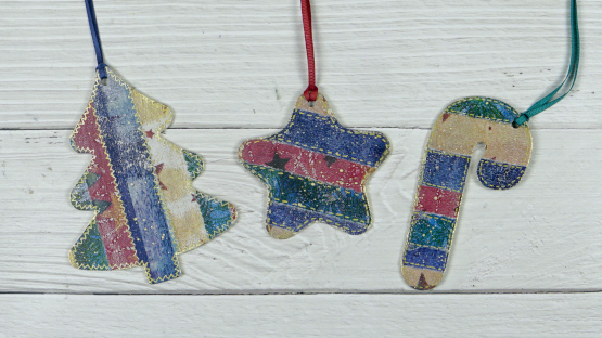
I have been creating collage panels with my many gel prints lately, most for Christmas cards. The striped and patchworked collages looked so pretty I decided to try the process on Grafix chipboard.
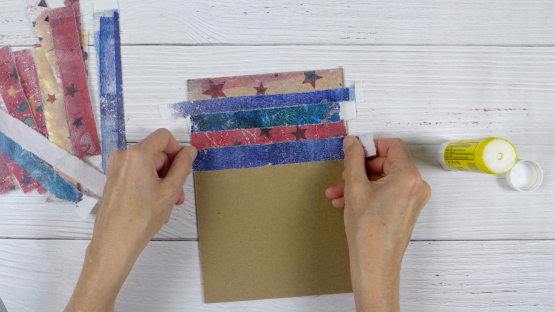
I collaged on both sides and love the way they turned out. I made a video of the process then made more chipboard decorations in different colours.
I used a serious chipboard cutting die to cut the ornaments. It is from Sizzix and I was pleased to see how clean the cuts were. If you have a digital cutting machine you would be able to cut the chipboard into any number of shapes.
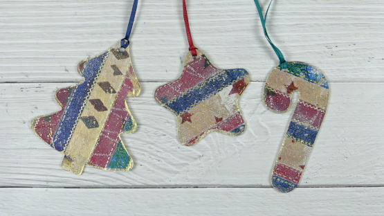
After cutting out the shapes I used a gold gel pen to add stitching lines and gold paint to coat the edges. A crop-a-dile made quick work of punching holes so I could add ribbon to the shapes.
(Compensated affiliate links from Foiled Fox, Scrap n Stamp)