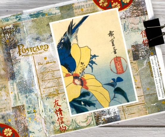
Collage behind Hibiscus and Bluebird
Posted: September 8, 2022 Filed under: Art Journal, Darkroom Door, Gazette, Penny Black, vintage postcard | Tags: Art Journal, collage, Darkroom Door stamps, Penny Black stamps 4 Comments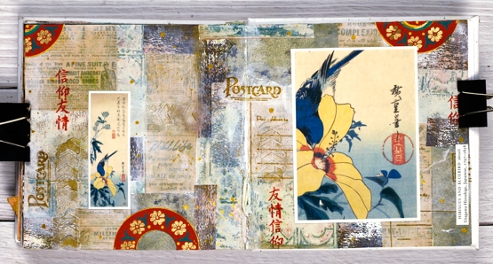
One of my favourite techniques when art journaling is to create a collage background from gel prints, patterned papers, stamping, stencilled texture and paint. Sometimes I know what focal elements I will add over the top, other times I wait to be inspired by the completed collage.
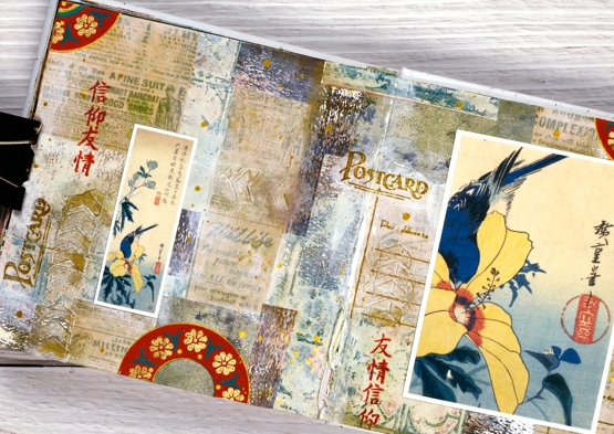
When creating this collage spread in the 6″x 6″ art journal I used gel prints and patterned papers in neutral tones: pale green, beige and browns. I did some stamping with Darkroom Door and Penny Black stamps on kraft paper and over the top of the collage. The focal point is an image from the front of a greeting card. As is sometimes the case, the back of the card featured a smaller version of the same art. I used both on my pages along with some handmade printed paper from a friend. I was very happy with the way the colours worked together and was happy to save and use a card sent by a dear friend. ( I cut the artist’s name from the card and added it to my page.)
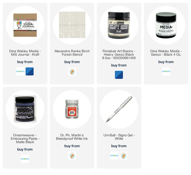
Supplies
(Compensated affiliate links used when purchasing from Foiled Fox, Scrap n Stamp and Ecstasy Crafts)
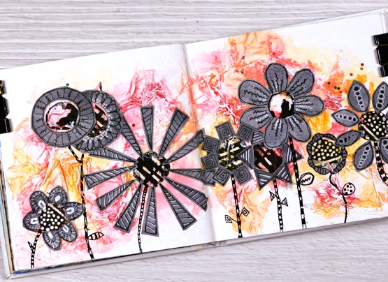
The Wheels are Always Turning
Posted: August 25, 2022 Filed under: 6"x 6" journal, Art Journal, Ciao Bella, clockwork stencil, mechanical dies | Tags: Art Journal, Ciao Bella, Mixed Media, Tim Holtz 3 Comments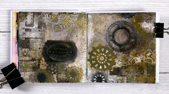
Not a leaf, tree or flower in sight on this journal page but it was made my me, just in case you are wondering. The day I created this page I claimed to have come over all Tim Holtzish; you can probably see the connection.
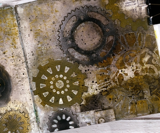
I began with a few strips of Ciao Bella rice paper glued to the left and right edges of the the journal pages. Over the rice paper I added texture paste through the Tim Holtz ‘clockwork’ stencil then filled the rest of the background with brown and black distress inks and sprays.
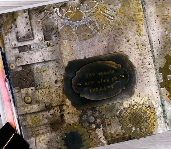
I cut a stack of gears from black and olive cardstock then arranged them both flat and stacked across the pages. The stars of this double page spread for me were the Finnabair metallic waxes. I applied them over the gear die-cuts and the stencilled clockfaces creating metallic edges and highlights. Adding old silver wax over black cardstock transforms it immediately.
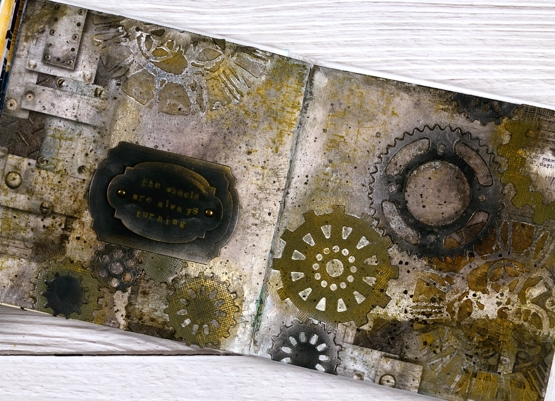
To complete the page I cut a couple of labels from black cardstock and rubbed wax on the edges. I used some little typewriter letters stamps to stamp, ‘the wheels are always turning’. When it comes to art journal pages and creating in general, my wheels are indeed always turning. Hope you have a creative day!
(Compensated affiliate links from Foiled Fox, Scrap n Stamp and Ecstasy Crafts)
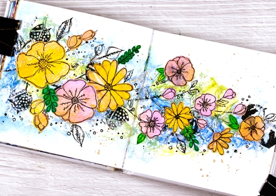
Echinacea Journal Page
Posted: August 11, 2022 Filed under: Art Journal, Finetec paints, gel press, Mixed Media | Tags: Art Journal, collage, Finetec artist mica watercolour paint, gel printing 10 Comments
I have echinacea or cone flowers growing happily in my garden and now happily in my almost finished 6″x 6″ art journal. A friend recently gave me a great big dictionary for cutting up so I ripped out the ‘book’ page and the ‘journal’ page and used them to cover the whole double page spread before I did anything else.

There were a few words I didn’t want covered up so when I was ripping then gluing I took care to keep them exposed. The word ‘boomerang’ appeared so I didn’t cover that one up even though it has nothing to do with this journal page. I am an Aussie after all. ‘Bookish, bookmark, bookshelf, bookworm, book-club and bookend are all visible, some of them highlighted. Somewhere in the gluing I lost the word ‘journal’ but ‘journey’ is still there.
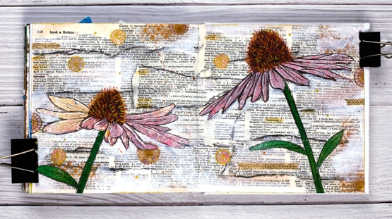
I used a black all pencil to darken the edges of the torn pieces and softened it with water. I also added white gesso over the top to mute the background a bit. I should have done those two steps in the opposite order so the gesso didn’t reactivate the pencil. I blended some tea dye or possibly antique linen ink around the edges and then wished I hadn’t, after all I don’t have to vintagefy everything!
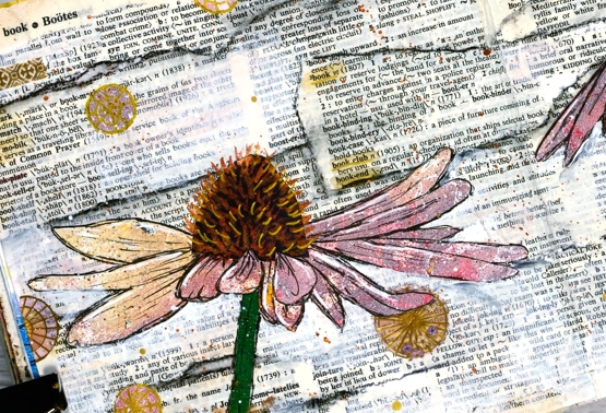
I cut the petals, cone, and green bits from different gel prints using a photo I’d printed out to guide me with the shape. After everything was glued down I used black, white and gold gel pens to add details and metallic paints on the cone details as well. I added white and gold splatter and a mix of washi tape and gel print circles dotted around the the place.
Hope you are surrounded by books and flowers…if you like them as much as I do!
Supplies
(Compensated affiliate links used when purchasing from Foiled Fox, Scrap n Stamp and Ecstasy Crafts)
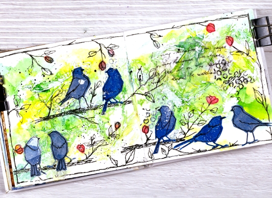
Art Journal variations on a theme
Posted: July 27, 2022 Filed under: Art Journal, Mixed Media, silhouette birds, Tim Holtz | Tags: Art Journal, Mixed Media 7 Comments
The three journals featured in today’s post are getting quite full. One contains only projects completed during my art journal adventure workshops and the other two have a mix of workshop pages and other experiments and explorations. I have enjoyed art journalling for years but in the last twelve months it has captured more of my interest. Possible techniques or layouts continue to pop into my head waiting for a chance to be tried in the newer 6″x 6″ Ranger journals or the 6″x 9″ Fabriano journals I started years ago.
Sometimes I design a page especially with the art journal adventure in mind. Other times I look through the journals and decide to feature a technique, theme or mixed media material. By the time I have tried the page once or twice then completed fresh ones during the workshops I have four or five pages made with the same theme or technique. I am not keen to make the same thing more than once so I am always thinking about different ways to approach each page.
The five spreads featured today started with the one below (featured in more detail in a previous blog post). The technique remained the same for at each workshop, but the shapes, colours and layout varied from one session to the next.
Of course not only are my pages different from each other but every page in the class is unique and I am always inspired by the colour choices, additional elements and different approaches each participant takes. Inspiration abounds. Can you tell I am enjoying myself?
Supplies
(Compensated affiliate links used when possible)
Off to School journal page
Posted: July 15, 2022 Filed under: Alcohol Ink, Darkroom Door, Mixed Media, scratches, tickets | Tags: Art Journal, Darkroom Door stamps, Mixed Media 15 Comments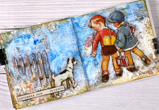
Some of you might recognise the artwork on this journal page. I have saved calendars, magazines, greeting cards and diaries over the years and now that I am creating collages and journal page spreads they are coming into their own. Quite a few years back I saw a calendar featuring covers from Good Housekeeping magazines of the 1920’s and 30’s. I thought the covers were delightful and bought two of the calendars. I enjoyed it during the year then tucked it away for future inspiration.
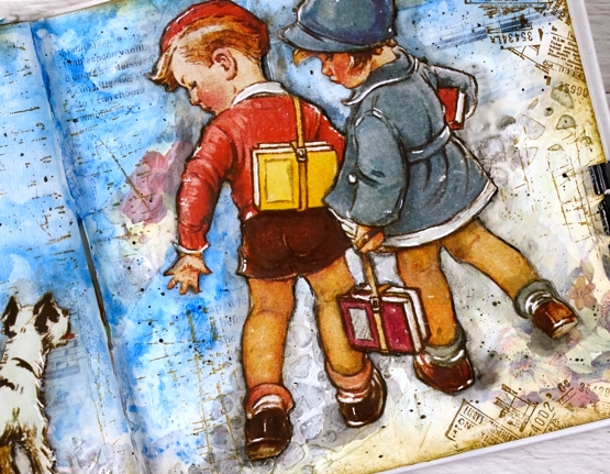
The calendar images are larger than the 6″x 6″ pages in the journals I am currently using so I chose a painting where I could cut out components and create a smaller scene. I cut the two children and the dog and glued them onto a collaged and painted background. I used floral paper mainly around the edges, blue paint for the background. The fence and cobble stone path were created with texture paste through a stencil. I used a few different Darkroom Door stamps to add vintage details across the page.
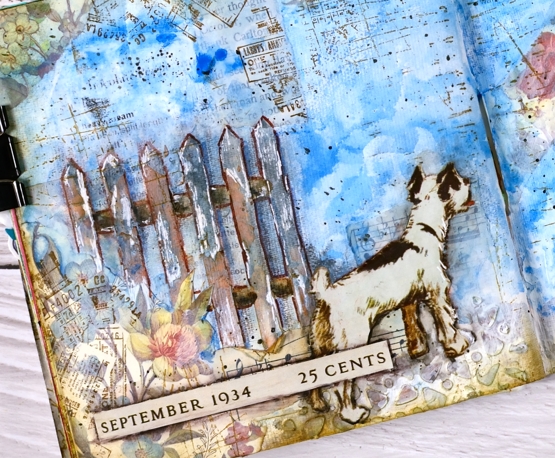
I did have to do more fussy cutting than I usually care to but these sweet images were worth it. Once they were glued down I used a black marker to go round the edges of the cut outs and immediately smudged the ink with my fingers or a damp brush. It’s a technique I have seen Vicky Papaioannou do many times on her journal pages. I used a white gel pen to add highlights, another trick from Vicky.
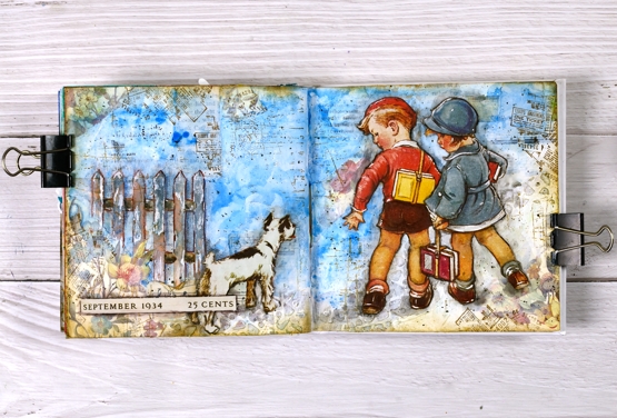
If you want to see what the original artwork by Vernon Thomas, just search good housekeeping magazine with the date I have added to the bottom left corner of my page.
Supplies
(Compensated affiliate links used when possible)
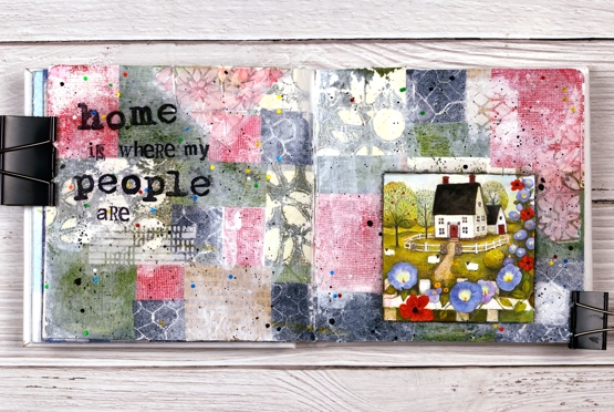
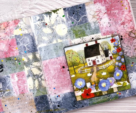
Home is… journal page
Posted: June 17, 2022 Filed under: alphabet medley, Art Journal, Darkroom Door, gel press, polka dot stencil, remington lowercase alphabet | Tags: Art Journal, Darkroom Door stamps, Darkroom Door stencils, gel press, gel printing 5 Comments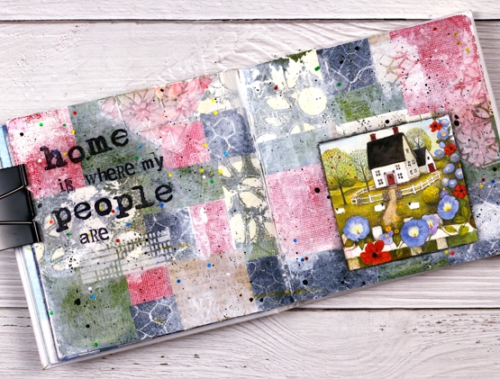
The shenanigans continue in my Art Journal Adventures workshops. Last month the theme was collage & texture and the range of pages was amazing. We all chose different papers, colours and focal images but followed a similar method to put them together.
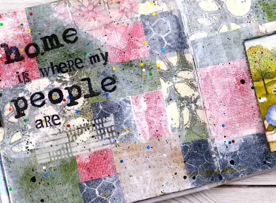
For this spread I relied heavily on my growing collection of gel prints. The little cottage picture is from a greeting card and I used it as a starting point when settling on colours. All the papers you can see are gel prints I made except for one kraft scrap down the bottom with text stamped on it. I added gesso as well as texture using modeling paste through the Ciao Bella patchwork stencil.
During each session of the class it was definitely a treat to walk around and be inspired by the ideas coming to life on all the pages. Some participants had their own stash of gel prints to draw from, others used some of mine. It was fun to see my prints pop up on other people’s pages. I loved it!
This week we are working on Tea and Coffee themed pages and next month it will be texture & movement. If you are close by and haven’t tried gel printing, I’m teaching another introductory class on July 9.
The sweet cottage with sheep at the gate looks nothing like my house! I do grow morning glory but that is about the only similarity. Home is definitely where my people are which means I have two homes very far apart. Although very much at home in Canada I claim Australia as home too, how could I not, some of my favourite people are there!
Supplies
(Compensated affiliate links used when possible)
Coffee art journal page
Posted: June 9, 2022 Filed under: Art Journal, coffee time, Darkroom Door, Mixed Media | Tags: Art Journal, Darkroom Door stamps, Mixed Media, Ranger archival inks 8 Comments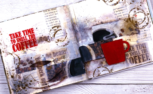
I’ve been having a delightful time in my art journals and in the Art Journal Adventure workshops. We have gone in three different directions so far and the next one is coffee or tea themed. You can see an example of a tea themed page on my classes page and here is my first coffee page.
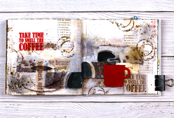
It doesn’t show up in the photo but the red cup is embossed and glossy and I want one just like it in real life! I used distress embossing glaze for both the words and the cup then had to create a visual triangle in red, do you see it?
I am currently not a coffee drinker which actually makes the quote all the more apt for me. I love the aroma! For Christmas I gave my husband a coffee subscription and each month the coffee comes in a cardboard package which smells delightful as does the mailbox !
If you are interested in joining in the art journal adventure please check out my Classes page where you will see the next two sessions or click on the Crop A While classes page.
Supplies
(Compensated affiliate links used when possible)
Remember when we all had library cards?
Posted: April 22, 2022 Filed under: Art Journal, bookshelf, bookworm, Darkroom Door, library books, Mixed Media | Tags: Art Journal, Darkroom Door stamps, Mixed Media, Ranger archival inks 9 Comments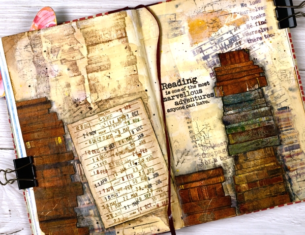
I have always loved the library, perhaps now more than ever. I remember as a child having my own library card at the Civic Library in Canberra as well as library cards at school. Filling a library card with date stamps seemed a worthy achievement and then I would get a fresh new card. If only I had kept those cards for forty years later when I wanted to put one in an art journal! I worked in my 9″x 6″ ‘literary themed journal’ for this one not the 6″x 6″ I’ve been sharing a lot lately.
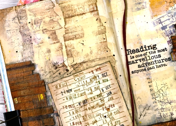
The library card on this journal page I made with a new Darkroom Door stamp, but I’m guessing you already knew that! The new set ‘library books’ includes a library card stamp, two stacks of books, an open book and three quote stamps. What can I say; it’s a delight.

This page was not a delight most of the way through but as I tell the participants in my art journal adventure classes this is often the case. Many pages really do not pull through until the very end. It is an example of a collage page which is what we will be doing in Art Journal Adventure Episode #3. All the dates are listed and linked on my Classes page including a couple of Episode #2 sessions next week.
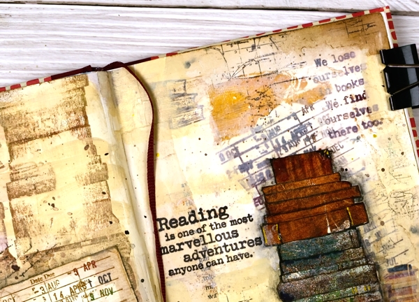
I began this spread by gluing down pieces of old book pages. If you look at the top right corner of the photo above you will see the aged rounded corner of an old page. It has been become one of my favourite collage tricks to stick the book corners over my page corners then cut away the journal page behind to leave that soft round corner. I did it on all four corners of this page. After the old book pages I added stamping, paint and a couple of photos of books from magazines. More paint then more books using stamps from the DD set ‘bookworm’. I had already stamped my library card, distressed it and set it aside.
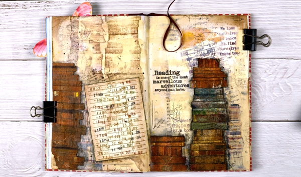
The stacks of very old books I made by stamping the DD ‘bookshelf’ border stamp on some gel prints. I cut them out (fussy) and defined some edges and spine details with markers. Once everything was glued down I added splatter and ink blending and some partial stamping with the DD world map stamp. Last but not least a wonderful quote.
I couldn’t end a post like this without asking for a couple of book recommendations. You have helped me before so please leave a recent favourite in the comments below. A few months back I read the first two books in a trilogy and now I am very keen for the third to be published. They were The Lost Queen and The Forgotten Kingdom by Signe Pike. I also enjoyed The Salt Path by Raynor Winn and have The Wild Silence, her second book, waiting for me at the library. I’m in the middle of Roots & Sky by Christie Purifoy which introduced me to her story telling podcast. That’s enough from me; I want to hear from you.
Supplies
(Compensated affiliate links used when possible)
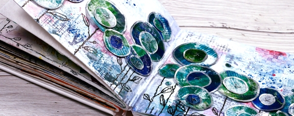
Circle Flowers journal page
Posted: March 25, 2022 Filed under: abstract flowers, alphabet medley, Art Journal, checkered, Classes, Darkroom Door, gel press, Hand drawn, mesh, Stencils | Tags: Art Journal, Classes, Darkroom Door stamps, Darkroom Door stencils, gel press, gel printing, Mixed Media, Penny Black creative dies 8 Comments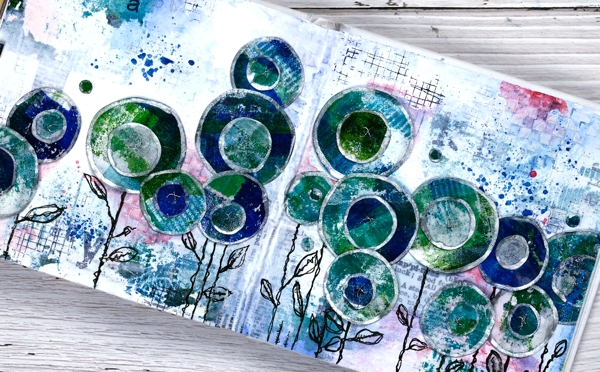
Last week I spent several happy hours gel printing. One of the prints I completed has ended all over this art journal spread. If you are a gel printer you know you can sometimes pull a couple of prints of the same design. The first one is full of colour and pattern and the second is often called a ghost print as it displays outlines and left over bits of paint.

For this journal page I used both the bold blue and green print and the ghost print. The ghost print can be seen on the top left and bottom right corners and is peeping out in a couple of other places. The first print which was very geometrical has been turned into circle flowers. It also had traces of a new stencil called ‘pods’. You will see more of it here on the blog because it is fabulous!
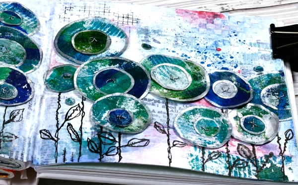
Also in the background you might see some black ink stamping (DD mesh and alphabet medley) and the texture of paste through the DD ‘checkered stencil. The text you see is a fabric tape with dictionary definitions of happiness; it is the first 49 & Market product I have bought and it is going to be handy!
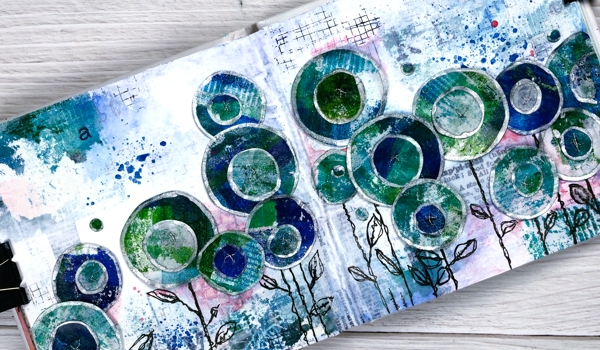
There is plenty of white gesso over the background to pull it together and mute some of the bold elements.
The flowers are all cut with Penny Black ‘abstract flowers’ dies which basically cut slightly wonky circles so I could have cut them myself but why bother when the machine will do it. The print was on rice paper so I could cut a few layers at once. After drawing an edge on each circle with a silver paint pen I stuck a small circle on a larger one, then sewed a cross in the centre with silver thread. There are stems in the set of dies but I doodled mine with a black marker. The blue splatters and pops of pink are from inktense pencils which are coming in handy for art journalling.
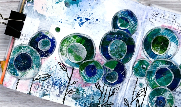
I know that was a lot of photos and chit chat but that is the way with some art journal pages especially the collage ones which involve different papers, paints, stencils, and mediums. I probably haven’t mentioned everything I used but if you are still here now I’m sure you’ve heard enough!
If you are in Ottawa and feel like doing a little art journalling of your own, there are still spaces left in my next Art Journal Adventure workshop where we will be creating a watercolour green and leafy spread similar to what you see below. All the details are on the Crop A While website.
Supplies
(Compensated affiliate links used when possible)
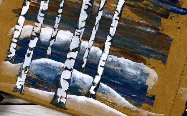
Birches on Kraft
Posted: March 9, 2022 Filed under: Alexandra Renke, Art Journal | Tags: Alexandra Renke, Art Journal 10 Comments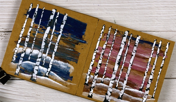
These two pages began as ‘clean up’ pages after completing pages in another art journal. I had some pink and brown paints left over and also some blue with brown. I used an old key card to lift the excess paint and swiped it onto the pages in my 6×6 kraft journal.
I didn’t have a plan straight away but a few weeks later I pulled out an Alexandra Renke stencil which I’d never used and decided to do a couple of simple landscape pages.
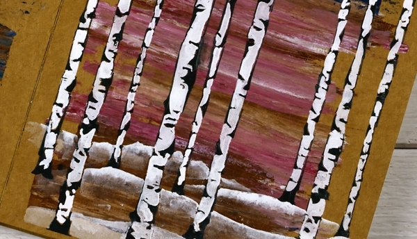
The stencil exposes only the edges of the birch trees which I wanted to be black so I mixed some black gesso with some black texture paste to make it thicker then spread it through the stencil onto the painted pages. Once it dried I painted the white spaces first with white gesso but it wasn’t opaque enough so I used Dr Ph Martin’s Bleedproof white paint.
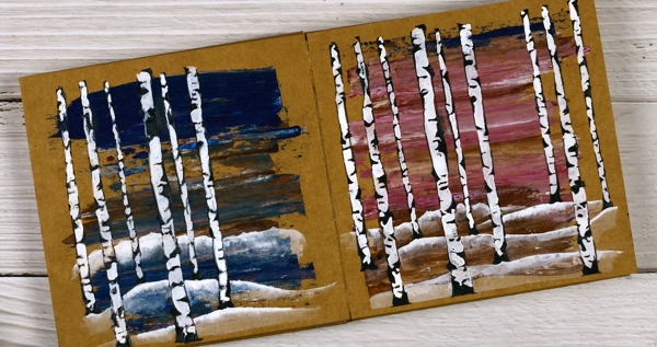
After completing the trees I painted some snow covered hills with the same white paint and diluted them with water to reveal the land underneath. This is the opposite technique to my usual watercolour technique where I paint the shadows or hills and dilute the tops.
So far I have tried distress sprays, gel pens, acrylic paints and texture paste on the kraft pages. As long as I include some light colours in my designs the brown background words really well. Next experiment? Collage, stamping or maybe coloured pencils.
Supplies
(Compensated affiliate links used when possible)