Snowy saplings
Posted: October 11, 2019 Filed under: saplings | Tags: Penny Black stamps, Ranger Distress inks, Tsukineko Versafine inks 6 Comments
Every year I make some snowy forest scenes, with stamps that are old favourites and with new ones destined to be favourites. These trees are from a new PB set called ‘saplings’ and they are so easy to work with!. I placed my hot pressed watercolour panel in the stamp positioner and placed a hill shaped frisket film mask across the base of the panel where I wanted to preserve white space for the snow. I could probably have used a couple of layers of masking paper as I didn’t end up getting the panel very wet.
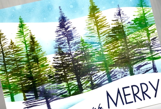
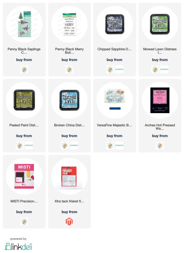
I inked one or two trees at a time with different combinations of the following distress inks: chipped sapphire, broken china, mowed lawn, peeled paint. Before I stamped I lightly spritzed the stamp so the colours would blend nicely. I moved the panel a couple of times and moved the stamps so I could get a decent row of trees at different heights. I sponged a bit of broken china ink along the top of the mask to create a shadow behind the snow bank then moved the mask to stamp a tree in front. I then moved the mask twice sponging both times to get another couple of snowy hill shadows to appear behind the trees and a blue sky.
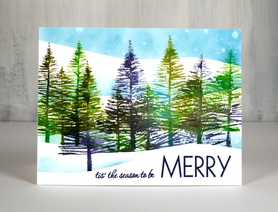
To create the ‘snow’ in the sky I gently splattered and strategically dropped some water on the distress sponging. The distress inks react with water so after the droplets had sat for 30 seconds I dabbed them with a paper towel which left white watermarks. To finish off I linked two stamps from the PB ‘Merry Builder’ and stamped them in majestic blue versafine ink.
Despite the appearance of a snowy scene on the blog today I am happy to report it has been sandals weather this week. Yay!
Supplies
https://linkdeli.com/widget.js?1559654439292
Creamy poinsettias
Posted: October 9, 2019 Filed under: diamond cut, geometrix: rectangle die, Ink to Paper, jolly holly, layered poinsettia, Penny Black, scarlet season | Tags: Ink to Paper, Penny Black creative dies, Penny Black stamps 5 Comments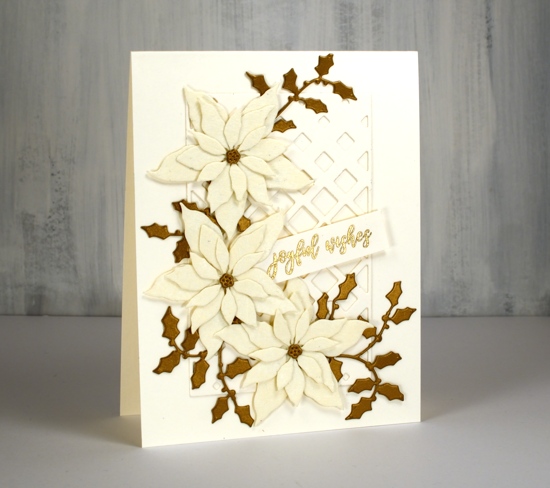
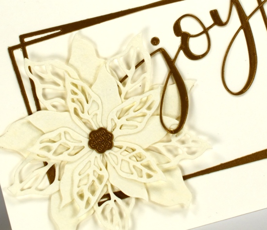
Lately I have been die-cutting poinsettias from all sorts of different cardstock. I have a poinsettia Christmas card class coming up so I’ve been playing around with lacy paper, shimmer paper, kraft paper and watercolour paper with plans to also cut up some pretty plaid paper. These two cards feature a lovely cardstock called ‘Ivory WorldWin twist’ which is a smooth ivory cardstock on one side a lace texture on the other side. I bought it at Crop A While, my local scrapbooking store. The lacy side is almost spiderwebby but in a delicate pretty way not a ‘look what’s behind the filing cabinet’ way.
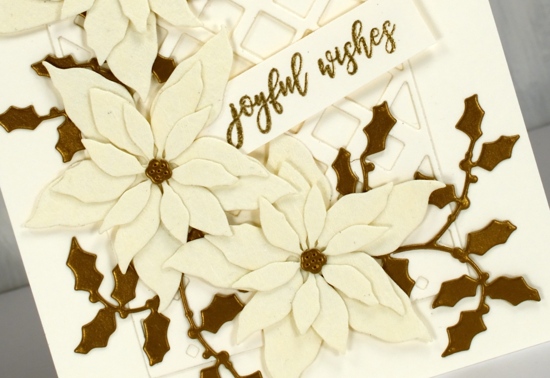
The card bases are neenah cream cardstock, and so is the sentiment strip and the PB ‘diamond cut’ behind the poinsettias. I used the PB ‘layered poinsettia die set’ for this trio of poinsettias; I like the size which makes it possible to fit three on a card front. (two more cards with these dies here and here) The PB jolly holly die cuts are a dark gold cardstock. I didn’t pop anything up on dimensional tape as it was getting pretty dimensional anyway with seven layers! That must be some kind of a record for me. I used glue for the flowers, narrow double sided tape for the diamond frame and stickit adhesive on the back of the holly.
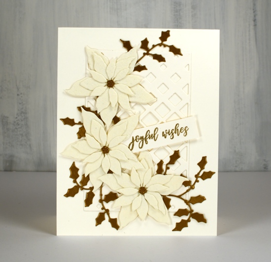
The second card features the same cardstocks but a new PB poinsettia stamp ‘scarlet season’ which has both solid and filigree flowers. I cut them once again from the lacy cardstock and layered them over a funky rectangle die from ‘Ink to Paper’ and added the PB ‘joy’.
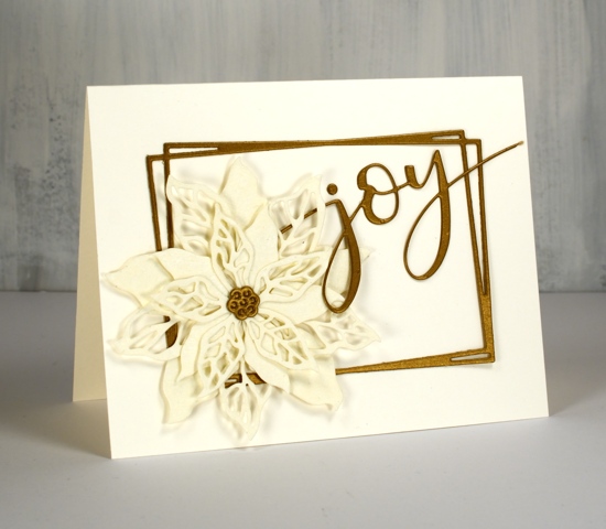
I’m not sure if it is the lacy paper or the colour combo but these cards have a bit of a retro look to them. I think these designs would be pretty with patterned vellum too.
As always the supplies are linked below; I have added a second affiliate with my Canadian readers in mind. The store is Scrap ‘n’ Stamp in BC. If you buy through my affiliate links from either Foiled Fox or Scrap ‘n’ Stamp there is no extra cost to you but I receive a commission. Thanks for dropping by today.
Supplies
Golden Delight
Posted: October 8, 2019 Filed under: Color Burst, golden delight | Tags: color burst, Penny Black creative dies, Penny Black stamps 5 Comments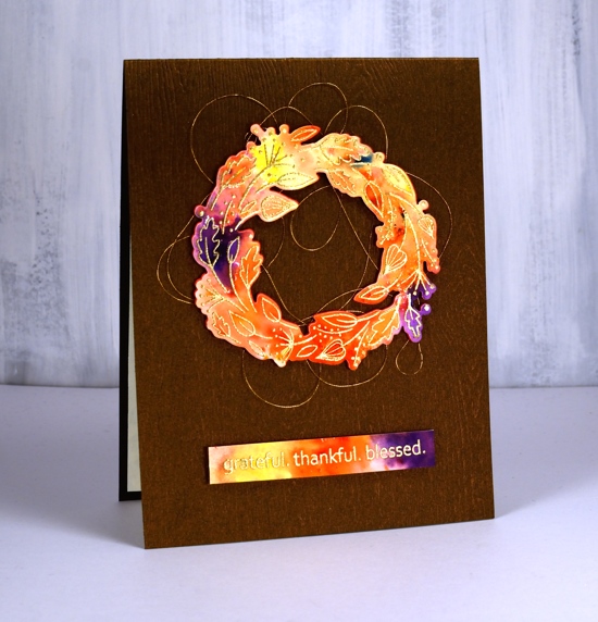
I decided to let the colorburst paint powders do the colouring for me on this cute little wreath from Penny Black. I embossed the wreath in gold on hot pressed watercolour paper and embossed the sentiment at the same time.
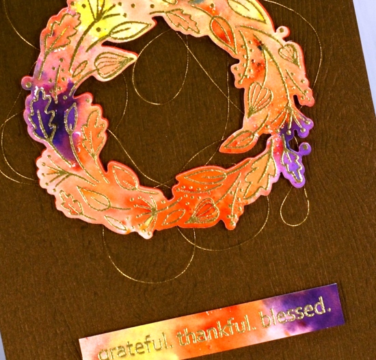
I sprinkled four colours of Ken Oliver’s colorburst powders over the embossing then spritzed with water and watched the colours emerge and spread. I helped them out a little with a paintbrush so paint filled every nook and cranny. Once the panel was dry I die cut the wreath and trimmed the sentiment to the right size then cut a wreath from adhesive backed foam also to pop up the watercoloured one. Before I attached the wreath to the card base I looped some gold embroidery thread back and forth around the wreath letting the adhesive hold it in place.
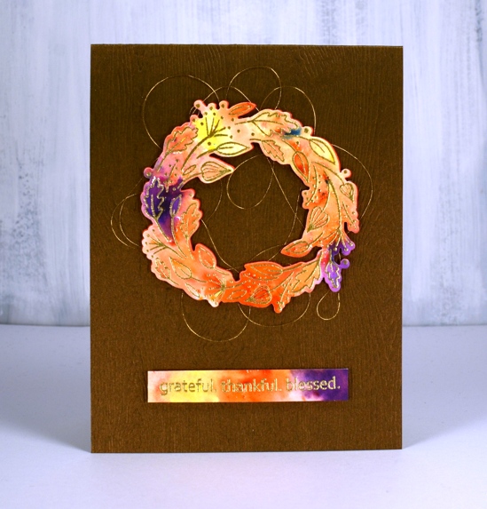
The woodgrained card base not only has texture it also has a little bronze shimmer to it. I bought it from my local scrapbooking store but you could get the same effect with a woodgrain embossing folder.
Feeling grateful, thankful and blessed to be part of this encouraging and inspiring community.
Supplies
I’ve been playing with the alcohol inks again!
Posted: October 2, 2019 Filed under: Alcohol Ink, Penny Black, simple serif alphabet dies, tall flowers | Tags: Concord & 9th, grafix craft plastic, Penny Black creative dies, Penny Black stamps, pinata alcohol ink, Ranger Alcohol Ink, Yupo Paper 11 Comments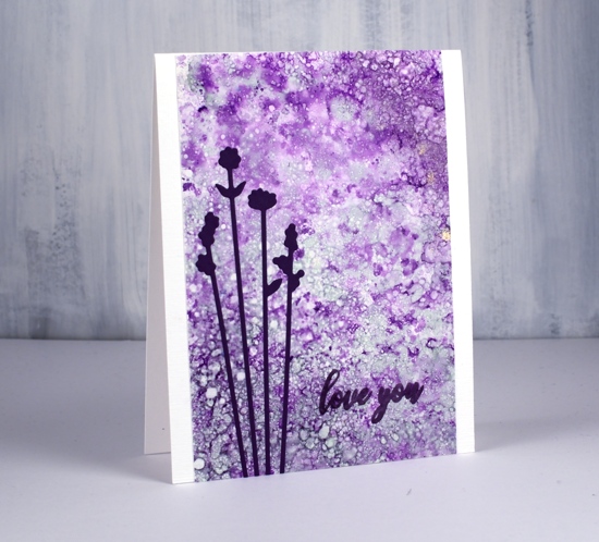
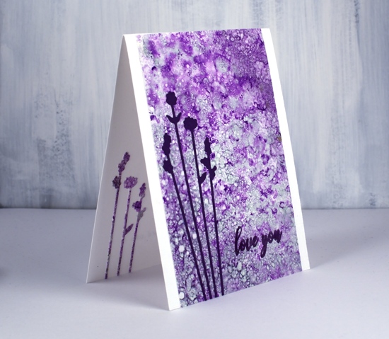
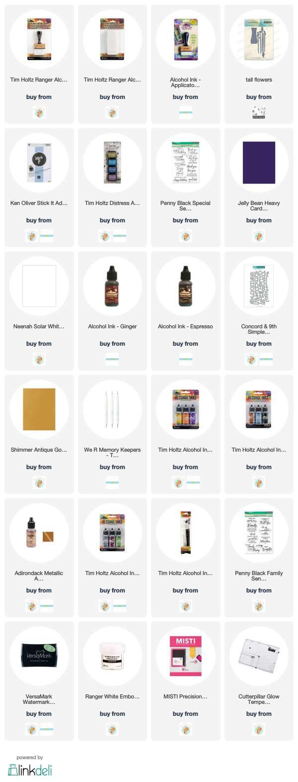
Last weekend I spent Saturday creating with alcohol inks while learning from Kathryn Kanadian who was in Ottawa teaching a couple of classes. Kathryn is a wonderful teacher and I now have a few new tricks to try and techniques to practice. This lavender panel was created with dots of ink on an applicator; I used passion purple, rich gold (Pinata) and juniper (Ranger) along with some blending solution or isopropyl alcohol. I dabbed the applicator all over the craft plastic for quite a while and added blending solution and more ink when needed. The gold ink didn’t move much but the other two colours created a lot of pattern. These delicate flowers which look a little like lavender are cut with PB ‘tall flowers’ dies. The sentiment from the PB ‘special sentiments’ set I stamped with dusty concord archival ink. I had a section of the patterned panel left over so I was able to die cut some more flowers to pop inside the card. You can be sure I put stick-it adhesive on those panels before I cut such skinny flowers out.
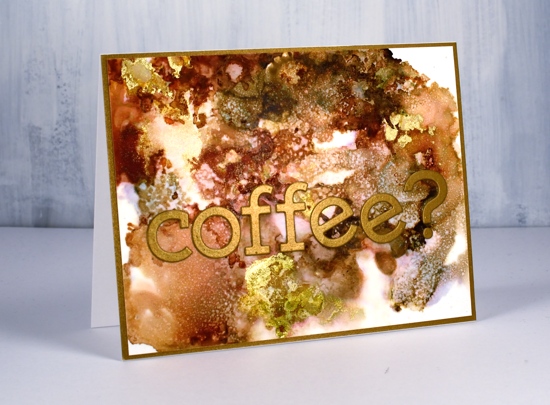
The panel of browns and gold below came together as Kathryn was encouraging us to experiment with blending solution to move the ink. I used more than I usually would and was delighted with all the variation of colour I achieved, the dotted patterns and the splotches of gold here and there. I used ginger, espresso (Ranger) and rich gold (Pinata). Kathryn had samples of her wonderful work including a coffee themed card that inspired this one.
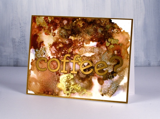
I used the Concord & 9 ‘simple serif’ alphabet dies to cut the letters from antique gold cardstock and framed the panel in antique gold also.
The daisy panel was a bit of a breakthrough for me as I had only made landscapes with alcohol inks by accident or trial and error in the past. With the introduction of a stylus and alcohol ink brushes I was able to paint some daisies and splatter a rain shower over the top of them.
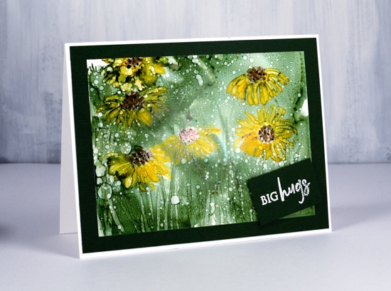
I began by creating a green background with the help of some isopropyl alcohol and green ink (not sure if it was meadow or pesto??) I used a stylus to dot the centres of the flowers in copper and pitch alcohol inks (Ranger) then I used a brush to paint petals around the centres and stems and grass at the base. The splatters of isopropyl alcohol pulled the composition together.
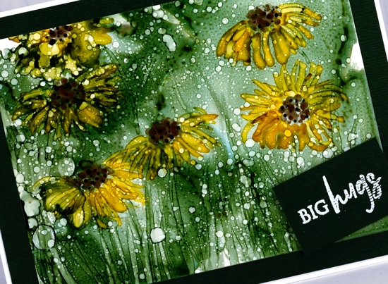
Although it looks black the cardstock framing the panel is actually dark green. I embossed a little sentiment from the PB ‘family sentiments’ set in white powder.
I created a few more panels during the class which hopefully I will turn into cards soon. Thanks Kathryn for a wonderful class.
Supplies
Autumn Bliss
Posted: September 30, 2019 Filed under: autumn bliss, calligraphy, Hand lettered, Penny Black, Watercolour | Tags: calligraphy, Dr Ph Martin Hydrus watercolor paints, Finetec artist mica watercolour paint, Penny Black stamps, Pointed pen 5 Comments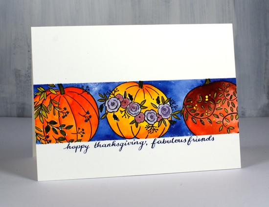
This card is one of those rare ones where the end result is very close to the dreamed up idea.
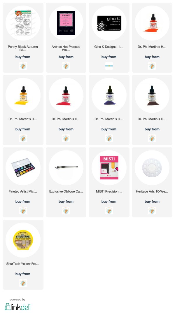
I started by masking a piece of hot pressed watercolour paper with tape. I taped it into the stamp positioner using the grid lines as guides to get it straight and, wonder of wonders, it actually ended up straight. I stamped the pumpkins from the PB ‘autumn bliss’ set in Gina K’s jet black amalgam ink. I bought the amalgam so I could compare it to my current fave black, versafine clair nocturne. The amalgam stamped well and dried quickly but I didn’t find it superior to the versafine clair.
I wanted bold bright colours and wondered which of my watercolour mediums would give me that result. I settled on my Dr Ph Martin’s Hydrus liquid watercolours. They are definitely bold and bright! Of course they can be diluted for a softer look but I was happy to make the most of their vibrancy. Even though I put barely a drop of each colour on my palette I still ended up with more than I needed. I tried to limit my colour scheme by mixing some of my own colours. I started with gamboge and brilliant cad red for the middle pumpkin and painted all but the flowers. I then mixed the gamboge with the brilliant cad red for the left hand pumpkin and again painted all but the leaves. It was very tricky avoiding the leaves especially before I realised that I had my reading glasses on instead of my stronger ‘art glasses’. Sadly my art glasses are becoming my reading glasses so in the new year I am hoping to get some new ‘art glasses’ to help me see and paint all the fiddly bits. The right hand pumpkin is brill cad red and Venetian brown.
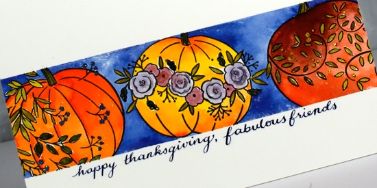
With my art glasses on I painted all the leaves and stalks with a green made by mixing gamboge with ultramarine. The flowers on the middle pumpkin I painted in a diluted deep red rose/ultramarine mix. I added little dots of gold to the right hand pumpkin using finetec pearlescent ink then used a rosy colour from the same set to add shimmer to the flowers. If I did the pumpkins again I think I would paint them one solid colour first with a little shadow and shading then use the pearlescent inks over the top to add all the flowers and leaves. The pearlescent inks are opaque and would not have let the underneath colour show through.
After all the pumpkin decorating, I painted the background with ultramarine. If you have masked with tape before you will know how satisfying it can be to peel back the tape to reveal crisp straight edges and also how frustrating when some paint has seeped underneath. Well, again, wonder of wonders, no seepage! Now, the last wonder of wonders is really the biggest. I occasionally do my own calligraphy sentiments, more often than not it does not end up straight, neat or the right size so I end up cutting the painted panel off and attaching it to a whole new panel in order to get rid of the messed up sentiment. This time I ruled my pencil lines, practiced the sentiment on a scrap, wrote it in pencil on the panel and finally wrote it with pointed pen in a mix of ultramarine and pearlescent ink. The next step was key; I have messed it up in the past. I left the room and went and had my lunch, that way I was not tempted to erase the pencil before the writing was dry, dry dry! I used one of those nifty battery operated erasers to gently erase all the pencil and then did a happy dance!
I hope you don’t think I am overdoing it in my satisfaction with this card, I know it’s nothing out of the ordinary, it’s just that it could have gone wrong in quite a few places but happily it didn’t.
Supplies
Homespun blessing
Posted: September 25, 2019 Filed under: Dies, golden delight, homespun, Penny Black | Tags: Penny Black stamps, Ranger Distress inks 16 Comments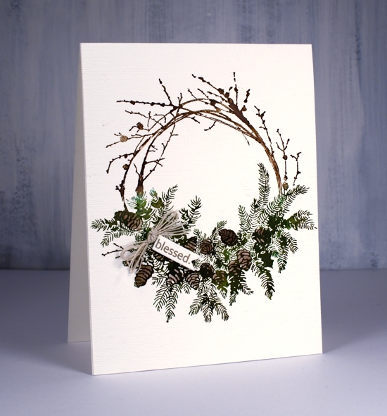
This beautiful wreath is part of the PB ‘Merry & Joy’ release. I know it is perfect for Christmas but I am putting it to use as a thanksgiving wreath first. I inked the wreath with two brown and two green distress inks both in marker and ink pad form. I inked the branch area in vintage photo and ground espresso inks and stamped a couple of times for good coverage on hot pressed watercolour paper. I inked the foliage area in forest moss and lucky clover inks then after stamping once it was easier to see on the stamp where the pine cones were so I could ink the pine cones in ground espresso ink and stamp again.
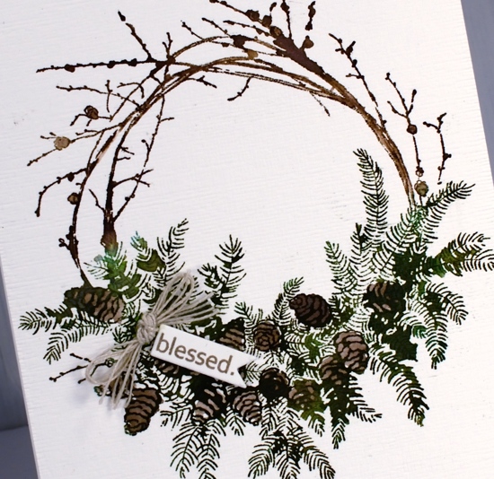
After the stamped image was complete I painted some water onto the stamp and stamped again (I kept the stamp in the MISTI the whole time) The amount of water transferred by the stamp was just enough to fill and darken parts of the image. I also coloured some of the pinecones in with a marker. One word from the PB ‘golden delight’ sentiment fitted on a tiny tag cut with a die from the PB ‘gift card pocket’ set. I rarely make gift card pockets but I use the different tag and label dies from this set often. To complete the wreath I added some hemp twine and popped up the tiny tag.
Supplies

Filigree thank you
Posted: September 18, 2019 Filed under: Filigree Foliage | Tags: Fabriano Watercolour Paper, Penny Black creative dies, Penny Black stamps, Ranger Distress inks 11 Comments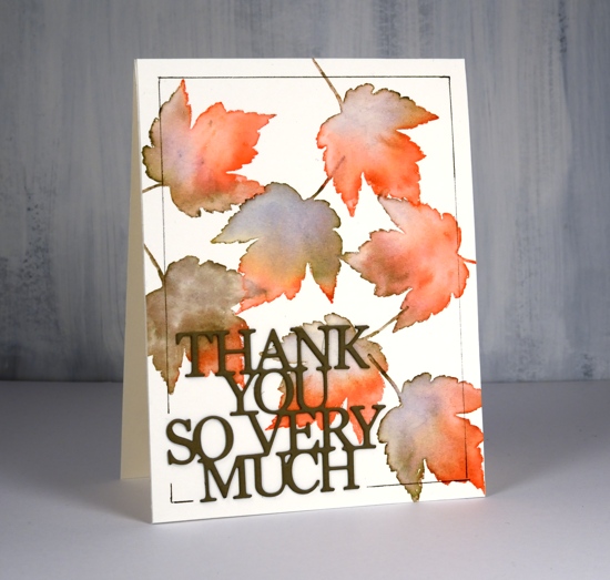
This leaf is from a PB stamp set called ‘filligree foliage. I haven’t used it for a few years but it is perfect for creating some autumn leaves. As the name suggests each leaf has a filigree pattern on it but you can’t see it on this card because I am using the stamp for its shape not its pattern. To see cards I’ve made in the past with this set click over here, here and here
I worked on hot pressed watercolour paper and moved the stamp around each time I stamped it. I used abandoned coral and frayed burlap distress inks, an odd combo, but one which seemed to work and even gave me a some purply blue in a few places. After stamping the leaf I immediately blended the ink with a paintbrush and water until I had filled the entire shape diluting all the stamped ink as I did so.
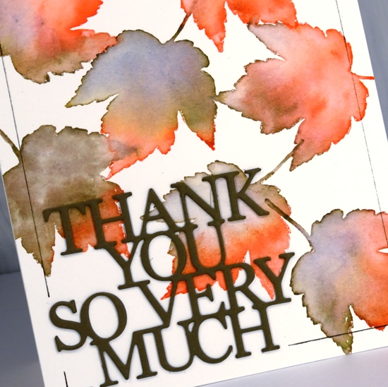
I added a double stacked sentiment die cut from olive green cardstock then ruled a thin brown frame around the edge with the help of the ‘staytion’ magnetic board and ruler. I know the ‘staytion’ was designed with stenciling in mind but it makes lining up die cut words and letters easy as well as ruling lines.
Can you believe I have another card for the current CAS watercolour challenge?
Supplies

Blushing blooms
Posted: September 16, 2019 Filed under: blushing, blushing cut out, Peerless watercolours, Penny Black | Tags: Peerless Transparent Watercolors, Penny Black creative dies, Penny Black stamps 10 Comments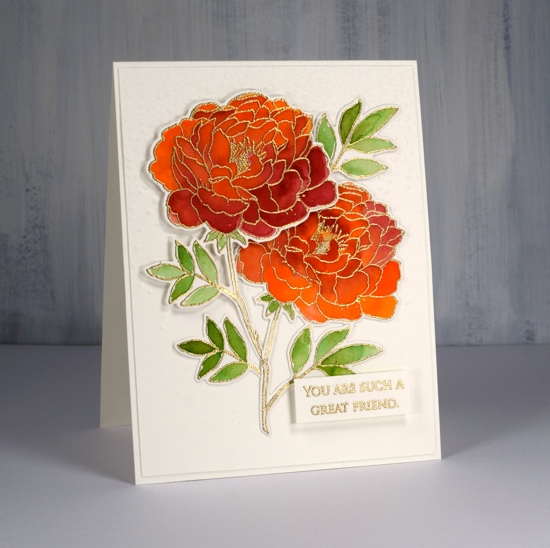
I have coloured this lovely flower a few times lately but I realised I hadn’t posted it all on my blog. I did some no-line colouring with the stamp which took a while due to the number of petals, but still produced a nice result which I’ll share at the end of this post. This weekend I decided to emboss the flower instead and paint it with peerless watercolours. I must say this technique was faster and less fiddly than the no-line petal by petal approach. I embossed two of them and painted them side by side with the same three paint colours. Peerless paint blends beautifully on the paper, in this case hot pressed watercolour paper, and I was able to add royal crimson over the top of flesh tint and vice versa until I was happy with the coverage and blending. The leaves were painted in olive green. I think I’ve mentioned before how much I love the quality, depth and blending of peerless watercolours.
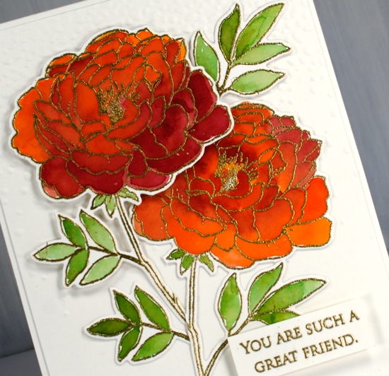
I used the co-ordinating die to cut out both flowers then arranged them on top of a ‘snowfall/speckles’ embossing folder background. I snipped a few of the leaves off and rearranged them to balance the composition. I also glued some pieces directly to the background and popped other pieces up on dimensional foam. The sentiment is from the grateful sentiments set and is embossed and popped up also. Because my orange/pinkish combo is opposite green on the colour wheel this card is a match for the current CAS watercolour challenge, a challenge I love but rarely get my act together to enter!
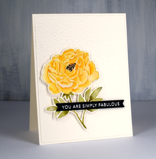
Here is a similar design I completed as part of my no-line watercolour class. I stamped in antique linen distress ink and used a selection of distress inks as ‘paint’. The sentiment is from a clever Taylored Expressions stamp and die combo.
Supplies
Autumn wreaths
Posted: September 13, 2019 Filed under: A Pocket Full, all natural, golden delight, Penny Black | Tags: Penny Black creative dies, Penny Black stamps, Ranger Distress inks, Tsukineko Versafine inks 10 Comments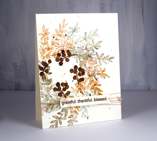
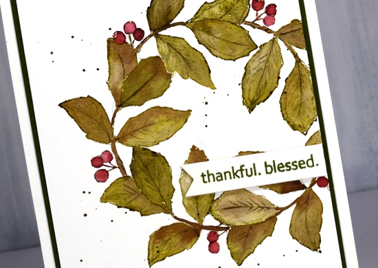
Much as I hate to admit it, things are beginning to feel distinctly autumnal. I don’t have any autumn wreaths to hang at home but if I did I think I would like one a bit like this, soft colours and delicate leaves.
I worked in my stamp positioner to create this panel on hot pressed watercolour paper but I think you could easily do it with the stamp on an acrylic block, it might even be faster. I started by tracing a circle on my panel with a pencil. Using the circle as I guide I positioned the branch stamp from Penny Black’s new ‘All Natural’ set so the base stems were on the circle. I inked with rusty hinge, stamped, moved the stamp around the circle a little, stamped in bundled sage, moved it again, stamped in frayed burlap and then repeated until I was all the way around the circle. I used a small watercolour brush to blend inside the leaves adding extra ink when necessary. I love the combination of colours; frayed burlap is new to my collection and I like the way it gets along with the other two inks. Once the blended ink was dry I stamped just a section of the berry stamp around the centre of the wreath in gathered twigs distress ink then blended it to fill the berries.
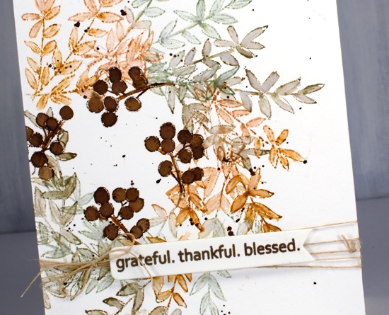
I used the same sentiment for both cards, it’s from another new and cute PB set called ‘golden delight’. I stamped both times on a little tag from the PB ‘a pocket full’ die set. To finish off the card I wrapped some twine around the panel, added a bow and popped the tag on top.
For the second card I grabbed another stamp from all natural and used the same process but needed a leaf mask cut from post-it note a couple of times where the leaves would have stamped over previous ones. This little stamp has both leaves and berries as well as a curved stem which just happened to conveniently match the curve of my traced circle. I used the same technique of blending the leaves and berries after stamping with forest moss and aged mahogany distress inks.
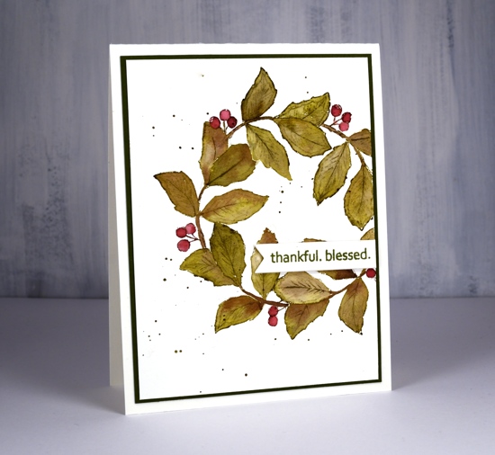
Both cards requested the splatter treatment and the second card wanted a olive green mat as well.
Hope the days are warm and sunny where you are.
Supplies
Wanderlust
Posted: September 3, 2019 Filed under: Penny Black, Stamped Landscapes, wanderlust | Tags: distress oxide inks, Penny Black stamps, Ranger Distress inks, Ranger Distress stains 7 Comments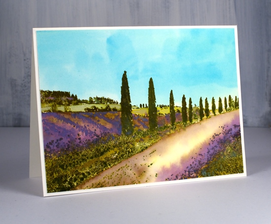
Wanderlust is the perfect name for this stamp; I would love to be walking down that lane in Provence! I have a friend with a house in Provence so I am curious to hear whether if I’ve managed to capture the look. To create this lavender themed panel I started by painting the watercolour paper in pale distress stains. I wet the whole panel then painted the bottom half in mustard seed stain. I was way too heavy handed and the result was bright yellow! I quickly whisked the panel to the sink and rinsed it off which resulted the pale yellow you see in the centre of the road. With the panel still wet I painted the sky area in broken china distress stain. I dried the panel and placed it in a stamp positioner to do all the stamping. There was a certain amount of back and forth with my stamping, blending, over-stamping etc but I will try and give you the gist of it. All the stamping is done with oxide inks on this panel so I would have more of an oil or acrylic painting look (something like this beauty by Maria Bertan). I stamped the trees and roadside grasses in peeled paint and forest moss distress oxide ink, wiping off the tips of the grasses on the right hand corner so I could ink with dusty concord oxide ink.
As I built up colour on the trees it was sometimes easiest to ink a large area with the oxide ink then wipe ink off the stamp where I didn’t want that colour. I also pressed the oxide ink pads down on my glass mat so I could pick up colour with a paint brush and apply it to the panel that way. As oxide inks are part dye ink and part pigment I was able to clear emboss over the stamping part way through the process to ‘lock’ in the colour on the foreground trees, grass and background trees. The ‘lavender field’ area is blank when stamped so I painted the rows of lavender with dusty concord and some spots of peeled paint oxide ink, the far fields in crushed olive and the road edges in diluted vintage photo. I loved the pops of purple so much I brought them into my second version also but not in the same way.
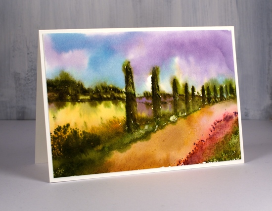
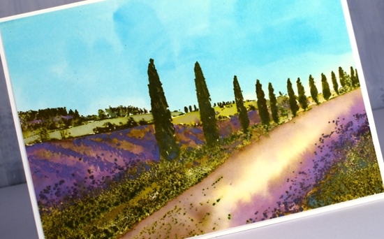
The second card is a looser watercolour look done with no oxides just the original distress inks and markers. I stamped the trees and grasses with forest moss, peeled paint and candied apple (roadside poppies). I was able to get some variety on the trees and grass by blending with a paint brush and re-stamping over the top.
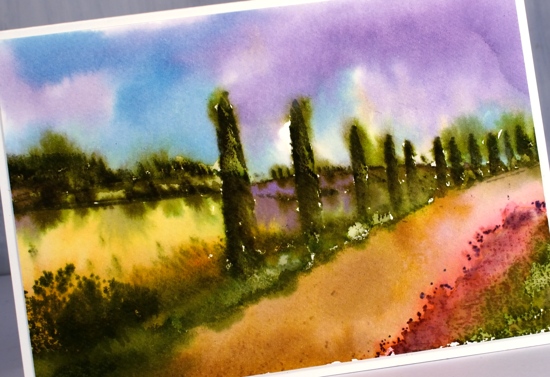
The adjacent field is painted in wild honey distress ink then there is a dusty concord field further back. To get the blended effect I also spritzed my stamp not the panel so water was transferred from the stamp to the paper in certain areas not over the whole scene. While the inks were still damp I painted a tumbled glass and dusty concord sky around the tree tops and down to the hill edges. Some of the green ink bled into the sky but not too much. Finally I painted the road with vintage photo distress ink.
Have you been to Provence? Does it look a bit like this? Or, like me, do you want to go there now?