Peaceful forest
Posted: October 16, 2019 Filed under: Ink to Paper, Peaceful Forest dies | Tags: Ink to Paper, Ranger Distress inks 4 Comments
Before I begin to chatter on about today’s card I want to thank all of you who left a comment under my Thanksgiving post. It was so lovely to hear from you; I really enjoyed your messages.

As I mentioned the other day every year I create new snowy forest scenes, often then include starry skies or the northern lights. This first card features a very easy way to make a ‘northern lights’ background for die cut trees, houses, reindeer, etc.
I picked three distress inks, the originals not the oxides but you could use the oxides for a slightly different look. I rubbed a cracked pistachio mini inkpad across a third of the hot pressed watercolour panel, then a blueprint sketch mini across another third (with some overlap) and finally a chipped sapphire mini across the remaining area. The panel looked like it had been roughly shaded with crayons or pencils. I then spritzed the whole panel so the colours would move and blend and used a paintbrush in a couple of places so the coverage was complete. I left the panel to dry leaning against a bottle so the ink drained down in patterns to give the look of the northern lights. The funky trees are cut using ‘peaceful forest’ dies from Ink to Paper. The snow banks I cut from a piece of cardstock with a craft knife in one continuous curvy stroke. I cut my curve with equal amounts of cardstock on each side so I could layer them and have a foreground and background snowy hill.
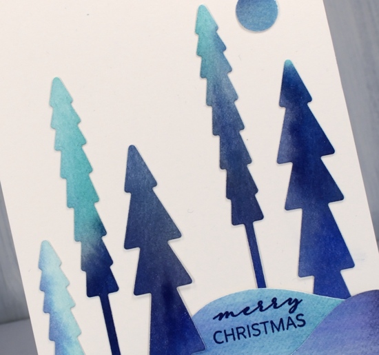
On the second card I began the same way and created my tricolour panel then die cut five trees from it and a little round moon. Once again I cut the hills by hand with a craft knife then layered them before tucking in the little trees all around.

Pretty easy-peasy wouldn’t you say. Just pick a few distress colours that would blend nicely, swipe them across your panel and add water!
The cute little sentiments are also from ‘Ink to Paper’ and there is a stamp set that co-ordinates with the tree dies but you will have to wait for another day to see that.
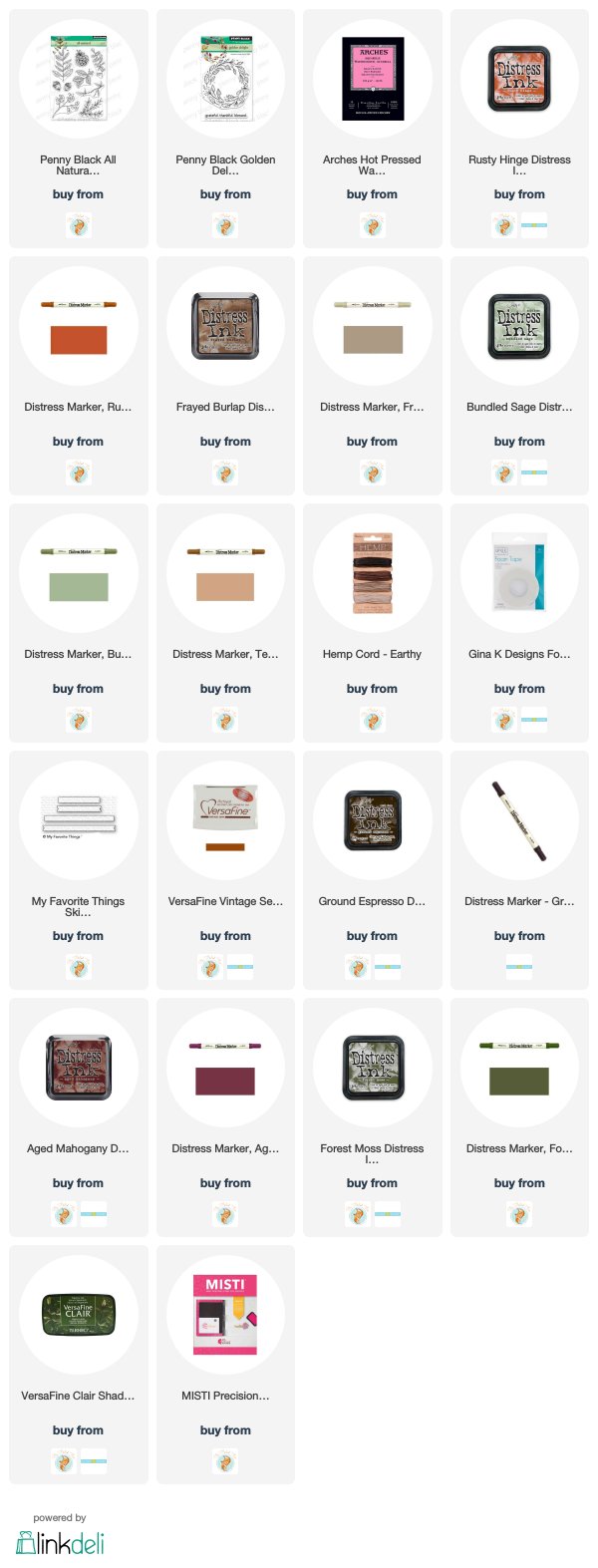
Supplies

Snowy saplings
Posted: October 11, 2019 Filed under: saplings | Tags: Penny Black stamps, Ranger Distress inks, Tsukineko Versafine inks 6 Comments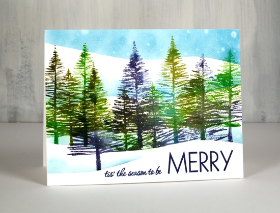
Every year I make some snowy forest scenes, with stamps that are old favourites and with new ones destined to be favourites. These trees are from a new PB set called ‘saplings’ and they are so easy to work with!. I placed my hot pressed watercolour panel in the stamp positioner and placed a hill shaped frisket film mask across the base of the panel where I wanted to preserve white space for the snow. I could probably have used a couple of layers of masking paper as I didn’t end up getting the panel very wet.
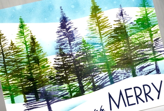
I inked one or two trees at a time with different combinations of the following distress inks: chipped sapphire, broken china, mowed lawn, peeled paint. Before I stamped I lightly spritzed the stamp so the colours would blend nicely. I moved the panel a couple of times and moved the stamps so I could get a decent row of trees at different heights. I sponged a bit of broken china ink along the top of the mask to create a shadow behind the snow bank then moved the mask to stamp a tree in front. I then moved the mask twice sponging both times to get another couple of snowy hill shadows to appear behind the trees and a blue sky.

To create the ‘snow’ in the sky I gently splattered and strategically dropped some water on the distress sponging. The distress inks react with water so after the droplets had sat for 30 seconds I dabbed them with a paper towel which left white watermarks. To finish off I linked two stamps from the PB ‘Merry Builder’ and stamped them in majestic blue versafine ink.
Despite the appearance of a snowy scene on the blog today I am happy to report it has been sandals weather this week. Yay!
Supplies

https://linkdeli.com/widget.js?1559654439292
Autumn songbird
Posted: September 27, 2019 Filed under: grateful for everything, songbird | Tags: Concord & 9th, Ranger Distress inks, Ranger Distress stains 7 Comments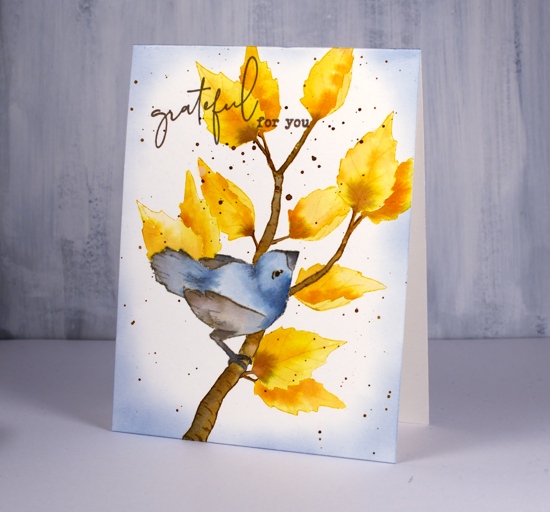
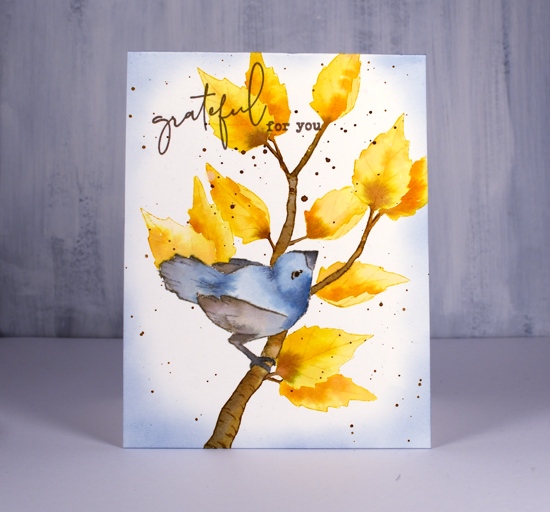
Hi there; it’s a special day! Not only am I hanging out on The Foiled Fox blog today, I also have a video to for you! I first used the Concord & 9th ‘songbird’ set last winter and incorporated the pine boughs, leaves and berries. This time I went for an autumn theme and used distress inks and distress stains as I seem to constantly be doing right now. I may need to mix things up a bit around here.
I have shared a few no-line colouring projects here lately where I stamped with antique linen ink; this project could also be considered no-line colouring but I stamped the outline images in brown, yellow or grey, colours I then used for painting. As the bird and leaves were not too fiddly I cut masks out so I could have leaves peeping out from behind things.
I worked once again with a fairly limited palette of fossilized amber, brushed corduroy, pumice stone, stormy sky and black soot, basically grey, blue and yellow tones.
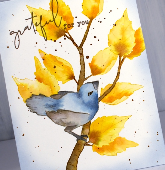
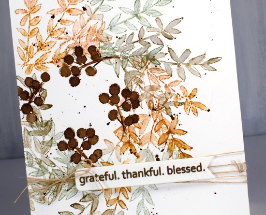
When it came to the sentiment I decided to pull out the C&9 ‘grateful for everything’ set because I love the words and that funky script. I added splatter and some sponging which filled the background a little making it appear lest stark.
I would love to know if you have some favourite ‘all year round’ stamps or sets. Here are a couple more all season options:
PB Nature’s gifts
PB Peaceful Moment
Thank you for joining me today, I’m looking forward to returning in October for some more fun with the Foiled Fox.
Supplies
Homespun blessing
Posted: September 25, 2019 Filed under: Dies, golden delight, homespun, Penny Black | Tags: Penny Black stamps, Ranger Distress inks 16 Comments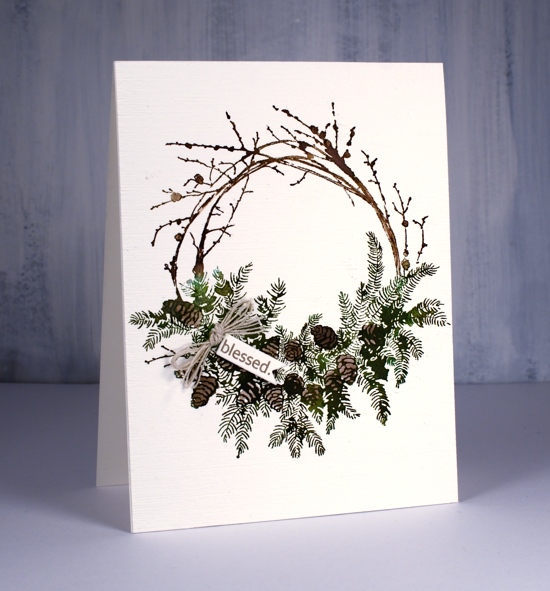
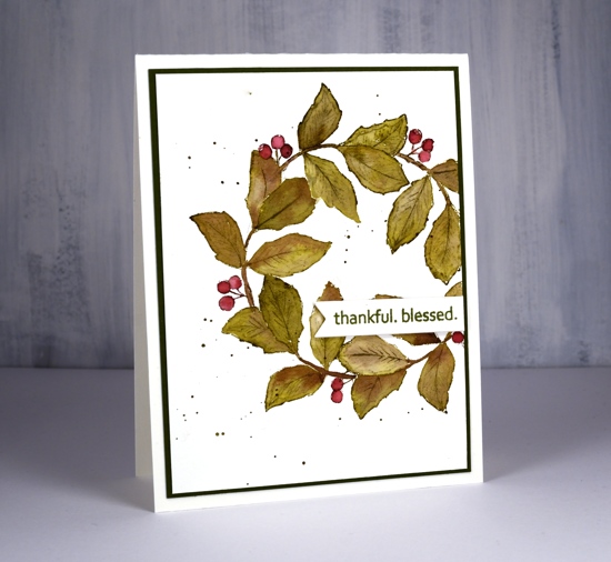
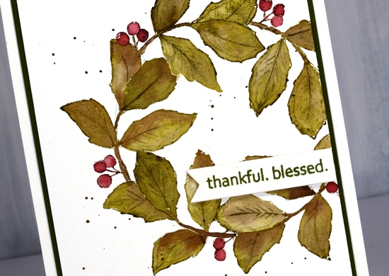
This beautiful wreath is part of the PB ‘Merry & Joy’ release. I know it is perfect for Christmas but I am putting it to use as a thanksgiving wreath first. I inked the wreath with two brown and two green distress inks both in marker and ink pad form. I inked the branch area in vintage photo and ground espresso inks and stamped a couple of times for good coverage on hot pressed watercolour paper. I inked the foliage area in forest moss and lucky clover inks then after stamping once it was easier to see on the stamp where the pine cones were so I could ink the pine cones in ground espresso ink and stamp again.
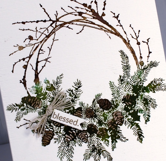
After the stamped image was complete I painted some water onto the stamp and stamped again (I kept the stamp in the MISTI the whole time) The amount of water transferred by the stamp was just enough to fill and darken parts of the image. I also coloured some of the pinecones in with a marker. One word from the PB ‘golden delight’ sentiment fitted on a tiny tag cut with a die from the PB ‘gift card pocket’ set. I rarely make gift card pockets but I use the different tag and label dies from this set often. To complete the wreath I added some hemp twine and popped up the tiny tag.
Supplies

Filigree thank you
Posted: September 18, 2019 Filed under: Filigree Foliage | Tags: Fabriano Watercolour Paper, Penny Black creative dies, Penny Black stamps, Ranger Distress inks 11 Comments
This leaf is from a PB stamp set called ‘filligree foliage. I haven’t used it for a few years but it is perfect for creating some autumn leaves. As the name suggests each leaf has a filigree pattern on it but you can’t see it on this card because I am using the stamp for its shape not its pattern. To see cards I’ve made in the past with this set click over here, here and here
I worked on hot pressed watercolour paper and moved the stamp around each time I stamped it. I used abandoned coral and frayed burlap distress inks, an odd combo, but one which seemed to work and even gave me a some purply blue in a few places. After stamping the leaf I immediately blended the ink with a paintbrush and water until I had filled the entire shape diluting all the stamped ink as I did so.
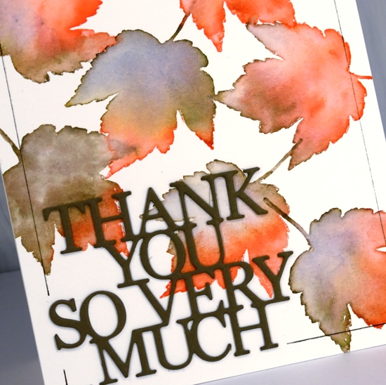
I added a double stacked sentiment die cut from olive green cardstock then ruled a thin brown frame around the edge with the help of the ‘staytion’ magnetic board and ruler. I know the ‘staytion’ was designed with stenciling in mind but it makes lining up die cut words and letters easy as well as ruling lines.
Can you believe I have another card for the current CAS watercolour challenge?
Supplies

Autumn wreaths
Posted: September 13, 2019 Filed under: A Pocket Full, all natural, golden delight, Penny Black | Tags: Penny Black creative dies, Penny Black stamps, Ranger Distress inks, Tsukineko Versafine inks 10 Comments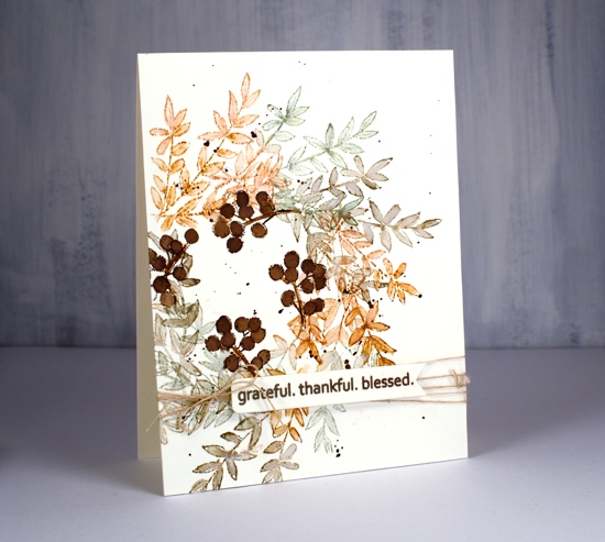
Much as I hate to admit it, things are beginning to feel distinctly autumnal. I don’t have any autumn wreaths to hang at home but if I did I think I would like one a bit like this, soft colours and delicate leaves.
I worked in my stamp positioner to create this panel on hot pressed watercolour paper but I think you could easily do it with the stamp on an acrylic block, it might even be faster. I started by tracing a circle on my panel with a pencil. Using the circle as I guide I positioned the branch stamp from Penny Black’s new ‘All Natural’ set so the base stems were on the circle. I inked with rusty hinge, stamped, moved the stamp around the circle a little, stamped in bundled sage, moved it again, stamped in frayed burlap and then repeated until I was all the way around the circle. I used a small watercolour brush to blend inside the leaves adding extra ink when necessary. I love the combination of colours; frayed burlap is new to my collection and I like the way it gets along with the other two inks. Once the blended ink was dry I stamped just a section of the berry stamp around the centre of the wreath in gathered twigs distress ink then blended it to fill the berries.
I used the same sentiment for both cards, it’s from another new and cute PB set called ‘golden delight’. I stamped both times on a little tag from the PB ‘a pocket full’ die set. To finish off the card I wrapped some twine around the panel, added a bow and popped the tag on top.
For the second card I grabbed another stamp from all natural and used the same process but needed a leaf mask cut from post-it note a couple of times where the leaves would have stamped over previous ones. This little stamp has both leaves and berries as well as a curved stem which just happened to conveniently match the curve of my traced circle. I used the same technique of blending the leaves and berries after stamping with forest moss and aged mahogany distress inks.
Both cards requested the splatter treatment and the second card wanted a olive green mat as well.
Hope the days are warm and sunny where you are.
Supplies
Gerberas
Posted: September 11, 2019 Filed under: Darkroom Door, gerberas, mesh | Tags: Darkroom Door stamps, Kuretake Zig clean color real brush markers, Ranger Distress inks 3 Comments
This pretty bunch of gerberas is one of the newest stamps from Darkroom Door. I would have shown it to you sooner but it arrived from Australia two days after I left to go to Australia! The inspiration for this colour scheme once again came from a simple web search. A photo popped up with pink, red, apricot and orange gerberas massed together. So that’s what I did.
I stamped in black ink and embossed in clear powder on hot pressed watercolour paper then used zig clean color real brush markers for colouring. I started each flower by colouring around the centre with the marker then blended out the colour with a brush and water. I was able to add more with the markers as needed. To give the flowers even more pizaazz I gave them all a layer of clear wink of stella. (the red and pink ones then got a coat of micro glaze because I kept touching them and getting pink and red stains on things that were not meant to be pink or red!) I wanted to mount the flowers on a background but didn’t want it to fight with the focal panel. The DD mesh stamp worked beautifully and reminds me of the decorative mesh that is sometimes wrapped around cut flowers.

I stamped a sentiment from the large DD ‘thank you’ set and threaded some sparkly black thread through the tag and round the panel. A friend gave me a stash of metallic threads recently and they are coming in handy for a little subtle sparkle.
For the second card I went with a more country style look. All the gerberas feature the same fossilized amber, vintage photo and rusty hinge colour scheme with the two brown inks used also to create a background. I stamped the whole gerbera stamp in fossilized amber distress ink first then inked the centres in rusty hinge. I blended each petal with water and did the same with the centres then inked one side of the flower centres in vintage photo to add some dimension.
I tried a woodgrain background but it was too dark. By choosing to stamp the ‘thank you’ sentiment strip several times more of the cream background showed through. I inked the sentiment strip in vintage photo and rusty hinge distress inks and spritzed it lightly before each print. The result was blended and sometimes smudgy words. I gave both the flower panel and the background the splatter treatment then popped the gerberas up on a foam rectangle.
Gerberas are pretty classy flowers I think, they always seem to stand out in a bouquet.
Supplies
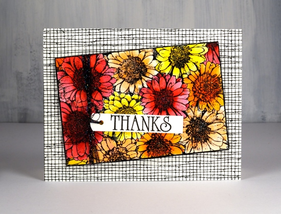
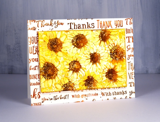
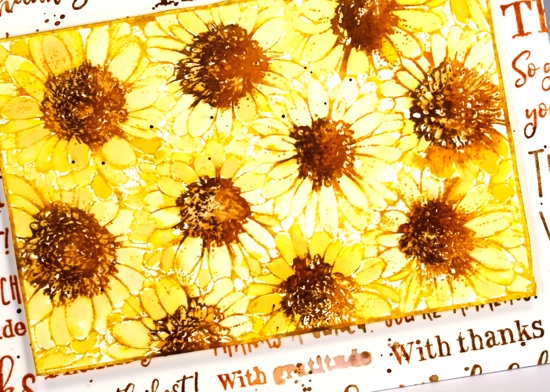
Filling in the florals
Posted: September 6, 2019 Filed under: big thanks, filled in florals, fine line florals, simple serif alphabet, simple serif alphabet dies | Tags: Concord & 9th, Ranger Distress inks 3 Comments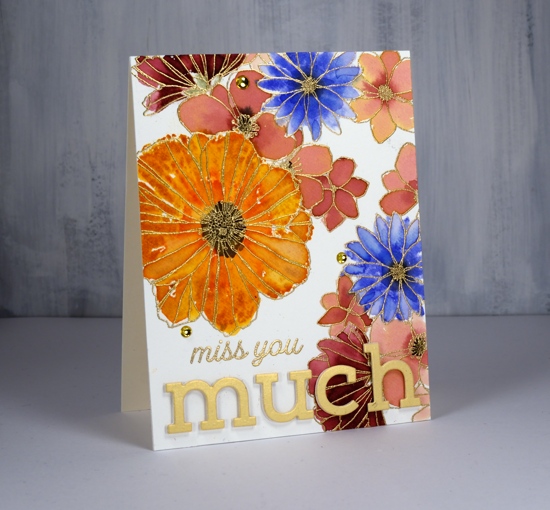
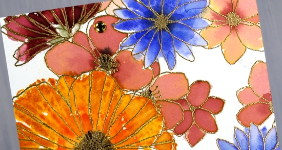
I’ve been playing with Concord & 9th’s co-ordinating stamp sets ‘filled in florals’ and ‘fine line florals’. For this first card I stamped the large ‘fine line floral’ stamp twice in versamark then embossed in gold powder. To fill in the flowers I switched to the ‘filled in florals’ stamps. I inked the large flower in wild honey ink then added abandoned coral ink around the centre. I spritzed the stamp then pressed it over the matching embossed flower. Because I had spritzed before stamping I got a nice blend of colours which loosely filled the outline. I repeated this step with the blue flowers (blueprint sketch) and burgandy flowers (aged mahogany) I diluted some aged mahogany to paint inside the remaining flowers.
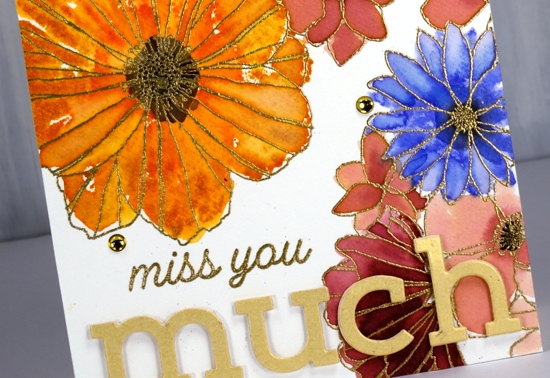
I stamped black soot ink in the centres and bundled sage for the little leafy bit below the petals. I stuck with the gold highlights when adding the sentiment, embossed ‘miss you’ in gold then popped the shimmer gold ‘simple serif’ die-cut letters with white foam. I thought it need just a little something more so added three gold half pearls. Usually I would add splatter but I guess I was feeling fancier!
The inspiration for the second card came as I was stamping off the ‘filled in floral’ stamps after I’d stamped the embossed areas. I grabbed another piece of watercolour paper then inked the flower stamps with the same colours used on the first card, spritzed the stamp then stamped one flower, spritzed again, a second flower, spritzed again and got a third paler flower. Once the panel was fairly full I switched to the leaf stamp, bundled sage and peeled paint ink and added some leaves. I used acrylic blocks for the stamping; there was no need for a stamp positioner with such a loose watery technique.

The watery technique did mean I lost much of the definition of the stamp so I drew some veins on the petals with a spiced marmalade marker once the ink dried. I used the simple serif stamps this time (they match the dies used on the other card) to stamp ‘thanks’ along with one of the sentiments from the C&9 ‘big thanks’ stamp set. This time I did want some black splatter but not all over the place so I chose the safe option of stamping black dots using two stamps from the fine line florals set then drew extra dots with a black marker. A black mat finished it off.
Are you a ‘stay inside the lines’ kind of painter or are you happy to be a bit loose and messy like I was with these cards?
Supplies
Wanderlust
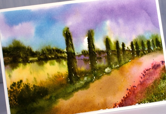
Posted: September 3, 2019 Filed under: Penny Black, Stamped Landscapes, wanderlust | Tags: distress oxide inks, Penny Black stamps, Ranger Distress inks, Ranger Distress stains 7 Comments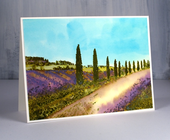
Wanderlust is the perfect name for this stamp; I would love to be walking down that lane in Provence! I have a friend with a house in Provence so I am curious to hear whether if I’ve managed to capture the look. To create this lavender themed panel I started by painting the watercolour paper in pale distress stains. I wet the whole panel then painted the bottom half in mustard seed stain. I was way too heavy handed and the result was bright yellow! I quickly whisked the panel to the sink and rinsed it off which resulted the pale yellow you see in the centre of the road. With the panel still wet I painted the sky area in broken china distress stain. I dried the panel and placed it in a stamp positioner to do all the stamping. There was a certain amount of back and forth with my stamping, blending, over-stamping etc but I will try and give you the gist of it. All the stamping is done with oxide inks on this panel so I would have more of an oil or acrylic painting look (something like this beauty by Maria Bertan). I stamped the trees and roadside grasses in peeled paint and forest moss distress oxide ink, wiping off the tips of the grasses on the right hand corner so I could ink with dusty concord oxide ink.
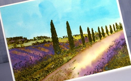
As I built up colour on the trees it was sometimes easiest to ink a large area with the oxide ink then wipe ink off the stamp where I didn’t want that colour. I also pressed the oxide ink pads down on my glass mat so I could pick up colour with a paint brush and apply it to the panel that way. As oxide inks are part dye ink and part pigment I was able to clear emboss over the stamping part way through the process to ‘lock’ in the colour on the foreground trees, grass and background trees. The ‘lavender field’ area is blank when stamped so I painted the rows of lavender with dusty concord and some spots of peeled paint oxide ink, the far fields in crushed olive and the road edges in diluted vintage photo. I loved the pops of purple so much I brought them into my second version also but not in the same way.
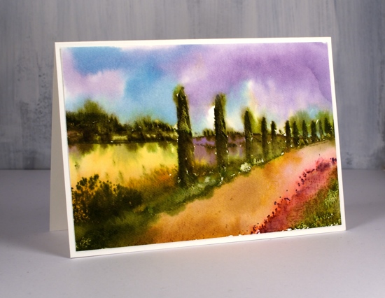
The second card is a looser watercolour look done with no oxides just the original distress inks and markers. I stamped the trees and grasses with forest moss, peeled paint and candied apple (roadside poppies). I was able to get some variety on the trees and grass by blending with a paint brush and re-stamping over the top.
The adjacent field is painted in wild honey distress ink then there is a dusty concord field further back. To get the blended effect I also spritzed my stamp not the panel so water was transferred from the stamp to the paper in certain areas not over the whole scene. While the inks were still damp I painted a tumbled glass and dusty concord sky around the tree tops and down to the hill edges. Some of the green ink bled into the sky but not too much. Finally I painted the road with vintage photo distress ink.
Have you been to Provence? Does it look a bit like this? Or, like me, do you want to go there now?
Supplies

Homeward
Posted: August 30, 2019 Filed under: homeward, Penny Black, Uncategorized | Tags: Penny Black stamps, Ranger Distress inks 6 Comments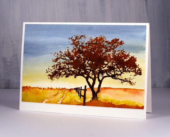
I have some more scenic stamping to share and without meaning to I have used an autumn colour scheme. Fall is going to come too soon as it is I didn’t mean to hurry it along!
When creating my previous scenic cards I stamped and painted the trees and scenery first, clear embossed them and added the ground, sea and sky last. For this scene I painted the sky first then stamped over it. I used weathered wood, stormy sky, and fossilized amber inks to fill the panel and create the look of sunset or sunrise in the background. I kept the colour very pale and diluted at the bottom of the panel as I knew stamping would cover the foreground anyway.
I dried the panel before putting it in a stamp positioner to create the scene. I inked the base of the stamp with fossilized amber and along the horizon with rusty hinge distress ink. The tree trunk, branches and the fence I inked with ground espresso and black soot markers. The foliage is a mix of vintage photo and rusty hinge ink. I used rusty hinge to paint a foreground rise also.
Believe it or not there I still have more stamped scenes to show you. I will probably toss a floral into the mix here and there too as I did this week. I’m not quite ready to be showing you Christmas cards yet but it won’t be long!
Supplies