Quick inky sky
Posted: November 24, 2021 Filed under: gorgeous grove, Penny Black | Tags: Fabriano Watercolour Paper, Penny Black stamps, Ranger Distress inks 7 Comments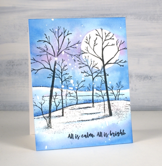
I’ve made many of these snowy scenes over the years but this was one of the quickest because the scene is all in one stamp. I already had a piece of hot pressed watercolour paper splattered with masking fluid, so that also cut out some time.
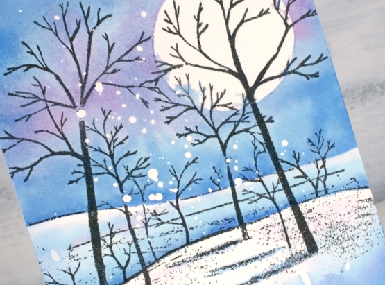
I stamped the PB ‘gorgeous grove’ stamp in versafine clair morning mist ink which I think I like better than black when the sky is not very dark. After stamping I added a frisket film circle mask which I did not seal perfectly but that’s ok; there’s a bit of cloud cover creeping over the moon.
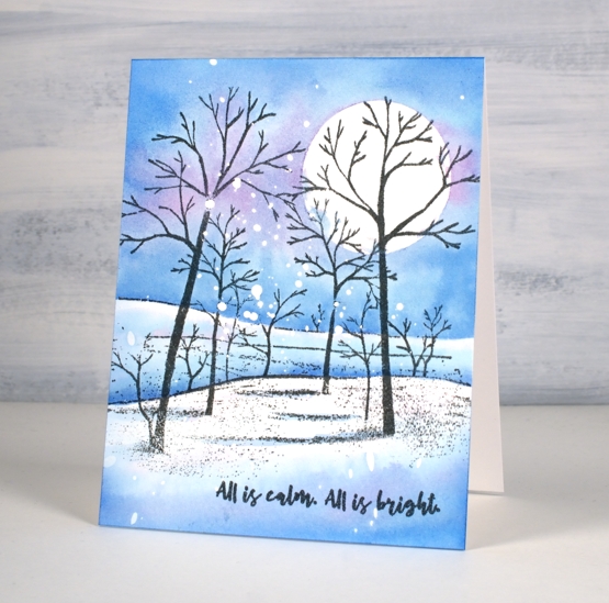
I didn’t want to spend too much time choosing colours so I just pulled out three of the newest distress inks. I’m still experimenting with the new colours so I started by painting salvaged patina around the moon then blending it with water to fill the top half of the panel above the horizon. Next I added prize ribbon ink just about everywhere and then some dabs of kitsch flamingo. I would not normally use these three colours together but it worked as distress blends often do. Once the sky was painted I dried the panel before using the same inks to paint shadows in the foreground and behind the snowy hill. The words are from PB ‘Christmas sentiments’ set stamped in morning mist to match the trees.
By the way I have a little sale going on over at my online classes site. If you use the code HTNOV you can get a 25% discount on the Floral Faves class, Winter Wonder class and the Colour Clues class.
Supplies
(Compensated affiliate links used when possible)

Let Heaven and Nature Sing
Posted: November 19, 2021 Filed under: CAS, nature sings, Penny Black | Tags: Faber-Castell Albrecht Durer Watercolour pencils, Fabriano Watercolour Paper, Penny Black stamps, Ranger Distress inks 9 Comments
This sweet bird is one of four in the Penny Black set ‘Nature Sings’. It is my plan to make a similar card with all four birds. I returned to a very clean and simple style for this one utilising some masking, blending and watercolour.
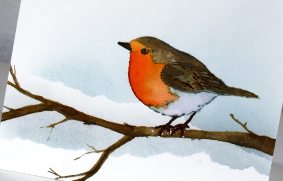
I worked on hot pressed watercolour paper because I knew I would watercolour the bird. Before stamping I tore a post-it note mask and lay it across the panel then blended speckled egg ink above it. I stamped the bird in soft stone papertrey ink then watercoloured with a few distress inks. The colours are listed below. The bird was floating in mid air so I drew a branch with a watercolour pencil then painted it with distress inks so he would have somewhere to perch. At this point I added a second area of masked blending to the background.

To finish off I stamped one of the sentiments from the same set in fallen leaves versafine clair ink. It just so happens that the CAS Christmas Card challenge this month is Christmas Critters so I am in!

Supplies
(Compensated affiliate links used when possible)

Carmine – No Line Watercolour Video
Posted: November 16, 2021 Filed under: carmine, Penny Black, sennelier watercolours, Tutorial | Tags: distress markers, Fabriano Watercolour Paper, Papertrey ink, Penny Black stamps, sennelier watercolours, Tsukineko Versafine inks, Tutorial, video 9 Comments
I hope you enjoy today’s no-line watercolour video. When I first saw this stamp I knew it would be perfect for the technique. There are a few little petals but most of the image is made up of open leaves and petals which are easy to see while painting. I used soft stone ink for the initial image on cold press watercolour paper and Sennelier watercolour paints for all the painting.
If you don’t always have a plan for the background you will see how I added one after all the painting was done. Take a look at the video below to see my process.
This is such a pretty stamp and might get inked up again soon to keep my stock of Christmas cards growing. I think it would look good embossed in white on a coloured background. Stay tuned!
Supplies
(Compensated affiliate links used when possible)

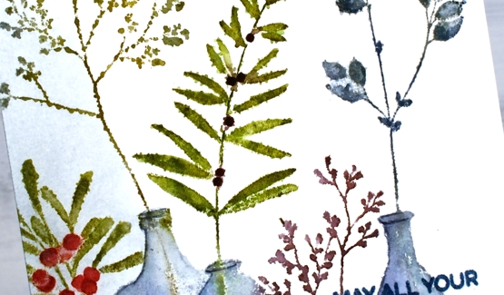
Festive Fragrance
Posted: November 10, 2021 Filed under: festive fragrance | Tags: Fabriano Watercolour Paper, Penny Black stamps, Ranger Distress inks 8 Comments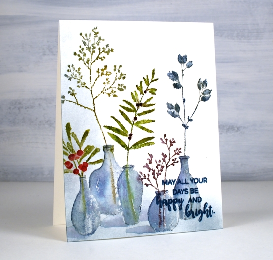
Isn’t this ‘festive fragrance‘ a pretty stamp? I know it is part of the PB Christmas release but it looks like an all-year-rounder to me. Just switching the colours around could make it quite springy or even autumnal. That’s the kind of stamp I like.
I chose to work with muted greens and blues plus a couple of berry colours. I inked with distress inks and markers plus a couple of Staedtler brush markers. I heard recently the sad news that distress markers are being discontinued so I am looking at my other markers to see which ones I might switch to when my distress markers can give no more. I think more than anything it is the colours of the distress markers that make me happy. Often when you buy a set of markers such as a 12 or 18 set many of the colours are bold rather than muted. There is a basic orange, red, yellow, light blue, dark blue, etc. You don’t find any stormy skies or picked raspberries!
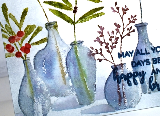
Anyway enough about that; I will keep you posted on my discoveries and choices. I used the mix of colours listed in the supplies below to ink all the foliage and used both faded jeans and weathered wood for the vases. The stamp was brand new when I inked it and I didn’t do any conditioning (such as wiping it or sanding it) so the ink beaded in a few places giving me a patchy look. I inked and stamped again for all but that tall bit of foliage. That one on the left I kept patchy as I liked the lacey look.
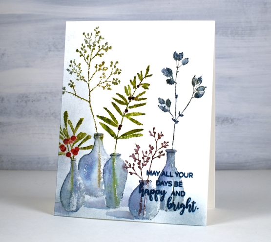
Once I had stamped and blended all the leaves and vases, I wanted to ground the collection somehow so I used a blending brush to add weathered wood ink to the base and side of the panel. I then painted shadows next to the vases with faded jeans ink. I finished the design off with a sentiment from the PB ‘happy & bright’ set knowing I would have to choose a bolder, darker ink so it would show up over the stamped vases. It is not as distinct as I would like but when the recipient looks at it up close it will be fine.
I hope you have had a chance to view the short video about my new class, ‘Wreaths – Stamped & Painted‘. Registration is open, a couple of lessons are already published and all the content will be accessible tomorrow. It is full of simple but pretty wreath designs, some very festive, others more rustic. I have included some technique lessons to show how I paint leaves and filler elements too so you can design with stamps plus your own unique touches. The giveaway is still open on my previous post where you have a chance to win a spot in the class. Make sure you pop back there and tell me how your Christmas card making is going. I see some of you have finished, some are barely started and some don’t go down that path. I think I am over half way with mine, largely because I created many wreath cards in preparation for the class!

One more bit of exciting news before I go. I am back on CRAFT ROULETTE this Friday as the guest crafter. Join me if you can on YouTube and drop a hello in the chat.
Supplies
(Compensated affiliate links used when possible)

Merriest
Posted: November 4, 2021 Filed under: Catherine Pooler inks, Karin brushmarkers, merriest, Penny Black, Tutorial, winter branches | Tags: Catherine Pooler inks, Fabriano Watercolour Paper, Karin brushmarkers, Penny Black stamps, Tsukineko Versafine inks 7 Comments
The new ‘Making Spirits Bright’ release from Penny Black is full of beautiful festive foliage. As you know I love working with florals and foliage especially on rubber cling stamps so these new stamps are definitely my thing!
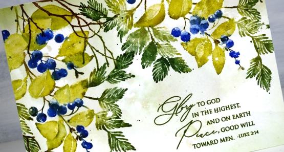
I used Catherine Pooler inks for this design and the colours worked beautifully. I sometimes forget my CP inks, then when I put them to use I remember now juicy and vibrant they are. Take a look at my process below; I have used some of my favourite techniques on this one. (by the way I think I call the release ‘keeping spirits bright’ and the branch stamp fragile beauty instead of ‘winter branches’. Oops)
I know I have been hinting and promising the new class release for the last week. So thanks for your patience; it’s coming, it’s really coming!
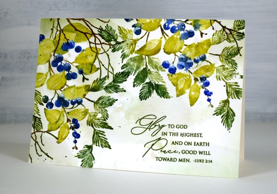
I know it’s subtle but one of my favourite things about this card is the muted background, just some pale greens and brown tones with tiny white dots from the masking fluid.
Thanks for dropping by today. I’ll see you again tomorrow.
Supplies
(Compensated affiliate links used when possible)
Floral Birthday
Posted: October 29, 2021 Filed under: all the birthdays, companions, Concord & 9th, Penny Black | Tags: Fabriano Watercolour Paper, Penny Black stamps, Ranger Distress stains 10 Comments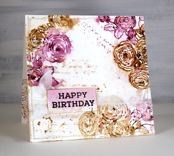
In my last post I shared a Christmas card featuring loose watercolour; the style of this card is even looser and was done with a few of the distress stain daubers I still have in my stash. Although I used techniques I’d devised years ago, this card was inspired by a card I saw on Pinterest recently. I followed the link and read through the whole post on the Tattered Nest Designs blog and combined some of her techniques with mine to create this very vintage floral birthday card.
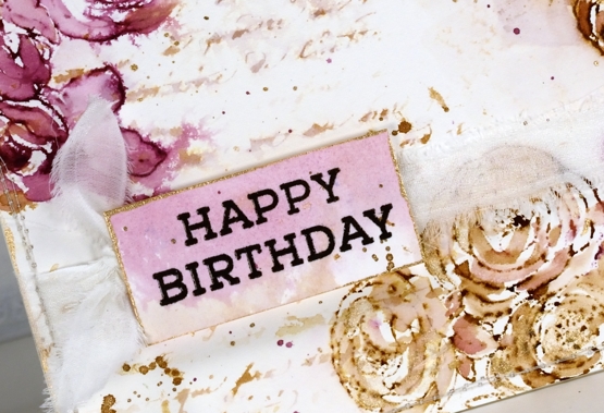
I worked on hot pressed watercolour paper with gathered twigs and seedless preserves distress stains. I still have those two colours in the daubers but you could use ink pads or spray stains on a glass mat or craft mat to get similar results. Check out the Tattered Nest post to read how she did it with spray stains. I inked the PB ‘companions’ stamp with both distress stains and stamped on the corners of my watercolour paper panel. I dried the stain with a heat tool then started blending loosely with water and a paintbrush. If the ink was too intense I would use more water or dab it with a paper towel, if too pale I would add more stain with the paintbrush.
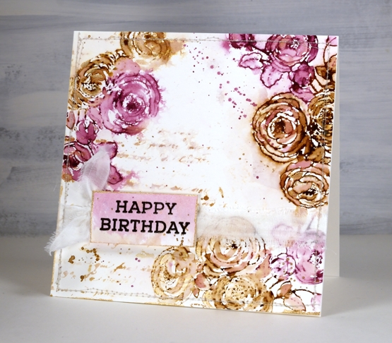
Once the flowers were loosely blended I inked the PB script background stamp with the same inks, spritzed it and stamped off on scrap paper. I spritzed it again with water before stamping a diluted print on the panel. You can see I also added splatter and created a sentiment on a small piece coloured with the same inks.
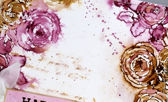
To finish the card I added splatter and some extra painting with rose gold pearlescent paint. You can see the gold border around the little tag in the close up above. Inspired by the Tattered Nest projects I sewed around the edge of the panel and then tore a strip of fabric to make a frayed ribbon sash.
Progress continues on my new online class; I’ve been gazing at the computer screen for days. I’m excited to share it with you very soon!
Supplies
(Compensated affiliate links used when possible)

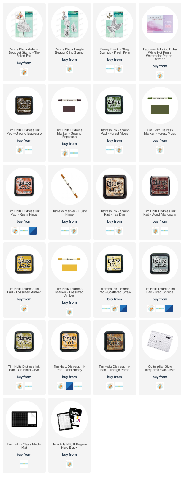
Autumn Bouquet
Posted: September 17, 2021 Filed under: autumn bouquet, fragile branches, fresh ferns, Penny Black | Tags: Fabriano Watercolour Paper, Penny Black stamps, Ranger Distress inks 12 Comments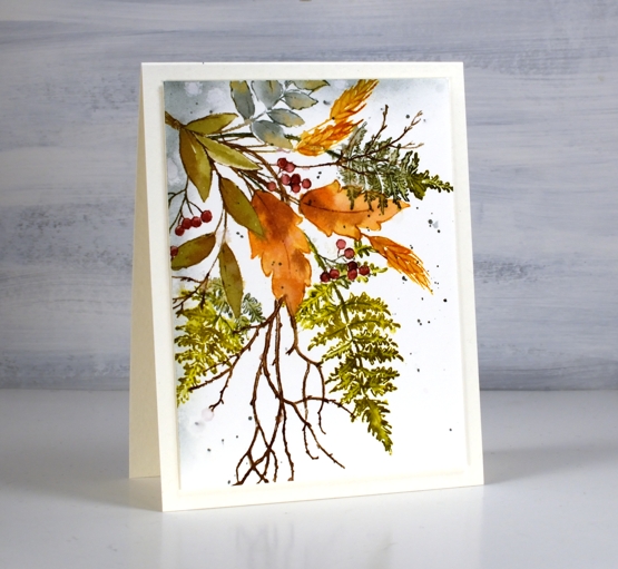
Are the leaves changing where you are? I noticed this morning a few patches of colour on the predominately green trees. The mornings are quite fresh too and the sunsets are amazing. Today’s card features a new Penny Black stamp ‘autumn bouquet’ teamed up with a couple of favourite filler stamps, ‘fresh fern’ and ‘fragile beauty’.
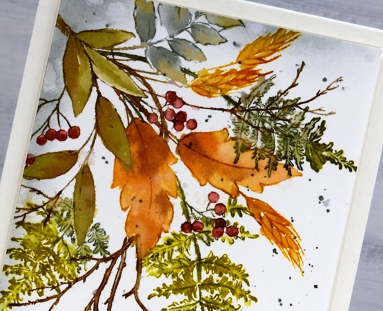
I kept the autumn bouquet stamp in the positioner so I could stamp each element one at a time. There are three types of leaves plus the wheat and the berries. All were done with a combination of inks. Often I ink the image using markers then smoosh the corresponding ink pad on my glass mat to give me ink for painting inside the stamped image.
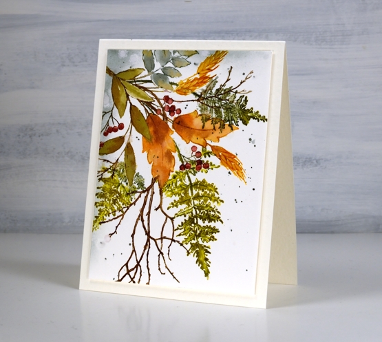
I used partial stamping to add the fern fronds and twigs. I usually ink the bit furtherest from the existing stamping then fill more in each time I stamp so as to avoid stamping over the top of other elements. This is because I am often too lazy to mask the stamping I’ve already done.
After painting and blending inside all the stamped images I used blending brushes to add iced spruce to two edges and splattered some over the panel. I trimmed and popped up the panel on a white luxe card base.
Have a wonderful weekend, thanks for dropping by.
Supplies
(Compensated affiliate links used when possible)
Combining scenic stamps
Posted: August 16, 2021 Filed under: farmland, homeward, Penny Black, Stamped Landscapes | Tags: distress markers, Fabriano Watercolour Paper, Penny Black stamps, Ranger Distress inks 7 Comments
I’ve been playing with scenic stamps again, this time combining sections of two stamps to create a new scene. The Penny Black ‘farmland’ stamp forms the background scenery and the PB ‘homeward’ stamp makes up the foreground.
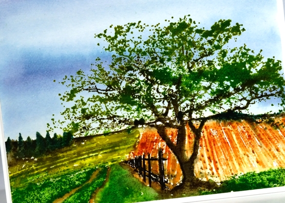
Out of habit (a successful one!) I used distress inks and markers to ink the stamps and add detail to the design. I kept the palette limited using two blues for the sky and several greens and browns for the rest of the scene. To see the process take a look at the video below.
I know some people find scenic stamps a bit daunting but the detail in the stamps themselves makes it possible to add a little or a lot of your own artistry. I hope you find the techniques shown in the video helpful.
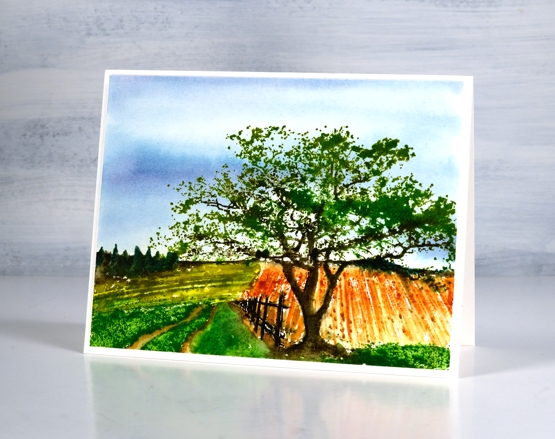
You can see cards featuring the farmland stamp on its own here and to see the homeward stamp here.
I mentioned in the video that although I think the fields look authentic I have no idea what the crops might be. If you know of crops that would appear to be rust or olive coloured mention it below!
Supplies
(Compensated affiliate links used when possible)
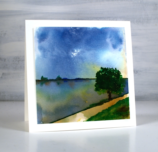
Lakeside Wander
Posted: August 6, 2021 Filed under: Stamped Landscapes, wander | Tags: Fabriano Watercolour Paper, Penny Black stamps, Ranger Distress inks 10 Comments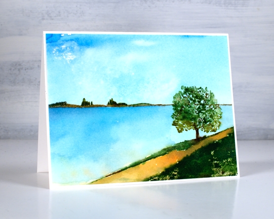
When I receive new scenic stamps from Penny Black I love creating a variety of scenes. I like to change mood and location first with colour and later with the addition of other scenic stamps. Both scenes in today’s post feature only one stamp, the new ‘wander’ cling stamp.
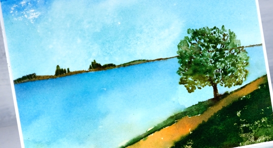
The stamp includes both the distant hills and the foreground with a tree. The space in between can be interpreted by the stamper to include whatever they wish. I have chosen to make it water in both my cards perhaps a river, a lake or ocean inlet.
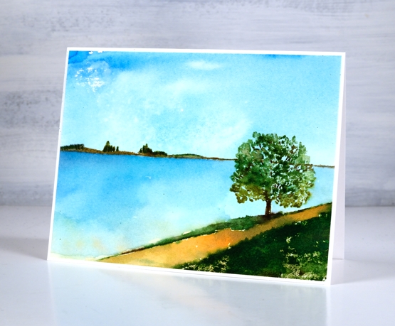
To make both scenes I created a smooshed ink sky first. For the sunny sky and water above I smooshed salty ocean, scattered straw and mowed lawn on my glass mat then swiped the watercolour panel through the diluted ink. For the moodier panel below I smooshed faded jeans, mowed lawn and tea dye to create my background.
Once the sky dried I stamped the scenic stamp inking it with a mix of distress inkpads and markers. I add colours a bit at a time to build up dimension sometimes spritzing the stamp to move the inks and other times blending the stamped inks with a paint brush
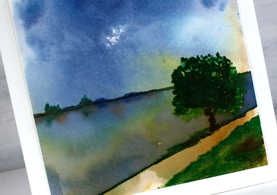
To add reflections to the second scene I painted over the water with hmmm, water so I could drop ink into the wet area below the land and trees.
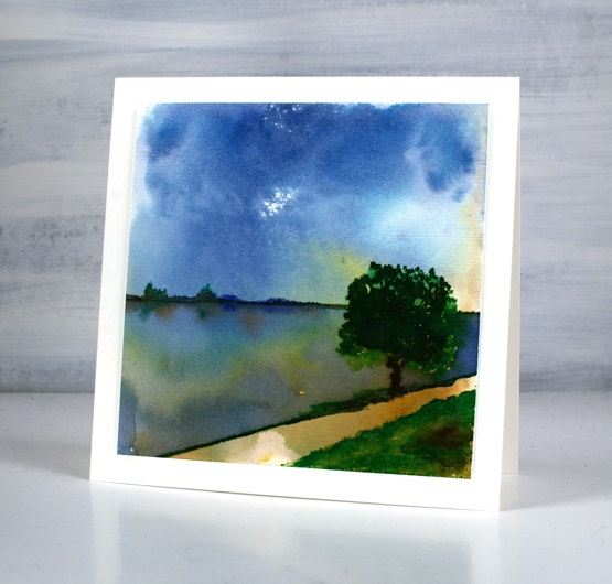
When I had finished the panel above I gave it some texture with the ‘subtle’ embossing folder so it looks like it has a canvas finish. The two cards definitely show different moods, the first being bright and sunny, the second darker but with drama in the water and sky. Which do you prefer?
Supplies
(Compensated affiliate links used when possible)
Country scene
Posted: June 25, 2021 Filed under: arbors, Penny Black, snow fence, Stamped Landscapes | Tags: Fabriano Watercolour Paper, Penny Black stamps, Ranger Distress inks 7 Comments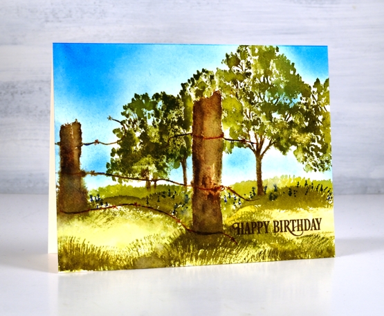
Another stamped scene, this one a little closer to home than the desert in the previous post. I paired the PB ‘arbor’ and ‘snow fence’ stamps to create a pastoral scene. I worked on hot pressed watercolour paper using distress inkpads and markers as my ‘watercolour paints’.
As the fence posts are in the foreground I stamped them first in a mix of browns, black and grey then blended on paper with water. Once the posts were dry I inked the trees in a few greens and brown avoiding the area behind the fence post. I should have masked the posts but I was feeling a bit lazy so I just inked and stamped several times getting closer each time to the post without stamping over it.
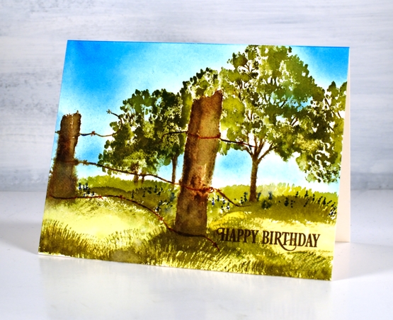
Once the trees were completed I painted a light wash of crushed olive and peeled paint inks over the ground area then used a fan brush which I’ve left untouched for years to paint grass in both forest moss and peeled paint. For a bit of interest I added blue dots to look like flowers under the trees. My stash of birthday cards is looking low so I added a partial sentiment from the birthday humor set. Are you a scenic stamper? What are your favourite techniques for bringing scenes to life.
Supplies
(Compensated affiliate links used when possible)