The Magic of Brusho
Posted: November 4, 2025 Filed under: Background Stamps, Brusho, contemporary, cricut, Penny Black | Tags: Brusho, brutus monroe embossing powder, cricut, Fabriano Watercolour Paper, Penny Black stamps 5 Comments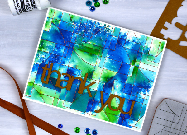
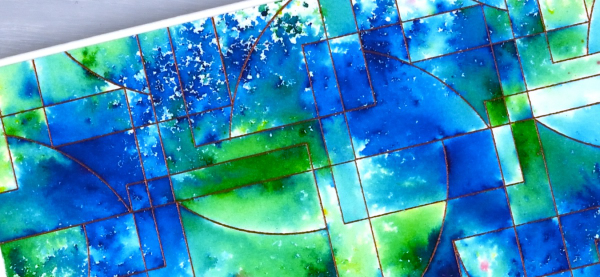
I’ve said it before but here is more evidence, Brusho watercolour paint powders make magic! I embossed the ‘contemporary‘ background stamp from Penny Black in a copper colour (I think it was ‘Penny‘ from Brutus Monroe) on hot pressed watercolour paper.
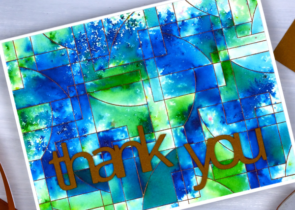
You can see the pattern in the background stamp is made up of curved and straight edged shapes. The embossing creates enclosed spaces on the panel and the the brusho powders get trapped in the spaces.
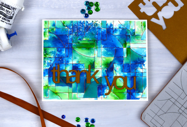
There are a couple of ways to trap brusho in an embossed design, you can spritz the embossed panel with water then sprinkle some brusho over the top, or you can sprinkle the brusho first then spritz. I often end up doing a bit of both. For this panel I think I spritzed some water first then sprinkled both blue and green brusho over the wet areas. My aim was to keep some sections blue, some green and others a mix of the two colours. I also wanted some areas to look speckled and other sections to look softly blended. Less water keeps things speckled; more water gives the paint more time to dissolve and blend.
I had some bronze shimmery cardstock which matched the embossing powder so I cut the ‘thank’ and ‘you’ on the cricut. I stacked two layers so the words would stand out from the busy background.
Brusho Daisies
Posted: July 19, 2024 Filed under: Brusho, daisy delight, Darkroom Door, Spellbinders | Tags: Brusho, brutus monroe embossing powder, Darkroom Door stamps, Spellbinders 7 Comments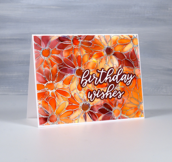
Yesterday I did some embossing with a friend and, as I was introducing her to brusho paints, I remembered how much I like the emboss resist technique with brushos. I don’t do too much heat embossing these days because of the gritty mess of embossing powder that ends up on my desk even when I am careful. But the results with brusho…
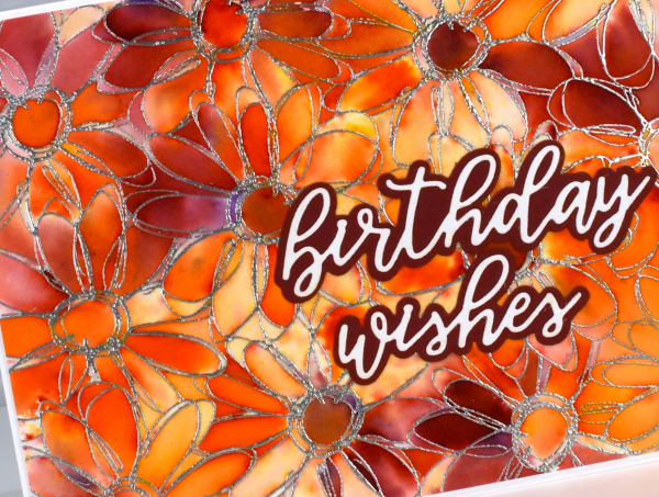
I embossed the Darkroom Door ‘daisy delight’ stamp on hot pressed watercolour paper with sterling embossing powder. I spritzed the panel with water then sprinkled orange and crimson brusho powders over the top. The trapped colour is just what I hoped for.
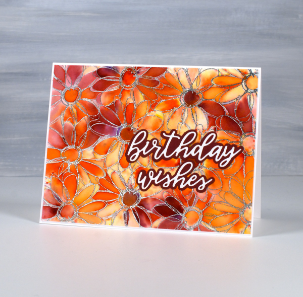
I added a Spellbinders sentiment from the die set, ‘Serenade Sentiments‘ to complete the card. So maybe it is worth getting gritty occasionally. This post includes affiliate links from Foiled Fox. If you buy through these links I receive a small commission at no extra cost to you.
Happy Day Roses
Posted: September 5, 2023 Filed under: Brusho, My Favorite Things, Roses all over, Taylored Expressions | Tags: Brusho, My Favorite Things, Taylored Expressions 7 Comments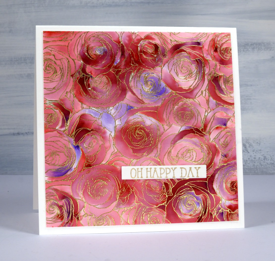
I made this large square card recently to give to a friend of ours on her wedding day. Our whole family was able to attend and celebrate with the bride and her family and it was indeed a happy day.
To make this card I used an old favourite technique with brusho and embossing. You might be surprised to know that I only used one colour of brusho, the crimson. I embossed the MFT ‘roses all over background stamp’ with gold powder on hot pressed watercolour paper. This stamp seems to be retired which is a travesty as it is lovely and also perfect for this technique. After a little research I discovered MFT have come out with a similar stamp which should also work. I could call the technique ‘sprinkle, spritz, trap, wait, wait, spritz and blend technique’ because that just about covers it. Sometimes with repeats.
I sprinkle brusho powder over the embossed panel, not too generously, but hopefully some powder lands in most of the roses if not all the little sections. I spritz from above with water and then watch the brusho magic happen. You have to be patient and see how much colour spreads from that first spritz before you add more water. I want variation of colour trapped in the little sections so I don’t flood the panel with water. After the spritzing activates most of the brusho powder I use a paint brusho to fill the petals(sections) with colour. As you can see some areas are quite dark and others are pale. I pick up paint from the darkest areas with the paintbrush if I need to add paint to a bare section.
The sentiment is from a Taylored Expressions set called ‘in & out birthday’.
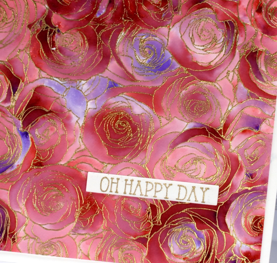
Here is another example of this technique but done with two colours of brusho.
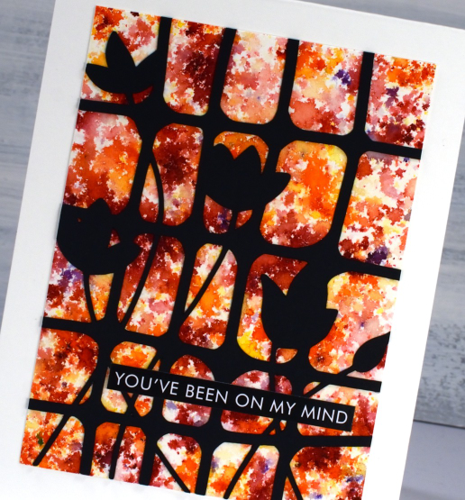
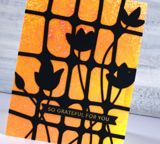
Lattice Blooms
Posted: May 1, 2023 Filed under: Brusho, Echidna Studios, lattice blooms, Paper Rose, Taylored Expressions | Tags: Brusho, distress oxide inks, Echidna Studios, Paper Rose, Taylored Expressions 3 Comments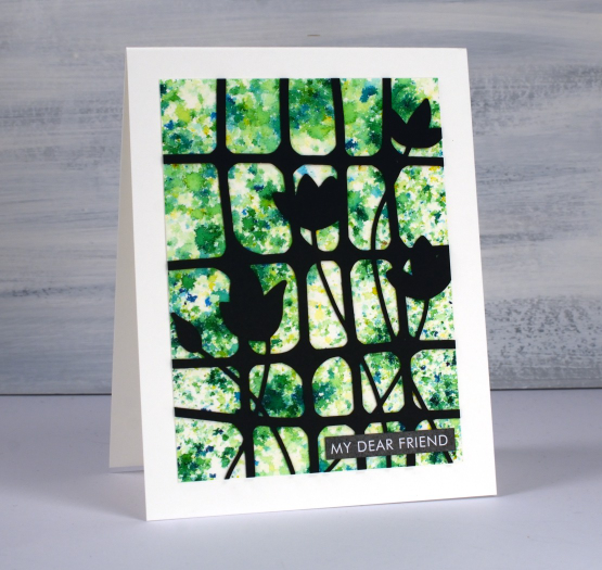
If you have used them you will have recognised at once that this is a brusho background and so is the next card with yellow, orange and red. To create a background like this with brusho you have to be patient and watch the brusho powder slowly react with spritzed water from above. If you don’t spritz enough water the powder stays dry; if you spritz too much water the diluted powders all run together giving you a blended background but not a confetti one like you see here. I worked on a panel of hot pressed watercolour paper and sprinkled brusho sparingly over it before spritzing with water.
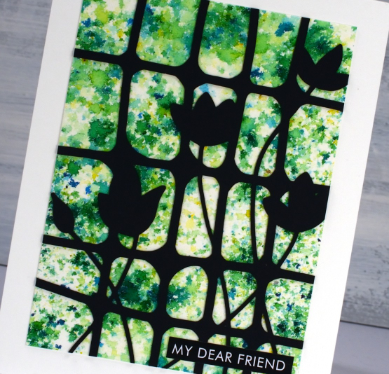
The lattice with blooms cut from black cardstock is another image I designed to be cut or printed. So far I have just used it on the cards featured today but I will also be using it as a stencil on my gel plate. The digital file can be found in the Echidna Studios etsy store.
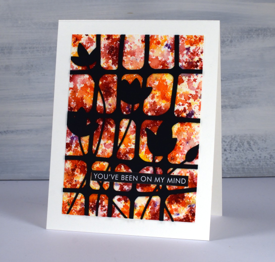
To complete both brusho cards I used sentiments cut from the Paper Rose Studio ‘so extra’ supporting sentiments panels. There are loads of words and phrases to choose from.
The card below also has a watercolour background but this one was done with oxide sprays. I have only recently dipped my toe in the oxide spray pool (just picture that literally for a minute!) With many oxide inks and many many distress sprays I didn’t think I needed the oxide sprays as well. To be clear I only have seven but with those seven I can get some very pretty backgrounds. Because the oxide formula reacts with water it also reacts with other sprays when you layer them. The pigments make them less transparent so the effect is quite speckly as you can see in the close up.
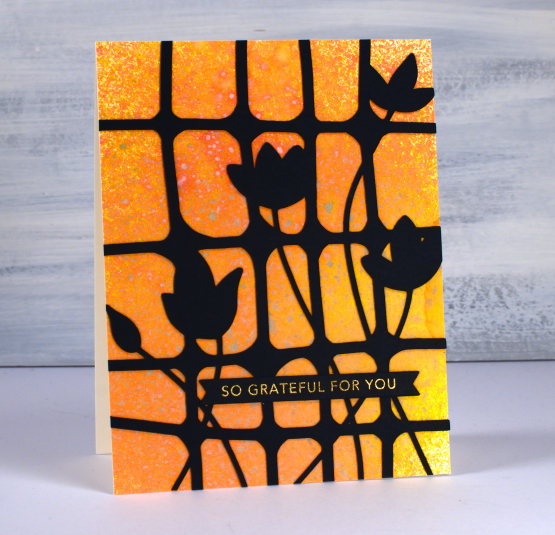
I cut the lattice blooms bigger for this card so it stretches from edge to edge. The card is finished with a Taylored Expressions sentiment strip embossed with gold. Those sentiment strips are still one of the cleverest ideas I’ve seen in stamp and die design.
(Compensated affiliate links from Foiled Fox, Ecstasy Crafts & Scrap n Stamp)
Birthday butterflies
Posted: March 31, 2023 Filed under: Brusho, Butterflies, Darkroom Door, this way | Tags: Brusho, brutus monroe embossing powder, Darkroom Door stamps 8 Comments
Darkroom Door has just released an amazing new collection of stamps so I will be showing off a few of them in the coming weeks. The narrow arrow stamp named ‘this way’ motivated me to pull out the brusho powders. Brusho is wonderful when used with embossed patterned stamps where the paint crystals can get trapped. I used both ultramarine and emerald green brusho on this card.

I embossed the ‘this way’ stamp in white powder on hot presssed watercolour paper then sprinkled brusho on top and spritzed water from above to get the colours activated. I also painted the black embossed butterflies with brusho but was a bit more strategic in my paint blending.

I popped some gold cord behind the butterflies and tucked a tiny DD birthday sentiment in as well. This slim border stamp is very versatile and in future posts I will be sharing how I used it with cars, motorbikes and a lighthouse!
(Compensated affiliate links from Foiled Fox, Scrap n Stamp)
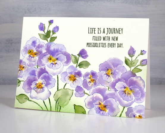
Fresh Pansies
Posted: March 30, 2022 Filed under: Brusho, pansies, Penny Black | Tags: Brusho, Fabriano Watercolour Paper, Penny Black stamps, Ranger Distress inks 13 Comments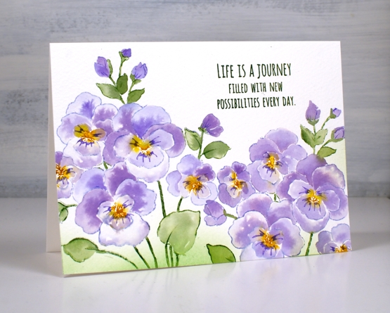
Pansies seem to be a happy flower don’t you think? This is the new ‘pansies’ stamp from Penny Black stamped twice on cold press watercolour paper.
In my previous post I asked what colour suggestions you had for irises. Jan in Oregon sent me some beautiful photos she has taken over the years featuring some stunning irises, so the inspiration file has definitely been topped up. She also sent a few photos of pansies, tulips and daffodils as they are the next flowers to be featured here on the blog. The photo below was my inspiration for today’s card. I ended up with more purple petals than white as I didn’t have time for negative painting but I was still inspired and delighted by Jan’s photo.
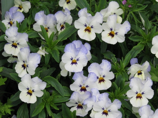
I stamped with distress inks then filled the petals with brusho watercolours using the same method I used recently for the irises. I used shaded lilac, mowed lawn and fossilized amber to stamp the outline then violet brusho and a mix of leaf green and moss green for the leaves and stems.

I used a purple marker to draw the lines coming out from the centre of the flowers, blended some mowed lawn around the stems and finished with a sentiment from the PB ‘love big’ set.
Supplies
(Compensated affiliate links used when possible)

Iris Elegance
Posted: March 28, 2022 Filed under: Brusho, iris elegance, Penny Black | Tags: Brusho, Fabriano Watercolour Paper, Penny Black stamps, Ranger Distress inks 14 Comments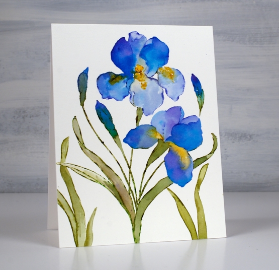
This is the second iris card I’ve painted but it probably won’t be the last. Iris Elegance from Penny Black is such a bold beautiful stamp.
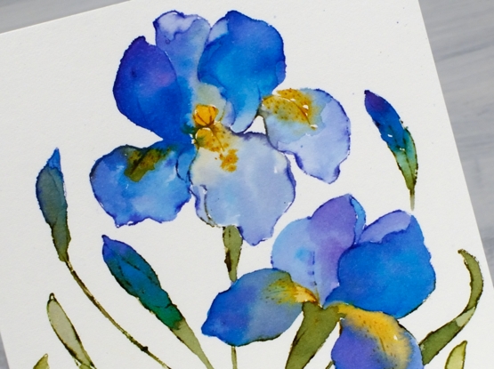
I worked on hot press watercolour paper in a stamp positioner to stamp the outline stamp in chipped sapphire, peeled paint and wild honey distress inks. I blended ink into the petals from the stamped outline but also used brusho paints to fill the petals with blends of colour. I had violet, ultramarine and moss green brusho mixed in a palette beside me so I could dip my brush and add paint to the petals.
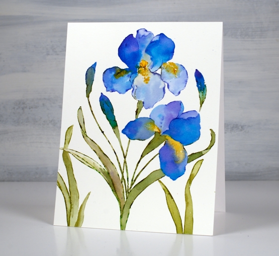
To fill out the design I stamped just leaves to the left and the right of the main image. Let me know if you have irises blooming already or suggest some petal colours to me. The yard is covered in snow again here so the irises best keep on sleeping for now!
Supplies
(Compensated affiliate links used when possible)
Irises
Posted: March 21, 2022 Filed under: Brusho, how sweet, iris elegance, Penny Black | Tags: Brusho, Fabriano Watercolour Paper, Penny Black stamps, Ranger Distress inks 8 Comments
The new ‘iris elegance’ stamp from Penny Black is a delight to work with. The design is large so there is plenty of space in the petals for pretty watercolour blends. I inked the stamp with distress inks then blended the stamped ink with water to fill the flowers using some co-ordinating colours of brusho for extra depth and variation. I have been flipping back and forth between hot and cold pressed watercolour paper lately; this one is hot pressed.
I have purple irises that come up in my garden each year but they don’t have the yellow centres I’ve featured on these ones. Yellow tends to be a pigment that pushes other pigments away which worked well on the petals. I painted the purples and then while the paint was still wet added yellow paint which spread and pushed the purple without making too much brown.
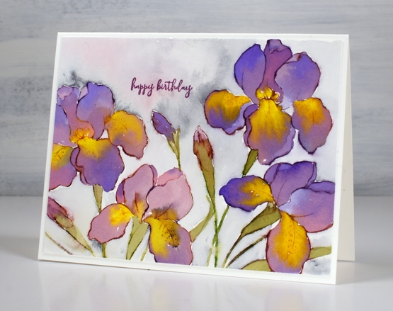
I don’t always add background but I did this time by painting water around the flowers then adding some Payne’s grey paint and a little diluted purple. Once again I chose the sweet little birthday stamp from the new ‘how sweet’ stamp set. Speaking of backgrounds, thank you so much to everyone who left me a message saying nothing more was needed on the recent poppy card. I am so encouraged by you, my kind and generous readers!
The warm weather and rain of the last few days has melted quite a lot of snow and now I see some green tips emerging. I have also spied a cardinal and a blue jay on the feeder. Spring is definitely in the air.
Supplies
(Compensated affiliate links used when possible)
Farm Fresh Lavender
Posted: March 15, 2022 Filed under: Background Stamps, Brick wall, Brusho, farm fresh, Penny Black | Tags: Brusho, Fabriano Watercolour Paper, Penny Black stamps, Ranger Distress inks 7 Comments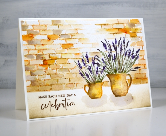
I am hoping I can fill a couple of jugs with lavender this summer. A couple of years back a friend split her lavender and gave me two plants which were coming along well last year and I hope will be even stronger and more full this year. When I have flowers in the garden I am always torn when deciding whether to cut them and bring some inside or just enjoy them outside where they will probably last longer.
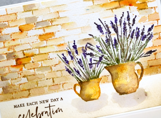
To create this little scene I used two stamps from the new Penny Black ‘farm fresh’ set and the ‘brick wall’ background stamp. I worked in a stamp positioner to create this panel. I stamped the jugs first with wild honey and tea dye distress inks. After blending the ink with water I added shadow with walnut stain ink. I used both bundled sage and rustic wilderness for the stems and a mix of milled lavender (of course) and dusty concord for the flowers.
Because I had done the jugs first I stamped and cut little masks from post-it notes to make it easier to stamp a brick wall behind them. I used tea dye to stamp the brick wall then started blending the tea dye ink to fill the bricks. I sprinkled a very small amount of sandstone brusho over the wall and started blending it in random bricks. This resulted in the warm orange bricks you see. I also added walnut stain ink to a few bricks for a darker look.
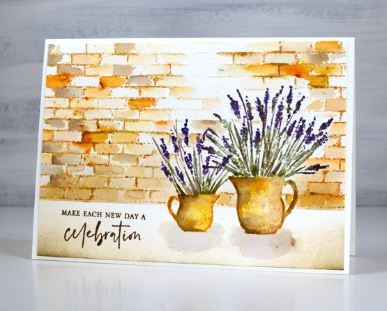
I blended antique linen and walnut ink in the foreground and painted pale shadows below the jugs. The card is finished with a sentiment from the new PB ‘love big’ stamp set.
Just in case you wondered at me thinking about cutting flowers from my garden, I’m just dreaming; it is definitely still covered in snow!
Supplies
(Compensated affiliate links used when possible)
Trilling Duo
Posted: February 16, 2022 Filed under: Brusho, Penny Black, trilling trio | Tags: Brusho, Penny Black stamps 7 Comments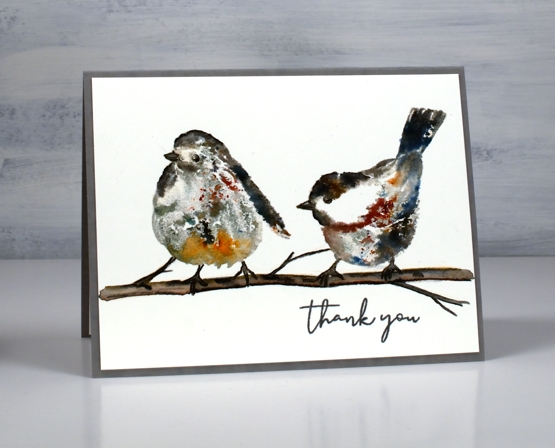
A couple of weeks back I created a card with the cardinal stamp from the PB set ‘trilling trio‘ and promised to be back with the other birds before too long. The set is called trilling trio because there are three bird stamps. I have paired up the other two for this panel and used brusho watercolour powder to add colour to the images. I love brusho powders but have not had them out much lately.
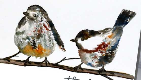
To stamp these two sweet birds I used neutral inks, water and the powders. I worked in a stamp positioner so I could stamp multiple times adding a little this or that each time. I used antique linen and hickory smoke inks for the first impression. Antique linen is pale and hickory smoke is grey so I put them where I wanted the light and dark areas to be but neither colour was so strong it couldn’t be diluted. The second time I stamped I spritzed the stamp with water so it was transferring ink and water. While the image was still wet I sprinkled some brusho very sparingly. If you haven’t used black brusho before you should; it is the absolute bomb because it is made up of other colours. The cute bird on the right is sprinkled with black brusho which resulted in spots of black, red, blue and grey. I also sprinkled some brown brusho.
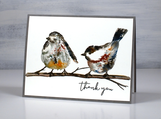
On the left hand bird I used some black brusho as well as some sandstone on the lower front feathers. I blended the stamping a little with a paint brush but not much as I wanted to see the magic speckles where the brusho lands and dilutes. I drew and painted the little branch with watercolour pencils and some black soot ink then added the ‘thank you’ from PB ‘ever thanks’ set. I just realised as I stare at the bird on the left that it appears to have three legs! That’s a twig on the far left just in case you were wondering!!
Supplies
(Compensated affiliate links used when possible)