
Blue Birthday
Posted: March 26, 2024 Filed under: banner blooms, banner blooms cut out dies, Dies, exquisite envelope, online class, Penny Black | Tags: online class, Penny Black creative dies, Penny Black stamps, Ranger Distress inks 6 Comments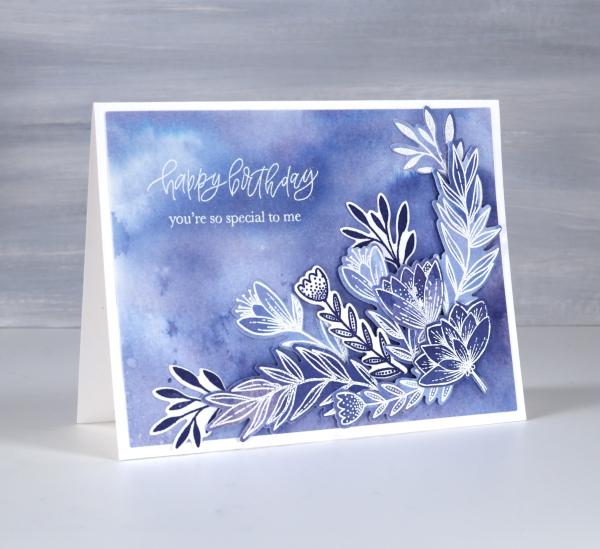
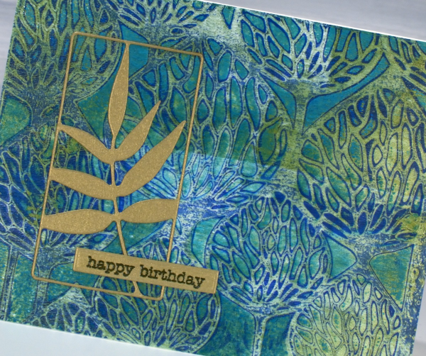
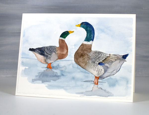
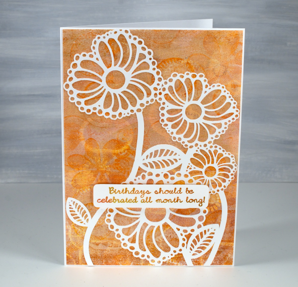
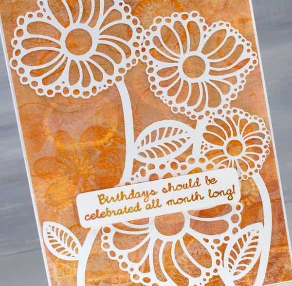
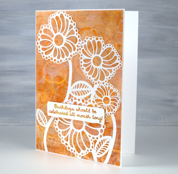
Blue is my favourite colour and the different hues seen on this card are examples of why it appeals to me so much. I tend to prefer the blues that are a little bit purply but I like the teal blues as well.
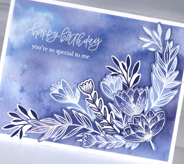
All the blues on the card are made from one ink, chipped sapphire distress ink. If you watercolour with your dye inks you have probably noticed that some inks separate into different hues when diluted. I thought I would share this card today because it features in one of the lessons in my Colour Clues online course. Colour Clues is a card making course which covers colour blending, contrast, separation and mixing. I created a 40% discount for all my online courses back on February 29, mentioned it in a blog post then forgot about it! That’s why I’ve been featuring it more this week. The discount code LEAPYEAR40 is active until the end of March 28 which is now two days away.
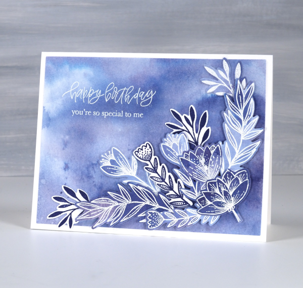
I chose the Penny Black sets Banner Blooms and Exquisite Envelope for this card because there were plenty of enclosed petals and leaves to trap colour. Banner Blooms just happens to have a co-ordinating die set which sped up the layering of blooms and leaves. This post includes affiliate links from Foiled Fox . If you buy through these links I receive a small commission at no extra cost to you.
Do you have a favourite colour. Does it turn up often in your crafting or perhaps in your wardrobe? I definitely wear a lot of blue!
Gel Printed Pods
Posted: March 25, 2024 Filed under: artsy stems, framed fern, gel press, Lavinia, online class, Penny Black, Tim Holtz | Tags: gel press, gel printing, Lavinia, online class, Penny Black creative dies, Tim Holtz 3 Comments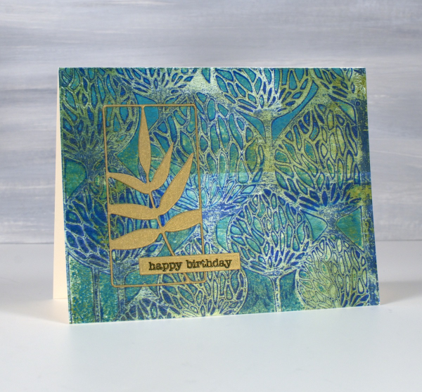
It’s been a while since I gel printed but that there is no lack of gel prints to show you. I currently have boxes of prints and and a stash of cards made from prints.

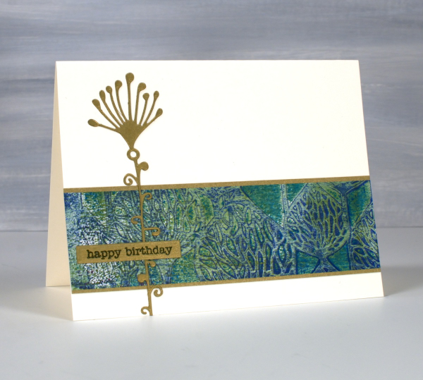
These two cards were made from the same stencil print, one of the examples from my Gel Print Journey online class (which is on sale along with all my online classes until March 29; just use the code LEAPYEAR40 at checkout)
If you are a fan of Lavinia stencils like I am you probably recognise the ‘Pods’ stencil used for this print. I printed on a 6″x 6″ gel plate giving me a print big enough for two cards. It’s hard to see in the photo but some of the paint was metallic so the print has some shimmer and shine on it.

I looked through my botanical dies and gold cardstock in order to fine co-ordinating elements for the cards. On the card above I used the ‘framed fern’ die from Penny Black and on the card below the die featured is from Tim Holtz artsy stems die set.
I hear my gel plate calling to me so hopefully I will soon dedicate a few days to happy printing. If you are looking for a beginner gel printing class or a refresher please check out Gel Print Journey. This post includes affiliate links from Ecstasy Crafts, Foiled Fox and Scrap’n’Stamp . If you buy through these links I receive a small commission at no extra cost to you.
Fuchsia Favourites
Posted: March 22, 2024 Filed under: captivating, Dies, gift card pocket, online class, Penny Black | Tags: online class, Penny Black creative dies, Penny Black stamps 9 Comments
As I wait for spring I thought I would post a couple of cards I made a few years ago when filming my Floral Faves online course. I used the beautiful ‘Captivating‘ stamp from Penny Black to teach a no-line watercolour technique. All my online courses are discounted by 40% for a one more week.
Edited to add: use the code LEAPYEAR40 if the discount doesn’t appear automatically.
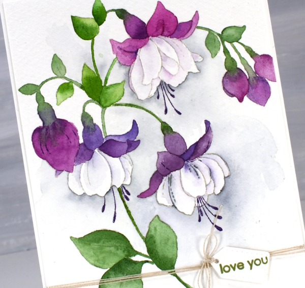
I used watercolour paints to colour the two cards featured today but I have also used waterbased inks smooshed onto a glass mat as they also work well for the technique. I added the tiny little tag from the PB ‘gift card pocket die set‘. It’s a set that I never use to make gift card pockets but often reach for one of the tag or label dies included.

I had fuchsias looking pretty in the planters at my front door last year. They were the opposite colouring of the ones above with pale pinky purple petals hanging down and creamy white petals at the top.

It might be time to pull out this stamp again and try it with the new pastel pencils. For more inspiration with this stamp click here and here. Today’s post features affiliate links to The Foiled Fox.
Zinnias
Posted: March 21, 2024 Filed under: Coloured pencil, Echidna Studios, pastel pencils, zinnias | Tags: canal paper, Echidna Studios, Faber Castell pastel pencils 7 Comments
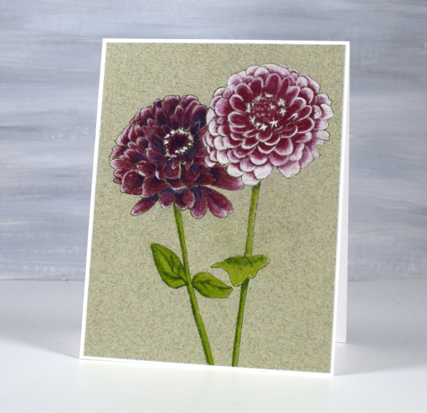
As the title suggests I have zinnias to share today. This pair is just one of seven images in the new digital set, Zinnias, from Echidna Studios. There is a bunch of five blooms, the pair shown on my card and some single blooms. All the images can be layered which means you can create your own bunches or rows of zinnias for printing.
I worked on Montreal Canal Paper, a textured paper made from cotton rag. In the past I’ve used it for watercolour, this time I used my new pastel pencils. The pad of paper I used has six different colours; I chose the green as it gave me an appropriate background. The texture in the paper holds the soft pastel well. I printed the two zinnias on the paper using my laser printer.

I kept the colour scheme limited and enjoyed blending two or three colours together to get diffferent colours and tints. From the Faber Castell set of Pitt pastels I used two greens -165 &170, red -194, blue -157 and white -101. I did most of the blending by adding one colour over another but further softened the blends at the end with a burnishing pencil.
As I often do, I searched for photo inspiration before colouring and found some deep burgandy colours among the many options. I think I might plant some in my garden this spring; the new digital stamps have inspired me. Let me know if you have success with zinnias in your garden.
Scrappy Journal Challenge
Posted: March 18, 2024 Filed under: Darkroom Door, gel press, global postmarks, Handmade book | Tags: Darkroom Door stamps, gel press, gel printing, Handmade book 6 Comments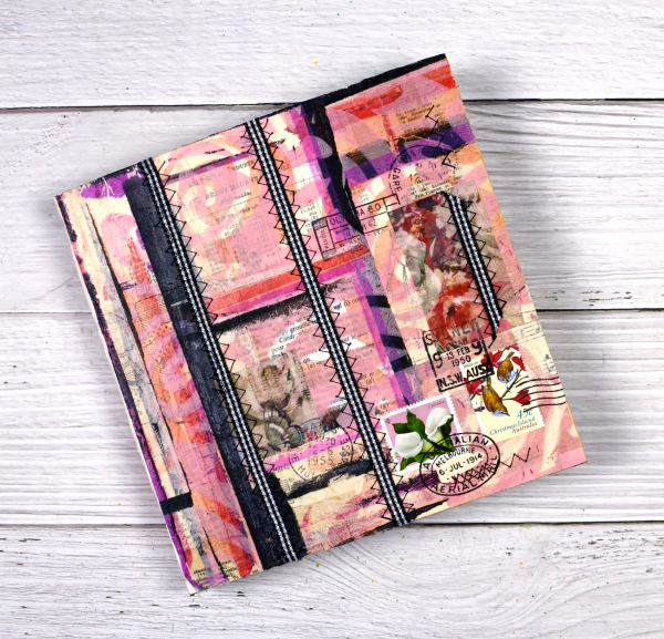
I’ve mentioned the Handmade Book Club before because I enjoy the 5 Day Challenges they offer. The most recent challenge was held last week and was called the ‘Scrappy Journal Challenge‘. The designer and teacher of the challenges, Ali Manning, came up with a tall narrow design which was very attractive. I changed the shape for mine because I will soon need a new art journal and the challenge was the perfect opportunity to get one made. The zig-zag sewing of the signatures was initially tricky but I soon got into a satisfying rhythm and finished them with only one early unpicking incident.
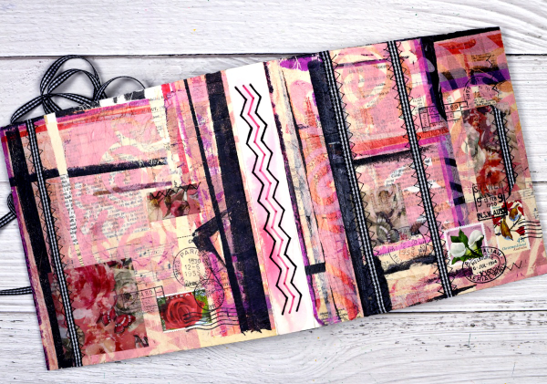
Other than the size of the book and the type of paper in the pages, I followed all the instruction from Ali. She is one of the best teachers I have had the privilege to learn from. I used watercolour paper for my pages and a heavy watercolour paper for the cover. I collaged the cover with vintage papers, then gel printed tissue, fabric washi tape and used postage stamps. The last details added were the gingham ribbon sewn onto the cover with a sewing machine.

The first photo in this post shows the front cover, next the full cover and spine, above is the back cover and below you can see the top view and four signatures.

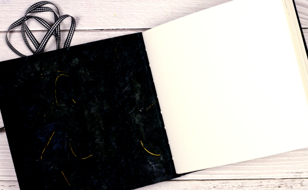
After sewing the ribbon onto the cover there were random lines of stitching on the inside of the cover so I glued black mulberry paper with gold thread in it over the complete inside cover. After I’d taken the photos I decided to add gingham ribbon ties to both the front and back covers to tie the book closed.
This is the third challenge I have completed with the Handmade Book Club. Here are the links to the other books I’ve made. Mixed Media Journal, Small Coptic Journal, 7×7 Coptic Journal
Standing Ducks
Posted: March 12, 2024 Filed under: Echidna Studios, sennelier watercolours, standing ducks | Tags: Echidna Studios, Faber-Castell Polychromos Colour Pencil, Fabriano Watercolour Paper, sennelier watercolours 5 Comments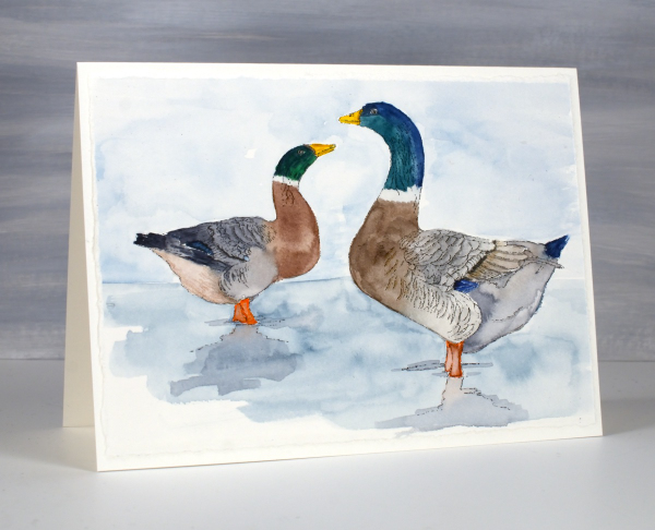
Introducing ‘standing ducks‘, a lovely digital stamp set from Echidna Studios. The weather has turned much warmer round here so there are puddles instead of snow to be seen; the type of weather where you might see ducks standing or swimming around. It is too early for ducklings but in the past we have had to slow down and stop for duck families on the busy road behind our house.

I printed both ducks from the set on hot pressed watercolour paper then painted them with Sennelier watercolour paints. I added some finishing touches with coloured pencils. I also printed the left facing duck on some pastel paper as I received a set of pastel pencils for my birthday and have started learning how to use them. As you can imagine pastel is very soft so it is fun to blend but easy to smudge. When I have done a little more learning and practicing I hope to share some pastel pencil colouring.
This card is another ‘larger than usual card’ measuring just over 5″ x 7″. The piece of watercolour paper I printed on had one deckled edge so I tore the other three edges to keep a deckled look round the whole panel.
Faux Postage Stamps – Video
Posted: March 7, 2024 Filed under: Darkroom Door, Elizabeth Craft Designs, fine flowers vol 2, global postmarks, Nature Walk, postage stamps, Tutorial | Tags: Darkroom Door stamps, Elizabeth Craft Designs, Ranger Distress inks, video 7 Comments
Recently I created some faux postage stamps from a stamped and watercoloured panel. I pulled out another floral panel from my ‘pile of possibilities’ and filmed myself making some more faux postage stamps to feature on cards. The watercoloured panel features a repeated flower from the Darkroom Door set, ‘fine flowers vol 2’ and there is a video of my watercolouring process for that too.
The large postage die set I used is from Elizabeth Craft Designs and includes a die to cut perforated stamps of different sizes which remain joined until you cut or tear them apart. There are also dies which cut rectangles to fit in each of the ‘postage stamp’ spaces. There are also bonus number and symbol dies, so the set offers quite a lot.
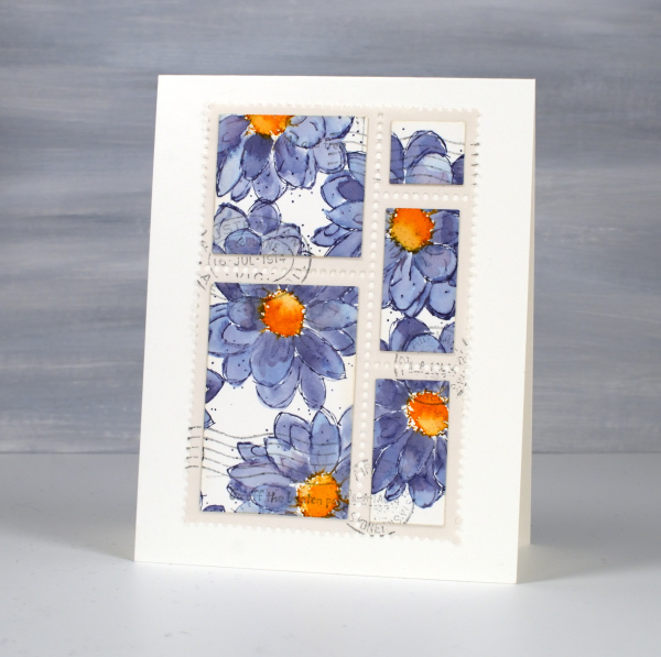
I chose this set because I liked the way the postage stamps were all joined and I have the option of creating combinations or individual stamps. There are dies available from other companies which just cut the perforated lines and I demonstrate how to do the same thing with that kind of die towards the end of the video. Adding stamped postmarks and even small words makes the faux postage look real and I’m really enjoying using stamped panels, patterned papers and gel prints to make my own postage. I think any hand delivered card I make from now on should have a handmade postage stamp on it!

Bubble Flowers
Posted: February 29, 2024 Filed under: bubble flowers, cricut, Echidna Studios, gel press, grafix, Taylored Expressions | Tags: cricut, Echidna Studios, gel printing, grafix, Taylored Expressions 3 Comments
Aren’t these happy flowers? The design is called ‘bubble flowers‘ for obvious reasons and is one of mine. I was inspired by a vintage brooch. The digital design is available in the Echidna Studios etsy store and can be cut on a digital cutting machine as I have for today’s cards. It can also be printed, foiled and cut as a stencil for blending or gel printing. Do you get the idea you’ll be seeing more of the bubble flowers?
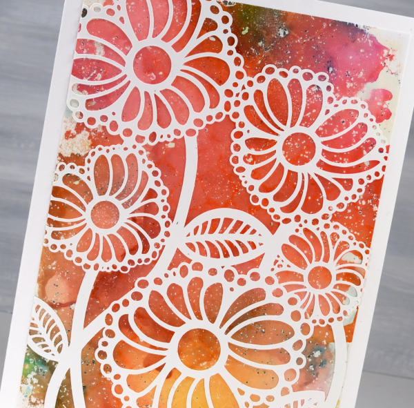
I cut the bubble flowers from thin white cardstock and you can probably tell there are some tiny cuts necessary. If I went much smaller than this I started to lose some of the bubbles so I kept it big enough for a 5″x7″ card.
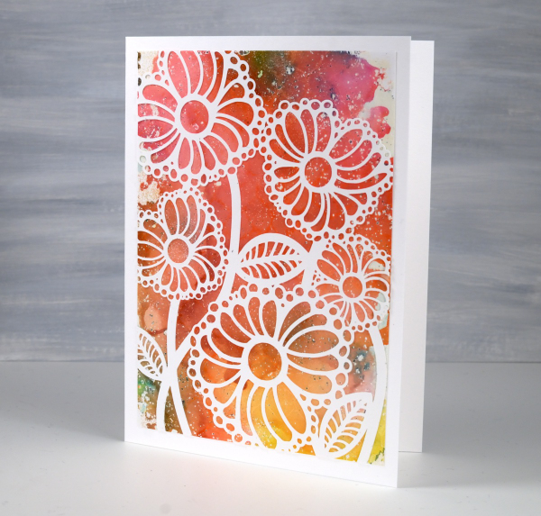
The backgrounds for both cards are gel prints. The multicoloured one above was created with alcohol inks then pulled with white acrylic paint. It was so pretty I didn’t want to cut it up or cut it down, hence the large card with a layer over the top.
The second background panel was all done with acrylic paints and a selection of objects to add texture. I can see one of my die-cut stamps, some chocolate tray shapes, lid shapes and other found textures. I cover a wide range of techniques in my Gel Print Journey class and I think this might have been a print I did just as we finished filming. All my online classes are currently on sale 40% off by using the code LEAPYEAR40 at checkout or by simply clicking the link above.
Because the bubble flowers are a delicate and detailed cut-out I used Grafix Artist Tac to glue them down. Once I had pressed the image onto the background I ran it through my die-cutting machine to burnish it. (quicker than doing it by hand). The sentiment is one I totally agree with and is from Taylored Expressions ‘In & Out Birthday’ set. Thank you for your lovely messages about our family’s February festivities; it was fun to share them with you in my previous post.
Family celebrations
Posted: February 27, 2024 Filed under: Ciao Bella, Darkroom Door, global postmarks, rice papers | Tags: Ciao Bella, Darkroom Door stamps, Mixed Media 9 Comments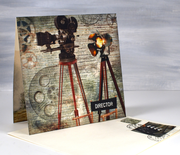
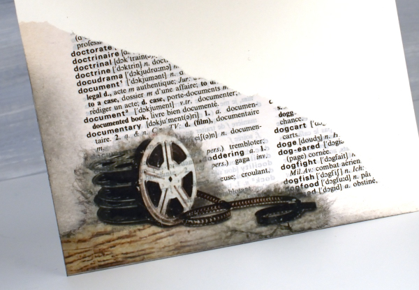
We recently enjoyed an exciting weekend as a family celebrating a birthday and a premiere. I used rice papers, sheet music and dictionary pages to create two custom cards. If you have done any of my online classes you might know my son is a videographer. He filmed my five classes for me but most of his time is spent on very different projects. Over the last few years he has been working on his first movie length documentary. It premiered in Ottawa a couple of weeks ago and our family along, with an excited crowd, were blown away by ‘City Limits: Ottawa’s Hip Hop History’.

I had a lovely time creating a celebratory card using a sheet of Ciao Bella’s rice paper. I have a little stash of Ciao Bella papers that I hadn’t dipped into and this was definitely the right occasion. The paper is aptly called ‘The director‘. I cut a large section to be the card front, tore a corner featuring film reels to go inside and transformed two small bits into faux stamps for the envelope. I am a little obsessed with faux stamps at present and like to make them realistic with the Darkroom Door global postmarks stamp set.

I used a couple of dictionary pages to add to the overall theme. Behind the projector panel is a dictionary page featuring the word ‘film’ and you can see the torn section of the ‘documentary’ page below.
We celebrated my husband’s birthday the same weekend and I paired the CiaoBella blue note cards rice paper panel this time with sheet music, being that my husband is a guitarist. The rice paper already had a tiny music print on it but the music paper I glued behind had a larger staff. I used it inside the card and under the greeting as well.
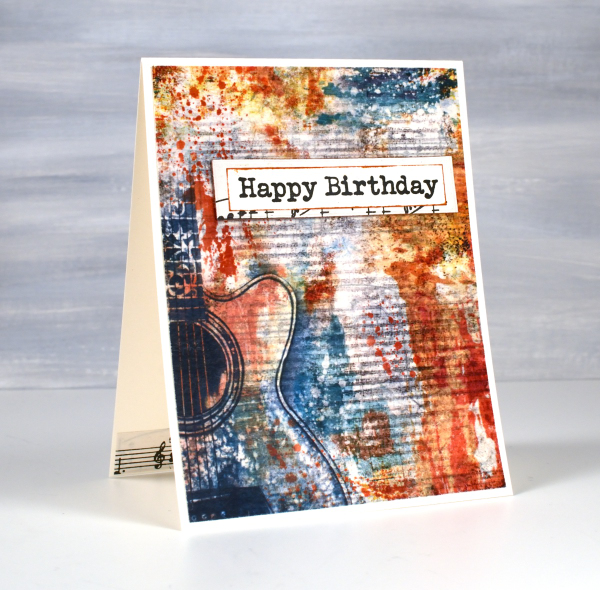
And yes, he did sight read the little segment I glued inside the card; he’s a musician!

This post includes affiliate links from Ecstasy Crafts where you can find these beautiful rice papers and many more. If you buy through these links I receive a small commission at no extra cost to you.
Tulips & more tulips
Posted: February 21, 2024 Filed under: Echidna Studios, sennelier watercolours, tulip background, tulip set, Watercolour | Tags: digital stamps, Echidna Studios, Faber-Castell Albrecht Durer Watercolour pencils, Faber-Castell Polychromos Colour Pencil, Fabriano Watercolour Paper, sennelier watercolours 11 Comments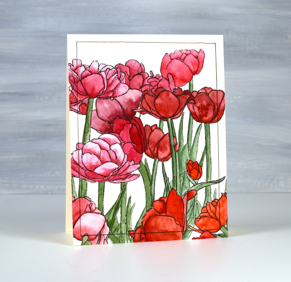
If there are tulips already blooming where you live you must let me know in the comments! It will be another two or three months before they bloom around here. All the more reason to have some blooming here on the blog. The group you see on the card above are part of a new digital stamp called ‘tulip background‘ from Echidna Studios. The whole image is a landscape oriented design and I printed it on hot pressed watercolour paper to be 8½” wide which gave me plenty of choice when deciding which part to use on a portrait oriented card.

I used Sennelier watercolours to paint the design using various mixes of four different reds and pinky red paints. I also used one of the reds to give the green paint a more muted realistic tone. Once I had painted all the tulips and stems I used polychromos pencils to add extra shading and shadow. This is a technique I learnt from Kathy Racoosin and it always adds to the finished panel. I ruled a narrow black line around the panel to frame it.

The flowers below are from a co-ordinating digital set simply called ‘tulip set‘ also from Echidna Studios. The set includes three individual tulips. I didn’t paint this one, my daughter did, using watercolour pencils. She also fussy cut each of the three tulips to create a pretty layered arrangement. This post includes an affiliate link to The Foiled Fox, if you use it I receive a small commission at no extra cost to you.


